See on Scoop.it – National Population Health Grid
http://youtu.be/C6UPqBSvudc IMG 1160 LongBlastomycosis ChicagoIllness
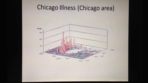
My "Blastomycosis, Chicago Illness" (4 min video) on YouTube was an early accomplishment using the 3D mapping technique developed more than a decade ago. Several years ago, I produced this teaching video to describe the different perspectives this mapping technique give you, for different distances from the earth’s surface and different levels of resolution. These results were not produced using a GIS.
The purpose here is to demonstrate that this method for surveillance can be easily applied to visualizing results, and has valuable applicability to use in large and small area surveillance and public health programs. Due to the nature of the algorithm, special reports can be be run by the dozens to hundreds of maps depicting spatial health measures per day. On the average, to produce my videos using this technique, I can produce more than 12,000 images per day.
If your goal is to determine specific cause and effect, applying your research question to dozens or hundreds of potential hypotheses, this is the method to use. It can be used to depict any size research area. You can use it to better target intervention activities, more precisely plan your health care programs and activities, or produce a clear presentation of your findings and results for a conference attended to by professionals or even local community health specialists.
Any public and community health issue, any population measure and any health economic metric can be mapped using this technique.
See on www.youtube.com
