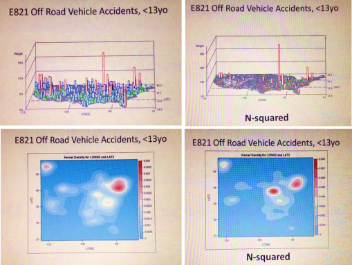
A simple way to tell the difference between neighboring regions is to magnify the results of your spatial data. This method is used to define where the nidus or nest of a problem exists in the social or community setting. It can also be used to define where to establish new clinics, or where to focus the bulk of of your intervention activities.
The simple use of N versus N-squared for your indicator score helps define exactly where the highest risk regions exist.
High risk is defined in two ways using this method. The first is the standard amount of events or risk scores obtained per unit area evaluated statistically (n, incidence, prevalence, age-adjusted results, etc.). The second is the simply square these results in order to identify the exactly location of your most needy community settings.
This evaluation process requires just a few minutes to be run, in a standard HIT system. It can be run at the local or neighborhood level, as well as the large area or regional level (like illustrated here).
The two sets of figures provided come from the following two videos posted at YouTube:
N — https://www.youtube.com/watch?v=lbg6Z8Ylfm8
N-squared — https://www.youtube.com/watch?v=If-HKIdoiuc
See on Scoop.it – Episurveillance
