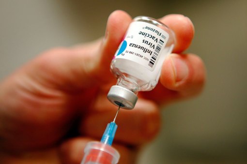
Arguments over whether the city can require pre-K students to get flu shots reached a fever pitch in Manhattan Wednesday, with a courtroom full of anti-vaccination activists railing against everyth…
Sourced through Scoop.it from: nypost.com
I spent the past three months reproducing my 3D maps of disease, that I developed the NPHG program for several years ago.
For those unfamiliar with my NPHG work, years ago I developed an algorithm for analyzing population health data, and then mapping the results of my analysis at the small area level (adjusted for particular density features), in order to produce a video of my results that depicts the US turning. This presentation can be zoomed in on, and looked at using any 3D angle. The purpose was to determine the best way to demonstrate disease outbreak clusters, ICD clusters, human behavior clusters. I produced more than 1000 of these 3D videos, each with 1000 or more maps in them.
Duplicating this statistical method for a smaller area, large medical data company, focused on NYC, I produced identical maps for this part of the US megalopolis. Most important to me was the fact that with the smaller dataset (1.5M-8M patients, 1B records), my results mimicked the results I produced for my 80M-120M patient population reviewed, that I posted quite a bit from over the past few years.
What is evident from thus duplication of findings is confirmation of a number of unexplored disease topics, in dire need of closer attention to culture, race and religion-related influences on the diagnoses, and the places where these events tend to cluster. This is certainly a way to uncover both the genetic and the cultural makings of the many neighborhoods that make up a healthcare populations "region" of distribution. It can be used to map out the value of where your facilities are placed, and how to link that info to community income level and types of medical needs.
The most controversial outcomes for these projects pertain to intercultural findings–behaviors, genomics, and culturally-linked ICDs that cross over into unexpected families and cultural communities.
The refusal to immunize your children is in part ethnic-culturally based, for two very clear reasons, and it is neodarwinian, U.S. based cultural beliefs–the notion that avoiding the vaccine is the safer way for a child to live.
It is up to the healthcare, managed care systems to be able to utilize findings like those produced using highly detailed spatial approaches to analyzing healthcare related needs, services and costs. The single most reason managed care groups have enabled these behaviors to happen in the NYC community is obvious–leaders of healthcare systems are inexperienced in producing an impact on the health of their local community. Another leadership related reason for the failure to improve healthcare practices and outcomes in recent years is also based upon poor experience and lack of adequate background in directing a managed care program as a healthcare system and business, not just one of either of these two.
Due to an efficient EHR, EMR, I can go to work and in an hour or two map the entire region and tell you where the most frequent use of these v-codes related to immunization refusal are documented. I can then map these results and produce a video well before the day is even half over.
So, for a while, I wasn’t sure why managed care programs still cannot engage in this level of spatial epidemiological research, much less get their act together with EHR and EMR. But this new "theory" in the dissertations that have been published in recent years, demonstrates this problem due to be to management and directors. Many if not most medical institutions have the employees with the skills for doing exactly what I do, map the results in record time, and analyze thousands of health related metrics per year.
My NationalPopulationHealthGrid.com page, personal blog site (brianaltonenmph.com), and YouTube sites provide numerous examples of this mapping technology. Once my dissertation is over (or just before), I’ll put out there the simple formulas I use to produce valuable epidemiological surveillance tools, without the need for a GIS.
See on Scoop.it – Medical GIS Guide
