See on Scoop.it – Medical GIS Guide
One of the hardest parts of studying historical medical geography is the time it takes to find your documentation. Maps are figures, usually included as addenda of figures to published writings. This means they are poorly indexed.
Chances are, for every 100 or more articles I have read, reviewed and/or hunted down in the 19th century medical journals, only one or two percent will have decent geographical illustrations about disease. The majority of books and articles of such value in Google Books lack the map due to the nature of its inclusion, normally as a pocketed insert or a fold out. So it is usually important that either a decent copy be found in hardcopy form, or that interlibrary loan services be used to obtain a photo of the map and/or the book/article itself.
Archive.org generally fairs better with the illustrations, spending the time needed to include these in the variety of electronic forms of the documents that they provide.
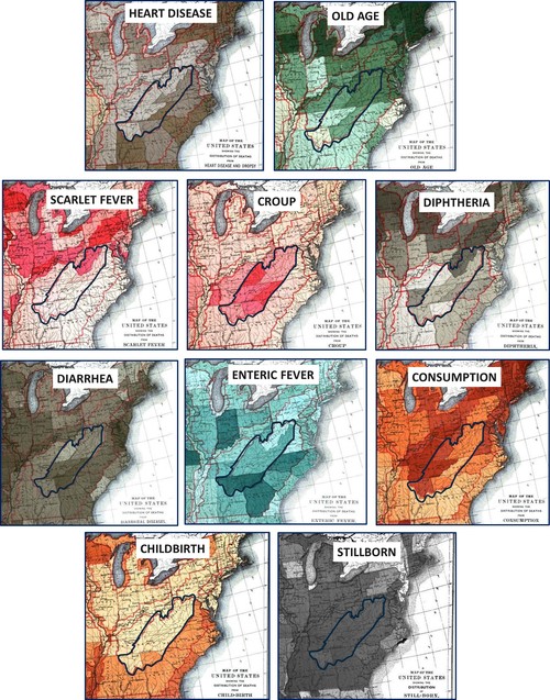
The above maps from the 1890 Census are detailed fairly extensively at my page https://brianaltonenmph.com/gis/more-historical-disease-maps/1890-the-1890-census-disease-maps/.
The point however being made here is that by reviewing historical maps we develop insights into how to better interpret the maps of disease we produce today.
The above maps are from my use of the Census maps to analyze what was becoming one of the poorest parts of the country–Appalachia. Even with large area choropleth mapping, we can still see where latitude, aspect (east vs. west face of the mountains), large scale area-specific landuse patterns (Coastal, vs. Great Lakes, vs. South, vs. Great Plains) and even population density (the early NY-to-Ohio, north to Boston, south to Washington DC megalopolis then developing).
For example East versus West had little to do with impacting how croup could be spread, whereas north vs. south and population density appear to play a major role in Scarlet Fever activities. Stillborn deliveries occur no matter where you reside. Enteric fever, from contaminated dairy products mostly, is more a southern phenomenon. Heart Disease and Old Age have higher rates on the east side of Appalachia (the megalopolis, with developed towns and cities).
This same method of looking at major geographic features i nrespect to disease and disease maps can provide us with important insights into the value of spatially presenting you public health and epidemiological findings. Programs that lack these valuable spatial techniques and insights into their findings are not going to provide us with as much value as a GIS study of the same important topics.
For more examples of how the maps of the past can help current spatial health researchers, epidemiologists and medical geographers, go to my blogsite on this topic at brianaltonenmph.com or visit my Pinterest page, where some of the more interesting examples of my findings are posted.
The five boards in Pinterest which review this work are as follows:
http://www.pinterest.com/altonenb/disease-maps/
http://www.pinterest.com/altonenb/spatial-health/
http://www.pinterest.com/altonenb/population-health/
