This page provides the math behind my grid mapping of the United States, without using a GIS. This technique is called grid mapping and was popular when ArcInfo and the first versions of ArcView were the most common spatial analysis lab tools.
Sourced through Scoop.it from: brianaltonenmph.com
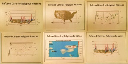
I use these maps to produce my 3D models of the US and its various public health patterns. The advantage to this method is in a decent system, it takes less than 10 minutes to map a large dataset, like that for the entire US, by zip code, block group, and/or gridcell plan (2500 analyses of 10s of millions of patient data rows, each depicting a standard one-row summary EMR).
Because this tool works very fast, I learned immediately to go through the extra effort needed to produce the 1,000 to 1,500 maps, with varying angles, pitch, and rates of revolution, needed to produce a video. A twenty second video requires about 1,200-1,500 images. A few of these videos are 5 or 6 minutes long. Most were derived from 2,000 to 3,000 images. Standard production rates in teradata are 15,000 to 20,000 images per day, developed into numerous videos. I mapped all of the ICDs, including those depicting specific age groups (suicide, homelessness and other V and Ecodes), in under two months.
My remaining research question: Can this same high rate of productivity (15k maps/day, for video production) be re-created in SAS-GIS, Cognos BI, ArcGIS, Qlik, Tableau or the host of other spatial tools out there? (see http://www.capterra.com/gis-software/ 😉
My dissertation work focuses on the barriers to implementing GIS in the managed care workplace as a highly productive reporting tool, i.e. reporting all ICDs, including age-culture-gender subgroups, with summary maps depicting the five primary ethnic disease pattern groups, on a daily basis.
See on Scoop.it – Medical GIS Guide
