
Note: As of May 2013, I have a sister site for this series on national population health grid mapping. It is standalone that reads a lot easier and is easier to navigate. LINK
Like any grid map, resolution either defines the map or detracts from its utility and value. The resolution of a grid map is defined by its cells. If the cells are too big, too much data gets compiled into the cell to illustrate numerically whatever spatial relationships we were searching for. If the cells are too small, the study is hindered by the lack of clustering of the data the high frequency of zero values in the dataset, and the effects of calculating these numbers for the countless small cells with zero values greatly hinders total image processing time.

If we placed the U.S. continental proper into just one cell of a very large grid, that cell would have to be a 2300 miles wide square; the north-south distance of the U.S. proper is only 1650 miles. The entire U.S. stretches 5100 miles from Hawaii to Maine, and 4300 miles from northernmost Alaska to the tip of Florida.
. . . . . . . . . . . . . . . . . . . . . . .
Ten years ago an additional problem that grid cell size provided researchers with pertained to storage space. Having too many grid cells increased the amount of work that had to be done. Large datasets require large amounts of storage space and when analyses are performed, more time was required due to so many cells.
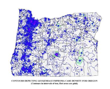
The above contour map was run on several thousand cancer cases in the state of Oregon in Winter of 2003/4, between jobs. I used ArcView 3.2, Spatial Analyst, with an Arc Avenue Extension added for grid mapping. The state was first converted to a square grid, with cells provided unique identifiers and measuring approximately 1 mi x 1 mi (I believe the state grid was 300 rows x 407 cols-Link to this). Centroids were then assigned to each cell, and any grid cell values, including lat-longs, were transferred to this shapefile; this process took 5-6 hours. Counts were the made of cancer cases (point data) per grid cell and that value also assigned to the cell centroid (range 0-30). Contours were then produced based on the spatial distribution of these centroid values. The contours were in increments of 1, with isolines mapped using a two-color range, by units of 1, with low to average areas in blue and hot spots (>5) indicated with increasingly hot to dark pink lines. The pink areas represent core urban areas, where the greatest numbers of cases were found due to the reporting methods for the time. Look closely at the state edge along the Columbia River at the south edge of the state–the contour lines extended to the edge of the map (not the edge of the state) and so had to be covered up with a white polygon with a boundary mimicking the page and state borders. Since the technology during this time was limited, the contour map alone took over 6 hours to run; this whole process took about two 10hr days. The computer I used was a Windows97 Compaq Presario laptop with a 4gb HD (it could not handle an 8); the laptop had to be laid upside down on my desk, with a 4″x4″ old IBM computer fan aimed at its lower corner due to a battery-related overheating problem with the system. Due to the risk this posed to the hardware, I never ran this program again to produce such a finely detailed map. Which was just as well, Upon closer inspection I noticed the erratic 90 degree turning of lines produced in the contours when viewed up close, a few square miles at a time. Soon after, I developed and then switched to my small area hex grid mapping technique in order to produce smoother, more appealing, and more accurate contour lines.
.
As it this weren’t enough, highly detailed datasets make you an expert in “nothingness”. You may be more an expert in where nothing exists due to cells lacking data, than where the true data exists. As a result, you become highly experienced in the spatial distribution of no data and where no significant differences exist in the relationships between neighboring cells on a grid. For grid cell analysis this means that the size of the cell either makes or breaks the value and applicability of your research methodology, which is why it is good to test your grid cell size for numbers of valid points in a cell and the distribution of those distributions before deciding upon the best way to grid map and the analyze your data.

This classic example of this ‘zero problem’ occurs with block-related census data. The classic census study makes use of census tract to perform a study. In general census tracts are very big. The bigger the tract, the less relavent those larger tracts are to the research at hand. In the image depicting tracts below, we see abnormally large tracts in the mid to eastern hinterlands of northern California and Oregon. In some cases, people exist in these tract areas, but so few that these polygons are useless when it comes to studying density related information such as diseases and accidents per square mile.

(see also http://www.census.gov/geo/www/maps/)
In contrast with this census tract problem is the the block problem. The block is the smallest useable area for population research and is the smallest polygon represented by a highly detailed census database. It is a very small area comprised of a small amount of data, and plenty of zero values.
The use of the block for performing population research allows one to exclude areas like in eastern Oregon where human populations are pretty much zero and where even human environmental interactions seem unlikely due to the lack of inhabitation or cohabitation. The problem with this very small area however pertains to its most important asset–its small size. In terms of space and time requirements attached to performing a census block study, it is not unusual for block data to require megabytes worth of space and lengthy periods of time to perform a sophisticated calculation. In one study I did for example in 2004, it took more than six hours for block centroids with their x and y coordinates to be assigned to each and every block and for the related census information to then be transferred from the polygon dataset to the centroids dataset using an ArcView Extension. With the numerous exceptionally large areas with multiple zero values for populations count in these blocks, there was no way any useful information on population health could be developed using this dataset. This meant that somewhere between zip codes and block there had to be a polygon area size that could be used for this type of research.

All 26 Million Road Segments in Continental United States. http://flowingdata.com/category/visualization/mapping/page/15/
The next largest polygon area related to census records is the block group, which groups together or aggregates individual blocks into clusters, the information of which is merged into a single polygon. Block groups is the way to go with population health research.
The major advantage to block groups is they have less zeroes to get in the way of areal density calculations, so there is more useful information to work with. In addition, the size of this data set required for storage is reduced to 1/6th to 1/10th the size of the more detailed block data set. This speeds up the research process considerably. This means that the major advantage of using block groups has mostly to do with database size, and the resulting speed of analysis and amount of time needed to construct a figure, or graph your results. More importantly, the lesser numbers of zero blocks seen is a major benefit for this type of analysis whenever GIS is employed, and the 6-hour centroid assignment and tabulation process took only one hour or less. There are less nearest neighbor relationships that have to be defined by the GIS in developing the table to match up with the base map that exists. There are less steps in the calculations that seem to linger on for long periods of time, leaving you uncertain as to whether or not your requested analysis is being performed.
Both large and area and small area analyses have their different benefits. Small areas are good for determining exactly where something is happening. Large area is better for developing standardized base population relationships, relating one member of that population to all others. When you try to use blocks for example you are more likely to have polygons with just one or two cases. There is no way these could be compared to the a population as a whole. The uneven age distribution negates any value to these very small case groups and is impossible to correct for. Large areas like census tracts provide us with more people data, enough to make comparisons with the population as a whole, even in terms of estimated likelihood for events taking place within specific age group ranges, such as 0 to 4, 5 to 9, etc..

Two very commonly employed examples of sufficient use of small area block analysis are the study of crime around a city and the study of motor vehicle-pedestrian accidents at a given location. An example of block group utilization would be the study of population features related to income and poverty, the need for social support programs, and the absence of community leaders and mentors. In terms of analyses related to general population health statistics and public health, the study of block groups is usually better, especially for very low incidence/prevalence diseases and very infrequent coded medical problems or emergency room conditions. In terms of analyses related to common point events such as criminal activities and intersection accidents, blocks may be the best way to go.

Census blocks and crime
See also Sonoma College work on grid mapping crime.
The next level up in size for areal studies pertains to political boundaries data, namely such things as voter registration areas, school zones, and congressional districts. This has the added advantage of being so large that actual full population analyses can be performed and age-gender adjustments attempted at the 5 year age range level. A disadvantage to the use of these areas pertains to the increasing homogeneity of the datasets produced due to the increased size of your research area and their arbitrary, ever-changing shapes and sizes due to local political and governmental history. Small clusters that exist as outliers in the block group evaluation process are often lost when this methodology of defining space is used (“hiding the poor” effect). Since many of these areas are governmentally defined, they are apt to change as well, making long term studies of a given voter’s or school tax region difficult to manage and make the appropriate corrections for over long periods of time.

In a way, substituting these well defined regions for GIS work by implementing a grid cell method for studying the distribution of numbers over space and time seems only to result in even more complications. In theory, by employing this method even more analyses need to be performed in order to transfer the given irregular polygon data attached to each of the above shapefiles mentioned to the grid cells you plant to use for your research. In addition, by adding such a task, this adds another very complicated step to the process as well, in which miscalculations can take place reducing the validity and reliability of the outcomes you get when you employ this process.

Examples of grids in use for the United States
Relating this to Grid Studies
Neither blocks nor block groups are being used for this phase of a grid-defined national disease study. But the same rules and issues for the use of block versus block groups apply to grid cell analysis. Large grid cell size makes for artificial clumping of the data–too many cases in a cell, in large numbers for each cell, with fewer cells lacking disease. Small grid cell size demonstrates a number of places where disease exist, but with many empty cells in between the disease containing cells.
Examples of Large Cell Area Grids

Space Station follows a 3-“column” path over the U.S. http://spacestationinfo.blogspot.com/2011_02_01_archive.html
.

Landsat provides approximately 55 cols x 25 rows of imagery, minimum, each with significant overlap. http://landsat.usgs.gov/about_LU_Vol_1_Issue_3.php

Climate Grid Mapping. Steve McIntyre. HadCRU3 versus GISS. Feb 17, 2007. http://climateaudit.org/2007/02/17/hadcru3-versus-giss/

The above drought surveillance program works with about 14 rows by 30 columns. http://pathsoflight.us/musing/
.
Distribution of the World’s Population in False Cube 3D
http://www.flickr.com/photos/arenamontanus/sets/72157594509798466/. Product of http://gecon.yale.edu/
In this review of diseases and mapping their distribution using the grid approach, this study begins with a review of rare to very infrequent diseases. The reasons to avoid high incidence diseases for the moment pertains to understanding the value of this methodology. The mapping of rarer diseases provides us with a lot of plenty of “empty space” (polygons with no cases). This makes it easier to see and understand the results of the small differences that exist in the programming for producing these maps. By engaging in a study with very large numbers of people, such as asthma, hypertension or diabetes, one might still produce an interesting outcome at first, seemingly rich in important information, but this data might also appear too “crowded” to clearly display any important spatial outcomes.
.
Steps in Analyses
For this review, the first attempt made to map disease makes use of zip code mapping. At the state level of mapping, zip code mapping is interesting but not that helpful. We can age-gender adjust the data for zip codes to some extent and make the outcomes more useful. But the overall problem with zip code based analysis, especially at the state level or smaller, is that many states have unpopulated or poorly population large regions. Zip code regions that are very large in area also tend to have the smallest numbers of cases. If we were to map out population density of cases using this method, the result would be very misleading. In eastern Oregon for example, a study I did on breast cancer diagnosis showed just two cases in the eastern part of the state, residing in the most rural part of the state. Since very few families reside in this region in general, the 2 cases produced a high incidence rate, which was very misleading due to the population and areal features. Zip code tract related analysis tends to work best in the urban-suburban setting. The more urbanized a city becomes, due to high population density, the more concise the lat-longs are for a given suburban-urban setting.
In spite of these size-area-population density related issues with using zip code data to evaluate diseases, when exceptionally large public health data sets are reviewed, this size effect of zip codes seems to become minimal due to the size of the complete area under evaluation–the entire country. For this reason, zip codes may also be useful for other types of studies involving large regions of the country, like the governmentally defined regions applied to census data research or the HEDIS-NCQA method of regionalizing the US defined elsewhere on this site for studying health care quality of care and access issues.
This zip codes mapping was used as an intermediary stage in the development of the research techniques. Each zip code has a centroid to which the zip data is attached to. These centroids in turn sit within a given cell of a grid laid over the entire United States. (As noted elsewhere I favor hex grid studies, but for the time being, and based on the tools being used (SAS), this work begins with a series of applications to the traditional square cell grid overlay for the US.)
The purpose of developing the zip code data is to then merge these results more in the form of a square grid analysis of zip code based data. The data types evaluated using this process are numerous, and tend to focus on ICDs, but some examples involve other metrics employed for health analysis, based on patient behaviors, patient responses to surveys, or automatic computer generated health risk scores assessment programs.

Next step: more details for the prior flowchart
The next step in this process was defining what size cell to use for the review. The cell size or resolution of the grid would be limited somewhat by the programming methods employed (some parts of the sql processes have max values to the process being used). As stated earlier, too much resolution has the effect of requiring too much time for data processing, providing large numbers of empty cells. [In GIS, there is another way to get around this, using other polygon metrics tools.]
The following detail some parts of the process I used to define grid rows and columns based mostly upon flat plane (Euclidean), not true spherical surface [Cartesian], equations.

Approximations for 20 , 25 and 30 mile square cell edges overlaying a zip code map, with quadrants defining 5, 10, 12.5 and 15 mile regular polygon grid cells.
The 5, 10 and 15 mile cells areas are inferred by quadrants of the larger cells indicated by the 5 mile markers along the central cross-lines
.

More notes: Pulling all of the above together, this method of research is for an exceptionally large area, involving zip codes and square grid cells that need to be developed by merging the data presented. Obviously, the size of the grid cell is best when it is typically greater than the size of the zip code tracts. In the above image for New York Zip codes, the 5 mi x 5 mi area barely covers an entire zip code tract area due to the irregularity of these polygons. A 10 mi x 10 mi area tends to cover a 4 zip code x 4 zip code tract array, with a 5 tracts x 4 sides or 20 demonstrating partial coverage along the edge; the total for this calculation is 16 + 20 or 36.
The 20 mi x 20 mi area demonstrates similar behavior–but with the following findings:
[(12 or 13) x (12 or 13) tracts] +[ 4 sides x (12-13 tracts)] = 192 (for 12 x 12) or 222 (for 13 x 13); estimated as 199 to 222, the mid-point of which is 207. (Side contacting tracts may be overestimated.)
Together, the trends these numbers demonstrate is the use of the max values for calculating zip code tracts per grid cell to be produced.

.
Once the grid cell technique is perfected, it can be used in any of several ways, each of which are tested here and demonstrated on separate pages.
One way to apply the grid cell data is as a varying area cell analysis to find the best square cell size to use for future research projects. This logic is akin to that just mentioned that excluded the use of block analyses due to its large number of zeroes. The same problems hold true for grid cell development. As demonstrated elsewhere, a small 1/4 sq mile cell is excellent when applied to data that is common in such settings, such as chemical spills in close proximity to transportation routes and urban-suburban settings (my Oregon Toxic Release Site study, done in both the square grid methodology and the hex grid methodology I developed).

Examples of grid maps developed for the Oregon Toxic Release study: the traditional square grids approach and my hexagonal grids approach.
.
Defining the size of the grid cells to be used for a national study was at first perplexing. The following steps have to be taken to produce a grid map of national data that is legible and immediately interpretable, and yet illustrates the data with enough details to serve a purpose using this map size.
[INSERT FIGURE].
The following logic relates to many of the steps taken in order to determine what is the best methodology to put to use for this project.
[INSERT FIGURE]
.
.
Defining a Grid for the Contiguous United States
The practicality of grid cell size in relation to map form, shape, size, and time-sensitive analytic processes limits this analysis to lat and long = 20, 25 and 30 mi cell sizes, or approximately 400 sq mi, 625 sq mi and 900 sq mi cells. This is based on the an analysis of the Contiguous US based on Extreme Points data provided by Wikipedia.
Obviously, if we were to map the US in square mile units or less ( a methodology promoted on one of my other pages), the numbers of grid cells could make this study too detailed to display as a single map. Its database could be too large, and the possibility of the zero value cells could impacting the overall value of such a process. For this reason I prefer to save the use of the small grid cell method for small, local area analyses, which is how it is normally applied for criminal and public health related work.
Another interesting dilemma in mapping the Contiguous portion of the United States is the answer to the question
‘exactly how big is the contiguous portion of the U.S.?’
For this study, the size of the contiguous portion of the US, depending upon the source for this information and the projection-related calculations used, is estimated to be approximately 2,800 miles (4,500 km) for the greatest east-west distance of the 48 contiguous states and about 1,650 miles (2,660 km) for a direct north-south transect. [see http://geography.howstuffworks.com/united-states/geography-of-united-states1.htm%5D.
At the wikipedia page exploring this research question, a slightly more detailed view of the size of the contiguous states defined the length horizontally on a map as 2,892 miles, but this is for a diagonal leading from Point Arena, California to West Quoddy Head, Maine. (wikipedia: http://en.wikipedia.org/wiki/Extreme_points_of_the_United_States ). Based on this information, the following possible extreme lat-long points can be defined for this study, with the preferred points in blue:
Northernmost Points for Contiguous Continent
- Northwest Angle Inlet in Lake of the Woods, Minnesota 49°23′04.1″N 95°9′12.2″W / 49.384472°N 95.153389°W / 49.384472; -95.153389 (Northwest Angle) — northernmost point in the 48 contiguous states (because of incomplete information at the time of the Treaty of Paris (1783) settling the American Revolutionary War)
- Sumas, Washington 49°00′08.6″N 122°15′40″W / 49.002389°N 122.26111°W / 49.002389; -122.26111 (Sumas, WA) — northernmost incorporated place in the 48 contiguous states (because of 19th century survey inaccuracy placing the international border slightly north of the 49th parallel here.[1])
- Bellingham, Washington 48°45′19.12″N 122°28′43.54″W / 48.7553111°N 122.4787611°W / 48.7553111; -122.4787611 (Bellingham City Hall) — northernmost city of more than 50,000 residents in the 48 contiguous states
- Seattle, Washington 47°36′13.81″N 122°19′48.56″W / 47.6038361°N 122.3301556°W / 47.6038361; -122.3301556 (Seattle City Hall) — northernmost city of more than 500,000 residents in the United States
Southernmost Points for Contiguous Continent
- Western Dry Rocks, Florida (24°26.8′N 81°55.6′W / 24.4467°N 81.9267°W / 24.4467; -81.9267 (Western Dry Rocks)) — In the Florida Keys – southernmost point in the 48 contiguous states occasionally above water at low tide
- Ballast Key, Florida (24°31′15″N 81°57′49″W / 24.52083°N 81.96361°W / 24.52083; -81.96361 (Ballast Key)) — southernmost point in the 48 contiguous states continuously above water
- Key West, Florida (24°32′41″N 81°48′37″W / 24.544701°N 81.810333°W / 24.544701; -81.810333 (Key West, FL)) — southernmost incorporated place in the contiguous 48 states
- Cape Sable, Florida (25°7′6″N 81°5′11″W / 25.11833°N 81.08639°W / 25.11833; -81.08639 (Cape Sable)) — southernmost point on the U.S. mainland
- Miami, Florida — the southernmost major metropolitan city in the 48 contiguous states
- Hawaii has the southernmost geographic center of all the states. Florida has the southernmost geographic center of the 48 contiguous states.
Easternmost Points for Contiguous Continent
- Sail Rock 44°48′45.2″N 66°56′49.3″W / 44.812556°N 66.947028°W / 44.812556; -66.947028 (Sail Rock), just offshore of West Quoddy Head, Maine — easternmost point in the 50 states, by direction of travel
- West Quoddy Head, Maine 44°48′55.4″N 66°56′59.2″W / 44.815389°N 66.949778°W / 44.815389; -66.949778 (West Quoddy Head) — easternmost point on the U.S. mainland
- Pochnoi Point, Semisopochnoi Island, Alaska 51°57′42″N 179°46′23″E / 51.96167°N 179.77306°E / 51.96167; 179.77306 (Pochnoi Point, Semisopochnoi Island) — easternmost point in all of U.S. territory, by longitude
- Peacock Point, Wake Island 19°16′13.2″N 166°39′26.3″E / 19.270333°N 166.657306°E / 19.270333; 166.657306 (Peacock Point, Wake Island) — first sunrise (at equinox) in all of U.S. territory
Westernmost Points for Contiguous Continent
- Umatilla Reef, offshore from Cape Alava, Washington (48°11.1′N 124°47.1′W / 48.185°N 124.785°W / 48.185; -124.785 (Umatilla Reef)) — westernmost point in the 48 contiguous states occasionally above water at low tide
- Bodelteh Islands, offshore from Cape Alava, Washington 48°10′42.7″N 124°46′18.1″W / 48.178528°N 124.771694°W / 48.178528; -124.771694 (Bodelteh Islands) — westernmost point in the 48 contiguous states continuously above water
- Cape Alava, Washington (48°9′51″N 124°43′59″W / 48.16417°N 124.73306°W / 48.16417; -124.73306 (Cape Alava)) — westernmost point on the U.S. mainland (contiguous)
The assumptions made for defining the eastern, southern and western most edges is that a landform is acceptible as the edge portion, so long as it is above the water surface for most of the year. For the Canadian border and northern edge of the country, the largest latitude was used, regardless of whether or not it was coastal or interior continent in nature. Since Hawaii, Alaska, the Bermudas, and Puerto Rico were not included in this analysis, their extreme points are not included. Thus the following four extreme points are used.
- The highest latitude (furthest to the north) selected for this work was taken from “Northwest Angle Inlet in Lake of the Woods, Minnesota 49°23′04.1″N / 49.384472°N
- The lowest latitude (closest to the equator) was Ballast Key, Florida (24°31′15″N / 24.52083°N — southernmost point in the 48 contiguous states continuously above water
- The easternmost was West Quoddy Head, Maine 66°56′59.2″W / 66.949778°W / -66.949778
- The westernmost was Bodelteh Islands, offshore from Cape Alava, Washington 124°46′18.1″W / 124.771694°W / -124.771694
.
These are used to define the four sides of the rectangle to be laid over the United States for evaluating the lat-long data related to zip code centroids, as noted in the original dataset. These points of course also mean that a significant number of cells in the grid are going to lack data. These empty cells are identified and processed later on in the map development process.
Because this is a lat-long map and not an equal area/equal distant mapping problem, some additions steps were needed in order to correct for the changing size of the edges of the rhomboids that defined the lat-long sections across the US map. At the northern boundary of the US, the distance between westernmost and easternmost corners is significantly different than the same distance between the southeastern and southwestern corners. The ratio for this degrees longitude versus degrees latitude relationship show that a 1.78:1 to 1.80:1 relationship exists for the mapping parameters. In terms of integer values, this suggests that an x-by-y grid with x~y should be close to one of the following sets of numbers:

The tightness of the above numbers pairs is illustrated by a simply x-y scatter plot with a linear slope line produced and its 99.98% Rsq defined.
.

The table of outputs used to produce the above tested results follows:

Each x-y relationship, with x and y expressed only as integers, produces a series of cell unit areas. These area values were calculated based on the typical rhombus equation
Area = height x (length-min+length-max)/2.
This rhombus geometry is illustrated in the following figure, which depicts lengths in metric units, but will be applied to the review of United States lat- and long ranges expressed in degree-decimal units, even though the Euclidean nature of these values and underlying formula don’t exactly apply to the Cartesian nature of this work. (Again this is done just for estimates to be applied to the methodology for grid definitions.)

The European metrics were then recalculated as US foot-mile systems values. (Typically metrics are applied to one map projection system and related NOAA mapping system and 3d surface modeling sytem, and the other to another year’s system. This potential error problem had to be ignored for this preliminary work.)

.
Since the rhombus is a flat polygon and earth’s surface is not flat, there is some error built into the use of a traditional rhombus equation for calculating mileage across one direction in degree units due to the curving of the earth’s surface. This curvature effect is exaggerated in the following figure. The true rhombus equation would suggest that base size along the the half way point across a flat surface would be 4942, if the two end values 4080 and 5804 were for flat surfaces. On a true map however we find the true value along this line is 5055, 97 metric units or approximately 2% more than the predicted value.
 .
.
In turn, across the earth’s surface, this 2% difference varies by latitude due to a slight flattening of the earth’s spherical form. This obvate nature or “flattening” of the sphere with compression at both ends theoretically exists due to the fluidity of its core, but also possible a combination of other surface material features related to creep brought on by gravitational and centrifugal forces. When distance units are small, these small differences in the total earth’s spheriodal shape, or more accurately the United States ellipsoid form, can quickly add up over space. When distance units are large, such and nautical miles versus regular miles, or miles versus kilometers, these differences appear to lessen. When very samll units of measurement are used, such as feet, the effects on numbers and values can seem substantial.

For more on ellipsoids and the earth’s geodesics see http://en.wikipedia.org/wiki/Figure_of_the_Earth
The above point is made due to the nature of mapping using a lat-long decimal degrees method. Errors increase in different ways along the various latitudes. Where ever area units are involved in the analysis instead of length units, these differences are squared. In terms of selecting the row and column numbers, for the 20, 25 and 30 square mile cell sizes, two values are given (related areas for which are displayed as highlighted pairs in the table below)–one underestimates the grid cell area based upon edge sizes and the second slightly overestimates this area.
As noted before, these values are only for the mid-range value latitude line cell groups. Cells closer to the equator are larger, those closer to the poles are considerable smaller. Changes in area along these latitude distances can also be calculated and worked into the overall equation, with multipliers defined to serve as multipliers of cell results for each cell with its centroid above and below the mid-line.
.

.
To produce grids with cells with area values fairly close to commonly used whole number values, the following row-col relationships were defined for the use of this methodology.

.
This basic information provides us with a starting point for defining how the US can be mapped. The above three sets of grid-mapping values define the grid cell by average area size in understandable units. Square footage has to be considered as well–values which rapidly get large as the edge size of a cell increases. This means that in terms of variation or change across space, cells with larger edges have even larger areas produced in terms of square footage. On a typical lat-long map, this means that the northmost and southmost cells of a given study region deviate the most from the expected values defined by the midpoints or meridian of the research area.
The grid cell sizes above–20, 25, and 30 mi edges–appear fairly big. If a small area epidemiological grid study, these will not suffice. But this size is acceptable for this large area size study. The size of the continguous portion of the US, for example, depending on your information source, is approximately 2,800 miles (4,500 km) for the greatest east-west distance for the 48 contiguous states. The greatest north-south size in miles is about 1,650 miles (2,660 km) [http://geography.howstuffworks.com/united-states/geography-of-united-states1.htm]. Obviously, if we were to map the US in square mile units, the numbers of grid cells involved could make such a study too detailed to display as a single map (suggesting we should save this resolution for engaging in local area analyses).
.
Defining Cell Size for mapping US surfaces
It would be nice to employ a 10mi x 10mi cell for this research, but since this is a national study, the resulting database size would be too large for this kind of activity, based on the calculation methodologies used (the system itself defines a maximum for either numbers of rows/lat lines or numbers of cols/long lines-the number of long lines surpass these max limits if 10 mile x 10 mile cell sizes are employed).
At a small area level, such a method could be employed. But then the problem surfaces as to whether or not it would be useful if zip code or census tract based data is being used to perform the analysis. This project utilized zip code centroid data.
Whereas my Oregon study worked on 10 sq mi cell sizes down to 1/16th sq mi (1/4 mi x 1/4 mi) cell size, and even smaller in some cases, this study makes less use of close ups, at least in its beginning. Surveillance activity typically reviews the same sized scanning area over time and space, with options of focusing on specific areas with possible clustering. Each cell has features that are assigned to the centroid that are used by the surveillance tool to detect these risk areas. With such information, a potential nidus can then be defined at the small area level, using some sort of algorithm for nearest neighbor or moving windows analysis. Numerous examples of these are provided elsewhere on this website.
Like any DEM related resolution problem, I had a number of resolutions issues to contend with when I reopened this project to try and update it. Trying to meld the polygon area data into grid layouts used to produce surface plots and 3D grid maps was a bit of a problem. When comparing two diseases for example, both diseases need to be tabulated together so that a single table was produced for reanalysis and projection on the same grid for comparison. This classical problem seen with remote sensing imagery analysis also exists for statistical numbers related grid cell analyses techniques employed by ArcGIS and SAS. ArcGIS is more capable of managing this problem; however, SAS has some programming issues to contend with, but they are resolvable.

An early successful but primitive attempt I could rerun without too much problem
When I reinitiated these studies, the evidence for when I last attempted this task seemed kind of humorous. Earlier attempts required numerous floppy disks and magnetic tapes (personal pc and institutional back ups) for data storage. (And believe it or not, the data quality was still good–nothing was lost or corrupted.) Still later in the early stages of work were those zip drives (selling at 5-7 dollars each then), followed finally by CDs.
My logic and methodology for developing the 3D modeling technique in 2000 was based on DEMs, stored as one or a few DEMs per zip drive, and satellite images. In 2002-3, this technique was used to map toxic chemical releases along the Willamette watershed close to Troutdale, followed by the mapping of west nile disease locally as a small area topography/landuse study. To accomplish this two years later in 2003/4, ArcView results had to be exported in dataform, and/or imported by way of IDRISI32 into the IDRISI software for subsequent grid mapping and DEM modeling use. For SAS systems lacking a SAS/GIS, the spatial analysis methodology being developed made use only of the basic SAS, and the x-y grid and 2d histo/false cube option. This SAS was used to produce the grid upon which the data would be mapped and analyzed spatially.

Used for proposals for my projects using this system, now referred to as Economic Grid-mapping or EconGrid for short, with focus on any metric, but usually people or consumer~cost/$, i.e. EconGrid Health, EconGrid Petrol, EconGrid Toys; the reports generated are EconGrid Matrix.
In retrospect it helps to know that IDRISI sql writing is much like SAS writing. The sql for this methodology in SAS and IDRISI had some very helpful similarities in terms of how to define the 3D imagery, the amount of rotation to be performed in series, the grid cell size, etc. IDRISI automatically produced the images required in just a few seconds, making this process extremely fast.
Currently (and finally), amount of data storage space and image sizes are no longer issue in this process. Time is still a hindrance, but not a barrier to completion. Now it is possible to store numerous image results, and depending on the software used, merge them into a primitive display of results displayed temporally as 3d views replicating a video of your result. Once space was no longer an issue, the 20-30 image sequence of rotating images in IDRISI were replaced by a 150-300 image series of rotating maps, with tilting images. Today, the best 3D imagery requires 600 to 1000 images for a one to two minute video or film clip; the rate of image display for these series is typically 50-60 images per second.
Example:
Τ
,
……………………………………………………………………

.
Final Notes & Commentary
I don’t know if there is really a nice way or a good way to say this. . . one of the things about Big Business and Big Data is that truthfully, businesses are into the money, not the consumer. The reasons for this are obvious. Investors need to be satisfied. The stock market has to demonstrate economic growth to investors. Financial holdings must demonstrate long term success and stability. In medicine, this means that on a short term level, sickness guarantees an ongoing income source for a company, no matter how much they claim to lose each time the end of quarter or end of year report is reviewed.
With the above two maps, you are comparing cost for a particular service in relation to demand or the number of times that service is provided. The issue at hand is the cost for preventing an animal vectored disease from being accidentally introduced into this country. Your results appear to be opposite or your expectations. The question of the day that your CIO asks is ‘How do you resolve this matter to bring down the costs attached to this prevention program and still generate effective use of services?’
Several times a year, CFOs and CEOs review the company’s profit margins, and like to get upset at the partial reimbursement policies attached to federal health insurance programs. The partial reimbursement has been anywhere from 37 cents to 58 cents on the dollar over the past decade or two, with additional reimbursements soon to be provided in the form of end of the year rewards for good service. Back in 2007, there was a threat to reduce reimbursements for Medicaid/Medicare expenditures to 37 or 38 cents on the dollar spent, forcing one insurance agency for the region to drop its 75,000+ caseload onto the remaining 3 or 4 other programs in the state already managing their own populations. To the largest of these programs, this meant a 50% increase in patients/members in need of monitoring, regardless of any reductions in reimbursements. In terms of quality improvement, this meant that workers experienced a sudden increase in work demand, without a 50% increase in staff required to engage in such a role. In the long run, the only company to lose in this case was the original insurance company, unwilling to take accept the new 37-38% reimbursement rate.
Answer: You decide to integrate the two into an equation meant to score a variety of services in each region related to these metrics. You assign a particular weight or value to high costs in order to hopefully bring them down. This still leaves you with a certain amount of dissatisfaction with that lone caregiver team down south and relative absence of care out west. So you assign a ranking score to places by types of people served and the need for more facilities and come out with the best way to spend your money, in terms of cost, need based upon patients and facilities per square mile, and concerns about prevention.
If we relate this to other much larger companies, federal reimbursement really defines a company’s progress. With time, and with slow and careful increases in other rates, some can compensate for these “losses”. To big companies, a 15% reimbursement over millions of people for poor performance equals a 50% revenue awarded to better companies that serve much fewer patients and never earn the matching financial rewards that the poor performance big company just received. One million dollars in grunge money is still much better than 50,000 to 100,000 in good clean money at the company level. Also with very large health care insurance companies, there are a number of ways to create change in order to account for these predicted losses, to make them nearly invisible to the customer, thereby diluting these losses and compensating for them by establishing other financial reimbursement methodologies. In the end, for some parts of this revenue, the more work orders get filled, the more profit is obtained. Even with fraud and abuse, ethics seeming to be one reason for such large numbers of sales. Fraud and abuse leads to increased sales. In the end, such sales are the most important parts of this transaction, and were there not attempts made to prevent such sales from being “illegal” according to federal Fraud and Abuse definitions, one has to wonder how long and for how far would such practices would be allowed.

Another very interesting way to increase revenues pertains to cost differences seen for a generic drug purchased by an employee on health care, by way of paying the standard co-pay, versus purchasing the same without the co-pay, resulting in a 40% savings for generically dispensed medications. The Medicare or Medicaid individual obtaining the same drug but at a much lower cost, if not at no cost. To balance the loss in revenues this process results in, a co-pay can be defined to compensate for these losses. Ten years ago, while reviewing a major national pharmacy database representing 250 million transactions per year nationwide, one major pharmacy, serving consumers as a subletted store space within a family-directed department store, was able to provide monthly generics at a cost of $4 or $5 per month; its competitor, a little higher up on the grapevine so to speak, offered the same but for $5 to $5.50, and a third for $6 to $7. To the individual required to make a co-pay, a $10 co-pay means that the $4 or $5 per month generic product, for which $10 is paid, actually provides a 100% or more increase in profits. So a co-pay isn’t always defined just for the benefits of the patient; it often serves to compensate for losses obtained or generated elsewhere.
With medical and pharmacy, the main questions to be answered pertain to how much you spend and how much they have to spend, each time you visit a doctor or refill your prescription. It is not so much that I am against the establishment when it comes to making your company grow or making a living, so much as this is a criticism to companies because they lack the leadership and skills needed to progress into the modern Big Data world. Most companies fail to engage in any truly original, innovative forms of Big Analyses. And more often than not, what we see for Big Reporting is mostly just tables with bigger numbers and greater consequences when they are wrong.
Currently, as the insurance companies, benefits managers, and other kinds of overseers expand and become bigger, they are responsible for more people, more data and more cashflow. Opposing such increases in their demands and such are the problems due to increased errors, more types of errors that can be produced, and overall, more mistakes in the reports being generated. At the employment level, for data managers, data analysts, data miners, and the GIS equivalents for each, with more patients for more clients comes more demand for data crunching and print out reports. Well it ends up that since the formulas and methods in use now are identical to 20 years ago, and in some cases even those of 50 years ago, it seems reasonable to ask if these older methods for evaluating data are just as valid today. They are if there is nothing you wish to do with that data but use it to design new plans elsewhere.
Note: Formula release to students is planned for a later date–once the PhD dissertation on this algorithm is accepted.
At the managers’ level of evaluating these kinds of research reports, most managers just don’t have the time to look through dozens of tables provided by these reports about the industry’s data. If we wished to look at the details a little bit more, we could be talking about thousands to tens of thousands of tables depicting small area data such as towns, counties, or even metropolitan districts. In the past we might accomplish this by printing out reports with hundred of pages of data bearing tables indicating all of those outcomes, and if we are used to such reporting methods, we will know exactly which pages to jump to in order to see certain outcomes, such as how many people and how much money was spent this year in outpatient facilities for emergency department or urgent care visits and at which cities or suburbs, or where did all the money go this year in terms of needs for long term care facilities due to an aging population.
Unfortunately, we do not have the time to review all of these types of issues for each medical condition, diagnosis, disease, procedure or care management activity by using a single display of all of these results for a region, unless we accomplish this by using just one sheet representing the entire country or research area as a graphical image–a map.
With a map, thousands of results can be reported by means of a single glance of the data. For a map bearing 80 rows by 110 columns of data, you are seeing 8800 bits of data on a single page, 2600 of which for a U.S. map. This contrasts with a standard report generated by a high cost data analyst, reporting just the results of the top twenty or thirty findings in a table or providing a client with 100 pages of data each with 88 rows of output using a 4 or 5 font printout.
Only with a map can you instantly make an incredible amount of spatial sense with the data being reported, after just a few seconds of visualization. The standardized reporting method in use today cannot make such claim. With 500 maps displaying 500 unique metrics, display 4.4 million pieces of information, 10 maps per page to display correlations between the different measures pulled together, you have a 50 page report with opportunities for comparisons to be made between more metrics than the standard yearly quality assurance report for CEOs, corporate and non-profit stakeholders, and various state and federal offices.
Not only can these maps be used to display basic numbers such as people, their average ages, or average and total costs per year, they can also display important mathematical relationships per grid cell, per narrow band age range, per gender or ethnicity type, such as: cost:case averages and ratios, ethnicity-specific prevalence rates for culturally-linked diseases, rx cost:med cost ratio adjusted for age ranges down to the one-year increment, the need for services:1 year age group rates useful for predictive modeling, or my favorite, the detailed results per grid cell of the following medication use-clinical activity log10cost ratio analysis based on a modified Chronic Disease Score method published
x = abs|(log10med-log10rx)-2|, if x>1, then “risk” with risk levels 1-7 based on int(x); test for log ranges 6 through 10 to determine preciseness of sensitivity.
In theory, this could be anything from poor sampling, to a climatic-topographic-ecologic disease, to a developmental disorder that is possibly genetic and culturally linked.
A series of 40 or 50 individual metrics can be compiled to define the quality of care that particular ethnic groups receive across all 8800 areas statistically analyzed. Or we can make this a 100 by 250 grid map and increase the spatial resolution here sixfold, to 100 sq mi increments. Using this method, the locations of those places where the most cost or worst performance exists for that test group, or where a series of analyses of various quality of care metrics taken for underrepresented or ignored populations, can be analyzed in considerable detail, like the mentally impaired or all of the ICD10 high cost psych patients across a large region, or the incidence of some of the most common medical conditions such as diabetes, hypertension, obesity, lower back pain, the typical cold, non-compliance with health care due to poverty, etc.
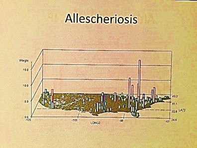
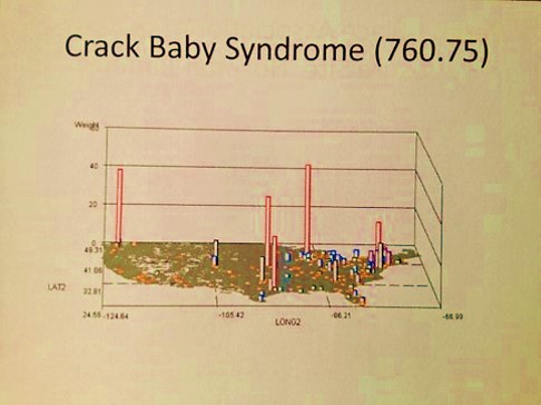
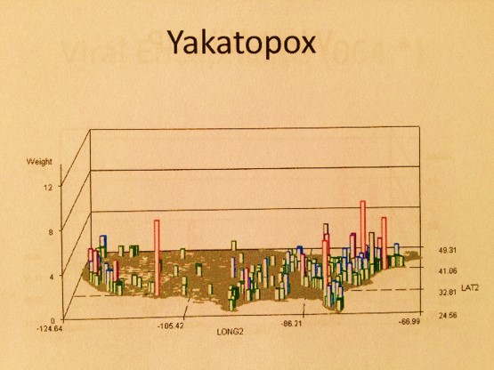
With National Population Health Grid mapping, the one thing that can be done which has never been done before, at least openly for public view, is the mapping of this nation’s public health and population health status for all diseases/ICDs at the age-gender-ethnicity-place relationship level. With this data, we find new relationships supported by the age-adjusted data already out there from the census. Relating this PHI data to other federal datasets, we can see how sickle cell is distributed about this country for example, or where major Asian groups are located who are always misdiagnosed for their ethnicity-linked cardiac conditions, or where child and spouse abuse and the highest amongst low socioeconomic status groups, or where childhood immunizations are refused the most and how this compares with the rest of the country.
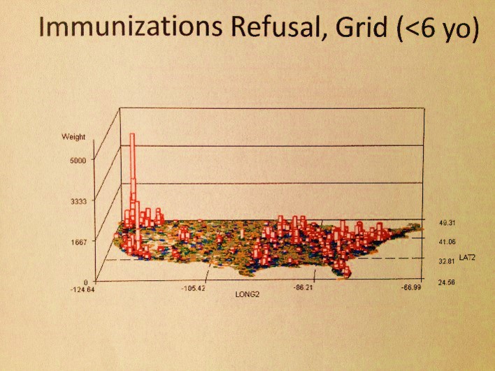
The following are examples of what a map can tell you:
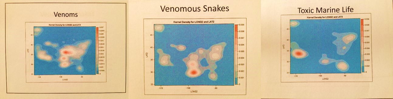
- I first used this technique to demonstrate how much the Pacific Northwest is the heart of immunization refusals, knowledge I acquired but never saw being mapped whilst a resident of 20 years; this had absolutely nothing to do with where the cases of the rarest immunized diseases were erupting, or even some common re-erupting small scale epidemic diseases for certain regions like diphtheria (which had a midwest peak), mumps (which is nationally re-erupting, not regionally), and polio (which has occasional Great Lakes area events).
- Following the Colorado incident of a teenager terrorizing his high school in Columbine, I mapped out similar activities throughout the country and saw a very national distribution within specific urban settings, not a regional distribution. My maps also demonstrated pyrotechnics to be an almost totally male-dominated hobby, with nearly all cases taking place within an extremely narrow age range.
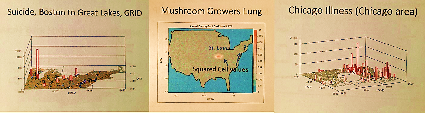
- My maps demonstrated that there is another very specific age-gender-linked distribution of behaviors related to suicide and the way that is is carried out. Suicide was shown to be an older youth to young adult problem peaking in the Pacific Northwest, and a 55-64 year old victims problem with statistically significant differences in the region next to Niagara Falls in NY. The Pacific Northwest cases by the way did not correlate at all with the spatial distribution of diagnoses for Circadian Rhythm disorder diagnosis or treatment/testing thereof.
- Peaks for Childhood sexual abuse in this country were always large urban-suburban, with statistically significant peaks in and around just a few cities, and an unusual peak along an in-migration route.
- The most likely in-migration related processes for specific ICDs could be identified for yellow fever (with in-migration routes not what we’d expect), as well as the distinct differences between measles and mumps. Diseases that migrate in from other countries demonstrate the most likely international airport cities they come in by.
- Foreign born animal diseases that are highly fatal to humans come in mostly from the east coast, perhaps due to livestock shipping. A few of these are linked to primate care facilities for medical testing purposes.
- Asiatic animal linked diseases from certain countries have specific points of entry that are different from animals coming in from other parts of the world.
- Specific human behaviors that are culturally-bound or culturally-linked diseases and syndromes demonstrate distinct in-migration routes; the most predictable of these routes is for the Mexican Hispanic population. (Some of these spatial associations are pretty much common sense, but confirm this process. One in-migration route for cultures was a surprise and demonstrated an unexpected peak).
- Specific high elevation linked diseases do not occur in high elevation regions or cities in the U.S., but are found in the three eastern US major airport cities, suggesting people get them before returning to the U.S. from a country with high elevation terrain, or due to being on the airplane.
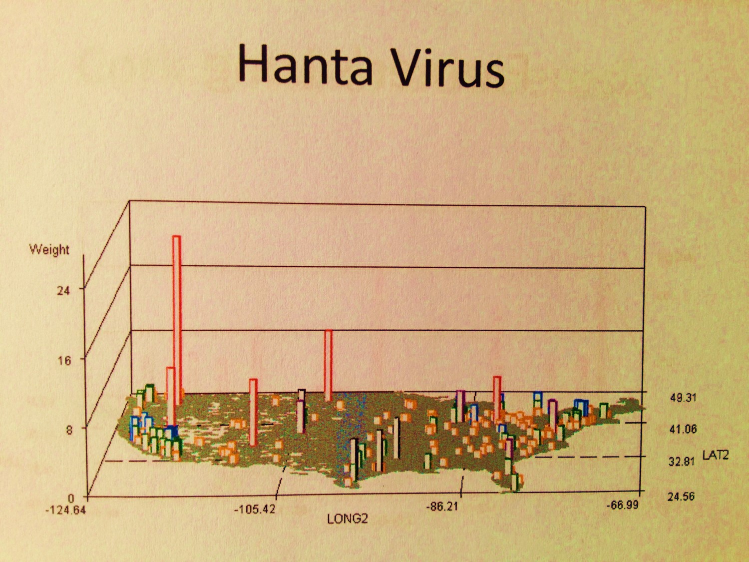
- Ebola has its center(s) for outbreaks, as do the hantavirus native to the U.S., and several microorganism generated rare diseases with victims who came into this country for more advanced forms of health care (at least one linked to an international missionary program).
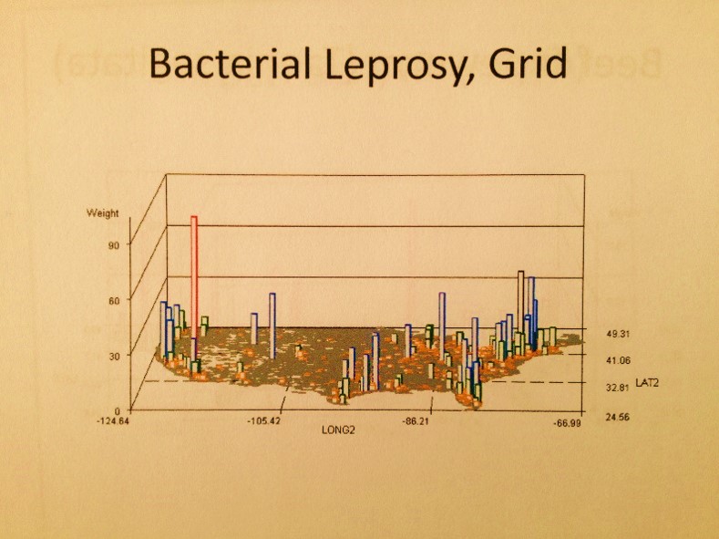
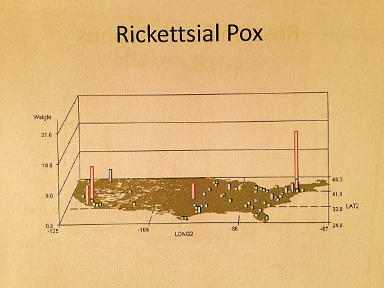
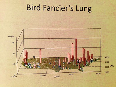
- A number of Pacific Rim zoonotic-anthroponotic diseases were identified. Also geographically distributed are people experiencing Mushroom growers’ lung at specific points in the Midwest and Northwest, a longitudinal band of people with coal miner’s lung, a tropical-temperate zone cluster of people with maple barking lung disease (not in maple tree country), a southern California-LA peak in bagassosis, and some very regionally distributed and even locally clustered examples of fungal dermatitis diseases like rhinosporidiosis and coccidiomycosis.
- Childhood born tuberculosis of maternal-fetal origin has specific cultural-regional peaks.
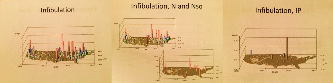
- The Muslim-Sudanic controversial practice of infibulation is a nationally occuring phenomenon without much regionalization.
- Culturally-linked kuru and chiclero’s ear demonstrate specific migration-related patterns within the U.S..
- A few genetic diseases demonstrate clustering in urban areas, either due to health care specialty care provisions or due to the local cultural setting enabling this disease to be regenerated through extended family member marital patterns.
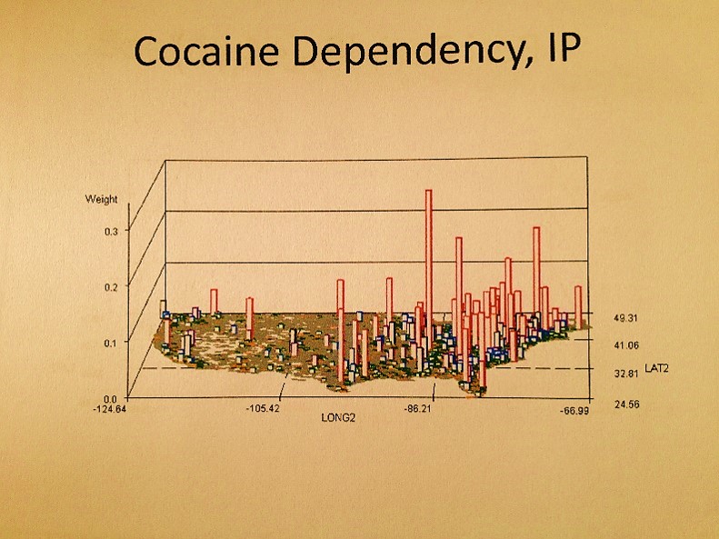
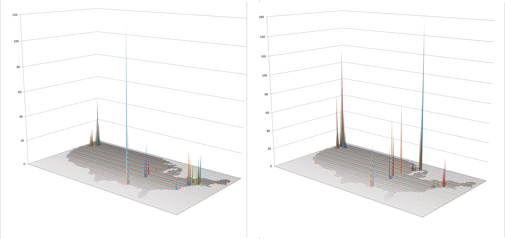
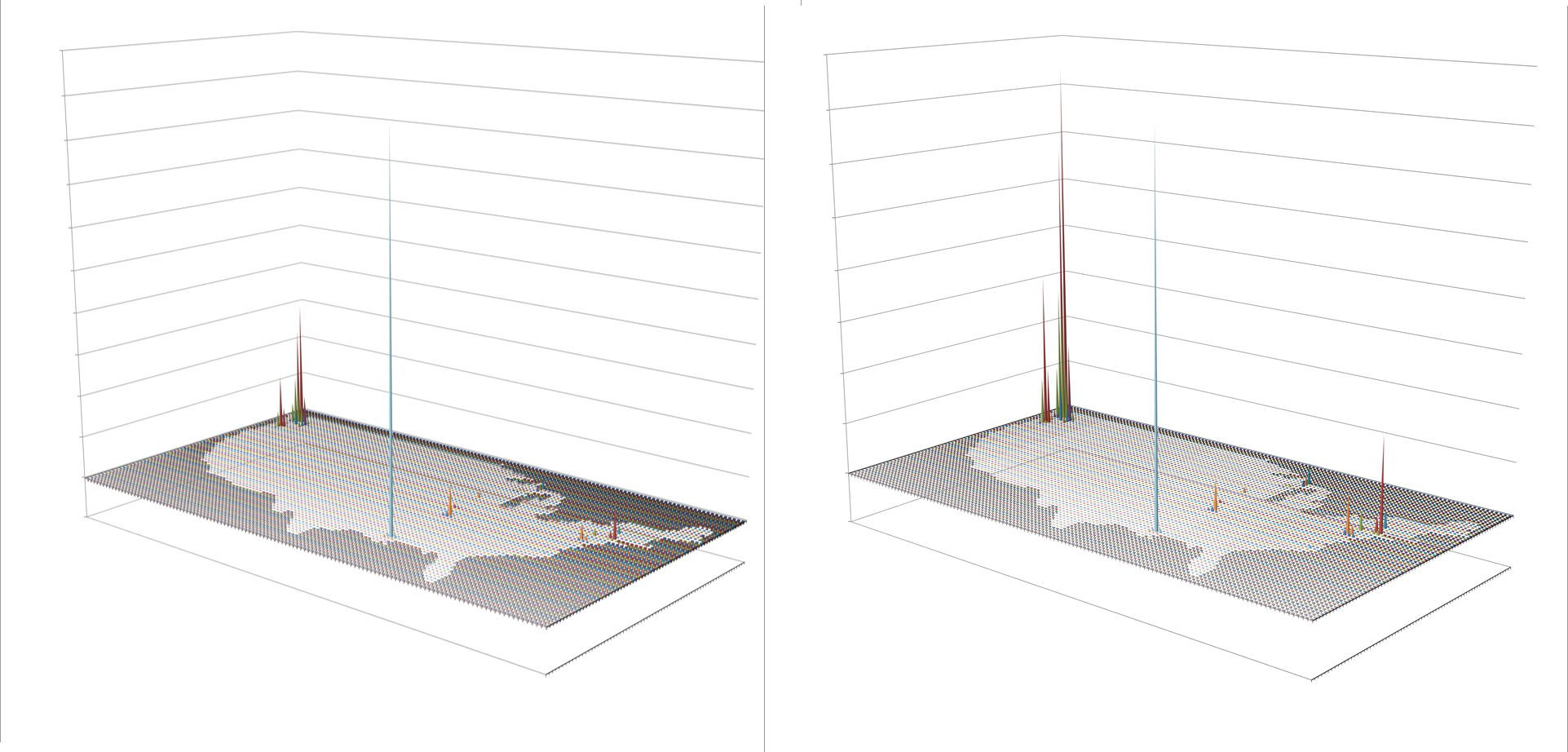
The algorithms used to generate these maps were all developed using ICD9s, HICLs, and V- and E-codes, with separate algorithms used to convert the data into a mappable grid maps dataset, followed by one or more of my rotating map/map video algorithms (see links at end of my Surveillance Applications … page). ‘IP’ refers to an independent prevalence calculated for cells, without adjustments made using nearest neighbor statistics.

Essentially, what I am trying to state here is that this method of mapping diseases is really a powerful epidemiological monitoring or surveillance tool. It is not at all a difficult task to do. I personally managed to develop the means for doing this, and then tested and employed it several hundred times over as of 2004. Even more since then.
The problem is this procedure is probably not being done outside the governmental offices due to simple laziness, lack of experience, lack of knowing, lack of imagination, lack of guidance, and/or poor leadership. Together this adds up to just one thing–lack of innovation. Along with the risk of falling behind in the medical business community quite soon due to lack of adequate preparation and forethought, companies that are behind in their technology have an impact on the information systems in the U.S. as a whole.
One of the issues related to mapping the national marketplace and its macroeconomics pertains to the theories out there defining how we are supposed to study people. They typically misguide or misdirect corporations into defining their primary goals based upon money, rather than people. These goals include such things as improving profit margins, reducing losses due to poor customer management (making your customer seek out alternative services), and focusing your actions mostly upon poorly written and poorly tested consumer satisfaction surveys. Instead of using true to life value data documented in medical records as signs of improvement of health or the generation of well-being, and an improved quality of life, we are focusing mostly on cost of care itself.
Instead of accurately measuring population health status and linking this back to care-related costs, we are searching for cost deference and cheaper services By ignoring the basic needs of people, focusing on costs instead of health, the best that can be produced by this method is short term based and not very helpful in terms of long term health benefits and preventive medicine.

As a rapidly growing population continues to increase in size, along with its related personal health information [PHI] database, it becomes harder to catch up and as a result, making the maximum potential of your work harder to reach. Corporations and Big Data analysts have the potential for making the best use of their Big Data, yet they don’t. Corporations/companies that engage in ‘only meeting the basic criteria’ set themselves up for failure.
In the worst of cases, companies put off these improvements to simply buy time, with plans to later changing these habits but to no avail. In the long run, refusing to engage in the most appropriate, best Big Analysis techniques out there, big businesses are ironically demonstrating the worst way to try to be both cost conscious and disease preventative. Using the national grid mapping technique makes for rapid, easy service with population health monitoring, making its users both proactive and productive, a necessity for this field, not reactive and limited by unexpected barriers.

Imagine a skyscraper being managed on each floor, and in each wing for some of these floors, by separate electricians and plumbers. Each company has its particular way of managing and improving its part of the system. Some systems completely up date parts, others provide more employees for the upkeep, others rely on short terms fixes with others looking into long term fixes that others will have to upgrade to at some point. Still others hire out for a part of their work, or import their necessities without need for reviewing them instead of producing them on-site. Others work the floors that are cheapest to reside in, versus those in charge of lofts and penthouses, or particular cultural and ethnic settings. Some pipes are dirty, some pipes are cleaned weekly. Some wires are low quality cloth wiring, others fiber optic. I liken this to certain parts of the IT system in U.S. health care. Integrative IT management is certainly not this system’s forte, or for the most part, related to any big contributor to this system. Smaller companies seem to manage Integrated IT management best.
To perform a more accurate analysis (Big Analysis) of population health, there are just two minor bits of information that we need about people in order to redefine everything in a more accurate fashion. We need to know ethnicity and cultural heritage, the latter of which is defined as the sum of the behaviors and philosophy that play a role in helping one to make personal health related decisions. Finally, we need to know the relationship these have to disease states, health care utilization and meeting specific needs. All of this can be done by making better use of the ICDs and E- and V-coding systems, as well as SnoMeds, MeSH, HCPCS, CPTs, HICLs, histo and topography codes, standardized survey results, and the like. If these just three of these sets of metrics can be linked back to the population health data as a whole, we can get a more accurate, highly detailed report on the health of our people, afterwhich, we can use these population health metrics to better deal with cost and compliance issues.
The first stage in improving Big Analysis is rather easily. We need to test population health routinely at the local vs. census level–compare local data to national base population data.
For the second stage we need to add ethnicity information to national mapping routines; even mixed answers to a question about ethnicity can have valuable applications in developing public health statistics. Turning to whether an individual is of a particular cultural upbringing or not is currently a hard set of information to get hold of.

For the third stage in improving national and/or grid mapping public health surveillance techniques, we need truthful customer generated health data. Agencies are now attempting to obtain personal health information by providing on line surveys, which is helpful but in recent reviews of these results were also found to be misleading. An individual may call himself/herself “fairly healthy” and yet have a glucose or LDL score that is very unhealthy, or simply not report the data pertaining to “alternative” health care practices. The most recent formulas re-reviewed still do not correct for this error.
Next, we need to take this one step further into the basic personal and cultural way of reviewing health. How many agencies or companies out there know how many of its members routinely engage in certain high risk behaviors aside from the basic like smoking and drinking? How many are able to identify those families with the highest risk of developing a culturally-linked disease in the form of a heart attack? or at risk of having a family member engage in a culturally-bound medical practice such as infibulation? or may be part of a large cluster of patients with specific diseases prevailing due to the local culturally-defined eating patterns and/or self-help programs? or child-raising and bearing activities?
These are the most important issues about the health of an individual that insurance companies, large employment firms, institutions, pharmaceutical benefit managers, and financial overseers of the large firms want to know. Those big companies that monitor population health outcomes for their investors focus on overall costs, averages, disease- or systems-related behaviors, not individuals as groups in need of changes in their unhealthy behaviors. Since most companies rely upon non-GIS methods, or GIS only as an information tools, or use outside sources for their required GIS data, or apply basic, primitive mapping tools to monitor people’s health, this is like applying a 20th century ideology and method to managing a 21st century health care program. Such methods have little potential for becoming well developed. [Follow-up note: after I penned this, about one or two months later, this became the primary topic of concern for managed care in general, through LinkedIn-the Medicaid/Medicare Managed Care Group.]

I may sound very critical with these statements, but my logic is that if we in GIS can do this on our own in the university or college setting, that within the company setting even more should be able to be accomplished, in much better form. This means that these companies need to have the right people with the right background and training at hand, and not simply re-train older staff members who lack the basic knowledge of GIS, don’t understand the field enough to have the much needed foresight, and don’t have the experience needed to think only spatially, not just via lists, graphs and tables.
As some neuropsychologists and individual working in the Creative Innovations Community put it, ‘we need to ask creative right brain thinkers rather than left brain thinkers to do what only right brain thinkers can do.’ A single page depicting a national population health grid map (right brained) provides as much information, if not more, than 300 pages of graphs and tables (left brained). Fifty pages of these maps (500 maps in total assuming 10 per page), tell use more in a few minutes than several days of perusing the left-brained analysts’ documents. We know where the needs exist down to the sub-county level, how much cost is involved in terms of expenditures and losses, how many people will be impacted, how much work will be required, and where our impacts and accomplishments were the greatest.
The use of grid modeling is a basic GIS skill, which fortunately does not require a GIS to be done if you know your program language and math. So one of the ways for Medical GIS’ers to score with the companies out there is to ask whether or not they are keeping track of the nation’s pulse so to speak. Is GIS a part of their main product line or is is only used for ad hoc requests? This is why I developed my survey on this issue about a year ago. Any companies that cannot answer this question or say ‘no, we are not doing a study of regional or national health’, or ‘yes, maybe, but we aren’t really generating and national maps depicting the outcomes of population health’, are indicating to us that they are simply falling behind with the technology, especially since most employ older programming standards and methods to produce these types of outcomes.
There are also companies that like to say ‘yes, we are utilizing GIS, we have a team involved in this process, that meets special needs for certain clients’. The next question to then ask is is this Descriptive data analysis and reporting or analyses focused on implementing changes and measuring statistical significance? Once you review the projects they are doing, you learn there is no analyses really taking place, just the cutting and pasting (or joining and linking) of numbers and facts to a map–no spatial analyses, no large scale spatial statistic generation, no isopleth or isoline results produced, no substance with much utility. You know where most of service A is required, but without the data needed to tell you why that service is needed.
Simple outcomes simply won’t do. To get a full picture of what is taking place in your population, each task and each query has to be run 500 to 1000 times and compiled together into a reporting system, to adequately review population health related to the 500 to 1000 different medical statistics needed to understand population health in a socioeconomic and ethnic-age-gender way. With the right formulas this can be done. For automated analyses and reporting, at the national population health level, this is why the grid method is the only way to go, at least at the private business level.
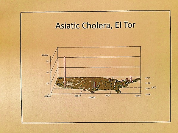
Note: Omsk is an infrequent to rare in-migration disease pattern, meaning the disease is brought into this country from abroad, by people, animals, merchandise, etc.. A nidus this large or different from the rest usually infers an outbreak. These isolated events can be grid-mapped, the cell values normalized, and the final maps overlain to produce a summary of the findings. This data can be divided into diseases by continent, or country, for anti-bioterrorism, episurveillance work. This method would be used to prevent outbreaks of highly deadly diseases such as Ebola.
.

Ebola
Applying some of the 19th century spatial logic to the above, Ebola is a tropical or torrid zone disease with latitude define spatial preference or endemicity/epidemicity, that demonstrates temperate zone epidemicity mostly in the southern hemisphere. Endemic areas might display enzootic (animal born and bred) patterns with Pyle’s Type I non-hierarchical diffusion behaviors within endemic regions and rarely impacted epidemic regions. The further we are from its nidus, the more hierarchical in nature the large area diffusion patterns become, with time and experience of previous exposure history increasing the hierarchical nature of its diffusion pattern. The first penetration of a previously unimpacted region will probably display Type I patterns locally, but possibly a mixed diffusion behavior as well depending upon the economic development of the new setting (Sequent Occupancy defined wilderness, pioneer, early farming, industrial, post-modern, etc. settings.)
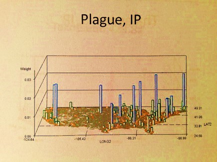
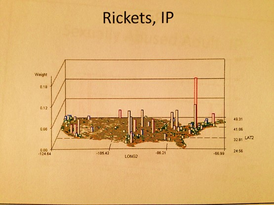
IP = Independent Prevalence, described in the essay above.
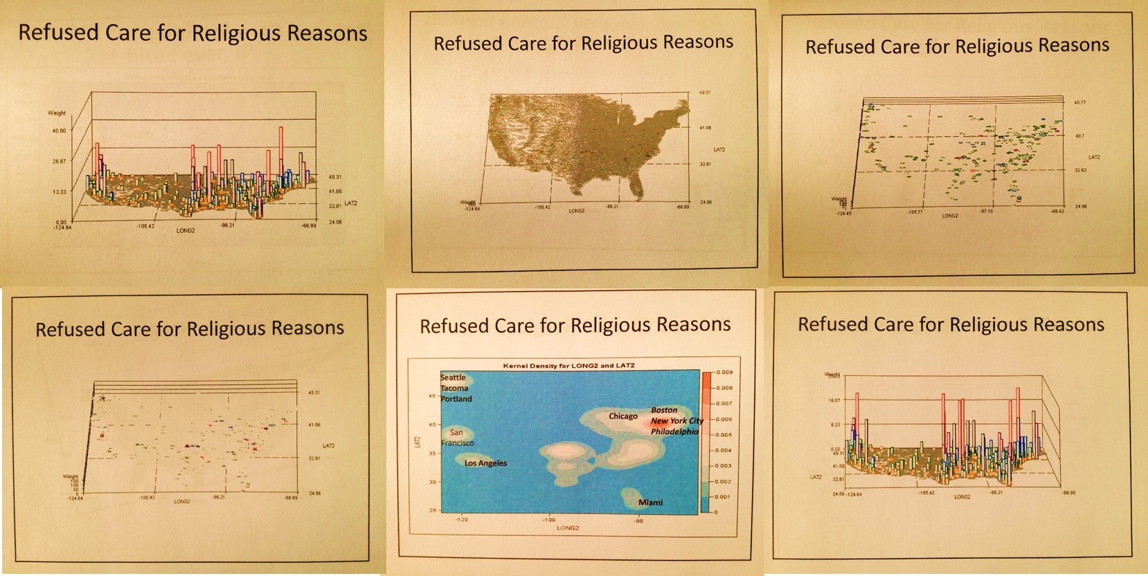
These images represent the process in producing the maps and 3D map videos. These all represent the same data. Images 1 and 6 are identical except the z axis has been adjusted. Images 3 and 4 represent the data, at different tilt angles, without basemap cells identified and mapped. This same image is modified with the basemap data added for image 2. Image 5 is much like a contour of the map, with kernel density taken into account and so represents a true concentration of the cases, useful in defining disease niduses. In theory, a kernel density map for numbers of cases overlain on a grid x kernel density map for adjusted values or IP (not shown above) = final map depicting areas with highest density, highest numbers, thereby producing an intervention map, where interventions can take place in a specific region due to high prevalence rate, or high numbers of patients, or both. [This latter formula is in fact a result of my work on risk zones prediction along flood plains, developed as part of the standard IDRISI Remote Sensing teachings back in 1997.]

Leave a comment