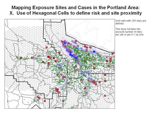
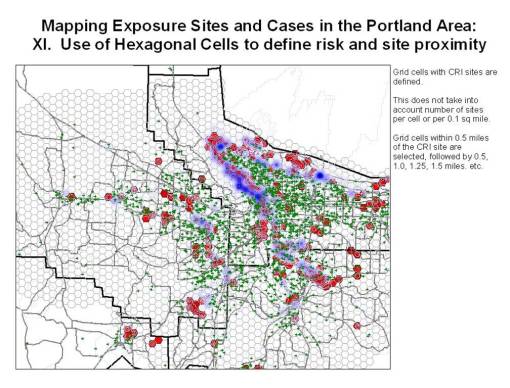
The initial steps in designing and testing the hexagonal grid method involved some basic spatial work with the data. The first issue one has to face when engaged in grid mapping is answering the question on ‘how do you choose the correct grid cell size to work with?’
An analysis of counts per grid cell is always the best way to begin this query into the methodology. Other methods have been used to approximately grid cell size, but, in the end, the primary feature that the grid cells are related to must define the size of the grid cell to be used. In general, a frequency count per cell, rerun for each grid size used, should give you a graph that is very much bell curve in nature until a peak is reached and the curve begins to plateau. The maximum cell size is directly related to that ‘S’ formed in the ascending curve, the size in which this change begins to take place.
A number of standard ArcGIS/ArcView extensions enable this type of analysis to be carried out, fairly rapidly in fact. The disadvantage to these extensions is that few of them keep track of the various trials run on grid cell size, so one had to keep detailed notes on the results that appear on the screen in a pop-up window with each cell size that is tested. Graphing these results out together to form a line will demonstrate where the critical size/area measurement exists. Once the right cell size is determined, and the grid mapped, the remaining typical stats, Moran’s ‘I’ and ‘Gi’ for example are now more reliable.
Essentially, this technique divides land surface area into cells, and then relates the centroids for each of these cells to release sites and/or cancer cases. A Nearest Neighbor type of analysis of distances from centroid to site or case can be done, with limited concern for the possible offset of true values due to the use of the centroid point to depict an area. This concern for error is minimized because the cell sizes (areas) selected are so small that changes for spatial error become more an issue of the accuracy of the spatial datasets, the types of projections being used to map this information, and the limits if the GIS tool itself. The issue of true/false location of the identifier (centroid point) for each count being taken is no longer interfering with the credibility and reliability of your final results.
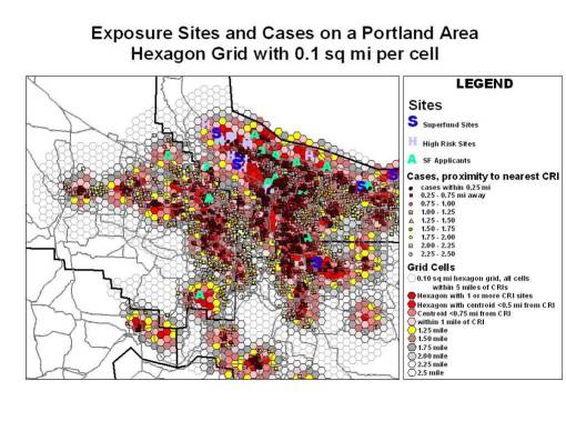
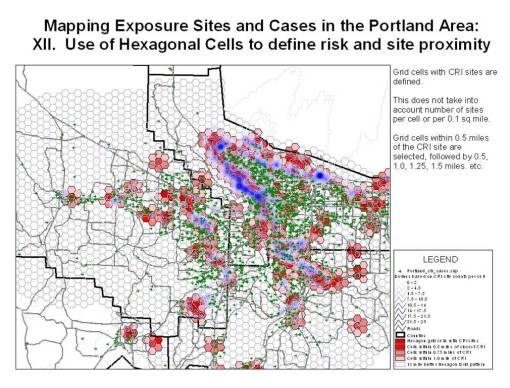
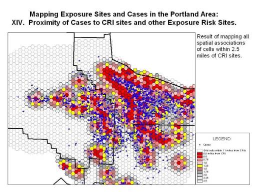
The following is a summary of the work, and is similar to the last map in this series, with case related details added to the legend.
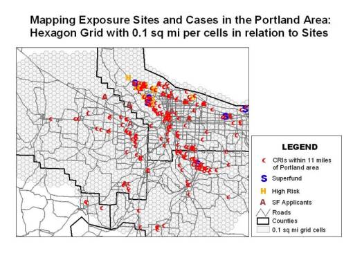
The initial area for research is as follows:
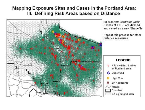
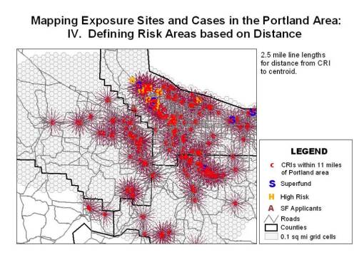
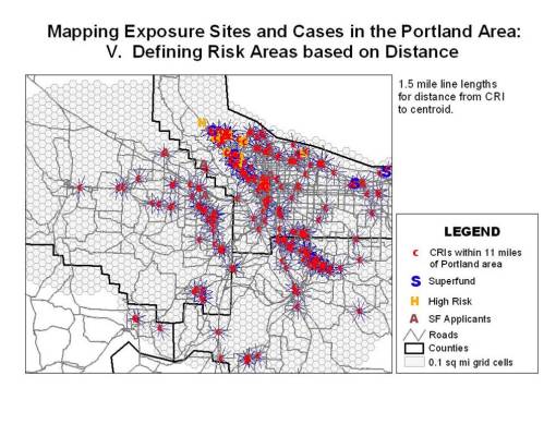
To perform a nearest neighbor analysis, distance as the crow flies are define using either the ArcGIS or an ArcView with the proper extensions installed. A 10 mile area was selected for the longest distance, from cell centroid to site. This will then be cut down to size based on the final longest distance limits we set regarding potential for exposure. 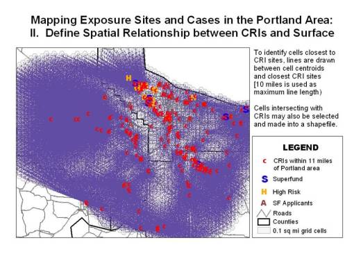
For this review, it was found that assuming 5 mile distance from the size resulted in poor outcomes using several other spatial mapping techniques, so for this study, using a totally different method of spatial analysis, 4 miles and less was the selected distance range. Several different distance measures were evaluated and mapped.
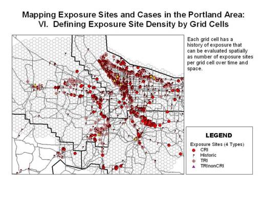
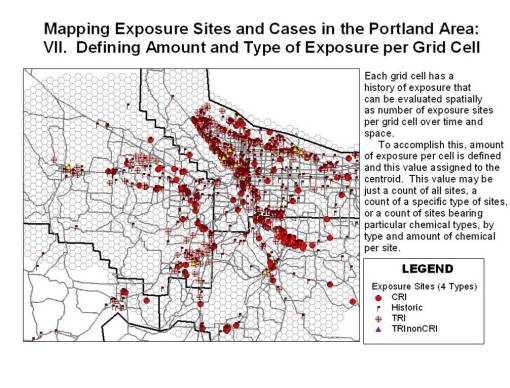
Next, we have to look at numbers of sites per cell, under the assumption that the more sites per cell, the more toxic the cell.
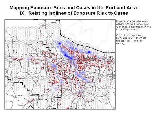
Isolines were then produced using these cell centroid values (numbers of release sites per cell).
The isolines were then compared with the case point data.
To carry out this review, the cells were then redefined in choropleth fashions so as to define the most toxic (highest risk cells) related to neighboring cells demonstrating a reduced likelihood for toxicity.
Added notes:
Whereas the contours are fairly specific in terms of defining the highest risk areas, cell provide this information for a much larger area.
As part of this last phase of grid cell definition, one can also link the site chemical information to the sites in order to relate chemical-related toxicity to the spatial distribution of these features. Site chemical data can also be restricted to specific chemical classes, ranges of toxicity, etc. to add emphasis to any spatial results being displayed.
[An excel spreadsheet with these formulas in place is available for students. See adjacent blog page on methodology.]
