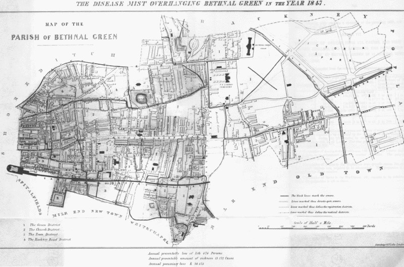
Map 1. 1847

Map 2. 1848-9
.
These two maps are most important for their place in the history of disease mapping, not necessarily for their content.
They are important because they demonstrate the effects interpretations can have on us about maps. That old adage that “maps can lie” has existed for as long as there have been maps. For maps to serve as the crux of political decisions to be made or to help the define the outcomes for a vote or change in land use patterns, maps prevail when it comes best serving the most learned of their reviewers.
A map has credibility from day 1, as soon as it has been made. There are some maps that never make it much past this first day however, examples of which involve property lines, a map defining an indiscernible location for an incredible claim, or a map that defines the borders of important colonial claims.
Most maps we look at as a source of information, and approach them with the assumption that they are correct. We then look at a map in more detail, sometimes double checking the claims on a map with what we already knew, to make sure the map is accurate, but more importantly, to make sure the map is recent, and not outdated. We don’t looks at a map of voting precincts and immediately question it at all. A printed map is much like the printed dollar. We accept it for what it is, rarely taking a close look to ensure the object it appears to be isn’t wrong or counterfeited.
But maps are very human in origins and nature, and even when as close to factual as one can get when making it, a map can still be in error. If the map is not in error, and is right for the time, it may be right only for that one time, the time that it was prepared and printed. All maps are subject to change and evolution over time, in some sort of knowledge related post/neo-Darwinian way. Maps are conclusions about whatever temporary lived subjective lines of reasoning we are basing the drawing and the conclusion of the map on.
The map entitled “A Disease Mist Hangs over Bethnal Green” is one such map developed solely as a result of erroneous logic, bad reasoning and numerous misinterpretations. This map is a disease map. That part is true. The part that isn’t true is what the disease is defined as, and from where or whence it came. What everybody believed in for the time this map was displayed, it seemed true to many, false to nearly just as many. Because it was based on a preconceived social paradigm, as depicted by this map, it couldn’t possibly be wrong. The only thing that could be wrong are the implications made by this map.
For example, if a map of dead and buried people was printed, one couldn’t argue about their death, but possibly argue about their burial location indicated on the map. If that map of dead and buried people were drawn such that little to no water edge or hillside and ravine could be seen, we’d have little to no observations to make use of for accounting for the reason for these deaths. We might even see on this map a series of places rich in dots, indicating that area is where many deaths occurred. What we then derive from this is that the cause for death has to be that one place, and the ways in which people were in association with each other, so crowded their deaths gave use nearly overlapping point location identifiers on this engineered piece of art.
Next, if we add other object to this map, with certain cultural or social values attached to them, the results of interpreting the map in some ways can be quite predictable. This is because there are human belief derived expectations about this map, and once the indicators of these expectations are there, it become hard to reverse these conclusions drawn. A map with different companies bearing different territories placed side-by-side will not doubt, because of the nature of businesses and companies, draw up criticisms from supporters of those companies and critiques involved with everyone else. If we called the Great Oak in the city the cause for death of many people on a particular street corner, this may go uncontested if the right version of the map is drawn. Thus we can draw a map in order to drive our point home, share our wisdom with unsuspected readers,
This type of criticism about map interpretations has been thrown at the most famous disease mapper in the field of epidemiology, John Snow. His map of the cases of cholera in a section of London, which he used to claim he had discovered the primary source for any by closing off this source for drinking water, led to the stop of this serious epidemic.
Now it may be true that Snow’s work was perhaps some of the most important for this time. True historians might choose to quibble with the details of what Snow was first with–identifying the source for this disease, being able to put a rest to its direct cause, or drawing attention to the general idea of sanitation and disease, the need for proper human behavior to prevail in urban settings like that part of London Snow’s famous event took palce in.
The reason for this argument about Snow’s discovery is its history and in particular its history of publication. The map that makes Snow’s work so famous was not printed immediately. It came in the second edition of his work, and was later redrawn in a slightly different form to better illustrate the case he was trying to make. So the first time into making such an amazing discovery, and then having it published, certain parts of this historical story were rehearsed, and then rewritten. Like the late 17th C discovery of the steamboat, being first is not always required for a uniquely new concept to be attached to your name.
John Snow’s role in medical geography and disease mapping as two separate but very interrelatable professions is what is really at stake here. In Boston, a physician figured out how the latrines were infecting drinking water and causing cholera. In other parts of this country a number of other doctors had published their works on their own discovery about the cause. Their differences were that they neven used a map to make their point, whereas John Snow did, the second time through.
In history, we have a tendency to switch back and forth between who and how to assign an important discovery to a particular person. We assign the development of the disease map as a consequence of French cartographers’ work on the different disease zones of the world. There was no map published as a part of the first world atlas in which diseases were described (as a part of military intelligence for the late 1790s), and yet these early writers often get the recognition for conceptualizing such a possibility.
Another cartographer and expert is the “Atlas”, Johanne Christopher Homann, had in fact stated much the same in writing as others, but as a part of the dissertation he needed to complete his schooling and enter his family’s profession of cartography and Atlas publication. For some reason, Johanne did in fact state the evidence he same for the spatial relationship between different climate settings on the map and certain people, certain diseases. But because Homann’s work was not well known, he misses out on having the opportunity of being the discovery of this important geographer’s tool.
So the map of Bethnal Green depicts much the same kinds of impacts that politics has on a person’s fame.
The Bethnal Green map is very important because as a third generation disease map (the second generation is Valentine’s Seaman’s era, the first the work of Homann), it demonstrated to us how changes are made due to maps. Any issue, topic, book, pamphlet, posting, that has a map attached to it for whatever reason gets more attention that any other document of twice that size or bigger stating the same. We trust a map as much as we trust a drawing made of our face, or a picture taken of a supposed historical or supernatural event. The map is slightly different because of its richness in data. Nearly all of the data we respect, the names of countries, rivers, oceans, cities, etc., and so we tend towards also trusting the finer details of the map like the average age of everyone who lived in a given region, or the way the disease in question behaved and distributed itself. We believe the map a little more than we believe some pictures of the supernatural. In fact, we tend to belief a map, any map, just as much as we trust a drawing or illustration of anything else that is “natural” (not “supernatural”).
What made the map of Bethnal Green so presentable and remarkable is how believeable it could be to some. To understand how this event leading up to an incredible set of beliefs works, lets reproduce it it another similar setting, try making the same claims, and come to an understanding of why we judge maps to be truthful usually.
Let’s reconstruct Bethnal Green and its epidemic problem in several other places–first a side of the Hudson River in the Hudson Valley, then along a hillside atop some steep piece of property or position a miles or so hig above the oceans. Then we can ask, how reliable is this claim, and how much does it depend upon how we see and interpret the land in a human sense.
…
