NOTICE!!
A Survey was developed to document and compare GIS utilization in the workplace. This survey assessed GIS availability and utilization in both academic and non-academic work settings (including workstudy and student employment). The purpose is to document the need for GIS experience as an occupational skill. The survey demonstrated that over the years, since 2012, GIS has been and remains underutilized by most companies, in particular companies related to Quality of Care improvement and population health monitoring. Spatial Technician and Analyst activities and a few managerial activities requiring GIS knowledge or background are in desperate need of inclusion in health care administration programs, with statistical analytics performed at the COX Regression and Kaplan Meier levels, based on Cost-Benefits and Healthcare Burden-Lifespan modeling techniques.
This survey is now closed.
…………………………………………………………………………………..
.
Valentine Seaman
(ca. 1800 Portrait)

Valentine Seaman’s mapped areas overlain on Longworth’s 1798 map of lower Manhattan Island (Many of the previous water bodies set in the city environment have since been removed by 1798. Collect lake, where one of the first steamboats would be tested by Fulton, remains immediately north of more eastern area highlighted on this map. To the right of that highlighted area was an old marsh-like lowlands setting. Also notice that the fields where some mosquitoes commonly breed are also a considerable distance from the city, located to the north and east. This meant that the ports themselves and nearby dumping areas were more than likely the mosquito source for these epidemics once the species were introduced by incoming ships. If the mosquitoes behave then as they do today, any garbage capable of holding water would have been capable of breeding the imported mosquitoes responsible for yellow fever.)
Valentine Seaman’s work on the Black Plague or Yellow Fever was initiated soon after the first epidemic struck Philadelphia in 1793. Benjamin Rush published his essay of the possible cause for this new epidemic in 1793. Valentine Seaman and many other physicians in New York City disputed Rush’s claims that this disease was imported and of foreign origins.
In part the New York physicians were correct. Rush had concluded that yellow fever was spread by contagion, from one person to the next by way of some direct or indirect contact. This was not at all the case, and the New York physicians noted the evidence for this by the way the Quarantine they set up managed those who had this disease. Physicians caring for those with yellow fever were free to wander in and around the hospital setting, even coming in contact, without ever effectively spreading this disease to other patients, physicians, or family. This meant the “infectious” nature of yellow fever was not what Rush had claimed it to be. They argued that certainly the incoming ships were the primary source for the earliest of these cases, but then added to this the notion that new forms of contagiousness developed in those who were infected. This new form of contagion was not as infectious as the initial people on board the vessels were. There had to be another source besides people for this disease. The New York physicians concluded this non-contagion source was the decaying materials resting in the ballasts of ships and lying inside the slips, and following their landing, beneath the piers surrounding by docks wherever the suspected infectious disease carrying ships were anchored. IN addition, due to the ever-changing water levels in this estuarine setting, the low tides left tremendous amounts of organic matter out there to decay and putrefy the immediate area. It was this putrefaction that most miasmatists believing in a domestic source for the yellow fever laid the blame upon. Once an individual was infected by the disease, that person could then begin to die and putrefy as well, emitting human effluvium thereby infecting anyone nearby capable of taking this effluvium into their body.
The New York physicians were partly wrong about this logic regarding the disease spread. Benjamin Rush of Philadelphia however was not any more correct with his own hypotheses. At one point he conceded partly to the NEw York miasma theory for yellow fever, but decided it was not the putrefying waste in the slips that created the disease. Due to the behaviors and locations of the first victims in Philadelphia, Rush ultimately tried to argue that a very bad and smelly batch of coffee beans was to blame for oe of the Philadelphia epidemics. Rush lost with this argument as well.
Neither Seaman, Rush or any of the comrades of these two doctors in the large cities were ever able to define the original source and cause for this disease-causing contagion or miasma. The mosquito was the cause, but that would take another century for scientists to prove. They eliminated the mosquito from their list of possible means for spread due to the lack of similar diffusion processes involving other animals and animalcules species. The assumption then was that if mosquitoes could carry the disease on its body, then so too could the common fly and other commonly swarming pests. Pests were pretty much ruled out extremely early and never really allowed to return as a possible cause. Two people (reviewed elsewhere) however did consider the “muskeeto” as a possible pathogen–Samuel Mitchell noted this possibility in passing, as well as a Ship Surgeon following the second series of yellow fever epidemic years.
Mitchell and Rush each held distinctly different beliefs about the yellow fever that created an argument in the journals then published, this argument ver quickly came to a head during the mid-1790s and continued for nearly a decade. Between 1794 and 1795, the common belief as to the diagnosis and cause claimed this was simply a case of Biliary Fever. Rush at first saw little difference between the biliary fever (a cure for which was attached to his name a few years later) and yellow fever. But quite quickly, the deadliness of yellow fever distinguished it from the very common bilious fevers that had been striking the country. The exceptionally severe attack made by yellow fever on the biliary system resulted in black purges and diarrhea, typically resulting in death. The other common name for this disease at the time was malignant fever, the users of which implying it was worse than early forms of bilious fever. What distinguished the more malignant forms of fever from other epidemic fevers of a “bilious nature” was the proximity of the most malignant forms to the ocean waters and shipping ports.
This disease seemed to many to be attached to the presence of ships, people, hot temperatures, and putrid air and water, in particular within crowded population settings such as large towns and cities. Since each of the fatal cases could be mapped, their possible causes could be related to each case. This is what Valentine Seaman did around 1794 or 1795 (in the copyright page of these early book, even Governor Clinton noted the importance of maps in defining diseases and other important features of the young United States, and so included maps in his copyright notice found in every book published in upcoming years.).
With his maps, Seaman was trying to answer the common question about these deadly fevers–were they of foreign or domestic origin?
Unfortunately, the answer to this question could not be easily answered, in spite of this use of maps for the first time in mapping a local epidemic, and so often the finger points to his failed theory as a historical fact, even though the individuals whose claims this map was meant to disprove were as much in error. In spite of this very early use of maps to understand disease, the cause as a form of infection, contagion, miasma or effluvium could never be proven.

Medical Repository, 1806
In 1795, Dr. Seaman of New York printed (“published”?) his map on yellow fever along with a description of his climatic, meteorological and topographic observations of this epidemic. Seaman was not new to this field or this form of study of disease. The recording of weather patterns in relation to disease was now a common practice. Its purpose was generally to relate wind flow, rain, temperatures and humidity to attacks of the most popular cause felt to exist for disease–miasma, noxious gases, or effluvium.
The common belief as to a cause for yellow fever usually related it to local harbors and ports due to their filth and stench. These harbors bore the most disgusting forms of human waste ranging from the products of local latrines and homes, to the rubbish thrown out by local restaurants and slaughterhouses, animal hide waste from tanniers and leather manufacturers, the old ballast of ships originating from across the world, anything and everything imaginable in a place where meat and animal products became putrescent, paints and other chemical products made their way into air passages and lungs, and on occasion these annoying smells made even more pathogenic due to a drowned child or victim of crime found floating between the pillars.
When yellow fever made its way into New York ports in 1796 and 1797, it offered Valentine Seaman the chance to observe its diffusion pattern, based upon the relationship of diseases to local geographic features.
Valentine Seaman is one of the first to engage in such a detailed observation of an epidemic disease making its way into a city population setting. The unique layout of this region made it possible for Seaman to draw comparisons previously undocumented by epidemic researchers focused on climate and topography. The way in which the lower end of Manhattan Island was developed and used made it possible for some very information maps to be developed and used to prove the theory that this disease was due to some sort of human activity related to the formation of unhealthy areas saturated with human waste, effluvium. Together these forms the miasma needed for the disease to spread from the water’s edge onto the mainland and into the nearby communities of this well settled part of New York.
Seaman also had other local diseases to compare this diffusion process with. The common fever of the marshlands was absent from the well-developed city environment, but still present in the regions north and northeast of the city proper. Placed next to the water edge, the harbors and ports were directly exposed to seasonal and monthly wind patterns, meaning along with the warm winds from the southwest New Yorkers had to experience those daily ocean breezes coming in, which on warm days carried with them ample amounts of humidity, pests, and sometimes unusual smells.
.
.
.

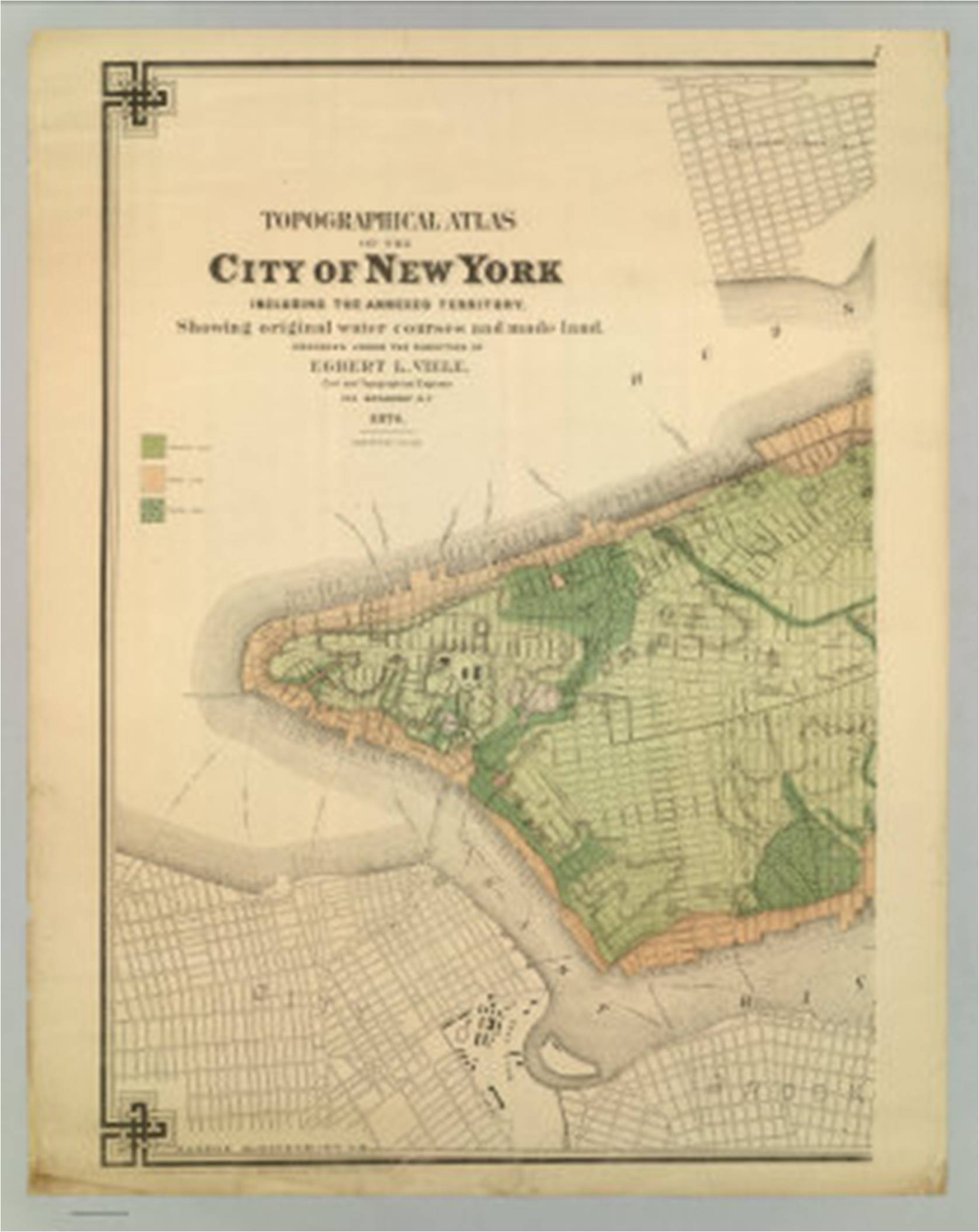
The above map illustrates the environmental history for the section of New York City north of the urban setting. Large farming areas are established, meaning that most of the surface water is due to lowland seasonal wetland field settings, along with a number of flowing brackish waterways, small streams, rivulets, canals and seasonal water ways. The edge of the terrain consists mostly of brackish or mixed fresh-salt water environmental settings, and was rich in sedges, reeds, rush, cattails, phragmites and arundinaria. The related zoology of this setting would make it very likely to be a primary source of the miasma or effluvium so often related to diseases. Anybody residing within 1000 feet from these places would consider his or her residence very susceptible to exposure to these natural causes for fever. Close to the source for this malaria there was the Collect Pond with its long passageway to the East River. This ecological setting was prime territory for mosquito-born diseases. For this reason it is possible this setting experienced occasional malaria, typhoid, or even yellow fever like problems. But the placement of the wetlands needed to harbor these vectors would have been located wither within the natural terrain settings or at the water edge of the urban region, the precursors to the ports built by the 1790s.
The following are the two original maps Seaman included in his essay on Yellow Fever. These were pulled from Medical Repository, (title page displayed later). Point case information appears on these maps, with three types of cases defined (yellow fever, yellow fever-like, those who were as a group taken ill). (Later figures accentuate and better define these features.)
.
.
 Original map from Seaman’s article
.
. Second original map from Seaman’s article
The following series of maps I tried to make sense of Seaman’s argument and its logic. The various cases noted on each of these maps, in particular on their closeups, are found in the lengthy medical journal article following this section of the disease map review.

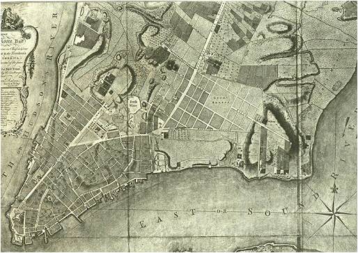
1780 map of Lower Manhattan Island, with the two Yellow Fever regions reviewed by Seaman, and two natural water sources for miasma
.

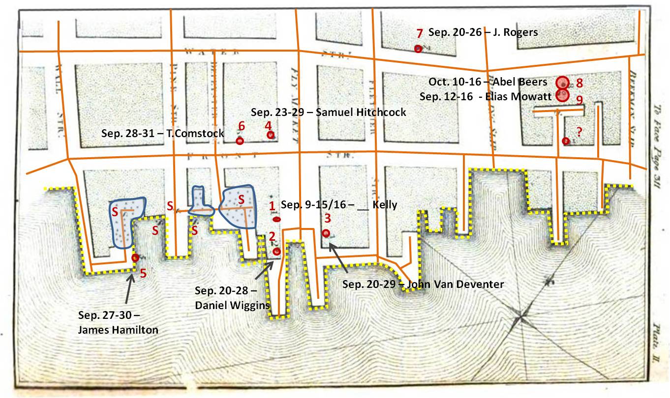
Fatal cases are noted in red, non fatal cases in slate grey. “S” stands for site of contagion or effluvium (or other miasma source).

Fatal cases are noted in red, non fatal cases in slate grey. “S” stands for site of contagion or effluvium (or other miasma source).
.
Area 1
.
.
With this map, Seaman is making visual notes concerning the proximity to slips, the adjacent roadways and how heavily they are travelled, and the location of putrescence or “filth”.
The following are variations for how Seaman’s map may have been interpreted.
.
Isoline or contour analysis. If we assume the center of the slip area, about 1/4th the way into the slip and away from its edge, to be the nidus (nest) or focus of the unknown feature responsible for the disease, contours can be approximated depicting the diffusion of the substance responsible for the illness away from this focus. These contours are based on the temporal sequence of the fatal case points and the distance that has to be traversed. In the text Seaman also notes the new slip, which could account for the clusters or aggregates of non-fatal cases adjacent to it. This introduces the possibility of the development of a second nidus in the new slip. The above isochron sequence assumes one nidus, but the significant delay for case 3 also suggests the possibility of a second nidus, and a dying off of the first following September 20th.

Vector analysis. If we assume the S point as a nidus, and apply vectors to the cases in the form of a spider diagram, we are provided another impression of the miasma behavior. This wheel-and-spoke-like form resembles a windflow diagram. An observant medical climatologist might associate these various cases and their locations about the nidus as consequences of different wind patterns. The NW direction has two vectors which directly overlap, but the majority of vectors are directed in a NE direction. Basic vector math can be applied to this analysis routine, resulting in some interesting conclusions about the above findings.
. .
.
Two primary vectors can be assigned to the previous vector map. The first is a time or temporal pattern vector, which is the average of the cases for each of the three months involved. A “size” vector can also be assigned. Size depicts the degree of impact noted; short vectors infecting the immediate surrounding region are assumed to represent strong cases eliciting high amounts of infection. The further one is from the nidus, the weaker the vector, such that more time is needed for fatal cases to erupt. Time direction tells us in which direction the flow is most ongoing and continuous. The size vector feature tells us where it is most infectious. (Please note this was not done with GIS, so it is an approximation.)
.
Area 2
The next series of cases reviewing in Seaman’s article did not have a map provided. The text described the pattern fairly well. The following maps were produced in relation to the content of this text.

.
The following names were provided for the cases evaluated by Seaman in this middle part of the area studied.
- Resided in lower parts of E. George St
- Sep. 1- 4/5 – William Cummings
- Sep. 14 – 18 – Margaret Wiggins
- Sep. 15 – 22 – _____ Brown
- Sep. 16 – 19 – _____ Price
- Sep. 16 – 22 – William Templeton
- Sep. 16 – 23 – John Busson
- Henry – E. George St cor.
- Sep. 19 – 23 – Boy Parcells
- Sep. 27 – Oct. 2 – Seth Fairchild
- Oct. 11 – 20 – George Ross
- Oct. 12 – 17 – _____ Hulshart
- Chestnut St.
- Sep. 9/19 – 23 – _____ Havens
- Water Street, near the Exchange/Lynch Stoughton’s Wharf
- Sep. 17-23 – Samuel Suydam
.
.

Seaman noted a cluster of homes close to Water Street with cases, several cases along George St and an isolated case on Chestnut St. The inferred diffusion pattern is fairly easy to reproduce based on Seaman’s writings. It leaves the slip and then follows the roadway, flowing between the buildings. This effect of the buildings is a common themes that recurs for the next several decades in disease maps. This route and behavior adheres to the “natural laws” (laws of physics) for the time regarding airflow and is therefore applied to diffusion processes as well. The isolated case of John Holmes, even in Seaman’s text, is suggested to be a case resulting from exposure close to the water edge, where the cluster of cases is noted “on lower East George St.”
.
A Closer view of the Cases
.
The Disease Diffusion Vector
A single vector best defines the diffusion pattern, although it is accepted as a bit of common sense that there is the possibility that the miasma would spread laterally and along the z axis as it continues its path away from the nidus. This could be used to describe why the Chestnut St. case occurs. Miasma or effluvium may have ascended along George Street and then taken a turn ENE along Henry, or travelled at an angle from its nidus direct to Chestnut St. But the lack of other cases along such routes suggests this was not a likely event. The cluster of cases by East George and Water Streets are the focus here. Seaman decided the Chestnut Street case was due to the patient spending part of the day close to the slip.
In general, these cases do not really provide any additional evidence supporting either the contagion theory with direct transmission of the disease from one person to the next, or the theory that this disease or its cause could have traveled from the slip along the street. Human behaviors support the first hypothesis, daily and seasonal wind patterns support the latter. These cases also support a hybrid of these two methods. In addition, almost a month passes between the origination of the September cases and the October cases. This infers either a “planting” of its cause or a re-emergence, and a lull in the development of any new cases for a short while. Recurring peaks would also be noted for diseases transmitted directly from one person to the next, such as the Iceland Measles epidemic mapped by recent geographers. In this case, the recurring peaks are probably due to cyclic weather changes (rain patterns, heat spells, each impacting shipping activities, etc.)
.
Area 3
Unlike the first map, these combined fatal cases and case clusters or aggregates occur much closer to the water edge. Several of the slips were severely putrid, and are themselves aggregated around the individual cases and case clusters. The sequence of cases suggests a migratory pattern for the miasma: inward along Pine St and along Front St. following the Slips. Logically, the further away an individual is from the nidus, the longer it took for the cases to erupt.
As before, individual case fatalities are noted with points and a few clusters of yellow fever-like cases which were not fatal indicated with the polygons. These two sets of cases may in fact be totally unrelated. But the aggregates infer the location of the nidus(es) (see ‘S’ locations). Seaman viewed the non-fatal case clusters as non-fatal cases of the same fever epidemic, which was possibly correct.
.
.
Areas of case clusters (‘S’) and Points of Yellow Fever cases (numbered)
The dates for these cases provide further insights into the progress of the epidemic. On September 9th, day 1 ensued. This was followed by a lull, which lasted until September 20th. In contemporary 19th century terms, this was possibly due to the need for miasma to be produced. Either the climate was not supportive of putrefaction, or the amount of filth in the slips still had to undergo decay. September 20th is a peak day and marks the onset of a second wave of cases. Nowadays, we might theorize this is due to the biological nature of this disease. Mosquito breeding habits occur in cycles and are very much rainfall dependent. But back between 1795-1800, the mosquito was never shown to be related to this epidemic. Another explanation for this delay between cases pertains to the use of slip by ships and tidal flower patterns. The slips periodically fill and empty in this setting. It was the exposure of decaying debris that was felt to expose the worst putrid materials and therefore produce the most disease-ridden miasma.
An alternative view of this second wave is that it is a result of a second ship coming in, which would confirm the contagion theory–this disease is carried by people and requires some interactions between people to spread from one victim to the next. If this alternative theory for the time lag is accepted, then one could also argue that this is why there was another delay until the October ensued (8, 9), due to a third infected ship arriving, perhaps by way of another slip.
.

Four Temporal Regions (Isopleths) with Isoline Boundaries, defined by clustering and “natural breaks”
It is possible the physicians at the time were trying to conceptualize the flow patterns for the disease based on its fatal and non-fatal cases. There are just a few of these cases experienced, relatively speaking, but enough for someone to try to produce a mental map of the disease pattern relative to its suspected site of origin. The nidus in the slip, as described in the text, and the first case for the above region, are fairly close to one another. If the first human case is used to map disease flow, the above isochrons are produced. If we begin this isochron from the nidus in the slip, the temporal pattern is the same, and the centroid slightly extended to include the northern edge of the slip.
.
.
Vectors defining case order/flow within the isopleths
A better way to understand disease patterns is to assign vectors to each association that exists. There is a spatial relationship that exists, focused on distance between subsequent cases, assuming a linear, direct, case-to-case spread pattern exists. There is also temporal relationship, or sequence in which cases erupt. Both are measurable as distinct case-disease relationships and separate vectors (depicting the sum of the other vectors combined) can be produced for each and laid on the nidus.
.
. Vectors for point clusters (‘S’ areas) added
In the above example, the assumption is that the nests of case aggregates that were not fatal are a result of the nidus (the wide arrow). This would infer human generated cause for disease spread.
.
Overall flow pattern based on vectors. Research Question: what wind flow pattern(s) is/are represented?
In this next example, the aggregates are assumed to be weaker versions of the disease, responsible for the development of a final more deadly series of cases beginning with the first human fatality noted. This natural, ecological nidus (in the area rich in “S” points) is also assumed to be part of the cause for the overall diffusion process of this epidemic in a northeasterly direction. The wide arrows in the above figure represent the human diffusion route and the natural ecological diffusion routes. Both tend to cause a flow in the same direction. The only difference between the contagion theory and the miasma theory is really the order in which the first case and the aggregate of non-fatal cases are related to the “S” points and to each other temporally.
.

The final flow or vector relationship of the disease relative to its nidal region.
.
Combined Vector Analyses
Making sense of the above findings for individual small region flow patterns requires that we place these back on the much larger map. Several flows can be defined: a flow along the coastal edge defined by East River form and topology, and an inland flow impacted by seasonal wind patterns, topography (building layout) and water edge/human transportation activity effects.
 .
.
.
.A 90 degree vector defined the inland directed flows from the water surface and sea ports with their effluvia.
.
Depicting this on a much larger map: .
.
.
.
.
The following is the original article used to produce the above disease mapping logic. Seaman was not the only leading physician to contest Benjamin Rush’s conclusions about yellow fever. As already noted, Samuel Mitchell was also contesting Rush’s claims, as well as David Hosack, the replacement for the famous Samuel Bard of the New York Medical School when he retired during the years prior to the yellow fever epidemics. One other political and personal/social competitor with Rush worth mentioning in Charles Caldwell, who although he learned under Rush as one of his mentors, ultimately distinguished himself from Rush by also believing in the topographically based local miasma-based theories for diseases like yellow fever. (He too is covered elsewhere.)
 .
.
THE ARTICLE
.
.
.
.
.
.
.
.
.
.
.
.
.
.
.
.
.
.
.
.
.
.
.
.
.
.
.
.
.
.

March 28, 2012 at 2:45 am
I.m quite excited to click onto your blog, I’ve several web sites and blogs on the yellow fever epidemics of the 1790s. However, you don’t seem to have the best sources on Rush’s position. From the beginning he thought the fever was imported. Can we get in touch by e-mail?
September 11, 2012 at 3:20 am
I should mention, you are the expert in this part of the Yellow Fever history. I would be interested to hear what you thought about the ongoing battle of who was right between PA’s Benjamin Rush and NY’s Samuel Mitchell. I don’t place Rush very high on a pedestal, due to the culture of his philosophy and upbringing. (I am NY so I am pro-Dutch and pro-Mitchell thinking; Rush was too British-American therefore.) I agree that Rush was pretty much convinced of the foreign born nature of the yellow fever, but his willingness to concede to others at times about possible local causes makes one wonder if he was really any different or special when compared with everyone else. My take on Rush is that he was like others, changing his mind at times with new information. Mitchell had some amusing theories for disease as well–Rush said the coffee went bad, Mitchell said there was this yet to be documented atomic substance septon, and a few other materials he made up names for as well (a lot of ego there). For yellow fever, there were local cases developing, so once the vector or virus finds a temporary home in the port areas, you could say coffee grounds, septon or ballast water was the cause–no one was really more wrong than others in their conclusions, they were just never right. And remember, some of the articles for that time (ca. 1793-1800) do mention “muskeetos”, but don’t lay the blame on just these animalcules; they are just one of several possible causes.
September 11, 2012 at 3:23 pm
I must have sent that comment late at night, because I had it all wrong. Rush always believed in the domestic origin of yellow fever. The basic change in his position over the years was from thinking the disease was contagious to insisting that it wasn’t. Rush and Mitchell were alike in proposing theories but Rush treated patients in infected areas during the epidemics of 1793 and 1797. Then he ran the out of town hospital in the epidemic of 1798. Mitchell even said he thought his theoretical work too valuable for him to risk getting too close to an epidemic. He eventually became a congressman. Despite his flirting with politics much of his life, after the epidemics Rush devoted himself to medicine. Pres. Adams appointed him to a sinecure position at Mint of no political importance.
Back to your expertise, with which I am quite impressed, perhaps there were no maps made of cases during the Philadelphia epidemics because the city was laid out on a grid and reporting the number of cases on a block by block basis was considered sufficient. However, one needed a map to understand NY city and because of that we have Seaman’s maps.
Bob
October 24, 2014 at 4:28 am
A very interesting account. He was my ancestor.