Posted by Brian Altonen, MPH, MS under Uncategorized
Comments Off on Teen Car Accident Statistics
See on Scoop.it – Episurveillance
Before you hand over the car keys to your teenager, know the facts. Car accidents are the leading cause of death for teenagers ages 15 to 20. Before you let your teenager take the keys, is s/he in the middle of ongoing texting with someone? Before jumping to conclusions about his or her behavior, do you know where s/he’ll be going, and is it on-road or off-road? Finally, how many times a week do you text to your teens and/or children while driving home?
According to these stats, 48% of kids 12 to 17 years of age have been in a car while the driver was texting. We don’t know what percent of kids at home receive texting from their parents, while they are driving. But even if there was just a two percent rate for this behavior while in a moving car, this means that at least half the time, a poor example is being demonstrated to teens about right driving behaviors.
Brian Altonen‘s insight:
2009 Teen Motorcycle Accident StatisticsUnfortunately, we are not as up to date with teenage motorcycle accidents as we are for other teen motor vehicle accidents.In 2009, 205 young motorcyclists (ages 15 to 20) were killed, and an additional 5,000 were injured.Of the young motorcycle riders who were fatally injured, 26% were not wearing helmets.Of the young motorcycle riders who were fatally injured, 39% were either unlicensed or driving with one that wasn’t valid.Teen Drivers, Cell Phones, and Texting32.8% of high school students nationwide have texted or e-mailed while driving.12% of distracted drivers involved in fatal car accidents were teens ages 15 to 19.Talking on a cell phone can double the likelihood of an accident and can slow a young driver’s reaction time to that of a 70-year-old.Drivers under the age of 20 make up the largest percentage of distracted drivers.56% of teens admit to talking on cell phones while driving.13% of teens admit to texting while driving.34% of teens age 16 and 17 admit that they send and respond to text messages while driving.48% of kids ages 12 to 17 report being in a car when the driver was texting.
See on www.edgarsnyder.com
Posted by Brian Altonen, MPH, MS under Uncategorized
Comments Off on Climate Change Expected to Dramatically Impact Health
See on Scoop.it – Medical GIS Guide
Do you think your allergies are bad now? Federal report shows that climate change may lead to longer, more intense weather patterns that could dramatically impact our health, especially for the most vulnerable populations.
Brian Altonen‘s insight:
GIS has innumerable applications to population-season-climate-public health monitoring activities. Temporal changes and latitudinal (seasonal temperature migration) changes are the first that come to mind, but influences of the environment upon human behaviors and peoples’ health are just as important. Disease in-migration patterns need to be monitored. Animal born disease patterns can undergo change overnight, without adequate warning signs.
Climate change over time, such as global warming, accelerates those changes already in place, and adds more to the agenda for research teams trying to monitor regional change patterns. Thus the need to have a very successful GIS program in place for monitoring these public health statistics.
Two international/governmental documents worth exploring on this topic:
STATISTICAL COMMISSION and ECONOMIC COMMISSION FOR EUROPE. CONFERENCE OF EUROPEAN STATISTICIANS. "Draft recommendations on climate change related statistics." Presented at the Third Meeting of the 2013/2014 Bureau Geneva (Switzerland), 28-29 January 2014. ECE/CES/BUR/2014/JAN/18. 8 January 2014. Prepared by the Conference of European Statisticians’
Task Force on Climate Change Related Statistics. 8 January 2014
Accessible at http://www.unece.org/fileadmin/DAM/stats/documents/ece/ces/bur/2014/18-Draft_recommendations_on_climate_change.pdf
and,
IPCC WGII AR5 Summary for Policymakers.
http://ipcc-wg2.gov/AR5/images/uploads/IPCC_WG2AR5_SPM_Approved.pdf
See on www.boston.com
Posted by Brian Altonen, MPH, MS under Uncategorized
Comments Off on Health Data Mapping Tool Shows Access, Distribution Needs — AAFP News — AAFP
See on Scoop.it – Medical GIS Guide

The AAFP recently announced that it has acquired HealthLandscape, an interactive Web-based mapping tool that allows users to collect, analyze and present complex health data in an easily understood visual format.
Brian Altonen‘s insight:
An excellent GIS tool to look into for supplementing the responsibilities of Managed Care.
See on www.aafp.org
Posted by Brian Altonen, MPH, MS under Uncategorized
Comments Off on Local Team Support versus Allegiance in Baseball
See on Scoop.it – National Population Health Grid
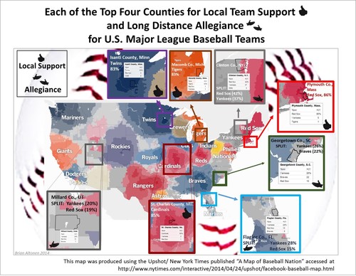
I used this Upshot/NY Times mapping tool available on the internet to evaluate counties for highest level of local team support, and longest distance allegiance to teams based on distance and percent support or allegiance to a distant team.
Brian Altonen‘s insight:
No county could be located that had a 100% score for local team support.
.
Allegiance or devotion to a former home or distant team was found in several expected places such as Florida (NY’ers winter paradise) and the Boston Red Sox-NY Yankees border in upstate NY.
Unexpectedly, Utah also has its own major followings for each of these teams. South Carolinians on the other hand were split between NY and Atlanta.
.
The best scoring local support that I could find (and by "local", I mean from the diamond to the neighboring teams’ territorial edges) was Boston Red Sox (86%), followed by St. Louis Cardinals (85%). [However, territorial area was not evaluated!!]
.
This interactive mapping tool, (for now, April 30th 2014), can be found at http://www.nytimes.com/interactive/2014/04/24/upshot/facebook-baseball-map.html#4,43.328,-74.795
See on www.nytimes.com
