Posted by Brian Altonen, MPH, MS under Uncategorized Comments Off on How will Spatial Analysis and GIS Impact the Next Generation of Managed Care Programs?
With Managed Care receiving limited support from the masses this presidential election year, one has to wonder if the current PPACA (“Obamacare”) program will survive another year.
When the presidential race is over this coming fall, if either of the two most supported candidates is elected, there will more than likely be changes brewing in how to resolve the issues that hold our healthcare system ransom in the United States.
Same image, different rotations
For example, my personal speculation is that if Hillary Clinton get elected, that the attempts might be to continue riding upon the system already in place, under the claim that some things need improvement, and the financing needs for effective management and control, but in the long run, we will simply take what it now in place and change it to make it more effective, more consumer friendly.
If Donald Trump is elected, the resolutions formed in my mind are less convincing or indicative of attempts to maintain some status quo and stability. In the worst scenario, healthcare will be placed more into the hands of private businesses again, and those programs devoted to the underpriviledge lower class fortified as they have always beenm being available to those most needy, but considerably more thought our in terms of determining those who are eligible.
This means that in-migrating people will not easily acquire such coverage, those moving here for work related reasons, be it permanent or temporarily, will also have more “hoops” to jump through to earn their coverage. That will service the current system greatly, in terms of finances, but re-open old wounds as the previously uncovered masses, who briefly entered some sort of healthcare status under Obamacare, will once again be left to fend for themselves. Some of this impact can be lessened, with certain eligible members maintaining their eligibility due to such things as young mother and child status, or having to deal with some life threatening chronic diseases state. But the least qualified people who were fortunate enough t obtain coverage in recent years, may again be out of luck by the time a new program is put in place, should the next President-Elect be Donald Trump.
Fortunately, it will likely take one and a half to two years for any new health insurance managed care program to be implemented. That will lessen to brunt of change this nation might endure, whichever way we go.
Some evidence suggests that Hillary Clinton might opt to produce some formidable changes in the Obamacare plan, were she elected.
This begs the question:
What might the best changes be in such a system, were it to be established as an extension in the current program that exists, yet meet the financial and service industry needs in ho the newer way to manage care gets developed?
For one thing, eliminating “Obamacare” is easy. Change the program, get rid of that title that now has a tremendous amount of hatred and regret attached to it.
But we might only need to eliminate a very small of the PPACA plan in order to satisfy the public masses.
The most important elements to PPACA are the transfer, change and implementation of healthcare into a high technology supported industry, complete with information technology never perfected before by any single healthcare plan (and yes, none have perfected it, no matter how grandiose their thinking and self-judgment appears to be to colleagues).
The information technology systems in healthcare today, known specifically as health information technology or HIT (like this label avoids to scary innuendo of the title IT), are still struggling now more than 15 years into managed care, and nearly twenty years into their complete development and implementation.
Generation after generation of IT fears and barriers have surfaced and resurfaced, demonstrating that the healthcare insurance companies and masters of the health economics industry aren’t as wise or able as they want us to think. A change in technology occurs quite readily and in months to a year longer, through simple acceptance of the technology and willingness to test its application. But one could argue that insurance companies and businesses fear IT advancement due its financial impact upon their individual financial securities, and morality targeting impacts upon the leaders, people and companies that have to use this new technology.
Insurance companies lose considerably once they see solid evidence for overcharging (we can leave the fraudulent billers and overbillers out of this argument even). Insurance companies will lose greatly once their additional charges and unnecessary charges are uncovered. The waivering tendency for insurance to assign value and price to specific procedures will raise some red flags, more than they have been doing since this issue was described to the public several years ago–for example, why is the PET costing $175 for medicaid, but $675 for privately insured individuals?
With presidential-elect changes inevitable in the next year or two, how will IT itself — that skill set which insurance companies have failed to support or engage in — determine the lifespan of the long-lasting stubborn companies unwilling to engage in the EMR, EHR, IT, HIT, HITECH Act requirements used to define PPACA?
The truth is, these IT developments are here to stay, whether you like them or not. They have already demonstrated their value, and provided evidence to necessitate their further development and use in the healthcare billing and insurance industries. Even if meaningful measures lessen to some extent, leaders and common sense workers will not engage in lessening or reducing their production of proofs that changes are happening.
With IT/HIT development, we will learn more and more about effective and ineffective certain companies, programs, facilities, neighborhoods, insurance plans, mail pharma companies, allied health programs (bogus or not), and counseling and family support service agencies will be when included as part of the broader, long term minded, preventive-palliative healthcare programs many places are trying to develop.
So IT/HIT must stay for these companies to document, and brag about their successes.
Adding GIS to this only strengthens whatever arguments are going to be made, and making it easier to convince you audiences, in whatever direction you want.
What prevents spatial health work from becoming a part of the managed care system is not just lack of intellect about what it is and what it can do (everyone knows a map can portray, or lie). What prevents spatial health from becoming a part of the healthcare system is the lack of knowledge, desire, experience, and skillset on behalf of leaders, to put forth the option of developing such a program in order to save their own business significant amounts of money.
There are a few companies out there that are experimenting with spatial analysis.
But I have yet to see one inkling of evidence that any industry out there is able to analyze its entire popular for the 15,ooo ICDs and ICD groups, the 4 fold as many visits as patients, the 10 to 20 fold number of procedures these people engage in, for 10 to 20 years of long term EMR/EHR history held secure as part of the older medical records systems.
A few companies have 20+ years of EMR on file (I work for one). GIS demonstrates outcomes that these data produce, that no other MC can produce through much of the country. Likewise, insurance companies and health businesses that manage the insurance aspects as well, such as KP, have developed partially functional spatial analytic systems that may have the ability to perform full reporting for a full healthcare program.
The question is: what will be the first company to emerge that is able to create a full-fledged GIS/Spatial analysis based version of the QI improvement report, detailing thousands, not hundreds of the most important population health features?
These features must include the following:
Human genomic data and disease history and spatial analysis
Emergent/Urgent care data, past and present, in reference to age, gender, etc.
Religious group data in relation to specific ICDs and medical events, compliance and non-compliance, and social and moral public health related disease or injury related risks
Race-Ethnicity derived reviews of its regions and communities in relation to population health, place, economics, and cultural traditions.
Socioeconomic status and predicted employment pattern related health care coverage, disease and success in relation to place, time and money
Chronic Disease (CD) management databases, devoted to hundreds of CDs, engaging in predictive modeling of these costly populations
Standard endemic disease pattern public health surveillance
Atypical epidemic and foreign born disease patterns and travel in relation to local regional health matters (local Legionnaires, Ebola, Chikungunya, etc. types of studies and prediction models)
The differentiation of standard linear versus hierarchical diffusion modeling behaviors and patterns pertaining to locally-specific disease patterns
A remodeling of epidemiological transition theory to best meet the needs of the local populations being served, with specific attention paid to economics, business and health, using the sequent occupancy model proposed on other pages posted at this site.
This survey is developed to determine how ready the healthcare profession is for the spatial analysis of health and health-related costs by a managed care system.
Posted by Brian Altonen, MPH, MS under Uncategorized Comments Off on Near time to test another hypothesis – U.S. Yellow Fever Geography
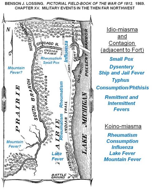
A depiction of how diseases were theorized around 1812, wtih expected locations of diseases over the Lake Michigan shoreline, Great Lakes area.
At times I get a little self-assured with the way my predictions have panned out over the past five years.
Back in 2013 I stated that measles was due to re-emerge, after discovering the dense cluster of non-immunized families and children along the west coast, centered in the Pacific Northwest.
Immunization Refusal peaks in the Pacific Northwest, 2000-2010. Individuals in the national dataset evaluated for this work, who had a Measles history.
Like I said in the many posting on that topic, before, during and after the measles outbreak in the Palisades area of New York, followed by the much broader, nationally spreading disease that erupted out of California. To date, most of the blame for that outbreak has been directed both at people from other countries coming into the U.S. for a short while, unimmunized and carrying the disease or bringing a child who has the disease, or we have blamed the numerous families into alternative medical philosophies and traditions in California, who felt the world was safe, and whp had that malingering phobia about their child getting autistic due to vaccinations–just MMRs mind you–“but hey, what the heck, we might as well skip them all.” I hear them say.
CDC and other major epidemiology, surveillance groups are focused on the California nidus based cause for the measles outbreak. They are wrong mind you, since the higher likelihood remains untouched due to this mis-directed focus down south.
And that is often what epidemiologists do–jump to conclusions, determine what’s likely to happen, and take action based upon that guess.
For decades, if not centuries (depending upon how far you read into the past), this basic layout of the world was used to define epidemic patterns, especially for fevers. Yellow fever was natural to the Torrid Zone, but during warm spells migrated into Temperate Zones. If in the upper north (for the southern hemisphere, lower south), the colder half of the temperate zone kept the fever present either by warmer weather, or by dense populations of people who could become infected. This important piece of American history is reviewed in more detail at https://brianaltonenmph.com/gis/historical-disease-maps/yellow-fever/a-new-war-yellow-fever/
So, the new Yellow Fever concern is bringing us another of these returning diseases that we are going to perhaps have to deal with.
If yellow fever hit the U.S., in epidemic fashion, I can predict that several big mistakes are going to happen and be published.
A section of William Aitken’s 1872 map of the U.S., depicting the Yellow Fever regions of North America [Link to Aitken’s map]
First, some of the past “yellow fever” outbreaks that weren’t yellow fever at all may be brought up. Yellow fever is very much a seasonal epidemic that erupts in the northern latitudes during the late summer, early fall–or as one Quaker physician Shadrach Ricketson stated around 1803 or 1804, it can become more likely when summer returns in the months of October and early November– that period of time we call “Indian Summer.”
Periods in Epidemiological Transition, according the the Sequent Occupancy method of interpretation. For basic background, see https://brianaltonenmph.com/gis/applying-new-methods-with-gis/sequent-occupancy/ In 1786, the famous patriot Benjamin Rush wrote about the ways in which society evolved in regions, producing a Human Species-based Evolution Theory that preceded Sequent Occupancy. (for which see https://brianaltonenmph.com/gis/historical-medical-geography/1786-benjamin-rush-an-early-rendering-of-the-sequent-occupancy-philosophy/ )
A very early possible outbreak, isolated on an Island south of Rhode Island is discussed in an article on an “Extraordinary Disease”. The geographical theoreies as to how an epidemic can strike an area, based on its levels of development, is also presented on this page that is referenced. This economic geography interpretation of disease explains the epidemiological transition patterns and behaviors we often see, in more detail and in a much more concise way that the traditional epidemiological transition theory. This philosophy that fits the epidemic changes better than epidemiological transition is called Sequent Occupancy Theory. (For “Extraordinary Disease” see https://brianaltonenmph.com/gis/historical-disease-maps/yellow-fever/1763-the-extraordinary-disease-of-marthas-vineyard-and-nantucket/ )
German medical cartographer Friedrich Berghaus produced this 1848 map, the second global disease map to be published. The yellow sections (barely visible) are the yellow fever areas of North America.
But the biggest mistakes US epidemiologists could very well make is to predict the entry of this disease by traditional mid-southern and southeastern routes into the United States. Some will believe it can return in a hierarchical way, via the largest, most heavily traveled cities.
Congressman-to-be Samuel Anderson theorized the possibility that yellow fever was being carried by ships. On one of the ships he managed as a ship surgeon, he documented the conditions that existed and he suspected may have been related to an epidemic brought up from Curacao to Delaware. This is from my page on this topic https://brianaltonenmph.com/gis/historical-disease-maps/yellow-fever/samuel-anderson-and-the-mystery-of-yellow-fever-on-board/
But my review of yellow fever 6 years ago demonstrated more cases striking the northern states than the southern ones. That can happen in one of several ways.
From one of my studies of Seaman’s maps of the 1790s-e1800 Yellow Fever in New York City (source: https://brianaltonenmph.com/gis/historical-disease-maps/valentine-seaman-1804-the-black-plague-or-yellow-fever-in-new-york-city/ )
First, the disease managed to come into the U.S. in spite of epidemiological surveillance in its natural endemic settings to the south. In other words, people bypassing the public health security part of the southern border of the U.S. will never be caught, and therefore make their way, as quickly as possible, to the northernmost parts of the US, via the Mississippi River and Great Plains travel routes.
Chiclero’s Ulcer ( see http://youtu.be/5a08oS23f4Q )
Of all things to relate to yellow fever, Chiclero’s Ulcer or Ear, an infection of the external ear indiced by the heavy humidity of Yucatan, also makes its way into this country via this route. The same migration route into the United States is followed by another Mexican-originated ecological disease–Pinta (pinto), a relative of STDs Falcoparum.
So, Yellow Fever could make its way into the U.S by a classical in-migration route, that one would think the U.S. government can secure and watch over.
Another route that Yellow Fever could take in is the route in first took as it made its way into this country–by traditional shipping routes. Though this may not be so likely today as it was between 1740 and 1815, when shipping was a primary way to get around. Shipping routes enabled the disease to follow the inland waterways as well, meaning that in order to infect parts of inner Canada the way it did, yellow fever had to enter by way of the St. Lawrence Seaway, head across the Great Lakes, and then head in every direction along major tributaries heading west and north into Canada, and south and west into the United States.
The first disease with numerous topographic and geographic associations was the yellow fever, finally put onto a map by New York’s Valentine Seaman, as part of his investigation of the New York City outbreaks.
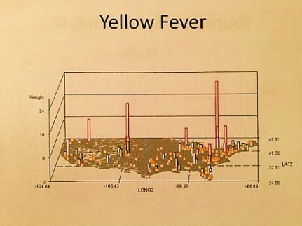
National Yellow Fever cases in the 2000s (personal research)
Numerous more maps of yellow fever behaviors have been published. Unlike Malaria or Dengue Fever, two other mosquito related foreign diseases to hit the United States, yellow fever has more of an ecological niche on this continent, and of the three, it is therefore more likely than them to return, and acclimate to the warming climate and the warmer southern shores of the United States, now managing to become a part of the ecosystems here, unlike back in the late 18th and early 19th century.
An Early Pinta 3D rotating image video I produced using my sql and sas formulas.
The third possible route for yellow fever into this country that is most unusual is akin to the last example just mentioned with the St. Lawrence Seaway. Today’s peaks of yellow fever seen between 2000 and 2010 possible relate to lesser security to the north, due to lesser expectations for yellow fever to enter the U.S. by way of a northern route.
And so, that’s the hypothesis I am testing here, by watching how the yellow fever behaves if it reaches this country. If there are weaker security measures for this disease at our north border, accompanied by lesser expectation by Canadian Public Health officials for a tropic disease to enter the heart of their country and establish a seasonal-only nidus there.
For more examples of Ecological Disease Cluster research using GIS, see my NPHG page: https://nationalpopulationhealthgrid.com/applications/2-ecological-disease-clusters/
Posted by Brian Altonen, MPH, MS under Uncategorized Comments Off on Zika – Methods for Ecologic Surveillance
The figures on this part are from my 2000 to 2006 studies of the Ecology of West Nile Fever. ESRI GIS, Idrisi and several raster-grid and imagery tools were employed over the years for this work. The research methods presented on this page and the site I provide links for, pertain mostly in New York, and to a lesser extent in Colorado. To date, the full data set I developed for west nile ecology work has only been partially reviewed.
With Zika now present on the United States continent’s mainland, numerous questions must be considered for the events that may soon follow.
Some mosquito-born diseases like Malaria fail to reach a state where the pathogen, vector, and hosts other than people enable it to become a part of the local ecology. Just what are the features that prevent such an event from happening? What parts of the potential ecosystem in which the vectors could survive is incapable of providing the requirements for its pathogens–plasmodia?
With yellow fever, there was limited possibility for the pathogen-vector-host/carrier relationship to exist as part of the natural setting. The limiting factor much of the time was weather, in particular seasonal climate changes that made it difficult if not impossible for pathogens to remain alive in much the U.S. over the winter. And although such is not the case in the deep south of the U.S., yellow fever never became the pathogen that it still is within its native tropical settings. So there’s more at play with this form of mosquito-vectored disease, than just the pathogen-vector-host relationship. Something in the ecosystem extinguishes the yellow fever virus, as well as limits its principally Aedes and Haemagogus vectors.
If we ignore for a moment the historically important Dengue Fever linked to a similar vector dependency, the next most important mosquito vectored pathogen to strike the U.S. is the West Nile Fever related virus. Although it also arose from a very different climate and topographic setting, like yellow fever and malaria, West Nile was able to establish itself as part of the natural ecology. Why did it accomplish this?
The traditional reasoning, from traditional epidemiologists, tends to focus on the human-host-vector-pathogen relationship, paying limited attention to the macrocosm of the pathogen and peoples’ world–the surrounding ecosystem. West Nile had a number of very distinct ecological behaviors that to date, with the exception of some of the work I published more than ten years ago, have not been developed into a potential method for evaluating and spatially analyzing mosquito-vectored imported disease patterns.
The following are the most important spatial methods for evaluating disease ecology pertaining to mosquito-borne diseases:
Plant Ecological research provides insights into the ecosystems that certain species of mosquitoes favor, and/or stay away from in terms of finding the niches for potentially infected mosquito populations.
Understanding the relationship that exists between landuse form, plant type, vegetation region or biome type, and the effects of these upon the microclimate of vector-breeding areas, provides a unique set of insights into how to evaluate the ecology of the vector-host relationship, and provides us with a way to initially define, more accurately, high risk regions.
As demonstrated by a field study I performed around 2002, using a light sensor, subcanopy light influences the behaviors of vectors and can be used to define the most susceptible natural settings for a vector to engage in specific feeding, mating, breeding and migration activities.
The application of normalized difference vegetation index (NDVI) imagery to studying species patterns and the possible locations of swarms or dense clusters of populations provides additional insights into how a region at the small area level becomes disease prone or not. [See https://brianaltonenmph.com/west-nile/6-remote-sensing/ ]
Satellite imagery may be used to further this method of research on the influences of canopy upon host-vector-pathogen relationships. [ https://brianaltonenmph.com/west-nile/6-remote-sensing/ ]
Competition between different species in a shared territory influences how they position themselves within the ecosystem, at the elevation and canopy-related level, and in terms of the distance from the water body that they may reproduce and aggregate the most.
My most successful series of studies demosntrated the ecological links between certain species and population density per species, the potential impacts of species competition on the exposure of people to disease carriers, and the important roles of understanding landform relationships with the behaviors of potential mosquito-carriers, a feature that is very microecological nature, and can vary from one moderately sized region to the next.
Most important to this study was the value it demonstrated for the use of NLC imagery and the value of applying other free (then, not necessarily now) spatial imagery data to this research process.
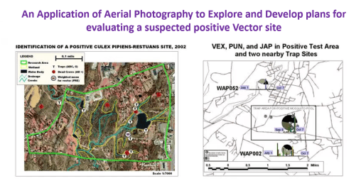
My most understandable and therefore successful outcome was of course related to the aerial photo imagery project, the third image above, for describing and demonstrating the spatial relationship between a cluster of positive testing animal hosts, and the probably location of a positive testing pool of vectors. These vectors overwintered the following seasons, and re-emerged in April of the following year, demonstrating the ability of vectors to retain an active pathogen or virus into the following years.
Important to note here – – for Zika to become ecologically stable within certain areas of the United States, and to become a part of the local ecology, this behavior has to be duplicated.
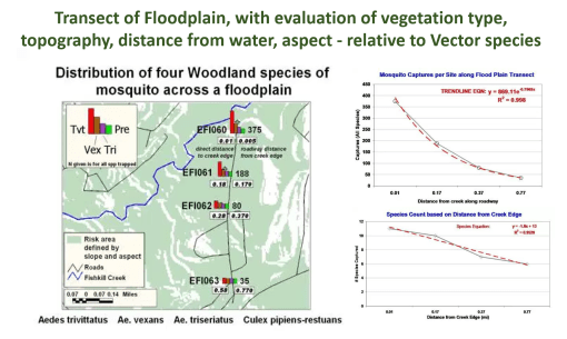
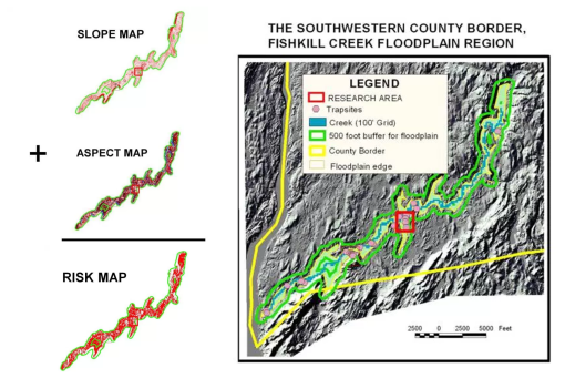
With IDRISI (and its subsequent products, IDRISI 32 onward), one is able to evaluate important topographic, elevation-related, and surface-reflection/solar pattern linked features to the behaviors of a disease. To identify the most susceptible, effective surveillance sites, the SLARs and related elevation datasets available to remote sensing staff can be used to define the more successful topographic regions for trapping possibly infected vectors. This worked in the field and for lab results (producing positive testing hosts and vectors) in several ways. The most important was it correlated back to the elevation-distance from water edge study I performed, by setting mosquito traps along a transect of the creek’s flood plain. It also explained why one creek was not very productive with positive testing species, versus the other. The two creeks appear the same, but topographically and ecologically, according to elevation and topographic images, their forms influenced canopy and solar energy aspect features, making one creek very stable ecologically and not a carrier due to high vector species diversity, whereas the other was less species rich and therefore more likely to harbor infectable vectors species, predominantly in regions where the disease would be spread by human ecological means.
Different species of vectors have different elevation related behaviors. Idrisi was also used to produce DEM derived images with overlays, to demonstrate how elevation above water surface does influence the species captured. The most revealing images and findings about vector species ecology came from my various studies of plant species, canopy type and light penetration, in relation to small water body locations, potential and infected raptor host species that had recently deceased, and the use of algorithms developed for testing the relationships between plants and small areas.
This first study is of a small shady yeard setting, with a nearby pond, a positive testing host, several related dead hosts, and a unique multispecies canopy setting. The NDVI was used to demonstrate the results of a supervised classification process used to reprocess the original image of this setting.
The trap sites on this property were added as point, converted to grid data, and then overlain of the reclassified NDVI. Buffers around the trap sites were identified and that data pulled from all subsequent images analyzed. The results of this analysis was then related back to the entire image to produce an entire map depicting the risk of each grid cell area. A Theissen Polygon analysis was performed of these trap areas, for use if defining the content of each trap site in terms of landuse, NDVI, canopy and vegetation related grid cell findings.
Several ecological tools already present in Idrisi were also applied, focusing on biodiversity and species richness, and tested as possible indicators of potential west nile-bearing vector-host settings.
Four types of regions were defined by Idrisi, each with different types of ecological relationships between the plants and other materials or belongings found in those particular regions. The hot spot was overlain on these four classes of disease inducing locations, and the point related best with Classes 5 and 6. (Above). This implied that Deciduous trees played an important role in producing the ecological setting that the vector species most desired, followed by a low lying moist vegetative region adjacent to it. It also demonstrated that the heavy canopy settings had minimal influence on vector swarm patterns. The heavy canopies at this site were planted evergreens, mainly 30-40 foot tall Fir and Pine trees.
Applying this back to the entire image, a cross-sectional risk area pattern could be produced, using several formulas or dimensions by which risk can be assessed. Linear, quadratic and cuboid formulas were applied. The cuboid model demonstrated the best fit, especially for Class 5 area, again, reconfirming the point-area derived summarization deduced based simply upon visual inspection of Class 5 of the classification images.
For more on the method for mapping mosquito cector ecology, see my pages at the following links: