
Figure description: Distribution of what I believe to be an urban-peri-urban genetic or congenital diagnosis/condition, around specific culturally defined parts of Long Island. Notice how this disease does not extend to other dense population centers elsewhere, such as down into New Jersey, north and eastward toward Providence and Boston, or northwards along the Hudson River.
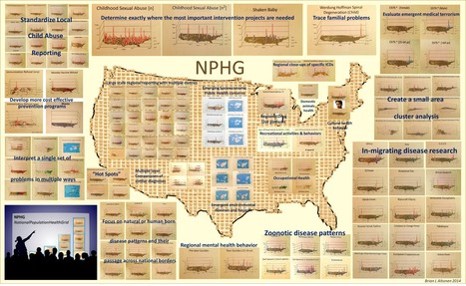
What needs to be Mapped?
The current status of the heathcare system is a state which has not advanced technologically or productively any further that its status five years ago, ten years ago, and maybe even fifteen years ago (2000).
This is quite a critical statement to make. Those devoted to the field of Medical GIS have been very successful in producing their maps that demonstrate what GIS is capable of accomplishing.
So, the accomplishments of using GIS for health related reasons are perhaps common sense to those of us in the field. We use maps to prove a point, to make a statement, to argue a hypothesis, to demonstrate proof that what we are claiming spatially may in fact be true.
Of course, there are those who have this contradicting philosophy, that maps can be used to lie to the public or upper leaders, or that they can be used to leader people in new directions, redirect money about to be distributed by a government agency. Maps are the basis for many a political argument. Knowing where the true boundary is has always been a concern, in many ways, for government officials. In health care, the map tells you where your patients reside, or who is responsible for a given region of community being mismanaged, or how the funds have to be allocated and to whom, to what office.
In healthcare, most of the decisions we make, if not the majority of responsibilities mentioned in a description of a company’s healthcare population, patients, clients, or members, are defined using maps. In fact, to demonstrate the importance of place and health within the government standards, the very first item a healthcare agency or npo has to produce for accreditors reevaluating the program, is information demonstrating that the community served and targeted meets the standard geographic requirements of being in close proximity to the facility under review. The medicaid and medicare programs do not want to fund people you are not obtaining their care from a person or facility that is too far away to receive immediate care. In reverse, the majority of people served by any company or agency being reevaluated has to have the bulk of its population within a given miles radius from the central facility. That number is usually 50 miles of less.
So, GIS is inferred by the requirements that a health care provider must meet for a program. GIS is not required. The spatial evidence referred to by the requirements given for producing a credible program, doesn’t even mention GIS, spatial or location. It mentions the geographic requirement for the managed care program to pass. That spatial location requirement is inferred, and the need to demonstrate this proximity of patient to care programs with the possible use of a map is inferred. This means that the spatial data can be provided quite easily by a third party, a company that knows little or nothing about the people and system it is responsible for analyzing once per year. It also demonstrates an example of where short-cutting the process for meeting spatial requirements can have an effect on the quality of health care service offered much further along in the evaluation process.

Because a company does not utilize GIS much in developing its managed care plans, what potential successes may be missing?
A company that makes minimal to no use of GIS for its managed care program is essentially not working with the complete facts on its patients. This company does not understand its population. It probably makes guesses about where certain age or ethnic groups may reside, and where services for those people are required more, but it has little to no proof that this need is the case, or how much of it is being met.
A managed care program that lacks GIS, or the full use of GIS, is not performing the steps needed to produce an effective preventive care program. It is not ready for an outbreak to occur, and perhaps wouldn’t be able to tell if one was happening, until that outbreak becomes newsworthy information.
When a news event does reach the paper, or some form of public relations announcement is made, GIS derived proof is rarely provided to back up the statements that were made. When a map of an area is published to demonstrate where a new service or offering is provided, there are minimal attempts made to evaluate the cost and outcomes of such an adventure internally; instead, the outside “expert” produces this part of the corporate’s regular report.
If a mother, or teacher, or commissioners of health and education entered into a hospital facility, and asked where else the kids are that their child may be most likely to get an infectious disease from, few if any schools and education programs keep close track of this information, even for themselves, to internally see an internal risk developing before the great outbreak happens. This degree of transparency is not only unachieveable by a health facility that lacks a GIS team, it is also unreachable because the facility typically does not have the data in a format where it can readily mine for this important public health information.

In 1997, it was possible to produce a GIS in the university setting that could monitor a flood on the flood plain. The task was determining the formulas for mapping that information–the main problem was that elevations for every small place is defined relative to the ocean surface, not the local characteristics important to health such as people, garbage, and sewage. Laterally or horizontally, it is easy to estimate distances from the closest object, but defining the distance above your risk factor, like the surface of a water body, and assigning risk based upon that elevation, wasn’t an easy task back around 2000.
Nevertheless, in 1997, I worked out a method to redefine or recalculate the elevations of a land surface, relative to the closest water body, not the Atlantic or Pacific Ocean or Gulf or Mexico. That required a combination of 2D and 3D modeling of surfaces using cuboid and polymodal (polynomial) equations, This exercise demontrated that most of the direct water flows on a land surface is defined by its surface planarity, whereas 15% or less of the flow of water is defined by those minute differences across small areas.
I used this combined 3D-2D equations to produce a false surface that mimicked the true surface, with the exception that the elevation of land areas were evaluated in relation to the closest waterbody surface. Now you could easily assess where the water would flood regions that are below 15 feet above closest waterbody surface.
Interesting to see how this two month trial and error means for modeling would finally have some replacement software packages out there to model flood plain surfaces with. I produced my equation in 1997.

The standard software packages that can produce similar results, using a lot of storage and programming space on the hard drive, came out about a year of two later. Downloading it meant you had to have a sizeable amount of storage space allotted for this program to be downloaded and then utilized to a limited extent.
Everyone back then could always use twice the amount of disk space they had on their PCs (with laptops not yet around). I was lucky to have a system capable of storing a half a meg of programming. Terabytes were known, but the reality was in megabytes, usually a half on up to 2 or 4, and 10 or 20 if you were lucky and had access to the right system.
The limiter to the use of GIS and mapping health has forever been the need for evaluating many measures, using just a small storage space.
That limited you to small area analyses, and often made us do large amounts of demographic and spatial analysis in tables and numbers, and then mapped these results.

A standard early ArcView 3.* township-county map series using Spatial Analyst extension
By 2002, the storage capacity had doubled, and we could produce and save a lot of maps on our computer, as images, and in the form of the raw and developed datasets used to define our findings.
In 2004, I once again tried to map the health of about a half million patients, this time using Perot systems and developing the method for evaluating age, gender and ethnicity and health, for all of the popular metrics for the time. Working in managed care, I developed the means to study the 150-250 metrics for QIA, PIP and Meaningful Use like required metrics (3/4ths of the metric were my decision, not required).
For the annual re-accreditation process, we valuated about 1500-2000 administrative, clinical and systems performance measures. A certain portion of these were for the annual HEDIS requirement. The rest were for internal reporting, answering important research questions, responding to curiosity questions that management and IT in the know had, and inquiring into potential new measures linked to utilization-cost analyses.
Another 500 to 1500 metrics could be easily developed using the pharma database, but we tended to stay away from the details of these, unless particular questions arose. Then, I would do the queries pertaining to that exact research questions, like attempting to answer the questions ‘is drug class A really better than drug class B regarding hypertension control?’ and ‘are medicaid patients less compliant with timely refills than middle age working class patients?’

A political cartoon I put together years ago, due to the partial nature and incompleteness of the metrics developed for a standard managed care program in 2004
The Managed Care Approach
In the managed care system, there are some given expectations of the health information technology that we must consider. We should be able to accomplish certain tasks readily, and report them annually, quarterly, or even monthly. These varieties of metrics about the quality of care, the meaningful use objectives, barely penetrate the surface of health care. Yet, so many companies and institutions seem to be struggling to get their MUs to work in their favor, or make their HIT and EMR/EHR system run correctly and effectively.
The lack of concentration out there in the healthcare system, at the administrative and leadership level, is why Managed Care (MC) hasn’t advanced much in the past decade.
Now it may seem unfair to compare MC systems and leaders to other highly successful GIS groups, like the environmental health experts capable of using both raster and vector tools as well as spatial statistics for their projects, or the climate and health experts who are skilled at higher levels of RS and IT like satellite imagery, AVHRR, NLCDs, and NDVIs.

The math behind my technique for developing the hexagonal grid, assigning a more accurate grids to a surface, for performing spatial analysis more accurately than the standard processes used by most mapping programs; this cuts the spatial errors in centroid-based analysis from 43% to approximately 17%.
So, how can we possibly compare the use of GIS by an environmental-ecological health expert with “experts” in managed care?
The better question to ask here is ‘why do they have to?’
My reasoning is simple. They have to do this because it has to be done.
Implementing GIS will certainly put an agency ahead of the bulk of its competition. Implementing GIS in order to perform more than just a few token programs would put any managed care agency in the lead. Implementing GIS in order to produce several dozen maps to demonstrate its programs and progress would make a healthcare program ahead of its competitors.
If you are a company using GIS, the reasons for GIS have two issues attached to your proposal. The first is how much in time, equipment and manpower will the new GIS cost the company? The second is what are the returns for engaging in this process?
The most basic example of this type of argument simply weighs out the cost for GIS as a software package, and one or two employees, and the time and physical equipment needed to demonstrate its value. This is then accompanied by attempt to measure something that GIS can effectively improve, and to evaluate the cost for that improvement and the savings or reductions in costs that it is responsible for.
Examples of Use
Each forms of health care specialty requires a special set of skills to implement GIS as a part of its routine. One way to break the subcategories of GIS/Spatial specialties in medicine down into groups is to use the following categories: medical ecology, environmental health, epidemiology, services and industry, demographics and health, and medical economics/business intelligence. In decreasing order of implementation of GIS as a part of its routine, GIS is perhaps used the most by ecologists, environmentalists and epidemiologists first, then by healthcare economics researchers, and finally by services and industry spatial analysts, and the medical economics experts, tend to focus on the marketing aspect of medicine and view patients as customers. They engage in programs devoted to insurance programs, pharmacy benefits supply and demand, laboratory test services, blood blank and tissue suppliers, surgical and diagnostic device related needs, home care medical equipment supplies, the dialysis industry.
When it comes to a special health need, such as the care for a patient with cancer, diabetes, mental health disease, epilepsy, multiple sclerosis, endocrine disorders, the spatial aspects of these healthcare related studies are produced by national and regional agencies devoted to those causes, usually operating and independent non-profit groups. There are many managed care programs that have allied programs developed in the same institution that may be devoted to such a cause. There may be a local office keeping the cancer registry or genetic diseases database that is documenting and databasing its cases, but rarely mapping them, and if so, engaging in such tasks rather superficially.

Religious based refusal for health care is noted as a V-code. With that data, we can research: “Where is the religious refusal for care most prevalent in the United States?” Knowing where this happens enables us to begin reviewing specific locations in order to determine how and why it happens. What social groups and causes are most linked to this behavior?
Demography and Culture
Before IT and Health IT (HIT), there is the field of demography to consider. Demography is that specialty by which we map people and their standards of living. We then analyze that data regionally and spatially and then try relating this to other special research topics, such as health and culture beliefs, or age and mortality rates for a given area. With demography, we can develop methods of how to analyze specific groups of people, and determine which spatial processes and analytic steps to take for comparing areas and the data about each area’s people. Taking this one step further, we can go beyond the typical population health metrics of age, gender, rate of marriage, number of children, reproductive rates, fecundity, morbidity and mortality, amount of income per household. We can relate that data to electronic medical records/electronic health records data, in order to design a fairly useful tool for analyzing quality of life, amount of health, healthcare performance, hospitalization needs, emergency services use, etc, for a region. These basic metrics are about as old as the idea of designing a health maintenance organization approach to care is–a process initiated in the 1970s.
GIS enables us to study any aspect of care that we deem important or necessary. The most surprising topic I even had to analyze spatially, in EHR data, related to the genetic screening and new tests for measuring likelihood of getting breast, lung, colon cancer. These events have specific codes that appear in EMR, and results that also appear in EMR. The frequence of positive testing carriers for specific diseases or cancer can now be mapped. If that data statistically compares with a specific local population, what moral questions are now linked to such EMR/EHR research potentails in managed care?

Several years ago, I studied one of the most controversial culturally-linked practices in medicine–infibulation. Infibulation is the process by which the genitalia are somehow altered, when the patient is young, for ceremonial and other culturally-defined purposes. In men, this process is akin to the Hassidic briss (circumcision). Some cultures try adorning the male genitalia, and this may be registered as the infibulation ICD.
But more than 95% of infibulation cases noted in the US EMRs involve women. The process that women go through with this are much more controversial. They often focus on cultural beliefs that the women must undergo the process, in order to protect, maintain, and assure her virginity for when she is married. This can involve steps as simple as removal of certain parts, but may be as aggressive as a procedure in which the opening of the vagina is closed, in order to prevent male penetration. This practice is illegal in the U.S. and is forbidden by the World Health Organization globally. The maps of US patients with this history indicate it is more common than we think.
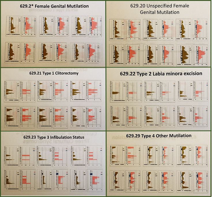
The most revealing part of this data is the form that the age-gender population pyramid for this case demonstrates. My repeated studies of national datasets for infibulation indicate there are a significant number of U.S. patients who have undergone this process by the time they reach 18 years of age. A certain number of individuals had this procedure done in the United States, by either a legal medical doctor or a “doctor” allowed to perform such procedures due to his or her license “back home.” These studies link it to specific forms of ethnic communities, not all African American communities.
In the field epidemiologist workplace, we typically correlate different ethnic disease to each other in our mind, because they seem to influence the same groups that we place together when designing our programs. The use of GIS to review demographics analyzes just black African American distributions relative to other groups. But within the African American group there are subsets–the Islamic group is one, the African American residents of the U.S. who came to this country as a part of slavery is another.
The following is a review of Sickle Cell Carriers. Sickle Cell came in with the slaves as early as the late 1600s, and therefore has a spatial distribution quite different from that of the Islamic related practice of infibulation.

GIS and Surveillance
There are already quite a few standard uses for GIS in place with epidemiological surveillance. The spatial distribution of certain diseases are routinely monitored. The local history of infectious diseases may be managed by local or regional spatial GIS epidemiologists, performing mostly at the university and government levels.
The same use of GIS can be managed for an agency, such as a PBM, a healthcare insurance company, a private managed care programs, or a large tertiary health care facility.
When I mapped the cases of mushroom grower’s lung, I was expecting a large density of cases in the Pacific Northwest, where a number of my colleagues were into the technology of home grown mushroom products. One of these individuals grew the Japanese mushroom used as a medicine, and this was his primary means of income. When I met him in the 80s, he came to me due to a pulmonary disease he was just diagnosed with, “mushroom grower’s lung” developed due to breathing in the spores over a twenty year period. When I mapped out this diagnoses nationally several years ago, I found a nidus in a region that was the mushroom grower’s capital of the country for a short while.
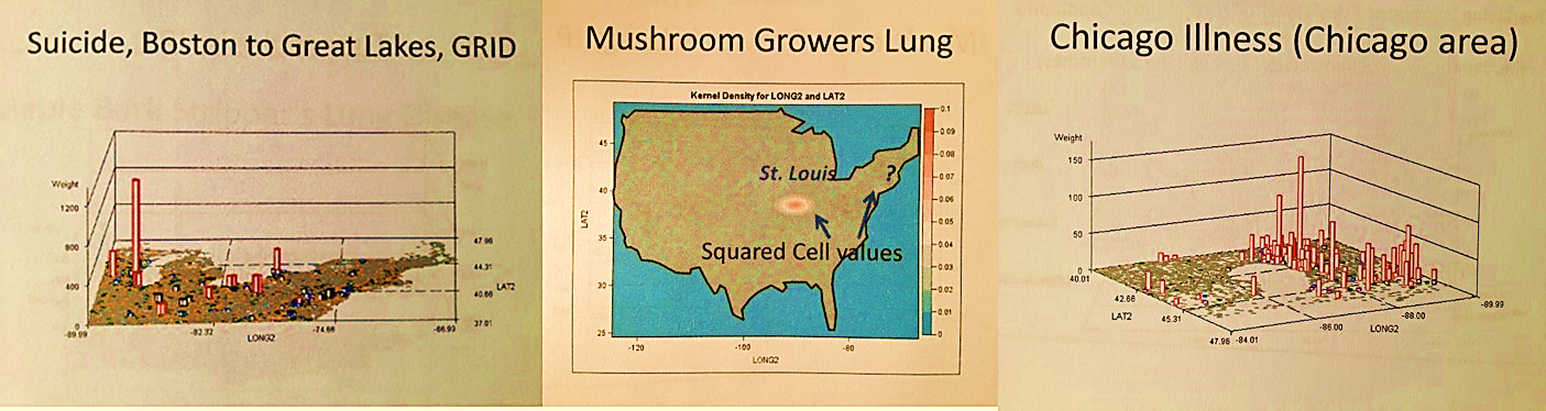
Repeating this process for other socially important ICDs, I came up with dozens of more findings. Suicide in particular was found to demonstrate regional differences which are related to age ranges. The youngest suicide attempts and victims are found in a different part of the country than those who attempted it due to a mid-life crisis. The Chicago illness on the map above is a fungal-based lung infection (Blastomycosis); the ecology and distribution of its biological cause determine the distribution of the disease, the spread of which is hastened by the seasonal Chicago winds.
This study of the Chicago disease was taken one step further, and used to lllustrate the different kinds of diffusion processes a disease might demonstrate (as follows).

When the Ebola hit in 2014, I reran the Ebola case study I performed several years earlier to see where the Ebola was distributed according to EMR/EHR. I then monitored the progress of the outbreak, posting almost daily my insights into this growing problem, and assigned some blame on the international programs for its uncontrolled diffusion pattern. I then used GIS to determine specific routes of entry. The most common route it took was human air travel. Ecologically, it was determined that a possible natural migration route was possible through the Caribbean Islands setting.

The entire Ebola season (June to December 2014) consisted of non-GIS work, one news event after another. Both the local-regional, and the national-international Medical GIS units were unestablished. WHO did not prepare for the outbreak, and the infrastructure of local and regional healthcare facilities lacked the knowledge, equipment and capabilities of monitoring the progress and routes of travel of Ebola in this country. The entire Ebola outbreak remained a retrospective study with more posted in the news than could be deduced during the outbreak process. The 2014 Ebola outbreak was a very small outbreak. What if this were the return of the Spanish Flu instead?
Local organizations, in the form of Managed Care must develop medical GIS capable of predicting, modeling and explaining to its experts the details that other global agencies cannot provide, will not provide, or lack the skills and ability to provide. (WHO later stated that it did not hire the experts needed to monitor an international outbreak, using this as part of the explanation for how and why it failed to develop any effective management programs in 2014, and even to date in 2015).
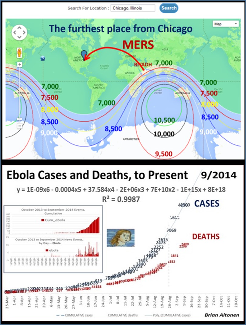
The two most important outbreak events demonstrating the need for GIS were the introduction of MERS and then Ebola into the U.S. in 2013 and 2014, respectively. Both events demonstrated similar mistakes on behalf of national and regional/local health care agencies. MERS demonstrated the inability for aviation services to have effective homeland security, public health related programs in practice. The occurrence of Ebola months later demonstrated the human factors behind the reasons why an international epidemic can strike–slow human response times, typical of human behavior and exaggerated by political or governmental control of these behaviors.

The Need for GIS in Managed Care
It demonstrates how far behind managed care programs are compared to programs with expertise in storing ecological data, land use data, raster imagery, temporal climate information, IT data content very similar to the information that Health Information Technology (HIT) workers deal with.
Are the HIT workers less trained, less knowing of their field and its math and science than the environmentalists and ecologists are out there?
Does this mean that the climate and weather predictor using his/her process to predict what next quarter’s allergy season will like is more competent and knowing that HIT workers, clinicians or not?
Why can’t HIT people work on more aggressive prediction models for their programs? struggle at trying to find where the fraud is happening? fail to get much beyond the few or few dozen topics they have analyzed repeatedly since the 1970s, and yet still can’t seem to perfect their care processes for?
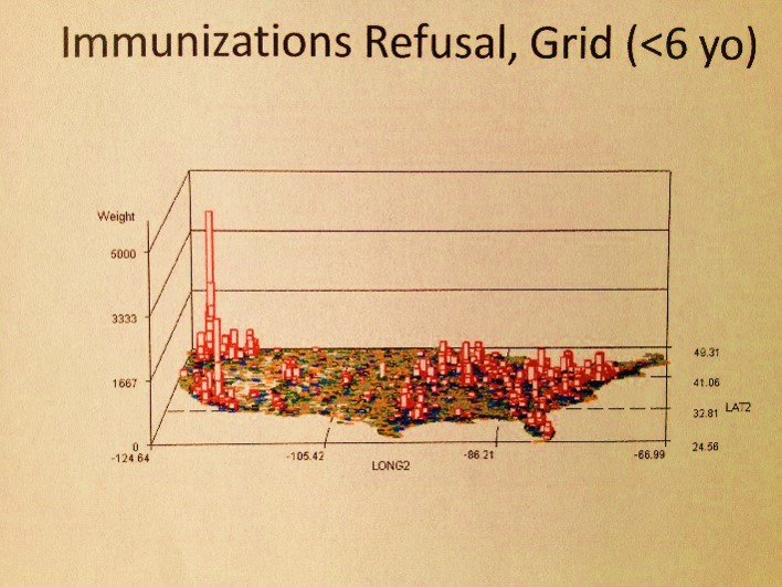
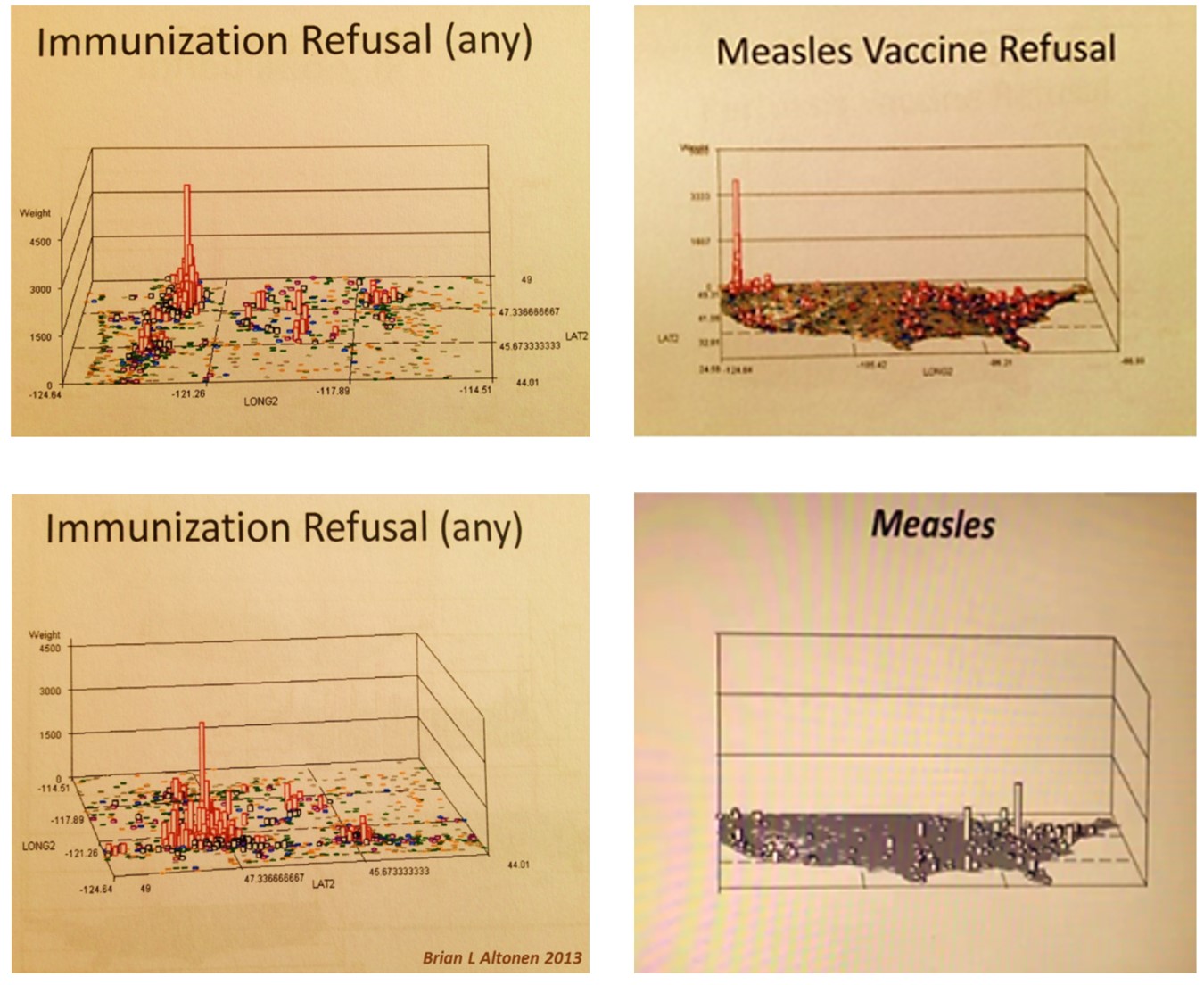
The immunizations of children are, overall, now less than they were a decade ago, and perhaps will return to the same poorly managed programs they had associated with them when the predecessor to managed care, health maintenance organizations, came to be in the late 1970s.
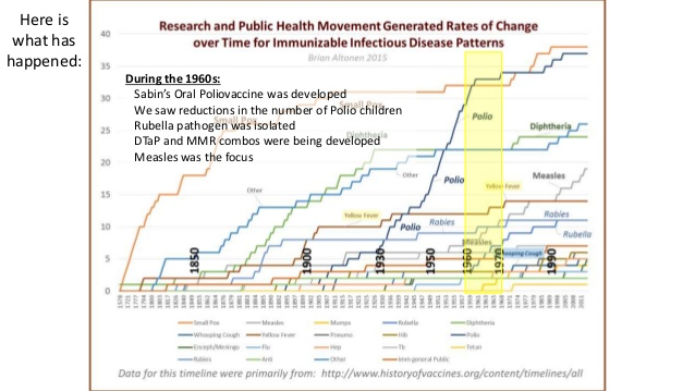
Face it, the recent outbreak of measles proves to us that we walk around too competent in our system. We record only what we need, have to and want to record–ignore the rest. We then use this to argue we have once of he best programs in the US.
Five years ago, a program in NW Washington made such a claim. At the time, their patients were healthy, but the neighbors and neighborhood were not. Such was where the greatest resistance to immunizations existed. Only, the health insurance systems did not know it, because those risks to the other half of the population were not insured by them. As a result, when the measles outbreak occurred in California, it had the west coaster’s idea of health prevention living practices to contend with–of should I say, take advantage of. The top notch insurance programs were a problem because because they did not know, and did not know how to learn and know–a status they are still in today.
In the meanwhile, GIS experts like myself are able to grab a hold of the related data when we find the chance, and use it to demonstrate their system’s failure, i.e..
More on the Methodology
The methodology I used to develop these maps came in bits and pieces over the years of employing GIS, especially Remote Sensing software systems. I knew quite a while back that this method of visualizing disease patterns would be quite amazing. The use of a rotating image to demonstrate spatial distributions and to engage the researcher/reader in much the same way as a flyover does of the area used in virtual flight training programs was the goal of this project. One says a lot more in picture than in words in some cases. And in this case, the use of a virtual fly over for disease surveillance and investigation tells us a lot–much more than just staring at the map, searching for aggregates, clusters, peaks in frequency, nearest neighbor relationships, whatever.
The following are some expectations we can define for GIS, as a valuable tool for the healthcare administration, the businessmen affiliated with these companies, and the managed care practices themselves. GIS may not work great for all businesses, engaging in all possible metrics. But using GIS to develop some methods for improving programs, and finding out where GIS helps and where it isn’t at all useful, should be the goal of the next generation of mindfully engaged (not habitually engaged) healthcare administrators, managers, VPs, CIOs, CFOs, CMOs, ad pro re nata.
- Meaningful Use measures
- Population health monitoring on a quarterly and/or monthly basis, by 300 major HI/QOC/Health metrics
- Population health monitoring at the cultural level, beginning with Hispanic and African Asian, then adding Asian, Native American, and certain local ethnic/cultural groups.
- Population health monitoring at the income level. Define 5 levels for your care region, determine the lowest and highest socioeconomic status areas.
- Engage in your regular Managed Care requirements assigned and dictated PIPs, QIAs, MU, and ACOs.
- Engage in regular HEDIS reviews, both clinical and administrative
- Produce GIS tools for special needs groups, like the Home Care team, the high cost patients management team, the smoking, diabetes, asthma and other chronic disease prevention groups
- Produce a team focused on change, long term (>5 years) and recent (past 2-3), for specific metrics, like timeliness of cancer screening, required physicals and blood tests, mother meeting child’s well visits goals and requirements, STDs rates, chronic disease management teams
- Produce a special team devoted to genetic, congenital and culturally=behaviorally acquired diseases, like the sickle cell, thalassemia, club foot babies, etc.
- Design an Atlas of Diseases for the program, including general and specific are or topic mapping printouts; produce two sections–focused on ICD and ICD groups, and ethnicity, and census derived income areas
- Design an Christaller’s Model Atlas devoted to patient care, with maps on patients, patient populations/subpopulations (density, type, etc)., regional distributions, service providers, satellite and central networks
- Design a Cost analysis Atlas for the regions, facilities, providers serviced
- Design an Administrative/Management series of maps on the guidance and leadership of the Managed Care program, focused on resources and administrative reporting to financiers and potential investors.
.
