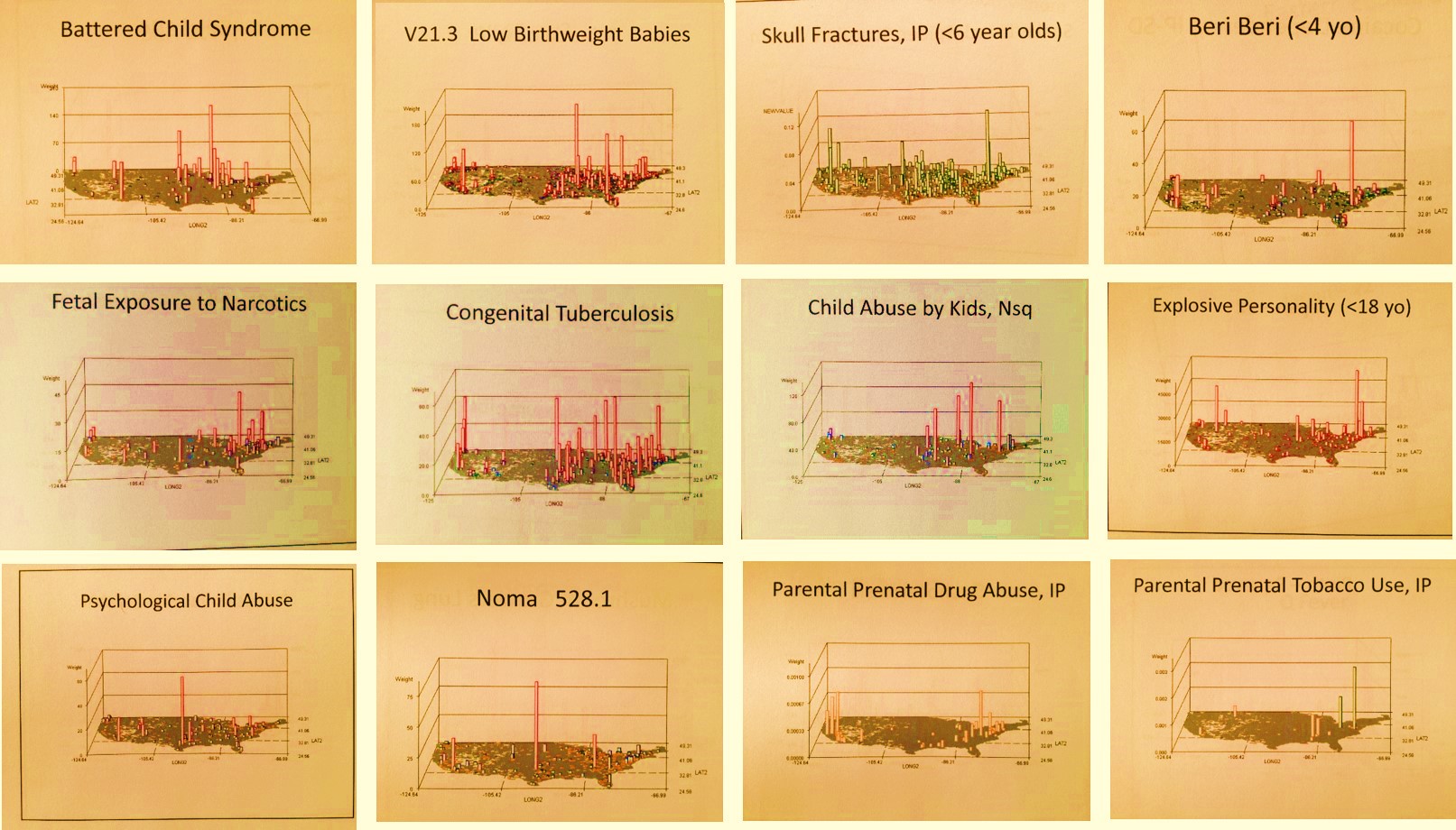
Childhood Preventive Care Topics for utilizing a 2005 Medical GIS research methods, with examples of results for several 2009 to 2013 test runs
The above is an example of how national population health grid mapping can be used to improve intervention programs at the population level, and produce topic specific reports on sensitive issues identified using EMR/EHR . In theory, the above maps could be overlain, multiplied or added spatially, squared and cubed, or merged with prevalence data, cost data, claims counts data, age specific data, ethnicity or gender specific data, for each part of the map, to produce a hybrid map depicting the highest risk areas for this special combination regionally define child abuse or neglect activities. (an example of such appears later.)
…………………………………………………………..
Note: As of May 2013, I have a sister site for the national population health grid mapping project. Though not as detailed as these pages, it is standalone that reads a lot easier and is easier to navigate. LINK
***********************************************************************
Note: this page and neighboring pages are derived from older teaching materials used for a lab on GIS and the corresponding lecture/discussion on ‘GIS, population health surveillance, epidemiology and public health’.
……………………………………………………………………
A map video of the heart of non-compliance with childhood immunizations in the Pacific Northwest, which is viewed from its north end with the Pacific Ocean on the right and Seattle to the bottom right for the above image. This is a good example of how this method can be used for local population health surveillance and community-targeted program planning. The full US version of this map appears later on this page.
The algorithms for this technique are very flexible. They were first developed using GIS [late 1990s] and then modified for use in a non-GIS environment [2000s on]. The benefits are faster map productive using non-interactive (automated), non-GIS methods that can be applicable to most health care EMR data warehouse/HIN systems at no additional software costs. You can vary your lat-longs, place of focus, and vary the size of the area mapped. It does not utilize a formal GIS software tool (including SAS-GIS). It can map raw data or any product of the raw data. It can be integrated into formula driven analyses for episurveillance and even anti-bioterrorism tactics (my primary promotion for its use). This 3D mapping technique is always more informative than 2D mapping when it comes to surveillance work, cost analyses, and program planning. Best of all, it avoids need for the GIS prep and fine-tuning work related to mapping. In Teradata, it takes just minutes to run at the national level (100M+ people with EMRs), and produces more than 10,000+ maps per day if you have videos in mind, 100s per day if you want to produce an atlas for any metric, ranging from ICD prevalence, to costs, Rx rates, compliance, and human behavior measurements by place or area).
.
Part I – The National Level
Having been exposed to the managed care system pretty much since its first development (including a 1970s period of computing), I can see how and where GIS can be applied to the managed care system as a whole, how it can be made a part of some internal medical surveillance system for the betterment of the health care providers and insurers who are involved, and how ultimately it could be applied to either some standard quality assurance programs designed to monitor the performance of a particular program, or applied as an additional tool and method used to assess overall program performance and compliance.
Ten years ago, the deterrents to applying GIS to an insurance or institutional population health surveillance program were numerous, and included such problems as
- Lack of available data, in either storage form, accessibility, and/or data quality
- The novelty of GIS in general, and related lack of adequate understanding of its applications
- The time-space constraints related to GIS use and application, including the time needed to develop a GIS utilization method or strategy, a clear understanding of the goals and applications for these uses, the ability to have the time and manpower needed to produce outcomes demonstrating,its effectiveness.
- The cost restraints that existed due to expensive technology like GIS and RS, which at the time were mostly in their exploratory and experimental stages, without much support shared between users in the business community.
- The limitations placed on productivity with GIS also limited its use due to inadequate or limited base data resources for producing maps, such as county provided base maps available for a price in some regions, whilst free in others, many not always meeting the needs of the agency or institution making use of this base data.
- The limitations of overall population demographics data for any area, although with the completion of the 2010 census, enough changes were made in terms of the format, applicability. and availability of this data to common GIS users.
- The knowledge base and experience in potential employees in a medical GIS field.
Due to advancements in the IT world due to big data availability and increased concerns with HIPAA compliance, the GISing of disease patterns did not work so well together. This is because the base map told you where the disease was, not necessarily the name of the person who had it (Personal Health Information or PHI), but enough information to make many feel that they could know someone in that region who this map was referring to, or know someone else who would know. Of course, there was never any proof such could ever be the case. No one knows everyone else well enough to be able to attach a name accurately to a case point on a GIS produced map.
The search for regional dysmorphology and other inheritable traits . . .
Nevertheless, this paranoia that circulated about regarding GIS technology had a strong impact on its fate and social acceptance for quite some time. This lack of acceptance was really a by-product of the health care industries in general. By misunderstanding the argument for why point data for a given disease should be acceptable, they in turn are implying that perhaps the impossible will happen, that each and every point on a map can be linked correctly to someone that someone else knows. This would only be true if for every disease each and every person there is was placed on the final map, and even then, we do not know if we have captured every one for the time. In simple IT terminology, one could say that these concerns about mapping seem to exist for argument’s sake, not at all due to proofs that exist regarding accidental disclosure of a fellow employee’s personal secrets and PHI.
HIPAA has begun to allow for some methods of presenting personal health information through GIS research to be developed. At the local level, there are avenues that can be taken to ensure PHI privacy, as well as make sure that very important applications for GIS are implemented for regional or local public health purposes. For now, the limited availability of BigData libraries may need only be applied to making population health comparisons at the business level instead of at the more PHI conscious department of health level.
 Two very rare genetic traits or diseases with isolated clusters
For implementation of GIS analysis of medical data at the national level, the following are the types of core databases now available, with limiters to their use being the selection of the smallest area(s) evaluated for a given region, and the specific locations of those areas selected for review.
1) US medical and pharmacy claims databases (e.g. MarketScan);
2) US medical record databases (e.g. GE Healthcare);
3) US government public use databases (e.g. NHANES, MEPS)
As for which types of businesses can and would make the best uses of it, GIS was and still is too costly for small groups that wish to engage in this process. This does not necessarily mean that small companies cannot utilize GIS in their work, it only means that different avenues may need to be taken for them to effectively compare their local outcomes to other local outcomes and ultimately the combination of these to even larger area outcomes.
A very specific, well localized cluster of an inherited disease on Long Island
We already compare small area outcomes with outcomes of larger areas due to the inclusion of this process in standard federally monitored, NCQA and HEDIS population health monitoring programs. Standard national disease frequency data is usually compared with all of the local studies that are engaged in the same study. In the past, the addition of base mapping was not essential to these standard Quality Improvement processes. Even today, the use of a GIS for performing such a study is still not necessary. Its primary service would be to the company itself that performs this task, making it possible for more effective intervention processes to be developed and for long term improvements in population health to be measured and demonstrated for the first time. So at the internal level, the early stages of developing a GIS program for supplementing the standard projects that are underway and ongoing is an important task to develop initiatives for. Without such initiatives, companies that remain true to their older practices take the chance of not getting ahead of the competitors. Knowing how to use GIS and perform disease and human behavior mapping are the most important skills that future statisticians could develop for the future QI programs.
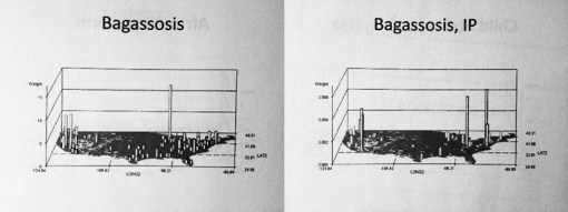
Bagassosis is an interstitial lung disease related mostly to the sugar cane industry, in particular the molding of leftover cane product
In the course of my work in Managed Care and a Quality Improvement analyst, I knew throughout this process exactly where GIS could be used to serve a better purpose than it traditionally serves in the annual reviews of health care programs. Currently, we mostly use GIS in an annual report to tell the auditors where our patients reside, and the illustrate that the bulk of these patients are residing within a certain distance from their primary care provider and the other local sources they make use of for special services. This is part of the requirement established and noted in the Federal Guidelines which requires reasonable care be offered without need for too much cost for travel or with too many travel restrictions preventing a patient from receiving the best care. For small business, whereas this was often the only use of GIS employed, by technical savvy people not necessarily medically, clinically savvy people, the current applications of GIS can now include means for prevention and for intervention success. We can use GIS to see where the problems lie, and see where to improve upon our services in order to make health care more accessible, and more easy to follow up on. In the long run, the outcome of this is a lower cost. The reduction in costs is first to the patient, who is as required traveling less for meeting health care needs, but then reductions can ensue in terms of quality and availability of care, thereby improving patient health, reducing health risks, and the possible need for the more costly urgent or emergent care.

Two Very Similar Diagnoses
The lower layer is a standard US diagnosis [the non-brown colored specks are hard to see], the second layer [red] is culturally bound, the third layer depicts areas with both.
One major advantage small companies have for possibly applying GIS to their work load before big business pertains to their small datasets. Smaller datasets can be more efficiently managed, even when input of this data requires some manual tasks that relatively speaking are time consuming for larger datasets. For small population industries, this means that there in theory is no excuse for not considering the possible use of GIS in today’s day and age. Even if you are only dealing with around 15 to 20 children with asthma per year, whom make up only 1 to 5% of the local childhood population in their immediate neighborhood setting, you still have the potential for applying GIS to any studies that arise based on need. In a recent discussion with a higher up pharmacy service industry Director, it was agreed that there is significant value to having this option available to us. Should an unexpected local public health concern arise, it provides us at the administrative level an opportunity to determine if case clustering is truly happening, for example as displayed by a series of conditions related to the health risk concerns. This duplication of CDC investigative epidemiological work is an important skill set a statistician could develop working for such companies. By allowing cost to be the deterrent to such a practice could in the long run work against local successes.

Coccidiomycosis is fungal-related and has an environmentally-defined distribution

Coccidiodin Distribution (LINK)
In the real world of quality assurance in health care, this means that the following standard programs for managing population health are examples of just a few that can be effectively carried out using GIS, even if and when limited manpower exists:
- Long term managed care of Asthma
- Post-cardiac hospitalization readmissions within one month following discharge
- Follow-up care for Mental Health related hospitalization discharges
- Child care well visit and/or immunization program compliance and performance
- Ongoing breast and cervical cancer screening followups related to initial diagnosis of a positive result (quarterly reviews are possible)
- Diabetes preventive care activities performance
For example, for the latter metric, a review of regular well visits compliance and HbA1c evaluations could be performed spatially to identify regions where differences in behaviors exist due to lack of public transportation, or culturally-linked non-compliance behavior demonstrating small area density, or combined facility-access-age related reason. Each of these has a datum that can be applied to developing a number of metrics linked to managed care accessibility, patient related compliance, or provider/health care facility imposed limits to access and utilization. Each of these measures can in turn be correlated with any problematic outcomes that occur regionally, in order to define regions where cultural sensitivity plays and important role, where income status impacts patient related self-management activities and preventive health behaviors, or where services themselves are in need of some fine tuning or other form of quality of care and care access improvement.
Two Very Geographic Disease Patterns:
the first is physiographic (mountains), the second pedologic and mycogeographic (Armillarius mellea rhizobia colonies in soil)
One of the major deterrents to applying GIS is the need for latitude-longitude data for each case. In small business settings, this data concern is often more manageable since the data itself is smaller in amounts, with the lat-long information more manageable in terms of manpower, the need for updates due to address changes, and maintaining this database for a considerable period of time in a fairly accurate form. When small address datasets are used to produce lat-long information, they are more reliably produced when that data is small in count and local to the lat-long data producer. That producer is more likely to be familiar with the local place names when an internal department team is employed to engage in this task, versus the product from an outside vendor.
.
Interestingly, the refusal to immunize your child does not increase the likelihood for infectious childhood disease onset and local epidemics. The distributions of outbreaks for immunized disease are defined primarily by population density (links to these videos are elsewhere on this blog). This is because it takes only one unimmunized child infected by a disease to produce an outbreak given the right density of underimmunized children. This makes the likelihood for exposure greater in densely population regions (Seattle and Portland for the Northwest). The total number of people who refuse to immunize their child in the Pacific Northwest are still very small, and so no significant level for risk of infection followed by an extensive outbreak. Still, an in-migration of non-immunized or underimmunized children into this region is a major cause for concern.
More importantly, small companies have the advantage of directly engaging staff in this process since these staff members are probably more reliable when determining whether or not we depersonalize the information enough by just using lat-longs for the study instead of address, reducing the likelihood that anyone will recognize who that person could be. This alone increases the value of performing GIS for many population health studies. This depersonalization of data for GIS automatically depersonalizes that given dataset for any and all other studies employing it, making the addition of GIS to a managed care QI program a better way to maintain the anonymity required by HEDIS. In the long run, it would not be a surprise to learn that once GIS becomes incorporated into a Quality Improvement process, that there is better control of the data and the related PHI. PHI datasets with just lat-long identifiers used for population health metrics tell us much less than the old standards employed, like the retention of a second personal identifier, due to reliability questions or issues involving the unique identifier.
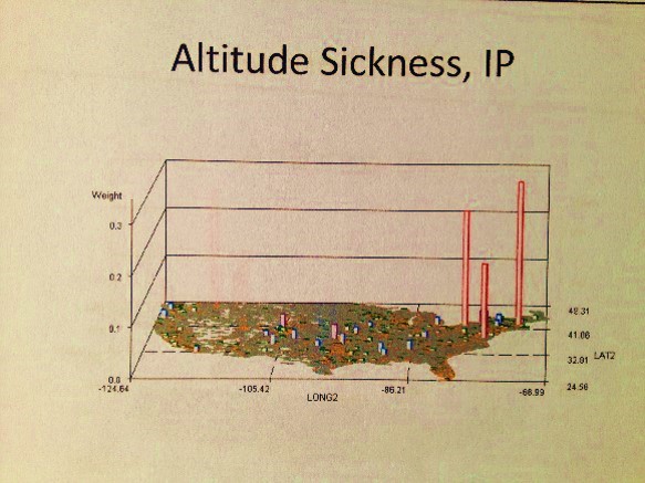
Why is Altitude Sickness not a product of mountain ranges or elevations?
Most likely this is because people are diagnosed with it following a return from such excursions. The three peaks noted above are peak cities with major international airports, suggesting people are diagnosed with this condition due to air travel and/or the places they visited.
In a study I personally did on several thousand cancer patients, 50% of the patient lat-long point data had to be manually produced once the address matching tool was applied. (This was back in 2000, and so addresses and address tools are of course now much better.). The rate of manually producing a reliable point shape file with accurate lat-long features was about 100 to 200 points or cases/patients per day, during a three to four hour workday, meaning up to 1000 points were produced per work week. For 3500 cases involving 7 related cancer types this whole process took just under a month.
Applying this to quality improvement activities and performance improvement projects (NCQA QIAs and MCD/MCR PIPs), for a population of 50,000 patients, undergoing an analysis of medical events that occur infrequently (3%) will take approximately 1-2, 2-10, and 10+ days to develop mappable base data for the patient set. In terms of practicality and implementation for such a procedures as part of some managed care quality assurance program, this means that two to three months of preparatory work is required if no lat long data exists for the patients to be reviewed, which in some sense means that engaging in such a study is very manageable, so long as the appropriate guidance and leadership exists.
.
Three Diagnoses related to African American Heritage or Culture . . .
with distinct distributions due to history of in-migration, ethnicity and religion, cultural beliefs and practices, and cultural origins
The new managed care guidelines coming about provide us with the opportunity to make more efficient use of GIS in health care management, population health monitoring and epidemiological surveillance. GIS is rarely applied to managed care population,health work. Yet in these more active healthcare programs it is not unusual to see GIS being demonstrated in public displays and professional presentations. The reason GIS is not commonly demonstrated or used probably pertains to the lack of manpower with the skills required to produce GIS results with minimal need for much research, development or analytic time. But the other reason probably for the lack of GIS in health care is primarily related to data quality when it comes to GIS methodologies. To be able to GIS the results of a study latitude and longitude features have to be applied to patient data, a process not at all common to most small health care or large scale programs overseeing their work.
Are Pedestrian Accidents involving children as the victim latitude related? If so, why? Are outdoor temperatures more conducive to recreation? Is higher population density compared with temperatures playing a role? Or is there simply no cause-effect relationship and this is a misinterpretation of data?
Nevertheless, GIS is a possible tool that can be applied to local health care data. The remaining social issues related to my statement here is the patient privacy concern. In no way does HIPAA makes it possible for some forms of GIS analysis to be engaged in and reported other than just internally. GIS analysis provides too much personal information on the resulting maps with good studies, jeopardizing the rights to privacy every patient has. Nevertheless, GIS employment to become one of the next moves taken to improve the current health care system.
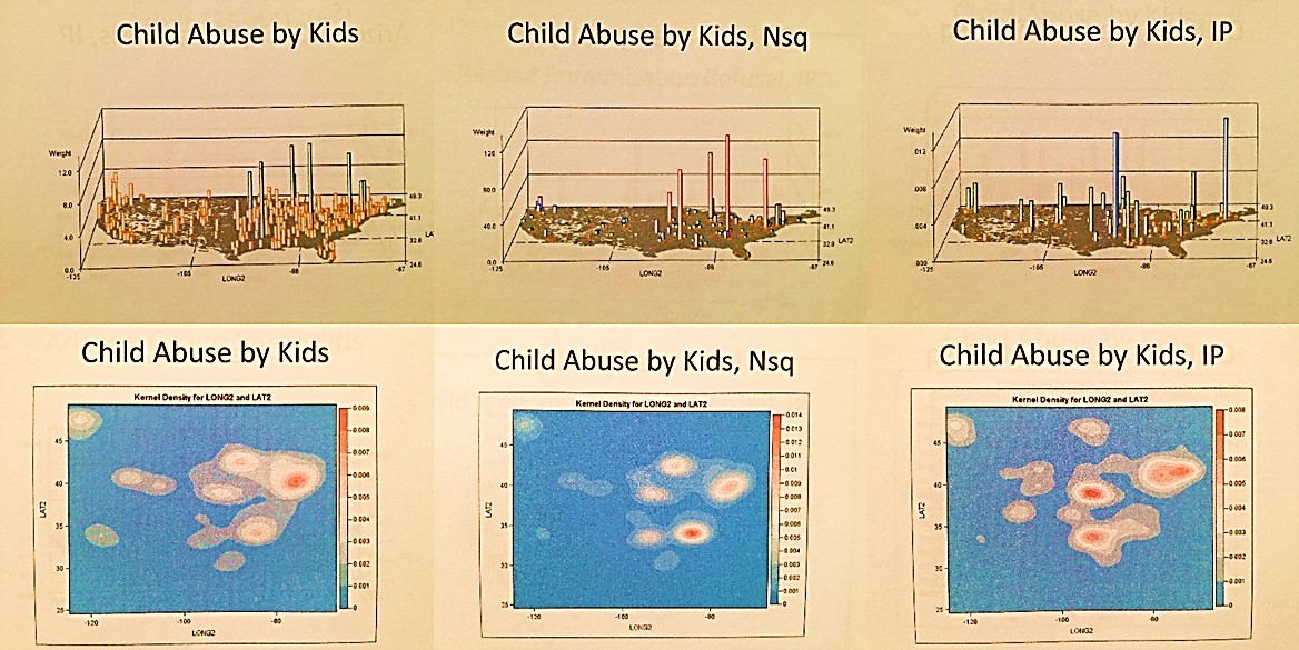
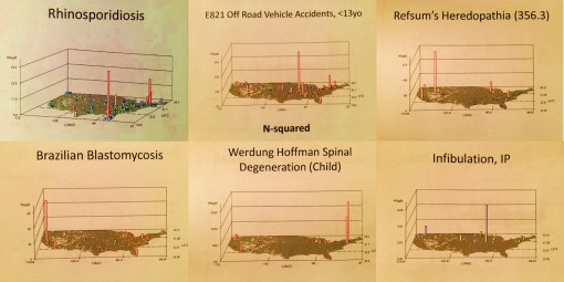
The application of N-squared instead of N to produce a map that is easier to comprehend and make use of is a trick I learned in digital elevation modeling and remote sensing. By squaring spatial values you accentuate the differences between neighboring territories, thereby making those with high N stand out. This in turn makes it easier to define the “nests”, niduses”, foci or starting points for any well localized medical disease or human behavioral problem, thereby defining where to begin your first intervention programs. If we overlay the last two kernel density images (the lower row), preferably by multiplication, the Nsq x IP map that results infers the strongest matching areas for high Nsq and high IP, thereby indicating locations of highest probability for risk of abuse, with the greatest numbers of children at risk for this abuse, the “hot spots” so to speak. This is one of the most cost-effective ways to isolate high risk areas that are also highest cost to a health care system, resulting in more accurate targeting of your intervention activities or practices.
So how do institutions make better use of its internal patient medical information applying some from of areal or point analysis routines, using GIS or a process much like GIS?
- This grid process that I review on several pages is one way to engage in spatial analysis at a very local level.
- The zip code process has problems related to large area data, meaning you can’t always locate results well enough to determine proximal cause.
- Address derived latitude-longitude based studies provide an effective way to map data, which for the most part has to remain internal with its reporting process.
- Block and block group based census analysis may be performed as well, eliminating some of the concerns for loss in degree of confidentiality.
- Topical mapping based GIS related predefined or pre-classified area analyses can also be performed. This process is engaged in by defining your topical areas first, categorizing data parts into groups, each linked to a distinct research area, and then engaging in the study of areal statistical differences.
- This is a highly effective statistically applicable method of making the best use of large data sets with limited disclosure of PHI. In theory it could be managed by most big businesses dealing with PHI, were this knowledge and method a part of the corporate mindset.
Currently (Feb. 2010), no large company has developed a way to analyze national statistics in small areas. Yet the availability to engage in such a process has been around for 4 or 5 years. Companies which have this data available to them only review the national data for the US in large areas. These areas range from a simple quadrant of the nation on down to duodecimal (even that is stretching it somewhat). State and county representations of this data have been around for more than 20 years. Certainly, some possibility exists for businesses to make smarter use of their data when dealing with disease research and prevention at the Big Data level, which is the reason for presenting this methodology as it applies to Managed Care programs.
The skillset and technology for making such a change exists, as my work demonstrates. Yet the manpower and leadership with the adequate knowledge base needed to make such a change happen doesn’t exist. The population that suffers from this delay in progress are represented by the patients. With the new managed care system coming to be, new businesses may have to develop to accommodate the needs of the population in general, not just the needs of corporately run big business health care industries. When companies choose to divide the US into large area sections, producing stats that cannot be managed at small area levels for care management purposes, the purpose of such experiments appear to be driven by defining regions with regard to marketing potential, not peoples’ longevity or quality of life potentials.
.
Twenty Eight Foreign-born Diseases
with in-migration capabilities defined by animal and people migration patterns
——————————————————————–
Part II – The Local Level
As inferred above, the implementation of a GIS to study Managed Care populations is relatively speaking an easy task, delayed somewhat by lack of company or corporate progress. Funding may also be a deterrent to companies taking on GIS, even though the method I detailed above makes absolutely no use of any GIS that one would have to purchase of buy into for time and utilization reasons. The above maps were produced in a standard software program that most if not all companies have, using formulas, methods and techniques that have been available in these software packages for more than ten years for the most part. The lack of any implementation of these techniques demonstrates a lack of sufficient understanding or knowledge base related to its uses, and a generic tendency to stick with the older methods of doing, rather than explore new methods.
In the most simplest, basic of systems, this method can be developed and working in just a few days, if you know the logic and the equations involved. A major time delay in implementing such a procedure, based on observations and experience in these work environments for nearly ten years now, is lack of knowledge and understanding at the managerial level on up, and the hesitancy of management in general to acknowledge its limitations and poor skill sets with this new and changing high tech field. The second reason this approach to researching and knowing population health pertains to human resources and the inability of HR departments to make the best use of the skills already present in the system that can implement such a task, coupled with that inability and lack of knowledge that management has regarding the need for this new process to be implemented.
One other possible reason small companies, programs, or the like fail to implement new processes is their own lack of momentum in micromanaging these steps. The task of knowing and mapping your patient population does require some time and stamina. Most companies don’t have that time at hand, and so contract this work out either internally to IT or externally to an outside GIS or pseudo-GIS population statistics surveying company, with limited skills and technology devoted to and newer forms of cartography. DOS-like, dot matrix printed reports still form the reports in some places, with tables hundreds of pages long and few if any maps, except by special request. Applying GIS to the small area, very localized way to developing a managed care system has a much greater influence that these simple internally reported outcomes generated by outside contractors. In the case of Quality Improvement techniques, tactics, and plans, improving the infrastructure should be the next step in improving the program as a whole, not trying to up you local percent immunization success another percent or two for the next report, in order to demonstrate improvement in 4 or 5 more people than the year before.
The following are examples of these maps as they relate to the standard ways we analyze health care systems. Some will entail data as they relate to the regular HEDIS metrics. Others are used to exemplify how an institution can almost immediately focus its epidemiological and preventive care research on the local needs. With minimal added time or manpower, surveillance at the local level can be initiated, resulting in improved outcomes in just a few months. It takes just 3 or 4 days to make a GIS work for a system at the local level, unless critical data related to location identification are missing. It takes 3 or 4 months for effective interventions to begin demonstrating an impact. Even with an annual HEDIS review, this means that demonstrating change can be accomplished by the next review of your health acre system, were such changes made by June of the measurement year.
Example 1. Childhood Immunization
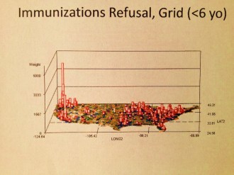
Because I worked so effectively in implementing a Performance Improvement Project on this topic in 2005, it seems only appropriate to begin with a review of childhood immunization as it relates to the implementation of a GIS for engaging in managed care quality improvement projects. The National map above demonstrates are very accurate rendering of the behaviors of people with regard to the immunizations programs in place. In terms of numbers, the west coast demonstrates much more non-compliance when it comes to parents allowing their young children to be immunized. There are two age groups analyzed for the preventive care activities related to immunizations–the HEDIS studies focused on children turning 2 years of age during the study year and those turning 5 years of age during the study year. The first is perhaps the most important of these two.
The above map is a representation of immunization refusals. There are two or three peaks on the west coast. The major peak is in Seattle, followed by a secondary peak in Portland, Or. The second largest peak, third peak overall, is in southern California. What these peaks indicate to us is not the numbers of children who fail to be immunized as a result of a HEDIS evaluation. What they portray is the distribution of non-compliant parents who have other personal beliefs, philosophies or agendas when it comes to this the engaging in this important preventive health program. Fortunately, the numbers of people engaged in this process are fairly small relative to the local populations as a whole. But these data tell us a few things we didn’t know before about the west coast population, as well as any other smaller peaks in numbers or prevalence (if an IP map is used instead) that are seen elsewhere in the country.
First, well localized education programs can be produced that are target these three peak regions. Second, surveillance programs can be put on alert for these urban settings, with the goal primarily of monitoring diseases that do tend to surface whenever immunization rates are down, such as mumps and pertussis, and small localized epidemics of dysentery or even measles. The resurgence of a small measles epidemic within the Seattle school system a number of years back was predictable based upon the above map. Parents concerned with polio may also be shown to be over-reactive, since a contemporary map of poliomyelitis outbreaks demonstrates a very localized regional pattern this disease has around the eastern half of the great lakes. Meanwhile, there are other diseases of a potentially infectious, but preventive nature can be reviewed as well in this way, with meningitis being one of the priorities when it comes to childhood disease management. Any insurance company, large teaching hospital, county health, or even state health department can implement a small area grid mapping GIS to engage in such a process.

Childhood URI claims is on the left, an immunized disease pattern such as mumps or rubella is on the right.
Example 2: Childhood Upper Respiratory Infection and Antibiotic Use
Childhood upper respiratory diseases are self-limited diseases that are not eliminated by antibiotic use. The overprescribing of antibiotics for URI cases increases the likelihood that an anti-biotic resistant strain of another disease might develop. For this reason, one of the standard HEDIS measures focuses on prescriptions of antibiotics written for children with URI. The higher the percentage of these prescriptions, the worse the performance. Applied to a standard point-line (classical vector GIS) or grid (raster or non-GIS) map, this data tells us where the improper care of URI is happening, such as low income community settings where standard unsupervised care is given to children (low activity rate HMOs, walk-in PPVs), versus CHIP (CHP) and Managed Care neighborhoods.
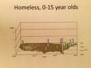
This same very specific, highly sensitive and selective way of monitoring childhood care can be used to monitor other neighborhood or community program based care patterns. HEDIS measures need not limit this surveillance technique. Examples of childcare related metrics that can be monitored for peak changes in behavior are as follows: child abuse of various forms, malnutrition, childhood injuries, fractures and dislocations, percent of children with at least one dental visit, all of the immunization metrics, well visits, lead toxicity testing, childhood psychology care administration, childhood poverty, homelessness, and lack of adequate living supplies or necessities.
In one such module I developed for this monitoring, the steps needed to develop a childcare monitoring system with automatic report generating potential required the following steps, with number of days required to develop the method:
-
define child care quality assurance metrics, including diagnostics coding, and design reporting format [1-2 weeks, add a month or two for department, Committee and/or Board approval]
-
evaluate data content and completeness (adequate enough to map or assign lat-longs to) [2-5 days, unless this has to be requested from outside source such as IT]
-
develop standard mappable dataset [1 Day or less]
-
apply mapping algorithm [1-3 days, assuming perfection is the goal]
- develop reporting method [3-5 days]
- retest, approve, and re-approve [10-15 business days]
- second committee/board review [next monthly meeting]
- preliminary testing [3-6 months]
- initial true implementation [can theoretically begin in 9-12 months, but initiate Jan. 1st or other date based on HEDIS eligibility and testing criteria]
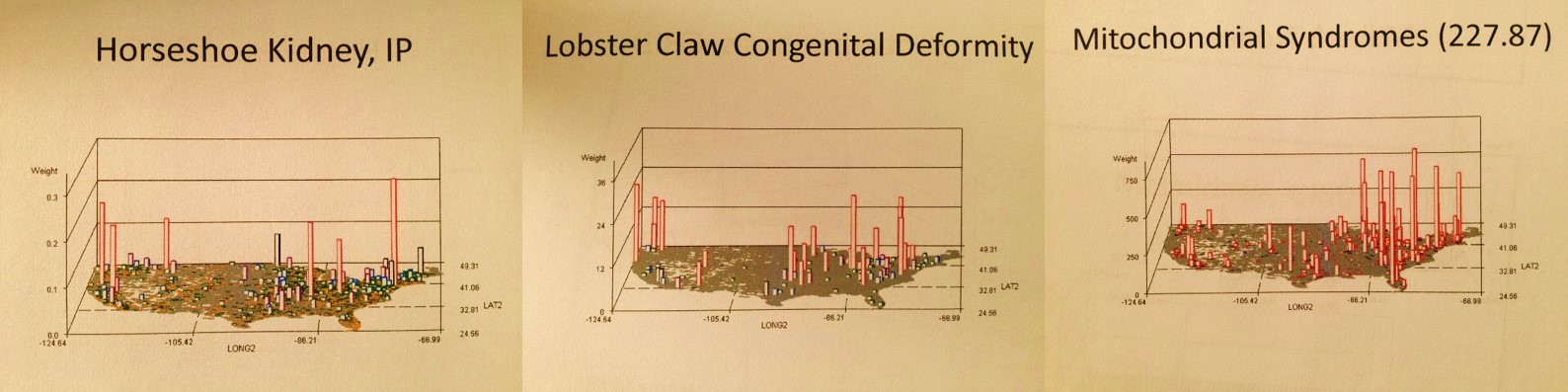
Example 3: Birth Defects, Childhood Chronic Disease Management and Quality of Life

The above (also covered earlier on this page, depicts a genetic disease with cultural history and attributes distinct to the region evaluated. It suggests opportunities for improved public health education in general, development of research protocols specific to this particular metabolic-genetic condition, and evaluations of quality of services provided to the social, cultural or economic group involved. The same process can be carried out as well for culturally-link and culturally-bound diseases as well.
One of the underrepresented topics of study in a standard HEDIS or quality of care review engaged in using the national standards pertains to birth related issues and quality of life for children. Some of the most basic examples of these important issues that are already under review include Autism and Attention Deficit Disorder. The first diagnosis in fact has a distribution of cases that extends well beyond the childhood years, as does the second, although to a lesser degree.
Important childhood chronic diseases with established programs relate to birth defects and early onset functional-anatomical diagnoses, potentially lifelong chronic diseases like epilepsy, palsy, and certain endocrine/metabolic conditions, and potentially deadly conditions such as heart, lung or major vessel defect and cancer treatment. Chronic diseases that begin with childhood can be monitored as their own unique entities. In fact, if a way to monitor immunizations and onset of infectious diseases in children has been developed, the amount of work required to rewrite this program to monitor another set of diagnoses, V-codes, E-codes with regard to service records and claims is minimal. In fact, several levels of monitoring can be developed, each with a greater complexity than the prior.
Well documented examples of similar studies involving culture and place, but not necessarily involving the very young populations include studies of schizophrenia in certain cultural, closely knit community settings like the Amish communities in Ohio and Pennsylvania. The same exists for Russian Jewish communities in the Catskills, specific Asian subgroups in specific parts of this country, and even Native American and indigenous Hispanic descent community settings.
Example 4: Outbreaks
Outbreaks are when diseases occur in greater than normal or unanticipated rates. Common community outbreaks may involve common infectious diseases, including those which are immunized against, those not normally immunized against but with a prevention for engaging in immunized based reduction in incidence rates (i.e. certain forms of encephalitis), local environment-ecology induced outbreaks due to zoonotic and azoonotic diseases, local environmental fungal or otherwise atmospheric induced diseases such as respiratory conditions brought on by allergens and hypersensitivity-inducing agents (spores, dust, chemical-induced), and population crowding induced diagnoses related to unsanitary living practices and/or unsanitary environmental settings (pollution, etc.).
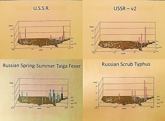
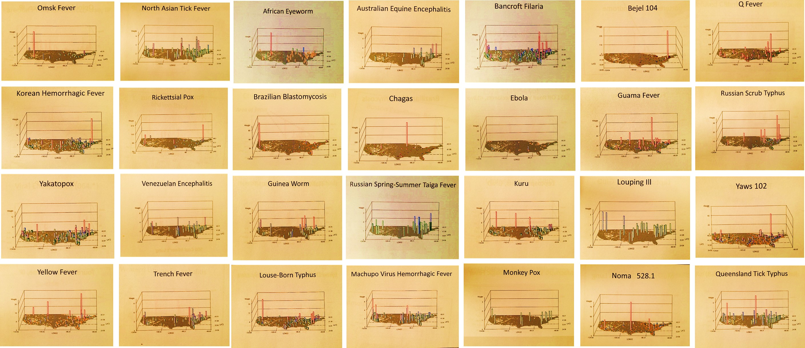
Distribution of Soviet Union-linked Zoonotic and/or Microbial Disease patterns. Several dozen zoonotic and viral diseases linked to Russian history, ecology, occupational patterns, economic trade activities, livestock importation, and people or families in-migration, to produce the above risks maps indicating where ICDs linked mostly to Russian resulted in cases in this country. The USSR map is the first pass on this focused mostly upon animal vectored zoonotic-anthroponotic diseases; the second pass USSR 2 reviewed an additional series of viral diseases and other non-axenotic diseases linked mostly to Russian ecology and place of origin. Disease can be divided into anthroponotic (A) (people-only methods of spread, relying upon population density), zoonotic-origins (Z) (animal origin and derivation, such as tick fevers, etc.), and combined A-Z origins.
Outbreaks are very geographical in nature. They can be people numbers or population density related, environmentally related, meteorologic or climatic related, human behavior and cultural related, and seasonal-place-ecology related. Examples of population induced outbreaks include childhood diseases, in particular for mumps, rubella, pertussis, and occasionally diphtheria. Environmentally-related diseases include household induced learning disabilities induced by lead, respiratory conditions induced by cockroach manifestations, increased heat stroke and heat-related deaths during a heat wave due to poor living conditions, childhood asthma induced by animal dander and urban setting pollen producers, household chemical poisoning cases, and accident induced injuries or deaths such as carbon monoxide poisoning, falling off a ladder or out of a window. Separate series of ICDs can be evaluated for each of these classes of measurements for population health.
.
.
With appropriate methods in place for classifying and subdividing these ICDs into groups, statistical evaluation methods can be developed to measure quality of life, indoor versus outdoor, for different neighborhoods, regions, cultural settings, using these environmental-population ecology metrics for monitoring, reporting on and planning more effective interventions against these conditions that help to drive up the cost of health care within certain communities. Instead of engaging in a single metric, one at a time, over a several day period for each metric, trying to predict where the problems exist, this basic GIS method can be used to solve these questions in much less time, automatically over dozens to hundred of indicator diagnoses evaluated for each population health metric the company or insurer/health care giver decides to monitor.
.
Example 5. Targeting Interventions
I just used a small area QOL (quality of life) approach to evaluating health care related needs for a given area. This method employs grid mapping technique and equations developed for this for use in scoring each area or grid cell for need of interventions, based on a frequency and severity score related series of metrics. Income, SES, age distributions, amount of unemployment, etc., can all be used to better define these area downs to the small cell or neighborhood-community health care level. Such a detailed focus is harder to achieve using the non grid metrics already in place, and is impossible to employ once your research areas extend to sized greater than a town or hamlet-village level. County health statistics are helpful, and perhaps for evaluating true prevalence and incidence rates are much more accurate due to the sizable n, but in terms of interventions planning they only provide us with information about what county to involve in more aggressive programs, requiring we determine where to begin this venture at the town, local hospital or schools level. The use of effective grid mapping to evaluate a region tells you more accurately which streets, small neighborhoods, farm settings, schools, hospital are most important to contact for the development of an intervention program targeting the specific high risk, high numbers populations or case clusters defined using this grid or small area polygon method.
The following are examples of well localized areas where large numbers of people prevail who are in turn causing the very well localized rises in diagnostics rates.
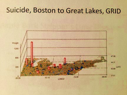
A great example of potential application. Chicago and Buffalo are high suicide cities according to the above map. The questions it poses are: a) what suicide prevention programs are running in these two places, not the mention the several other cities between them? b) Niagara Falls has a long history of association with suicide attempts. Does any program know which age range this is for?
[Answer: 55-64 year olds, with events occurring outside the immediate area adjacent to the falls instead of at the falls.]
These increases in diagnostic rates may be due to the biology of the people there, their physiology, pathology, genetics, environment, etc., or it may be due to reporting methods in place, local socioculturally defined behavior patterns, local business related statistical gathering processes (such as inept clinical practices elsewhere for whatever reason), or local overseer review patterns of behavior.
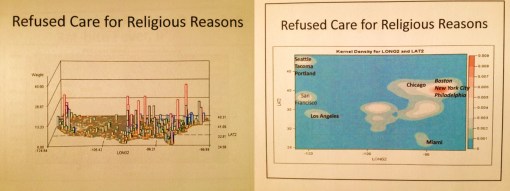
The important social questions the above map poses are as follows . . . How accomodating are the anti-street drug utilization programs to the needs of parents and expecting parents? Four major high risk areas are noted in the above map for towns, cities within the tested grid layout that have special need for such preventive health care programs. Chances are the agencies are unfamiliar with this special need they have. If you were a central big data surveillance/epidemiologist involved in national population health monitoring, how do you go about getting this information across to the proper authorities? Will any believe you or be willing to engage in intervention activities?
The above metrics for example tell me there are certain places in the US where poverty and culture related behaviors prevent the full implementation of health care. If these V-Codes are evaluated at the small area, we can see if this behavior is diffuse or localized for a given urban or high population density setting. Most importantly, this single metric is just one of unlimited social behavior practices or behaviors that can be monitored and evaluated routinely using the grid formulas developed for this study. A combination of this V-code map with local census data regarding race, ethnicity and religion could be used to define areas in need of better services, with services and preventive health education provided in the right languages.
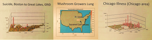
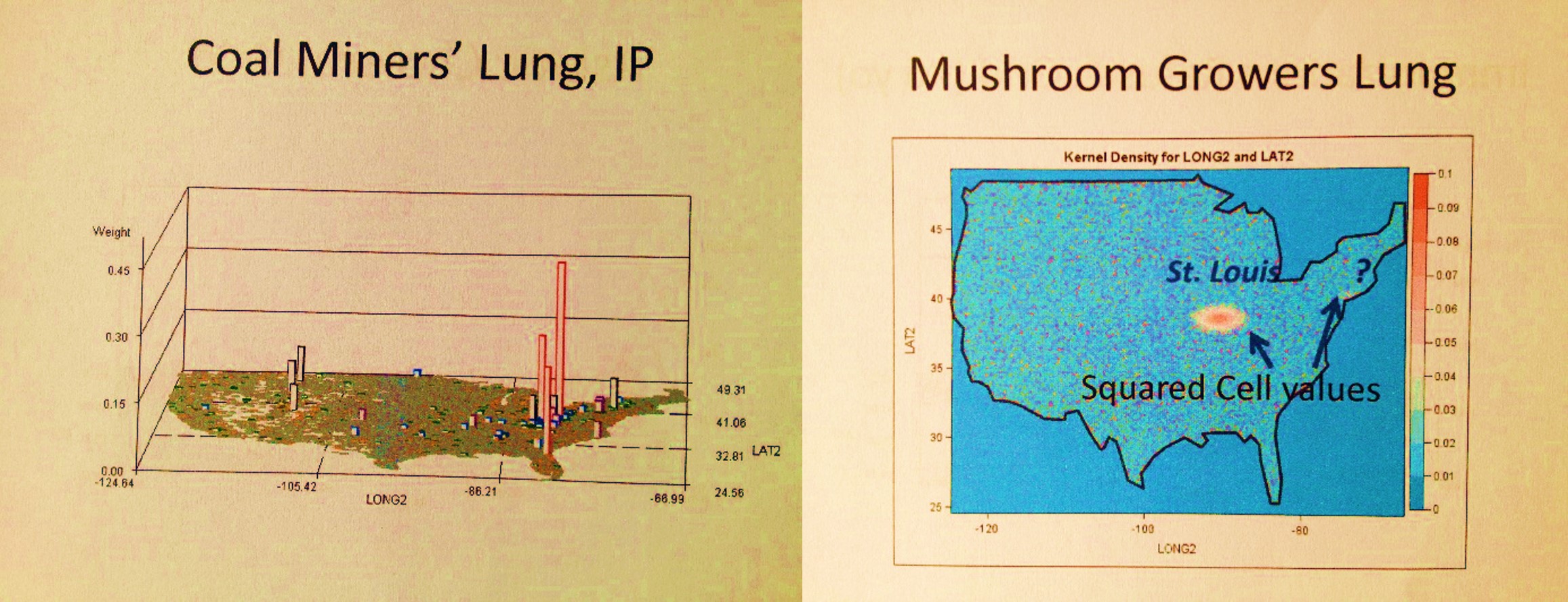
Specific regions with niduses unique to the setting, and the related quiz:
a) St. Louis is the Mushroom Growers Lung capital of the nation–For what possible reason(s)?
b) What exactly is the diagnoses known as Chicago Illness and why is it densest in the Chicago area?
Answers:
a) perhaps due to local growing industries of domestic mushrooms; but also likely because one of the largest Armillariella mellea colonies in the world grows in this region.
b) Leptosporidiosis, a fungal disease sensitive to winds, wind direction, climate, days of sun/clouds, high-low temperature extremes, population density, availability of growing surfaces, and means to store and periodically recirculate the spores.
.
Exposure to fibers (in particular asbestos) in the home setting.
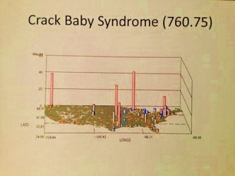
Other similar urban studies like this include: exposure to lead paint chips (lead exposure ICD), exposure to animal-vermin dander and childhood asthmatics, poor nutrition and SES, accidents such as fractures and ER visits, aggregated indicators of potential newborn child abuse (EMR entries for poor nutrition, parental drug abuse history, newborns crack syndrome, elbow dislocations, injury, fracture, battered child, shaken baby, abandonment, etc.), all of these by block or community.
.
Example 6: Occupational-Environmental Disease Patterns
Right now, occupational and environmental disease patterns are routinely performed for regions more as a secondary or tertiary health care level, with university hospitals engaged in the most complete of these kinds of population health evaluations. The primary, well-funded regional programs have an opportunity to expand their services and impacts by behaving much like a regional poison control center, monitoring specific environmental and ecologically linked diseases on a regular basis. About ten years ago, prototypes of this work were in place in regions like central Oregon, central to western New York, and upper Colorado. These facilities monitored public health related zoonotic and environmental disease patterns. Similar small scale programs exist for some large area farming communities, logging industry settings and mining regions.
Occupational/environmental disease monitoring program that include local natural versus human environmental settings, and locally specific forms of work linked to natural resources and climate, can be developed from environmental programs already in place in many county or regional health department settings. Combined local Big Data and GIS processes enable a public health department to monitor and map these ICDs regularly and report on them weekly, monthly, or via an alert process. Some of these methods are already in place. But the implementation of a grid mapping GIS will enable these procedures to expand into new horizons of disease monitoring and reporting. The ease at which the programs run mean that less sophisticated and costly software is required, and so even smaller areas with less financial support and infrastructure can engage in these epidemiological surveillance procedures.

QUESTIONS:
a) What other bird handler’s lung disease is common? Between this and the other, which is domestic in origin versus the other more likely warehouse in nature and origin? What wild variety of occupation-linked pulmonary disease does it most closely related to?
Answers: a) psittacosis, mostly from parrot and parakeet handlers; b) psittacosis is the more domestic of the two; c) guano handler’s lung (bat and marine birds) from coastal island communities.
This is especially important for certain agricultural settings and natural resource settings where nature is the source for much of the local income and highly important to the local economy. The numbers of infectious, zoonotic, microorganism related diseases, both indigenous as well as those foreign to this country, provide us with several dozen to about two hundred ICDs that need to be mapped and monitored. As illustrated in my way of merging common datasets together to produce a single map, we can use these maps to determine where high risk areas are, and where certain places become susceptible to diseases, even at what time of the year a specific livestock-born intestinal tract malady is about to become infectious and released for introduction into local human populations. In a somewhat controversial manner, these maps tell us where the barriers need to be improved to protect us from disease in-migration from other countries, and how to prevent interstate travel of locally expected diseases such as lyme, traditional plague, bovine plague, west nile and hanta virus.
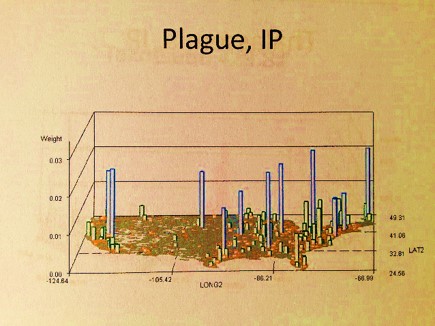
Q1: Where is “the plague” most often found today? In Rural versus Urban settings?
Q2: Which major HEDIS/NCQA population health metric is related to this disease ecology study the most?
A!: Domestic and Wild Rodent and Prairie Dog Settings. Rural settings=rangelands and occasional urban edges in the Midwest; urban settings=dwellings within low income communities.
A2: Asthma preventive care visits; with emphasis on the 5-17 and 18-25 year old populations.
.
——————————————————————–

Other pages related to this:
They cover:
- Culturally-bound syndromes
- Culturally-linked diseases
- Culturally-related diseases
- Culturally-specific or different (infectious and non-infectious) diseases

Leave a comment