
Asiatic cholera was by far the most important disease in disease mapping history. Its predecessor, yellow fever, set the stage for the use of maps in investigating disease patterns and migration. Two things had to happen for the use of maps for disease investigation had to take place. First there had to be a very solid theory developed detailing why maps will be productive. Maps serve to provide us with important insights into the environment and climate. If these features had little to do with disease, then a map of disease might not serve any additional purpose other than to document what might be otherwise considered common sense about the causes for disease. For example, if people were the only cause for disease, in particular the bad habits people had when living in crowded conditions such as improper disposal of human waste and the tendency to gather garbage and refuge in certain places, then a map might only tell us where these people were at their worse. But that in theory is already known if we keep track of people’s living habits and places. So a map had to provide us with something else to demonstrate its worth.
Maps added the environment to disease natural history studies. They provided a form of documentation for that theory for disease based on climate and weather. They gave researchers the view they needed to look for other possible relationships between disease, place and people. By using a map to study disease, researchers added that last element of nature that Hippocrates first posed about diseases and their causes–the value of understanding air (aere), water and place (loci) and their impacts on disease. With maps, physicians were able to add to their theorey about the miasma cause for diseases. The continued the age old environmental theory, which by the 1830s some physicians were trying to replace with the much newer, people-focused, zymotic disease theory (a sanitation-environment based theory, based mostly upon individual internal disease components and people’s behaviors, in the long run a precursor to the bacterial theory).
There was a bit of a division about the details on how maps and miasma would be conceptualized with disease mapping from about 1825 to 1850. By far the best to understand this concept were the inventors of the landschaft concept, the relationship land and its form and content have upon whatever exists in association with it. In some ways, we can look at landschaft as some sort of gestalt interpretation of place, as if places had minds of their own, and influenced us in many ways. This exact philosophical concept is what led the Prussian-German geographers of disease to study this part of medicine so intensely from about 1780 to 1815. The American version of this philosophy was fairly pint-blank and common sense, based on observations, and the development of new alternative philosophies for disease based on climate and environment, that served to replace the out of date theories left over from the colonial years. The Prussian-German setting did not have this pre-post Revolutionary War issue to contend with as much. Their philosophy was the consequence of an on-going philosophical, academic discussion going on, without war to break the lines of communication and logic being shared. For this reason, some of the most important medicinische-geographische to be published during this time, at least when it came to a landschaft-based theory, came from the German books, but appear in cleaner and sometimes simpler versions in the American literature.
Even though American physicians seemed to argue in the medical literature some evidence here and there for a part of the landschaft-environmental theory for the pathogen miasma, it was the German writings that provided us with the most complete, interactive version of this theory. These writers were able to integrate the miasma concept as it pertains to the stars, comets, earth and sun, to the miasma of the earth’s soil, or water bodies, or unique geological formations, or unique fauna and flora assemblage laid out for each given area on the earth’s surface. To these landschaft thinkers, we were perhaps still pastoral people for the most part, but we were also something very minimalist in purpose and importance when it came to the balance of the environment. This reductionist way of looking at nature, assigning less value to people in the wilderness, was a very non-American way of conceptualizing man’s role in the environment. Due to the demographic focus of sanitationists striving to clean up our living habits, we focused more on ourselves than the Germans did.
The only question that seemed to matter to the German interpretation of nature and disease, is did disease require man to exist and did it rely upon man to migrate about the earth’s surface, or was it a consequence of a place, that did not necessarily tag along with us wherever we moved to? The maps came to serve an important purpose in answering this question. The German cartographers were the first to provide a total earthwide gestaltic interpretation of disease on this planet. But they were soon followed by the reductionist Anglican scholars trying to produce similar maps, with a little more sensibility and readability in the English speaking and reading part of this world. We Americans learn more about these Anglican and early American disease mappers more than anybody else because the theory is posed to us in a way that we were raised to understand such relationships. The German gestaltic point of view was rarely a common part of the English point of view, even though the maps sometimes appear identical in certain parts of their content. The closest thing an American or western European cartographer does to may diseases in a very gestaltic, German way is seen when the American or English cartographer cannot understand much at all of the underlying cause for a given disease being mapped. American and English disease mappers even in the late 1800s still maintained that some disease had this miasmic tendency, and were distributed diffusely across the surface of the globe, whereas others had very specific, well-documented pinpoint causes for their origins. In this way, we see Felkin’s 1880s map being produced, with Scorbutus demonstrating a form spatial relationship along the edges of land, but a very obtuse, diffuse, theoretical spatial distribution once the sailors catch it while crossing the vast ocean surfaces. According to this interpretation, the disease can be both physical and miasmatic in nature, behaving differently when located over completely different surfaces of the planet earth.
Yellow Fever is the precursor to the theories for Cholera. But as yellow fever came to be one of those diseases with well definable wateredge boundaries defining its places of diffusion and eruption, cholera demonstrate some different behaviors, which were more easily relatable to ships and transportation patterns. This allowed for the next stage of advancements in medical cartography to take place. A linear route of diffusion was defined, that was no longer diffuse along its edges like the clouds drawn over the oceans depicting scorbutus were.
In terms of cartographic activity, the sequence of disease mapping events by disease type are Yellow Fever ca. 1797, probably followed by Typhoid and/or Intermittent Fevers (mostly what was later called malaria), and then Asiatic cholera. All of these conditions were then linked by many epidemiologists, medical cartographers and even political spokespersons to miasma–this effluence, gas or cloud of vapours linked to certain atmospheric conditions often linked as well to local topography, hydrologic features and certain human environmental settings such as areas close to latrines, ports and slaughterhouses, butcher shops and other beef processing centers.
This first stage in the development of this affinity towards actually mapping disease and its causes is very much linked to the military history of mapping, in which maps were produced to define the battlegrounds to be and make certain choices about where to form camps the night before and how to keep the troops as healthy as possible before and during battles. During the Napoleonic era, this philosophy was at its first peak in popularity. Still, no maps have been located to date depicting military sites or sites to be with swamps nearby and strategic notes about terrain and waterways. We know this to be the case however through common sense, the given that people take these features into account when strategizing for the next battle, and the fact that we do see more evidence for reevaluations of past events following a way, with maps produced that depict where the soldiers’ deaths occurred.
Following the production of the 1797 maps published in 1805 by Medical Repository, the next most important single event (epidemic or endemic) map we find is that of the “miasma” circulating through a certain part of London. Two things about this map make it very speculative, providing evidence to indicate that it was actually a most interesting example of a map used to depict a certain set of results needed to convince the people and government that important steps had to be taken to deal with the poor. This map has miasma, a very ubiquitous substance that lacks boundaries, and seems to be able to show itself anywhere and anytime it wants or needs to. The miasma was that ever-present cause that could be used by leaders to make the public believe whatever they wanted the public to believe in. Since it lacks definitive barriers as an airborne feature, assuming there are no obvious limiters of its flow such as winds and wind tunneling effects, or excessively tall landscape features like cliffs and rapidly rising mountain fronts, you could choose to interact the miasma with the terrain any way that you want. Terrain could guide the miasma into susceptible regions, or have no effect on this diffusion process at all. In the case of the map of miasma when it struck London in 1832, the land surface features that might even have effected its flow included some of the taller building of the city, a symbol of the rich considered to be responsible for the social inequality then existing in these parts of London.
It is interesting to watch as the maps change over the next five or six decades to see when and where the miasma begins to disappear from the maps used to predict disease. By the late 1880s, we see one of the last remaining maps with this mysterious airborne cause for disease distributed over a very large region of the earth’s surface–this appears in the scurvy map produced by Felkin. This was because the cause for scurvy had yet to be discovered. During the 1840s, cholera was between its two epidemic periods of of 1829 to 1834 and 1846 to 1853. Typhoid maps were being produce every now and then. Cartographers now had the time to think back on the previous yellow fever and early cholera epidemics and pandemic, enough to lead them to begin producing global and small area or local maps about the disease patterns. This would later lead individuals like John Snow to produce his famous cholera map of London concerning the Autumn 1848 event.
In the United States, this prepared the local physicians for their own need to develop a map of epidemic, migrating diseases. In 1849, when the epidemic came to Cincinnati, we can tell these physicians were seemingly already prepared for its arrival. The medical texts referred to the incumbent fate of Americans due to the anticipated arrival of cholera later that year or next, and so, as soon as the first signs of cholera struck this country in Autumn 1849, the first maps of its recurrence were made and almost immediately published soonafter, as early as April 1850 for Cincinnati. Prior to this second cholera pandemic of the mid-nineteenth century, much time was spent by medical topographers and climatologists documenting their observations on each of these natural history features in relation to disease patterns.
A lot of theories were published about how diseases may be caused by these natural features, and numerous gatherings took place professionally with the goal of trying to make sense of many of the different findings being published. In conflict with these natural based medical geography theories were the theories that place most of the blame solely upon people, population density, how cities were built and laid out, how human related sanitation features related to death and disease, and how the domestic home setting and human behaviors could be considered the cause for some diseases as well.
When the second cholera epidemic in India and Western Europe became pandemic in nature, the reason to map everything natural and human-related came to be. It was the result of this second cholera pandemic that we see the global mapping of diseases and large disease prone regions begin to become more locally focused and more defined, and now the reason for mapping smaller areas exists. The maps that came out due to this period of development in medical cartography include global disease maps like those of Muhry and Johnston, specific disease maps mostly focused on cholera activity, and timed series maps used to compare the same region from one date to the next, typically by year. Each of these reflected slight changes over the first map of this type popularized, that produced and published in 1848 by Berghaus.
Berghaus essentially took the map produced in the 1820s by German mapper Schnurrer and made this a completely visual object. Disease mapping was therefore perfected by 1860, just in time for a new theory for disease to take hold and replace the miasma theory so common throughout the literature. The observations made about disease and place from 1800 to 1850 enabled new theories to evolved that focused upon other natural features. The most population natural history related theories for disease were either focused on small living creatures referred to as animalcules, or to the acidity and alkalinity of the earth’s natural materials, in particular the geological features and their impact upon water. Disease cause transitioned from mostly climate and miasma related to a focus on water and the content of that water. Since water behavior on the earth’s surface depends upon such things as landforms, specific geological forms, the nature of the soil and its permeability, naturally some of the first topographic theories of disease were developed based on the absence or presence of limestone, karst topography, and the solubility and chemistry of known landform materials.
By the end of the 1860s, this had turned medical geography into a specialty focused on landforms and mineral-rock chemistry. Thus the first cancer maps related to earth’s chemical features were produced. Throughout the late 1850s and early 1860s, writings were published detailing the geographic behaviors of disease in relation to filth and sanitation. Even though this theory doses have some roots going far back in American medical geography history, it did not become the most popular theory until the 1860s, due to the newest theory developed and promoted by William Farr–the zymotic theory for disease, made popular in the 1840s, but not fully accepted by Royal physicians until 1857.
Zymosis turned medical cartography into a specialty focused on disease and people, disease and place. For this reason, the first contemporary style epidemiological maps were perfected, depicting people who were influenced by a disease, in relation to others with that disease condition and the migration of diffusion pattern for that disease being illustrated. The first primary mappers of this sort pretty much located around the world, but in the United States, John C. Peters, employed by the government, was this country’s first highly successful developer and promoted of this style of disease mapping. We see predecessors to Peters’ work also performed by the famous midwestern epidemiologist Daniel Drake and John Snow in some regards, although Snow employed streets in his map not to correlate people to each other, but rather to the contaminated water pump. Drake made a more generic use of his street maps.
.
CHOLERA MAPS
.
WORLD MAPS
.
1832. TANNER – CHOLERA EPIDEMIC MAP

.
1833. SCHNURRER. CONTINENTAL DISEASES MAP & CHOLERA MAPS
SCHNURRER
.
1848. HEINRICH BERGHAUS – WORLD DISEASES MAP & CHOLERA MIGRATION MAP

.
![]()
1856. ADOLPH MUHRY – WORLD CLIMATE AND DISEASES MAP

1856.
.
.
![]()
1856. ALEXANDER KEITH JOHNSTON – WORLD CLIMATE & DISEASES MAP
1856, 1862.
.
![]()
1873. JOHN C PETERS – WORLD CHOLERA MIGRATION MAP

1873.
.
.
![]()
1885. JOHN C PETERS – WORLD CHOLERA MIGRATION MAP

.
![]()
1885. ALFRED STILLE – WORLD CHOLERA MIGRATION MAP

.
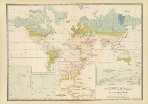
1889. ROBERT FELKIN – WORLD CHOLERA REGIONS MAP

.
![]()
HEMIGLOBAL
STOUTTETTEN – HEMISPHERIC CHOLERA MIGRATION MAP

![]()
.
.

Leave a comment