February 2014
Monthly Archive
February 22, 2014
Posted by Brian Altonen, MPH, MS under Uncategorized
Comments Off on Eden – About EDEN (Emerging Diseases in a changing European eNvironment) / Home
See on Scoop.it – Global Health Care
EDEN, Emerging Diseases in a Changing European Development
Brian Altonen‘s insight:
From Main Page:
EDEN (Emerging Diseases in a changing European eNvironment) is an Integrated Project of the European Commission that aims to identify and catalogue those European ecosystems and environmental conditions which can influence the spatial and temporal distribution and dynamics of human pathogenic agents. The project develops and co-coordinates a set of generic methods, tools and skills such as predictive models, early warning and monitoring tools which can be used by decision makers for risk assessment, decision support for intervention and public health policies.
EDEN integrates research in 48 leading institutes from 24 countries. The eco-geographical diversity of the project area covers all relevant European eco-systems from the polar circle in the North to the Mediterranean basin and its link with West Africa in the South, and from Portugal in the West to the Danube delta in the East. EDEN is organised into a series of vertical Sub-Projects linked together by a series of Integrative Activities that include biodiversity monitoring, environmental change detection, disease modelling, remote sensing and image interpretation, information and communication.
See the
EDEN project [1.53 MB]EDEN_DisseminationPlan_v04 071215 [151.92 kB]EDEN strategy document 07 [1.64 MB]Executive summary year 3 [3.63 MB]Executive summary year 1 [239.81 kB]
See on www.eden-fp6project.net
February 21, 2014
Posted by Brian Altonen, MPH, MS under Uncategorized
Comments Off on Are There Geographic “Hotspots” for Shaking Babies? Shaken Baby Syndrome.
See on Scoop.it – Episurveillance
The Medill Justice Project, in its now year-long effort to build a database of SBS cases, has published a portion of that data relating to the geographic occurrence of SBS . . . . http://www.medill.northwestern.edu/experience/bsj/exclusives/medill-justice-project.html
Brian Altonen‘s insight:
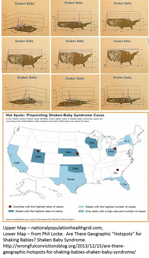
Phil Locke’s article "Are there geographic "hotspots" for shaking babies?" (http://wrongfulconvictionsblog.org/2013/12/15/are-there-geographic-hotspots-for-shaking-babies-shaken-baby-syndrome/) provides us with important insight into this growing national public health problem.
The above map in this figure is the nationalpopulationhealthgrid (NPHG) mapping technique developed for mapping any medical statistic or number down to the small area level. Beneath the NPHG map is the US map by states produced by Lauryn Schroeder of The Medill Justice Project at Northwestern University (http://www.medill.northwestern.edu/experience/bsj/exclusives/medill-justice-project.html).
NPHG allows us to identify small areas of high incidence for any medical diagnoses, episode or event. Exact locations within each of the states noted as high risk were reassessed down to the town/city level using this innovative mapping technique.
Important to note here is that NPHG displays its results in 3D, and can also be used to generate rotating videos of your results, impressive for any public speaking or upper level management presentation.
Minus the videos, NPHG can produce hundreds to thousands of maps per day, depending upon your study. The rotational 3D images used to make the videos could be produced at a rate of 15,000 to 20,000 (15-20 videos) per day. At this speed, we can now report on dozens to hundreds of metrics per week spatially, either locally or at the national level, and at any pre-determined subpopulation level (age, gender, SES, etc.).
There are no limits to the use for this spatial modeling tool.
See on wrongfulconvictionsblog.org
February 21, 2014
Posted by Brian Altonen, MPH, MS under Uncategorized
Comments Off on Are There Geographic “Hotspots” for Shaking Babies? Shaken Baby Syndrome.
See on Scoop.it – Episurveillance
The Medill Justice Project, in its now year-long effort to build a database of SBS cases, has published a portion of that data relating to the geographic occurrence of SBS. The report identifies s…
Brian Altonen‘s insight:
Phil Locke’s article "Are there geographic "hotspots" for shaking babies?" provides us with important insight into this growing national public health problem.
The above map in this figure is the nationalpopulationhealthgrid (NPHG) mapping technique developed for mapping any medical statistic or number down to the small area level, without the use of GIS. Beneath the NPHG map is the US map by states produced by Lauryn Schroeder of The Medill Justice Project at Northwestern University (http://www.medill.northwestern.edu/experience/bsj/exclusives/medill-justice-project.html).
NPHG allows us to identify small areas of high incidence for any medical diagnoses, episode or event. Exact locations within each of the states noted as high risk were reassessed down to the town/city level using this innovative mapping technique.
Important to note here is that NPHG displays its results in 3D, and can also be used to generate rotating videos of your results. Impressive for any public of upper level maangement presentation.
Minus the videos, NPHG can produce hundreds to thousands of maps per day, depending upon your study. The rotational 3D images used to make the videos were produced at a rate of 15,000 to 20,000 (15-20 videos) per day.
See on wrongfulconvictionsblog.org
February 19, 2014
Posted by Brian Altonen, MPH, MS under Uncategorized
Comments Off on Monitoring and Reporting on Cultural, Racial, Ethnic, Socioeconomic, and Special Needs Groups — i.e. the African American subpopulation
See on Scoop.it – National Population Health Grid
Brian Altonen‘s insight:
With an efficient disease mapping and surveillance program you can monitor the effectiveness of your health care system for the groups that are most needy, the socioeconomic and ethnic or race groups we usually pay less attention to than we’d like because we don’t have the manpower and time needed to evaluate all of our PIP and HEDIS measures for special needs populations.
With the best use of HIT and Big Data, you can routinely monitor each of these groups for hundreds of metrics that are specific to their areas of high risk. With the right system, we can easily produce annual and even quarterly reviews of topics like African American, Asian American, Hispanic, or Native American health needs, and/or monitor our low income, special needs populations and our highest risk chronic disease patients.
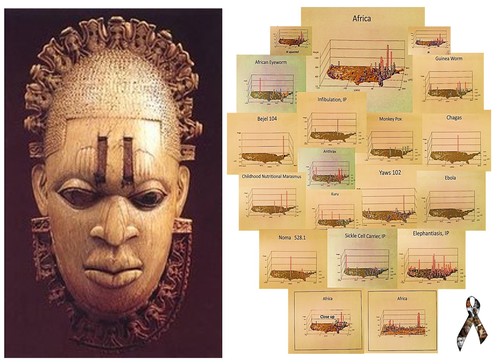
For example, more than 100 key indicators were identified for monitoring for the African American culture. They included diagnostics and V-code and E-code entries, and specific ongoing physical, cultural and mental health measures normally not focused on for this particular group.
A few examples of unmonitored diagnoses. and potential long term health or QOL risks faced by the African American patient population are demonstrated by the following short videos.
African Eyeworm — http://youtu.be/dSP6tOQs-RQ
Bejel — http://youtu.be/RI9Z0HXZFUg
Ebola — http://youtu.be/RfvUQfYLlvM
Crimean or Congo Fever — http://youtu.be/YWuMBOdB08k
Guinea Worm — http://youtu.be/YwSnpT7hAI8
Obscure African Cardiomyopathy — http://youtu.be/90XMDpr-fZ4
Kuru — http://youtu.be/x4VR1rf6C78
Elephantiasis — http://youtu.be/Uc6zvqutU3g
Elephantiasis, IP — http://youtu.be/-SS43bqFqvM
Sickle Cell Carrier — http://youtu.be/q7U9Z91ljRU
Yaws — http://youtu.be/SsMQNsxOkSE
February 17, 2014
Posted by Brian Altonen, MPH, MS under Uncategorized
Comments Off on How Pakistan’s polio strain could affect world health
See on Scoop.it – National Population Health Grid
Pakistan’s beleaguered battle to eradicate polio is threatening a global, multi-billion-dollar campaign to wipe out the disease worldwide.
Brian Altonen‘s insight:
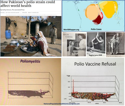
Immunizable infectious diseases are making their come back in certain parts of the world. Polio is the most recent example.
In the United States, there is a human behavior that results in two regions with the highest rates of failure to immunize children–the Pacific Northwest urban center and the tristate (NY-NJ-CT) metropolitan region. This is according to krigged population health density grid mapping data and the evaluation of claims data identified by the appropriate V-codes.
Each childhood immunization disease has its own unique spatial pattern. (see http://nationalpopulationhealthgrid.wordpress.com/applications/01-childhoodimmunization/ and http://nationalpopulationhealthgrid.wordpress.com/applications/3-sociocultural-disease-clusters/
Polio is unique in that is appears to present with a well defined ecological and topographic cluster in the Great Lakes region of the United States. This could be due mostly to more effective surveillance and reporting practices for this region clinically, or some combination of population density, climate, weather, transportation, and landuse feature(s) that favor poliovirus activity and disease transmission.
Poliovirus is considered mostly a human-dependent enterovirus, that normally does not engage in processes involving livestock and other animals (excluding primates). Therefore, a cause for this unique geographical pattern of the cases has yet to be determined.
See on www.denverpost.com
February 14, 2014
Posted by Brian Altonen, MPH, MS under Uncategorized
Comments Off on Population Density + Immunization Refusal = Potential Outbreak
See on Scoop.it – Episurveillance
Brian Altonen‘s insight:
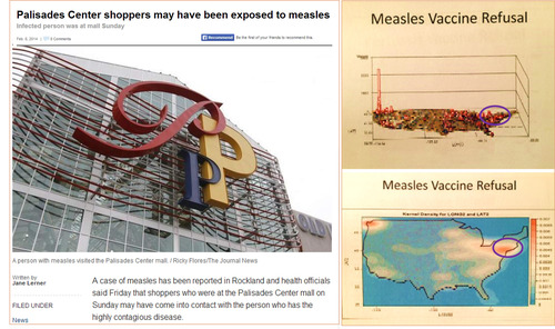
The recent exposure of a shopping mall to measles in Rockland, NY is a reminder of how important childhood immunization programs are and the need for ongoing surveillance of infectious disease patterns.
Three spatial behaviors define how outbreaks occur and the patterns by which they are likely to spread.
1) Population density is important to understanding these patterns due to likelihood of contact and the development of new victims.
2) Transportation and communication patterns define where people travel and aggregate, and the most likely routes to be taken by diseases or health problems imported from other locations.
3) In some cases, local land use patterns, and socioeconomics and human behavioral patterns help to define those parts of the country that are more susceptible to certain diagnoses and new cases than others.
The review of several immunizable diseases and their varying spatial patterns for outbreaks over the past decades, at the small area level, is at https://www.youtube.com/playlist?list=PLWrApErk5byY6emyCz0_ROOXw9FdsfCfY
A review of immunization refusal patterns in this country for childhood immunization programs is at https://www.youtube.com/watch?v=9TYCqtIg2Xs&list=PLWrApErk5byaJjbbjS6TEAAChZ7apmbzg
The Pacific Northwest, the nidus or nest for this behavior of refusing to immunize your child, is displayed spatially in detail and 3D at https://www.youtube.com/watch?v=YHH32Oq_obs&list=PLWrApErk5byaJjbbjS6TEAAChZ7apmbzg
According to the 2D krigged data map, the New York City region and urban settings in the Pacific Northwest are the epicenters for these outbreaks.
February 14, 2014
Posted by Brian Altonen, MPH, MS under Uncategorized
Comments Off on Chicago Illness, Dispersal Patterns – YouTube
See on Scoop.it – Medical GIS Guide

http://youtu.be/EXvvlNePtZs — 3D mapping rotational imagery mapping of theoretical ‘Chicago Illness’ Dispersal Patterns
Brian Altonen‘s insight:
Chicago Illness – A Lesson in Rotational 3D Epidemiological Mapping and Public Health Surveillance.
Why and how do diseases spread and migrate?
Now you can monitor this process, and determine if particular diagnoses, human behaviors, or other public health concerns diffuse or travel in all directions, or are hierarchical in nature, meaning they tend to travel the way people travel and strike heavily populated regions first and then the suburbs. Some diseases and behaviors such a poverty, abuse, poor nutrition, child care related issues, follow a reversed hierarchical pattern, impacting poorer households first and if and when infectious, later impacting the middle class and upper class communities.
Ideally, we can monitor population in this way with little effort using the highly effective NPHG methodology. This way of analyzing and visualizing population health has the potential of preventing disease, designing better intervention programs, and determining your highest risk communities for any intervention programs you might have in mind.
This is what the NPHG method for disease mapping was written for. It’s advantage is it is less expensive than buying into a GIS or new HIT system of any kind.
Whatever system you utilize for developing your EMR/HER data and HIT monitoring programs, this method can probably be used to perform the tasks at hand. If not, Open Source methods makes reaching this goal possible, in less than a year, at little or no cost.
See on www.youtube.com
February 4, 2014
Posted by Brian Altonen, MPH, MS under Uncategorized
[2] Comments
See on Scoop.it – National Population Health Grid
An 11-year-old boy is in the hospital after trying to commit suicide — the victim of bullying at school.
Brian Altonen‘s insight:
Childhood related community health related behaviors and statistics can now be monitored at high detail, locally as well as nationally using the NPHG method.
Relying upon national V-code, E-code and ICD datasets, I used NPHG to map out map a number of aggressive behaviors and various suicide behaviors by specific age group in under a day.
This way of mapping the national data takes less than 20 minutes in a teradata system per analysis, and can be used to produce 20 -40 videos/analyses or 15,000 to 30,000 images per day.
For a rotating 3D map of the US depicting childhood suicides, at extremely high resolution, see https://www.youtube.com/watch?v=K-8go3lLjDE
See on abclocal.go.com
