One of the commonly cited recent medical geographers is Gerald F. Pyle (for example of book, see http://books.google.com/books/about/Applied_medical_geography.html?id=AIY1AAAAIAAJ;http://userpages.umbc.edu/~earickso/Profiles/pyle.html ). The importance of Pyle’s work is his introduction of hierarchical diffusion process to the modern medical geography world. This wasn’t necessarily a new concept in the field of medicine, for a review of 19th century medical journals over the years indicate that physicians as early as 1832, due to the Asiatic cholera epidemic, were able to imagine such a perspective of the diffusion process. This is evidenced by Lewis Beck’s review of the first introduction of Asiatic cholera into the upper part of New York State via the St. Lawrence Seaway, with well defined temporal-spatial patterns that he noted related to city size. (The Historical Medical Geography section has Lewis Beck’s article for review.) Gerald Pyle however managed to demonstrate more clearly the application of understanding non-hierarchical radial or linear diffusion processes in comparison with the hierarchical diffusion process defined in his work, to which he then added a hybrid version of this diffusion process known as the “Mixed Model.” In my own work (my thesis) I added to this the “reversed hierarchical diffusion pattern”, a more post-modern take on Pyle’s theory and model, in which socioeconomics and social inequality are show to play a role in the diffusion of disease within densely populated regions (on my thesis page on Oregon Trail diseases), with certain diseases impacting the poor due to their population health features and local sanitation and and environmental health related features.
.

The inspirations Gerald Pyle experienced for his cholera disease maps probably came from his observations of Edmund Charles Wendt’s Treatise on Asiatic Cholera published in 1885. This work included a review of all findings available for the time for cholera, and provided some important summaries of the most important works in this field. Lewis Beck’s 1832 recount of cases very clearly delineates this process once these results are tabulated (see my page).
One of the most important geographic reviews of cholera during the 19th century was that of former homeopath, converted medical climatologist John C. Peters. John C. Peters left the field of homeopathy around 1862 due to ongoing political disputes between regular medical doctors like Peters who wanted to practice homeopathy as an adjunct and the members of the homeopathic field without MD training who were purists when it came to the practice of their form of medicine. For several years Peters voiced his opinions about this growing political problem in the these two fields. When he left the field of homeopathy he left behind his long history within this profession, being an editor of one of the national journals for homeopathy for a number of years in the 1840s, but like others converted from life as an amorous admirer of the field and its philosophy to one of its worst critics and political enemies in the medical field by the end of Peters’ career.
By the 1870s, Peter’s maps focused on the environment in such a way that no homeopath would ever consider exploring the origins of disease and defining their treatment. For homeopaths, medicine was practiced from the skin in for the most part. For Peters, everything about health and disease seemed to related to what was happening around the body from the skin out. Climate, weather and topography were the most important of these features. The only additional feature Peters’ and others climatology physicians took a close look at was human population behaviors and sanitation. No matter what the cause, Peters could come up with a map depicting disease travel and diffusion behaviors in such a way that could be either large area related or small area, very close knit neighborhood related studies.
Peters took the opportunity of working for the government in documenting the 1877 events involving cholera, obtaining as many maps as he could from others in the field and then using these and the results form his own studies of cholera epidemics to produce global maps of this disease. From these maps and from other readings Gerald Pyle engaged in regarding cholera, Pyle was able to produce his own temporal, behavioral maps about cholera activity. The basis for Pyle’s maps were the numbers of theories that already existed out there about transportation and the economy. He reviewed disease diffusion like it was the diffusion of a new product or an idea, trying to determine the reasons socially and physically for the paths that were taken. He used this thinking to develop the three means in which a disease is spread, the descriptions of which are found much later on this page.
With this page I hope to bring Pyle’s work into perspective with the disease mapping work of the past, and vice versa. The purpose here is to integrate two disciplines for disease separated by time, philosophy and history. Comparing Pyle’s views of disease with regard to space and time, in relationship to the 19th century views of disease mostly in terms of space, and then trying to consider the temporal feature along the way, should at least give us a broader understanding of the importance of Pyle’s models, even though at times they do appear somewhat simplistic.
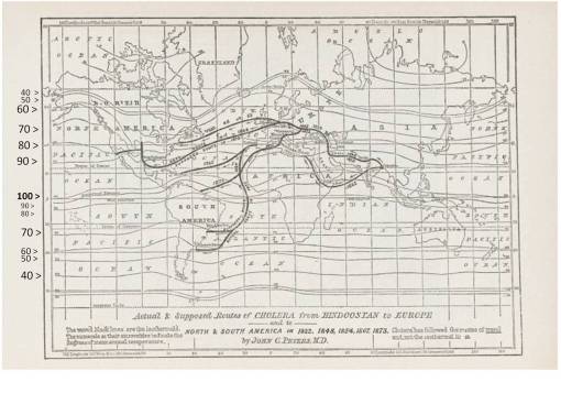
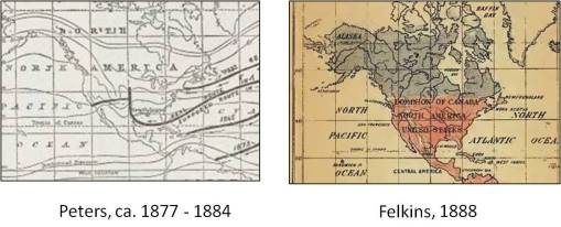
John C. Peter’s World Map of Cholera Migration, with Isotherms Labeled
Nineteenth Century Disease Mapping
John C. Peters’ maps were important additions to the late 19th century field of medical geography in that they helped display the natural ecology of the organism soon to be defined as the cause for this disease. At the time Peters produced his maps, the most common theory for a disease like cholera referred to it as a zymotic disease. This term, initiated by British epidemiologist William Farr as early as the 1840s did not become popular until the late 1850s after the spread of the second pandemic form of cholera around the world, and the third epidemic to go well beyond the natural endemic area near Bangladesh.
The zyme related to zymotic theory according to Farr was this theoretical name for a substance capable of diffusing or being spread from one person to the next. This diffusion process had to be more direct for the spread of some diseases, even requiring direct contact to be made such as for measles and small pox, referred to by Farr as their own distinct subclass of zymoses. These diseases also had the added feature of being preventible by vaccinations, a most important application for this theory. Diseases that could not be vaccinated against fit into the zymotic subclass in which cholera was placed. The disease was known to be diffusible by various means outside the body, and no vaccine could be easily produced for it like those of the other class.
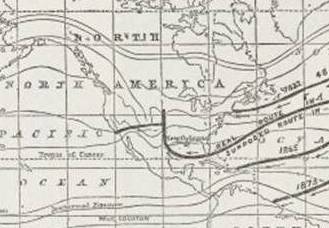
John C. Peters’ map with a focus on the U.S.
Zymoses made it possible for epidemiologists to qualify and categorize their findings so as to produce a sensible theory for various diseases based on these new observations. The most important of these observations were those of waterborne disease behaviors in association with water content and water quality, and still later water pH and water chemistry. Throughout the zymotic years we see lengthy reports being produced detailing the content of water. Such reports, usually produced for potable water, kept records of the sediment and debris in water, the microbes observed as best they could be described and classified, and numerous details about the water’s chemistry like it mineral content, temperature, transparency, sedimentation behaviors, and appearances on glass slides placed beneath more powerful microscopes.
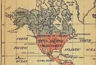
Felkin’s Cholera Map, a close up on the U.S., 1888
These observations took place throughout a time that clues to the bacteria theory for disease were already there. The germ and the virus were concepts already known, that could be mapped, and since the early 1800s, the idea of the worm, fungus, and animalcule can be found repeatedly in the medical literature whenever theories for disease were discussed. Perhaps one of the malingering beliefs from the past that kept the mapping of disease across large areas active as an epidemiological skill, was its remaining theoretical case of miasma.
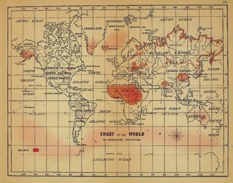
Felkin’s World Distribution Map of Scorbutus or Scurvy (notice the more solid colors on land with delineated edges, versus the diffuse nature of the “miasma” depicted over ocean water)
In my coverage of an 1888 set of disease maps by Robert William Felkin, we see evidence for this in the way the one remaining zymotic disease to which no zyme is yet defined, scorbutus, exhibits both the very strong topographical features of the shorelines in its distribution, whereas at sea it remains in this less defined mythical form, appearing like gas or humidity or some minute invisible pathogen, like a virus or poison traversing the ocean at large, always there for new victims to inhale or make contact with, and thereby develop a disease from. In the northern hemisphere such an association was made famous by the tales of sealhunters and whalers during the 1800s, who’d catch scurvy, become fatigued and head to shore, and then eat one or more of the local shoreline plants due to lack of food supply, and miraculously regain their sanity and be cured of scurvy. Felkin’s map hints back to these legends.
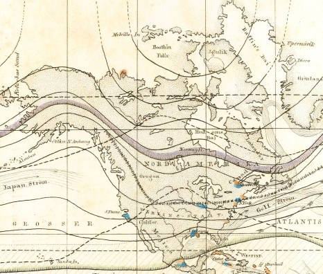
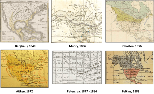
Adolph Muhry’s World Disease Geography, Close up on the U.S., 1856. Yellow fever and cholera stricken spots are displayed. Muhry’s map suggests he was more focused on specific places depicted as points in relation to climate and weather. This is an early way of defining the hierarchical diffusion process; certain high population settings relative to climate are related to the primary causes. This point-mapping eludes to the early 19th century people and sanitation interpretation of disease. The other method of disease mapping assigns blame to areas rather than people; Felkin and others define people as being secondary to the principle cause in many cases.
(see page devoted to this map for more)
The purpose of disease maps is to document how and where, and sometimes when specific natural features were important to the progression of the disease in endemic or epidemic fashion, and what human population features were required for an epidemic to erupt from certain diseases. In the decade immediately following the printing of Wendt’s book and John C. Peter’s maps, the focus on disease shifted to microbial life and the bacterial theory. Both miasma and the zyme were no more. The viral, germ, fungal and animalcule theories for disease popular on and off throughout the 19th century took on a new form as the bacterium was better understood. The relationship of microscopic bacteria to people and animals as well as food and water became the popular substitute for the previous theories for disease popular. The traditional medical topography and medical climatology teachings were reduced in importance relative to microbial work, and never fully recovered their importance to disease theory in a manner like that for the century prior.
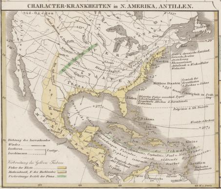
Berghaus’ World Disease Map, with focus on U.S., notice Yellow Fever is emphasized. Berghaus merged the yellow fever with the famous Matzahuatl that struck primarily the highlands. A separate, more hemorrhagic fever epidemic of Aztec history, Cocohuatl, was not yet distinguished from others and therefore not clearly mapped.
In retrospect, we can now look at these past theories for disease prior to the bacterial theory and begin to make better use of this information through spatial or geographical reasoning, which is exactly what Pyle is trying to do with his maps. Pyle’s maps [this page] are like large area maps, with diffusion processes inferred or eluded to by arrows, and points used to help generate these hypotheses. The points indicate date and ranking of place, allowing for an analysis of order and the diffusion process to be performed. The purpose of this mapping is made clear by Pyle by hierarchical and non-hierarchical diffusion processes he defines. His maps differ from those classic to mid to late 19th century medical cartographers like Adolph Muhry, Heinrich Berghaus, or Alexander Keith Johnston. But they also differ from the nature of some of the last disease place maps like that produced by late 19th century writer William Aitken.
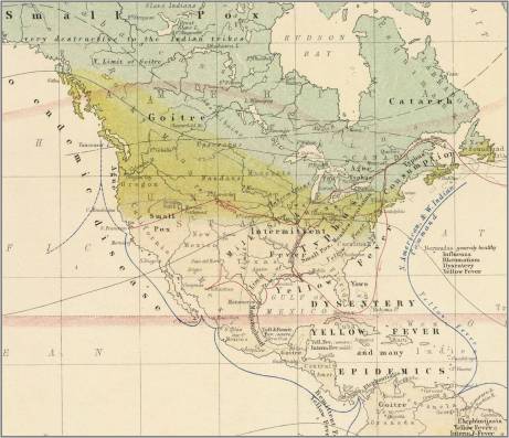
Alexander Keith Johnston’s Disease Map of the U.S. area, 1856/62 [Link]
The best demonstration of this value of the disease map as the old timers see it is demonstrated by Johnston’s map of yellow fever in the United States, which defines the diffusion pattern for a regions close to major ocean edges, along very heavily travelled riverways. Without knowing the bacterial cause for disease, and with zymosis a very young theory when Johnston produced his map, we are left speculating about the environmental and meteorological causes more than the population and sanitation cause for this disease. This map directs us towards a large area depicting where the epidemics prevailed, leading us to naturally turn to thoughts that nature is the cause, with its complex miasma-ridden small areas due to their ecology and topography.
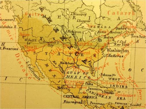
William Aitken’s Disease Map of U.S. area, 1872 [Link]
Johnston’s map missed all of those hints that yellow fever might have prevailed had the ships carrying these barrels and ballast made their way to inner cities. His map was large area not small area, and no diffusion processes are delineated, just the areas resulting from these diffusions. This was even more true for the earlier map produced by Muhry. Berghaus’s map appears comparable to that of Johnston. With the much later map by Aitken, we see more detail, more area specificity, but still no flow or diffusion delineation.
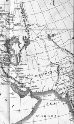
Scouttetten’s 1831 Cholera Diffusion Map (he mapped only Eurasia), Military Route through Ural Mts [Link]
Hints of the population theory and cause for epidemic spread of disease are found on Scouttetten’s map of cholera for 1832 to 1834 diffusion patterns. Scouttetten provides us with a map contradicting Johnston’s proposition of certain areal features as the cause for cholera. Drawn 24 years before Johnston’s map, Scouttetten’s map shows us that elevation related climate patterns are not the barrier to disease diffusion like the topography-climate-latitudinal theories for this disease suggest. Scouttetten’s map is more like the concepts being shown to us by Pyle. We can relate Scouttetten’s map information with the theories suggest by Pyle, and define the different types of diffusion processes, and see where linear and radial diffusion occurs and where hierarchical (esp. with many lines to one spot) diffusion is probably occurring.
.
Spatio-Temporal Relationships
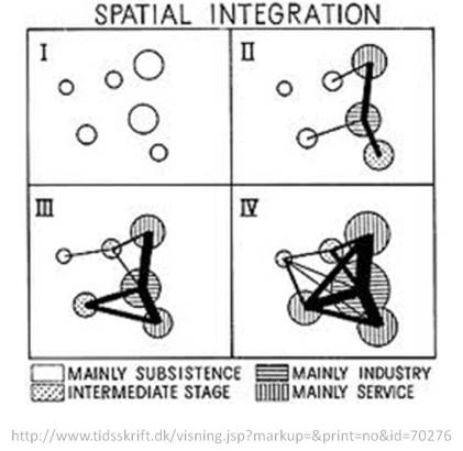
The following drawing depicting four periods of transportation can be related as well to disease diffusion patterns as well.
.
Pyle’s work made use of economic and transportation to help develop his disease diffusion theory.
The above illustrations depicting four generations of transportation types can also be related to types of epidemic spread patterns.
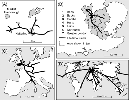
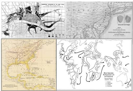
The following maps can be related to the above or Pyles models. They depict the Plague ca. 1600-1700 (upper left), the distribution of yellow fever by diffusion and transportation (lower left) 1800-1825, the animal born Bovine Tuberculosis or Consumption c1855-1883 (upper right), and the global diffusion of the second wave of the 1918 influenza epidemic (lower right).
Transportation Geography and Disease
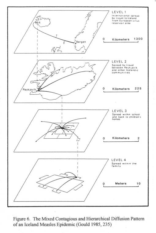
The following way to visualize or model data flow also help us with determine the time and behavior patterns of a disease asiatic cholera. Since the disease has to flow, the first method depicted does not relate to cholera; it implies isolated communities with isolated epidemics or endemics. The second pattern is required for a diseae like cholear to develop; the necessary parts are the possible ranking of places or definition of hierarchies, telling us where the disease could first come in. The third and fourth patterns represent a maturation of the previous behavior, and could relate to progress in an area’s local economy and development occuring over time.
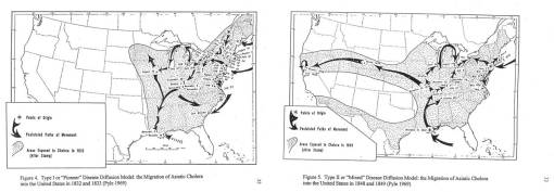
So, if we look at time as a sequential behavior rather than as a purely continuous temporal behavior, meaning there are distinct periods when no events are occuring, allowing for a new outbreak to commence with diseases, we can see that diffusion is improved over time, progressing more quickly with each new generation of the disease. Pyle made reference to this phenomenon using some of the older ideology available about sequent occupance–terming the first phase or stage of migration as Pioneer. This was purely a diffusion type of behavior and mimicked much of the behavior noted for the epidemic that preceded Asiatic Cholera–Yellow Fever. The second stage in this process of growth was termed a mixed diffusion pattern, in which patterns resembling those of a pure diffusion process existed along with patterns brought about by human transportation features–a hierarchical diffusion process, or to devoted Pyle followers and purists–Type III.
The first four above are world disease maps; cholera is displayed as migration routes in each rather than as an area. Peters’ map depicst cholera migration. Felkin’s map depicts a cholera prone region.
Pyle’s Maps
Type I and Type II Mixed
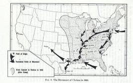
Type III (?)
When we compare the earlier mapmaker’s products with Pyle’s maps, it helps to first note that Pyle’s map depicts a migration pattern, which is found on each of the first four maps above but much less obvious. (See other pages devoted to each of them for more details; the map drawers had slight differences in interpretation, not worth going into right now.) But Pyle adds a temporal component, but then makes use of arrows for flow. On one of the maps detailed by Peters, this data is available for the Mississippi River valley and Great Plains region. Pyle’s philosophy was related to this map, with some logic changed slightly, and a final step added in the end once it became clear what the final map was telling me.
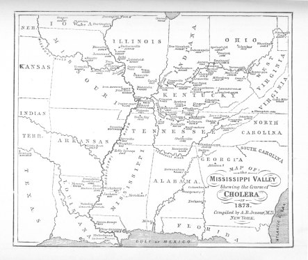
A. B. Judson’s map, found in Peters’/Wendt’s A Treatise on the Asiatic Cholera [Link]
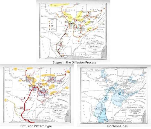
As noted on the other page in detail, since Judson’s map provides us with dates for given places, we can take advantage of these and produce a very different map that reveals even more aboutthe disease behavior. To acomplish this, I went through a number of analyses of this map in order to draw some time related conclusions regarding disease flow, briefly summarized as follows.
Essentially what I did was duplicated Pyle’s logic, reviewing flow/time patterns basing this on some guesswork about the primary water transportation routes (pyle had his transportation going east to west, my routes ascend the Mississippi River Valley, thereby reversing some of Pyle’s patterns, but not at all his logic regarding transportation behaviors.
What I like to call Pyle’s areas were then defined, with diffusion patterns and disease clusters counts, shape and form used to define these areas, which are identified with Roman numerals to depict hierarchy and sequence. Another way to possibly interpret these areas is to consider:
- ‘I’ a primary transportation route, resulting in hierarchical flow, between big cities; this is followed by
- ‘II’, which is a branch off of this primary route; it displays mixed diffusion behaviors, and then
- ‘III’, a completely rural, random radial diffusion process.
The above was then used to produce a much more understandable map of the disease behavior based on isochron lines, each line depicts a one-month passage of time. (Note, all of this was done by hand, not GIS.) Notice the dark to light color depiction of this. (Unfortunately the lightest area (III) outer boundary is a dotted line and hard to see on these reduced versions, go to the other page to view these sections in greater detail.) The nidus (nest) for this disease is Louisiana’s New Orleans (there is a point there for February but it hard to see). This nidus is followed by its nearby urban and suburban settings and several secondary centers or niduses located to the north along the major rivers (also dark blue, small and perhaps subjectively drawn polygons). The lightest areas are distant suburban to rural regions (we can related these as well to Sequent Occupancy, converting the original temporal version of this into a more modern socioeconomic/regional economics interpretation, with area I=Cities/UrbanCenters~Stages 4 [tech] and/or 5 [post-modern], area II as Stage 3 [manufacturing and the like] mostly, and the backwoods to countryside with scarce cases as Stages 1 [hinterlands, woodlands] and 2 [early domestication, homesteading]. All of this is covered elsewhere on this blog.
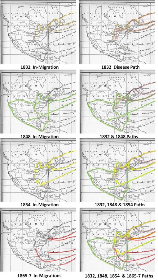
One other way to look at these diffusion paths and human behavior is to look at the changes over time and economic development as well, for example comparing the behavior of the first pandemic to hit this country with the second and then the third, etc. , as follows. Dominant points of entry and dominant paths of travel can be defined withthis technique, the results of which by the way are much more impressive when a GIS is used instead.
With the above disease diffusion mapping exercises, a number of different trains of thought were pulled together to see if ‘anything new pops up’, to put it lightly. Pyle’s review of disease migration takes into account the specialties known as human geography, population geography, environmental geography and and transportation geography. Relating Pyle’s work to past maps adds value to historical disease map research and analysis and provides us with insights into how to make new pattern recognition with the more recent and current mapping techniques and outputs. The past mapping provides us with examples of what happens in history as diseases migrate. This information enables us to be more accurate interpreters of our own maps placed before us on the computer screen. Most importantly, temporal and spatial behaviors tend to correlate, and we can see this again from historical mapping.
Pyle’s work to me is kind of that essential last step one has to take in an analysis of a disease’s behavior. The historical maps give us a static perspective in some cases and clues to any recurring behavioral patterns for others; however, they are not always accurate. The addition of area definition (I, II, III; or Type I, Mixed, Type II) is also an important step in this analysis. By adding the isolines step to Pyle’s method of evaluation we get very helpful insights into the possible lessons these maps provide. Such as the purpose for this project, not more than 3 years into the making.
.
..
Leave a comment