
A theoretical 52 x 63 Grid Map of the contiguous US, presented using map images, with cells represented by each map measuring approximately 30 mile n-s x 40 mile e-w.
(examples shown below and elsewhere are mapped using a 20×20 or 25×25 mile grid cell area; the illustration above uses a sampling of my 3D maps to depict the theoretical grid)
Also: see my SISTER SITE, developed May 2013 to promote this method. It is a standalone that is easier to read and to navigate. LINK
A lesson for the 2000 students/month who visit:
“Long story short:
Corporate strategists need to get out of their 20th century mindset and into the 21st century.”
Prabhakar Gopalan’s Why corporate strategy needs to change with the cloud. Posted January 1, 2013. [*LINK*]
.
See my PINTEREST folder devoted to this for more
.
![]()
A Logo for the NPHG Program and Project
Introduction
Right now it is possible to know the health of the United States down to the small area level. This process, being heavily promoted in the business world, is typically referred to as “visualization”. The visualization of outcomes is a new concept to businesses. Visualization is a right hemisphere skill and the ability to interpret visual data a right hemispheric approach to interpreting data. The advantage to visualizing and interpreting data is that one visual object provides us with as much information as 300 pages of data developed using solely the left hemispheric approach. Those with the proper skills can digest and decide what to do based on such data much faster than traditional data analysts, by two magnitudes in fact in terms of speed and progress. Unfortunately, the traditional corporate setting for the past several decades has veered away from too much use of visualization technique to learn about business and people. This places any businesses focused too much on the traditional left hemispheric approach to data seriously behind in today’s market place. The best way to interpret and analyze spatial information, or any information pertaining three or more dimensional relationships (not necessarily aerial), is for business requirements to include the development of corporate knowledge, and methods for obtaining success in these matters using the right approached to analyzing BI data.
BI Visualization right now focuses mostly on just multi-dimensional data analyses in search for clustering of results, relying upon such modeling tools as hadoop, Cognos or Tableau. But the use of these alone does not constitute true spatial analysis, just 3D analysis. It takes us one step closer to an answer, but does little to tell us where to being implementing changes or interventions. 3D spatial modeling tells you where the greatest need for interventions exist, and where to best spend you money. By taken a 3D BI model of data and applying it to the spatial realm, you end up with a 4 dimensional approach to making the best use of you information. From that point on, each parameter, metric, co-factor, or other qualitative or quantitative feature that you add to your analysis, the more consider your outcomes are. Ideally, by using an n-dimensional interpretation of an event, and then applying that n-dimensional outcome to place and time, you have expanded the value and potential use of your work to the n-2th power. Currently, big businesses have not reach that ‘n-2th power’ state of being. BI analysis is still mostly two dimensional in nature–the most important information is still rarely mapped.
Applying these concepts and the need for change to public health statistics, one can argue that disease, medicine, and the cost of health care are in need of a similar overhaul. Major government groups have successfully produced 3D visualizations of health information, spatially, well beyond the level at which businesses have been able to implement similar projects. Right now, with these Federal, NIH, CDC, US Census, etc. data you can produce maps that provide us with a good understanding of how health and disease behave in the United States, in enough detail to impact how businesses can improve upon their cost and expense related behaviors. Yet such is rarely the case, although attempts are probably now being made to implement these kinds of improvement at the industry level.
![]()
The main logo
In general, there are a number of flat plane modeling techniques for disease mapping and presentation. The 3D modeling of that same information adds several new insights into what can be done to better understand disease patterns and peoples’ health behaviors, which is why I developed the method being presented here. With 3D mapping, we see the results already provided by standard 2D methods, but with that added information needed to know exactly where to begin our intervention or disease prevention process. Standard 2D methods tell us where we can initiate such tasks, but not with the precision that 3D modeling provides at the small to large area level.
The technology, formulas, algorithms, and methodology needed to produce these 3D maps are already out there. Sonoma College and Yale are the two best examples of this. Sonoma developed their method in 1997 for mapping crime statistics. The GEcon group at Yale developed it to map global economics.
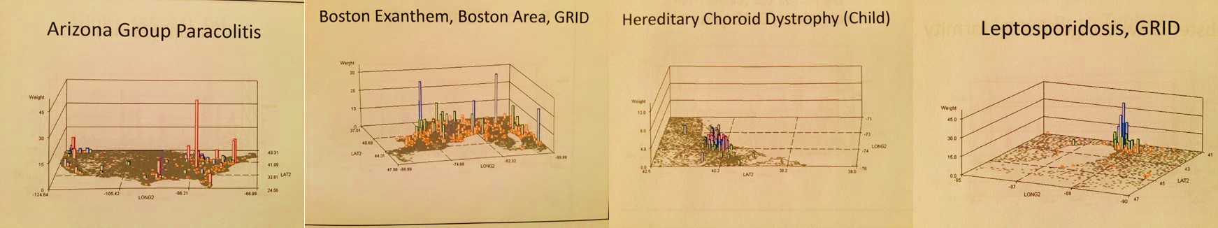
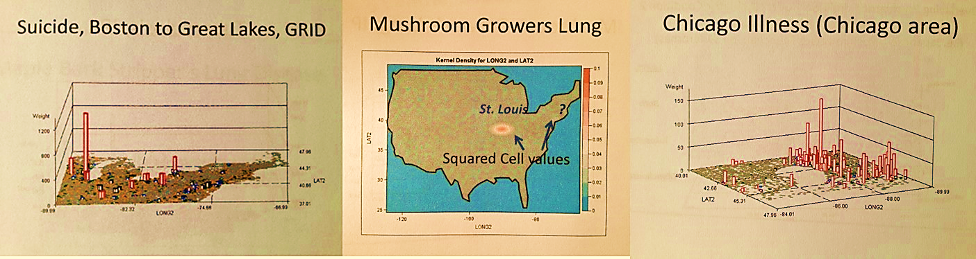
I developed my method in order to map diseases, down to the small area level. The smallest area mappable using this method is in theory not defineable, but there are certain sized areas that seem to work best based on population distributions, using the standard spatial statistical logic out there for defining your best areal patterns (see my page on this). The maps presented here are for the most part producing using a standard 25mi x 25mi area grid. Although presented mostly by mapping N, prevalence, cost, and on occasion unhealthy behaviors, this method can be applied to anything and everything that can be mapped qualitatively or quantitatively, for examples:
- cost-benefit analysis,
- risk relationships,
- amount of non-compliance relative to regional income status,
- amount of abuse and reported rapes in relation to poverty,
- the statistics of fraud with prescription drugs in relation to areal crime rates,
- the places and kinds of terrorists that are out there relative to school grades or college enrollment,
- age and ethnicity relative to specific culturally-born consumer goods purchased,
- whether or not we see our regular doctor or our cultural physician to remain healthy,
- the amount of money wasted on people matched by a lack of funding where it is needed elsewhere,
- the numbers of catastrophic events that occur financially for a region such as tsunamis, floods, fires, accidents,
- the places where the most organs used for replacement are obtained due to accident rates,
- the places where ample elderly care exists in one section of town but little to none exists just five miles away where it is needed ten times more.
The companies with the potential to engage in such mapping of Big Data in the near future, with the assistance of Teradata, alteryx, mongoDB, Cloudera, Saleforce, Apache, Hadoop, ParAccel, Sybase, SAP, AgilOne, BloomReach, Cassandra, Mahout, to name a few. A major barrier to mapping disease using the national grid format is inability of companies with this data to have the skillset needed to develop this as a routine part of the everyday process. A standard report consisting of hundreds to thousands of maps of disease distributions, costs, adherence rates, etc., can be produced in one to three days for the dataset available, meaning these reports can be generated on a monthly and perhaps weekly basis. A slow process for producing such information can produce a minimum of 10,000 map illustrations per year, with half of this process driven manually. This means that in theory it is not unrealistic for me to think that at least 50,000 such geographic reports can be generated for diseases per year automatically, and probably 100,000, spread about 1000-2000 ICDs meaning that everything can be mapped and reported on each year.
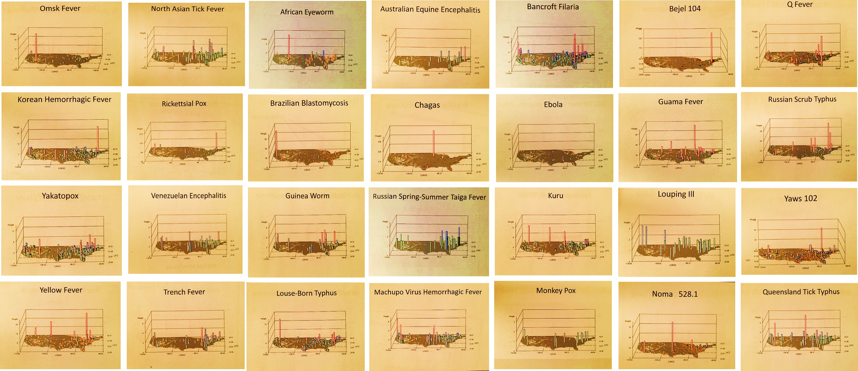
I have mapped all of these kinds of public health concerns or issues using this technique I developed for mathematical grid mapping that allows me to study any size area I want, over any size large area I want.
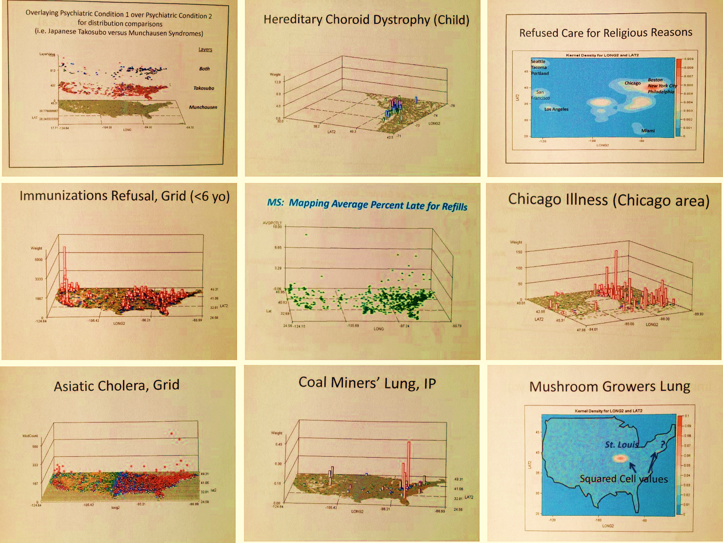
In most cases being demonstrated, I applied this to the continuous or contiguous parts of the United States, but I have also applied it to sections of the U.S., and even to small areas of the U.S. such as just a state, or a set of counties around the Great Lakes, or a small section of a single county where an abnormally high amount of birth defects were noted using this technique. This technique answers questions like:
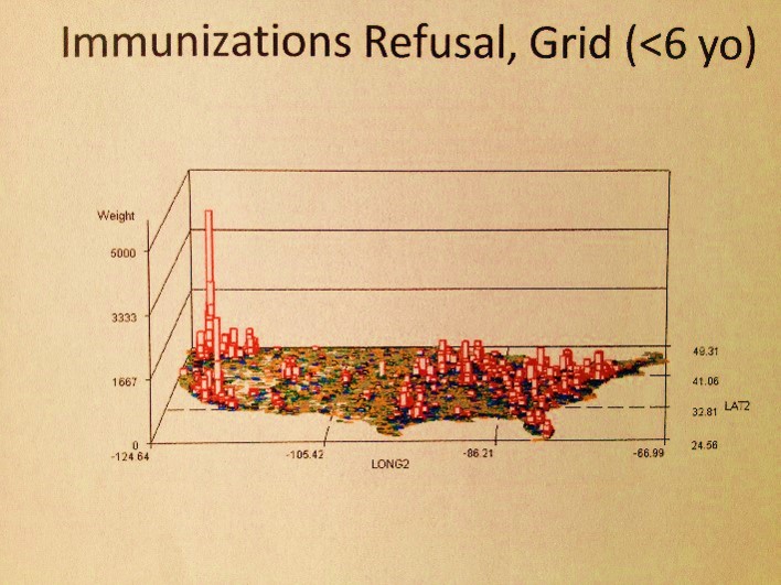
- ‘where is the worst part of this country to raise a child because too many parents are refusing to have their children immunized?’
- ‘where in this country do the healthiest people of young to middle age survive, those people most likely to not involve themselves with the new health plan in the works for 2013 to 2014, and most likely to be willing to pay a penalty for this lack of engagement?’
- ‘at what age in children do the least number of visits with a doctor happen?’
- ‘where does the greatest amount of peer violence linked to guns used by children occur?’
- ‘where is it that elderly people are most likely to be documented as being abused?’
- ‘which common human behavior and unhealthy habit displays such an imbalance in men versus women in terms of age that these condition require a 20 year difference in terms of when interventions need to take place?’
- ‘what is the peak age of fibromyalgia in women versus men, and why does this 15 to 20 year difference exist, with women 4 to 8 times more likely to be diagnosed?’
- ‘for what age group and what place is it most likely for there to be a larger need for liver replacement?’, ‘for lungs?’
- ‘which sexual organ infectious disease produces 5 times more likelihood of need for care in girls under 15 years of age than Chlamydia or any of the ordinary STDs that we normally think about?’
- ‘where are the youngest pregnancies (14-15 yo) taking place in this country?’
- ‘what are the peak towns or cities where battered child syndrome and shaken baby syndrome occur?’
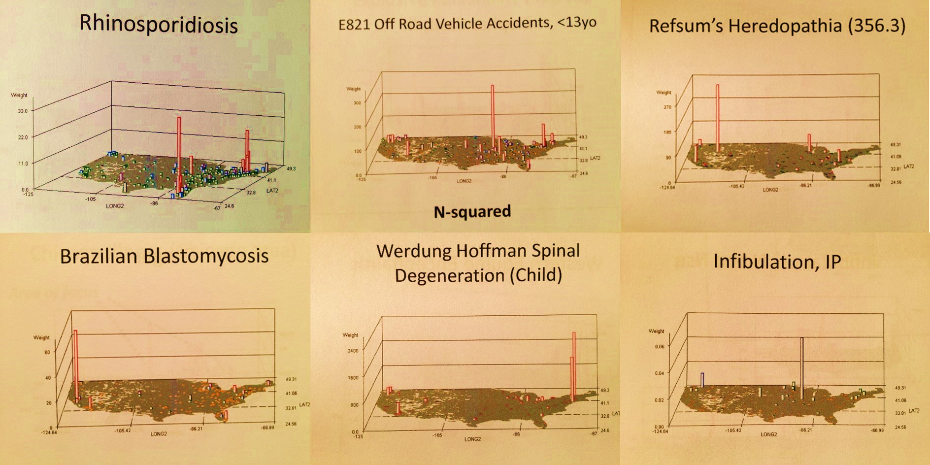
- ‘where are the largest number of childhood related ATV accidents occurring?’, ‘the most pedestrian accidents of children under 5?’
- ‘where should the most concern be expressed about malnutrition in children due to a high number of beri beri diagnoses or malnutrition induced visual disturbances?’
- ‘which extremely low elevation cities have the greatest reports filed for high altitude sickness’?’, ‘what are these reports due to?’
- ‘what single town in this country illustrates how fungal spores inhalation can cause the greatest amount of cases of pulmonary hypersensitivity induced per square mile?’
- ‘which California setting has the greatest bagassosis peak? (an occupational, respiratory lung disease due to grain products)’
- ‘where does the rare Yucatan disease ‘chiclero’s ulcer” come into this country and where is it peaking so far away from this place of entry and why?’
- ‘where are the bioterrorists living who want to infect big cities?’, ‘what gender and age are they?’
- ‘where do the largest numbers of examples of kids abusing other kids sexually get reported?’,
- ‘where is the largest amount of African mistreatment of children under ten years old happening in which female children are asked/forced to undergo infibulation (genital manipulation in the form of surgically induced closure of vaginal orifice)?’,
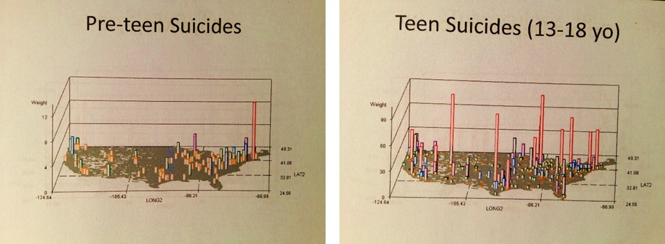
- ‘where does the largest number of teenage suicides take place?’,
- ‘which age group of people is most likely to commit suicide at Niagara Falls?,’
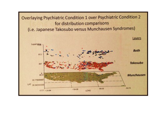
- ‘where do the largest numbers of elderly deaths occur in Southeast Asian and Japanese cultures due to psychologically induced torment from a removal to the U.S. and/or the death of a spouse?’
- ‘where are we spending the most for specific high cost medications and receiving the least in terms of returns related to reduced costs for health care linked to those medicines?’
- ‘where is the most or least money spent on elderly care for chronic disease management?’
- ‘which part of this country has chronic disease patterns that mimic the patterns of the oldest part of this country (65-80 yo), only with these diseases being diagnosed at statistically significant greater rates for people who are 20+ years younger?’
- ‘which two cities have the largest influx of macaws, cockatoos, parrots, conures and other tropical birds via commercial ships, thereby causing the greatest number of ‘bird fancier’s lung’ diagnosis adjacent to a port setting?’
- ‘where are the most non-compliant patients possibly residing for MS based on finances and non-compliance behaviors?’
- ‘what Caribbean disease clearly portrays an in-migration into this country via Miami, Florida?’
- ‘where do the most expensive solid organ replacement surgeries happen?’
- ‘which tapeworm infection in low income children occurs mostly in and around Midwest dairy farms?’
- ‘which dislocation occurs mostly in mid to late age 30 years olds, and in women more than men?’, ‘which fracture?’
- ‘what joint dislocation filed as a need for emergency care is linked only to children under 2 years of age and is most likely linked to abuse or mishandling of that child?’
- ‘which two totally disconnected parts of the country demonstrate rhinosporidium endemic tendencies?’
- ‘which borderline areas demonstrate the least resistance or surveillance impacts when it comes to preventing a foreign born disease like yellow fever from making its way into this country?’
- ‘where are the most infants born with congenital tuberculosis?’
- ‘what single, small area in this country demonstrates a very high number of poliomyelitis cases still occurring?’
- ‘what are the routes taken by foreign born vectored diseases like those from parts of Russia different from those taken by diseases from Mexico or Australia?’
- ‘where do the Ebola outbreaks tend to occur?’
- ‘which fungal disease demonstrates the greatest relationship to one of the Great Lakes and in what city?’
- ‘what are the 200+ diseases that can be monitored to show us how medical problems from the other continents make their way into this country?’

This method that I developed answered each of the above several hundred questions for me, and hundreds more over the years. Almost immediately into this mapping, after applying it to diabetes, rheumatoid arthritis, and the various HEDIS/NCQA chronic disease measures relate to heart healthiness, aging, quality of care, etc., I realized it had an important application to answering those moral questions that are often found in the news. These health question pertain to mental and physical health related problems, like child abuse, violence, etc. I used this technique to do regular mapping by small area polygons and then grid mapping in which the polygon mapping outcomes are converted to grid mapping data, using an algorithm I developed more than ten years ago. This technique normally maps out these results at the national level on a grid map with 25mi x 25mi grid cells, with values that can be displayed as numbers (to evaluated simply costs), or adjusted by age, gender, etc. (for prevalence), or by producing a “weighted hybrid map” in which both cost and prevalence, or any other related metrics, are included in the equation use to assign a particular area its risk score. But I can reduce the cell size if necessary.

So why use this or promote it?
No matter what the data or technique being used to analyze data, we ultimately have to find a place for the information we produce in order to make the best use of it. Normally, we produce reports riddled with tables, charts and graphs depicting our findings, with numerous paragraphs and endless amounts of reading materials that only the most responsible of workers need to go through, and which usually only those with the most time on their hands take the opportunity to store. Whether this data is produce by Bayesian modeling, some sophisticated predictive modeling equation, the use of a Monte Carlo method that takes hours to complete, in order to make the best use of this data it has to be related back to the real world. The best way to interpret these outcomes is through images and maps, not endless amounts of lists with just the top 15 to highest numbers reported and highlighted. This is an important skill with population health that nearly all Big Businesses are lacking.
.
What started me on this pursuit for a methodology are the following questions I had to answer:
- What are the most expensive medications out there at the per dose level?
- Which medicine costs the most money per individual, meaning that it is taken the longest due to its relationship to chronic diseases and has moderately to considerably high costs? for what disease?
- Which medicine is used only once or twice at a time, but the cost for it is extravagantly high?
- Which medical procedure or surgical process has the most cost attached to it for a single scheduled or walk-in visit and the subsequent episode of events that prevail?
- Which medical condition has attached to it the highest value should need for emergent or catastrophic care ensue?
In contrast, by reviewing these topics for the businesses I worked for, I developed an understanding of the limitations that existed for the current methods we use. In the business world, cost is the issue, so much that one could expose a business to an innovation and that business wouldn’t know what to do with it, or carry that process to the next level by spending the time needed to learn it and ultimately market it to its clients. This inability of businesses to see the potential for new discoveries is a characteristic trait of companies that fail to grow and keep up with the times. In contrast to focusing solely on cost, clients and investors, businesses can opt to look at “the Big Picture”, and try to understand people first and then use that knowledge to better understand cost.
.
.
Teaching Video
For examples, I found the following questions were not of interest to most companies, yet actually reveal more important information regarding the potential long term costs for health care, and the related quality of life effect that each of the related diagnoses can have on patients:
- What is the age at which the largest number of male versus female patients are alive with a heart disease, and after which we see the numbers of patients reduce significantly due to increased mortality rates and co-morbidity-related deaths as one gets older?
- What is the peak age for boys experimenting with smoking? and how does this contrast with the peak age for numbers of smokers at a given age for women? Which one of these two genders demonstrates the highest potential for costing us more in terms of time out of work and any required health care as he/she gets older during the peak employment years?
- Where in this country is the number of refusals to immunize children more than 40 to 50 times higher than anywhere else in this country?
- What region of this country has a significant cluster of recurring poliomyelitis cases unlike any other part of this country?
- Which chronic disease is 5 to 8 times more likely to impact women than men, during the peak productive years of life as an employed individual, such as during their late 40s to mid 50s?
When a company or individual is more able to answer any of the first set of questions above than the second, its focus is on product and costs, meaning the patient is simply interpreted as a consumer. If a company or individual can answer one or two of the second set of questions, this means there is a focus is on quality of life, preventive care, chronic disease management, and reductions in long term cost of care. Both of these are good reasons to evaluate, yet the focus is on the former, due to its link to the corporate earnings usually, and not the patient.
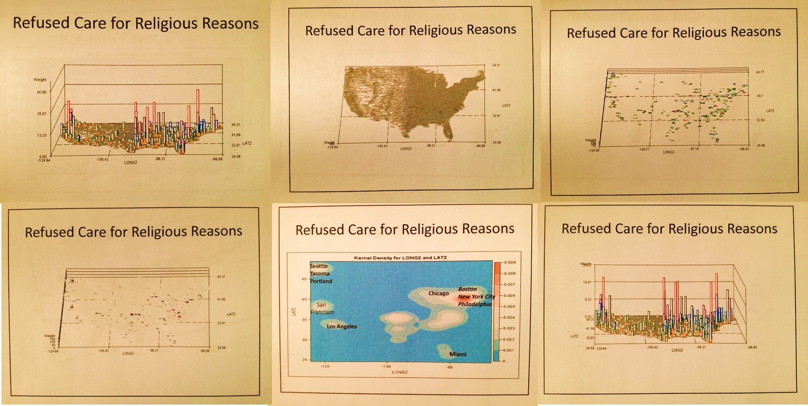
The results on the maps above come from a method I use to analyze information which focuses on utility and applicability. It is a spatial portrayal of statistics that not only changes the concept of visualizing results into an immediately applicable product, it requires no more time or effort that the basic x-y-x graphical manners of presenting data, those graphs for which slopes, standard deviations, modes, ranges and variance dictate how and what we will do next to modify these results. Unlike the standard or flat planar model for presenting results, the results of a 3D geostatistics plot of outcomes defines the routes we need to take with intervention activities for the improvement of health or the elimination barriers.

My 3D geostatistical method is a much better, more eidetic way to present spatial population health information. It enables users to obtain the best product of their information whether they are trying to analyze the health of their people, or anlayzing something as basic as average prescription drug cost or timely refills. Any and all of the information that ultimately is portrayed using this method can be spatially applied, defining exactly where to start your new plan of action, which you may decide upon using a prevalence model, cost-number of patients model, or a hybrid of both to which regional emphasis is added based on administrative notes.

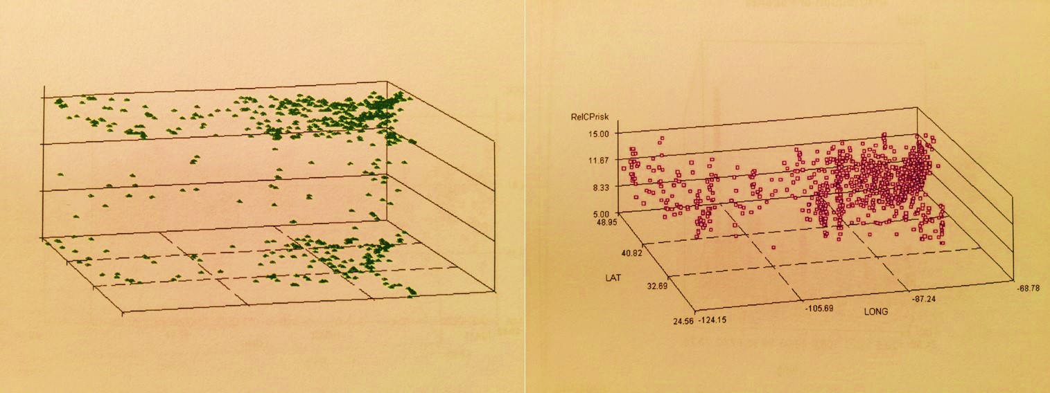
False 3D Spatial Stats Patterns: Case$ or # (left) and Prevalence (right)

Hybridized Overlay Results: $# x Prev (left); Regionally weighted $# x Prev (right; weighted West>>East)
This makes this use of geoplotting essential to improving the accuracy of targeted campaigns if rapid, highly efficient outcomes are desired. This is how and where this 3D non-GIS, basic outcomes based problem solving method comes into play when planning cost-saving integrated public health programs.

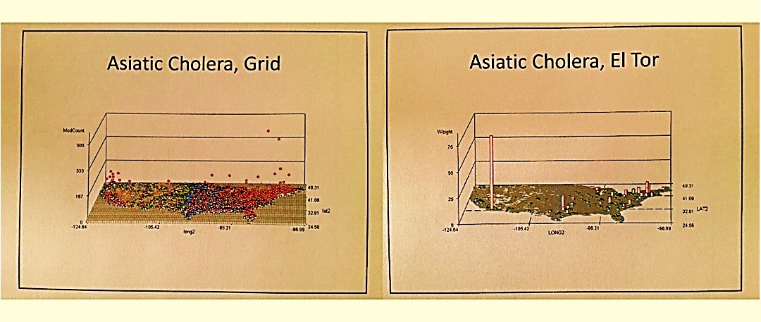
Immunizable Infectious Disease Case Reports, 2005 +/- 2 years.
No matter what statistical method is being used, this method allows for the presentation of outcomes such that the results of as many as 500 or 1000 theoretical studies can be portrayed on a single page. It then allows you to make sense in the next dimension both regionally or locally. Instead of making decision based on large area features, virtual graphing results (BI 3D modeling) that tell you what the problem is but not where, we use this method to identify the areas most in need of intervention and change. We not only learn the region where changes have to be made, but the exact place in that region where it is most needed and where the intervention process has to begin. Unlike flat 2D mapping of information, we learn where within a place, ranked the same as all of its neighbors on a 2D map, we need to focus our initial activities.
.
No single reporting method produced in the traditional format can tell us all of this on just one page. All the new methods for calculating risk and developing prediction models, have to be presented using these processes in order to reach the ultimate goals for these projects. This is why I focus on False and True 3D mapping techniques.
Note: none of the maps on this page were produced using a GIS product; they are the result of a series of algorithms I wrote. Applied to a standard parallel systems TB environment and a high-speed data mining tool, completion of these queries took just 20 to 40 minutes to produce 500 to 1000 images; we can compare this to a GIS which takes 1 to several days of manpower time to complete and produce the results required. This method can be automated to produce several dozen 3D map series per day, far exceeding my initial goal.
To HR and headhunters exploring my site (IPR statement being developed as well), the following are what I do best and am looking for employment opportunities with:
.
Demographics Analysis.
Population health analysis at the millions to hundred million patients level (10B claims rows), in particular data mining and exploration at a very fine detail level. My degree history and clinical experience are in several fields, providing me with a significant knowledge base needed for analyzing age-gender-ethnicity, claims, lab and visits data, health care costs pmpm, ip/op utilization, health risk scores, drug chemistry & toxicity, foodways, rx metrics, OTCs, diagnoses, ICDs, v- and e-Codes, HICLs, cancer histo codes, and all other metrics normally contained in the electronic health information system.
.
Quality Assurance Analysis.
Health care program analysis (Medicaid, Medicare, Employee Health, CHPS, homeless) at the population level, such as the HEDIS/NCQA work required by insurance company overwriters, insurance companies, regular companies sponsoring their own insurance, and health care programs. received awards for this work several times a year from 2004 to 2006. This work later included survey tool development and analysis, member/patient health behavior data analysis, hotline monitoring, “silent” case management data monitoring, scoring prevention and maintenance care programs, HSR/PPR activities, and engaging in intervention program design and management.

National Population Attributes Grid Mapping.
My background in analyzing significant sections of the national health data provided me with the experience to analyze previously unresearched age-gender claims-cost relationships. The several venues in which this has taken place have exposed to sections of the ICD9 data (we are now at ICD10) for a few thousand diseases/groups, focused mostly on non-specific large region, area and zip datasets pulled from historical clinical and claims information. With nearly 15 years experience dealing with population health data, I have a very detailed understanding of people, age and longevity with regards to particular diagnoses. In fact, I have developed a method to classify ICD age-gender data using much the same techniques I applied to the Oregon State Toxic Release Inventory study and related risk analysis research from 2000 to 2006.
My study of population health focuses on details that to date are routinely excluded from most population health studies such as ethnicity, place and income relations, personal background that can be linked to sociocultural diagnoses and culturally-linked/culturally bound syndromes. Due to the nature of my mapping algorithms and mathematical techniques, I can just as easily map this information at a very small area level, with or without a GIS (without preferred for very lengthy studies with 100s to 1000s of metrics to report), along with regionally and nationally and, in rare cases globally depicted outcomes such as international shipping and oil industry ABS data from the late 1980s. My GIS and non-GIS data mapping algorithms are personal IP. My most impressive tools create the very convincing 3D, rotating animated videomaps of disease first presented in the classroom in 1997 and March 1998, as well as at meetings and conferences ca. 2000, and on and off via the web since 2004. The entire US in terms of demographics, cost, financial flow, service industry demands, population health scores, etc. can be mapped using national population grid techniques, with specific algorithms I developed to display statistically significant regional/nearest neighbor differences for any sets of metrics.
This work constitutes a part of the GridEcon Matrix program used to measure consumer products in general, but with health care services as its primary example. The algorithms, formulas and techniques I successfully use, and now present to companies that are interested, are applicable to researching and mapping any large area metrics related to population, economics, cost-demand relationships, and customer-based prediction modeling routines. These formulas are applicable to analyzing any and all services or products, health related or not, but work best with large area/national datasets with millions of customers or consumers of store bought products, foodway patterns, traffic flow patterns, and energy/petroleum product utilization, metrics typical of Big Data settings. The logic and methodology related to my grid production are defined on other pages, for both national population grids and hexagonal grids. The complete logic, steps, algorithms, and formulas behind my national population grid mapping technique are briefly explained but not revealed on any of the pages at this blog site; the hexagonal grid formulas (not algorithms) that I developed in 2004 are provided for student download (hexagonal grids is my most active and successful GIS page).
.
Big Data Analysis.
The truth is there are a lot of Big Data people out there, but very few who are well trained and who have years of experience as Big Data Statistical Analysts. Big Data is prone to certain reporting mistakes, the bigger the datasets or database the greater number of reporting mistakes. Data quality and integrity are a major issue in today’s business world and economy; this means that our means of accounting for our errors and avoiding them as much as possible has to be better managed, acknowledged when discovered, and even included in some of our final presentations. When we use old formulas and methods, for investigating newer, much larger datasets, we take the chance of introducing major errors into our analyses. Applying old fashioned approaches is why these events happen. Statisticians, data managers, basic analysts and programmers who are not experienced with the new GIS tools, the new spatial equations, the new metrics available, produce some of the most risky reports when it comes to errors and bad reporting at the large area Big Data level. The most common themes popping up in my survey of spatial analysts working and vying for positions is that their job is behind in the technology that they learn and that traditional emphasis on SAS background and training excluded them and their companies from developing effective spatial analysis programs. For Big Data and spatial or spatio-temporal studies, unique math and algorithms are required for companies to get ahead, not the older tabulation and graphing routines. There is too much data to anlyze, report and display using these antiquated methods with Big Data.
Professional Survey Development and Health Risk Analysis.
Experienced using a number of survey sites on the web. At the peak of this phase in my career I produced more than 250 surveys per year, evaluating up to 150-180K physicians and other allied health care providers, nationally and internationally. I developed two multilevel risk scoring formulas for evaluating chemical exposure in the environment and likelihood of cancer (detailed on one of my pages). I produced a number of patient health and safety surveys/questionnaires and designed a very unique one that uses semi-2D response graphing to define measuring risk relative to two very different behaviors (“health risk scores”), such as comparing health for patients mostly on Rx drugs with no visits versus those with poor Rx data and plenty of visits and medical claims data.
Bad Surveys versus Good Surveys
Business Analysis.
Other applications for my skills include consumer-marketplace analyses, natural resource (gas-coal) utilization-costs analyses, gas-travel/vacation-consumer research, and pretty much any kind of risk-prediction study or cost-benefits analysis. My key to applying these skills is the grid analyses technique I developed and improved upon over the last 15 years. All of my analyses are performed regionally with a focus on reporting multiple metrics. For this reason I am searching for another petroleum product, natural resource, broadbased consumer study, or travel industry related opportunity to expand the application of this unique skillset.
………
“Hot spots”
Maximum use and maximum efficiency are required for Big Data
My philosophy is that if we want to improve upon our understanding and use of Big Data, then we have to employ better methods to analyze that Big Data, not just report on its averages, n, and typical stdev. This means we have to pull away from past techniques since they produce very superficial, simplistic results and too often result in errors. In the long run, older non-spatial analytic techniques will not be applicable to the future marketplace. People have to be analyzed incrementally in small groups or sub-populations, regionally and by age and ethnicity, even individually if possible, but most certainly not as large aggregates, producing data that prevents us from targeting our changes and program improvements. Right now a number of new methods for dealing with the Big Data demands are being proposed and marketed, none of which have been truly tested. Some are just hypothesized and marketed by way of corporate news releases, some exist on paper, the best have already been tested and are ready for applications. Whenever an industry begins to fall behind, the products of its technology are often marketed in this fashion, like the first bioengineering products, nine out of ten of which failed more than twenty years ago as the various industries tried to take the lead producing the first alpha-interferon or the first bioengineered cancer drug or antibody. My spatial and pyramid-grid-matrix analysis techniques have been tested for its numerous applications since 2004. Its applications include studying and predicting numerous environmental diseases like the various cancers, asthma and various zoonotic and infectious diseases. The most basic human behavioral diseases like diabetes, chronic heart disease, hypertension and hyperlipidemia can be better monitored for place, relationship with care giver, and condition. Some of the most important social diseases for the time can be regionally monitored and mapped such as child, spouse and parent abuse, signs of nutritional deficit, unusually high emergent care (E-coded) needs or V-coding indicators of social and behavioral risk.
This method helps to identify socioeconomic pockets where rare culturally-bound and culturally-linked diagnoses are abound like certain blood disorders, cardiac anomalies and metabolic syndromes. Even those chronic diseases or diagnoses that can be tough to control can be better managed such as IBS, GERD, lower back pain, multiple sclerosis, epilepsy, and autoimmune diseases like rheumatoid arthritis. For the first time, older age population diagnoses can be more effectively location-monitored in one-year age increments such as hip and femur fractures, glaucoma, retinopathy, prostatic disease, cancer, and Alzheimer’s and a number of behavioral health metrics. Likewise, metrics for identifying risk related to pregnancy and childcare, mid-age preventive care, and pre-retirement-to-retirement quality of life changes have been developed. Finally, this disease reporting and monitoring tool has been tested on conditions which are continuously ignored like certain psychometric outcomes, psychiatric problems, and mental health conditions, behavioral and developmental disabilities, childhood and teen development related diagnoses, intraregional familial and genetically transferred conditions, and numerous other diagnoses commonly ignored in past reviews of our various health care programs.

The National Population Health Grid project and its reporting tool GridEcon Matrix [GEM] provide us with some of the most important forgotten or lost population health information out there in Big Data. With this tool, we have available to us a more complete reporting tool and a way to engage in better population health care practice. Why study, develop interventions for, but only report on less than 10% of your health population when it is possible to completely understand your Big Data patient load at national, regional and specialized sub-group levels like Native American, African, Asian, Disabled, Infant, Teen, Young Adult, 65+, and Chronic Disease Managed?
 .
.
This method was designed to focus on the cost-care relationship, with possible use as a prediction modeling tool for better understanding future costs and regional health care needs. Still, it also has valuable applications that stretch into other markets as well, for example the petroleum industry, the natural resource industry, the consumer-market industry, and the travel industry.
The National Population Grid and GridEcon Matrix work combined are currently my most successful Big Data/Big Analyses projects.
See more on the above at Linked-In and ResearchGate.
.
.
