Innovation, according to wikipedia:
The word innovation derives from the Latin word innovatus, which is the noun form of innovare “to renew or change,” stemming from in—”into” + novus—”new”. Diffusion of innovation research was first started in 1903 by seminal researcher Gabriel Tarde, who first plotted the S-shaped diffusion curve. Tarde (1903) defined the innovation-decision process as a series of steps that includes:
- First knowledge [Schopenhauer 1]
- Forming an attitude [Schopenhauer 2]
- A decision to adopt or reject
- Implementation and use [Schopenhauer 3]
- Confirmation of the decision
Ref: Tarde, G. (1903). The laws of imitation (E. Clews Parsons, Trans.). New York: H. Holt & Co.; Wikipedia:
.
Seeing the Elephant – Part 3
One of the most common mistakes made in a corporation or work setting where discoveries are important is deciding to follow a single avenue to success. This avenue is defined by some guru within a company, a CEO or outsider perhaps who was hired in due to his/her innovative ideas. At first, the vision this person provided us with appeared profound and incredible, but as the company changed and this vision became integrated with the rest of the program already there, the company lost a great deal of its appearances of success.
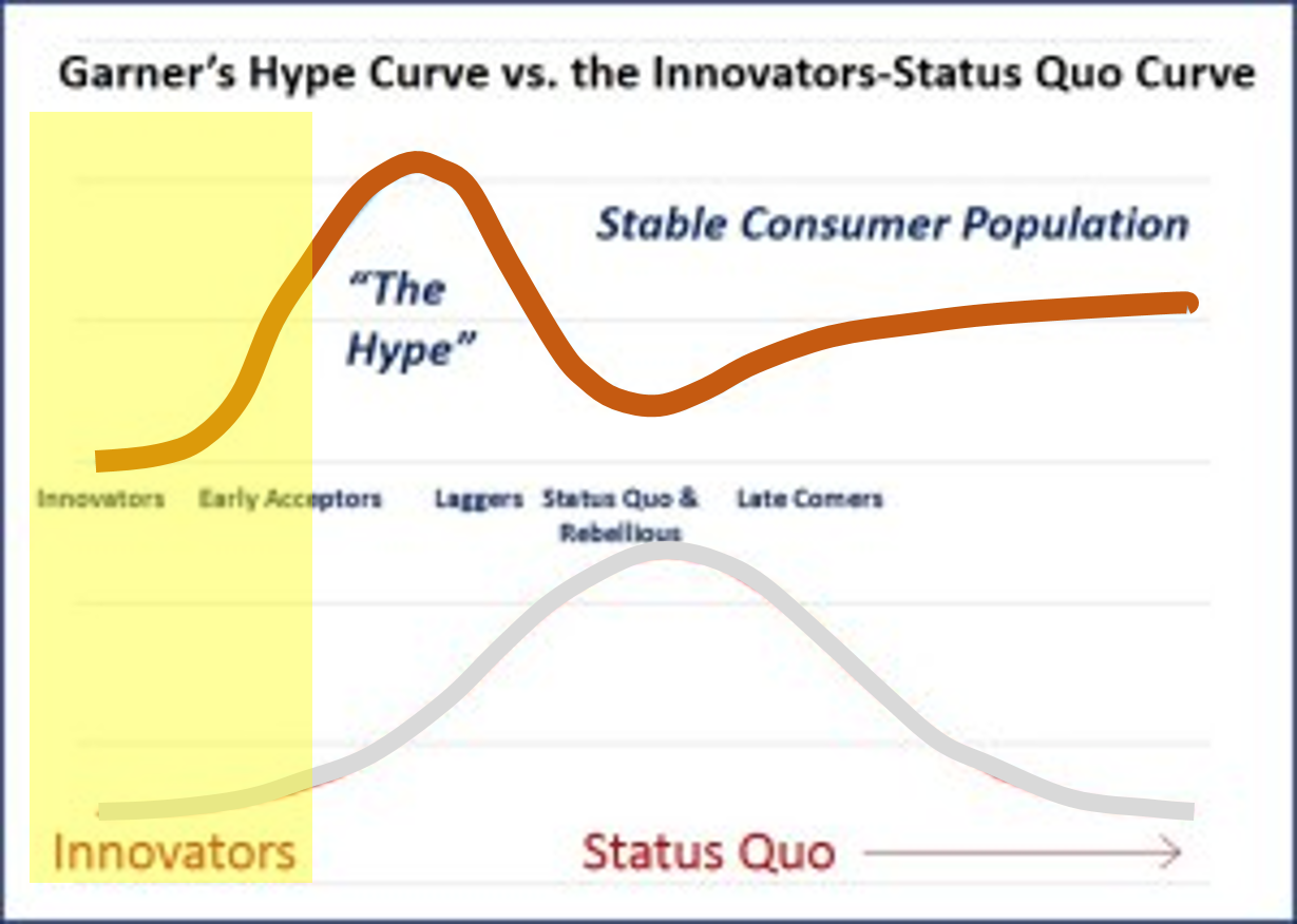
The above happens because these companies are unable to differentiate when they are behaving in accordance with the Garner’s Hype curve for success, rather than following the true Innovators-Status Quo [ISQ] curve that most corporations follow. The ISQ Curve exists for a reason. It is normal human behavior to try to think of ourselves as ahead, without spending the time needed to see where everyone else lies in relation to us. Chances are, we are in the heart of the ISQ Curve. Hopefully we are not so naive that we are far behind of the eight ball–so far into our past that we jeopardize our future in the field. There is also this 15-16% likelihood or one in three that we are on the good side of progress, meaning we are ahead in our business or field, enough to even slow down for a while and become “peak average” if we wanted to.
But a lot of companies like to tell themselves and their employers that they are ahead. So as the law goes, when so many companies are trying to make such a claim, they all merge into that single status quo category, and therefore are not really ahead.
This happens because companies do not engage in learning about their competition effectively. They thus drive their production based upon imaginative or speculative views of where they stand at the time. The also drive their desire to change and become innovative based on this line of thinking. According to the Garner’s Hype Curve, these companies are engaged in the “Hype process” (no longer in the yellow, “innovative zone” depicted on the graph above), thinking they are ahead, but due to lapses in knowledge are in fact rapidly falling behind should no further changes be made. A general rule is that only a few companies are by definition every innovative. In a business managed by 100 major companies, this means that at most 5 or 6 are ahead, but in reality only one or two become highly influential innovators and maintain that state of being. It also means that two-thirds of companies are into the hype, and one-sixth or more are late comers to this hype, with less than one-sixth being just behind that 1% or less innovative group–those companies that are “Early Acceptors”, who know enough about the innovator’s goals and concepts to be willing to back up such plans for change. Unfortunately, this also means that the best innovators who are still silent about their discoveries might remain so for a while, thereby lacking many acceptors.
“All truth passes through three stages. First, it is ridiculed. Second, it is violently opposed. Third, it is accepted as being self-evident.” Arthur Schopenhauer
One of the key driving factors for this period of growth in the new health care system is recognizing the need for failure. It is not just the reasons for failure that have to concern us. In a system that is rapidly becoming incredibly huge, in the form of Big Data, a lot of the older processes have to be eliminated from the manner in which we operate with this data. This means that generating those 300 page reports filled with tables and graphs has to stop, especially since it takes only one good end product to display all of that information on just one page in a report, along with another 2000 pages of reports to match on the same page.
Companies dealing with Big Data like to revert to the practice of reporting the top 1%, 5%, 10%, to quintile, 20 top costs, etc. etc. etc. This presentation assumes the items discussed are independent from the other 99%, 95%, etc. ignored. Such is not the case in health care reporting. A high cost Diabetes-related event does relate to the blood testing events noted 500 lines of more down on the list of outcomes, sorted in descending order. That very rare hemophilia condition that never appears in any final report, at times causes the greatest amount of stress on the financial system due to the extremely high cost of its very unique medicines, and those one or two cases that required 1 to 5 million dollars worth of this medication per year. The top 20 reporting style out there right now is required to put in extra time, manpower, skills, activities, analytics time, review time, reporting time, and presentation time, just to get that one additional metric addressed like the company required.
So how do we present the information on population health that we need to know in a way that is feasible, useable, actionable, the importance of these intervention effects provable, and their outcomes measurable?
Without GIS, the medical interpretations of the national population never presents a complete picture of who we are and what impacts our different health related features have on our life, our future years and the care of others through the generation of affordable health plans. With GIS, a statistical monitoring program can be designed to measure 100s of population health features in a very short time. Based on an analysis of a non-GIS technique developed as part of a project designed to automatic spatial health data reporting, it was found that a reasonable number of reports to generate per day, semi-automatically was about 20. If this process were completely automated, productivity could double or triple and still be manageable at the level of manually generating personal reports for your client based on the results obtained during that day.
Exactly where this new method of reporting fits in with the national public health reporting requirements being generated are as follows.
Accompanying any population health analysis engaged in there has to be an adequate way to demonstrate actionable impacts that can be generated as a result of this data. The role that GIS plays when it comes to evaluating population health is telling us where the interventions need to occur. These interventions can be targeted towards:
- system barriers,
- institutional barriers,
- program or project methodology and performance barriers,
- provider/clinic barriers, and
- patient/member barriers.
These are the standard subcategories of barriers reported on as a part of recent QIAs and PIPs.
Without GIS (or my NPHG mapping equivalent algorithm that is not at all a true point-line-area GIS method), an insurance agency, company, investment firm, large overseer QA agency, governmental agency, or pharmacy benefits management company can perhaps identify a lot of the major barriers effectively, but not be informed as to where to begin their intervention process. Distributing interventions across a large area within a system can be time and energy-consuming and a result in a tremendous amount of waste in materials and supplies, and the related losses due to excessive costs. With GIS (NPHG) used properly in small area incremented evaluations, one knows better where to target any expenditures and activities that are required.
Fortunately, a true GIS is not needed to plan your work based on spatial information–i.e. NPHG. In a standard GIS based system operating in a data warehouse setting, three-fourths or more of the planning, reviews, qualitative analyses, presentation, choice and selection of graphics requires true manpower. People need to review those maps and learn to evaluate their every detail so as to avoid certain text and numerical errors, poorly defined keys and legends, the improper use of numbers, poor choice of illustration and size related mapping techniques, etc. etc. (NPHG takes 1/100th that time.)
The following table depicts the present state of developing plans to evaluate population health related behaviors in order to document and illustrate population health improvements. With Big Data, we tend to measure health at levels 6 and 7. The ultimate statistic demonstrating improvements in health appears in the large regional studies often published or even reported annually by some national organizations and agencies. At the business level, since businesses are by nature in competition with each other, there is no homogenization of data for multiple businesses working the same region in order for high quality analyses and reviews to be made for an area. By knowing how much of an area’s population a business has can tell us whether or not its data is representative of the entire regional population. In places out west, where there are fewer insurers per square mile or large area, a single company may provide a large enough data set to consider their population representative of the region in general, to some extent.

Recent attempts to merge the data from several Big Businesses makes the much larger population based analysis more possible. The traditional inter-agency comparison of health insurers for an area such as the HMOs vs. the MCs vs. the more unique independently designed systems becomes possible when affiliate HMOs or MCs merge their data across a large area, or when various separate insurance companies agree to pull their data into a regional data warehouse for review, in compliance with HIPAA, by all the other competitors as a single pool. (The competitors are merged into one set, which is then compared by the company with its own, or competitors are assigned generic identifiers as reported as Company A, vs. B., . . . vs. your own.)
A good amount of this problem goes away when exceptionally large Big Data suppliers exist. The best example of this are the very large pharmacy benefit management groups or PBMs. PBMs serve numerous insurance companies, and given the right company management and service settings, obtain medical information that is similar emerge to effectively merge it into a single warehouse. In theory, this enables them to pass that critical percentile mark in order to feel that your data pretty much represents the national results (based on testing this theorem, suffice it to say that this % is less than 33%). Without implementation of a fast-moving non-GIS spatial modeling algorithm or even the much more cumbersome, slower processors associated with GISing up to 200 metrics per day, nationally, exceptionally large-scale businesses, business overseers, etc. with a patient population >50M, are missing an opportunity that other competitors may not have. One of the chief reasons these companies are behind in this spatial approach to national population health data mapping is that they lack the manpower, knowledge base and skill sets needed to properly implement such methods of analyses. This lack of knowledge exists for the following reasons:
- This lack of knowledge not only prevents companies from seeing the potential that exists, it also makes it impossible for leaders in their teams to see an endpoint that far exceeds all other accomplishments made to date.
- If companies fail to think ahead adequately and recognize the need to more properly manage their data for future applications, refusing to take such actions to improve the corporate skill sets, they increase their likelihood for failure.
- When companies inadvertently placed themselves years to a generation or two behind in their information technology skill set and their information holdings with regard to the spatial analysis of population health and personal medical history information, they fail to develop the means needed to advance the performance of their profession to its fullest potential.
The problem has currently placed some businesses and industries in a trouble-shooting mode. When there is this much engagement in a latent response to technological needs, numerous companies develop numerous ways to approach the problems at hand. These problems might even worsen in some cases when managers who are inexperienced are left in charge of newer companies with more “modern” IT and Analytic teams. Several years ago, I noted that a successful agency, team, service or company must meet the following requirements for remaining active and economically successful in the future.
- A capability of incorporating new technologies within their program
- A capability for planning, developing and initiating a newly discovered high technological venture in 6 months or less.
- A capability for improving the new technology and maintaining its success and increasing its popularity.
- A capability for improving the infrastructures and knowledge base required for these improvements.
Companies that focus too much on past experience, at the risk of ignoring the new technology that is out there, prevent change and improvements from occurring with their company thereby placing themselves at risk it terms of long-term marketing success when it comes to competitors.
To reiterate what I have stated in another criticism on this site on another blog page, as well as a similar criticism made by an outside source . . . .
“Long story short:
Corporate strategists need to get out of their 20th century mindset and into the 21st century.”
Prabhakar Gopalan’s
Why corporate strategy needs to change with the cloud. Posted January 1, 2013. [*LINK*]
Currently, the most common methods companies use to avoid implementing spatial analyses by analysts or adding GIS to their IT team include:
- Substitution of a tool already in use by that company for use as a substitute for the GIS, the most common examples of this the use of imagery drawing tools, autocad, and makeshift databases including visual presentation devices as substitutes
- Sub-contracting out GIS work because it constitutes a small part of the project, such as sun-contracting a GIS company to perform the task, or substituting an individual in possession of a GIS or GIS equivalent for such skills.
- Implementing the use of a less expensive, partial GIS-like tool that does not fully engage in spatial analysis steps, such as making use of a mapping tool that lacks any ability to engage in spatial analysis, or even worse, the implementation of a tool that cannot even produce a spatially related database for review using other non-GIS statistical tools.
- Development of a GIS station that had adequate GIS software but either lack of staffing, inadequate staffing, lack of knowledgable technicians, and/or a separate department with the potential for implementing a GIS, but with whom GIS is not a primary task (i.e. an IT department that claims it is GIS-savvy but in terms of applicability is useless when it come sto producing products or calculating results on time.
- Development of a fake GIS or pseudo-GIS station from tools already available within the company, thereby making the best use of software licenses already obtained but at the risk of neither knowing or understanding the ultimate end-product that GIS can produce, or being able to perform accurate and reliable quality assurance checks on the internal product. Unless adequate spatial analysis is engaged in with the software at hand, datasystem generated GIS systems may not suffice for this role, such as the SAS-GIS, in which neither raster, drg, grid, or photogrammetrics work can be performed. [The manufacturing company-related similar to this is claiming you’ve produced a software tool that can do it, but the users cannot make it work, and once they do they find it is not a true GIS tool; a number of the most popular products fit this bill.]
In a survey tool developed to analyze corporate skills and success related to spatial analysis of the nation or region as a whole, a number of ways to measure this lack of change were developed.
I am including the notion of innovation with “Seeing the Elephant” because getting beyond the issues related to the second requires the former. Even innovation has its parts that need to be addressed. One can see something and therefore believe he/she invented it, and therefore is innovative and a self-defined “inventor” and yet be unable to cash in on the opportunity or make whatever it is that was discovered actually work. In fact, this ‘inventor’ may only be able to see what can be done, and never be able to produce an outcome with it.
So what do we make of this . . . is he/she really an inventor?
If he/she can pull together a team to use their imagination to conjure up a way to actually accomplish this task, then perhaps he/she is an inventor. But then the issues becomes who actually was the inventor? The original knowledge source? The Team? The most important contributor of that team? The key member of the team without whom no creation could ever be made?
The typical outcome of this scenario is that the team gets the recognition, but the manager takes much of the credit. In such cases, if the true inventor leaves the team to search for work or recognition elsewhere, the project tends to fall apart with time, since no single individual knows and understands the full logic and reasoning–the complete anatomy needed to form much-needed corrective surgery so to speak.
- Part 1 of “Seeing the Elephant” was a review of how population health is researched and the various issues we have to contend with regarding this data, the outcomes and their relationship to overall people health. This was based on my experiences with the HEDIS, NCQA, Medicare, Medicaid, CHP, Employee Health Homeless and numerous other programs out there designed to monitor and measure the success of the various health insurance programs out there for working and non-working people. This work included the use of two major database systems for measuring population age-gender-ethnicity and health features: CVC Caremark and Dell-Perot Systems. A number of other much smaller databases were linked to this work as well, including an experiment intranet program then being test, used for the development of a population health scoring I wrote that measured a little more than 200 basic health related features encompassing members of all age ranges.
- Part 2 consisted of a review of two aspects of population health surveying that could be done but are never done. The first is a detailed 1-year age-gender review of health related features, the second a review of the data at the small area level using 21st century spatial mathematics and technology. My research with the age-gender curve taught me that age does make a difference at the 1-year intervals. Many outcomes appear quite similar to each other even though they are not when a standard 5-year or 10-year age group procedure is used for evaluating health metrics. This was developed in order to produce a replacement for the standard outcomes averaging methods already in use. This work demonstrated that two populations with the same average outcome for a metric can involve two completely different populations. The second part of this process consisted of generating a grid map for analyzing the US. This was developed in order to eliminate the age-gender biasness related errors being generated with zip code tract analyses. It also resulted in a more accurate way to produce 3D surface modeling maps illustrating or depicting health status regionally. This method has no limits to the smallest area it can evaluate, but due to the Moran’s I and Geary’s C metrics logic underlying this process, grid cells greater than average zip code tract size for the 90%ile of tract is preferred. This means that multiple zip codes are often linked to a single grid cell; this also means that the cell population are more balanced and less numerically age-gender biased than seen with zip code and block group or simple block analysis techniques. An additional benefit to this method is it reduced the zero value problem that creeps up in the math and map modeling programs.
- Part 3 of this “Seeing the Elephant” [this page] pertains to the limits that currently exist and the lack of innovations that have existed at the corporate level with population health monitoring. The previous steps reviewed how to review population health and two basic ways to improve upon that analysis (although mostly at a larger regional scale or at the small area level–<500 sq mi cell area–for the second part). This is more a critique of the current systems in use at large corporate and npo agency/federal office settings that are not performing at a level of matching their potential. The reasons for this lack of innovation and lack of internal ingenuity is reviewed briefly. This is of course based on personal professional experience and of course cannot be accurate for corporations and settings in highly secured settings, many of which I expect to know the difference between simple CLUS and LOESS, or false versus true cuboid analytic techniques.
- Part 4 of this series of reviews I am making expresses the applications of what I produced and displayed to real world population health metrics, analysis and active intervention planning processes. Few if any corporations are current at such a level in serving their communities as a whole.
When it comes to monitoring population health, “seeing the elephant” refers to getting the big picture, not just a part of the population.
The monitoring of population health serves as an important level of health research in terms of future population health. This in turn relates to important topics like social inequality and health, income and health, gender and ethnicity and health, nationality, location and health.
In general, there are three types of companies or agencies out there reviewing population health.
- Behind: The first is behind in both technology and applications but managed to obtain contracts due to the traditional nature of its products.
- Average: The second is a company that is status quo, in par with expectation and making better use of the current technology. These companies are well-informed, well-educated and successful, and tend to perform in accordance with governmental and other special agency standards.
- Ahead of the Average: The third company or group is ahead of the bell curve, making more than adequate use of the 21st century technology and new methodologies and software available for their work, and are ahead of the status quo.
Due to the changes currently taking place in the HIT world as part of the new health plan, I can rank many of these companies that are engaged and active into one of two categories (more as time passes). They are:
- Slightly Ahead: This group does have its companies or groups that are slightly ahead of the rest, generally speaking, only about 1 to 5 years ahead in terms of intellectual property standards, meaning their formulas, methods and/or substitutes for such are just a year or so away from duplication elsewhere.
- Very Much Ahead: Then there are those who are well ahead of the status quo, those that are truly innovative, inventive, creative, but also likely to produce some products that will fail and others that will slightly help in their advancement, and a few that put them well ahead of the status quo.
One of the major problems that currently exists with technology is that the data exists but the infrastructure and knowledgebase needed to make the best use of that data is lacking. Data storage ability and capacity has placed this field one or two notches ahead of the corporations and agencies that have the potential of making very effective use of this data. The answers that such data systems are capable of providing exist in the eCloud, whereas the knowledge and ability of people to make adequate use of that data remain at a level well below to eCloud, too grounded due to their reliance upon old knowledge and old technology.
There are several levels of technical development seen for companies. The following technologies defined the level of 21st technology that is incorporated into a company’s make-up. The following are examples of companies that produced over the years.
- Development of text and excel files or tables only. End products are 300+ page documents, mostly tables; manual data transfers and manual reports processing work are commonplace. GIS map products are usually contracted out.
- Development of SAS output, mostly in the form of cut and paste data, in excel and text form; some reported generated automatically. Data is provided mostly as descriptive data, lacking analysis, but on occasion including some basic statistical significant analysis such as Xsq, Student’s-t, ANOVA, Binomial, simple Regression, Log Regression and Multiple regression (1960s to 1970s stats). Methods of analyses chosen are questionable in terms of application and reliability/validity.
- Like the prior, but with development of more sophisticated SAS outputs, but with 20th C methodologies and formulas; there is a little descriptive mapping of the results either in table form or in crude fancy looking map form. The key indicator of this level is the overall lack of true spatial analysis. Limitations of applicability of results apply and threats to the validity of the results are imposed due to the heavy reliance upon old formulas, old software tools and old techniques. Some basic GIS, using commonly marketed lower cost software.
- Development and implementation of true spatial analysis techniques utilizing a primary GIS tool, not a pseudo-GIS, descriptive, partially spatial analytic tool.
.
My survey that has been in use this past 18+ months was designed to assess the HIT businesses for this feature. To date about 100 very good assessments have been made of some of the top companies or businesses in this field, ranging from responses from basic insurance company respondent/participants, to companies that provide it as part their service, to companies experimenting with it or testing it. The level of service provided that was evaluated ranged from companies that evaluate this data using standard traditional methods to companies that employ some of the newer big data technology out there to companies that I know are well engaged in the big data business and in theory are capable of spatial analysis, as claimed by their information, in their training sessions, in their software packages, or in their advertising and YouTube information.
To date, no companies are actively using regularly a standard GIS on a weekly to daily basis, or to reports hundred to thousands of spatial reviews per year, which is the full capability of this technology. Most companies are still in the last decade publishing reports with 2D graphs and geographic images of limited use. Statistical evaluations of data are not the norm. Instead the norm is descriptive data, like the top ten cities in this country, or the top ten places where a product is used, or large area reviews of where a given prevalence or incidence is–information with which no successful, cost-saving interventions can be developed.
When I entered my HIT career I couldn’t believe companies hadn’t an idea about valuable GIS applications. I found it even more amusing to see some of these companies were doing it and not everyone knew this–which is because it was contracted out. The results of this survey will be reviewed at some later date.
One of the criticisms that comes my way with this argument has been that I am overreacting, over-responsive, exaggerative. That would be the case if the goals I am discussing were not easily accomplished or could not be easily managed in a typical setting, because it is overly time consuming, manpower consuming, or not effective enough to make good use of. However, I have demonstrated that this can be done, and how to produce these results in just a few minutes, dozens of projects per day, with 10,000+ images produced per day. (My minimum in fact was 10,000.) These results even tell you where to engage in your first interventions. So I am not sure what a good reason for not engaging in valuable GIS use might be, except to suggest that perhaps there is lack of an adequate knowledge base and inadequate infrastructure out there to fully implement this effective quality of care/quality of life centered program.
.
