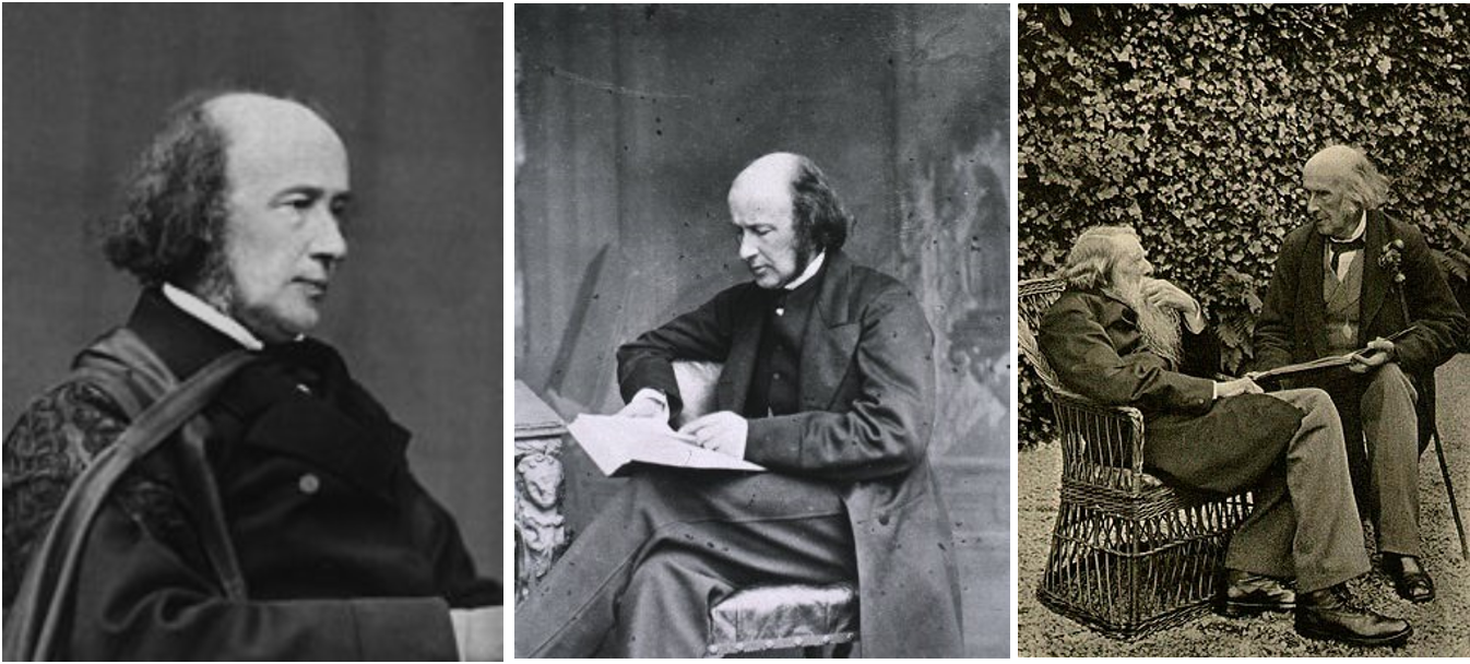
Sir Henry Wentworth Dyke Acland, 1st Baronet, KCB
(23 August 1815 – 16 October 1900)
The 1854 Cholera Map
Acland’s 1854 Cholera map is unique in that it is temporal in nature. Each of the cases presented has a number to identify it, instead of a single point or symbol. The number indicates the order in which the cases presented in the immediate community. This method is used in other cholera mapping situations. It is the simplicity of Aclands map and the number of cases he counted that make it stand out.
The order in which cases develop is important to determining if the disease was passed on from one person to the next. This information is also used to determine whether or not the disease is due to something travelling from one place to the next, in some kind of spatially sequential way, or if it is seemingly travelling about randomly from one neighborhood to the next in some illogical manner.
The use of temporal patterns to define a disease behavior is nothing new to the medical profession, after all this is what contagion historically is all about. However, since the mapping of numbers is not often done in such a densely packed manner, this map deserves a closer inspection (wish it was in focus better however).
The migration of a disease like cholera from one place to the next, as time passes, is easy to display with a map, as are the sum of events over a season travelling from one region to the next, be it large or small. But in this case, the cases that are evaluated exist extremely close to one another, as neighboring homes, tents and even bunks within some form of communal living shelter. Acland’s numbers on the map define single and group events, and for the most part sequential events. But even more important is the obvious clustering these cases demonstrated.

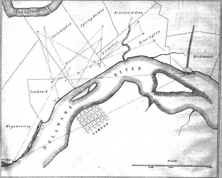
Original map from Seaman’s article
.
.
Second original map from Seaman’s article
We contrast this with Valentine Seaman’s spatio-temporal map. Seaman’s map is also spatio-temporal, but with temporal defined by the article accompanying it, not the map itself. Seaman’s map just depicts points. But as I detailed on the page focused on his map, we are left to fill in the gaps on our own when we look at it, allowing me for example to theorize about the flow of the disease being mapped, using standard vector analyses.
Unfortunately, this early example of a yellow fever epidemic map, with very few cases, is more open to a certain amount of subjectiveness. Numbers of cases are seen to occur within close proximity to each other, and upon first glance we infer some order to these cases. We don’t have to do that with Acland’s map.
The same can be stated about one of the more famous maps of this time. John Snow’s cholera map provide just spatial data, not temporal. To know the temporal data we have to turn to his text, or some sort of follow up summary to Snow’s original data to figure that out.
[AMA map]
Likewise for the map published by the A.M.A. in their Transactions published for 1850 (above). Cases and order are given, this time with both on the map but again without clear labeling of the content on that map. At the time this became politically troublesome for the AMA, since a countering argument for the AMA’s main topic for that meeting, cholera, was provided with an excellent synopsis as to its possible cause by an esquire (law-trained), amateur meteorologist and gardener, not a physician, John Lea. who added numbers to his map as well, although intended them to serve more as a legend accompanied by his text, a clarification process which worked quite well with his disease map.

In this map below, without paying attention to sequence information, notice there are two very distinct clusters noted for cholera. The first is in in the upper center of the image, the second is in the lower section. There is also a moderately sized third cluster of cases adjacent to the bow and branch of the river in the lower left quadrant. Also notice the very small aggregate, just a few people impacted in the upper left quadrant, close but not next to the river edge.
Acland’s interests in this profession are focused on the health of poor communities. Such a focus led him to naturally search for a more accurate review of the cholera as a disease as it traveled about infecting different parts of the city. This philosophy and pattern for cholera spread during that time was focused either on some form of miasma (of which by now there were numerous forms of this theoretical pathogen), or on the issues directly at hand with the people taken ill–their poor hygiene and their risky lifestyle.
Acland seems to favor the beliefs of the sanitation movement for the time, focusing more on lifestyles and the healthiness or unhealthiness of the living environment based on sanitary measures. The cause for disease is directly linked to these causes, no matter what its real nature is–miasmatic or not. Acland in many ways was a social rights activist by taking this step in studying the disease patterns of poor communities, be they miasmatic and geographical in cause and effect, or not.

Acland’s cholera map is important because it includes temporal information on the cholera cases. By detailing the first 30 cases of the local epidemic, he provides evidence for a reduced likelihood that “miasma” could be the cause. No single site was afflicted first, followed by its neighbors downwind or downstream, and then followed again by the next neighbors located still further downwind or downstream. More importantly, Acland’s map constrasts with the famous map by John Snow, on which a source of infection and the placement of diseases over space are display, but without any way to immediately deduce temporal features from this map.
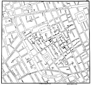
John Snow, 1854 Cholera Map (dots depict cases, with clustering patterns produced)
Other versions of cholera maps produced by this time include the classic maps depicting the routes of migration. Numerous scholars produced such maps following the 1828-1833 cholera epidemic. But these were not case/point maps, and a few related maps that were developed soon after focused on regional patterns of disease distribution in combination with travel or migration routes. Such maps depicting regional cause also promoted the ideas that certain diseases migrated into new places to produce epidemics not normal to that setting, and from about 1800 to 1850 also promoted the idea that latitude had a great impact on how these disease traveled, such as from their endemic tropical settings into temperate settings during the warmest months of the year.
Case/Point maps depict diseases differently in that they related people and place to each other, within and between the groups for each. With people, the within groups concept prevails, which is how diseases are passed from one person to the next regardless of where this event is taking place. With place, the concepts to concern oneself with as an epidemiologist include ‘how does a disease migrate from one place to the next?’ by air? by water? by ship ballast? or fabrics stored on board? or by one person to the next? from non-potable water barrel to the unwary ship passenger? from the air that one is incompatible with to the highly susceptible body due to poor heritage and/or constitution?
Case/point data like that found on Snow’s map however still provide us with valuable information.
They provide us with information that requires different thinking processes than line and area mapping information. It is for this reason that these case/point maps at the time they were first produced for cholera took into consideration a more complete way to review the concepts of cases and places, over space and time. The returning Asiatic cholera epidemic of 1849-1853/4 in United States history made Cholera the first disease to result in the implementation of a worldwide disease mapping program for transported disease patterns.
.
This important period of time in disease mapping history was preceded by only one other very important disease mapping event in medical history, the production of the global epidemics maps by medical cartographer Schnurrer in 1831, and Bergmann in 1847. Whereas global disease maps and their followers were very large area focused, and more difficult to relate at the local level, the case/point map was applicable specifically for use at the small area level. This the importance of these maps, and of the importance of Acland’s unique modification and application of this mapping technique.
.
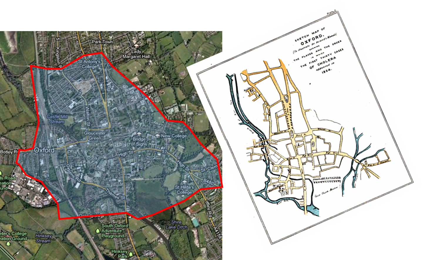
The area of Acland’s map
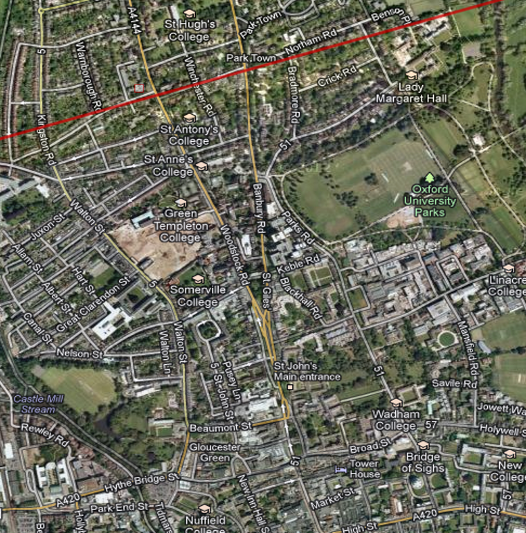
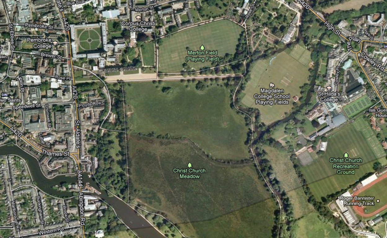
The following satellite images pulled from Google map help to place the study at hand. Notice these cases are not seaport, estuary, harbor or bay related cases like they commonly were and are with commonly mapped yellow fever. These cases are considerably inland, demonstrating a tendency to favor densely populations settings and/or moderately to tightly pack living settings within communities. These features suggest cholera to be more a social disease phenomenon more than a topographic, meteorologic or otherwise purely environment epidemic problem. This is probably the logic that initiated the research questions posed by Acland and others when they began viewing these well localized outbreaks in detail.
.
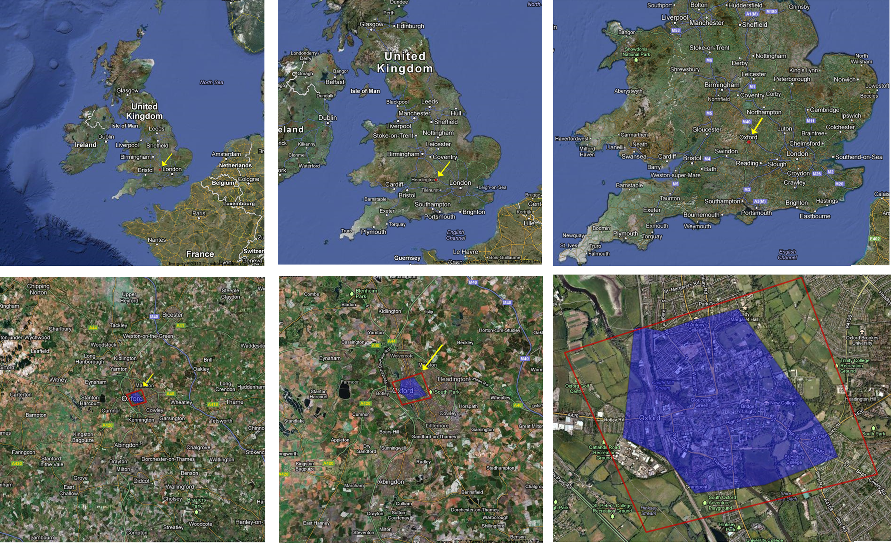
The size and spatial distribution of Acland’s very localized cholera study.
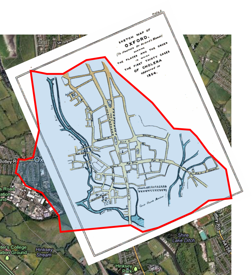
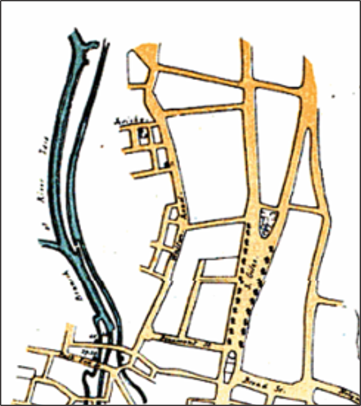
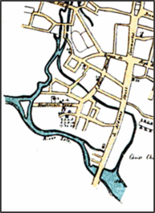
The projection and formatting of Acland’s map was slightly different from the same used by the Google map images. Therefore, adjustments of Acland’s map were made, as follows:
.
.
Even with the angular adjustment noted above, there are still some very slight variations in the linear aspects of the map that are seen at times, nothing too serious so as to result in evaluation errors, but enough to keep in mind when reading through my evaluation of Acland’s map. In particular, the area in around where “Oxford” is noted on the map is slightly different in terms of topographic/land-surface form distribution (the roads appear a little off). The case cluster is at the southern end of the elongated fork in the road.
.
Furthermore, since a number of portions of the communities on Acland’s map were not fully developed into how they appear today, the roadways seem different at times. A few are not found on the current map, and were presumably removed in later years, especially those along the river edges. Other roads changed in terms of use and priority. Also, intersections or corners at times seem slightly changed or smoothened out over the years. Satellite images especially demonstrate some major changes in water flow patterns, with the branches and parallel or braided patterns of some parts of the Thames river redirected or redefined in terms of landuse priorities.
Acland’s map shows forks and parallel flowing portions that are now smaller in a number of places on the Google images. For comparing the image to Acland’s map, some shared features were identified and then use to reposition (“reproject”) the map so it could be compared with the Google images.
The following closer up views of the two map types depict examples of this process carried out with more precision in mind. The first set depicts the northern cluster found in the upper central portion of Acland’s entire map with its cluster or aggregate of cases. The second, the southern cluster, is the lowermost cluster or aggregate of cases. There is also a a third, smaller cluster or aggregate noted in the middle-left portion of the complete map–referred to here as the riverside cluster.
.

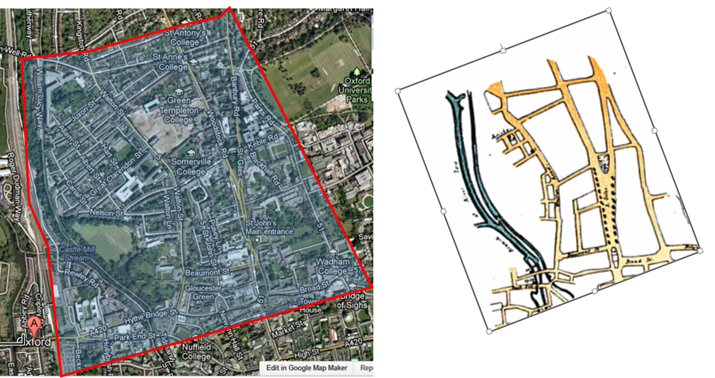
The Northern Cluster
In the above map note the positions of High Street and Banbury Road delineated in red, and the smaller streets associated with these streets along the eastern edge of the Oxford campus area.
.
.
A few minor discrepancies are also noted in this comparison above. (The blue point indicator is a default of the Google Map–due to an osteopathy school advertisement). Also notice that most discrepancies in these maps pertain to river and creek patterns. The case cluster was an array of temporary residencies located just beneath the very light cross road through the green space.
.
.
So what was happening in Oxford around this time that resulted in the two major disease clusters?
On the previous map, the cluster exists at the Banbury Road and Woodstock Road fork. The following close up of this area doesn’t reveal anything new or significant related to disease patterns and population behaviors (of course, the time frame is very different between the two). But this conclusion is not based on any statistical analysis at this point. The case cluster is at the southern end of the long fork in the road.
.
In urban setting, it is the rate of expansion of populations in a region that are largely responsible for cholera introduced to their settings. Rates of travel, the numbers of people who travel, the density of people at the beginning and end of that excursion, as well as the density of people along the roadway, all play a role in defining where the cholera will remain alive and take the next life.
In retrospect, these findings suggest that the clusters are due to crowded settings and unsanitary living practices. The aggregate noted at the Banbury-Woodstock Road neighborhood became more likely to impact the “protected” higher income neighborhood once the disease “took hold”. This is not so much a statement that defines the disease itself as changing and becoming more likely to infect people (although such could be the case, since vibrio is ecologically trained and behaved), it is more meant to state that the human events that ensue once a disease takes hold naturally make those who try to remain uninfected more likely to ultimately become infected if the right actions aren’t taken.
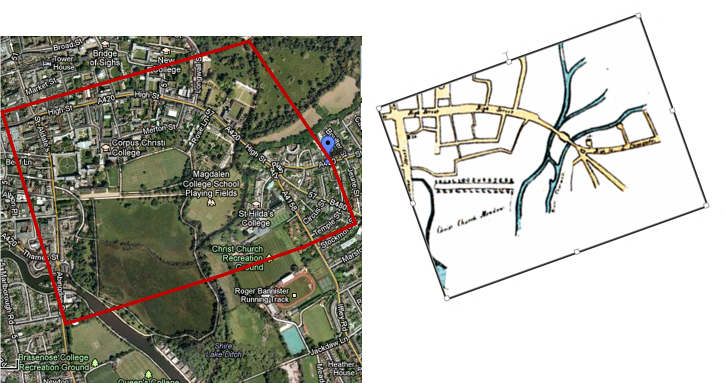
The Southern Cluster
The southern cluster of cases involved the Christ Church Meadow (the large open space on the map above). This and the surrounding region may be considered a place devoted to revivalist activities and camp meetings, these uses noted as such by Acland on his map.
This parallels another ongoing observation taking place about cholera at its original nidus, the holy site in Mecca is where large numbers of people aggregate each year. These activities became associated with the westward migration of cholera into Western Europe beginning 1817, a consequence of participants returning in an infectious state due to the poor sanitation of where they stayed. Some of the first detailed observations about this potential link between Mecca and the cholera epidemic problem were published around 1850. This study of the much smaller area near Oxford provided similar documentation on this cause for the outbreaks,
So it is possible that Acland related these observations to the camp his congregation raised at the north end of the Christ Church Meadow. Even if he did not read such reports, Acland was still able to realize that population density and poor sanitation may be the reason for the cholera behavior and related outbreaks. Acland’s note on the temporality of these cases in Christ Church Meadow (his enumeration of the cases) solidified his theory. It was the spatial relationship of the people in a single place that mattered, and thus the reason for his emphasis on this way of mapping.

Only the Camp cluster had numbers are are sometimes discernible from the version of Acland’s map obtained for this review. The other two maps, when viewed up close, have enumerations that cannot be interpreted.
.
The Riveredge Cluster
The riveredge cluster is the more traditional geographic behavior of cholera/Asiatic cholera that we expect to see. [Again, my thesis goes over the geographical forms of cholera behaviors in much more detail.] Even a small number of cases developed in this low income, high risk, high ecologically-supporting environmental setting. In a way, such sanitation related problems may even be why this place was reassigned new land use patterns in later years.
Geographic notes on the Clusters
One other observation worth noting is the varied geographic patterns associated with clustering. This would have redirected some of the focus on the causes for this disease to the people, and away from topography and climate.
The first map depicts the camp meetings group residing in an undeveloped area, with flat topography and most likely occasional ground saturation problems. Both of these settings would have had neighborhood bathroom or latrine facilities, in the same setting where neighborhood wells were dug.
The second map depicts cases at a considerable distance from the water source, in a medium to low income community located in the heart of the suburban setting.
The third map is of the low elevation wetlands setting, a place that matches some of the geographical (elevation) requirements for cholera noted around this time by William Farr.
Final Notes.
As all of the events Acland witnessed took place, he was a member of the church where some of these deaths occurred. Acland’s work on the Christ Church congregation provided him with instant fame as a physician and a knowledge of people, poverty, sanitation and disease. He rapidly became one of the most respected writers on the relationship between poverty and disease.
Unlike many other other maps on this disease, Acland’s map was very spatially and temporally specific. There was no miasma wandering about causing the disease. Instead, Acland’s work led people to realize that certain prevention activities focused on people, not the diffusion of local winds and air, must be dealt with the reduce this epidemiological problem. Acland’s map strengthened the support of Snow’s map on cholera theory. Even so, both of these maps focused only on the population, population health and population health behaviors as the causes, not the underlying environmental or ecological cause yet to be discovered.
The following retrospective interpretation of the land use and population behaviors in relation to place, wealth and health, is a modern explanation of the same time period in history.
Quote from site (bold lettering added)
Many of the same speculators, notably George Kimber, Thomas Wyatt, and John Eveness, were involved in building developments elsewhere in the city. In the early 19th century there was a prolonged period of working-class house building in the parishes of St. Clement, St. Ebbe, St. Giles, St. Mary Magdalen, and St. Thomas, so that between 1811 and 1851 the number of houses in the city, including St.Clement’s, more than doubled to 5,100. By far the biggest increase came in the decade 1821–31, when the number increased by c. 42 per cent, slightly easing the problem of overcrowding which had grown in the previous decades. (fn. 17) The building was mainly in the the Friars district of St. Ebbe’s, around Gloucester Green, along Walton Street, in Jericho, and in St. Clement’s. (fn. 18) Further north, St. Bernard’s Road was being developed in 1832 and Observatory Street in 1834. (fn. 19) The development was primarily a response to the city’s rapidly increasing population, but also resulted from a shift in population out of the central parishes, where very little new house-building took place, and where extensions by colleges depleted the existing housing stock. (fn. 20) Oxford was unusual in that the movement outwards was by the less well off, leaving ‘a ring of suburbs around an upper-class centre’. (fn. 21) Until the development of North Oxford later in the century there was no suitable land available for the building of middle-class housing, and the middle classes remained in the centre or lived outside the city while working-class housing was concentrated in areas that were often low-lying, ill-drained, and subject to flooding. The new houses were two- and three-storey brick cottages, occasionally varied by polychrome brick-work, and most were solidly built although drainage problems quickly became apparent. The terraces contained a variety of house-types of different standards. (fn. 22) Some of the later houses, such as those in Paradise Square begun in 1838, were built for slightly more prosperous residents. (fn. 23) The new estates were laid out by speculative developers and the houses built by ‘a host of small capitalists investing savings and mortgage loans in the building of small groups of houses on individual lots’, often with the intention of living in one house and renting the others. (fn. 24) In Jericho, which grew as a result of the removal there of the university press in 1830, the press did not build houses for its own workers, being content to take a few over later to rent to its employees. (fn. 25)
Footnotes:
17 — Pevsner, Oxon. 270–1; V.C.H. Oxon. iii, plan facing p.37.
18 — Pevsner, Oxon. 233–5, 274–6.
19 — Bodl. G.A. Oxon. a 65 (218–19).
20 — Pevsner, Oxon. 235–6, 240–4, 252–3.
21 — R. Newman, ‘Town Planning in Oxf.’ Oxford, ix(3), 61; Kelly’s Dir. Oxon. (1937).
22 — E. M. Jope and W. A. Pantin, ‘Clarendon Hotel’,Oxoniensia, xxiii. 1 sqq.
23 — e.g. D. Sturdy, How to Pull a Town Down (Westm.1972); Curl, Erosion of Oxf.
24 — Mills and Fisheries (Castle Mill).
25 — Pevsner, Oxon. 324.
From: ‘Modern Oxford’, A History of the County of Oxford: Volume 4: The City of Oxford (1979), pp. 181-259. URL: http://www.british-history.ac.uk/report.aspx?compid=22805 Date accessed: 14 April 2013.
.
Health, Work and Play
To Acland, the health of the poor and underpriviledged impacted the health of the middle and upper class.
This was the main premise of Acland’s work, and the purpose for his emphasis on the behavior of the cholera epidemic.
Acland wrote about this event as an additional and distinct writing separate from his major work responsibilities and tasks at hand. But soonafter, Acland came out with a book entitled “Health, Work and Play”, in which he delineated the responsibilities of the upper class to those below them, and the value of these behaviors when it comes to health as a whole. In Acland’s booklet on Cholera, such a claim is very much common sense–if the poor get ill and can facilitate the spread of the infectious disease to others, then the poor must be treated properly when it comes to caring for them and making sure their environment does not become healthy to others.
With physical disease manifestations, this is an easy promise to state and define to some precision. Such is not the case for mental health, which was the crux of Acland’s follow-up to his essay on Asiatic cholera, which makes the same claim about the need to adequately care for the poorer classes with regard to mental health.
Such a philosophy is stated as follows, in two book reviews published about Acland Health, Work and Play.

.
.
This page is focused on the maps that Sir Acland produced.
More of his work and writings are under review for another page.
Drainage and the treatment of sewage, and the treatment of mental health patients, were the two major subjects of Acland’s career and work.
For more on Sir Henry W. Acland, see
Online Books page with much of his work.
.
