July 2016
Monthly Archive
July 24, 2016
Posted by Brian Altonen, MPH, MS under Uncategorized
Comments Off on Moral Reasons for Medical GIS
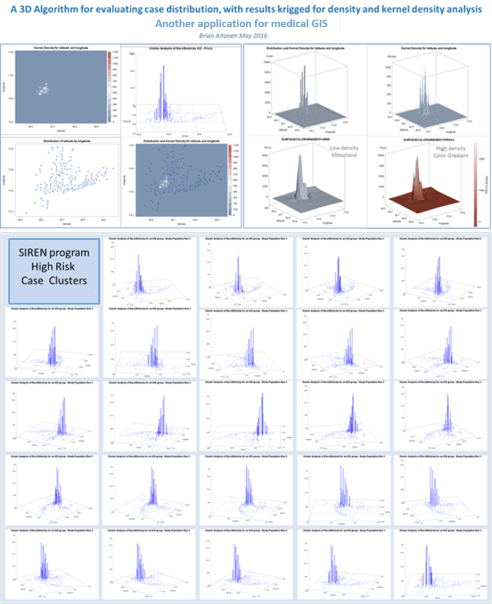
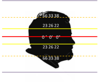
An Automated 3D Mapping process (courtesy NPHG technology).
Recent results of a new technology for spatial medical cartography that I developed, requiring minimal engagement at the IT developer’s end, including an elimination of time requirements related to the development of videos
.
We are in the initial stages of implementing GIS for managed care based population health monitoring. There are a number of software programs out there than enable you to include maps in the displays or presentations you develop as part of the monitoring process of your workstation. As leaders in the field, the production of “dashboards”, “scorecards” and “reports” have enabled us to increase our understanding of the population we serve and develop the knowledgebase needed to better manage the various types of healthcare programs we provide.
Surveillance is a major reason to establish as GIS workstation that has specific public health and population health and safety related metrics defined. Most of the uses of GIS to date have been for research purposes, with a few projects actually evolving into standard intervention, health safety, health security and even cost effectiveness reviews of our programs.
There are literally thousands of conditions, events, diagnoses that fit the description of being important to national health security concerns. Aside from the hundreds or more zoonotic and rare infectious diseases, there are culturally linked and bound health conditions for which the knowledge of their notations in the EHR or EMR should lead to the raising of a “red flag.”
Included in these issues are those related to domestic violence, spouse or child related mistreatment, malnutrition, unsanitary living conditions, criminal activities, illegal or immoral seclusion to an inside home-setting, etc. etc. This particular event is one of the most controversial to appear in the US EMR/EHR data. Its controversy in part related to its reasons for practice, as well as its reasons for continuous practice in spite of international laws passed prohibiting it from being performed.
This new technology enables spatial analysts to define the sociological or sociocultural “hot spots” in health related issues. The recent re-eruption of measles, the in-migration of mosquito-born diseases like zika, the possible planting of new forms of food-spread antibiotic resistant bacteria in certain parts of the U.S., the increasing density of certain culturally-linked genetic disease traits due to cultural growth, combined with the ongoing forming of you families with shared genetic traits, set the stage for the development of a medical GIS by all managed care institutions. When such an HIT-GIS station is developed in association with the local public health program activities utilizing spatial health analytics tools, we develop a better understanding of our local population health, and can more quickly use this knowledge to monitor, survey and even predict the health changes expected for a region.
July 16, 2016
Posted by Brian Altonen, MPH, MS under Uncategorized
Comments Off on “M.A.P.P.” — a Medical GIS programming process with local applications
Genetic Disease Carriers, for a very common malady within a heavily populated urban setting. Note: this was not performed using a GIS, but a simple set of SQL-SAS algorithms
Fortunately, technology does catch up with some of the programs I write. One of those programs in the combined SQL and SAS needed to automate reporting for managed care companies.
The limiter to producing an automated ‘MAPP’ Program, as I call it (Mine-Analyze-Produce-Present) is the amount of work you put your system through.
My first attempt to go through this process entailed a production of about 3500 popualtion pyramids for most of the major ICD9 disease classes, many broken into specific age groups, in order to determine the highest risk gender-age groups in one year increments for very special social disease patterns, such as anorexia, wife beating, pyromancy, infibulation, and the varous forms of child abuse. This evaluation took me nearly a half-year to complete, b ut inspired me to automate my processes some more for producing more effective products, more quickly.
My second attempt entailed evaluating regional disease patterns. To accomplish this, I broken the US down ultimately into about 25 regions. It seemed the NCQA, NIH, US Census and USGS ways of breaking the US population and states down into regions, based on income and/or expeditures and insurance related patterns, wasn’t exact enough to demonstrate the varying family sizes I noted for unique areas, in more unique parts of this country. The Midwest and Great Lakes areas for example, I divided into north-south and east-west and combined N-S-E-W quadrant patterns to determine where the most statistically significant differences existed across state line/regional or subregional borders. That project fortunately took only a week or two to perfect, and led me to develop the grid mapping of the entire United States, in detail.

Over the past five years, the status of Medical GIS as practiced within the Managed Care profession has remained at a 5.50-5.75 level. We don’t use GIS to improve our HEDIS results, nor event to routinely monitor the HEDIS requirements, or event the Obamacare “Meaningful Use” requirements. There are numerous programs underway to try to convince managers to implement some form of spatial monitoring process. But due to disinterest, and/or lack of knowledge for this form of research and exploration, this more productive form of Health Information Technology (HIT) management has not become a standard part of any managed care system. It remains, in what I like to call, an “Experimental Use” category for HIT.
My grid mapping algorithms begin with the zip code mapping style, in which two kinds of maps are developed. The first is a raw data related zip code choroplethic or 3D columnar like demonstration of where the distributions exist for each particular metric. These metrics are, like before, of diseases and disease groups based upon ICD9, but also included evaluations of human behavioral patterns like late refills on necessary chronic disease prescriptions, or incidence/prevalance rates for some of the more classical population based disease distributions.
My second way of 3D mapping uses the grid modeling, of one or more resolutions. I tends towards the “best resolution” models determined using standard comparison analyses of the ability of different grid cell sizes to cluster series of adjacent cases to each other, producing the best fit half-bell curve of smoothly changing frequency distribution half-bell graphs. Each have their values when used to produce 3D mapping of large regional health care statistics.
My recent years have been spent applying these processes to local disease mapping. In particular, larger urban areas were needed to test the models that were produced. This allows the cartographer to test outcomes, and then to quantify the utility of each process relative to the spatial-temporal distribution patterns of diseases or measured events. Some processes work incredibly rare on rare disease events. Some appear to be under representative of high density patterns, like diabetes, obesity, hypertension, atrial fibrillation.
The use of prevalence incidence metrics for the spatial grid modeling technique is still very important to work with. But in too many cases (about one third of the time), this traditional use of “rates” as determined by demographers, epidemiologists, and public health specialists to be the chosen method, are unrealistic and useless at the business level. It would be a tremendous waste of company money to direct your spending to the higher prevalence/incidence places, which some of these values relate to low population counts, not any true need to healthcare facility or products and care management development.
There are several essential ways to develop your EMR data for automating the managed care population health reporting process. With the proper use of macros, you can develop the programming needed to make these calculation processes happen. Most importantly, this methodology doesn’t require the introduction of new software and work station settings to the system.
Granted, these standards to evaluating populations will be around for a while, and unfortunately, they distract from the directions in which more effective evaluations need to be made. The standard Cognos, Sharp and other systems out there are productive, but too slow. These processes evolved from the processes I developed are a great deal more productive, and produce lengthy detailed reports, on a daily basis if you wanted.
In the past year, the following algorithms were developed, tested, utilized and produced into report-producing programming end products:
- Population pyramid and standard barchart graphical depictions, for detailing standard metrics (demographies, diseases, costs, savings per member, cost, predicted costs, etc.)
- Age-Gender Population Pyramid produced statistical comparisons of matched or comparable regions, for any health-related metric
- Race-Ethnicity defined grouped data and regrouped data (binomial grouped) differential analytics, per metric
- Religion and Health regrouping algorithm used to compared traditional and various non-traditional religion and religion-health profiling methods for evaluating areas, regions, neighborhoods, in relation to treatment patterns, refusal for care, disease outbreak patterns, and performance of preventive care programs.
- A method for defining the least healthy patients in any program or population
- A method for defining the most important (highest numbers, incidence, costs) ICD groups for a given population, based upon race, ethnicity, etc.
- A method for applying and then combining or merging the three major risk scoring formulas into a single population-area health analysis methodology, specific down to the 1-year age increments for assigning a risk score, for each patient, and then reporting the summary of these data at the age-gender depicting race, ethnicity, religion, regional, program-defined, facility-defined levels [8 x 3 x 10 x n1 regions x n2 insuranceprograms or insured groups (MCD, CHP, MCR, COM, etc.)].
- A method for mapping these data (numerically, or fraction/ratio related):
- institutionally
- facility or office/provider based
- by network types (MCD, MCR, CHP, COM, BCBS, Obamacare)
- by industry distributions (urban hierarchical modeling processes)
- by socioeconomics data, race, ethnicity, and religion
- by specific disease classes (ICD, V and E codes)
- by specific human behavior patterns (based upon criminal or consumer data)
- by potential investor types
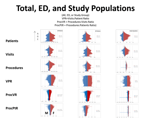
We expect some of what we see on the above diagram. As people get older, they potentially get sicker and require more care. Those who are the sickest experience increases in care related needs, relative to their number of chronic disease patterns. Visits include all visits to doctors, hospitals, labs, referrals, ERs, counselors, anytime you walk into a place and are billed for that visit. Procedures are actions taken by whom you isit, like your lab tests, your annual x-ray, PET, MRI or mammography, your routine drug levels screening for seizure control, your monthly drug urinalysis. VPR is Visits to Patients (per patient) ratio, per 1 year increment of age. ProcVR is the procedures to Visits ration; expected to increase as you get older and more procedures need to be peformed for more reason. ProcPtR is Procedure Patient Ratio, which is a product of ProcVR and Visits to Patient ration of average visits per patient, by age increments (1 year). The left column is for all standard office visit procedures; the middle column for Emergency Visits only; the third is of a population with a specific medical history using the ER for a specific reason. What is most important to note is the flate VPR that exists throughout the ER visits, relative to age. Younger people come in for different reasons, but that seems to balance out with the newer reasons that lead older people to come into ER for in order to receive care. The small spike at 0-2 years of age is for post-delivery problems, that often cause deaths in some children.
July 5, 2016
Posted by Brian Altonen, MPH, MS under Uncategorized
Comments Off on Update on Site Popularity & Statistics
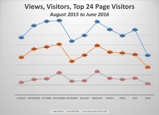
A review of this website performance over the past 11 months suggests, as expected, the academic year is an indicator of visitors. Both winter and summer breaks define the lulls for its use.
As of July 4th, more than 360,000 visits were documented at this site since 2009. It is currently receiving about 90,000 visits per year, representing about 60,000 visitors. The most visited site is page one.
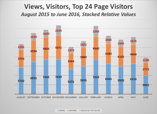
A review of the monthly reporting for pages visited demonstrated there are repeats for certain pages as being the most visited for the month. Tabulating this data produced a table of 24 most visited sites. The two that stood out the most during the past year are my detailed review of the first US Census maps of disease and the historical medical geography article on an outbreak at Martha’s Vineyard in 1763.
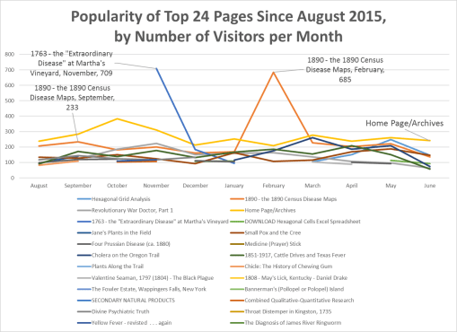
If the ratio of visitors and views relative to the views of these Top 24 sites are calculated, the following numbers are generated based on these three monthly sums.
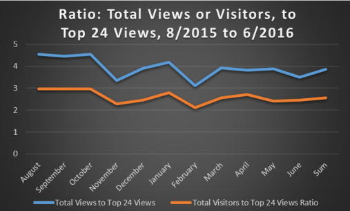
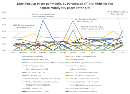
There are approximately 925 more pages that can be viewed at this site. Therefore, a review of these percentages was made relative to total visitors for all pages.
This produced the following percentages of visits that each of the 24 sites represents, on a monthly basis.
A closer view of the lower values is provided:
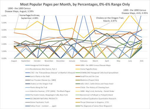
From these results we can determine the most popular topics in historical medical geography and historical medicine.
My site is saturated with coverage of the history of Colonial medicine, centering on the New York area, and so may of these pages pertain to that subject
- Small Pox and the Cree
- Throat Distemper in Kingston, 1735 (early Diphtheria?)
- The Diagnosis of James River Ringworm (Slavery and disease, Thomas Jefferson’s estate; a disease never before evaluated in the historical literature)
- 1763 – the Extraordinary Disease
- Revol War Doctor,
- Jane’s [Colden] Plants . . . ,
- Valentine Seaman,
- the Fowler [initiators of Phrenology] Estate,
- Divine Psychiatric Truth [religion, philosophy and psychology]).
Midwestern and Far West exploration and development are also reviewed extensively, those pages being:
- Cholera on the Oregon Trail (my 2000 MS thesis)
- Plants along the Trail (Oregon Trail medicine)
- 1808 May’s Lick Kentucky (an early geographic interpretation of the Midwest)
- 1851-1917 Cattle Drives and Texas Fever
Historical Mapping
- Valentine Seaman (the first ever disease maps, of NYC yellow fever)
- The diagnosis of James River Ringworm
- Yellow Fever revisited . . . again
- 1851-1917: Cattle Drives and Texas Fever
- 1890 – The Census disease maps
- Four Prussian Disease maps (1890s map)
Several cultural topics received a lot of attention, especially:
- Small Pox and the Cree
- Medicine (Prayer) Stick (Indian medical philosophy)
- Chicle: The History of Chewing Gum (an important Hispanic Heritage study I did from 1988 to 1992)
A stand alone piece I produced was on the history of the late 1890s-1930s ammunitions seller, Francis Bannerman and Bannerman’s Island, which I have family photos and relics from, an important piece of Hudson Valley history
Another important standalone topic is my work on combining qualitative and quantitative research practices for more thorough cultural reviews of community and population health (my current occupation).
This leaves the mention of hexagonal grid modeling, a technique I developed in GIS and applied in winter 2003/4 (unemployed), for mapping environmental chemical exposures in the state of Oregon. I developed the math and theory behind this after beginning work for Medicaid/Medicare in Denver Colorado in 2004. I posted it on this site in late 2009 or early 2010. The popularity of this page immediately jumped to the top of my lists of pages visited.
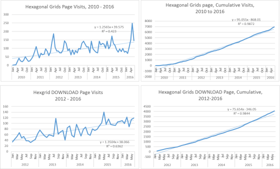
Due to the increase popularity of this topic, I produced the DOWNLOAD page for students to access the excel I used in 2004 to produce my hexagonal grids. (newer versions of this are perhaps due for release; I have an SQL/SAS related version as well developed.) This method of modeling continues to rise in popularity.
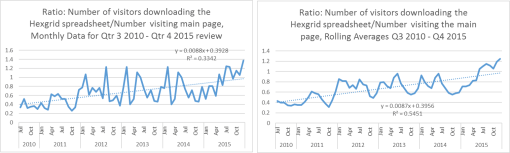
Based on number/percent of visitors to it for downloading the excel file, it continues to increase, with primary interest perhaps being expressed by students enrolled in GIS and/or urban planning and development programs. Based on the feedback I get, most of the support for hex grids remains mostly a practice of western European spatial analysts; for the Americas, its frequent visitors and users appear to be Canadian.
(Time for US urban planners and spatial analysts to catch up!)