NOTICE!!
A Survey has been developed to document and compare GIS utilization in the workplace. This survey assesses GIS availability and utilization in both academic and non-academic work settings. The purpose is to document the need for GIS experience as an occupational skill. GIS is currently being underutilized by most companies. Spatial Technician and Analyst activities and a few managerial activities requiring GIS knowledge or background are reviewed.
This survey, which takes about 20-25 mins to complete (’tis a bit long), can be accessed at
Survey Link
…………………………………………………………………………………..
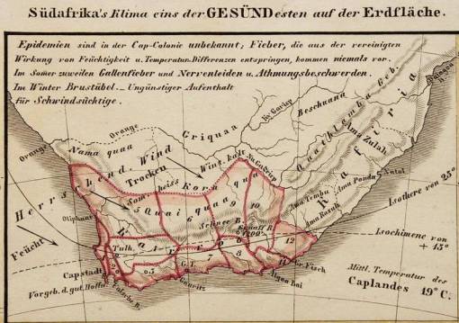
A section of Berghaus’s 1852 map of disease (Planiglob zur geographischen uebersicht der Verbreitung der vornehmsten Krankheiten, denen der Mensch auf der ganzen Erde ausgesetzt ist.Inset maps: Character-Krankheiten in N. Amerika, Antillen – Marschroute der Cholera, der verheerendsten Krankheit des 19ten Jahrhunderts – Südafrika’s Klima eins der Gesündesten auf der Erdfläche. From: Physical Atlas… (1852) by Dr. Heinrich Berghaus. To be covered on another page)
DISEASE MAPS
Introduction
This page is not intended to be a primary reference to disease mapping and medical geography. Instead, it is a review of some of the history of this field, with considerable attention paid to antebellum materials since much of my work has focused on this period of time in North American medical and epidemiological history. The most helpful reference for finding the early versions of medical geography and disease maps is Medical Geography in Historical Perspective, edited by Nicolaas A. Rupke (London: The Wellcome Trust Centre for the History of Medicine at UCLA, 2000).
Research Methodology
From 1994 to 2002, I performed a fairly extensive review of the historical documents in medical and local history libraries pertaining to Colonial and United States medical history. Like many of the studies I performed pertaining to Dutchess County and Hudson Valley history, this interest too has its origins with my review of Dr. Cornelius Osborn’s biography. As part of the research of Dr. Osborn I realized one had to understand the details of disease philosophy as it pertains to the surrounding climate and regional landform/land use patterns. A number of Osborn’s diseases discussed in his vade mecum are climate and/or landform based. He had ample amounts of local botanical medicines available for his to experiment with or make use of. He placed his home above a floodplain with a local history of cases of bilious fever and dysentery, features he may have well related to the large lake and swamps located just a half mile east of his home. Dr. Osborn also had the problems related to shipping and immigration to contend with. Each time a schooner arrived from elsewhere, it was very likely to have on board passengers infected by any of a number of contagious diseases, a stash of merchantile goods including containers contaminated by diseases packaged elsewhere, and in some cases, ballast water and stones that were released that held numerous disease carriers, like the vibrio of a cholera stricken shipping port or the larvae of numerous mosquitoes carrying such diseases as malaria, yellow fever, and several encephalitis carriers.
To understand the colonial interpretation of climate, place and disease, the best way to go about this is reviewing the primary literature, and so that was done, over a considerable length of time I might add.
For nearly all of this work I made use of the late 19th century Index-Catalogue published detailing the holdings of the Surgeon-General’s medical library and requested several thousand journal articles, of which approximately 50% could be found and delivered. There is also a version of Index medicus published for the first years of its production, but there were serious disadvantages to spending much if any time with this classic medical research reference viewable only in hard copy form. First, Index Medicus starts fairly late, about 1902, and lacks much of the prior publications; those which it does contain from the early years are typically the most important and at time most famous of such writings.
However, the older Index Medicus is also the hardest resource to use. I advise against it unless it is the only reference source you have. My major reasons for this is the lack of completeness of Index medicus. When a topic is found in it the number of references is about one or two percent of those in the Index Catalogue. Its bibliography of the journals reviewed is substantially less in size, and it does not review the foreign documents much at all.
Second, the key words bibliographed are somewhat unpredictable. Many of the words found in Index-Catalogue were easily deduced, and synonyms often had to be reviewed as well. With Index Medicus the key word or subject was standardized, or so you would think. Every now and then the committee that helped establish this method would change their key word subject headings, and the terms you are used to look up suddenly vanish from the series.
Finally, the publisher of Index Medicus moved around for a while during its earliest years, so not all volumes are available in most libraries, and the very early, these new volumes are usually printed in a different format–in French! Of course then, the listing of journals referenced does include foreign languages, but mostly those of Western Europe.
So, the Surgeon-General’s Index-Catalogue is the best way to go for this line of work. Using this valuable reference requires a lot of patience, and a lot of time, forethought and afterthought. I recommend more as a follow up, once the major review is over, if you feel like it and you have the time.
The Surgeon-General’s Index-Catalogue list its documents primarily based upon just one or a few key words, and there is little if any redundancy in the references listed. This means that in order to find a specific articles by a known author, one has to attempt the author’s name search first, and then begin to break the article down into major topics. Were I to look for an item that I was previously unaware of, by Daniel Drake for example, I would go about searching for the reference by first looking under the author’s name, and then try to predict what the primary focus of article could have been, according to the cataloguers of the time. If this article seemed to focus on fevers and landforms, I would review ‘Fever’ (a huge topics, with tens of thousands of items listed), by specific subcategories, ranging from anything to do with where the area of interest existed, to what its secondary disease-related aspects might be such as topography, montane setting, soil type, geological form, presence of nearby waterbody or lake or river, etc. Then, there is the fever type or name one might need to review as well such as Yellow Fever, Malaria, Black Plague, Biliary, Mountain, Ship, etc. Each one of these would have to be reviewed, with “Fever” as the initiating term, i.e. “Fever, Yellow”, etc. The other approach is to simply look at the Landform, which unfortunately also requires a significant amount of guess-work, ranging from a search under specific peak name or mountain range names, to a search by State and then County, followed by township or regional names if they were common at the time, followed by Topography, Pedology or specific soil types, etc. In the end, the best way to use and search the Index-Catalogue is to be ready to spend plenty of time engaged in this task. Have specific authors, places etc., that you wish to review, all written out, and then be willing to simply explore this 75+ volume series, over a significant period of time for these topics.
During my several year period of perusing the Index-catalogues, I found the titles of tens of thousands of articles that were in some way, shape, or form of potential value to understanding the 19th century interpretation of medical geography and its related study topics or forms. As stated earlier, I ordered a substantial number of these over a 2 to 3 year period (I got 50% hits for electronic or hard copy, all with pre-1880 dates, most pre-1850), during which time, the numbers of journal articles containing maps in some shape or form were considerably rare. The bulk of these writings provide mostly descriptive information on the disease or medical topics and its relationship to any or all of the above, including local weather, climate, atmospheric conditions, winds, seasonal features, solar patterns and activity, temperature, barometrics, topography, hydrology, pedology, phytogeography, zoogeography, ecology, population density features, etc., etc., etc.
The most important topics to review for this type of investigative work, we they are noted in the Index Catalogues, are as follows:
- Author’s name
- Location (state, county, city/town name)
- Location-related medical meetings and associations minutes
- Place name (Country, Region, town, etc.)
- Type of Place (“Rivers”, “Lakes”, “Glaciers”, etc.)
- “Medical Topography”; Topography, Medical
- “Geology”
- “Medical Geography”
- “Climate”
- “Meteorology”
- “Weather”
- “Hydrology”
- “Water, . . . “, “Water Bodies”
A number of the maps I uncovered as a part of this process are reviewed on this page and elsewhere in the related blogs.
The following are several classic examples of disease maps on the web, of which four are fairly important to note.
![]()
John Snow (1854) versus Thomas Shapter (1832) – The Invention of Point-based Epidemiological Disease Mapping
John Snow (15 March 1813 – 16 June 1858) and Thomas Shapter (1809-1902)
The “Discovery” of point-based disease mapping is typically attributed to John Snow and his 1854 cholera map. John Snow isn’t the first to produce a disease map. A number of historians like to assign this “discovery” to the French cartographers employed in the battlefields. Local endemic and epidemic diseases very much defined the outcomes for military events, an association between topography and climate often referred to in many 18th century maps, but rarely noted specifically as the major reason for map production.
John Snow is also not the first medical topographer/climatologist to produce the first map of disease related to population and surface features, with the goal of defining the cause for a possibly epidemic versus endemic case cluster. This first is attributed to Dr. Valentine Seaman of the New York-New Jersey part of the United States. Seaman’s first documented map is for the yellow fever epidemics of s shipping port published as a part of his treatise in 1804. This map served as an introduction to the value of illustrating the usefulness of maps in an exploratory fashion, when the goal is determining possible causes for a cluster of cases. Since the number of cases was fairly small for Seaman’s map, and its focus was on fairly diffuse spatial patterns like air flow direction, areal humidity and temperature features, and regional population and land use patterns, its outstanding features were easy to assign point-to-point relationships for. These early yellow fever maps therefore often became maps that focused on areal rather than point features for the pathogen, which in turn were linked to the case-defined point patterns for a disease.
The change in medical cartography emphasis from yellow fever to the mapping of Asiatic cholera added yet another feature type to the disease mapping process. Like with yellow fever, transportation routes were felt to possibly play an important role in the diffusion of yellow fever migration, the importance of shipping routes was reduced considerable by those who argued that local features were the primary cause for the disease, implying there was at most an indirect relationship between yellow fever cases and shipping routes. The people transported along these routes possessed some sort of condition or state that made them susceptible to the disease, but not necessarily the primary cause for the disease itself. This “miasm”, “virus”, “germ”, or other form of contagion could not be identified as human born of object and region born.
With the movement of Asiatic cholera from one place to the next, a much more definitive transportation route was finally defined. This route was first identified by enough of the physicians following the 1817 Asiatic cholera pandemic. These observations and their interpretation were beginning to be finalized as another Yellow Fever epidemic came to North America in 1821. Physicians now had two major spatially definable disease patterns to begin to analyze and make decisions about regarding the cause and effect relationships that existed between disease niduses or points of origin, disease ridden regions or places where they tend to erupt and the cases begin to aggregate, and the actual individual cases themselves, illustrated as points or very small areas (address blocks) on a map.
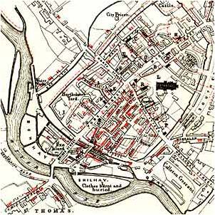
Thomas Shapter’s 1848 Map of the 1832 Asiatic Cholera Epidemic in Exeter [See http://www.casa.ucl.ac.uk/martin/msc_gis/map_making_myth_making.pdf]
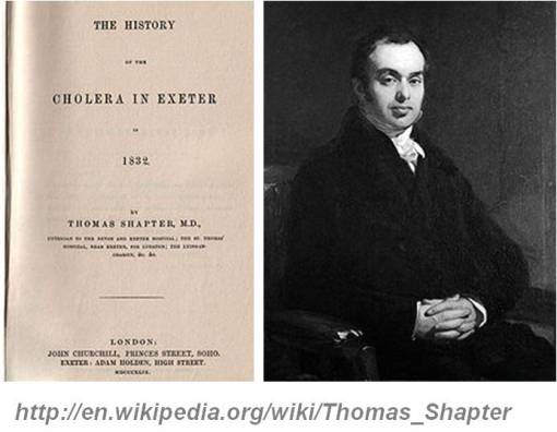
Thomas Shapter’s 1848 map is the first map to successfully map cholera behaviors by employing a point-to-point epidemiological pattern. This map depicts the spatial behavior of the cholera epidemic in Exeter in 1832. The epidemiological review for this map precedes Snow’s discoveries by 16 years, and the first successful detailed use of a map to depict disease patterns in 1848 precedes Snow’s accomplishments for the same by 6 years.
So what was it that made John Snow’s map so popular and to some, seem falsely exaggerated in terms of its historical importance (see http://johnsnow.matrix.msu.edu/aboutsite.php and the alternative viewpoint on this at http://en.wikipedia.org/wiki/Thomas_Shapter). There is additional evidence out there for this tendency for historians and researchers to focus too much at times on medical history in a very Anglocentric fashion. Medical historians inherently approach their field of study with prejudice, versus the less prejudice, but still personal and pre-judgmental social historians of medicine. Regular medical physicians exploring “irregular practices” like herbalism and electromagnetic cure have typically been against these forms of therapy as soon as the first period of this work was initiated. Likewise, the discovery of one generation of doctors may be judged as less important than the discoveries of a more recent generation, at least according to professional colleagues and other contemporaries.
It was this professional and cultural prejudice that led medical geographers to provide minimal attention and appreciation for the Russian medical geographers of the early 19th century. Adolph Muhry’s map of the world disease patterns (1852) preceded Alexander Keith Johnstons’s global disease map (1866) by 14 years. Yet few of us have had the opportunity to learn about and/or observe the results of Muhry’s work, which according to one review of Russian medicine published during the 1980s, noted as well numerous other temporal discrepancies in who made the first discovery in Russia versus who became the first to make these discoveries available for interpretation by the common English readership.
Likewise, more of this cultural biasness has already been discussed regarding Cadwallader Colden’s first map of American Indian cultural geography and the related plant geography (another topic at this site, Colden was too pro-colonist and pre-patriotic for members of Royalty to accept many of his decisions–he ultimatelywas blamed for the Stamp Tax Act and the cause of the American Revolution; his botanic discoveries were ignored and his redefinition of Newtonism too non-traditional). Biasness can also be noted for the discovery of the cow pox inoculation discoveries of the late 1700s. This was a discovery made by individuals in a lower class economic setting (milk maids), and for which most of the fame was assigned to physician Edward Jenner. Similar socioeconomic biasness was noted for the “discovery” of the digitalis effect upon the heart and the cure of peripheral edema, a local herbalist’s knowledge absconded by the famous physician William Withering.
Of course my own statements made here can be considered a little too exaggerating and even prejudiced. But the other lesson here is that when we review medical history, we rely too often on the works of those writing about the past. We like to say that historians use the original material to define their synopses, but the truth is little of history is innovative, most in retold and at times rewritten to fit a new social paradigm popular for the time.
Fortunately for Snow, his map was produced during the mid-19th century, that period when new ways of mapping were being define by physicians and scientists. So it is not atypical for many of the new maps published around this time to have some discovery of new level of creativity attached to the end products. Snow’s map is important because he was able to finally convince a group of intellectuals slow to change their ways of thinking and behaving in a rapidly changing field. Physicians in medicine took nearly two generations to fully accept the bacterial theory for disease, for example. This is because the old-timers who still believed in old-school methods of thinking had to depart from their profession. Members of the medical field did not become believers in the bacterial theory overnight. Nor did this group of colleagues see the value of Thomas Shapter’s first point map of Asiatic cholera cases, and its value as an epidemiological tool.

One version of John Snow’s famous cholera map (publication date for first version – 1854)
The most commonly cited disease map of historical significance is probably John Snow’s map demonstrating his method of identifying the source for cholera in a specific part of London. This is considered one of the most important classic uses of mapping epidemic related data for purposes of identifying the possible underlying causes for a local outbreak of disease, which Snow suspected was due to contaminated water. This represents an example of a combination of epidemiological surveillance and public health/disease prevention uses for disease mapping.
Thomas Shapter
See also http://www.casa.ucl.ac.uk/martin/msc_gis/map_making_myth_making.pdf
![]()
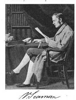
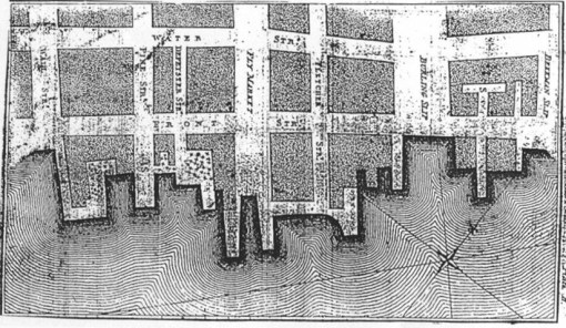
Valentine Seamen’s Yellow Fever epidemic investigation, cases for the year 1797 , first published 1798 (a version published in Medical Repository is under review at this site)
Valentine Seamen’s map on Yellow fever is the second most cited historic example of the use of a map to review local disease patterns. The purpose of this map was to put certain public health and quarantine related matters into perspective in New York city following the re-emergence of several yellow cases after the docking of a shipping vessel. Seamen used this map to document the locations of cases in relation to their possible causative agents, such as local swamps and ports. To Dr. Seaman, the purpose of this map was not necessarily to try and link any of these cases to the local ships docking and unloading. This map in part was meant to demonstrate that other local features may have been responsible for the Yellow Fever as well, including local still water bodies and marsh-like settings found in the outskirts of the urban setting where locals travelled during the days before the epidemic took hold. In the end, of course, the cause for Yellow Fever was directly linked to the ships, their people, their water supplies (including ballast), and any potentially contaminated products stored within the containers on board. This map produced by Valentine Seamen was meant to better define the true causative agent for Yellow Fever–its contagion or “miasma.”
![]()
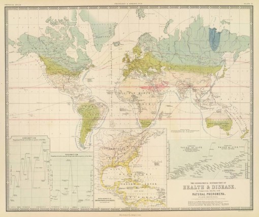
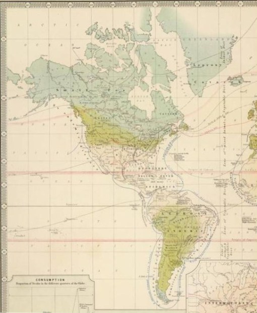
Alexander Johnston’s regional disease patterns, 1856.
The third most common map is Alexander Johnston’s map depicting specific disease areas around the world, based in part on an isotherm map used to define three zones on the earth’s surface; torrid, temperature and frigid, and on his review of endemic and epidemic prone regions around the world based on exploration, travel and migration history.
Close up on upper left quadrants, the Americas
![]()
Henry L. Bowditch’s Consumption as an environmental disease, 1860.
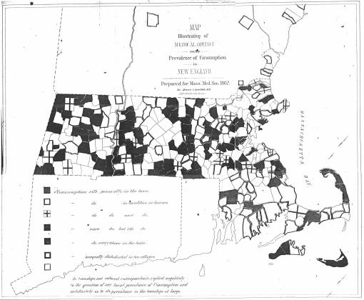
The fourth most common example cited for a historically important disease map is Henry L. Bowditch’s map of consumption published in 1860. This map was meant to demonstrate the spatial relationship of certain soil features to the incidence of tuberculosis or “consumption,” a popular belief due primarily to the work and writings of Pettenkoffer beginning around 1855. Bowditch’s map covers the entire state of Massachusetts, with differences between areas depicted at a county level This was a choropleth map and relied heavily upon the popularization of soil studies being perform in order to determine how disease relates to specific chemical and physical behavioral features of soil such as solubility of soil chemicals in water percolating or the effects of the soil ability to expand and retract its volume based on the local temperature, humidity and precipitation histories. One popular theory was that these retractions could result in the expression of recently synthesized gases, old poorly kept air, built up fumes or the like, and even several versions of soil-produced miasma based on local pits, caves, hollows, etc., just beneath the surface.
Bowditch’s article also provided us with two other maps worth mentioning (reviewed on a diferent page). These represent epidemiological maps that are more representative of the types of small area analysis epidemiologists engage in. The emphasis for most of the eighteenth and nineteenth century disease maps was on major topographic, climatic and meteorologic features. It is interesting to note how much the nineteenth century versions for many of these maps resemble the manner in which similar maps were produced during the colonial period.
![]()
A History of Medical Geography
The main difference between medical geography and medical cartography is that the former has existed as long as humans were capable of associating health and disease with the surrounding environment. For this reason, the earliest medical geography writings often cited are those of Hippocrates, in which important geographical features related to air, water and place were described in an essay bearing the same title.
When reviewing the medical classics, it is quite easy to go to any of a number of classical ancient writings on man and nature and find some sort of reference made to place and health. These discussions of health and place are quite variable and can range from culture-related interpretations of the environment-disease relationship, to natural resource interpretations of the relationships between people, place, living and work-related activities, and disease. Although it is commonly taught that certain time periods in the history of disease geography and disease mapping exist, many philosophies pertinent to a particular time period may very well be simply local natural history observations and events specific to local places. These early discussions about moving to a new place, for personal or health reasons, makes the selection of an place to an example of medical geographic thinking. Well before medical climatology, meteorology and geography officially became a part of the medical profession, or a part of the medical thinking and philosophy, people were already taking these factors into account when traveling, moving, taking temporary residency at a far away site due to some valetudinarian concept, or selecting a new area to have a permanent homestead in which to settle.
In some of the old colonial maps there is emphasis on the “Vly” or swamp for example. The implication this mention has on an area is that the area next to the Vly is prone to various fevers, and given the right number of people diarrhea and dysentery. The fevers may include remittent, intermittent of continuous. The ague, or what is known today as malaria fever, may occur in areas where there is more heat and humidity. The areas still being settled with new houses may exhibit a transition from occasional bouts with diarhhea, to more spell of bloody diarrhea, to the worst forms of bloody diarrhea resulting in black or greenish stools known as the dysentery. Even then, this very physically defineable epidemic or endemic disease pattern may suddenly transform into something much more severe. In the worst scenarios, a town of village becomes so settled that these normally troublesome but not dealy fever problems suddenly transform into severe diarrhea spells that demonstrate first a biliary onset followed by a melacholic and deadly phase–these were known as the yellow fever and considered by some to be the next great plague.
As for the diarrhea problems, even the dysentery wasn’t enough of a problem. This normally endemic and recurring disease pattern could at times appears to be changing to yet another version of the great or black plague. This time the fever wasn’t the chief sysmptom, but instead the dehydrating ongoing bouts with diarrhea, with stools transforming from the black stools of severest dysentery, or what they called “cholera”, to the white ricey stools of a special kind of cholera known as “Asiatic cholera”. The transition from melancholic to mucosal discharges (appearing white and ricey due to masses of the organism responsible for the condition building up in the gut), was a tell-tale clue to the revenge of nature (or God) about to prevail. This transformation of disease into its newest most deadly pattern was the chief reason maps had to be developed to make sense of the clues that were out there. The transition of epidemic diseases, brought into the shipping ports by ships, from yellow fever to asiatic cholera, was considered the most important disease study and research clue out there. Without a “germ” or “virus” to assign any direct cause to, the epidemiologists were left with the need to produce disease maps, in order to relate these deaths and cases to every natural event and condition out there–be these wind, sun, weather, topography, or population and transportation features.
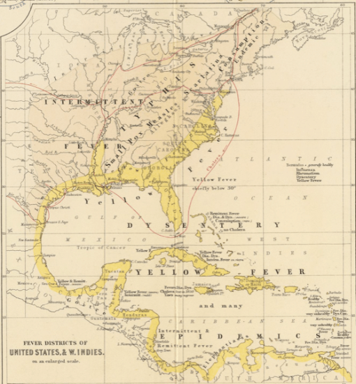
Detail of the Southeast Region of the US illustrated as a separate map by Alexander Keith Johnston based on his 1866 Disease Map. The Yellow Fever regions are areal or polygonal and the cholera routes linear. Measles, scarlatina and consumption endemic regions are also diffuse and areal, and relate to local topography, distance from large populations, and for consumption, latitude. The “pioneer” area for infectious diseases (Stage I on the sequent occupance map) is implied by the Appalachian nature of measles and scarlatina, and to some extent consumption or tunberculosis. Stages II and III are present in the yellow fever infested regions–population density and in-migration history are important, but topography and weather/climate are often the final determinants. Notice also the latitude-dependent nature of specific fever types (see Cuba and vicinity). Stage in economic development and living conditions are the implied causes for “Dia” and “Dys” in the same region.
The impact science has had upon these various past and ancient disease philosophies is based almost entirely on the technology and related findings used to define the particular belief system used to define medical practice and disease pathology studies. Due to science, the miasma of the early colonial years and earlier became the putrified gases of the dawn of the nineteenth century or the vapours extruded by soils and rocks found in particular geologic settings. In this way, it often common to think that little has changed with regard to how scientists and physicians related disease rates at some areal or regional level, and how the local environment, weather and climate, landforms and soil, or plants and local animals play a role in this view of the healthiness of the local living place.
For the New York region, Valentine Seamen is the first disease cartographer. Seamen most likely had associates and assistants working by his side during this time of early disease cartography history. His most important maps related to the yellow fever cases of 1802, but by this time yellow fever epidemics had erupted locally and within neighboring states at least several times during the past decade. A review of some of the Medical Repository notes referencing this work, even before the publication of Seaman’s 1802 map, include printed reviews of the medical association’s meeting schedules, agendas and minutes. These minutes at times refer to other maps not uncovered by previous investigators of this important part of American medical history.
A History of Disease Cartography
In terms of a time-related review of the develop or production of maps with health-related information included, the exact time period for when the first such maps were developed and/or began to be more popular is difficult to determine. There were a number of important maps produced prior to Seamen’s 1797 map on the yellow fever epidemics in and around New York City. A review of the local trade journals and professional documents indicate that Seamen had probably already been testing this use for mapping months if not several years before submitting his map of the controversial 1796 cases to the local physicians and politicians concerned with the local epidemics that were repeatedly returning.
If one looks at the colonial exploration and migration periods and how maps were used to make health or medical related suggestions at the time, we can easily argue that the focus of climate many of these maps portrayed was in itself a medical-related use of mapping. For example, it is not uncommon for these maps to depict any of several drawings or action depictions representing the climate of an area, the main direction of wind flow, or whether or not a region is considerably warm and “torrid”, versus incredibly cold or “frigid”. It could even be argued that maps depicting certain plant or animal life forms in particular regions could be not only interpreted as depictions of climate, but also depictions of health for a given place, setting or type of location. The overall purpose of these symbolism-derived messages would be a combination of much smaller goals related to the mapping, such the promotion of migrations into a particular far away country, the ability of people to acclimate to particular parts of the globe depicted on the map, or the desire to inform the map-reader that a certain location appears to be blessed by certain types of wind patterns, normally accepted to be signs of very healthy living places.
The use of maps to depict regional health-related differences at a smaller level that the global maps on latitude-longitude, climate and weather, and overall topography and health, are those produced during the colonial years meant to depict healthy living sites and not so health neighboring tracts of land. Very few of these maps are actually published, and some of the best examples of these maps remain within the numerous collections housed by private holding possessed by historical societies, estates owned and managed by early book collectors or private librarians, and local public and private libraries of considerable age and local historical importance. Locally, for Hudson valley-related history enthusiasts, some of the most impressive early Dutch colonial maps that perhaps meet this requirements for a historically important medical map of the region are those which make an emphasis on topographically and hydrographically defined-area prone to diseases like the fever, dysentery, and consumption. Maps depicting Vis-Kyl and the great or “Grand Vly” lake-turned-swamp settings of the area are good examples of this. The commons sense for the time dictates that these areas were included on the maps due to the given common knowledge that these types of topographic settings were very unhealthy living environments, enough to include them on maps in order to caution travellers and local settlers from passing too close to these disease-prone areas.
The best examples of maps with clearly identified health-related intentions are those produced for military activities. During the 18th century, these maps served an important purpose to their primary readership, the militia and its leaders, due to the importance of having this knowledge about a particular area readily available to you as a military leader when you are trying to determine which is the safest and most effective way to engage in an upcoming pre-battle migration. the most commonly cited examples of these are the French Military maps produced during the late 1700s, used primarily for military purposes.
In the decades that followed, it was the military maps that would provide us with the most important information about the spatial behaviors of diseases. The reasons for this were several-fold. First, military operations consisted of sizeable populations of people, living in closely cramped quarters or in tenting communities, making it very easy for human borne diseases of an infectious nature to be spread quite easily from one place to the next. Second, the high population density and general human behaviors typical of densely populated communities of people made it easier for diseases to be spread from one individual to the next, easier for human behavior events typically required for the spread of other less infectious diseases such as sexually transmitted diseases to take place, and easier for premonitory events required for disease development and spread to ensue such as the increase in amounts of human waste and debris at a per area, per site level close to population settings. The third major factor making military events very important in the history of disease spread and travel, migration, and diffusion rates is the rate at which these human behaviors took place. Whereas with shipping for example, the length of time needed to travel from one are a to ne next might be several weeks or months in length, for a military group of equal size and ability will normally take just half this amount of time to complete the same travel route. This time-related difference meant that whereas some disease may simple reach their end and dissipate in a short time due to the lack of exposure of the cause to new victims in the given amount of time required for this spread to take place, with military activities, the rapid travel provides a new opportunity for normally time-restricted medical events to continue to find new victims and re-propagate itself within the allotted time. A military traveler is more likely to spread a disease than a non-military traveler or explorer, across a much longer distance and within a shorter period of time.
By the end of the eighteenth century, the military practice of mapping disease and health became a popular tool potentially available to physicians and scientists residing in non-military community settings. During this time, two types of maps developed due primarily to military mapping methods. The first focuses on point data such as locations of cases, locations of people with some sort of relationship with a particular medical happening, etc., and the other type of map developed at this time was a broadly applied areal map defining one large risk area in relationship to others. Both of these forms of medical mapping took center stage by the 1840s, when some of the first effective methods of depicting disease on a map were published.
The most commonly cited map for the 1840s and 1850s in medical history is John Snow’s map pertaining to the relationship between contamination of certain water wells used by local populations and the large incidence of disease in close proximity to specific water sources. The city this disease mapping application was being used for had multiple water sources, enabling each of which could be separately mapped and for a specific caused for the majority of the disease cases to be identified and its use prevented, thereby eliminating the overall cause and effect for the epidemic at stake. John’s Snow’s most famous map had several versions that were produced due to the early lack of acceptance of Snow’s claims, followed by a republication of the book on this diseases and its maps several years later.
The most commonly cited example of an area-based disease tendency map was produced by Alexander Johnston around 1856. This map depicts particular regions of the globe with particular disease patterns, either of endemic or periodic-epidemic nature. Numerous other examples of this kind of map were developed about this same time in medical history, with one of the better examples of these maps depicting the relationships between a particular disease type and a particular place on the map is that of Adolph Muhry published about the same time. This map makes considerable mention of disease related regions in the world, as well as at a partial continental and/or country level, and a very specific small area, city- or town-like, urban-nonurban population level.
Following Johnston’s and Muhry’s maps, other areal-based maps followed, with the most popular becoming more and more credible due to the reduction in the sized of the areas being used to define a particular disease-related behavior or feature. One of the first, fairly detailed, area-specific maps related to diseases and epidemics is that produced by Bowditch pertaining to assumption. Between the publication of Johnston and Muhry’s maps and Bowditch’s production of a county-based pedology (soil)-consumption map, a number of other applications of maps to disease mapping and analysis became fairly popular.
The pages following this page provide still other interesting or historically important disease maps; some are further explained or reviewed. Other more brief examples of these maps follow on this page as they become available.
![]()
Historical Foreign Disease Maps
As much as possible I engage in translations of many of the documents I review for this work. I am now going on my 32nd year of this work, which began during my years as a student in the school of medicine with a work study position, working as a translator, transcriber and researcher of Revolutionary War and colonial New York manuscripts in the summer of 1983 (the official beginning of my Dr. Osborn 10 year project). I first worked as a Latin manuscript/document reviewer for some colleagues there and as a pharma-Latin translator for the symbols and characters normally applied to these traditional documents. I turned to French next with New France writings, and finally German with the pharmacology work I did on innumerable manuscripts, diaries, war documents, letters, etc. etc. over the years pertaining to 1780-1800 medical botany history and the 1700-1840 Moravian-Indian medical history. All of this set the stage for my translation of Colden’s work on the New York Flora completed by 1739–no one had translated this important document before. I then turned to Homann’s important writing from 1720 since it was the first book ever written about the the idea of mapping health, culture and disease.
The following are examples of the items types of I translated, most pertaining to the history of medical geography and cartography.
- Latin Essays on Anorexia Nervosa. ca. 1690. The first diagnoses of these conditions.
- An extremely rare Moravian (Higher Swiss German) rendering of the famous herbal by Matthioli, for owner of document.
- Belgian Military Pharmacopoeia, 1660s-1690s (French)
- Dutch Pharmacopoeia, 1720 (High Dutch)
- Dr. Osborn’s manuscript, 1763, 82 pp. combination Old English, Old Dutch, Latin, abbrev. susp^, word:g, and both alchemical and pharmaceutical Latin.
- Old English-Swedish Viking Christian, Icelandic herbal medicine recipes (Latin and Runes dialects), ca. 1225. (results posted somewhere on this site)
- Cadwallader Colden’s Planta Coldenghamiae (completed around 1739, publ. 1749, 1751), with Swedish materials included.
- Various German, Latin, Swedish and Italian articles and documents pertaining to Jane and Cadwallader Colden.
- Scouttetten’s Cholera in Europe Map (1834) German
- Friedrich Schneurrer’s Global Disease Map and Cholera Maps, 1831. German.
- Heinrich Berghaus’s Global Disease Map (1848) German
- Adolph Muhry’s Global Disease Map (1856) German
- Four Prussian Disease Maps (1880.) German
- F.A. Brockhaus’ Geogr.-artist. Anstalt, Leipzig. Verbreitung Eininger Wichtigen Infektionskrankheiten Im Deutschen Reiche in Den Jahren 1901 und 1902. Brockhaus’ Knoversations-Lexicon. 14. Aufl. Jan. 1905. [Work in Progress]
- Marquis de Lafayette [Fr.] communications/letters, war and post-war
- Yellow Fever Post-Colonial Military Documents, (ca. 100-150 pp. so far)
![]()
Most of my Historical Medical Geography Maps were photographed or scanned and then posted (with separate pages devoted to them)
- Valentine Seaman’s NYC Yellow Fever cases map, 1797 (1804 Medical Repository journal article)
- Scouttetten’s Cholera in Europe Map (1834)
- John Lea and the Geology of Cholera (1851)
- Transactions of the American Medical Association, 1850. The 1849 Philadelphia Cholera Epidemic map and accompanying disease migration maps. [Work in Progress. To be posted in summer 2013 due to pending publication of my related article by a European medical journal.]
- Heinrich Berghaus’s Global Disease Map (1848)
- Adolph Muhry’s Global Disease Map (1856)
- Daniel Drake. Principle Diseases of the Interior Valley of North America . . . . (2 vols), New York, 1850. (esp. volume 1, with 15 medical topography maps, several figures.) [Work in Progress]
- Samuel Haughton’s Cholera in Ireland, 1866
- William Aitken’s Hygiology, 1872 (Book reviewed), 1872 map, in detail.
- Central Mexico Medical Geography (ca. 1880)
- Bowditch’s Consumption maps (1 State and 3 Local) (1862)
- Investigative Maps of Enteric Fever (1872) [Work in Progress]
- Charles P. Lyman’s Contagious Pleuro-Pneumonia of Cattle (1875/1880)
- Texas Drives and Cattle Fever (with “Infected Districts” maps, and many other historical, recent and modern maps)
- John C. Peters and Others (Judson, Stille), Asiatic Cholera (1875)
- Charles Denison’s North American Topography, Climate and Consumption series (ca 1863) [Work In Progress]
- Charles Denison’sRocky Mountain Health Resorts (eastern Rocky Mountain Sanitarium and Mineral Springs sites), 1878.
- Alfred Haviland’s 1875 Cancer in Britain map [Work in progress]
- Robert Felkin’s Disease Maps for various tropical diseases, 1889 (book reviewed), 1889 map series.
- F.A. Brockhaus’ Geogr.-artist. Anstalt, Leipzig. Verbreitung Eininger Wichtigen Infektionskrankheiten Im Deutschen Reiche in Den Jahren 1901 und 1902. Brockhaus’ Knoversations-Lexicon. 14. Aufl. Jan. 1905. [Work in Progress]
