With no knowledge of the true cause for many diseases, physicians learned to correlate disease and the environment through the spatial associations they made between disease cases, local weather conditions and the local topography. With time, these interpretations of the environment were defined to include new discoveries being made, such as the behaviors of disease in relation to local geology, soil porosity, pH and chemistry, and the temperature and chemical make-up of water bodies. As smaller and smaller portions of the local environment and ecology were better understood, many of the early theories for diseases like cholera based on climatic and meteoric theories were replaced by animalcules, poisons, and chemical causes. It wasn’t until the late 1800s that the true bacterial nature of Asiatic cholera was finally understood.
Around 1800, very few maps were produced relating cases of illness to the local environment. Samuel Mitchell defined this profession during the late 1790s, and by 1798 his colleague Valentine Seaman produced one of the first disease maps depicting yellow fever cases in relation to local shipping ports. The most common belief during this time was that diseases were a result of the relationship between the human body and the surrounding environment. In the shipping port setting, the putrescence produced by ship ballast, human waste, and dead plant and animal parts floating about the docks were considered one possible cause for the disease. The alternate theories for the time defined air borne miasma as a cause, either carried inland by ocean breezes or brought to port by winds travelling through nearby marshlands. Still other theories for the epidemic fever trying to be understood included meteorological features focused on recent precipitation patterns, average temperatures and changes in humidity.
Due to its tendency to remain close to shipping ports, this geographical study of yellow fever remained focused on the relationship between the introduced, epidemic tropical disease and the immediately local tropical like environmental conditions located close to ocean waters. The same logic was used to define the geography of other epidemical disease patterns such as typhus, spotted or dengue fever, and “ship fever” (bubonic plague). By 1832, with the arrival of the first cholera epidemic into the United States, medical geographers were ready to produce some of the first comprehensive environmental disease maps of the epidemic and its human epidemiological patterns.
The mapping of cholera throughout the nineteenth century helped medical cartographers perfect their skills in disease mapping. It was during these decades that uniquely informative forms of mapping disease were developed. During the first twenty years, these maps focused on environmental features. Following the 1856 epidemic, temporal maps of cholera epidemic history were soon developed, in search of commonalities for these epidemics. By the 1870s, medical topography maps were expected products of the many epidemic studies and reports engaged in and published. Medical disease maps were commonpalce to many state and regional public health reports. They were even required by most states as part of the annual state’s report to the governor.
John C. Peters of the New York City area took on this task for the United States Government in 1872/3, He grew up learning about all of the prior attempt made to use maps to define the possible causes for various diseases. Originally a strong promoter of homeopathy, his retirement from homeopathy in 1860 and his total conversion to the sanitation theories of disease promoted along with medical topography and cartography helped to form the numerous reports he produced for decades to come.
John Peters benefitted from many of the maps produced before him. The following are examples of maps that he had for review, in order to determine how best to produce his own maps on local disease patterns. This section is then followed by some of Peter’s own maps.
The first cholera cases-areal map, produced in 1848, concerning the 1832 epidemic in Exeter
The First Point (Case) Map
The above map of cholera in Exeter was the first example of a published case map on cholera.
There were probably other case maps much like the above developed as well. But none ever became as famous as John Snow’s map of the Asiatic Cholera and the manner in which it infected just one of the several potable water sources for London during the 1850s. Snow’s map is possibly the first to detail extensively the logic behind proving one source of water being a distinct cause for a disease, versus the several other providers of potable water whose reservoirs were not. John Snow’s map is famous, and highly commended by most current medical geographers, but is not necessarily the first to make such a discovery, as evidenced by other medical geography historians discussed elsewhere on the web and at this site.
The bar above depicts Google images for "John Snow's Cholera map"
John Snow’s Maps
The following are interesting GIS or ArcGIS renderings of these maps.
Adolph Muhry’s Map
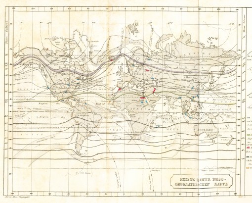
The first map to be produced and continue to be reproduced by other cartographers and epidemiologists was the regional disease patterns map. The first of these was developed by German cartographer and geographer Adolph Muhry, and effectively displayed both case and areal data relative to disease types.
(this map is covered in detail on another page)
Alexander Keith Johnston’s map
Muhry’s map defined the field of medical cartography in a global sense. Muhry’s work was followed, or perhaps paralleled, by the map produced by Alexander Keith Johnston. Johnston’s map of disease regions provides an incredible amount of detail on the regions. Some of these regions are very much accurate in terms of climate and topography, others are very much the result of pro-Anglican, pro-Western European cultural interpretations of the rest of the world during a time when Colonial Expansion was the expectation and promoted philosophy of the cartographer.
North American portion of Alexander Keith Johnston’s Disease Map (this is covered in detail on another page)
Johnston’s map is impressive, but problematic since it “regionalizes” certain disease types and patterns. Johnston’s map is best interpreted for specific aerial features, in particular regarding medical climatology and continentally defined disease ecology features.

John C. Peters’ Maps
As Peters later notes, Johnston was too focused at times on the isotherm and latitude lines, thereby preventing him from producing a true interpretation of many of the disease patterns. This focus on temperature prevented other theories from developing and becoming promoted when it came to better understanding disease causation.
Even 30 years later, when Peters produced his own maps on the global migration of diseases like cholera, he had to take the extra time needed to demonstrate to the reader that there were actual and theoretical migration routes for cholera, and that the isotherm line and latitude rule were not always the best way to interpret and predict disease migration habits. Peters favored the rules of disease migration defined by the sanitation movement since the 1950s. Some diseases were a consequence of filth first, and the natural environment second. To Johnston and others, this relationship was in reverse.
John C. Peters produced two types of disease maps.
- Most of his maps depict medical topography, a study of disease in relation to land forms and nature. These are point (case)-area maps depicting where cholera prevailed, defining land use patterns, and water and landscape features, and detailing the people of the region, including points depicting where the individual infected by cholera resided and were presumably infected.
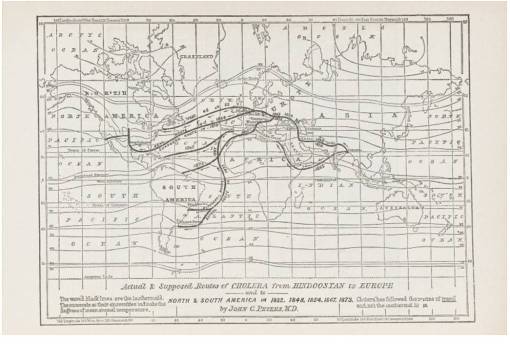
- Peters also produced several large regional or global disease maps. These are his most informative in terms of the history of medical geography and epidemiology. They depict the relationship of disease-ridden areas to human migration patterns and transportation routes. His best known maps depict the diffusion of cholera across Europe and his 1873 map depicting the global spread of cholera as several pandemics between 1815 and 1872.
A large number of these maps are accessible documents in Government Document collections. His essays are often published on their own, and later republished as a government document and/or as part of the annual reviews each government agency had to produce. The Cholera maps produced by John C. Peters later became the inspirations economist and geographer Gerard Pyle (covered separately) needed to produce his own interpretation of cholera, which are some of the most commonly cited maps about cholera migration in the United States. The following are examples of these maps.
John C. Peter’s Epidemic Maps
Example 1. In this first example of Peters’ maps, there is a series of concentric rings depicting the literal diffusion of the cause for cholera radially in all directions in almost identical fashion. This mnap above depicts the focus of the disease (the centroid of these rings), which is just a few blocks from the edge of the heavily travelled waterway nearby, located within one of the more heavily populated parts of the city portrayed. This suggest that Peters imagined the disease to begin as a direct result of human population density, in relation to but not directly related to the city’s water edge where ships could be docked. This enables opportunities for the disease to be introduced by something directly linked to the local waterway, but also by some other means requiring adequate numbers of people. Since Peters’ philosophy for the disease is that it is due to poor sanitation in the urban setting, this allows for descriptions to be given for diseases that are shown to be home-bound and/or born, water or riverborn, occupational in cause and onset, as well as due to human migration habitgs on ship, by train or roadway, or on foot. A simple look at the above map displays a reduced density of disease as one increases distance from the center of the concentric rings. Even 50 years earlier, the common theory for this spatial placement of the disease nidus based such arguments primarily upon poor sanitation, poor human living conditions, and inappropriate placement of certain low income ethnic groups. Compared with earlier writers on the philosophy of this disease migration process, the diffusion of Asiatic cholera was explained using more complex, much lengthier arguments. The theory for disease at this time could therefore be diverse, and not just focused on one major causality, such as the “filth” hypothesis promoted 50 tears earlier by French epidemiologist and medical topographer Scouttetten (which see on another page). 
Example 2. This next map places more emphasis on nearby topographical features, in particular the hills and marshlands located nearby. Once again, a stream is displayed on this map, implying streamside weather, atmospheric conditions, marsh-related miasm and airflow patterns as potential causes for the distribution of the disease causing agent. Concentric circles are lacking from this map of the disease, implying there wasn’t the perfect concentric, centrifugal-like flow of the pathogens at hand. This disease pattern is less human population realted and more medical topography related in terms of its form and behaviors. Peters uses transportation routes to demonstrate the possible pathway the disease took into this much smaller semi-urban population setting.
Example 3. Peters is again focused on population density and the urban setting with this map, but there is also evidence for where, how and why certain niduses are formed in the city. The foci define by circles depict specific building forms where the disease prevailed as multiple cases, and one setting along a route followed by water. Each of these are on opposing sides of the railroad track or heavily travelled roadway, the transportation route by way the disease may have been introduced into this setting. 
Example 4. Bends in river routes commonly form ports for rivers along which cities develop. Common features to these settings are the swamps that form upstream and downstream from these bends, hydrographic features develop due to oxbow-history and/or allovial stream bed formation history. In either case, the land form that is produced due to these geological activities is one which harbors water, allows for decay and vegetative rotting, producted poor smelling and often humid air (“miasm”), and which is often assocaited with numerous other seasonal endemic disease patterns (dysentery, diarrhea, influenza, malaria, yellow fever, “ship fever” (typhoid), spotted fever (typhus or typhoid), etc.). Such a setting has traditionally been a favorite landform mapped and researched by early medical topographers trying to link it to any of a number of epidemic and endemic, nearly predictable disease patterns. Peters makes a series of observations trying to use this setting to define yet another set of reasons as to why the disease asiatic cholera managed to make its way into this heavily populated small town setting of Mount Vernon.
.

Peters’ Regional and Global Maps
.
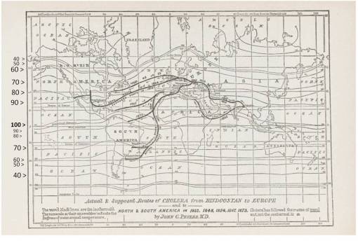
Original Map
The 100 degree isotherm labelled
Left footnote comment: “The waved black lines are the isothermals. The numerals at their extremities indicate the degrees of mean annual temperature.”
Right footnote comment: “Cholera has followed the routes of travel and not the isothermal lines.”
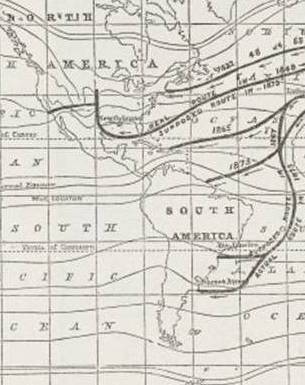
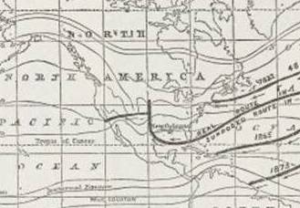
Labels for North American lines: “Real Route in 1849” (also labelled as) “Supposed Route in 1873”
For South American lines: “Supposed Route in 1867” and “Actual Route in 1873”
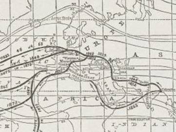
In the above figure, notice the two routes from Hindoostan to Europe: the northern route across land is labelled 1846/6 and 1873, the other, mostly by shipping routes, is labelled 1865.
North and South American portion of the map
North America Only. [Is the double line a latitude limit?]
All isotherms labelled.
.
During the years Peters was engaged in this work, the bacterial cause for cholera was on the brink of becoming proven. Not everyone in the medical field was aware of this. There were several requirements established for proving the bacterial cause for a disease that were published and it was up to the scientists to meet these requirements. The association of Robert Koch with this discovery is very much due to a timing of the appropriate events proving this discovery. Koch was really just a one professional decision ahead of another microbiologist trying to acquire the fame of proving the cause for this disease. This discovery was a professional goal prevented by slow responding British Government officials. By 1883, the bacterial cause for Asiatic cholera was proven by Koch and his team and the British were left to suffer the consequences of of these bureaucratic decisions.
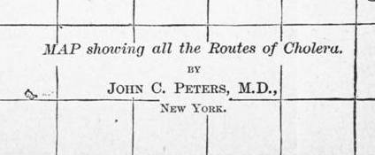
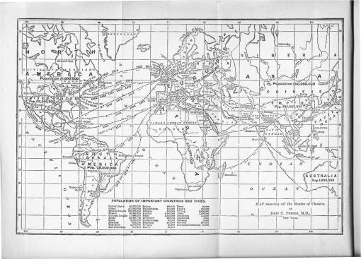
The following is Peter’s Asiatic Cholera map published as a part of the government documents. It appeared as the frontispiece in A Treatise on Asiatic Cholera edited by Edmund Charles Wendt, in which specific chapters were developed and presented by Drs. John C. Peters, Ely McClellan, John B. Hamilton, and George M Sternberg. (William Woods and Company, New York, [May] 1885.)
..
.
.
.
In 1885, when Edmund Charles Wendt’s Treatise on Asiatic Cholera was published, this work was a review of all the findings then available to medical researchers, with important summaries of some of the most important work in this field. In just a year, vibrio became the well known and irrefutable, well-documented cause for this disease. Peters’ maps were still important in that they helped to display the natural ecology of this organism, suggesting how and where specific natural features were important to the progression of the disease in epidemic fashion, between countries, and what human population features were important regarding its necessities as a human disease. From that point on, the focus on disease shifted to microbial life and its relationship to people and animals, and the traditional medical topography and medical climatology teachings became second rate to the results of microbiological work. Over the next decade, like most major philosophies that undergo change, diminish in importance and popularity, and then silently depart the field that once was so enamored over these scientific, philosophical concepts, disease mapping and the natural effects upon disease became minimally important. Whereas Western Europe became focused on the non-geographic nature of disease, only the Eastern European regions managed to keep some of their researcher’s attention focused on the geography of disease behavior and patterns. This would result in the most important contributions made by Russian scientists Igor Pavlovski and Voronov.
Pavlovski’s work has received considerable review from Western European epidemiologists and academicians, but Voronov’s have unfortunately been almost completely overlooked. Since Voronov was the successor to Pavlovski, this prevented the important contributions Russian disease cartograpehrs and ecologists already had on this field from advancing much further. Voronov’s work added substantially to the natural ecological interpretation of disease in terms of microorganism or pathogen, host-vector relationships, and most importantly, definition of areal limitations that each of the steps that the disease ecology and migration processes take. Voronov perfected the macroecological behavior of disease much like Russian interpretations have perfected the macroeconomics view of world business and finances, defining zoning patterns related to hosts, carriers, vectors and human victims of disease, a method of spatially presenting disease not reproduced with similar success by Western European epidemiologists, and when produced, tend to represent the rediscovery of past accomplishments rather than an addition to past successes produce by the medical geographer







Leave a comment