NOTICE!!
A Survey has been developed to document and compare GIS utilization in the workplace. This survey assesses GIS availability and utilization in both academic and non-academic work settings (including workstudy and student employment). The purpose is to document the need for GIS experience as an occupational skill. GIS is currently being underutilized by most companies. Spatial Technician and Analyst activities and a few managerial activities requiring GIS knowledge or background are reviewed.
This survey, which takes about 20-25 mins to complete (’tis @25 questions), can be accessed at
Survey Link
…………………………………………………………………….
Note: As of May 2013, I have a sister site for the national population health grid mapping project. Though not as detailed as these pages, it is standalone that reads a lot easier and is easier to navigate. LINK
………………………………………………………………………
Natural Disaster Patterns — Risk Management and Surveillance

![]()
The following examples of my GIS work focus on topics that are reviewed elsewhere on this site. Typically a single GIS project has the opportunity to consist of numerous much smaller studies. Due to the efficiency with which data analysis can be automated using GIS, incorporating more than one measure into a single project design is the most effective way to engage in such institutional or business endeavors. At the institutional or university level, this results in better use of resources made available to us, allowing for additional analyses to be performed and additional insights to be provided. In terms of business endeavours, these tasks provide additional insights that can be added to final reports filed according to corporate contracts, and result in the development of new measures of potential value to future markets.
The following two are from a three part report I generated on the diseases of the United States. The purpose of this report was to illustrate how an “Atlas . . . ” could be developed for any healthcare program or large facility to make use of when monitoring its managed care related public health, meaningful use, quality improvement, surveillance, and intervention activities.
Disease Maps Part 1 ALTONEN 2012
Disease Maps Part 2 ALTONEN 2012
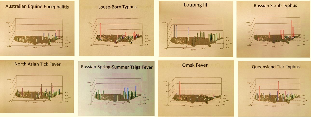
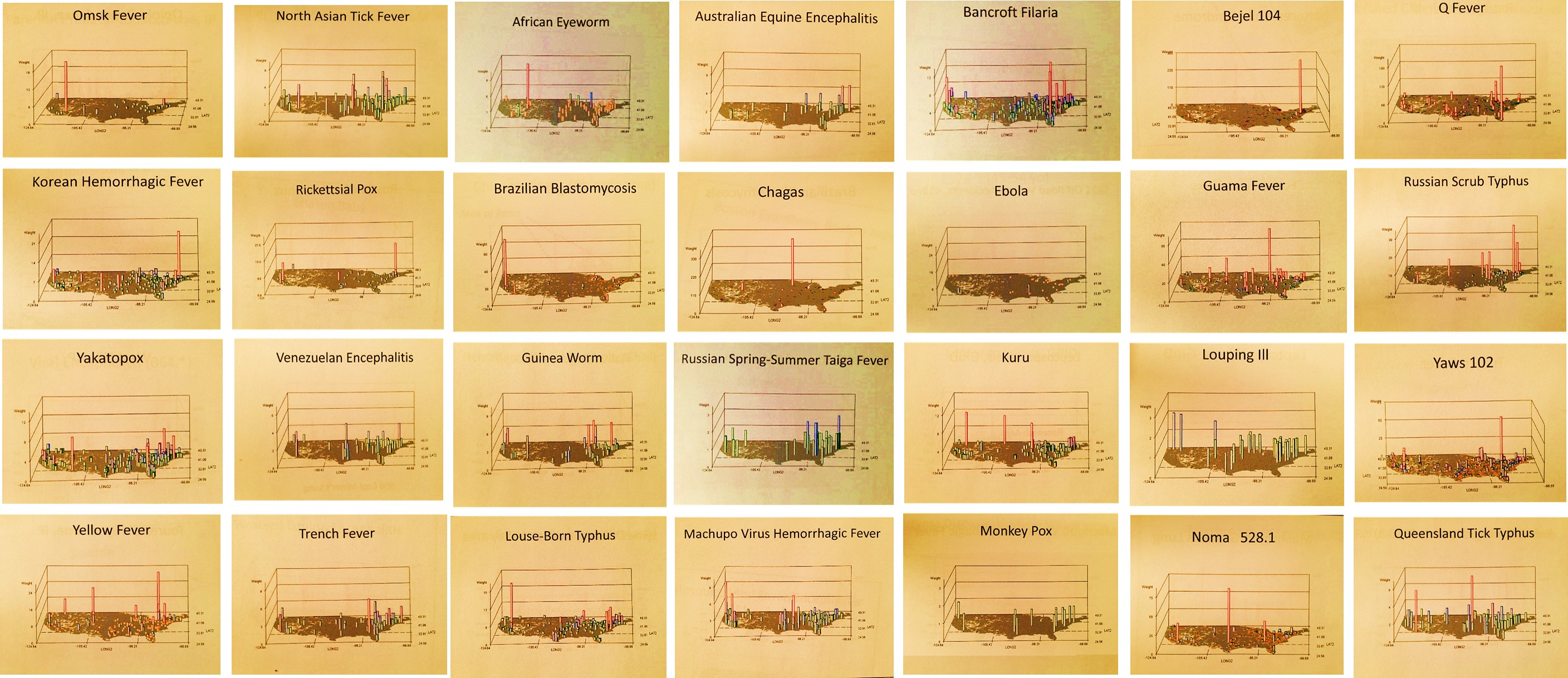
With the above in mind, please check out the following videos I produced that depict spatial disease patterns. These maps are typically of the rarest diseases and conditions which have strong environmental features and spatial relationship linked to their cause and diffusion process. The most basic maps consist of raw numbers (n) for ‘people with disease counts’. The IP maps or Independent Prevalence (“IP” is in the title) display areal values calculated independently for each grid cell (a theoretical “perfect” age-gender distribution population is used for this). These videos usually include a contour plot (the initial page) based on nearest neighbor derived density patterns, following by rotating 3D images of the US, depicting either real areal (combined grid cell-zip code) values and/or true square 25 mi x 25 mi gridcell n or IP patterns (since grid cells eliminate no data areas, these tend to displaywith a strong background or basemap and very few or no grey zones normally applied to indicate missing or no data).
.
The symbols below are links to more videos
.
Ε θ η σ μ ε δ
∞
Throughout the site are these links (like above, with some “invisible”) to special GIS outcomes. Quality is poor at times due to time and technology limitations.
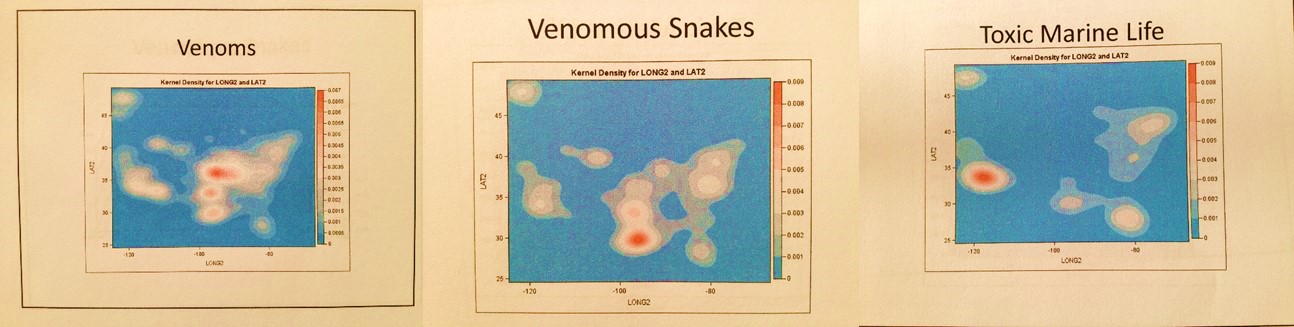
The above is a density map of the US for urgent care/emergency visits related to Venomous Animals
![]()
National and International Health Statistics
Example: Immunizable Diseases
‘Healthy People 2020 – Missed Opportunities in Current Childhood Immunization Programs.’ 2009.
This is self explanatory. I re-wrote the sql and algorithms from this innovative IDRISI-raster mapping program I developed, making it run in SAS and performing either a point-line-area [pla] or raster analytic process (ArcGIS-Spatial Analyst for GIS-savvy individuals). This short cut actually makes it run many times faster than any of the other three method/systems available (IDRISI/ras, ArcGIS-any version, or SAS-GIS). I can be applied to large area disease mapping and display, or be applied to very high quality, high resolution close up reviews of a research area, like an entire city and its suburbs, scanning from east to west across this research area. (For example, my occupational disease examples in the videos scan for “hot spots.” ) These rotating map images enable all parts of the map to be clearly displayed. Various levels and stages of this mapping method are presented here, and in the links below that appear as underlined map titles, letters and various shapes. A specific set of pages were developed for teaching purposes and demonstration of this technique, drawn from my 1997 and 1998 IDRISI, the 2004-5 ArcGIS classes, and some GIS job seeking activities from about the same time requiring such presentations. As usual, this work has been expanded to include hybridized grid-raster-pla methods relying mostly upon a raster-like format of analysis and display. In the end, the sophistication of the cell formulas is really what defines the final output, not the grid-raster-pla formulas and techniques. Cell formulas are used to define cost, risk, prevalence, normalized behavior change rates, normalized and corrected GINI and SES adjustments, etc.
For numerical analyses in GIS, the Spatial Analyst and Network Analyst extensions to ArcGIS are a good place to start. There are also a number of tools out there you can add-on or pay a small licensing fee for that make the GIS more helpful. At the corporate level, a well-trained GIS analyst can be very dissatisfied with the limited knowledge and understanding corporations have for this new technology. When they do make use of it, the form of software employed and methods in which it is applied are often quite primitive, perhaps ahead of some of their competitors but still very primitive.
One non-GIS population health analyst company I was familiar with produced several hundred pages of detailed tables on numerous diseases, but was incapable of producing any maps. This level of technology is like ordering demographic information from a company paid to engage in a census survey, but in the end only provide you with a book riddled with more than 300 pages of tables, and no map to go with it. If this were done for community health-related purposes, the value of the technique fails if the purpose of the census was to develop future programs. Your company now has to pay for a third company to map out this information or do the same itself.

Coccidiomycosis: a Southwestern Disease
Another GIS development group produced a product that is colorful and futuristic in appearance. To make it look new age and highly technological, a palette was use that gave the maps a dark background with colorful pie charts and sized point shapes for the various towns and cities being evaluated for this regional economy/consumer activity study. Again, only one of two important steps needed for any GIS related project were taken–whereas the previous company put the need for GIS on the back burner, relying upon primitive printers to produces a report that looked much like the 1980 census books we reviewed in the past, the second company decided to ignore or not make any attempt to understand the value of the data, its goal was only to produce a type of map that would put any reader of its reports in awe. The one question you have to ask yourself when you are a company, or working for a company, trying to produce these complex reports and pretty images is what do you, your workers and your clients walk away with by paying you to engage in this corporate experiment? If your company cannot make important discoveries and as a result make valuable changes at the population level, not at the corporate and financial level using this new technology, then you are perhaps wasting time trying to develop some new tool for use in marketing your skills.
Occupational Allergic Bronchitis
Now the above images and video example are showy but they are true outcomes. The purpose here is to point out that this can be done and should be done within an employee setting. A recent exploration of the major companies in this field, now going on two years, continues to demonstrate how far behind in this technology we are within the corporate community. I base this on a review of some survey work involving about 150 major companies (about 8 companies per month average) with the skillset and data availability theoretically needed for the production of this form of external reporting. The assumption being made here of course is that if they included this in their protocols beginning two or three years ago, they should have an expert in the field by now producing highly detailed maps demonstrating a strong understanding of this way of analyzing health. Instead the end products on display are for the most less than the value of the best research out there published when ArcGIS became perfected. (My survey defines 10 levels of ingenuity and technical prowess, with GIS perfectionist levels scoring 7 and above based on rate of use.)
The thing about corporate settings that is very upsetting when it comes to GIS utilization is that the larger the corporation, and the more complex and complete its population information, the less likely it becomes for making discoveries. Even though the potential for discovery is there, the old corporate mind is two or three generations behind and as a result important changes cannot be made, important discoveries cannot be made adequate use of.

Elsewhere on this site I like to refer to this as the “Seeing the elephant” problem that the corporate world has. When a company incapable of seeing the complete picture of things is merged with another company of equal size or larger, the result is only something that is worse–a Mammoth rather than an elephant, a rich holder of information that becomes even slower at making advancements, much less capable of making innovative discoveries.
This is opposite of what we might expect for the corporate world. We expect the corporate world to be cutthroat in nature, always in desperate search for some new technology or some new way to take a leap ahead of the others. What stops corporations from making these leaps and changes is the leadership. If the leaders in the company having an inkling of an idea about what it is their groups devoted to innovation have discovered, then chances are they are not going to make the leap in knowledge base and initiate the activities required to make their next major advancements. There is this irony to the fact that this kind of problem occurs every day in large corporate settings.
I like to tell companies that if they wish to make important accomplishments and advance, that they have to have good management that know the field, not just know about the field, and they need new thinkers. Any and all old-fashioned idealists who are working as managers, trying to maintain their place on the hierarchical ladder of life with this company, have to be thinned out if they decide that some new idea or invention is 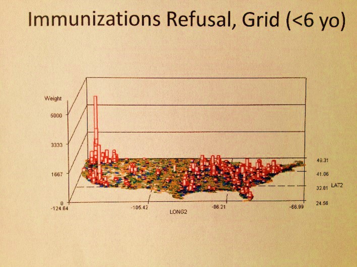 working against their own ideas and discoveries that they’ve been trying to promote, ineffectively, for most of the years of their employment.
Where are most of the vaccinations refusals by parents for children?
There are these formulas I developed for GIS research that make no use of GIS in the corporate data system. Before ArcInfo evolved into a combined ArcInfo-ArcGIS system, before there was spatial analyst and network analyst, there was just the numbers and tables to work with. No true maps, just images that this information could be pasted upon. (There is also that old Goddard Space Center-related UNIVAC system I worked with during my first years in college which used x, o, i, period, stars etc. to illustrate what looked like a map, back in the 1970s, but the complexity or applying that new method of drawing need not be detailed here.)
One set of US maps I developed in recent years used this method to post the results of numerous population group studies (to be displayed on the page about this SAS formulas). Another method I developed threw out the need to see boundaries and such. State or county edges were less important, so long as the results graphed were adequate in displaying the regions under review. With this method, I could use the thousands of pages of tables and covert them into a single page consisting of a map illustrating the meaning of these numbers. That is what this exercise in non-GIS spatial analysis is about–how to illustrate your results in a clear and accurate way without the ned to purchase any GIS tools.
In general, companies fall for the glitter attached to many of the GIS tools out there for mapping your company’s “findings”, which more than likely tends to be your company’s non-researched data now considered to be of potential value. The smaller companies involved in this data manipulation and data presentation produce a colorful product, but one which can be easily replaced by a competitor, since most if not all of these companies provide primitive statistical tools. This is why I am attracted to the use of just the ESRI and Clark University GIS tools and apply it to nearly all of my presentations at this site. The latter, IDRISI of Clark, was born in a university setting, and enough like the SAS produced by UNC more than 30 years ago to have some skills that cross over. The former, ESRI, is the first born in GIS as it related to the current needs for public health researchers. In my GIS classes these two are required programs for individual searching for a GIS related profession. [That only touches the surface however, since I make other recommendations freeware/shareware as well.]
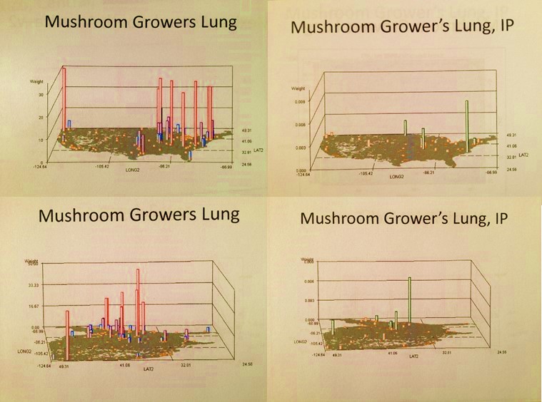
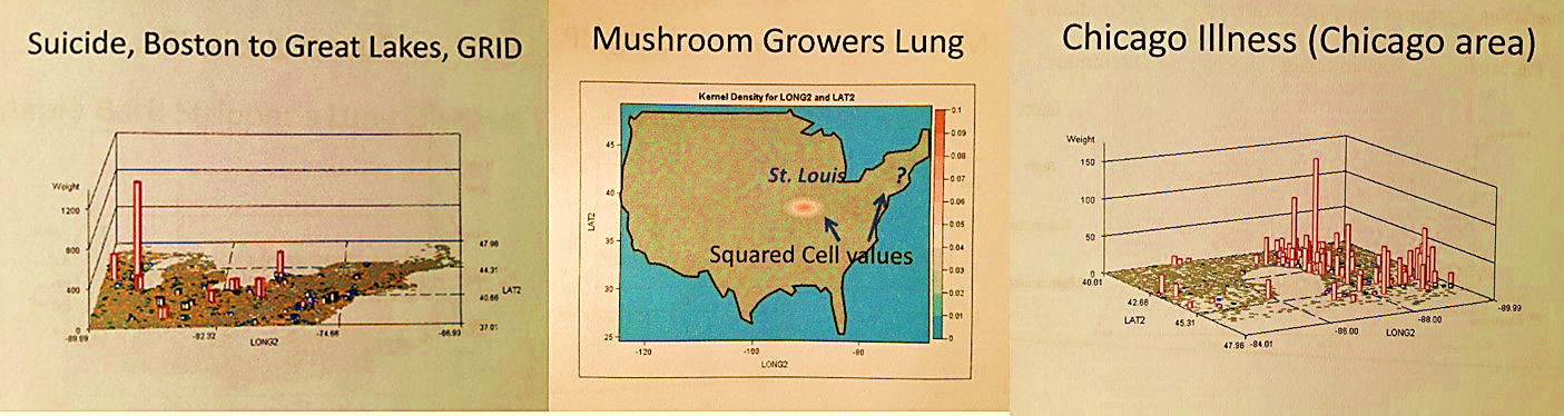
Mushroom growers lung, Portland, Oregon and ?
If you compare the tools used by corporations with either of these two preferred academically produced and tested sysems,, you have to wonder how and why companies could possibly make any advancements without them, and how and why they selected their actual GIS programs and methods or the GIS end-product companies they contract to. Without these two essential programs and skillsets, any advancements they make come only as a result of their being slightly ahead of their competitors. Being the larger (largest?) elephant in their field, they like to move slower, and are not always moving in the right direction. (I apologize for being so critical here.) Unfortunately, in such settings, those who are making the decisions regarding change are not the best decision makers when it comes to disease and public health. They are usually not that far ahead when it comes to the bell curve. When applying for a GIS job, accept those whom employ one or both of the two recommended above (many Federal/Federally contracted and RS specialized companies are not included in this referral).

Pinta: a Disease Migration Pattern


A Landsat 7 Satellite Image of Dutchess County, NY

Positive-testing site for West Nile

Risk Management
.
The “dangers” of transoceanic travel
Portion of a 1562 map by cartographer Diego Gutiérrez and engraver Hieronymus Cock, original owned by British Library
.
Links to examples of Foreign Disease Introduction Maps produced using my GIS programming (IP = Independent Prevalence maps, for exceptionally high N; others are raw data based on cases from about 1970-2000)
.
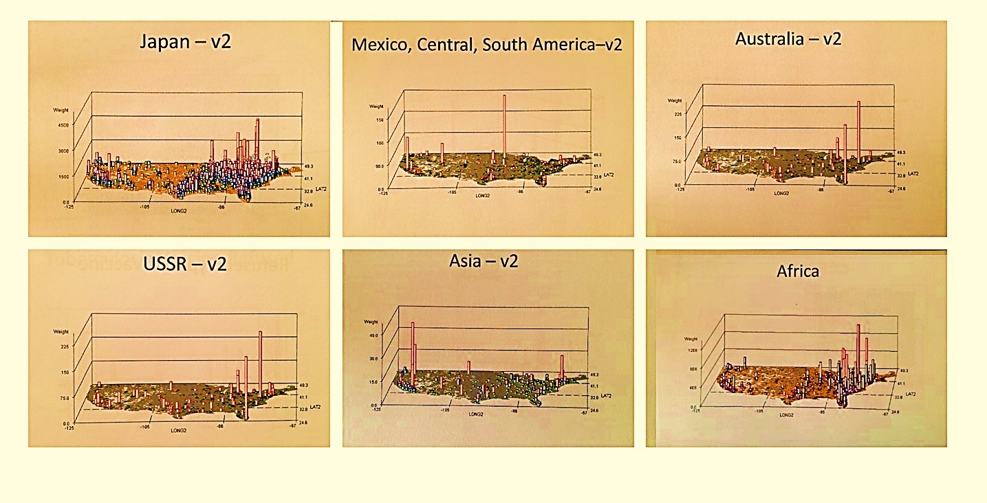
All imports Japan Mex/S Amer Aust USSR Asia Africa
Total Disease Influx or Importation, by Major International Routes and Regions (there are two versions of these–version 1 measures influx of principal diseases indicative of primary migration routes, v2 adds other ICDs linked mostly to the country or region evaluated. A full collection of these maps is scheduled for posting later in Fall 2012. Some v2 maps have close-ups of high density urban areas.)
.
Introduction
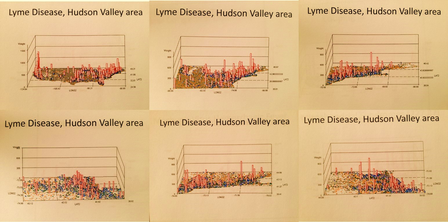
Most of my Medical GIS and Risk Management studies have focused upon disease and epidemiological patterns, with reviews of particular environmental risks such as topographic, hydrologic and weather-related events. My disease ecology work for Oregon and New York, the Gulf Coast and its deltas and bay settings, and the west coast bays and harbors focus on waterborne disease patterns and the ecology and zoonoses of these disease patterns. My medical hydrology and climatology work includes projects devoted to epidemic related disease spread patterns, such as my thesis work on the spread of Asiatic cholera into the midwest from 1849 to 1852, and its natural barriers to continued diffusion westward along the Oregon Trail due to local geographic and climatic features. My international disease diffusion patterns focus on those topics related to yellow fever and asiatic cholera, but also west nile and lyme disease,both endemic to the Hudson Valley region. My geological risk work includes topographic and pedologic-hydrologic studies performed on parts of lower New York and all of Long Island during the 1980s, and much later certain parts of the Pacific Northwest where natural disasters are fairly common due to local fault zone behaviors, active volcanic regions, slope failure and other gravity induced surface change problems, and high tsunami risk communities located along the west coast.

A number of my studies are included in this section, but primarily my ArcView and IDRISI GIS projects. More details about many of these projects may be reviewed elsewhere at this site as well, a separate webpages. My most important studies have been devoted to my 6 year review of West Nile ecology and my 8 year study on Oregon Chemical Release history. Some very important examples of historical applications of maps to the research of disease patterns have been provided as well, primarily due to the scarcity of these important order examples of medical geography history.
Δ Φ Θ
A closer look at diseases in or near Louisiana and the Gulf of Mexico
.

Seismic map showing the two earthquake belts of the world. (From R. A. Daly, Our Mobile Earth, New York & London 1926, p. 6.)
.
Geospatial Risk Management Practice
Prior to 1800, most natural disasters were attributed to some Higher Power. These events included earthquakes, severe weather changes, unusual downpours of rain and hail, significant tremors in the earth, exploding volcanoes, the falling of meteors, and the passing of comets.
Certain parts of the world provide us with unique opportunities to evaluate spatial patterns relative to risk. The risks that Geographic Information Systems can be used for when monitoring natural event include such events as Tsunami dispersal patterns, Non-cyclical Ocean Surge activities, recurring Hurricane patterns and routes, earthquakes, large area subsidence and shear change patterns within housing settings, and recreation area mudflow and avalanche patterns. Smaller events are just as likely to cause significant changes in living areas, such as industrial and agricultural related chemical leakage and release into aquifers that feed local water tables, natural formation and release of toxic and carcinogenic substances ranging from oligocyclic-polyhalogenic compounds produced by substrate microbe populations, natural radon gas release, abandoned mining sites located upstream from new dwellings, documented and undocumented hazardous sites related to 19th century businesses and early 20th century unregulated chemical industries.
ρ
Rabies demonstrates two major ecological features–human population density results in a spiking of cases in the tristate area near NY, but climate and its Mediterranean origins result in it much broader distribution across the southern latitudes of the United States. (For more, see Aurelius [Aulus] Cornelius Celsus’s ca. 150-180 A.C.E. work De Medicina, in particular Book 3 which includes a section on diseases on the Island of Lesbos.)
Assigning risk to a given region is a multistep process that involves the unique input of spatial information at various levels of complexity. In theory, we can define anything from local ecological features and human population features to large area physiognomic, topographic, climatic and geomorphologic features to any analysis done of a region for local risk assessment. When we review large area topographic features such as bays and harbors, the population, transportation, climate, cyclical and hydrological features play the most important roles in allowing for new risks to be developed.
§
Cholera in the Gulf
In the case of the Gulf of Mexico region for example, a combination of waterflow both inland and within the Gulf help to define the risks generated by the distribution of such risk factors as large oil spill releases, or the simple ecological distribution of the highly toxic E. coli and Vibrio cholerae strains common to shoreline settings. In the case of identifying a source for multiple cancer cases clustered within a given rural setting, not only does land use history play an important role in this regional risk assessment process, so too do studies of local population features such as age, gender, ethnicity, and income status, the study of natural carcinogenicity and co-carcinogenicity features related to foodways and occupational patterns, and the study of “upwind” or “upstream” carcinogenic/cocarcinogenic patterns such as the spread of benzene derivatives from large forest and manufacturing industries still active in distant communities.
þ
Patterns and Methods of Disease Spread, using the ICD for “Chicago Illness” as an example.
The following are examples of the kinds of risk assessment studies that can be performed using GIS. Each one of these was developed based on the use of standard GIS tools in combination with highly specific analytic tools design for use with ArcView/ArcGIS systems and Idrisi32 Remote Sensing analysis programs, long with several additional spatial analysis and Remote Sensing tools that may be used as stand-alones.
Risk Modeling and Prediction


The study of airborne pollution dispersal from Aluminum Manufacturing and Paper Manufacturing Plants located along the Columbia River. 1996.
Along the Hudson River, one of the most popularized environmental issues has been the impact of Indian Point nuclear power generating facilities on the local ecology and local population health. The Hudson River has also played an important role in defining the pollution and chemical release related environmental issues the local populations have experienced over the past decades and centuries. The detailed economic, transportation, environmental, and demographic histories of this harbor-estuary-river setting make the Hudson Valley one of the more complex spatial regions to analyze in terms of geography and health. Whereas the Hudson River has historically been likened to the Thames River of England, the Columbia River at the Oregon-Washington border, according to Woody Guthrie, is ‘the Hudson of the Pacific Northwest.’
During the past century, the Columbia River has become a major location for large-scale manufacturing industries to develop. The largest and best known of these facilities are those devoted to wood and pulp products manufacturing. Due to ample amounts of water provided to industries by the Columbia, this region has since became a major source for the manufacturing of aluminum products during the past 50 to 60 years.

For this study, two major manufacturers were reviewed. No specific pollutants or chemical history for either of these sites gave rise to this study. This analysis was performed simply as a theoretical review of this area in the Pacific Northwest. Due to steadily increasing population counts in this region over the years, the goal here was to define how to best monitor local environmental and population health features in relation to these two local businesses, by monitoring air quality and chemical content.

A number of sites were defined for the placement of air quality sensors designed to monitor chemical release. GIS was applied to determine those areas of highest risk to exposure due to local topographic and windflow patterns. Small area analysis on foot and through the use of locally produced and provided shapefiles and TIGER data, in combination with other hydrological, ecological, and land use features were applied to identify the best sites for the placement of these air quality monitors. Seasonal and the most common local weather-generated wind flow patterns were taken into consideration. Sensors were set up to define those areas with ongoing wind activity and regions where stagnation was likely to happen due to local topography.
.
The Study of waterborne chemical and disease flow patterns along a local watershed, within a well-defined Periurban setting. 1997.
A periurban setting with adequate amounts of shapefile data was identified, and then assessed for population, landuse, hydrological, topographic and DEM features. DEM-based analyses were the primary emphasis of this study. The most important question to answer was ‘how do we identify a particular area based upon its distance along the z-axis, from the closest local water surface?’ The primary reason for this question is based on the assumption that water-based microorganisms are most likely to infect people closest to the water edge at a specific height above the water surface. Since most elevation datasets have elevations defined based upon a standard baseline point (above sealevel) this project required the development of a formula with which the ever-changing elevation level above the closest water surface features could be defined for the given study area. Formulas were developed using the IDRISI DEM-based trend modeling analytic tools. Artificial surfaces were identified using standard topographic 1D, 2D 3D and 4D formulas. These surfaces were then combined is such a way as to replicate the surface across which the local river flowed. When this replicated surface was overlain with the true surface, error analyses were performed defining those areas most susceptible to analytic errors (mostly >60 degree stream bends). The topographic/DEM causes for these areas of error were documented. This methodology demonstrates that two land surface formulas could be used to artificially mimic a surface across which water flows. There is a two-dimensional planar surface that defines the overall flow patterns and direction for water. This surface has to be merged with a cuboidal model to produce the most conforming artificially-generated land surface. The range of cuboidal involvement in controlling water flow features varies from 12% to 17%, +/- 3% depending upon type of creek flowing across this terrain. In other words, 83% to 85% or a water flow direction features is based solely upon the centroid elevation above sea level value for a planar surface linking the start of the flow pattern under analysis with the end of this same flowing material.
For the second part of this project, the goal was to use this formula to define areas along an ever-changing elevation water edge surface that were a specific height above the closest water edge. The assumption was that an area less than 150′ above the water surface was most susceptible to chemicals and microbial organisms resigning in the local water body or subterrain aquifer system. To answer this question, a 50′ square grid pattern was then developed and elevation values transferred to the centroids (IDRISI polyline and polygon-point rasvec tools). This z-value was related to a grid pattern of the DEM and the closest grid cell measuring greater than the water surface z was identified, and then mapped out in z=5 foot increments travelling away from the water edge. This resulted in a model that demonstrate elevation above closest water surface in 5 foot increments, as one travelled away from the water edge. Risk areas could then be defined based on elevation above closest water surface, not above sea level. An elevation of 150′ above water surface was defined to be the uppermost elevation for risk areas along this particular creek. assuming a hydrophilic organism like alkaline water born vibrio could be raised in this setting between human hosts, a risk area was defined where such an organism could remain stable and biologically active within the aquifers between human host victims. This was therefore the setting where such a disease could develop into a local endemic or epidemic disease pattern. Landuse features such as livestock- and manure- rich regions were defined as potential vibrio carrier settings.

A study of the distribution of Cancer Cases. 1997-2002.
From 1997 to 1999, several efforts were made to develop way to assess cancer distribution across the state of Oregon. The first project involved the study of Breast Cancer incidence and prevalence rates at a county level based on annually reported public health data. This information was related to socioeconomic status and the mobile screening program then in place designed to reduce late diagnosis rates and the resulting mortality that can often occur due to late screening.
The second phase of this project became more focused and concentrated on several cancer types linked to environmental chemical exposure. The spatial distribution of these cancer cases was documented, and several methods or analyzing these distribution patterns were developed.

The end result of this review was the development of a contour map using a 1 mile grid cell analysis technique, assigning rates to the centroid of each cell and then using these point values to produce a contour map on disease distribution based on a 2.5 mile radius.

A case contour map with risk areas in pink
.
![]()

Application of GIS in analyzing Chemical Release Data for the State of Oregon. 1999 to 2006.
The state of Oregon is unique in that it has a complete, fully detailed site analysis for chemical release sites. For this reason, studies of chemical release can include evaluations at the day, site-specific, and specific chemical level in a way that cannot be performed for any other part of the United States. The information on the length of time for these releases is provided due to the inclusion of Standard Industrial Classification data and historic background for each site and its industries. Levels of chemical release can be evaluated at each site using this data.


A number of methods are already in place for analyzing chemical release analysis. Indices for assessing risk have been developed by various consumer rights groups, the AMA, NIH, CDC, and EPA. A detailed analysis of chemicals associated with spills was performed, with some emphasis on the relationship between chemical type and industry type, defined using Standard Industrial Classification values for each industry. These methodologies were applied to the state database on Chemical Release history, with individual chemical reports evaluated and databased as well as a unique addition to this method of analyzing chemical release for a given area. A series of toxicity, carcinogenicity, and leukemogenic values were defined for each chemical based upon standard data sources (esp. SAX, NIOSH and CERCLIS). Chemicals were grouped and special databases developed based on large number and small number reclassification systems developed for chemical type, double-bond counts, free radical electron pair structures, toxicity and carcinogenicity indices, and the combined indices developed for this project.

450 sites had a Confirmed Release Inventory (CRIs), meaning they could be evaluated to define SIC and its relationship the chemical and chemical group release patterns and habits. SCI-chemical groups relationships were plotted and SICs regrouped according to similar chemical profiles; this also meant that some SIC normally grouped together had to be separated, such as Creosote industry versus Plywood Manufacturing and raw material related lumber industries. SIC groups were then defined and used for correlation with related to each of these groupings, and a predictive model developed for chemical types expected to be released at a specific sites with undocumented release information, but with a well-defined SIC history allowing for a SIC-reclass grouping. This was then used to reclassify Industries with specific SICs based upon shared chemical release patterns (for example, Creosote was removed from other Forest industries due to its very unique chemical release history). Forty-five Chemical profiles or signatures were then developed for each of the most predictable SIC-defined chemical release patterns. These were used to predict the release patterns for other Chemical Release sites with unreported studies of the release pattern, and with SIC identification provided in the EPA data source.


In total, more than 64,000 chemical reports were evaluated and entered over a 5 year period, and more than 3200 sites evaluated, reported from 1985 to 2000. An additional selection of the remaining 750 sites for the first ten years of EPA data were evaluated as well, demonstrate no major difference in the final database developed based on the CRI complete chemical report files. Historical sites were added as well for retrospective reviews.

The most important part of this work pertains to the use of grid methods for risk analysis. In 2004, I developed a method for defining hexagonal grids on a map in ArcView (this excel sheet is now available on another page of this site for downloading). Hexagonal grids differ from the standard square-celled grids in that these cells are more realistic in terms of how they present surface features spatially in all directions. The corner effect of square cells is eliminated from the mathematics when analyzing distribution patterns. The maps that are produced are more realistic in nature.

The most important utilization of hexagonal grid mapping relates to how we can produce the most realistic method for demonstrating risk. Isopleths are often used to demonstrate the spatial distribution of risk. With square grid maps you end up with a fairly coarse representations of lines defining risk changes across a land surface. With hexagonal cells, much smoother isoline maps can be produced. In the following map, buffers, the theissen method, and hexagonal grid analysis techniques were applied in order to accurate define risk due to exposure to potential carcinogen release by industries located close to an urban setting.


Disease Ecology Studies

West Nile Ecology, 2000 – Present.
This is an ongoing study centered on west nile disease patterns in the Hudson Valley of New York. The Hudson Valley can be defined into three major hydrographic regions: maritime, estuarine/brackish water, fresh water (lacustrine, riparian and wetlands-marshlands). Demographically, it can be defined into urban, periurban, suburban, rural and borderland-hinterland (natural) settings. Topographically, it can be defined into urban-suburban, agricultural-field, semi-forested/highly impacted, hilly-forested underdeveloped, and fairly undeveloped montane settings.
¤
Of the nearly 30 species of mosquitoes related to the New York State setting, most of them reside in Dutchess County, a county situated in the middle portion of the Hudson Valley, on the east side of the Hudson River. More than two thirds of these species can be captured in some of the more pristine periaquatic sections of this part of New York located at its northern edge, adjacent to Connecticut, Massachusetts and the southern boundary of Columbia County, New York.
The unusual topographic features of Dutchess County, New York, in combination with its varying population densities, made this county a very important region to study west nile behaviors within both natural and highly populated land use settings. The following dem-derived map of a trap site was produced using IDRISI32. This is a window pulled from the DEM overlain with a vegetation features grid produced by the state; this overlay was used to reclassify this new grid into a color pattern by matching cell color to type (all waters were colored blue, all vegetation patterns green, etc.) Higher elevations according to the DEM were assigned a deeper green color. The locations of sites are the red points.

The above is an example of a transect study I often applied to west nile ecology work. Species of mosquitoes vary according to tree canopy features, distance from water edge and elevation above closest water surface. The positive testing species was located at the lowest elevation above the nearby creek. Species at higher elevations were found to be non-west nile carriers and surprisingly fed only on frogs (two Rana species (green and brown) were found in the 12-20′ hgt woodlands above the road).
λ
Lyme Disease Ecology. 1997-1999.
From 1997 to 1999, local and state grants supported this study of Lyme Disease incidence in the immediate Oregon-Washington border community settings and the southern Oregon-California border settings. In particular, we were interested in defining whether or not Lyme disease would become more firmly planted in the state as an endemic disease. At the time of this investigations, Lyme Disease cases were reported for the hiking trail settings at the northern edge of the State of Oregon, and appeared to ecologically well-defined at the southern border. Less than 100 cases of Lyme Disease were officially reported and verified for the state of Oregon. Therefore, a study of the ecological requirements for lyme disease-related borrelia-rodent, host-vector interactions to take place. The southern region had ample numbers of cases just across state lines in northern California, with local phytoecology appearing to be a defining feature for this disease pattern.
The ecological requirement was confirmed when it was determined that lyme disease was able to infect Southern Oregon, but only within its inner landscape. At first, terrain features such as hills and mountains, along with population density patterns, seem to be th factors limiting the spread of Lyme disease across coastal range settings, in either direction. In fact, it was the unique soil and geologic patterns of the southwest, coastal communities that became the limiting factor. This areas contains unique plants and ecological relationships due to its chrysolite geologic setting, which results in an unusual soil pH and unique floral patterns. These floral changes reduced the sources for rodent feed typically consumed by the more inland Lyme Disease carriers. This prevented the migration of lyme disease into this region, and allowed in part for a more inland distribution of this disease along the central state highway routes. In Southeast Oregon, a unique anti-borrelia factor was identified in lizard populations, preventing the distribution and spread of borrelia by way of this potential disease carrier. Essentially, this meant tha borrelia could not be spread by the two fairly common host-carrier populations. The spread of borrelia northward was therefore defined to be a result of domesticated animal infection,especially dogs and cattle, and human-related spread patterns brought on by outdoor occupational and recreational histories.
∂

Pectinatella colonies
Wappingers Lake Ecology. 1976.
My first study in environmental impacts and health involved the uses of lands along the Wappingers Creek. At the time, the popular concern was agritoxins and the impacts of agrichemical, agritoxin release into the Wappingers Creek, as a result of runoff and percolation events, on the ecology of the Wappingers Lake. The most obvious change in Lake ecology was the increase in development of pectinatella blooms along the creek edge. These blooms are considered indicators of the warming of water temperatures in combination with increases in natural fertilizer agents rich in Nitrogen and Phosphorous in the creek water. Were such changes to exist, this would reduce the inhabitability of creek waters by temperature sensitive brown and brook trout populations regular introduced into this creek setting.

This study detailed the food web of the creek and the role of microscopic organisms in the lake ecology. The impacts of nitrates and phosphates one the water were discussed, along with a study of land use history along the edge of the entire Wappingers Creek. The study of Wappinger Creek edge land use features focused on this area’s pedologic features. Specific soil types were related to the lake and stream ecology, with some types linked also to high N and PO4 producing land use patterns and behaviors. Soil map related slope patterns were also related to this in that some slopes and related soil types were found to be high run-off producers and the most likely causes for chemical percolation into the creek waters. The most likely soil types and land use features that when combined produce the worst algal and pectinatella blooms were theoretically defined based on this review of the Creek’s watershed features.

Pectinatella species
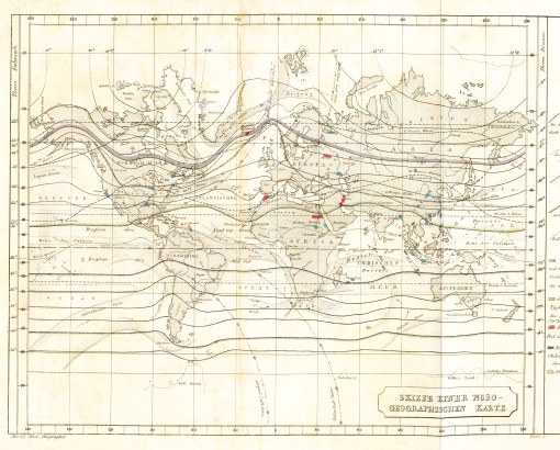
.Adolph Muhry’s
Historical Epidemiology
My first study of disease mapping and medical cartography focused on the following map produced by Valentine Seaman. Dr. Seaman was the mentor for Fishkill physician Dr. Bartow White, congressman and an active member of the national whig party. Seaman’s goal for producing this map was to demonstrate a relationship between several local cases of yellow fever that had just arrived by international ships, and the general land use and population features of the local setting. The link of yellow fever to mosquito-related diffusion pattern was never concluded based on this map.
Following yellow fever, asiatic cholera became the primary globally transmitted disease in need of detailed mapping and documentation of its geographic features and requirements. Like yellow fever, the microbial cause for this disease was unknown. This lack of knowledge for a cause led to the development of dozens of theories for epidemic diseases, with widespread diffusion patterns, often appearing somewhat environmentally and meteorologically or climatically based.
My study of the proposed causes for cholera published led to the discovery of several more disease maps. Several very local maps of cholera behavior were published, one of which linking cholera to geological patterns is reviewed in detail on a separate page. German medical topographer Adolph Muhry’s early map on the distribution of disease patterns globally was reviewed and is also included on this site. The more widely known disease map produced by English medical cartographer Alexander Johnston is included on this site, along with the second most popular disease map discussed by historical medical geographers, the Massachusetts map on tuberculosis distribution related to soil type.

Yellow Fever Epidemics
The first spatially or geographically evaluated disease pattern in North American history is Yellow Fever (see Valentine Seaman’s 1804 maps above), the diffusion of which came as a direct consequence of the industrial revolution and the increase in commercial transportation that it led to. With increased travel by ship from one country to the next, it was possible for infected individuals to reach their destination still carrying the virus that causes this often deadly disease. In turn, this led to the successful reinfection of community settings capable of harboring and contributing further to the diffusion of this disease. In United States history, one of the most active corridors for Yellow Fever to enter the continent was New York Harbor and the Hudson River estuary. This disease travels what is known as a hierarchical diffusion pattern. Places that are more active and successful industrially tend to become infected first due to the higher likelihood that international shipping will have a route that ends in these more economically successful urban settings. From this heavily populated urban setting, we find fairly rapid diffusion of the disease to new victims, due to local mosquito vector activities. These urban settings in turn enable the disease to remain active until it can either successfully infect victims heading into suburban settings where potential future victims live, or manage to diffusion to a combination of natural features such as mosquito population flying/diffusion patterns along with local season wind patterns.
ý
We expect Yellow Fever to enter this country via tropical routes. The spikes in this map suggest it could go undetected and enter the country from Canada due to reduced expectations and a lowering of the guard.
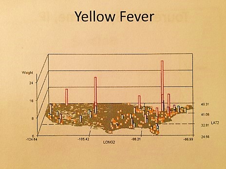
The main limiting factors in the diffusion process for yellow fever are lack of ecological requirements for susceptible mosquito populations, the lack of travel to potentially infectious regions, and the lack of adequate human population size in these regions. From 1750 to 1800, this limited the diffusion of Yellow fever to the coastal communities and their direct economic links inland. Due to distance and limited commerce, upriver towns along the Hudson were more likely to become infected if they were situated fairly close to the urban settings in and around lower Manhattan. Poughkeepsie was a major docking port far upstream, and for a variety of reasons, became a very popular escape for urbanites avoiding the plagues of the yellow fever that came in during the first years of the nineteenth century.
Historians have known for years that Poughkeepsie was a haven for these urbanites, for which a variety of topographic and climatic reasons have been assigned. According to Noel Webster, Poughkeepsie was safe due to its relationship to the city and the nature of its local population and living environment. The cleanliness of this suburban setting compared to the debris and contagion infesting the Harlem waters, according to Thomas Paine’s writings about this time, indicated Poughkeepsie was safe due to its clean nature and ongoing economic potential. Local real estate agent Livingston marketed this urban setting as one “blessed by westerly winds”, a feature which Webster also linked to a region’s ability to avoid Yellow Fever introduction. In this case, it was people who defined how and why this epidemic was able to finally makes it way up the river to infect the less urban settings of this important trade route. And once again, this patter of spread proceeded in a hierarchical fashion.

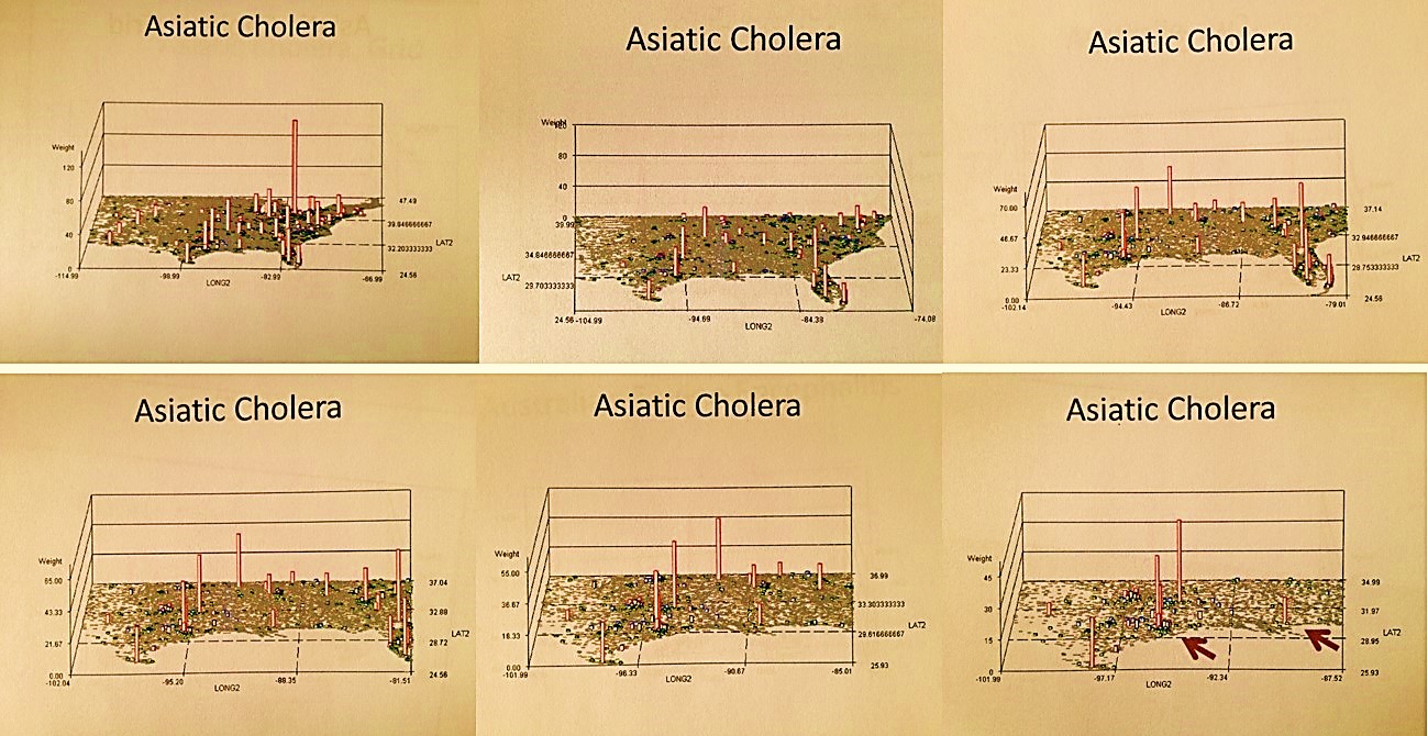
The Spatial Distribution of Asiatic Cholera and other Diarrhea-inducing Epidemic Disease Patterns during the 19th Century. 1997-2002. The 1849 to 1852 Asiatic Cholera epidemic history in the United States played an important role in this country’s history. This epidemic was well documented in both professional journals and personal diaries, newspapers, and various professional medical and governmental reports and reviews published about this disease from approximately 1800 to 1890. With the source for this major epidemic unknown at the time, numerous theories were produced in order to define its causes and means for prevention, and a number of non-Asiatic forms of ‘cholera” or diarrhea diseases reported on as well as a variation on this recurring and unique epidemic disease.
The most fatal form of cholera today, El Tor, has two kinds of behavior. The climate-based, natural ecology diffusion process makes it a natural part of the southern US climate settings. Note the nidus on this map in southern California close to Mexico. There is also a population density based human ecologic behavior of this disease that is better depicted by closing in on the most populated part of this country–the New York-New Jersey-Connecticut-Pennsylvania area.
Asiatic Cholera is spread into, along and through well populated regions. Non-asiatic cholera or severe diarrhea and dysentery do not require human population density features as much as the require environmental features, like contaminated water bodies, areas where livestock are likely to die and decompose, regions where the physical requirements needed to cause diarrhea spells in human exist like salty, alkaline springs, bacteria contaminated water sources, and other sorts of natural laxatives.
The less fatal non-El Tor Vibrio cholerae of today
For my review of the Oregon Trail cholera and diarrhea epidemic regions, non-Asiatic Cholera forms of diarrhea in epidemic form were analyzed spatially in relation to Asiatic Cholera. Behaviors were then defined that determined the causes for the misidentified Asiatic cholera cases reported across the US within the Oregon Trail diaries. (Cholera is fatal within a few days, dysentery and diarrhea usually are not, even after a month of symptoms.) Focusing on the Oregon Trail epidemics and their unique non-Asiatic cholera form and variety of causes, two regions could be defined–a cholera region and a dysentery region.
A primary cause for traditional, modern and historical population density dependent dysentery epidemics; not a dysentery expected of the poorly population Oregon Trail west of the Mississippi River and Fort Kearney.

Topographic, climatic, pedologic, hydrologic, zoologic, ecologic and demographic requirements for Vibrio cholerae induced Asiatic Cholera in United States history were identified, and then compared with similar spatial features along the Oregon trail between the jump-off sites in Missouri and the end points in Eugene and Portland, Oregon, to determine the furthest extent westward the Asiatic cholera could go. Another 6-8 months were then spent trying to determine the non-vibrio causes for the diarrhea epidemics along the trail west of Wyoming and into Oregon. (All of these studies ended up going into the appendix, once the most likely single cause for the non-vibrio epidemics was identified.)

The epidemics west of the Continental Divide were identified as opportunistic Salmonella intermedia events for the most part, produced by decaying animal carcasses and poor sanitary conditions along the trail. This theory is supported by the incidence of cases topographically defined–oxen/livestock deaths were most dense at sites where uphill slopes significantly increased, and at sites where drinking water was poor and often deadly due to its alkaline nature. The salinity and alkalinity of the wells and aquifers along Platte River in general in turn provide additional support for this theory, due to growth and ecological requirements for vibrio to persist in a given area and successfully overwinter.

Other causes for diarrhea and dysentery were investigated, including Giardia, amoebic and non-amoebic dysentery causes, and other forms of vibrio, several adapted E. coli vibriotoxic forms, and several food-related diarrhea-inducing bacteria. Amoebic dysentery was ruled out based on population density requirements. Giardia was ruled out based on symptomatology. Foodstuff-born bacteria were ruled out based on reported cases in the personal diaries and the details on their symptomatology, length of occurrence, the gross fecal form data and daily counts of cases and livestock carcasses passed; all of this information was provided by the writers and mapped. An elevation model was developed based on elevation data was provided for much of this route in 1842 and 1843 by John C. Fremont, who led a federally funded expedition design to document te details about this territory. Geographically, two regions were defined based on the various spatial features evaluated: an Asiatic cholera region and a Salmonella intermedia region.

.
Η Ε
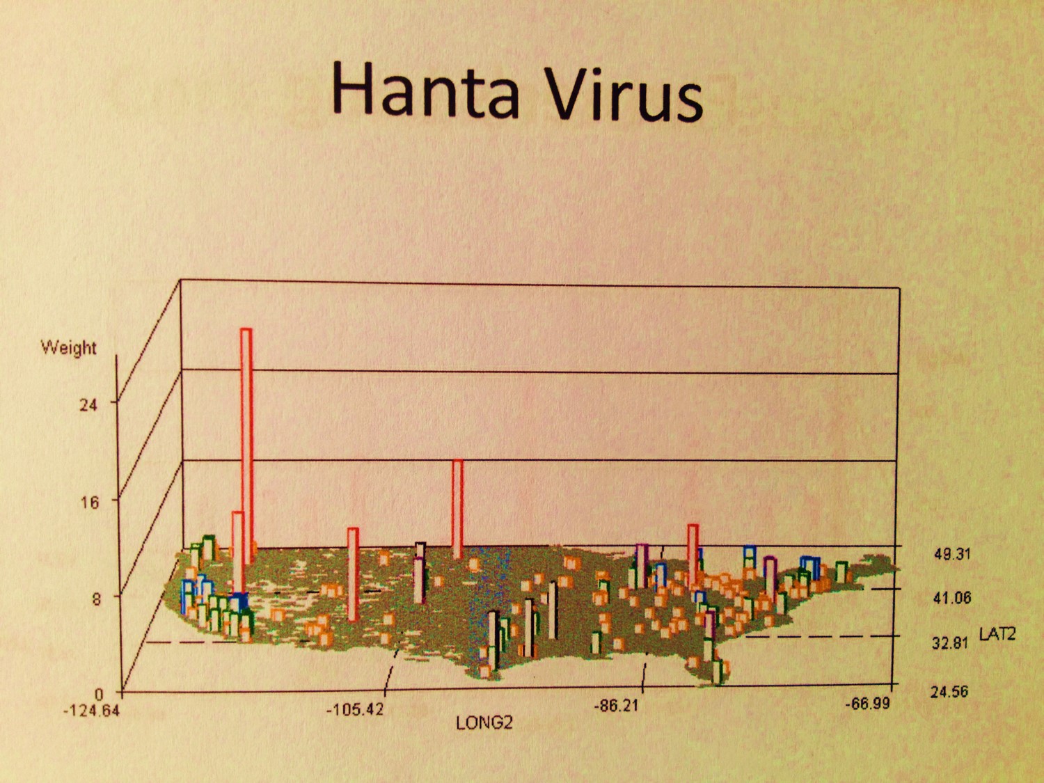
A comparison of two host-vector diffusion processes: HANTA (now indigenous, hosted by migrating rodents) and EBOLA (temporarily introduced, by air travel)
Diseases and Disasters–the new History
One of the advantages to reviewing the old documents, especially before and right after the development of the bacterial theory for disease, is that we are provided a spatial take on disease behaviors. These early writings that focused on climate, weather, topography, wind flow patterns, water, soil, plants and animal ecology, all had very important theories developed about the relationship of disease to the local geographic features. The spatial relationshipsfor disease were being accurately described without any knowledge of the cause.
In the 1880s, USDA Special Report entitled Contagious Disease of Domesticated Animals, the cause for a new animal borne disease noted for this country–Pleuro-pneumonia or Bovine Lung Plague still had no known cause. In a report submitted by Prof. James Law of Cornell University, the historical and geographic details of this disease were evaluated globally, leading Law to produce “The Lung-Plague of Cattle-Contagious Pleuro-Pneumonia”. This suggested there was some form of “virus” (as they called it then) responsible for this newly introduced zoonotic disease pattern. In a report generated based on Law’s report, it was stated
“As to the nature of the plague, Dr. Law states that there can be no doubt but it is determined by an infecting material conveyed in some manner from one beast to another. The intimate nature of this material has never been determined.”
A simple map illustrating the range of its distribution enabled researchers to develop a theory as to how it was it was introduced into this country, the ways it was spread and how local human ecology and land development practices enabled it to spread steadily from New York and New Jersey, through the backwoods and into the farmlands across to the Mississippi River and as far west as California. Even though its cause was still unknown (a mycobacterium species specific to cattle), mapping this disease was effective way to design preventive practices to be developed in order to prevent its further spread.

Plates 2 and 3 were cropped and electronically inset on a scanned version of the map bound between pp. 178 and 179. Note the spread of the disease from the three major port cities on the northern mid-Atlantic shores. Source: Contagious Diseases of Domesticated Animals. Continuation of Investigation by Department of Agriculture. Department of Agriculture. Special Report – No. 22. Washington DC: Government Printing Office. 1880.
By focusing too much on the minutia of a disease that is animal bred, borne or induced, we miss some of the most important elements in nature responsible for this disease and its epidemic behaviors in the first place. Now, approximately 125 years since the cause for this animal disease was uncovered, and its relation to the related human killer tuberculosis better understood, there is evidence that new strains of this livestock epidemical disease pattern could be spread from Africa, where a number of new very tolerant new strains exist. The diffusion of this disease to North America would have uncertain consequences (this disease mapping topic will be posted next month). This is why studying to geography of these diseases of the past provide us with so much useful knowledge for the future.
Similar transoceanic diffusion patterns have arisen for other animal and human diseases, such as west nile, the new malaria and dengue, the various forms of equine encephalitis, hog cholera, avian flu, glanders, farcy and swine plague. The two major lessons we benefit most from relating to disease modeling is understanding the nature of the diffusion process is it hierarchical and linear in nature, or ecological and more like something that is two or three dimensional in nature?
A current “Plague” map (human-animal plague, not bovine or swine plague)
There are three standard methods people apply maps to disease that I see at every GIS and Medical GIS meeting or conference.
The first type of disease map is simply a descriptive rendering of the disease and its ecological nature, using the map more as background and as a tool on which data is laid in reference to point, arc and polygon forms. Often a single accomplishment that is made is discussed, but there is little provided in the form of specific research questions that were asked, specific objectives laid out regarding the use of maps, or even the inclusion of a single statement defining the spatial discoveries that were made using the map. For these kinds of presentations, the map serves as another figure, and need not be GIS developed in many cases.
The second type of medical geography or risk map provides insights into some of the methodologies used to make a series of important discoveries or answer a series of questions. In a collection of maps presented that were used to detail the flooding of the Mississippi River flood plain for example, the methodology used was clearly implied by looking very closely at the map, in order to see where the high risk areas lay. But the description of this method in text form was not provided, and the specific details about how the GIS was employed as a statistical tool were never reviewed in the work. Upon first glance these maps appeared to be somewhat inspiring, but the complexity of how the GIS was employed to integrate layers of data was never provided.
The third type of medical geography is fairly standard and only important in that the techniques help support old methodologies of spatial review already out there, or are attempts to apply non-spatial statistical measurement techniques to a GIS tool without using GIS to produce the true spatial comparisons. Each line, point and area was researched as an independent spatial features without and association with its neighbors, without the topology that is presented by using standard GIS statistical tools. These maps are descriptive in terms of the use of the map, and make good presentations, but they are not good examples of spatial analyses.
The three ways to engage in risk management and medical geography work using GIS are as follows:
- As a descriptive tool
- As a means to employ base maps in order to illustrate outcomes for a non-GIS, non-spatial analysis that was done
- As a means to solve spatial questions and explore new spatially related topics about disease and people
.
© κ
Some diseases migrate in biologically and ecologically, others culturally as a consequence of people migration. These two are examples of the latter–their causes are pretty much foreign in origin and remain foreign in terms of their natural ecology.
Most professional settings focus on the second application, followed by the first, and do little to incorporate into their work the skill set needed to produce effective discoveries by focusing on the third method of disease mapping, and more importantly, developing disease prediction modeling techniques. In general, the best statistical evaluation involved as part of a study does not employ just one tool or method, but instead employs multiple methods involving multiple formulas and multiple ways of interpreting data. Likewise, for any GIS project to be effective , reliable and trustworthy, this same rule has to be applied to spatial statistics. Use GIS to provide the background information, to provide the base level statistical and numerical findings, and to design and test various ways of analyzing your data spatially, by linking your results to the base map data and by performing the analyses both prior to and after that linking process. Ideally, if these analyses can be performed in both vector and raster systems, you provide your work with more credibility and a potential for better understanding, later recall and future recognition.
A number of purely neodarwinian or culturally evolved “diseases” or conditions come to this country. The above are examples of these unique culturally-linked diseases and culturally-bound syndromes. Some have a potential biological component or genetic predisposition. Most others are purely behavioral in nature. The first video displays distribution of Takotsubo Heart Disease and the common Factitious Disorder (Munchausen Syndrome). Both are strongly linked to elderly populations. Whereas the first is a grid plot, the second is a zip code tract plot reviewing patient distributions in 3 layers for thes two ICDs. It compares the distribution of the United States equivalent Factitious Disorder (layer 1, unfortunately with barely visible cases) to the culturally-defined Japanese elderly disease that has an underlying anatomical and physiological theory (layer 2). Layer 3 displays areas where both exist. Population pyramids show that both ICDs have very similar age gender distributions (reviewed extensively on another page).
Disease diffusion is primarily a process that is reviewed best with raster systems and tools like Spatial Analyst or any of a number of satellite imagery software programs. Diseases spread in some heirarchical fashion follow a linear process and need only a vector GIS system to be managed and employed successfully (i.e. ArcGIS/ArcView Network Analyst). Diseases that are primarily ecological in nature are most easily described using vector systems but best evaluated using raster systems. Diseases that are primarily human related are usually best managed using a vector system. But unfortunately, many to most diseases do have some natural ecological features underlying their non-epidemic behaviors in relation to spatial patterns, like the raster based interpretations of weather, climate, surface aspect, temperature changes, and related soil or vegetation types, for just a few basic examples.
Θ Ç €
Common Drug Dependencies: Opium, Cannabis and Cocaine
The Old and the New
There is also an old way and a new way to engage in GIS-based disease mapping and disaster management. The “Old” way is not as archaic as those old blue copies I recall pulling from NOAA back in the 1970s as a part of my three years of meteorological training, at just the right time, by way of turning on the printer attached to a Univax sitting in the next room. The “Old” way today is to rely solely upon base maps to produce your work and your reports. Even though these basemaps do require a lot of work to get them to produce effective illustrations and such, the most advanced activities we often tend to use requires just a little manipulation of the datafiles, enough to add another detail to the map or correct for some automatically generated datafeed errors. This “Old” style of medical GIS produces those maps with the standard data provided to you when you buy your GIS.

The “Old” Way
The information can be quite impressive, and is a good start. But the more important discoveries have yet to take form.
Your next level of mapping adds to your skills the use of the extensions provided for GIS. For ArcGIS, the network and spatial analyst tool are a must for beginners and should be integrated in the first semester of training, even if as a last week or two exercise. The best use of DEMs, vector-raster imagery combinations, and the implementation of mapping with theoretical diffusion related tools such as for kriging or evaluating elevation/surface plane relationships help in the understanding of the problem at hand, and can be used to develop some prediction modeling formula requirements. It sometimes takes 5 or 10 times longer to produce these maps, but they are worth the effort, for example:

The New Way
The best use of GIS for disease and risk surveillance is performed live and ad hoc. It is typical for all or most field studies engaged in for county or state surveillance program to be reported late, not daily but weekly or less. These are followed by an even later report from the county or state to the CDC or some other national/regional research site. By the time your data hits the national database and are entered and validated, few fieldworthy analyses can be done. Therefore, the best analyses have to be done as soon as possible, hours or days after your surveillance work and days to weeks before you find out any of the lab results related to your surveillance work.
Unfortunately this bureaucratic process typically delays reports of a positive find by a week or more. The further up the political step-ladder the data goes, the longer it takes to hear back about anything. Ideally field training and experience are more important than waiting for the next lab test to come back from a national, regional or local state-operated testing lab. For this reason, taking immediate steps to evaluate an area can appease concerns that are out ther about the species coming up out of the manhole or culverts next door, or the worries about the possibility that some neighbor’s chickens died twice in the last days for potentially human infecting disease causes like avian flu.
The following two examples are of
- someone who came down with west nile and had not been travelling, and
- a site where a nuisance swarm formed in early October, a very late time of the year for any new mosquitoes to hatch in this region.
In the first example, Culex pipiens-restuans is the culprit [abbreviated PRE]. The other species are ecological components of this multiple trap setting, which was a woodlands with a seasonal water body situated beneath a 30 foot canopy of pioneer tree species (mostly elm and ash) and occasional junipers. This woodlands followed the north and east edge of the yard of the place where the infected person resided, an man about 60-65 years of age. Across from the house on the other side of the turn-around section there was a rivulet and a grassy area. Walking through these areas you could tell immediately that this was more an ecological setting than a human derived trash-ridden mosquito mating setting. Since PRE does favor very small water containers like plastic containers, tires, etc., it seemed unlikely that much if any PRE would be captured. As I should have predicted (based on the background sounds of nature), the primary species at this site was Uranotaenia, the major blood source for which is frogs. The other species present were mostly wildlife feeders, and were competition for any PRE related mosquito-human interactions (see the transect study of East Fishkill/Fishkill Creek Floodplains for more on this; competition reduces likelihood of spread, in spite of larger numbers of potential vectors present). PRE was the least captured species.
For the second example, the city edge swarm had a behavior that was very different, and very much a surprise due to the intensity of the swarm and its location. Right in the middle of a heavily urbanized setting there were obvious swarms of the same species. This purpose of setting up traps at this location was to find the center of the swarm, not to deal with any disease carrying vectors. Since this was the last week of the trapping season, all of the field traps were collected and by the end of a second day placed in a line-rectangular grid array on just this one site, up to 3/4 miles to the north and 1 mile to the south. A line was formed along the water edge, forming the “longitudinal” axis, and up to four sites were posted along horizontal lines at fairly equal distances north and south of what appeared to be the center of the swarm. With these results, in just 36 hours, the site could be shown to be a particular facility on the other side of a fence. The density of the field counts allowed for entry onto that site, which is normally fenced and locked. This entry was done in order to document the source of this swarm–an 8′ deep water filled cistern setting, with a manhole cover. This cistern/entry space was filled with sludge release by very old septic tanks after a massive post-storm, in which the runoff generated sewage overflow. The larvae for this pool began hatching about 1 week later, and 1 or 2 weeks before the nuisance report was officially generated for follow-up.

Live site analyses, with shapefiles input into a GIS on the same day
.Conclusion
Disaster and disease management involves a completely different set of GIS related processes. It usually employs just the first two methodologies or approaches described above–the use of GIS simply for illustration and the overlaying of non-GIS produced statistics onto a map without employment of any topological math processes. The third approach is most important–the use of GIS and spatial analysis to answer questions and provide new analytic methods.
Aside from traditional GIS extensions and querying methods, a number of externally produced add-ons can be used to engage in both the spatial statistics analytic process and the very specific prediction modeling process, such as using GIS to define a tract for a tornado or the route that a mudslide might take once a certain amount of rainfall accumulates on a surface. As was the case for disease modeling, the use of the smae GIS tools for disaster modeling and prediction provides good statisticians new avenues to take in the exploration of GIS as a future occupation. In my classes taught in Colorado several years back, each lab period had two extensions or tools that were downloaded and the incorporated into the day’s exercises. Some new GIS image analysis or interpretation tool had to be included in the exercises.
The most important of these tools to incorporate into any classroom/lab session on GIS are as follows:
- ArcView Spatial Analyst
- ArcView Network Analyst
- MultiSpecWin32
- Geotiff
- var. Extension tools
The best disease or disaster management process using GIS requires that we employ both raster and vector GIS systems, allowing both traditional and ad hoc studies in any project. Environmental offices, groups, agencies and companies regularly monitor such things as air quality, ozone, water flow, water pH, water microbial content, aerial benzenes, emf fields, and numerous other environmental health metrics on a regular basis. Meteorologists monitor the weather, Seismographers the earth’s crust, Heliologists study the sun for periods of atypical energy release. It is very possible to set up a GIS that can be used for specific evaluations of local areas, first in order to define high risk areas for such events as flood and saturation generated mudflows or landslides, but later for integrating traffic flow patterns with ozone and climate and temperature in order to predict any upcoming unhealthy commuting days. It is possible to use DEMs and satellite imagery to map flood areas, and based on elevations above local water body surface level, extend these results over large areas of a river and lake edge or surface. Topography, ecology and weather also have much to do with how diseases migrate and infect new populations, be these diseases animal or human born. More importantly, a review of everything generated about the spatial behavior of disease needs to be reviewed extensively before any truly geographical method of monitoring disasters and diseases can be developed. The current systems often too much on tradition, at the expense of not testing for new applications with new potentials. I have yet to converse with a west nile field technician for example who uses grid analysis and light and ecological measures to assess any of the mosquito born human or equine diseases.
There is this exploratory method of engaging in “ecological” studies of disease, disaster, and epidemiological security risks that need to be more refined to be helpful to its fullest extent. This means that students must learn skills that are outside the normal realms of most researchers. That is to say, there are the findings of “past” researchers that must be incorporated into the current paradigm on how we use GIS to study and predict diseases, natural events, population changes, and the potential for public health tragedies. The transition to a less geographic way of interpreting health has since led to the loss of some very important medical geography knowledge background now missing from most medical GIS workplaces.

.
.E979
ξ
Explosive Social Misconduct Disorder: the mind of a murderer, or piece of mind for a terrorist? Notice how the distributions of Prevalence for this psychological condition and the numbers and places for Emergency visit events with a terrorist-linked code don’t match. The Colorado Events in Columbine and Aurora more closely match the distribution of events related to Explosive Personality Syndrome, although this condition alone is also not perfectly or directly linked to such tragedies.

SOCIAL CONCERNS AND MORAL ISSUES
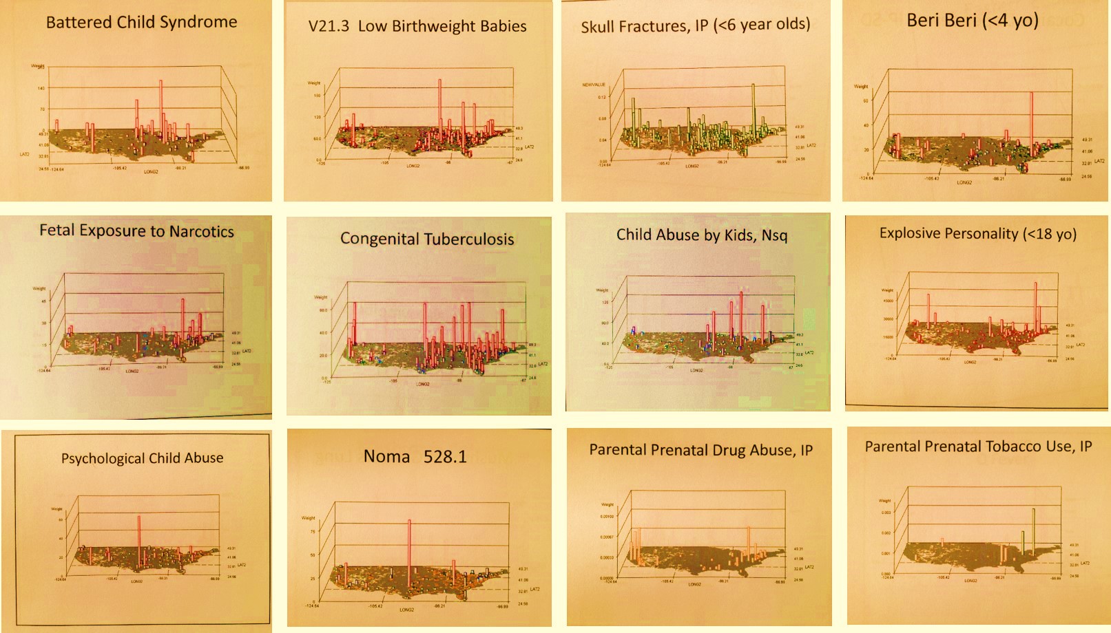
Finally, with the help of Emergent Care codes (E-codes) and V-codes, we can evaluate conditions that are important to the quality of life and lifespan for two of the highest risk groups–children and retired individual >70 years of age. Employing this method, feti, newborns, young children and teens were reviewed for the following map videos (Notes: this topic will also have more maps on a separate page; as before, most maps are raw N’s due to rarity of coding this information; IP maps are Independent Prevalence maps with independent inferring individual cell calculations without the nearest neighbor adjustments found with contouring and the isoline formulas I use).
.
Prenatal Tobacco/Nicotine Exposure
Refusal to Immunize Children, 0-5 yo
Skull Fractures in Children 0-5
Young Child Pedestrian Accidents
Off-road vehicle accidents, children 0-12
Homeless Teens and Young Adults
.