June 2014
Monthly Archive
June 30, 2014
Posted by Brian Altonen, MPH, MS under
Scoop.it
Comments Off on Could Ebola Spread to the United States?
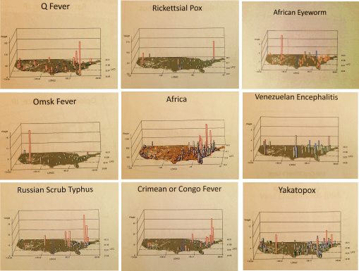
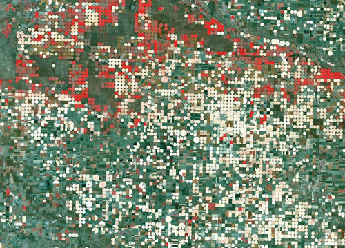
African-U.S. Disease patterns, from NPHG (the National Population Health Grid mapping project)
Source: news.yahoo.com
We COULD, or is it SHOULD, already have the answer to this question!
No doubt the CDC, NIH and WHO have some of the best people and tools in use to evaluate this potential epidemic problem.
At the public health level, if no such programs are in place regionally or within urban-metropolitan regions, the hubs of international commerce and travel, it is probably way too late to get anything started for this season. When asked how long it takes for me to establish a workstation from scratch, my guestimates based on experience are several weeks to, unfortunately, up to a year to develop and test, assuming the agency has a fairly poor infrastructure in place.
The infrastructure requirements for mapping a serious disease migration like that of Ebola requires more than just a basic demographics, transportation, and overall health patterns geographic information systems. Ecological data has to be completely included with this Integrative Disease Management (IDM) geographic information system. I favor phytoecological mapping due to correlations that can be drawn between vegetation regions and host-vector patterns. The skills of Pavlovski and Voronov of the Russian fields of study in human ecology, macroecology and disease geography drew together some of the most important ideas in spatial zoonotic disease patterns that have yet to be made a part of a daily system in most U.S. surveillance systems (see https://brianaltonenmph.com/gis/historical-disease-maps/zoonoses/ ).
The essential skills of mapping required for preparing for Ebola or any other in-migrating disease pattern, requires a complete and extensive review of these natural events, both in the natural setting and within the human ecological setting. Studies of lyme and west nile in the U.S. for example, using NLCDs, remote sensing and climate analyses, show these techniques could provide important insights into certain types of disease patterns. The mapping of all of the rare to infrequent zoonotic disease patterns for the U.S. (like some of those pictured above), yellow fever (https://www.youtube.com/watch?v=qH_cWGT8QbE&feature=youtu.be ), the distribution of diseases that logically came in by airline such as internationally induced elevation sickness (https://www.youtube.com/watch?v=PPeiDkhrgkI&feature=youtu.be ), and something as seemingly unrelated as hurricanes and tornadoes, produce findings that can be applied this work as well. [See sections of my extensive Pacific NW coverage as well– https://brianaltonenmph.com/gis/population-health-surveillance/production-examples/regions-and-health/part-iv/ ]. Could it enter via Mexico? Another disease evolved natural to that region could provide us with insights into how extensive in-migration travel is for the U.S. (https://www.youtube.com/watch?v=fcDTC-fXhg0&feature=youtu.be  ;).
At one point I produced a series of international migration maps using two types of formulas, one focused on the basic migration patterns ecologically and environmentally defined, the other inclusive of diseases from other countries that are primarily people related, not necessarily vector or animal related. The latter provided insights into how people travel from Africa (and other main regions or continents) to the US, and probably who upon arrival had to be assessed for something they may have brought in with them (recognizing “rule outs” as an important part of claims related behaviors in EMR is important to know).
My NPHG 3D map video on Ebola demonstrates the “rule out” effect in the claims contained in EMR: https://www.youtube.com/watch?v=RfvUQfYLlvM
More of this In-migration Disease series of NPHG videos, using several unique areal and grid mapping algorithms I developed, is at:
https://www.youtube.com/playlist?list=PLWrApErk5bybFfsOWTXWjlwvIM7D4d6-h
So, at the risk of repeating myself too much, I recommend the following [NOTE: at this site, the non-Youtube sites with my name attached, already on this page, may not open depending on your device; so scroll down or hit HOME above to see all of them]:
The Latitude and Longitude of Ebola.
https://brianaltonenmph.com/2014/06/24/the-latitude-and-longitude-of-ebola/  (seen on this page, below);
Current Ebola Outbreak Is Now The Worst In History And ‘Totally Out Of Control’. http://www.scoop.it/t/global-health-care/p/4023600494/2014/06/25/current-ebola-outbreak-is-now-the-worst-in-history-and-totally-out-of-control
http://www.pinterest.com/altonenb/epidemics/
. . . and concerning dozens more vectored and non vectored diseases out of Africa, such as Chikungunya (if link is disabled or blocked, see June 9th entry below):
https://brianaltonenmph.com/2014/06/13/monitoring-chikungunya-virus-and-dozens-more-vectored-diseases-in-the-united-states-a-testing-of-our-spatial-analytics-potential/  ;
The behavior of such a disease were it to come in through Chicago like MERS did (again, see below):
http://www.scoop.it/t/an-episurveillance-researchers-guide/p/4022709334/2014/06/09/a-lesson-in-disease-migration-the-chicago-illness-to-be-compared-with-mers
And “the methods to my madness”:
https://brianaltonenmph.com/about/grid-economics-and-population-health-work-experience/
But if you don’t want to listen to me, see:
‘outbreak’ at Tumblr. http://www.tumblr.com/search/outbreak/recent?language=en_US
Mapping Ebola’s Deadly Spread (Huffington Post). http://www.huffingtonpost.com/2014/06/20/ebola-map_n_5516406.html
Brief General History of Ebola.
https://web.stanford.edu/group/virus/filo/history.html
June 25, 2014
Posted by Brian Altonen, MPH, MS under
Scoop.it
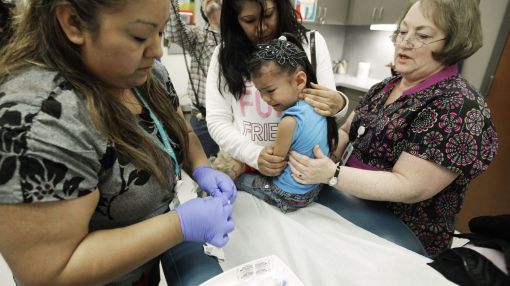
Comments Off on Here’s to Pop Culture! The Anti-vaccine movement gives old diseases new life

Medical experts are worried that an increasing number of children may become susceptible to diseases such as measles and whooping cough
Source: www.usatoday.com
The video at this site summarizes quite well the public health issue we are now contending with. (See http://www.usatoday.com/story/news/nation/2014/04/06/anti-vaccine-movement-is-giving-diseases-a-2nd-life/7007955/)
Adults are vulnerable as well, especially those who are 50 years of age or older, whose childhood vaccines might no longer be fully effective.
For those who think this issue is really “blown up”–children with lost appendages and neurological diseases due to meningitis, mumps and whooping cough are shown on this video.
Other sites worthy of review include:
Newsweek’s “Anti-vaccination movement strikes out in the Bible Belt States” at http://www.newsweek.com/2014/06/27/anti-vaccination-crazies-strike-out-bible-belt-states-255483.html
“Leaving the Anti-Vaccine” at http://www.voicesforvaccines.org/leaving-the-anti-vaccine-movement/
The Washington Post’s “How the Anti-vaccine movement is endangering lives” at http://www.washingtonpost.com/blogs/wonkblog/wp/2014/05/05/how-the-anti-vaccine-movement-is-endangering-lives/
Committee for Skeptical Inquiry’s ‘The Anti-Vaccination Movement’ at http://www.csicop.org/si/show/anti-vaccination_movement
Finally – – – Some PHYSICIANS are anti-vaccine as well ! ! !
See more on this and the counts of lives lost at Jenny McCarthy’s Body Count site page, http://www.jennymccarthybodycount.com/Anti-Vaccine_Body_Count/Home.html
June 24, 2014
Posted by Brian Altonen, MPH, MS under
Scoop.it
Comments Off on The Latitude and Longitude of Ebola
The patterns in general for Ebola migration and diffusion are somewhat predictable.
When viewed in a global sense, we get a better perspective as to why foreign born diseases inevitably go northward as the season progresses.
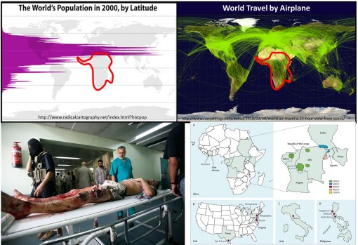
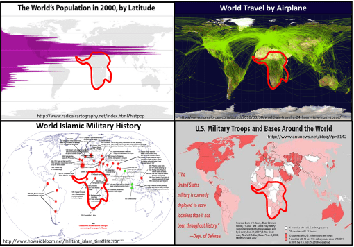
Population density and clustering in relation to the latitude is the reason diseases diffuse from the tropics to the northern temperate zones where more people reside. Any one looking at the above map with population density displayed relative to latitude can figure this out.
But the above basic display of latitude and people relationship took centuries to develop, still longer to make sense in terms of diffusion processes and the importance of spatial epidemiological research.
Source: news.yahoo.com
Today’s vision of how a disease spreads was not to obvious to people during the 17th and 18th centuries. Through observations made over time and distance, doctors and scientists developed what they referred to as “The Latitude of Pestilence Law” in 1814. This law explained epidemics and the migration of diseases as a consequence of global climate differences across the earth’s surface and as a consequence of seasonal changes making of section of the earth resemble another climatologically, and in particular in terms of amounts of rain, daily temperature levels, humidity, and the health attached to each.
This relationship was first described by geographers trying to describe how and why yellow fever behaved the way it did. It did not infect Europe much at all, but created a devastating impact on North America, progressing from the south to the north. At first this was taken to be the consequences of slave trade, that is until England came into the path of yellow fever as well.
The seasonal and recurring behaviors of yellow fever resulted in the first global warming theory to ever be made in the literature, by the now infamous Noah Webster (originator of the Webster Dictionary). But much more was soon to be learned about yellow fever as medical climatologists and medical topographers combined their theories and produced a number of novel geographic theories for yellow fever. (see this Global Warming review at http://wp.me/Puh6r-3Z1 😉
Two of the most important of these theories became popular in the young United States throughout the early to mid-19th century (https://brianaltonenmph.com/gis/historical-medical-geography/1814-the-latitude-of-pestilence/ ). One of these theories stated that the destruction of forests was causing this “black plague” through global climate change, induced by noneother than God Himself. But quite soon, as quarantine practices were perfected, this theological explanation was dropped and most people began adhering to the preachings of physicians and scientists instead.
Quite early in this period of the use of climate and topography to explain disease, latitude worked very well in helping us understand the relationship between particular diseases and the time of the year, seasons and climate. During this time, medical geography reached its peak in performance both as a medical profession and as a natural science study.
The realization that sanitation was important is certain diseases developed took center stage between 1850 and 1860, by the end of which the earliest organism or animalcule and sanitation theories developed. It was during this time that physics impacted medicine as well, in particular the physics and laws used to describe and explain the earth’s magnetic fields. In the 1860s, the popular culture aspect of this claim led British military physician and geographer Robert Lawson to go one step further with the theory by trying to explain the remaining observations about latitudinal behaviors of disease based on a new rendering of the earth’s magnetic fields, in turn creating a new longitudinal disease theory.
Lawson used the recently discovered global magnetic field flux behaviors made by Faraday to explain how changed in disease patterns happened (some might even call this an early predecessor to today’s El Nino theory). By following a north-south pole route, as magnetism fluctuated to the east and west due to surface feature differences, it changed local climates, local energies, and made certain regions more susceptible to natural events than others. He used this to explain the deviations seen in certain disease patterns (https://brianaltonenmph.com/gis/historical-disease-maps/robert-lawsons-pandemic-waves-theory-and-map-ca-1864-1875/ ). He then duplicated Faraday’s map renderings of these terrestrial magnetism lines, and re-named them “Pandemic Isoclines” on his disease map, which was subsequently published and thereby popularized.
Like any popular culture, Lawson’s theory died out, and his historically important map forgotten (but posted on my site just noted).
For several centuries now, scientists and doctors have observed diseases travel from the tropics to the temperate zones of the world. These earliest reasons given for this migration based temperatures and climate during the 1700s and 1800s were transformed into a host-vector-pathogen theory and a sanitation theory by the 1880s.
In either case, the migration of certain diseases remained south to north, beginning at or below the equator, and initiating in less developed tropical and southern temperate zone developing countries. Today we define this to be due to an ecological theory involving all of the carriers and initiators of these illnesses.
The distribution of global population and population density patterns in the upper left map, displayed here, demonstrates how and why this migration happens, and shows us that it is in fact inevitable in a sense. There are less people to be impacted by a disease that travels south, much more to the north. Thus the survival of the pathogen and its end product for us–vectored and non-vectored viral and bacterial diseases. Transportation of hosts and vectors, by air, water, ship, plane, or infected humans, defines the changes in longitudinal distributions for these public health concerns.
June 24, 2014
Posted by Brian Altonen, MPH, MS under
Scoop.it
Comments Off on The Latitude and Longitude of Ebola
The patterns are in general Ebola spread somewhat predictable.
When viewed in a global sense, we get a better perspective as to why foreign born diseases inevitably go northward as the season progresses.
Population density and clustering in relation to the latitude is the reason diseases diffuse from the tropics to the northern temperate zones where more people reside. Any one looking at the above map with population density displayed relative to latitude can figure this out.
But the above basic display of latitude and people relationship took centuries to develop, still longer to make sense in terms of diffusion processes and the importance of spatial epidemiological research.
Source: news.yahoo.com
This vision of how a disease spreads was not to obvious during the 17th and 18th centuries. But through observations, time and travel, doctors and scientists were able to establish what they called the latitude disease diffusion law –known as "The Latitude of Pestilence Law" in 1814. This relationship was first described by geographers trying to describe how the yellow fever made its way in a seasonal fashion to the young United States in the way it did during the early to mid-19th century (https://brianaltonenmph.com/gis/historical-medical-geography/1814-the-latitude-of-pestilence/ ). Yellow fever was the nation’s new "plague" (the in fact called it "the black plague").
Latitude worked in helping to explain its behavior relative to time of the year, seasons and climate. During the 1860s, British military physician and geographer Robert Lawson went one step further by trying to explain the remaining observations about latitudinal diseases based on his rendering of a new longitudinal disease theory. He used the recently discovered global magnetic field flux behaviors, following a north-south pole route, to explain the deviations that were occurring in disease patterns (https://brianaltonenmph.com/gis/historical-disease-maps/robert-lawsons-pandemic-waves-theory-and-map-ca-1864-1875/ ). He essentially then duplicated Faraday’s map renderings of the ever-changing terrestrial magnetism lines, re-naming them "Pandemic Isoclines" on his disease map.
For several centuries now, scientists and doctors have observed diseases travel from the tropics to the temperate zones of the world. These earliest reasons given for this migration based temperatures and climate during the 1700s and 1800s were transformed into a host-vector-pathogen theory and a sanitation theory by the 1880s.
In either case, the migration of certain diseases remained south to north, beginning at or below the equator, and initiating in less developed tropical and southern temperate zone developing countries. Today we define this to be due to an ecological theory involving all of the carriers and initiators of these illnesses.
The distribution of global population and population density patterns in the upper left map, displayed here, demonstrates how and why this migration happens, and shows us that it is in fact inevitable in a sense. There are less people to be impacted by a disease that travels south, much more to the north. Thus the survival of the pathogen and its end product for us–vectored and non-vectored viral and bacterial diseases. Transportation of hosts and vectors, by air, water, ship, plane, or infected humans, defines the changes in longitudinal distributions for these public health concerns.
June 21, 2014
Posted by Brian Altonen, MPH, MS under
Scoop.it
Comments Off on California declares whooping cough epidemic – Outbreak distributions may be predictable using NPHG
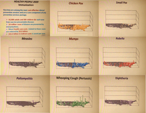
California is declaring whooping cough to be an epidemic after 800 cases were reported in the last two weeks. Learn how whooping cough spreads.
Source: edition.cnn.com
My controversial 3.75 minute NPHG presentation on the distribution of immunizable diseases is at : https://www.youtube.com/watch?v=UBUPd8LPdrQ&list=UUMJaJTXo6VmoTW2yktQiZrA&index=24
My 3D videomap on the distribution of refusals to immunize children is at: https://www.youtube.com/watch?v=LyqSJQOqSHU&index=21&list=UUMJaJTXo6VmoTW2yktQiZrA
The Playlist for this several year old site is found at: https://www.youtube.com/playlist?list=UUMJaJTXo6VmoTW2yktQiZrA
June 21, 2014
Posted by Brian Altonen, MPH, MS under
Scoop.it
Comments Off on Docs look for clues to whooping cough epidemic
Scientists are searching for clues to the resurgence of whooping cough, a nearly forgotten childhood infection causing outbreaks around the country. California last week announced a whooping cough epidemic.
Source: www.usatoday.com
June 13, 2014
Posted by Brian Altonen, MPH, MS under Uncategorized
Comments Off on Monitoring Chikungunya virus and dozens more vectored diseases in the United States – a testing of our spatial analytics potential
See on Scoop.it – Episurveillance
Outside the CDC and other epidemiological and public health work environments, other programs can monitor and report on their vectored diseases patterns. The most rapid way to analyze any ecological, population base, or culturally and socioeconomically based disease pattern is by grid mapping.
Grids have been criticized in the past because they are not exact. Current systems can manage the small area grids and map results incredibly fast and with an incredibly high resolution less than the spatial error contribution. These systems need not be GIS, but can include standard Big Data sets up designed for SAS (not SAS-GIS) and SQL. Adding GIS also means your are also adding a tremendous amount of work due to whatever programming (“tweaking of the maps”) is involved. This also increases the cost for producing and maintaining an effective surveillance system, and it can increase the likelihood that researchers’ or presenters’ bias and presentation error could impact your work.
One can accomplish the same using Teradata. It takes just 10-20 minutes to map a total of 2400 25 mile areas, representing the outcomes for the entire U.S., up to 1000 maps per data run, 24k per day, for one analyst. [See NPHG pages for more.]
Brian Altonen‘s insight:
Chikungunya Cases Double in CaribbeanNBCNews.com-Jun 5, 2014… Vincent and the Grenadines, and Saint Maarten),” they wrote in theCDC’s … “As of May 30, 2014, a total of 103,018 suspected and 4,406 … Officials have been cautioning that the virus could become established in the U.S. …Mosquito-Borne Chikungunya Virus Spreads in the Americas
Medscape-Jun 6, 2014 The next mosquito-borne infection you might want to start worrying …
Washington Post-Jun 5, 2014 Chikungunya Cases Increase in the Americas
Guardian Liberty Voice-Jun 7, 2014 Mosquito-borne chikungunya cases double in Caribbean
WXIA-TV-Jun 5, 2014 Mosquito-borne virus a public health nuisance
In-Depth-San Jose Mercury News-Jun 4, 2014
June 9, 2014
Posted by Brian Altonen, MPH, MS under Uncategorized
Comments Off on A lesson in disease migration. The Chicago Illness (to be compared with MERS)
See on Scoop.it – Medical GIS Guide
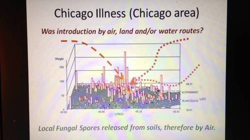
http://youtu.be/qN9CALP2_uw ; Chicago Illness, Full video,7, recording session 0808, Teaching Videos. The ways in which a disease like MERS can spread from Chicago to other parts of the country, based on the Chicago Illness diffusion pattern accompanied by lecture notes and demonstrations .
Brian Altonen‘s insight:
The Diffusion of diseases in this country follow several spatial patterns and abide by specific temporal patterns.
The simplest spatial model for diffusion is the radial or linear process with follows either just the air and is impacted by wind flow patterns (radial), or travels a natural route of least resistance such as through a gully, along a woodlands edge, parallel to roadways and animal migration routes (linear).
A more complex spatial model follows human migration and travel patterns and certain commercial or economic paths. The most human dependent ironically abide by many of the same patterns that inventions and discoveries tend to follow. They hierarchically diffuse from one area to the next, going from large population area to large population area and then back-tracking to smaller areas between these major landing or outbreak areas.
In some cases, especially when poverty becomes a major issue in how a disease develops, a reversed hierarchical pattern develops. That is to say they at first behave hierarchically, moving from one large area to the next, but each time they reach a new population center, they infect the most susceptible populations. In most urban settings, for numerous regions low income, low socioeconomic status neighborhoods become the places where many of these disease develop, or adapt to human population features and human behaviors to help find the next susceptible victims. Cholera is an example that migrates internationally in this fashion. The most susceptible areas and people are typically low income groups residing in low property value settings (poor managed, filthy, least desirable living places.)
The temporal pattern of disease flow is related to how it travels and at what rate across the earth’s surface. As recent diseases making their way to the United States from other countries demonstrate, distance is no longer a deterrent to international disease spread. Even Australia, more than 10,000 miles away from the center of the U.S., is capable of sending its next disease or vector to the U.S.
This review of how diseases that make their way to Chicago fits the current dilemma we are in with international disease migration patterns and concerns. The spread of MERS into the more southern midwestern regions of the U.S., demonstrates a possible mixed diffusion pattern. The early stages appear to be linear or radial in nature based on transportation routes, but should this disease take off and produce an outbreak, hierarchical diffusion patterns are expected as well.
See on www.youtube.com
June 4, 2014
Posted by Brian Altonen, MPH, MS under Uncategorized
Comments Off on Saudi review finds over 100 more MERS infections
See on Scoop.it – Global Health Care
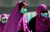
MERS (Middle East Respiratory Syndrome) is a coronoa virus induced disease first documented in Saudi Arabia in 2012. It’s mortality rate is about 30%. On May 2, 2014, the first case of MERS made its way to the United States. On May 11, 2014, a second U.S. case was confirmed. (http://www.cdc.gov/CORONAVIRUS/MERS/INDEX.HTML)
Brian Altonen‘s insight:
News about the United States cases of MERS is at the CDC site http://www.cdc.gov/coronavirus/mers/US.html
The status of health care in Saudi Arabia was detailed in the conference presentation:
HEALTH CARE DATA IN SAUDI ARABIA: CHALLENGES IN COLLECTING, SHARING, AND APPLYING, by Mohammed Al-Kelya MS, PhD and Abdulaziz Al-Saggabi, MSc, PharmD (http://www.ispor.org/meetings/neworleans0513/releasedpresentations/FORUMArabicNetwork.pdf 😉
WHO has reviewed healthcare in Saudia Arabia and presented its conclusions at Eastern Mediterranean Health Journal – Health care system in Saudi Arabia: an overview, http://www.emro.who.int/emhj-volume-17/volume-17-issue-10/article-11.html
In a 2008 article published in the Lancet about disease penetration due to tourism and travel, a complete review was provided for diseases from Saudi Arabia and elsewhere,
Lin H. Chen, and Mary Elizabeth Wilson. The Role of theTraveler in Emerging Infections and Magnitude of Travel, Med Clin N Am 92 (2008) 1409–1432. doi:10.1016/j.mcna.2008.07.005.
available in its entirety at http://download.thelancet.com/flatcontentassets/H1N1-flu/epidemiology/epidemiology-1.pdf
Older people with comorbidities are at the highest risk of infection and mortality from this diagnosis. For more, see "Health officials keep close watch over MERS as potential pandemic", in
Infectious Diseases in Children, September 2013, at http://www.healio.com/pediatrics/news/print/infectious-diseases-in-children/%7Bf9c3c3e0-0c66-45e5-a024-5256240113e5%7D/health-officials-keep-close-watch-over-mers-as-potential-pandemic
As many as 17 million people per year travel out of Saudi Arabia to other parts of the world. High migration rates for people and high mortality rates for the virus (30-50%) are the makings for a potential pandemic, according to some writers.
For more on migrating disease patterns, see also:
Infectious Disease Movement in a Borderless World:: Workshop Summary, by Forum on Microbial Threats, Board on Global Health, Institute of Medicine. National Academies Press, Washington, D.C. Preview available at http://books.google.com/books?id=TJZhAgAAQBAJ&lpg=PT67
INFECTIOUS DISEASES RELATED TO INTERNATIONAL TRAVEL AND MIGRATION: PART I . By George A. Wistreich, RC Educational Consulting Services, Inc, PDF accessible at http://www.rcecs.com/MyCE/PDFDocs/course/V7104.pdf
See on news.yahoo.com
