NOTICE!!
A Survey has been developed to document and compare GIS utilization in the workplace. This survey assesses GIS availability and utilization in both academic and non-academic work settings. The purpose is to document the need for GIS experience as an occupational skill. GIS is currently being underutilized by most companies. Spatial Technician and Analyst activities and a few managerial activities requiring GIS are reviewed.
This survey, which takes about 20-25 mins to complete (’tis a bit long), can be accessed at
Survey Link
……………………………………………………………………………………………………
NEWS FOR HARD CORE GIS USERS (4/29/2011): Several months into posting this page, it is still my most popular. I found the Excel Spreadsheet used to generate the coordinates I produced the hexagonal grids with, and posted it for downloading at https://brianaltonenmph.com/6-gis-ecology-and-natural-history/hexagonal-grid-analysis/hexagonal-cells-excel-spreadsheet/.
Also: a useful calculator is at https://rechneronline.de/pi/hexagon.php You can use this to calculate portions of the hexagon based upon an initial given assumption you want to include, such as the area of the cell or the length of its side or the length between certain parts. This mimics some of what are on my excel attachment many people use; but it is a also good link to know.
History of Hexagonal Grids
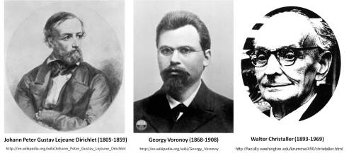
The use of hexagons to map features across a land surface is really quite an old geographic method in modern geography history. It was first reviewed extensively by economics geographer Walter Christaller and published in 1933 in Die zentralen Orte in Suddeutschland . . . (Jena). In this work, central place theory was described and the notion that urban planning might benefit from the development of defining multiple areas, each with its own particular attributes designed to fit specific sociological needs, could assist in improving the development of various types of economic regions. In 1965, the value of utilizing this method to review spatial distribution was once again popularized by Loche (The Economics of Location, New Haven, 1954) and Haggett (Locational Analysis in Human Geography, London, 1965) (For a summary of the above see also: B. Garner. “Models of Urban Geography and Settlement Location.” Pages 303-360 in Socio-economic Models of Geography. (1968) Partially Reprinted as Parts I and III of Models in Geography. 1968, 1969, 1970, 1972. Richard J. Chorley and Peter Haggett (eds.). Currently, this interest in the distribution of people, money, commercial products and customer needs has led to an increased interest in the development of a way to produce hexagonal grid mapping techniques through the use of GIS. This study explores the hexagonal grid methodology that was developed to better understand the spatial distribution of possible exposure in relation to the distribution of chemical release sites for the state of Oregon.
 .
.
Study Background
[Note: The full report filed for the grant-funded portion of this work, prior to developing this hexagonal grid technique, appears on this site at: https://brianaltonenmph.com/3-gis-environmental-health/report-for-grant-funded-research-2002/]
Before going into the hexagonal grid mapping technique, it helps to understand how and why these maps were developed. Jan Semenza (now with the European CDC), was the principal investigator for this project and myself the grant-funded research assistant/GIS spatial epidemiologist. The original goal was to map out specific forms of cancer in relation to chemical release sites. The primary supporting theory at the time for chemically-related carcinogenesis was the benzene theory of cancer, as well as some other major carcinogens research related to such chemicals as mercury and other heavy metal industrial waste and/or chemical release products, and the theories related certain industry-types to carcinogenesis such as paper manufacturers or electronic circuit board industries. [All of these maps and mapping methods are detailed on other pages.]
Once the point mapping of these cases and chemical release sites was accomplished, there were still some spatial problems that had to be dealt with. This first major problem was the major differences in polygon sizes and given population densities to the numbers of cancer cases documented for this study. These very different and very irregularly distributed results led to the need to define another way to look at chemical release and type in relation to cancer case distribution. The focus was then turned to reviewing chemical history in order to define the most likely population regions that were cancer-prone due to exposure, and then relate this information to the spatial distribution of cancer cases. This part of the project involved a detailed analysis of SIC and chemical history, resulting in the production of a series of “chemical fingerprints” or signatures that could be related to specific SIC groups developed based on company history and type.
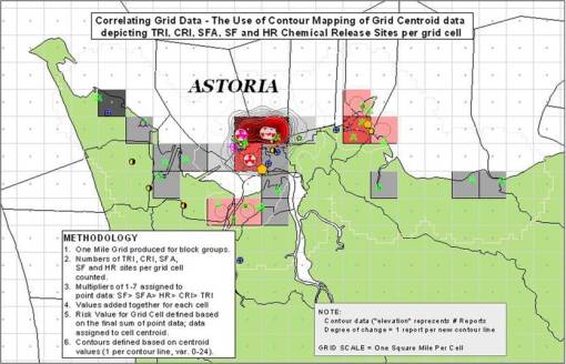
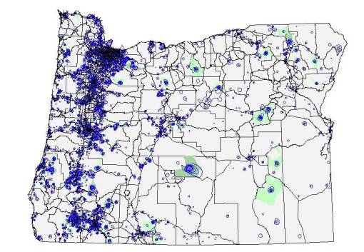
With these chemical signatures now defined, the issue became evaluating one site relative to the next, with various cancer cases in close proximity to both of these sites. A single case could be related to one or more sites. So how did local incidence or frequency in relation to areal chemical release history play out spatially was our next question. This led to a statewide gridmap produced the old-fashioned way, using an Avenue extension, and a grid developed for the entire state of Oregon based on 1 mile x and y side lengths for each grid cell. The grids were evaluated for cases per cell, and that data tranferred to a centroid point file developed to replace the grid. Finally, these point values were used to produce an isolines maps. This 8 to 10-hour process relied on four Avenue extensions programn and led to the development of the cancer case isoline map displayed below and detailed elsewhere on this blogsite.
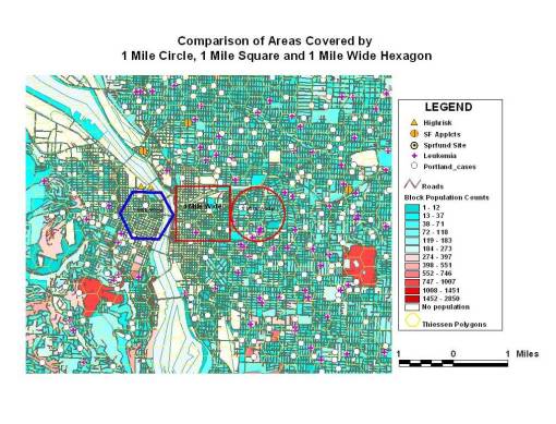
The next phase of this work entailed the grid mapping of cases, release sites and chemicals at the local level. Standard grid cell techniques were used to produce these maps, relying upon 1 mile sidelength followed by o.5 mile sidelength perfectly square grid cells. This produced grids with cell areas of 1 and 0.25 sq miles. The resolution of the 1 mile cells made the results of this spatial study very questionable. The issue was that a chemical site in the upper and lower corners of one cell was close to a case in another cell, and since both were in the corners of these squared, they seemed more likely to be related to each other than to their independent grid cell centroids. This meant that the grid cells had to be reduced in size significantly, to 0.5 mile sides or less (0.25 sq mile area vs. 1 sq mile), and for something to be done to correct for that corner effect I was experiencing. [Note: All of the techniques discussed are reviewed on other pages.]
That is when the idea came about getting rid of those large corners by using another polygon grid map–the only type of which that could be produced and have cells that are identical to each other in shape and size was the hexagonal grid. After researching this topic, it became clear that hexagonal grid cell use was not common to ArcView at the time. In fact there were no Avenues extensions written for this purpose. All grid producing programs were then used to produce square grids, some with centroids and unique identifiers, some without these important features.
The goal thus became to produce a formula with which a hexagonal grid map could be produced. This process took most of the winter of 2003. Numerous methods were produced and tested, involving numerous grid cell sizes, varying in row-column values. In the end I produced two workable versions of these grid cell x-y calculators, designed to produce a rectangular grid with hexagonal cells rather than a square grid. My first method produced cells with a specific side length. But due to the difficulty of calculating events per square mile using such centroids and polygons, I developed the second series of formulas and programs used to produce the centroid x-y’s for grid cells based on a specific areal size. This way, the numbers of cases per cell, the numbers of chemicals per cell, the numbers of sites per cell, the numbers of total years of release for all sites additively, etc., could be more easily reviewed.
The final step in this process was to develop a tool that would do this for a fairly large grid size in terms of numbers of rows and columns. My original tools were small–50 rows and 50 columns. Due to the problem of exceptionally large grid cell sizes for a given research area around a site or series of sites (even 0.25 sq mile is sometimes too big), I decided I had to develop a very large grid with large x and y value counts, i.e. 140 x 200 or greater. The next step was to determine where the error problem was outweighed by the choice of small cell size. In other words, why produce a 2500 sq ft cell that would be about 50 x 50 feet, if the error for your x-y cases or release sites points is +/- 150 feet? These “low error” small cell size ranges were thus defined and a standard area for evaluation of toxic release then determined. Almost always, cells that were < 5 sq miles were used, quite often they were much less than 3 sq miles in terms of area.
With the new hexagonal grid cells it was immediately noticeable that more realistic series of chemical exposure isolines could now be developed. This led to the production of certain measures and isolines testing in relation to such variables as numbers of chemical sites per grid cell, numbers of reports files per cell, numbers of reports of specific carcinogens reported per cell, etc. These values were assigned to the centroid of a cell, and since that the cell size was exceptionally small, this meant that the numerical results were more realistic, with spatial distributions sometimes calculated at exceptionally small areal levels (a couple of football fields for example). Now numbers of cases per grid cell could be compared to grid cells in which numbers of companies, amounts of toxins released, years and amounts of release, could all be evaluated equally. The final process consisted of trying to convert these centroid values assigned to each and every cell into isolines, to display the relative distribution of carcinogens in relation to local cases. Everything that was mapped was measured based on the same areal size and technique–the small area hexagon grid cell.
This study began as a grant supported project back in 2001. During the first 2 years of this study, financial support was provided in the form of grants provided by the School of Public Health (seed grant) and Portland State University School of Urban Studies (for continued studies), and a local grant provider for the region from Northwest Medical Foundation (NMF, (for a year long study). The first two grants funded portions of this work that were half-time work and lasted only from June 1, 2001 to December 2001. This was then followed by the Northwest Medical Foundation grant awarded for the period of January 2002 to July 2002. This work has since been ongoing due to the amount of effort that went into producing the database and the depth and detail of databases produced due to the original funding sources.
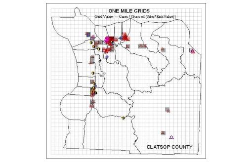
One of the first square gridcell large cell area techniques employed, at the county level
Methodology
All chemical releases sites were mapped for the state, along with their chemical release history. This information was obtained from a state database established for documenting the state’s toxic release history by Oregon State University. This database included the details provided for each of the chemical reports filed for the most toxic of these site known as confirmed release inventory sites (CRIs), an aerial photo of the place, and additional land use and extensive amounts of information on company history and the findings from each of the site visits by inspectors and environmental clean-up crews.
This information was then databased and related to a variety of other variables, including total number of years of release, amounts release, relative toxicity and carcinogenicity of the chemical release, and the standard industrial classification history of each of these sites. A detailed chemical database was also developed detailing the types of toxicity, along with a NIOSH data generated datasets on each of the chemical types, including several new reclassification systems developed for use in reclassifying chemicals into several different types of groupings based on major chemical features and side groups in these chemical known to be responsible for chemical carcinogenicity (i.e phenolics, benzenes, petroleum products, heavy metals, organic mercury, etc.), as well as certain levels of toxicity and carcinogenicity defined by NIOSH, EPA, NIH, AMA, American Chemical Society, Physicians for Social Responsibility and several environmentalist groups.
As the need arose, this data was then joined or linked to the shapefiles produced using the coordinates provided for each site at the EPA database website. SIC and chemical datasets were also developed for linking to the shapefiles, to which company names or ids was attached for the join-link process. These databases (back then saved in comma delimited form) were developed to determine if certain industry types could be linked to local cancer cases. A detailed analysis of SIC and chemistry was finally developed in order to assign a chemical signature to each SIC class defined for every company. This was based on the full chemical reports filed for approximately 500 confirmed release sites. This provided 45,000 chemical reports detailing the tests performed for just under 200 different types of chemicals, as many as 170 per site measured at least twice each.
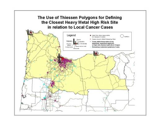
Early Example of Theissen Polygon Use. Distribution of people and cases across 4 NW counties was evaluated relative to four sites with a history of release of highly toxic metals.
Over the next few years, another 17,000 reports for 677 non-Confirmed release sites were then added, each with a history of release from 1984 to approximately 1987. This data evaluation process pulled in the remaining high risk sites for the most part. Most sites reported during this time were fairly high risk in nature, with a few exceptionally high risk based on the number of chemical reports filed, that for various reasons, never received superfund status and funding (some were late reporters deliberately filing late to avoid paying the clean up costs, others were late due to legal, business or financial reasons). For the most part, only a few dozen of these were very important additions to this review. Most of these sites were in general small incidents that perhaps should not have to be included in this kind of study, due to the possibility of assigning medical risk to a site that isn’t such a risk. (Sites that are supposed to be totally cleaned up are not pulled for this review; they are on another EPA list.) By including these final sites, it was found that we develop a better understanding on how and why repeated spills or infractions occur, for example due to a single company, or due to a series of events related more to human behavior than corporate mismanagement, such as demonstrating a high likelihood that a spill or release accident could take place due to local geographical, traffic, commercial or other human behavioral activities and events.
Once all of this chemical report data was linked to site and SIC data, this was then used to develop bar charts depicted expected exposures per site, based on n-sites per SIC groups. Some SIC groups had very few representative industries; others had dozens of industries upon which to based these expected TRI and spill histories upon. Finally, this information was used to predict the chemical release exposure history or potential for chemical release by sites that lacked any chemical release data or for some reason were unwilling, legally exempt, placed on a delay for superfund testing, or illegally self-excluded from chemical testing as per the company’s legal and financial decision.
The Hexagonal Grid Cell Method. The utilization of hexagonal grids to analyze population features was never heavily popularized, perhaps due to the ease at which square cell grids can be calculated, produced and then analyzed using a GIS. The equations needed to produce the centroid values for each cell in a square grid are fairly logical and easy to produce. Their distance relationships are easy to calculate due to the orderly layout of the grid cell centroids, in a very orderly fashion along x and y axes. The problem with using square grid-related layouts and centroids, is that these areas and points are not the best way to represent spatial distribution across a two-dimensional surface. The corner effects of square cells increases the probability for error based on point-centroid features involving cases or sites and specific predefined research areas.
The best way to evaluate any type of spatial distribution is through the use of hexagonal grids. With improvements in computer technology, in particular GIS, most of the calculation and drawing limitations that once prevented us from using hexagonal grids have been pretty much been eliminated. Hexagonal grids applicable to GIS can be fairly easily produced, given the right tools and knowledge of the related math equations.
The major problem with producing a hexagonal grid is the layout of the hexagonal corners (nodes) and placement of the centroids. We can use standard statistical tools to develop a series of equations that in turn be used to define the centroids for a hexagonal grid layout, using an offset (alternating) row-column relationship that result in points that are equidistant from the next closest points in all locations and all major directions (left-right, up-down, corner-to-corner, with less variation in distance change as one travels along the edge. These points may then be used to draw out the entire hexagonal grid cell boundaries.
This use of a hexagonal grid is the preferred method for producing grids applicable to the production of isoline or contour maps. For this study, such a technique was used to produce the datamaps needed to calculate chemical release activity in relation to disease (cancer) location (but not necessarily incidence or prevalence). This method is useful for comparing spatial relationships between one set of isolines data and another, such as population-disease density contours in relation to chemical release site related contours.
A Grid Maps and Isolines Review
Even though the misplacement of grid cell centroids is still a problem with hexagonal grid cells, the impacts of this methodology induced error lessen when hexagonal grids are developed versus square grids. This is because the distances between the most distant points in the corners of a square cell and its centroid, versus the same for a hexagonal cell, are not just slightly different, they are considerably different. Reviewing the manner in which a circle is placed in each of these possible cell shapes, we can see there are obvious shape and size differences for polygons located at each of apices. The more apices (corners) a cell has, the more fitting a circle is within that shape. Only two polygon sizes can sit side by side pretty much and form a complete grid with polygon shape homogenity–squares and hexagons. For the square cell grid mapping a line through these two cell types will result in a staircase like transition from one cell to the next when the changes are pretty much diagonal in nature. For the hexagon grid, these 90 degree changes are reduced to 60 degrees normally. This results in a transition across a surface that appears more “desirable”, ‘readable” and understandable to the eye and contemplative brain. When isolines are produced using the centroid values from hexagon maps, they are easier to understand and relate to than a contour map produced using the centroids from square cell maps.
Therefore, one of the most important uses of hexagonal grid cells is related to the development of isolines. For this study, the goal was to use isolines to depict chemical exposure based on highly detailed spatial datasets. This eliminated the problems experienced when dealing with irregular shaped centroid block and block group data: too many census polygons are null in block data, and area still varies too much with block groups.
Research Obstacles. In my first attempts to develop the isolines maps for this research, focusing on the Portland, Oregon region, I found it difficult to relate the densely packed release site data with the light to moderately packed case data. Harmonizing the fairly scarce data points depicting low disease incidence (in terms of population density data) with the more common toxic release site locations required several methods be tested before a fairly reliable method of analyzing and depicting the end results could be verified as valid in terms of depicting the potential for exposure to site activities and the final incidence or prevalence rates or related cancer cases that may have developed due to these exposures.
For several other spatial analysis techniques in GIS, it is recommended that different area sizes be tested for distribution and density patterns, and then the results reviewed, in order to determine where you get the most sites per cell in terms of variance and standard deviations on sites per cell. A 5×5 area is definitely too big; a 0.05×0.05 mile area is too small (too many nulls). So it helps to test your grids at different cell sizes.
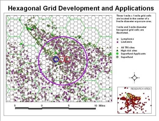
This problem also reminds us of a similar problem involving census block and block group data. If the grid cells are too big, you do little to make up for the large and small size issues that existed whenever you rely upon census block or block group data. However, it is not the irregularity in block/block group counts that is corrected for as much with grids as it is the irregularity and shape and size noted for census blocks and block groups. We can even try to correct for the erratic census block and block group numbers by reassigning them to their related grid cells and multiplying that number by percent of total census block/block group area occupied or covered by that grid cell. This works regardless of whether these grid cells are square or hexagon.
The only hindrance to relying totally upon grid analysis data in this cases is the misapplication of census data to a grid cell. In some cases, the census areas are for the most part unoccupied; they have no people residing in the block or block area for much of its area. This means that in rural settings, this method could be problematic. A single census area with a few cases, overlain by 10 or 20 grid cells, could produce erroneous results if you divide the few cases by area across the various unoccupied cells. Those unoccupied cell areas should be assigned a value of zero.
Advantages. In terms of mapping exposure risk, there are several advantages to developing these grid methods of analyses instead of using census block/block group spatial data. The primary reason for their use is to quantify in more detail the spatial layout of all the numbers required for the analysis. You are not focused on the people, but rather on just the locations of release sites. Whereas in typical census tract-based analysis of this information, most, if not all, of the fine detail needed to do accurate spatial interpretations is lost, this is less the case with the use of smaller areas such as block groups. In turn, blocks themselves form the most retailed form of spatial analysis possible. However, due to the relative scarcity of cases that can occur at times for given regions, the use of blocks introduces an error generated from the propensity of zeros or null values in the datasets produced using census blocks. The relationship between one site and the next for the most part seems to be primarily based on mostly zero values.
Example of Grid Mapping for Portland, Oregon
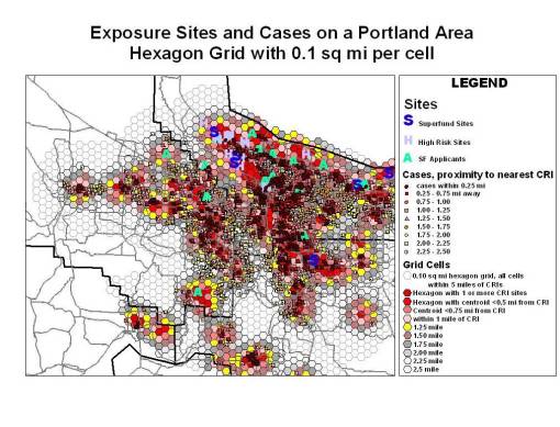
The above “beehive” grid (second figure above) consisting of hexagons laid over the surface of the research area was developed for a study of chemical exposure in the immediate Portland, Oregon area. I was particularly interested in the Northwest sector of the city due to its industrial area, where numerous toxic release sites existed, including several sueprfund, superfund application, and what I considered “High Risk” sites based on the complexity and amounts of chemicals released and/or being tested for. This process eliminated the “corners effect”, problem I was experiencing with the square grids in Astoria, Oregon (this square grids method and other examples are on another page).

The Math and Geometry of Hexagon Grids
In general, grid cell matrices have at least two sets of distance measures to deal with for your distance calculations. There are perfectly horizontal and vertical rows of centroid points that are equidistant from each nearest neighbor, and there is a diagonal array of centroid spatial relations which utilize a different set of calculations to define the nearest neighbor in terms of diagonal spatial relationships. Obviously, the distances between nodes for vertical-horizontal versus diagonal spatial features are completely different–the centroid of the square grid cell is its shortest distance from the center of each edge, and is longest when extended to any of the corners.
In square grids there are four corners that are situated further away from the centroid than the midpoint in a polygon edge. In hexagonal grids, there are six corners that are furthest away from the centroid. For good spatial analysis we want grids with identical cell shapes and sizes, laid out perfectly so as to cover the entire are under investigation. Only square cell grids and hexagonal cell grids can be use to perform equiarea cell analyses on maps.
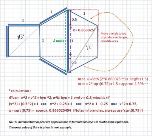
This problem with locating data in relation to a cell’s centroid placement is this difference in distance problem that exists between corners and edges for square grid cells. This problem is totally eliminated through the use of hexagonal cells. Whereas in a square grid the corner apex is 41.4% further away from the centroid than the edge-line centroid (1 versus hyp = sqrt(1^2 + 1^2) = sqrt(2) = 1.414 approx.), in a hexagon grid the difference is reduced greatly to approximately 1.000-0.866 or a 14.4% difference, approximately.
Based on the formulas in the following figure, the “magic number” here is exactly 2.59807621135332. This is the area:sidelength ratio for a hexagon cell. For a grid cell with an area of 10 units, you will produce a side length of 10/2.59807621135332 or again exactly 3.8490017945975.
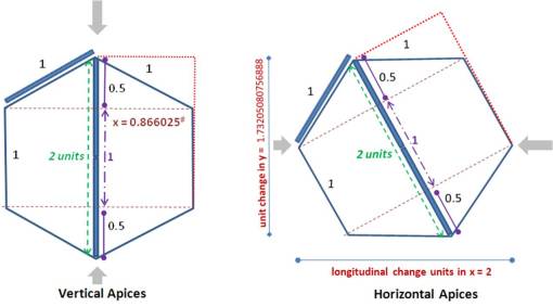
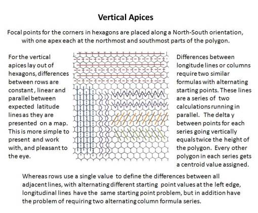
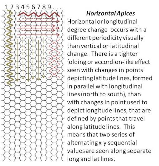
There are two types of lat-long, hexgrid layouts that are easy to produce-a vertical apices approach and a horizontal apices approach. These terms are derived from where the shape guides you when viewing the grid. The vertical and horizontal apices approaches to hexagon grid mapping are illustrated below. The human/reader perspective on the horizontal apices grid is to move to either the left or right and you scan the image. The vertical layout of apices tends to flow more in an up-and-down direction. Thus my selection of these terms.
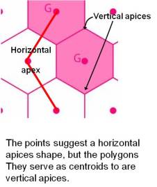
When planning a project in which you want to map everything out using hexagons instead of square grid cells, it helps to keep in mind that there in an inverse relationship between points and polygon shapes. The production of points that lay out on a map like vertical apices hexagons, once they are treated as centroids and used to produce a polygon file, results in a vertical apices polygon shapefile. The production of a series of points that suggest a vertical apices gridform, will once the polygon map is produced, displayed as a horizontal apices polygon shape file. (Thus, my horizontal apices hexagonal grids are produced using a series of points that appear as if they are of vertical apex form.)
Due to the nature of human perception, for the first figure below the two most noticeable apices in these cells are the top and bottom corners; these are what I mean when I state “vertical apices”. If the cell is rotated 30 degrees either way, the left and right apices stand out, pointing east and west, as well as the bottom and top hexagon side level with the horizon. This I call the horizontal apices approach to producing grid cell layouts. This twosome classification is not the only method that is available. In theory this also means that there is an infinite number of variations in the actual grid that could be produced (involving a differential equation), based on every possible stopping point between the 0 and <30 degrees rotation. From each of these theoretical starting points, a new grid with new lat-long equations and data could essentially be formed. [I have not hazarded a guess or made any attempts as of yet to work these formulas using a 15 degree +/- n degree rotation; my original formulas do utilize sine and cosine variables; I just haven’t tried to answer this theoretical question.]
For vertices, see broad gray arrows.
Note: for the above vertical apices, the x value in the hexagon is not exact; it was rounded to 6 decimals. See figure below and notes in text for exact values, or routine to avoid miscalculations based on choice of wrong value. Fortunately, there is an absolute value for each of these very long-decimal values.
Applying this to GIS, the arrangement of the hexagons is the issue. The centroid of each cell is what is being produced as point files, to which a Thiessen Polygon extension is then applied.
Longitude lines, using the vertical apices approach.
Addition of Units to a starting point. 2x or [2 * 0.866025403784439] is the distance multiplier for adding a unit length between longitude line points. If Long-line 1 (line_1) is at 0, with long-unit=1.000 (this can be replaced with feet per degree unit, meters per degree unit, etc., depending upon coordinate system in use),
- line_2 is 0 + (2 x 0.866025403784439) or 1.73205080756888,
- line_3= line_2 + 1.73205080756888 , or line_1 + [(line_n-1) x 1.73205080756888], adding 1.73205080756888 each time a new line is to be produced.
Projections in use for this application are best selected from equal area maps, or maps with descent equal area-equal distance so long as the focus of the surface area work is in the center of the map produced for the study. The points used to produce the grid shouldn’t extend too far towards the map projection borders.
Latitude lines.
Addition of Units. Fortunately latitude lines are much easier to produce with this type of display of the hexagon (a vertical apices approach). The distance between centroids along the longitude line, use to produce the latitude points, is simply 2 units.
Grid used for the calculation based on length of side (square cell, sidelength l_sq: hexagon cell side length l_hex, with l_sq = l_hex)
From Point to Grid
The above is for producing a single relationship between two points along the x-y or lat-long axes. How is this converted to a grid?
To convert the above to a grid, you simply replicate it accordingly, using the Addition of Units formats briefly described above (reverse the two formats for the Horizontal Apices approach).
This sounds easy, and perhaps once one gets the gist of it, it is. But at first it is a pain to produce, and unfortunately I haven’t developed the formulas and theory well enough to place all of this into an ArcView Avenue Extensions formula. [By the way, as a past professor directing this suggestion to any graduate students out there, this would be an excellent thesis or dissertation topic!]
Square Grids
Essentially, to produce a grid you need to know the following: number of cells per full row horizontally, and per full column vertically. For square grids, the answer to this question is pretty basic. The simplicity of square grid cell production makes it the most common method used to employ grid analyses to spatial analysis.
.
More about Square Grid Error Problems. The major limits to this method are obvious–the corner and apex problem. The closer an event is to an apex or share point, the more likely that error get introduced into the spatial analysis. An event taking place exactly on the apex point can be linked to four separate centroids and subsequently grid cells. When likelihood for spatial error in terms of distance +/- 3% or +/- 5% is introduced, a point in one cell can actually be related more to an event taking place in the adjacent cell, close to its corner apex, or even its centroid in some cases. This can be corrected for by repeated measures taken using overlaying grids, or even better, by the use of slightly shifted overlaying grid, but this event could become a little more cumbersome, and perhaps awkward to mathematically conceptualize, develop formulas for with regard to offsetting the centroids, and determining your maxes and mins when it comes to staying within the most appropriate low error or ideally error free parameters when running this type of grid analysis using offset grids.
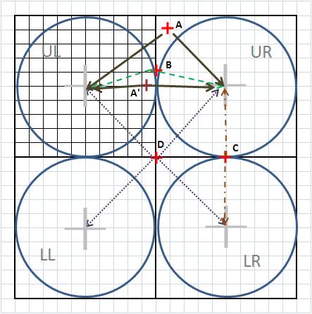
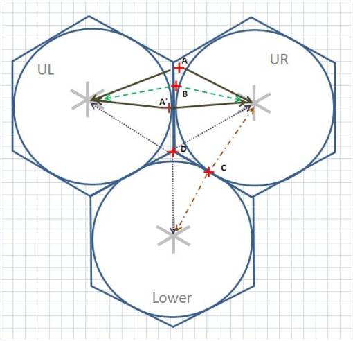
Examples of square grid point-centroid assignment problems. Points [+] in this discussion are referred to as cases.
A. Upper right (UR) cell is best fit, but distance from centroid also suggests spatial problems since this case is further away than a perfectly circular distance measure suggests may be possible. This could imply that a case located just across the border in UL cell (A’) could be equally likely to be due to centroid in UR. But A’ is probably related more to UL cell centroid. The size of the area outside of the circle and its percentage of a grid cell defines the amount of potential error the use of grid cells might result in. The method related error added to the +/- 3-5% human and standard statistical errors given suggest a 40-45% likelihood that there could be a problem with these corner apices case points. The use of hexagons reduced these apices/corners-induced errors significantly.
B. This case is now even closer to be equally likely in relation to either centroid.
C. This case is equally likely to be due to UR or LR centroid. Another measurable feature has to be added to this analysis and then that feature related to both cells, and then to the cases, to determine which cell/centroid is more likely to be the cause.
D. This case is the worse scenario; it is equally related to all four cell centroids. It may take as many as three additional measurable features to allow for differentiation to occur in regard to place and risk of centroid relationship.
Hexagonal Grids
With hexagonal grids, the rows and columns alternate in their alignment, and there are primary and secondary lat-long features, with alternating row or column alignment patterns depending on the method used to make the grid (horizontal or vertical apices). This means the longitudinal values switch back and forth between two sequences distinctly different sequences.
The following is the simple of the two options to pursue when trying to define a grid, the Vertical Apices series:
The horizontal apices method (employed for my maps) reverses the math functions for x and y axes. The method is the same, and is retold slightly different in the following rendering of these notes:
Hexagonal Grid Errors. When we apply the same reasoning to hexagonal grids, there are several features that make hexagonal grid less likely to produce spatial error based on distance from centroid versus apex related features. The following displays the same types of error just reviewed for square grids.
For error type A, the problem with two points of similar distance from a centroid, with one actually being closest to the centroid in its grid cell, we find the differences in distances for each point to its centroid becoming much smaller.
As the point migrated down (error type B), getting closer to the midline between the two cells, these differences also reduce in size, and there is less area that the point can reside in thereby causing this error. The smaller apical areas outside the circle are one of the major advantages to using hexagonal grids. The probability of error induced by areas outside the circle formed around a centroid is reduced, and reduces much more rapidly as this inability to relate a point to a left or right (UL or UR) centroid increases.
For error type C, the problem remains unchanged for hexagonal grids versus square grids.
For error type D, a major advantage is seen by the reduction of the problem from 4 cells with a shared point feature to just three cells. This may seem like a small amount of change, 1/4 versus 1/3, but is important in terms of improving upon the use and validity of the results of any grid cell mapping done for large amounts of data.
When this latter improvement is combined with the reduction of outside-the-circle area problems that is seen (41% to 14%, this constitutes a 27% + 8% = 35% improvement in the spatial reliability of study outcomes. This 35% improvement in validity and reliability is in addition to other valuable features related to hexagonal grid mapping, such as visual clarity, less likelihood for lat-long angular distortion of findings, and improvement in centroid-based isoline map production (no 90 degree bends in lines, they are better rounded out wherever there are major bends).
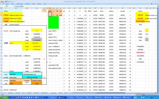
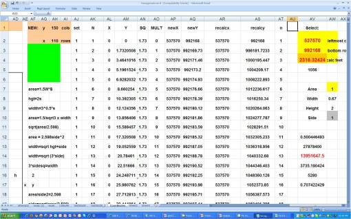
Excel Worksheet for producing grid coordinates, 150 cols, 110 rows, used to produce 149 x 109 grid array (to be reviewed in detail elsewhere)
Producing the Grid
To change a small relationship between several points considered to be centroids into a hexagonal array, a lot of points need to be produced. The grid has a number of rows and columns that need to be defined. Each row has a length in terms of numbers of points, which also relates to and/or defines the distance between each pair of sequential points in the row. The same is true for points that define columns.
The worksheet above produces 150 x 110 or 16,500 points. The entire process is automated, so all one does is put the starting x, y values in separate cells, and define the size of the cell area to be used. A number of multipliars and such are included on the sheet as well in case conversions are necessary. The above is set for a State Plane coordinate system. So the values, conversion factors, and multipliers have to be carefully assigned to avoid misapplying metric system values to English system values. A similar sheet does the same but sidelengths are specified instead. Each lat-long requires a separate column. The X starts at 0, to which is added number of feet per unit of measurement defined based on the distance between neighboring cell centroids. Recall the layout of some columns (or rows) are not exactly linear; depending on the setting, they can alternate with the second mesaurement system. So every two lengths actually received the next value for x or y, with the next value in sequence receiving its new value from two cells above as well, etc. to the end. Two columns are counters, to tell when either 110 or 140 is reached, depending on the settings.
In terms of details, the first column AJ is column counter, with 150 as its max per series.
A good general rule to follow is the produce a grid that overlays a specific area plus some. The total grid should be more than the research area in size, or lengths of x and y axes directions. A 5 mile EW by 10 mile NS area for example would require a 6 by 12 mile grid. This way you are allowing for some buffering, in order to avoid edge or “drop-off of data” effects upon the statistical analyses later done. If the 5 x 10 mile grid is the have 1/2 mile distances approximately between points, that means we’ll have ((2×5)+1) by ((2×10)+1) points defining that area (it takes 11 points to define 10 lengths, 21 points to define 20 lengths).
But we also want that 6 by 12 to be used for buffering and preventing edge effects. So we design a ((2×6)+1) point by ((2×12)+1) point grid. This produces a 13 x 25 point grid, meaning there are 2 extra points along the EW and 4 extra points along the NS provided. This will work, right?
Wrong. The problem is you’ve added two rows of cells to the EW and 4 extra rows of cells to the NS (2 extra points form two extra cells to EW rows, the third point is already provided; 4 extra points add three extra cells to NS columns). The 2 extra points may not be enough really to correct for edge effect. Recall the lay out of hexagons is not like square grids; there are paired formulas involved here, with alternating formulas seen along each axis (the accordion like effect). To further correct for this anomaly, we need to add another row/column or two, making it 3 or 4 rows or columns, or even 4 or 5 rows or columns to be safe. So etiher the area has to be made wider, with its northwestern corner moved further away, or the size of each cell has to be reduced so that more cells are produced in both EW and NS directions. The first method is easier to do. But if edge of available space becomes and issue, your area is at the edge of the reserch map itself, you have to readjust your numbers of gridrows and columns counts by reducing the size of the cell. The only other option is to find a new research site with a larger buffer edge.
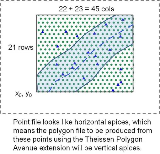
In the following theoretical research grid, the area to be studied is a stream edge, with specific point objects noted along the flood plain. The points displayed on the hexagon grid have 0.75 mile to 1-mile distances between neighboring centroids.
So as you walk away from the stream edge, you pass through or get close to around 4 points on this grid. These will produce a total of four cells as you walk away from the stream edge. If the distance being represented by point distances is accurate, this means that we have about 4 miles of stream edge to be evaluated, with one or two outer cells available as buffers to make sure the inner two cells are corrently displayed spatially, with the right neighbor effects features. This would allow for a 2, or perhaps 3 mile research area on each side of the stream. We can also include the areal features of the fourth cells away from the edge of the stream, but these are limited in that they only demonstrate influences from the stream side. This means on the NW corner of the map, on the NW stream edge, there are three sites on the border of the spatially searchable region; they can still be reviewed from all possible directions, but the upper northern most site is exceptionally borderline. The SE edge of the stream has 2 or 3 points with these possible limits. None are at risk for an edge effect.
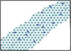
(Note: this is a mock up produced just for this illustration and is obviously not an actual GIS result; actual GIS results appear in next section).
Assume for the moment that your grid is produced with all these points (how to do this still has to be worked on), and you need to select only those points to be used to make the hexagonal polygons overlay. You also have a shapefile produced that is your research area, plus its buffer (the nine to ten-mile wide light blue polygon overlay along the stream). You can use the research site to select just those points in the point shapefile that define this research area. Using this research polygon to select for the points, those that insect with it, you select these points, and save them to a new shapefile.
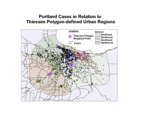
Example of Theissen Polygon Tool using an unofficial urban boundary defined for the Portland Area, followed by the definition of four regions or sectors for use in toxic release site comparisons. A Weighted Point was assigned for each sector based on cancer case distributions. All values for areal comparisons are assigned to this point. For hexagon grids, the hexagon point file is used to produce the borders of each gridcell using a Theissen polygon Avenue Extension.
Next, you run a Theissen polygon tool, using whatever ArcView Avenue extension, or ArcGIS or IDRISI drop-down option is there for you. I like to draw a shapefile defining the research area, such as the perimeter of a city, the urban boundary, etc. Or you can use a preconstructed shapefile like the official urban boundary (again, using a city as an example). By producing the Theissen polygon within this study area, you end up with a hexagonal grid approximating the final area of research.
What you should end up with is an array of hexagons with the edge of this shape file appearing erratic and irregularly shaped for its non-hexagonal polygon edge cells (not done for this example). Check these to make sure you defined a large enough buffer; the stream edge/study area cells should all be perfect hexagons. [Not displayed relative to the above; for real examples see the next sections below.] The irregular cells on the edges are removed for appearances sake, and a new map with grid cell overlays produced.
Further Description of above Example. In the above example displayed, after the toxic release sites, confirmed release sites, superfund applicants sites, and superfund sites were mapped, high risk sites were also defined (those not of superfund status but perhaps should have been). The toxicity of each of these sites was then quantified (this method is on another page). It was immediately obvious that one small section of the city was toxic due to the clustering of these sites (the shipping international ports, warehouse and industrial-storage facilities), and so the urban edge that was defined (there is an official one but that was not yet fully defined by the trimet ESRI group) was overlain on this and used to visually determine the four quadrants of the city, where site clustering could be seen occurring independently in each quadrant. The ovoid urban boundary served the base for the Theissen polygon tool, the four quadrant points were defined using a centroids Arc Avenue extension based on all the toxic sites for each quadrant. Then these four new centroids (not weighted at all when they were first produced from the chemical/site data) were used to break the urban area into four sectors using the Theissen polygon extension. Chemical release types and amounts, as well as case clustering could then reviewed for each sector. [The poorest population is, of course by sociological cause or “default”, in the upper left NW sector of the urban area, close to all the international shipping, chemical storage, toxic release and superfund sites.]
The Spreadsheet
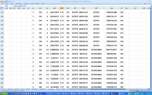
The following are the spreadhssets used to produce the grids. These will be detailed better at some later date on another page.
Important values to walk away with based on the above math.
- the square root of 3 (approx 1.73) is the multiplier for the distance between centroids along the longitudinal line for vertical apices layouts; the use of the equation sqrt(3), 3^0.5, or the like has to be used in the equation. With 1000s of points being produced, exceptionally small errors add up quickly in small unit coordinate systems, such as feet per mile (SPC systems) and the like.
- with distance between columns defined, the rows are left to work as single units; these units alternate between full changes of 1 unit followed by an identical series with full unit changes at n.5 levels. This transitional part of the series is displayed below.
.
The following are noted in the above transition period in beginning the calculation of a new series of x,y’s:
- AJ values change from 1 to 2,
- AL values demonstrate a 1.5 change,
- for AN, the 3^0.5 multiplier is retains throughout the spreadsheet,
- for AO, a count to 149 ends, and is recommenced with the n.5 count going up to 149.5
- AP values step up in units of 2 in this case
- AR values change due to a formula developed to produce a change in this coordinate based on a distance change, which is in turn defined by the original area per grid cell defined for this series of point lat-log value generators (good luck in figuring this one out).
The following is provided to facilitate a review of the above figure.
.

Hexagonal farmlands array, Libya
An Example of Actual Hexagon Grid Production using ESRI ArcView GIS
The following method of producing hexagonal grids was developed in the winter of 2002/3 or 2003/4. (I was applying for jobs that winter and waiting for the phone calls.) I had just completed a lengthy period of study of standard grid analysis techniques and felt the results that were received were questionable due to the possibility of error introduced by the corner effect of these cells (explained above). It took me a day or two to developed the formulas needed and define how to best replicated them linearly (or in euclidian fashion) along x,y/lat-long systems. It took much longer, about a month, to develop the excel that would successfully produce a given set of lat-long or x,y values, using the right multipliers, for the right coordinate system(s) (Cartesian or non-Cartesian), which can be varied with each study project, with original x,y values when needed for such systems as SPC, etc. In the end, this system of course works best with Equal Area projections, especially those with small length changes, such as decimal degrees down to 10decdigits or more, and feet-based English and Science metrics or smaller, vs. yards or meters.
The following is a very brief overview of the process I engaged in with the GIS. A few examples of the maps produced are provided. (I will add some more to fill in this description of the process once I find them.)
To produce hexagonal grids, two sets of calculations were developed to produce the alternating sets of points/lines seen in hexagonal arrays. These two equation sets were alternated appropriately in order to produce lat-long values with the appropriate change in values, depending on the type of lat-long or x-y values we were dealing with. This program was modified to produce dataset series that could be mapped to produce hexagons with predefined edge lengths (such as 1/10th mile per side) or pre-defined area (such as 0.25 sq mile area per cell).
The lat-long/x-y values are imported as point data, and then a Thiessen Polygon extension is used to produce the final grid. Variations in area/size of cells vary according to typical projection-related parameters such as projection type and accuracy of lat-long measurements linearly and/or spatially. It is recommended that whatever projection one uses for this type of analysis, that the projection chosen be somewhat reliable in terms of distance and/or areal accuracy across the research area evaluated.
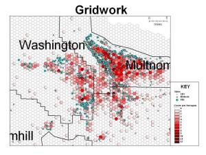
Hexagonal Grid Production applied to an Areal Analysis of Chemical Exposure Risk – Leukemia/Lymphoma Case (Point) density
[NOTE: The following are brief discussions of several hexagonal gridcell projects I engaged in around 2006. The various steps involved in developing each of the illustrations the the left and those which follow are presented in detail on separate blogpages, for which see Gridcells and Gridwork.
For details on how the cell-based analysis of exposure to Aromatics was performed, see the series entitled Aromatics. The statistical notes and methodologies are to be included on a separate page.]
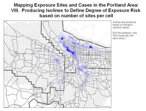
Hexagonal Grid analysis of Toxic Release Sites information. The design of an isoline/contour mapping technique accurate to the 0.05-0.1 mile level; used to depict risk of exposure to specific chemicals, chemical groups, or classes of toxins monitored according to EPA guidelines.
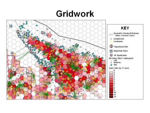
Cases can be related to toxic release sites. Using a Spider Extension for the GIS, connections can be displayed and the lengths of these lines used to analyze nearest neighbor relationships.
In order to develop an analysis of spatial relationships between cells information (exposure site(s), type, counts, toxicity, potential carcinogenicity, etc.) and cases in relation to the “benzene theory” for carcinogenesis, the spider tool can be used to measure distances between each case and each site which has a history of aromatics release.
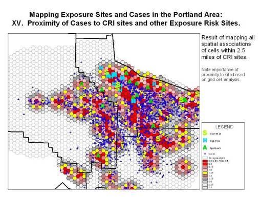
Cases linked to CRI Sites. Site information attached to cell centroids. Case information is expressed using a point shapefile. Relative number of sites per cell is depicted by cell color. Cases are represented by the blue ‘+’
These results (the distance measure between case (blue ‘+’) and site) were then incorporated into the case dataset and used to produce cell-based choropleth displays of the data.
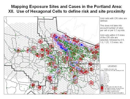
Cases in relation to the spatial distribution of Confirmed Release Inventory Sites, with cumulative CRI data incorporated into grid cell centroid datasets. Cases = green ‘+’; hexagon patterns represent CRI site density (# per cell).
In the above display of results, isolines are developed depicting the density of release sites per grid cell. Portland cases are depicted using a green ‘+’ about the release sites.
In this third display of results, cases are assigned risk based on proximity to toxic sites, the data for which was provided as grid cell data in order to merge the risks of neighboring exposure sites situated within the same cells. The deep red cases are located within a quarter-mile of a potential exposure site (Confirmed Release Inventory sites used for this display, but High Risk sites, Superfund Applicant and Superfund sites are also depicted). Notice how these cases are typically clustered (this may also just be a result of population density features). The bright red hexagons are those situated within a half-mile of a site.
.
