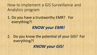
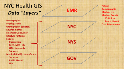
The analysis of electronic medical records and the operation of a geographic information system are two very unique sets of skills, which when combined require time and finesse to get to an advanced level with the analyses.
In many ways, the complexity of each as stand-alones are comparable. There are multiple levels of format, complexity and relationship to medical data, which in this EMR system includes “dimensional” databases devoted to
- Patient/Demography,
- Visits,
- Procedures or Events (treated as at least two levels in my models),
- Results, outcomes or findings attached to the prior two, and
- Location (x, y and z)
- Time (t).
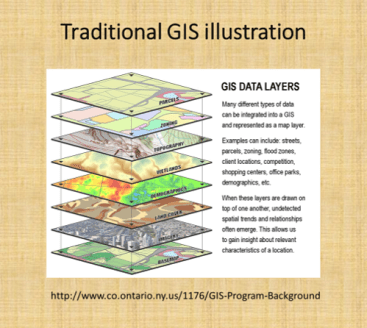
In a traditional GIS, this is comparable to the different “layers” that may be overlaid for analysis, and the “dimensions” at which maps or images can be produced and evaluated using this method.
To develop an effective data storage, surveillance, analysis and presentation tool, equal amount of time and effort need to be spent at the EMR and GIS end. You comprise value and quality of spatial produce when too much time is spent on developing an effective EMR, without engaging adequately the GIS-related spatial analysis and presentation potentials of the program.
In traditional GIS classes, twenty years ago, the ability for researchers to use GIS to perform their analyses, besides the traditional Excel with Add-ons, or SPSS, or Stata, or SAS, or S+ to perform the analyses. The early impressions were that GIS could very well make these older, very traditional analysis programs obsolete. However, most recent changes in GIS and Statistical Analysis tools demonstrate the inability of any of these traditional software brands to hybridize their technology with other brands out there.
This is exemplified by the recent change in SAS from the traditional SAS (8.* to 9.*) to SAS Enterprise, without the traditional programming atmosphere offered by the older products. (Hopefully the new SAS will improve, but for now it’s overall value has been reduced by one or two application related levels).
When we look, for example, at the years long attempt to add a GIS option for SAS, in the form of SAS-GIS, the results of this product were quite upsetting, due to the quality of the output and figures, no necessarily the meaning and value of the analytics itself. SPSS is now compromised by its level of complexity, and breakdown into multiple sections of the software subscribed separately. Like a number of drawing programs that did the same, obtaining these forms of software became impossible for smaller groups, making it necessary for more affordable, more productive tools to be developed.
Due to these recent changes, there may never be a perfect mapping environment for adequate population health surveillance and analysis, in fact, a form of EMR-GIS that is equally valuable and applicable across potential EMR-GIS settings, be they linked to big business or small business, large or small EMRs, insurance companies or much smaller institutional healthcare settings, large area or small area focused operations, large npos or small npos with minimal funding to support their goals and plans.
Transformed Data
Next, it helps to interpret these two large parts of the EMR-GIS system (EMR and GIS) in view of their smaller parts.
The EMR currently in use within my system makes use mostly of SQL and SAS. This two-tiered method of pulling and then evaluating data was successfully developed and implemented to perform the prior Big Data spatial health projects that were posted several years ago, when the national health data was analyzed (varying from 40-120M U.S. patients, 1-2 billion records per year, using SQL in a Teradata datapull work environment), then exported, filtered and turned into quantifiable location data, and then mappings using a SAS polygon-grid mapping program that I invented (it took only 15-30 minutes to produce a national map).
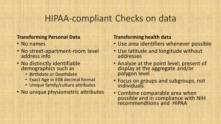
In this newer system, more data crunching and redefining is done as part of the initial datapull process. All data are geocoded, and made HIPAA compliant as part of this initial datapull. This means a number of basic features of the data have to be maintained, such as no personal names, SSN, patient or member IDs, phone number, exact address, etc. These are all changes in the initial data pull process.
For example, for research purposes race and ethnicity data are converted to the U.S. Census standards, and missing or unknown data meaning converted to the appropriate subgroups (for example, as AfrAm or BL, Wh, As, SoAs, Al/NatAmer, HI/Pac Isl, . . . “N/A”, “unknown”, “no response”, “refused to answer”, “other” may be coded together or as their own unique subgroups). As another example, ten to twelve groups were defined for “religion”, referred to as Religion Groups (file column name “Relig_Grp”), and grouped as [I am being quite non-specific and incomplete here]: Christian, Christian-related (sects), Jewish, Muslim, Buddhist, Hindu+, Agnostic, Atheistic, Natural Theologians, . . . None, Other, . . . Unknown, Not noted . . . etcetera. When appropriate, all locations/specific places, proprietary and specific names are also recoded or eliminated.
The end product of this data pull is “transformed data”, which has four levels of HIPAA related compliance. This initial pull generally results in Level 1 data–which means that it would be difficult for an HIT individual to trace it back to the actual individual, without knowledge of the SQL transformation programming that was used. This data may then have to undergo further transformation or aggregation, depending upon it uses and needs.
Transformed Data Levels
-
Level 1 is intended for internal use and may include generally acceptable information, for example, a list of patients with names, DOBs, MRNs, addresses and phone (never SSN) numbers to contact.
-
Level 2 is no name, no address (lat-long instead), and preferably DOB converted to decimal age, for example, internal studies that are part of the system/network, but may not be fully active or engaged at the ally facilities.
-
Level 3 includes the above, plus recodes or removes all facility identifiers and PCP info, as needed, converting these to unique identifiers to something that can be decoded later when needed; this is intended for external use (but may include location or facility for certain outside npo activities such as quality assurance or improvement checks and program grading projects).
-
Level 4 is aggregate data (i.e. adequate for unmonitored course or college level training), with all of the above features, and further limitations applied when needed in complete compliance with location related features, as defined by NIH PHI guidelines.
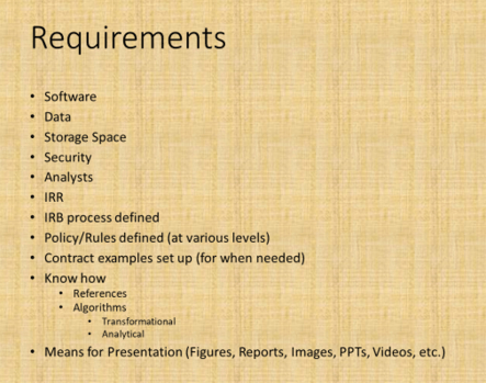
Software
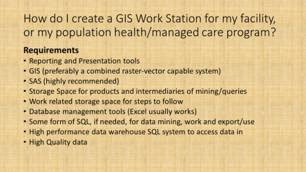
Up to this point, some form of data storage process and a GIS are mentioned as requirements. A SAS may be used as a substitute for the GIS, assuming the programming I promoted here and elsewhere– areal (i.e. zip. census block) and grid (namely square or hexagon) spatial analyses, without basemapping — could be implemented (no SAS-GIS add-in is needed). In many cases, the data pulls are done using some internal software and/or sql. In the above figure, other steps are required to implement some standardized surveillance-analytics program. They define the most basic requirements.
Setting aside the selection process for a GIS for the time being, knowing your potential data and information resources for one of the most essential parts of this process.
Data
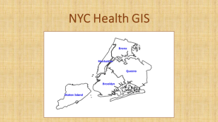
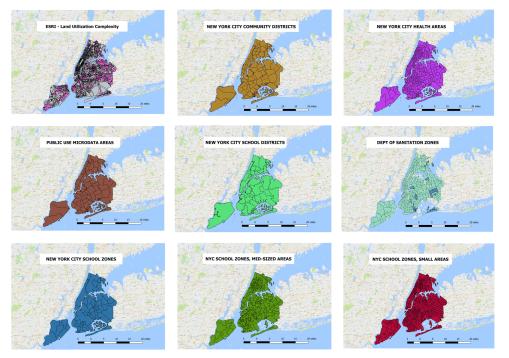
Again, using the NYC setting as the example, there are several sources for basic information data and spatial data available for setting up a surveillance analytics spatial workstation.
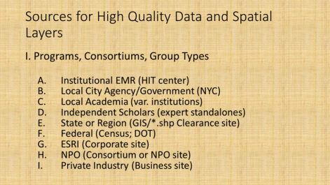
The better know sources for data for spatial analysis work are the GIS companies and resources, with ESRI perhaps the better known, and a number of Federal, State, regional, agency related resources serving as the primary sources for the actual GIS spatial (point, line, polygon) shapefile data. Knowledge related resources or datasets (directly or indirectly spatial) that can be linked to shapefiles comprise the rest in the above listing.
The following sites were used to access the base layer and background mapping data for establishing this EMR-GIS.
- NYC Oasis Basemap (to locate sections for a study; to review features of that section): http://www.oasisnyc.net/map.aspx
- NYC Open Data: https://opendata.cityofnewyork.us/
- NYC Open Data, datasets browsing page : https://data.cityofnewyork.us/browse
- NYC Planning (department of transportation) maps and baselayers/data: http://www1.nyc.gov/site/planning/data-maps/open-data.page
- NYC Map Tiles (background or basemaps, i.e. older maps digitized): https://maps.nyc.gov/tiles/
- NY Orthoimagery maps (also base maps): https://orthos.dhses.ny.gov/ see also http://gis.ny.gov/gateway/mg/napp_download.htm
- USGS Earthexplorer: https://earthexplorer.usgs.gov/
- Landsat, downloads/purchases: https://landsat.usgs.gov/landsat-data-access
- Landsat general page : http://www.landsat.com/
- Zip Codes (some ESRI links): https://www.zip-codes.com/zip-code-map-boundary-data.asp
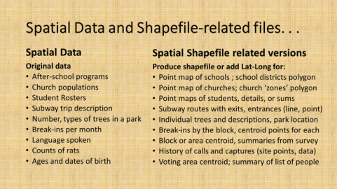
NYC Open Data site is the source for most of the shapefiles and spatial data, which are used to link EMR data to. There are spatial and non-spatial (location or area related) data available at this site. Most of this data is reliable and useable (can somehow be linked to a GIS, either by lat-long-x,y coordinate, or place name/zipcode/etc.).

The Orthoimagery page provides rasterized datasets that in some ways are comparable to the use of Landsat imagery (though not exact as LS or NDVI ,etc), and may be evaluated using some of the same remote sensing methods or strategies.
Medical GIS
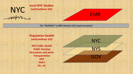
To date, there has been a number of barriers preventing the adequate application of GIS within the health sector to the implementation of a facility or program based GIS devoted to monitoring, surveillance, intervention and other health program management activities. At the institutional and insurance company level, this barrier exists due to the lack of knowledge and experience within the Medical Records or EMR data management system. There have been numerous examples of GIS utilization attempted here and there throughout the system. Still, to date, there is no clearcut leader in the field making use of a combined EMR-GIS data warehouse management practice or procedure. For nearly twenty years, EMR-GIS practices have remained at the experimental level, when interpreted using the process I developed years ago just before analyzing the national U.S. EMR data for the first time at the 50M to 100M patients level almost 10 years ago (see nationalpopulationhealthgrid.com).
The result of this disengagement of GIS expertise in the field is literally the stagnation of health management at the local and regional government program, insurance program level. Is it possible that the limits have been reached for singularly trained people, forming a team of varying experts, who when even working in groups are unable to take their team performance to the next level of achievement?
The barrier to health improvement has often been related to this lack of GIS implementation. The combination of changes in software, hardware, storage technology, data analysis speeds, data build and restructuring speeds, have partially limited the ability of “experts” to make any long lasting changes. Since all of these parts of the EMR data technology undergo changes and development at rapid speeds, by the time a process is developed for such a program, the tools and information have changed, the older knowledge base is outdated, desires to patent or own a particular process get outdated (half of the 17 years patent rights may be gone), and the health of the people may have even changed, making certain areas of focus no longer applicable.
Implementing a GIS at the healthcare level, in particular within the private business or hospital/facility levels, enables more directly targeted, patient and doctor implemented changes to be made. Whereas at the insurance level, the same achievement is theoretically possible, the one or two steps away from the patient-doctor interaction that an insurance company places itself, and the frequent discontent patients suffer due to the lack of helpful or adequate coverage (even lack of coverage) insurers provide, severely hamper any ability of the insurance company to have a timely impact on patients’ health. To implement a GIS at the caregiver’s facility level ensures the facility of its right and ability to make improvements.
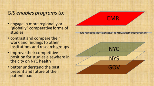
If we look at this issue as a similar series of different care programs were implemented in the past, we see a parallel here. In terms of intervention rates for patients receiving some form of preventive care, such as childhood immunization, passive programs with insurers that fail to interact with patients (i.e. PPV) have much lower rates than HMOs, which is turn have lower rates than Managed Care programs, in which the provider and patient are regularly evaluated and scored for their more interactive relationship. Enabling a program to evaluate its population provides its leaders directly with opportunity to make decisions that immediately speed up or slow down certain parts of the healthcare process. They need not wait for feedback from their patients’ insurers, and in general, they can do nothing if they rely upon last year’s (or if lucky last quarter’s) reported posted by the regional public health review.
Finally, it is important to note that the variety of measures that a program can engage in is much greater when the program itself carries out these activities, instead of waiting for regional agencies and scorers of programs to determine what limited measures to use to evaluate an institution or facility’s performance. An effective combination of EMR evaluations and GIS monitoring and surveillance can carry out such processes as fast as on a daily or live basis, instead of retrospective.
The benefits of implementing an internal GIS include enabling a program to surpass its competitors, even the smaller programs may supercede the prior successes of their much larger competitors.
Summary
To succeed in the implementation of an EMR-GIS program at the institutional level (not just the limited research level), the following processes need to take place.
- learn the required skills, implement them, and develop the required work habits;
- define rules and regulations, and establish/publish policies;
- ensure HIPAA compliance, meet related NIH research and PHI requirements;
- set up an IRB capable of handling all of the above processes;
- produce a task force comprised of experts in these fields;
- review and test the EMR data, including routine error analysis checks;
- document/detail the Levels 1 through 4 requirements of data transformation, and define the pre-Level 1 data limits (i.e. ‘no SSN release, ever’, etc.)
- implement a GIS–first at point-vector level, and then at raster and imagery levels
- define the EMR, GIS and combined EMR-GIS-analytic processes (flowcharts)
- establish some regular analysis and outcomes reporting standards (mimic your HEDIS, and then some), and semi-automate to fully automate these processes
- engage in structured and non-structured text analyses EMR data analytic processes
- develop and initiate qualitative, quantitative and combined research programs
- apply the EMR-GIS tools and methods to searching for new grant opportunities and identifying unique population related needs for your program
- develop a big data GIS reporting “Atlas” that can be regularly produced for your facility/facilities and the appropriate parts of the program
- produce a time comparison report of the ICDs and therapeutic/diagnostic results performed on your facilty or institution’s population, comparing three periods of time, in order to define the changes in ICD rankings that have taken place over time [last year, vs. 6 yrs ago, vs. 11 yrs ago) at the patient, visit, visit:patient ratio (VPR) levels. (Also consider repeating this for special subgroups, i.e. just child age diseases, or just chronic disease rates, or just infectious diseases.)

For the past few years, researchers accessing the electronic medical records system have been most devoted to very basic forms of observation, surveillance, monitoring, and reporting. GIS has been theoretically applied for the most part, or to experiment with this analytic process, to supplement processes already underway for quality improvement activities, and/or to use GIS to produce basic spatial expressions of the data researchers are working with. The best use of GIS is to apply it to explain why certain things happen, for predictive modeling, and to evaluate change at some fairly sophisticated, detailed level of analysis. Yet for the most part, we primarily envision and apply GIS in health research to explain something that happened, not why and where it will happen.
The public health and quality improvement practices have already developed GIS in order to monitor and report upon such basic public health data as STD rates, or watching for infectious disease outbreaks, or monitoring the HIV incidence for suspicious sub-populations that serve as some nidus for some outbreaks. Public health and population health management programs employ it for reporting and planning purposes, such as for evaluating and recording childhood immunizations and to intervene where changes are most needed, or to study 18 to 24 year old Chlamydia rates in young people who are sexually active and demonstrate high rates for unexpected pregnancies.
Health improvement programs may use GIS to report on annual diabetes well visit rates or to show spatial relationships that might exist for high and low A1c, LDL and BP areas. In the background, some parts of the New York City GIS teams have been able to provide potential researchers with helpful baseline spatial data to use for developing new spatial surveillance systems, by providing important supporting spatial datasets for this work., such as relating the placement of clinics, offices or similar service facilities, to increase the engagement of patients with these programs.
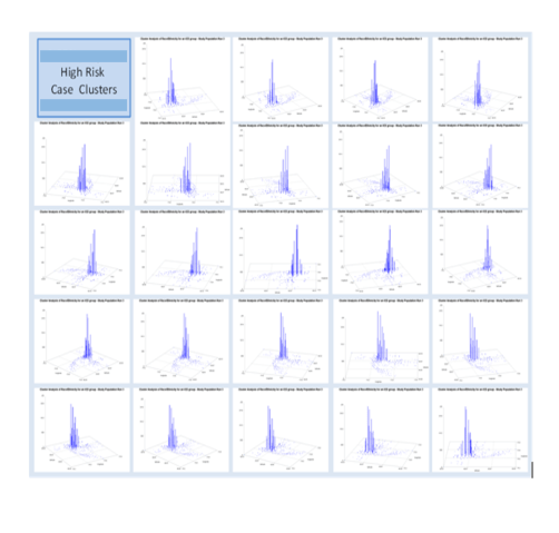
A number of years ago, I graded the level of accomplishment an program had in spatial epidemiology applications as typically as high as level 5.5 to 5.75. This was based upon the different practices these groups normally engage in with GIS, using it to record, develop a history of, experiment with, and research how to implement this form of practice for basic health and safety concerns. This also has attached to it the supposition that for the most part, health care programs engage GIS at only some basic level. To determine just how much a program is engaged in the use of this tool, one need only reflect on how many measurable factors or details contained within an EMR system are being analyzed. Is the EMR being used to its fullest extent?
An example of the 3D Mapping of cases using SAS 8.* and 9.* (non-SAS-GIS), applied for surveillance purposes since 2007
For the most part, GIS in health has been very slow in advancing in the actual implementation of this means for reporting during the past ten years. We are certainly more familiar with the potential uses of GIS and its possible applications outside the already well-established realms define by environmental health, public health, population health, and quality of service/intervention teams. For the most part, these projects remain single examples of what is being done. Very few programs engage GIS at the level of big data reporting, such as mapping all 999 ICD9s at the spatial-temporal-age-gender-race level, per program, per facility, per larger unit (i.e. insurance programs, companies, NIH funded, SES focused programs) responsible for providing that care.
That is now changing within the population health surveillance and research activities I engage in on a regular basis.
For the past 2+ years, time was spent exploring the complexity of a complete EMR.
When we all first learn about ‘big data’ what we see as examples do not accurately demonstrate the details, length and complexity of health data that resides in the most basic, first or second generation residing within an EMR system. There are not just 1, 2 or 3, or even 4 to 6 special tables within which all data are recorded. Each group of data that can be placed within an EMR forms its own table, with multiple rows entered per unit of activity or metric being evaluated. These multiple row tables are modified or reconstructed into one-to-one or one-to-a-few formats.
When all patient data are entered, for example, these data which are stored initially as rows, get converted to columns, with patient identifiers (or its numeric assignment) as the index column(s) for this work. Each patient can then have columns that depict name, gender, dob, dod, mother’s name, address, state, zipcode, race, religion, insurer(s), etc. In the system I use, these tables are called dimensions and provide the most important personal, family and demographic data that exist for any given patient.
When a patient interacts with the health care system, there visits happen. Some programs call these interactions between health care staff, and another entity involved with the patient –such as patient, parent, other provider, previous care giver, other facility. In this review, I term these actions “visits”, but it has other common names elsewhere in the QOC/QI system.
This second dimension of care, the Visits, have only a few basic elements that define them, such as location (coded even down to the extreme, such as bed in a room), date, time (at day-hour-minute-second level) that something starts, ends or happens, time of closure or completion, etc. The study of the Visits Dimension for a patient’s care process provides the dimensions needed to correlate events over space and time, allowing for a review of practitioner or systems logic, and identifying situations where changes may need to be made, through rule-setting, policy, procedure, assignment of place for the event to happen, implementation of different programs for poor performance teams, groups or places. Without even looking at what practices were performed for a patient in the health care setting, we can see where further investigation may need to be made due to higher failures or death rates are seen for a given program. The details of what were done and which of these went wrong haven’t even payed a role yet in the health care process.
The third level or dimension of care pertains to the details of what events ensue during a given visit. The definition of each step in the care process also enables a time element to be defined for the care process. This means the patient may come in a time1, see the MD at time2, received an injection at time3, be seen by a specialist at time4, undergo and MRI at time5, be evaluated at time7, be admitted for inpatient care at time8, and then undergo nearly a thousand more time-defined processes over the next few days of treatment, recovery, and then discharge. Other temporal processes that can be evaluated here include time till initiation, overall time elapsed, time to recovery, and even post-inpatient time in relation to unwanted readmission events.
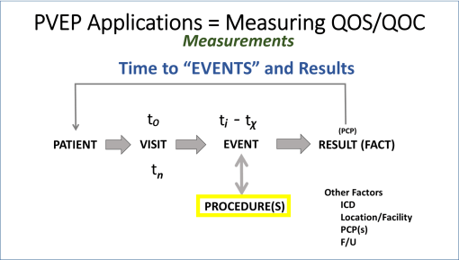
FIGURE 1
In this review of the care processes, what happens with a “visit” are generally interpreted as events or procedures. Events are what happens to a person, that typically is considered part of the care process. Procedures are practice related events that typically involved additional skills and are often coded with a procedure identifier because that identifier may be linked to the cost of care and billing. As a general rule, events are not charges, procedures are. Events carried out by a clinician are considered in defining the bill for the visit. Procedures carried out by the clinicians and/or technicians are often charged per routine, not per visit. But like always, we have exceptions–such as procedures that are free but documented as part of the visit. One of the most common of these within the system I operate are the Vital Signs taken and related medicate history questions asked and entered during each visit event.
The value of Procedures and Events coding is that the kinds of services being offered are considered, along with their relation to the overall timing and sequence of activities engaged in for the care process.
The “bread and butter” of all health care processes are the results of these procedures (and sometimes events). “Results” is the term applied to these datum elements here. And results are typically more than just the “result” of a test.
Typical results entered into a data warehouse include such datum as (with semicolons as separators): Yes; T; 1; 20; 3.45; “2,4,5,3,6,1,8” ; Complete; French; 13450; John Smith Sr.; “>150”; “168/96”; phq9; “above normal range”; Dr. Chase”; etc.
Over the past few years, extensive reviews were carried out for the size and numerica relationships between these four core “dimensional” datasets–patient. visit, event/procedure, and results–a general accounting of these figures, for just one visit and its linked events, is about 1:7-10:40-400:4000-40,000. I term this ration P;V;E or P; R.
Patients are their own unique number, Visits are their own unique number, but for a health related happening (a diagnosis linked to the visits), one patient may have 7-10 visits per year related to it (directly or indirectly) per year. Each visit in turn results in various events and procedures (vitals taken, labs ordered, educational materials provided, referrals give, etc.); even the most basic, simplest visit, such as a 9 month old well visits, will have Procedures entered for several immunizations, several health and safety checks with the mom, height and weight measures, pulse, an overall health evaluation visual exam of the kid done for scoring the child’s development, etc. etc. Therefore, 40 to 400 events (educating the mother about breast feeding) and procedures (labs, health metrics) are not atypical to any system.
The key to understanding each program, each system, requires a complete evaluation of these different measurables, numerically and percent wise, to see what the norm is for the system, and to see how its various subcomponents perform and document the same duties. So, for a single institution, we might assumed that all follow a protocol, and that each one could have different time related findings, but all within institutional standards, such that all of the products of that type of visit are the same (i.e. vitals documented and entered, immunizations that are due were completed, all of this occurring in less than one hour.
“Results” is the next dimension, but the data content of this is actually best considered multidimensional. The basic format of results data should be qualitative or quantitative, structured or non-structured, parametric or non-parametic. Different institutions may store subparts of these data into separate places, such as grouping all pulses into one dataset, or all lab measures and results into a single laboratory results file, or all xrays taken into a single xrays database, with dates, times, procedure taken, amount of energy administered, time in and time out, results, initial interpretation, final interpretation, etc.
Results are any outcome of happening linked to a procedure or sometimes event. Therefore, results can also be evaluated as relating to any of several groups of data entries:
- process or procedure related info, such as exposure time, amount of xray administered, test tube/sample number, type of test, numeric sequence of sample taken, frequency, drug administered Y/N, type of test administered, units of measurement, US or metric values,
- true results, like positive diagnosis (structured or non-structured), amount of energy read, size of nodule noted, amount of radioactive substance detected within tissue, estimated cells per cc, percentile ranking of height, LDL, BP, and id number for organism identified
- events, activities, notes, that follow and/or relate to those results , such as normal range, maximum range allowed, viewed by PCP #, diagnosed approved by department head (Y/N), reliability of results (0/1), event closed or not (0/1).
- general or non-specific non-structural data, such as words, text, impressions, notes of normal range, etc. entered as free text into a cell designed for this (Comment, Other, or Note cell ) and used by the practitioner to provided additional notes, which may or may not be specifically related to the procedure at hand.
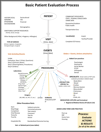
FIGURE 2
The data evaluation, up to this point, focuses on just the Visit as the chief event, or research and analysis unit. We can look at one visit and all that happens in relation to it, be it a well visit, an inpatient stay, an emergency event followed by hospitalization, a referral to a specialist, a meeting with a social worker. You can analyze the time component, the sequence, and/or the length of time until a certain point is reached (how long until the MRI was done?).
The data evaluation can also assess all of these events, over time, for a single patient, in relation to his/her medical history, and onset of new diagnoses or ICDs.
In the following model, the sequential visits related to single problems are assessed, such as diagnosis of heart disease, leading up to valve replacement. Each one of the processes as defined in Figure 1 above, is presented by an oval in this figure.
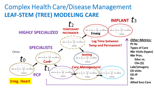
FIGURE 3
Over time, these processes of care escalate and can have a cascading effect on patient health care needs.
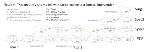
FIGURE 4
In the more complex, lifespan models, all of the diagnoses and actions taken to care for someone may be placed into this model, to define lifelong related population health processes and individual health care experiences.
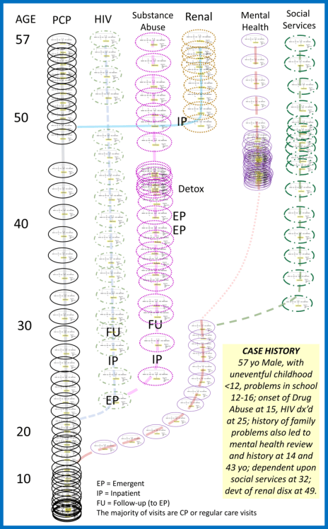
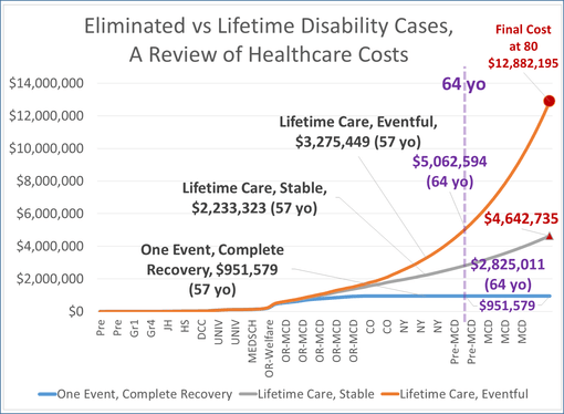
In an application of this model to a personal medical history model, to review cost of care to the overall results of that care, for someone with a long history of epilepsy, the following cost analyses models were developed. They predict the relationships of rising costs for care in patients well controlled, not controlled, and those who underwent some intervention care (such as neurosurgery), versus those who didn’t. [These were all covered earlier; the arguments for costs depicted here are found on those blog pages].
The Spatial Modelling Dimension
The next level of implementing this process for evaluating health care involved the application of these above statistical processes to data that may be linked to GIS research processes.
All data in an EMR, structured or not, parametric or not, numeric or text, can be converted to fully quantitative data by adding simple several spatial elements to the project.
The common comparisons between facilities and clinics, or health care between races and neighborhoods, for examples, are informally spatial in nature, and more formally best referred to as geographic, since latitude and longitude, distances, time, and spatial relationships are not a part of their formal numbers based evaluation processes. By add the location-distance relationship, such as through the use of centroids, or space area analyses, or patient place (lat long) data, any and all health EMR data becomes quantitative in nature. A fully text based, non-structured, content analysis, or 50 people undergoing a rare experience, is made spatial by adding lat-long to their analyses (although this one metric alone benefits more by other non-parametrics such as race, gender and age).
Health care analyses that become replicable and semi- to fully-automated in EMRs analyses can also be semi-automated or manually interpreted using GIS. The values of this application for GIS to healthcare monitoring are fairly easy to visualize.
By implementing a GIS at this time for this surveillance program, a second process for evaluating health spatially is now in operation.*
This process of spatially evaluating data in SAS was developed a few years ago. The means for producing videos of these 3D models of health in an urban area were perfected, in SAS Basic and SAS Graph (no SAS GIS was developed).
Which is fortunate, since SAS GIS has recently been turned over to a new workstation format for spatial analysis using SAS–SAS Enterprise with ERSI ArcGIS extension. At the institutional level, this doubles the cost for implementing such a program at the QI/QOC level for Managed Care programs, like the ones I have worked with.
The spatial SAS methods applied serve in the analysis and projection/display process, with the animation of results that can be developed for rotating 3D model imagery the major benefit of this spatial analysis method. [see Below] We can further improve upon this by smoothening out the shapefile centroid data used to produce these models, by converting irregular shapefile (zip code) data into more regular square cell grid data (the algorithms for this I presented numerous times elsewhere). We can further smoothen these presentations with a hexgrid modeling algorithm I developed (also detailed elsewhere; no example here, for now).
With the addition of a regular GIS workstation to the analytics process for evaluating 20 years of 11 million people’s health data, this work environment enables higher levels of the above (see initial figure) scoring system to be reached–Levels 6 and then Level 7. Because the data pulls and reconfiguration are based upon automated or semiautomated, often SQL and then SAS macro processes, it is possible to run these evaluations for numerous new types of studies: for example, re-evaluating past reserch projects and questions across the system, by focusing on any form or group of ICD, labs, diagnostics, psych test results, demographical, Age-SES-Race-Ethnicity-Religion (SAS-RER) grouping, neighborhood (latlong), NYC healthy area polygon, nearest office visit (location theory/distance), inpatient stay pattern, Log reg / Kaplan Meier derived life expectancy patterns.
The following is an early example:
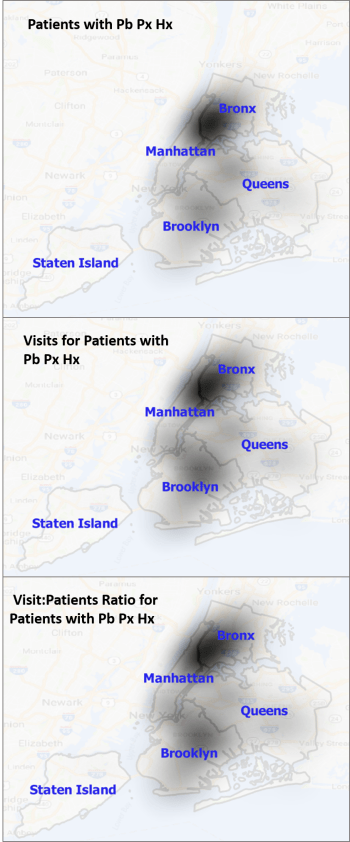
NOTE: Pb = Lead, Px = poisoning, Hx = history. This is for 0-9.99 year olds
Future postings will review these processes in more detail, cover the theory, review the programming and statistical methodologies, and provide various types of examples.
*Thanks to my research assistant Terrence Calistro for installing and developing the GIS.


