The complete version of Johnston’s map, downloaded from David Rumsey Map Collection Database and Blog
Note: This page is a Work in Progress; but the maps are very interesting and so this page is displayed.
.
Preface
One of the chief questions to pose about any map and its artist or author is what was the purpose of the map?
Not only do maps serve a role as an information source, they also serve as an important educational, artistic, scientific, economic, governmental, or even political piece of history.
In the past, maps were often produced for mostly political or social reasons, such as defining the edge of a kingdom or country. But even medical maps can bear these features, and we normally don’t interpret medical information as having political intent. For example, the famous map depicting the impacts of miasma on a poverty stricken part of London in 1832 by Thomas Shapter would have most certain been taken differently if the source of the miasma were known, and its impacts of people, exactly when and where, and due to what causes better understood. We can compare such a map with the map made very popular that was produced by John Snow, to which we attach the history of public health and disease prevention.
Another map with similar intentions in mind, was John Lea’s map of cholera in Cincinnati published in the early Spring of 1850. This map blamed the disease on something other than what the medical field was focused upon–acidic versus alkaline rock materials and soil, and the ability of some of these to apparently encourage or prevent the Asiatic cholera from taking hold of an urban region. Snow’s map and Lea’s map were very much in conflict with each other, even though both were perhaps equally true and equally conducive to errors in interpretation. Maps are after all a human interpretation of events and how they appear to fit together when presented in the right way as parts of some constructed drawing or image.
In the medical community, maps are generally designed and created for the public good. They educate doctors about diseases and patients, and provide the general public with important insights about the quality and amounts of health care we might have available to us out there. Maps can also teach us about the amount of the local people who are undereducated, or the numbers of poorly nourished families in need of more financial support.
We rarely expect these maps to be culturally oriented or culturally biased, even though they are at times.
The classic example of this a map containing the judgments made about disease and people, medicine and health, about the consequences of disease with regard to place, and the effectiveness or lack thereof for specific public health disease prevention programs. When we map a public health practice like immunization, it is generally accepted that immunizations are very important to us because they increase the longevity of people. Sometimes this clearly distinguished reason for a map doesn’t exist, for example in regard to whether human behavior is the cause for a disease such as lyme disease or west nile, or is it nature? If ethnocentricity and culture are the cause for certain conditions, it makes sense to map these conditions to see where they prevail and try to predict whether or not they could become a serious problem. We also troubles adapting to some new cultural conditions being discovered in societies by the use of maps. In Johnston’s map, Plica Polonica stands out in his writings and in the medical literature as, what I call, a culturally-linked syndrome. It is a physical disease manifesting itself in certain places and people due to a combination of living conditions, domestic and occupational environmental settings, and climate-temperature-local ecological patterns. This physical manifestation of the skin, displaying itself in other ways as well such as through the hairstyle, results in a people and culture that outsiders interpret as conducive to this condition, even though it is nature that is the first cause followed by the human ecological pattern.
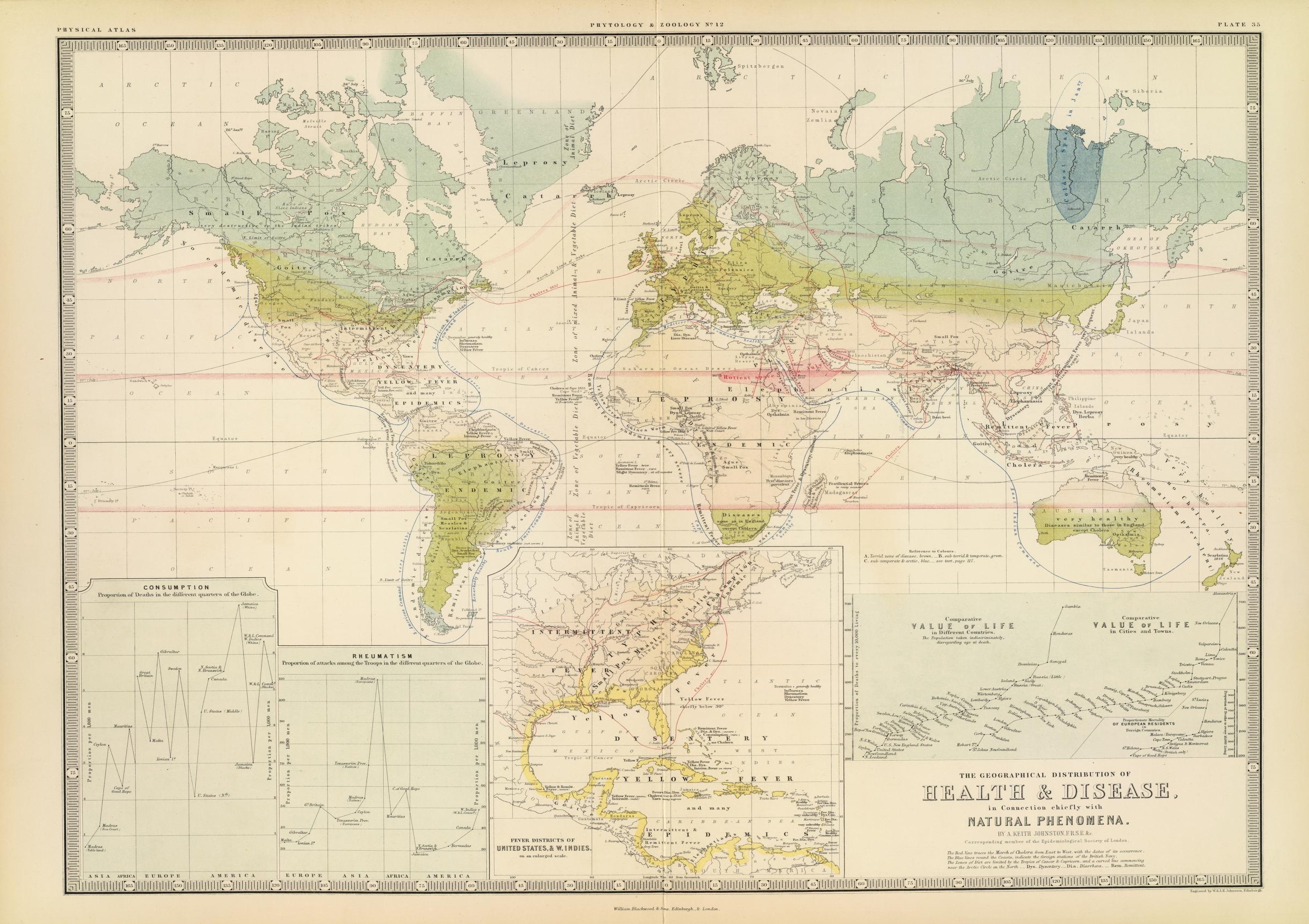
Johnston published his interpretation of disease patterns in the world by using a map in the early to mid 1850s. Disease mapping was very popular by then, due mostly to the return of Asiatic Cholera to the other hemisphere (the Americas) in 1849. Asiatic cholera quickly became the most frequently mapped disease in medical literature for the time, surpassing even the more frequent yellow fever epidemics.
The following dates or facts should be kept in mind when reviewing these maps:
- The first medical geography writing to influence Johnston’s mapping was the map produced by German medical geographer Heinrich Berghaus, published in 1848.
- Johnston’s 1856 map can be directly compared with Berghaus’s map, and served as the basic work for William Aitken’s map a decade and a half later.
- The same year that Johnston’s work was published, Adolph Muhry published a global disease map as well.
- On Muhry’s map, there is further reiteration of the lengthy statements made in one or two word forms for places and diseases found on the maps by his predecessor Friedrich Schurrers and Heinrich Berghaus.
- The artistic rendering Muhry made of the world and its medical geography was very different from that of Johnston. We can see the “landschaft” focus of Muhry by how much he details the climate and weather in regards to health, with points telling us where problems prevailed due to these very large areal features. Color and flow also define the way in which Muhry’s map related to anything we learn and need to know the movement of. Johnston’s map produces this same information, and more, as well. But Johnston’s way of doing this goes to the extreme when it comes to providing detail at some backyard-neighborhood level.
- Johnston’s map served as the basic information source for Aitken’s map, covered on another page.
In terms of more contemporary ways of evaluating maps, we can perhaps state that Johnston went too far at times with his claims. His illustration of the part of the Americas susceptible to small pox seemed very large, but in Johnston’s mind it was place and climate that defined this, not people. If a place with small pox was not occupied as of yet, how could it exist there then one might be wondering. But to Johnston and others this meant that if and when people did move into this region, they were going to experience the impacts of such a fatal illness. This Johnston’s map told you the risks for each of the places you decided to move to. He then places these land-health notions in context with the rest of the world, by telling you those large zones that exist known as torrid, temperate and arctic or frigid, places defined by temperature patterns and latitude-topographic-wind flow patterns, places where certain diseases prevail and certain other diseases not be of any concern.
Just how much of Johnston’s map is subject is up for debate. It is hard to measure the parts of a map and try to lay judgement on them, which would be required were we in need of answering such a question. The German map by Muhry, who was primarily a meteorologist, does have more truth to it per se, for it just details the classes of things that exist to make us ill and the kinds of diseases generated, based mostly upon symptomatology, since this is how the German language allowed the disease to be named. Such was less the case for the British mapping of disease patterns. The names of which could be highly subjective at times, and require we have additional knowledge to infer the relationship between a disease name or state and a place, with climate, temperature, rain, humidity, pressure, re-evaluated as well. In essence the British lacked any equivalent for the German concept and use of the term landschaft.
.
Basic Map Components: Title, Legend, Scale, Tables, Other Figures
NOTE: The version of Johnston’s map, used for this closer review, was downloaded from David Rumsey Map Collection, (I highly recommend viewers visit this site, which is perhaps the greatest of the internet map sites.)
.
.
.
.
.
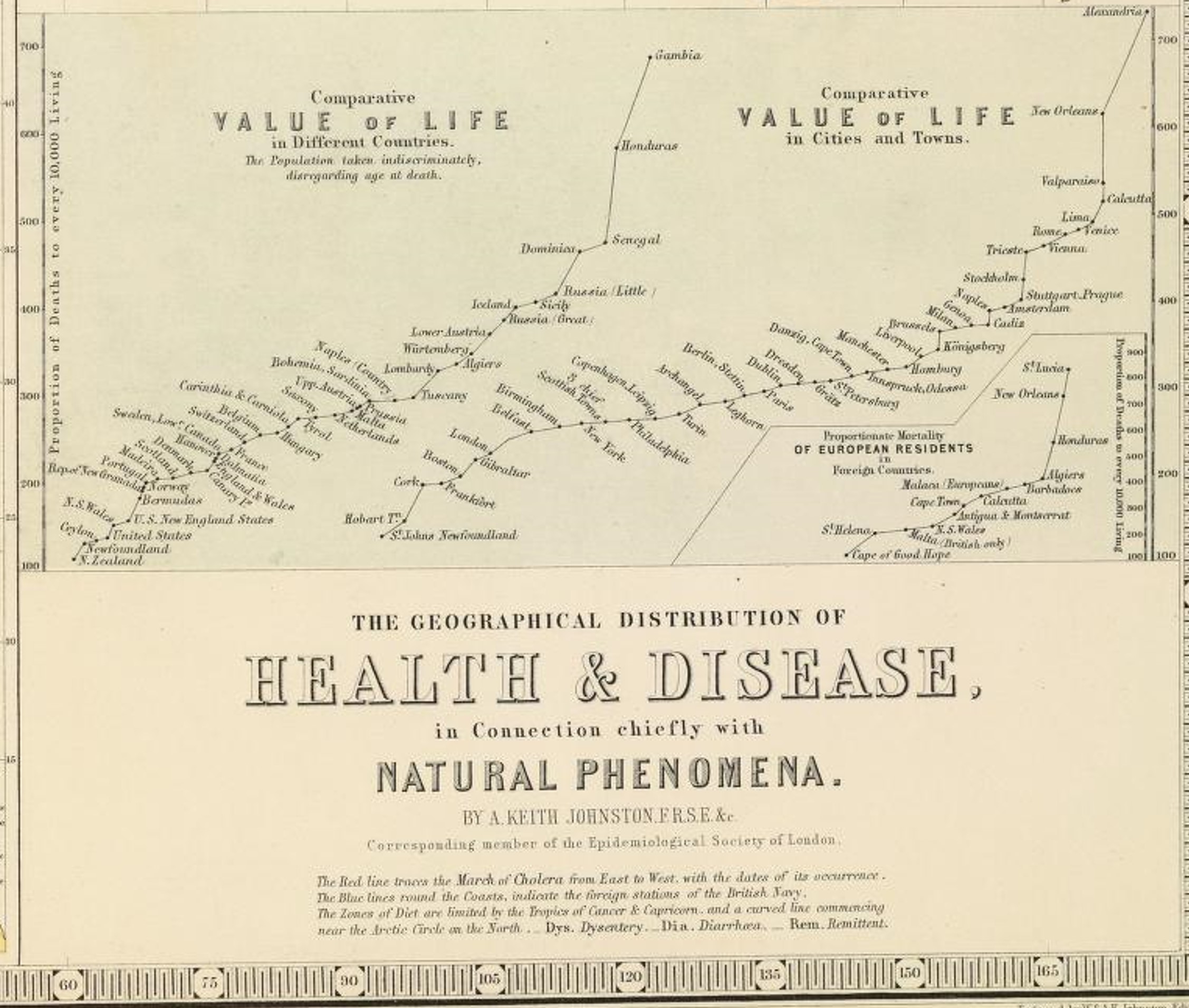
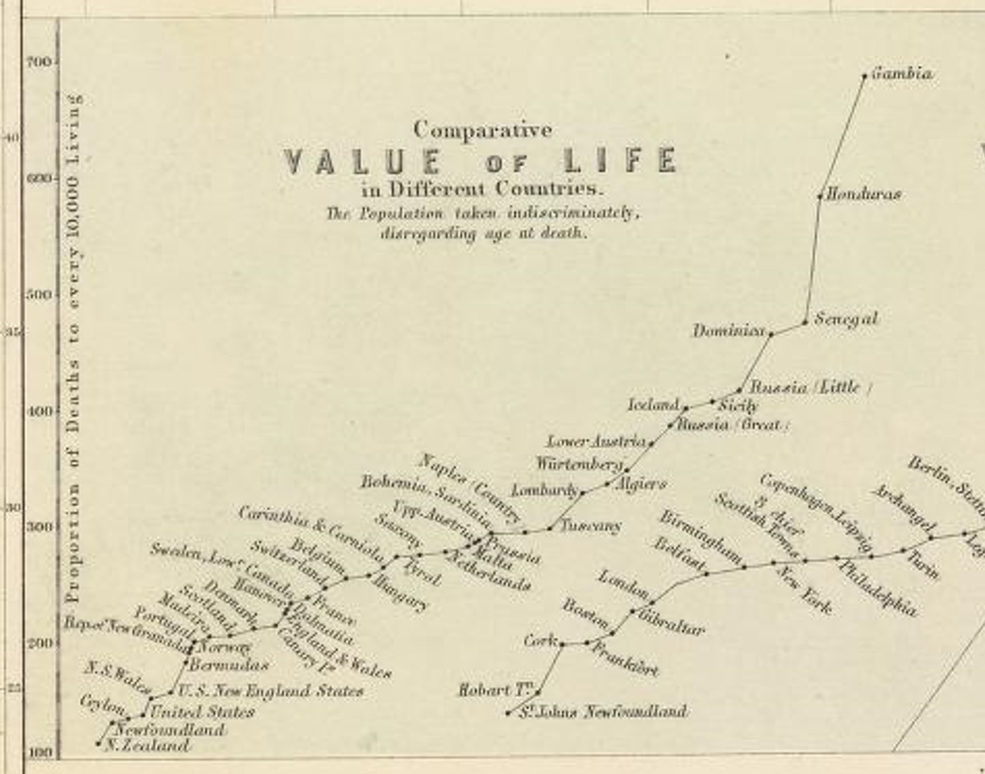
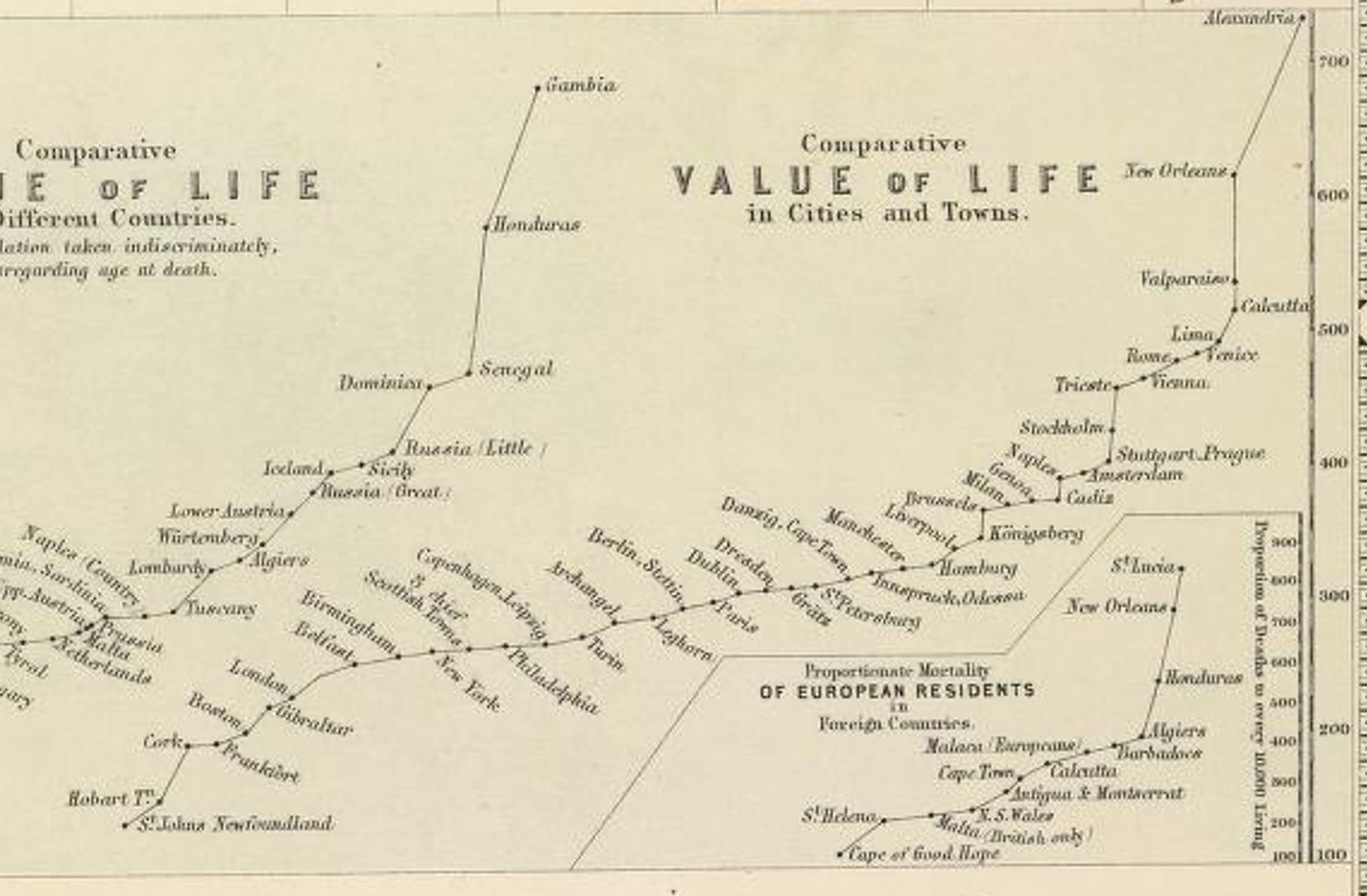
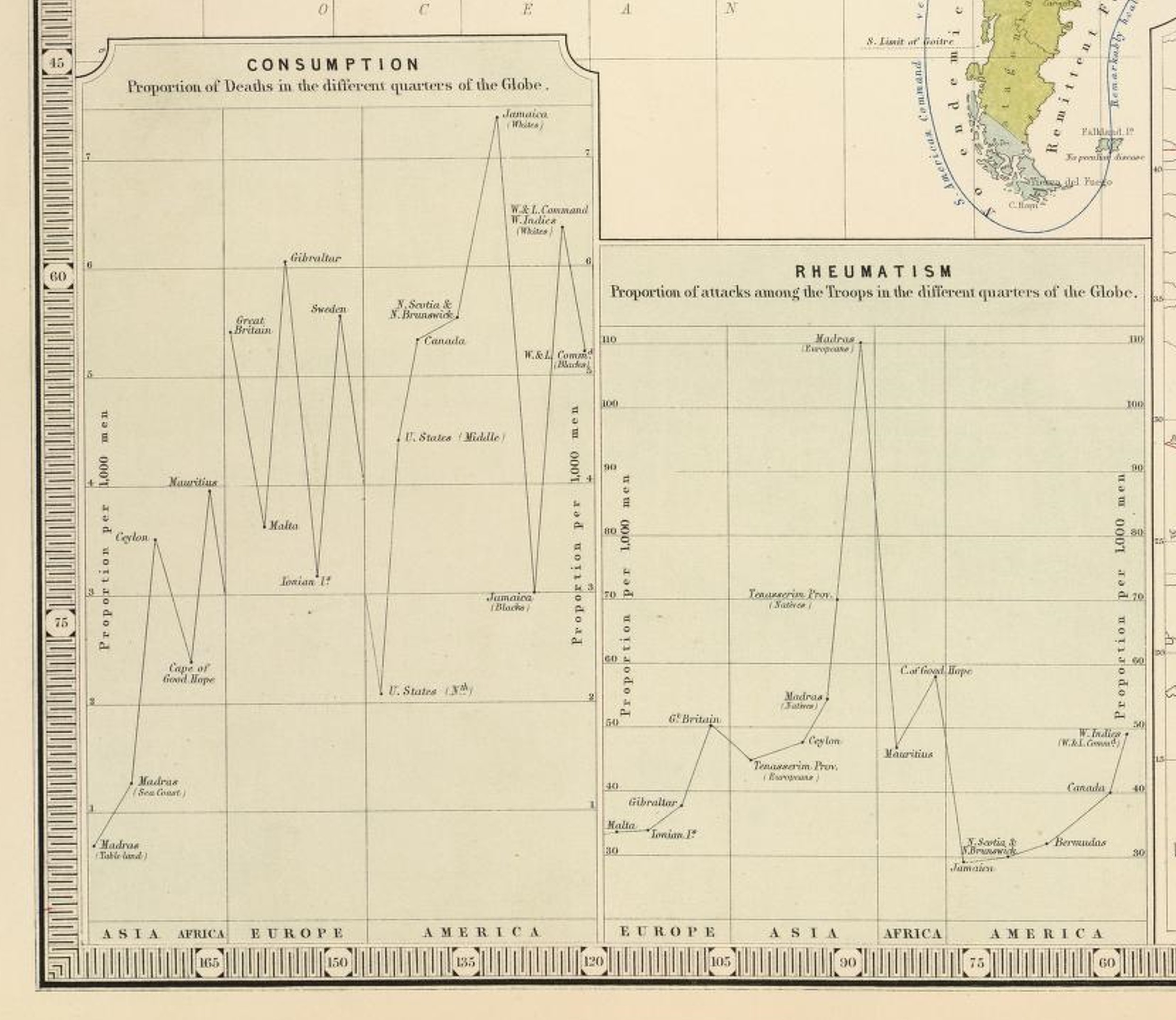
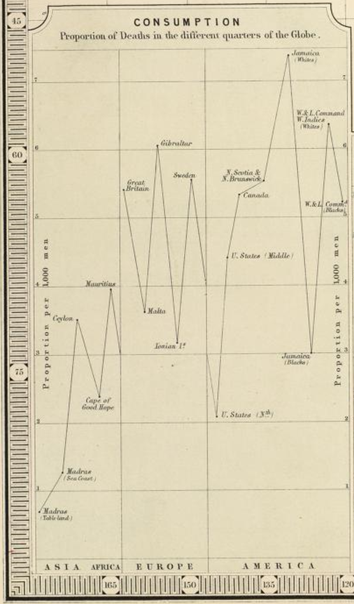
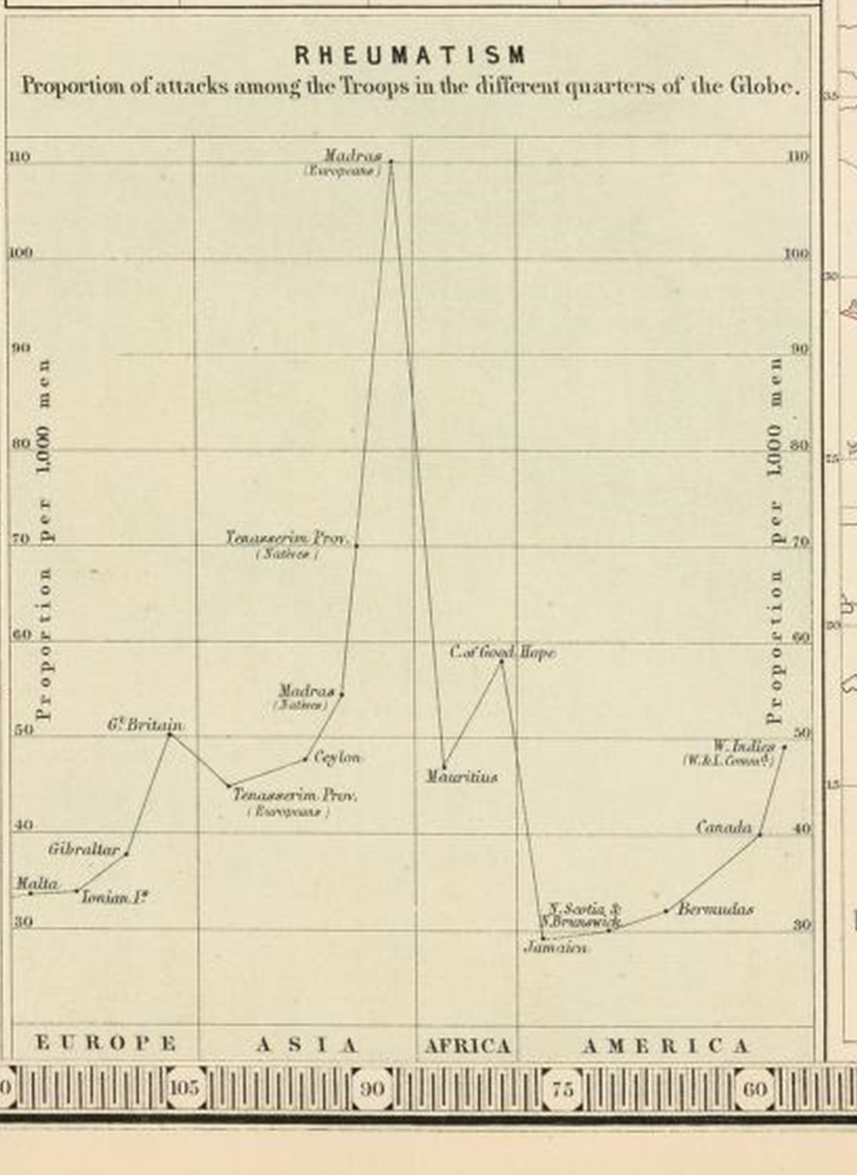
Note the reference to military with the Rheumatism graph. This reference to British military recurs elsewhere on his map, suggesting Johnston’s plans and/or intentions for this map involved the military. He used the military observations and records to develop some of his theory on the distribution of diseases relative to late-longs and climate, and in turn produced a useful map applicable to any future plans for military travel abroad.
.
.
.
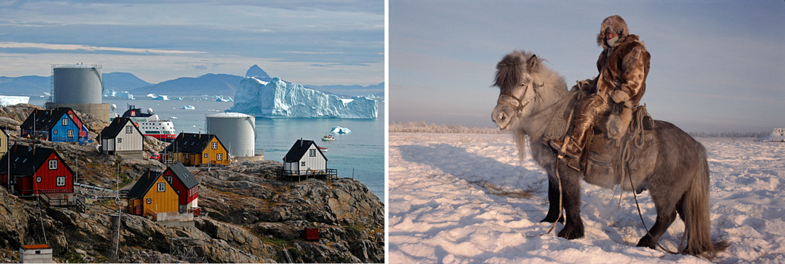
Two of the Coldest Places on Earth with inhabitants: North Ice, Greenland and Verkhoyansk, Northern Russia (source)
.
Northern Arctic or Frigid Zone, in Parts
.
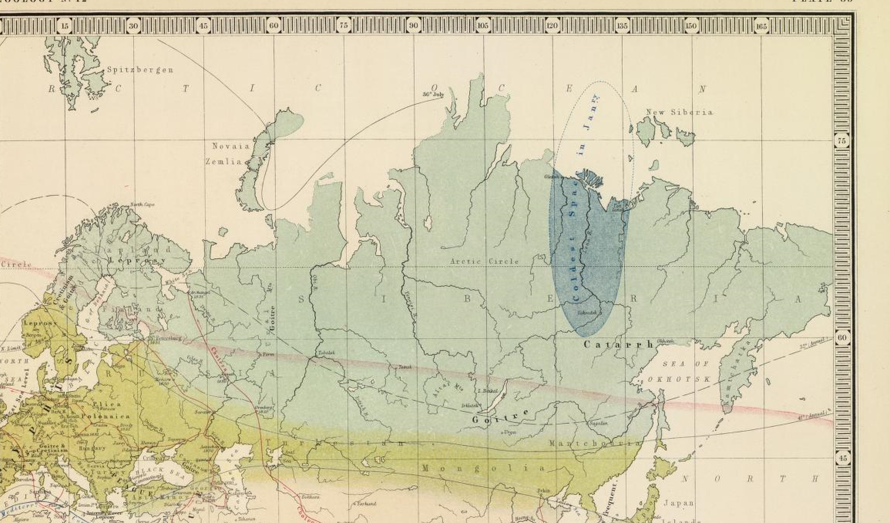
The “Coldest Space” on Earth (blue)
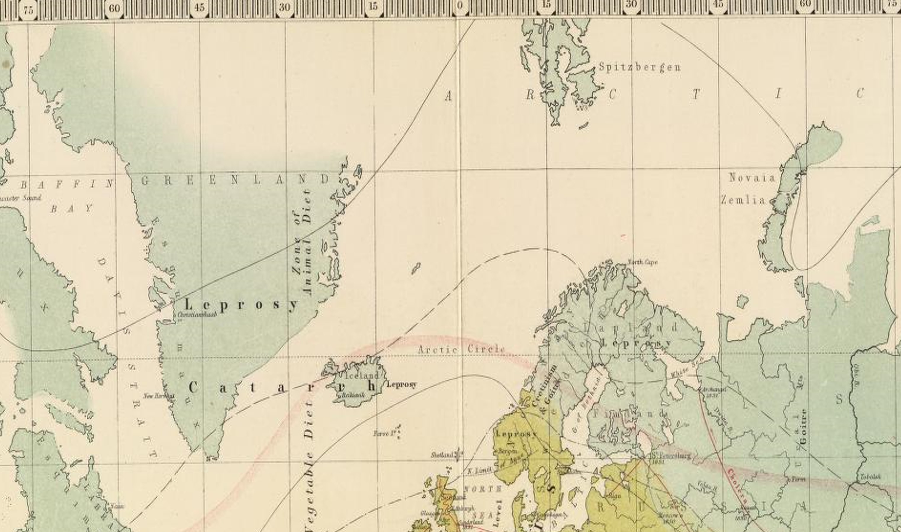
Leprosy struck all three zones on Johnston’s map. There were several versions of leprosy besides the traditional form. Robley Dunglison’s Medical Lexicon for 1866 identifies three forms: black, white and Norwegian or Radzyge.

Sections in Dunglison’s book on Lepra, followed by pictures.
Black, White, Arabian (elephantiasis) and Scandinavian forms of Lepra are displayed. White leprosy is aka vitiligo. Arabian leprosy is elephantiasis, and involves the face and head, Norwegian leprosy is aka Radzyge, and has tubercular and scalar forms.
These different forms of Lepra were not yet differentiated well from each other when Johnston’s map was made. This was due to the lack of any well developed microbial or bacterial based theory for disease.
 .
.
Very befitting . . . the Coldest Place on Earth is adjacent to a Catarrh region.
- Notice the solid and dashed lines are annual average temperature lines.
- Catarrh wasn’t fullest distinguished into the modern forms of illness known as the cold, the flu and pneumonia.
- The influenza was researched extensively as a unique disease with a unique seasonal and areal behavior as early as the late 1790s. Shadrach Ricketson in New York performed one of the first epidemiological studies on this disease in which letters were sent to physicians around the state about their observations for this disease.
- Zymosis or zymotic theory helped divide the catarrh into more distinct categories with different causes recognized, sometime between 1855 and 1865.

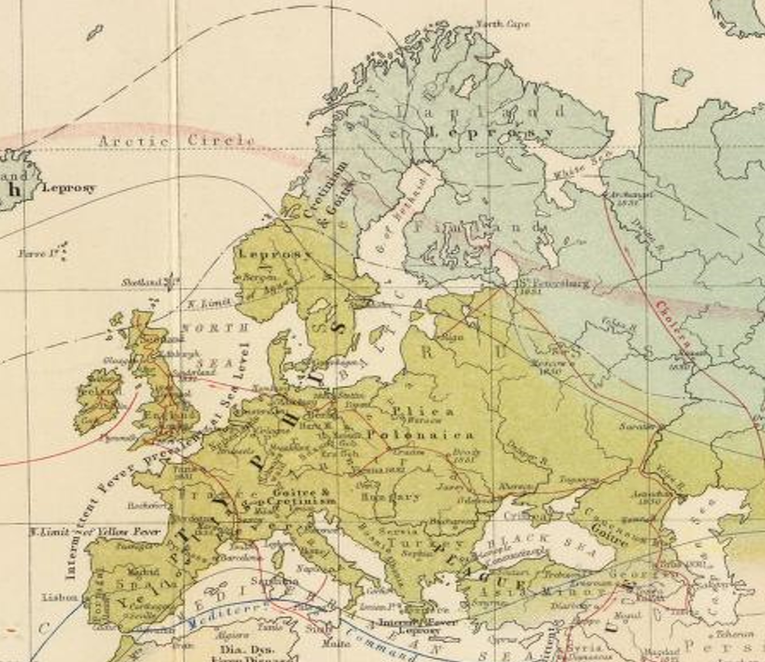
Goitre
.
Europe, some Middle East to India
.
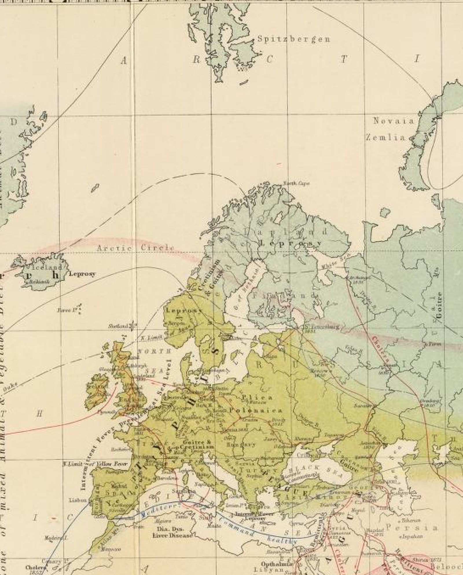
Notice the dark blue line in the Mediterranean Sea: it is labeled “Mediterr.[anean Line of] Command healthy” Other lines either depict travel routes and cholera diffusion or are annual isothermal lines.
Two things helped to define the Goiter zones on these maps: 1) being considerably inland with limited trade possibilities at certain times of the year due to topography, climate and distance that had to be travelled, 2) limitations in agriculture produced by local topography, pedology, climate and ecology. Culture added to this whenever the people or their traditions relied heavily upon crops that increased the likelihood that some form of iodine deficiency would ensue. Goiterogenic crops were the brassicaceae members: the cabbages, mustard greens, cresses, broccoli, cauliflower, rape, kohl rabi, kale, brussel sprouts. They fared well in cold climates, stored well over the winter, but unfortunately reacted with what little iodine there was available to the body and in the soil. Thiocyanates are a group of chemicals (with R-SCN) that may have been responsible for this. Onions, leeks, scallions, garlic, etc might have added to this health problem due to their thiols (R-SH).
Notice on the above amp the following Regions:
- Thermal regions or zones
- Light blue-grey areas – Arctic Zone
- Yellow areas – Temperate Zone
- Light areas – Tropical Zone
- Epidemiological Areas — Intermittent Fever prevalent at Sea Level, Typhus, Plica Polonica, Yellow Fever, Goitre & Cretinism, Goitre, Opthalmia (sic), remittent Fever, Dia. Dys., Liver Disease.
- Linear map depictions focus on the Cholera transportation routes
Questions
As you look through the various sections of this map, try to answer these questions:
- Which diseases remain on either side of two neighboring thermal zones?
- Which diseases do not have this thermal barrier?
- Which diseases appear to be shoreline diseases
- Which are primarily inland and involve some form of cultural isolationism?
- Deformity in shape and form are always culturally-defined “disease” patterns attached to certain forms of judgment. Which disease(s) have the most value attached to their diagnoses based on changes in appearance?
- Typhus and Plague are unique for this map due to the way the wording was placed on this map. What impression does this leave the map reader with?
.

.
Areas — Intermittent Fever prevalent at Sea Level, Typhus, Plica Polonica, Yellow Fever, Goitre & Cretinism, Goitre, Opthalmia (sic), remittent Fever, Dia. Dys., Liver Disease.
Lines — Cholera, “Mediterranean Command healthy”
.
Plica Polonica, brought on by vermin, is associated with the history of dreadlocks. What follows is my figure on this pulled from Berghaus’s 1846 Disease map page.

Goiter and Cretinism. Goitre (goiter) is for the most part a glandular disease linked to enlargement of the thyroid due to inadequate Iodine uptake. It is a nutritional disorder that can be induced by poor diet, by environmental chemical exposure, and through certain dietary patterns and/or foodways. Cretinism, for the time frame in mind for Johnston’s map, is a developmental disorder related to congenital thyroid deficiency. During the mid to late 19th century, this term may have also referred to other physical deformity related diseases with family heritage and genetic linkages such as Mongolism. Some developmental disorders are not only genetically based, by can be induced through chemical exposure. Thus the 19th century rendering of this diagnoses doesn’t always match today’s impression of cretinism. Adding to the problems with increased cretinism were the culturally-defined behaviors of young adults in their early child-bearing years. Families that kept their relationships within the cultural setting were more apt to result in a larger number of these children (due to in-breeding essentially). [Can you tell which of the pictures below does not not display cretinism?]
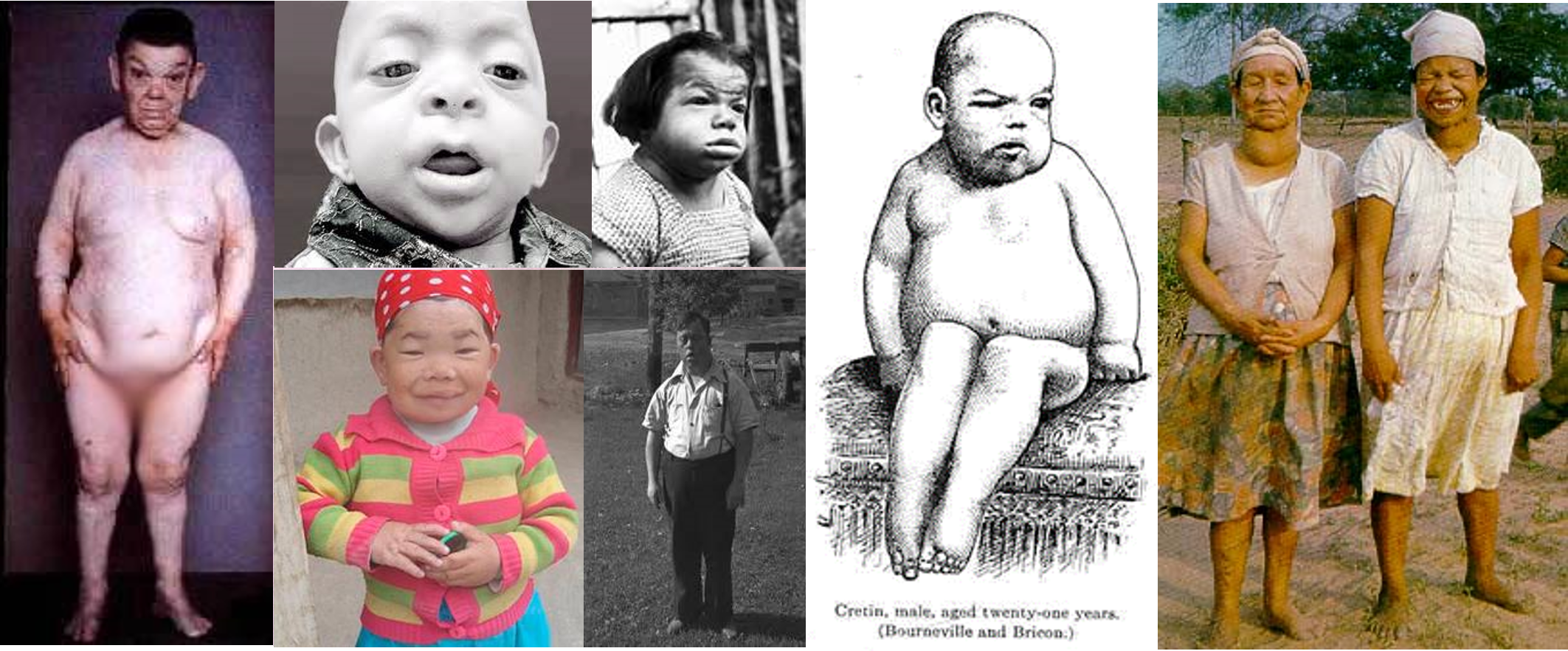
- The above are all adult age people (photos gathered from a web search, trying to avoid copyright issues).
- Cretinism and Goiter are noted by Johnston as being together with each other in Northern Italy and Scandinavia.
- Cretinism was typically related to constitutional (familial , and much later genetic) predisposition, due to its congenital nature. But it was in fact primarily environmental in origins.
- Goiter was due to environmental impacts on Iodine availability.
- Notice these two conditions occurring in tandem in the same family with the rightmost image; this was probably Johnston’s experience with this as well and may have led to some difficulty deciphering the other goiter cases noted in rural areas without any related cases of cretinism (typical US history within hinterland settings, ca. 1800-1840; akin to the modern Appalachian poverty concept).
- The second image in the bottom row appears to be mongolism, which Johnston and others grouped together with cretinism.
- Most of the United States cases with similar appearances were most likely related to “Monsterism” or Monstrosities brought on by combined industrial chemical-nutritional exposures. Chemical industries made considerable use of highly toxic, heavy metals.
- The U.S. did have its cretin cases as well, but they never stood out as much in the family medical books and medical trade magazines as Monsterism did.
This problem presented itself very early in medical history due to the deformities attached to such states. Some of the more genetically linked examples exist to this day, such as in the form of digestive or metabolic syndromes that are enzyme based. Racial or Color-linked disease are also well known to exist in this manner, such as sickle cell and the thalassemias. Contemporary 3D Grid mapping can be used to demonstrate these clusters based on a small area analysis of the entire country. For example, the following map depicts a clustering of cases on Long Island, but not in New York City where the population is greater. This suggests a unique social cause for this diagnosis on Long Island that is absent from the city, and pertains to anything from Long Island hydrological/ potable water chemistry to cultural community settings and traditions, including marriages within traditional family lines.
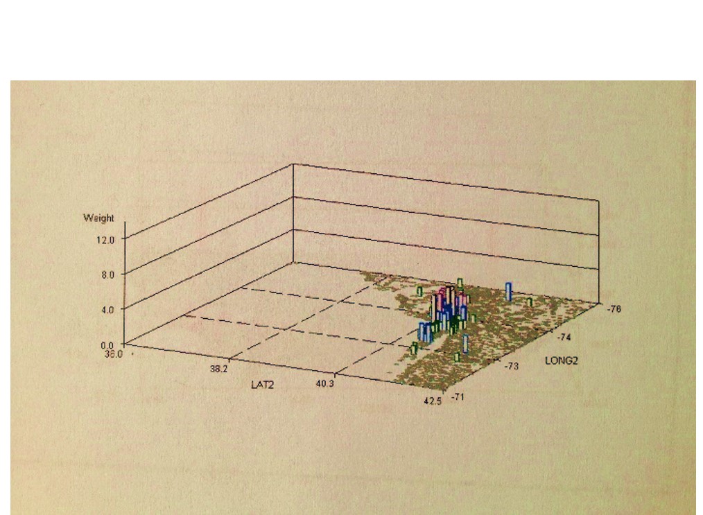
A contemporary genetic or developmental dystrophic disease clustered on Long Island, with potential cultural links (link to related page).
.
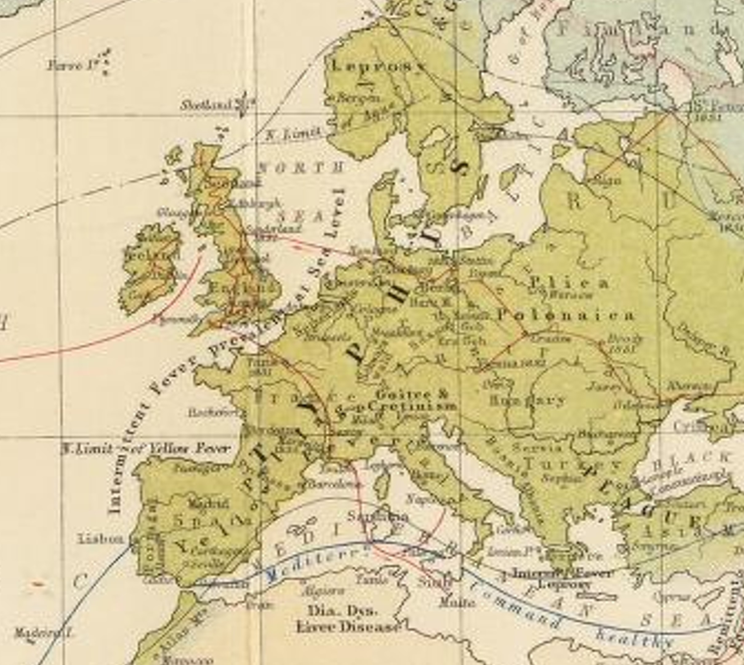
The three most significant temperate zone epidemic diseases of western Europe: Typhus, Plague and Yellow Fever. Note the Diarrhea, Dysentery and “Liver Disease” in northern Africa. This liver disease is probably microbe linked. Some regional dietary patterns were also responsible for liver dysfunction due to consumption of hepatotoxic foodstuffs, or tendency for farmed goods to become hepatotoxic, such as certain grains prone to ergot and hepatotoxic mold and fungi, and umbel crop plants and greens prone to the development of hepatotoxic pyrollizidines due to soil conditions. Some water features may also be prone to liver flukes and schistosomiasis.
.
Africa – Middle East – Asia
.

Notes:
- Note the presence of “Dys. Leprosy Berba” [Dysentery Leprosy and Berba] for the Philippine Islands region.
- Dysentery is most likely opportunistic, not amoebic, due to location and time frame in history.
- The Leprosy is probably primarily due to Mycobacterium leprae (see Mansons Tropical Diseases, Chap. 58), although other leprosy like conditions may be included (see later review of Lepra on this page; also, for a good read see J. Y. Simpson’s Antiquarian Notices of Leprosy, . . . Part II. (Edinb. Med. Surg. Jl 1842; 57:121-156).
- Berba has yet to be identified. Isolationism kept New Zealand and Australia from experiencing the wrath of the worst of the Western European diseases common to heavily populated settings (see below for more).
- Madagascar is truck by “Pestilential Fevers”.
- Indian and Ceylon have the Beri Beri. The other primary vitamin deficiency disease, scurvy, is not mentioned on this map. Beri Beri may be associated with the East Indian Command line (in blue, from the Red Sea to Bangladesh, to Australia), and is a place where this can set in on the long voyages. This again infers a command line shipping related agenda that underlies Johnston’s map production, perhaps to impress Royalty.
.

From Berghaus’s 1846 Disease map page
.
Asia
.
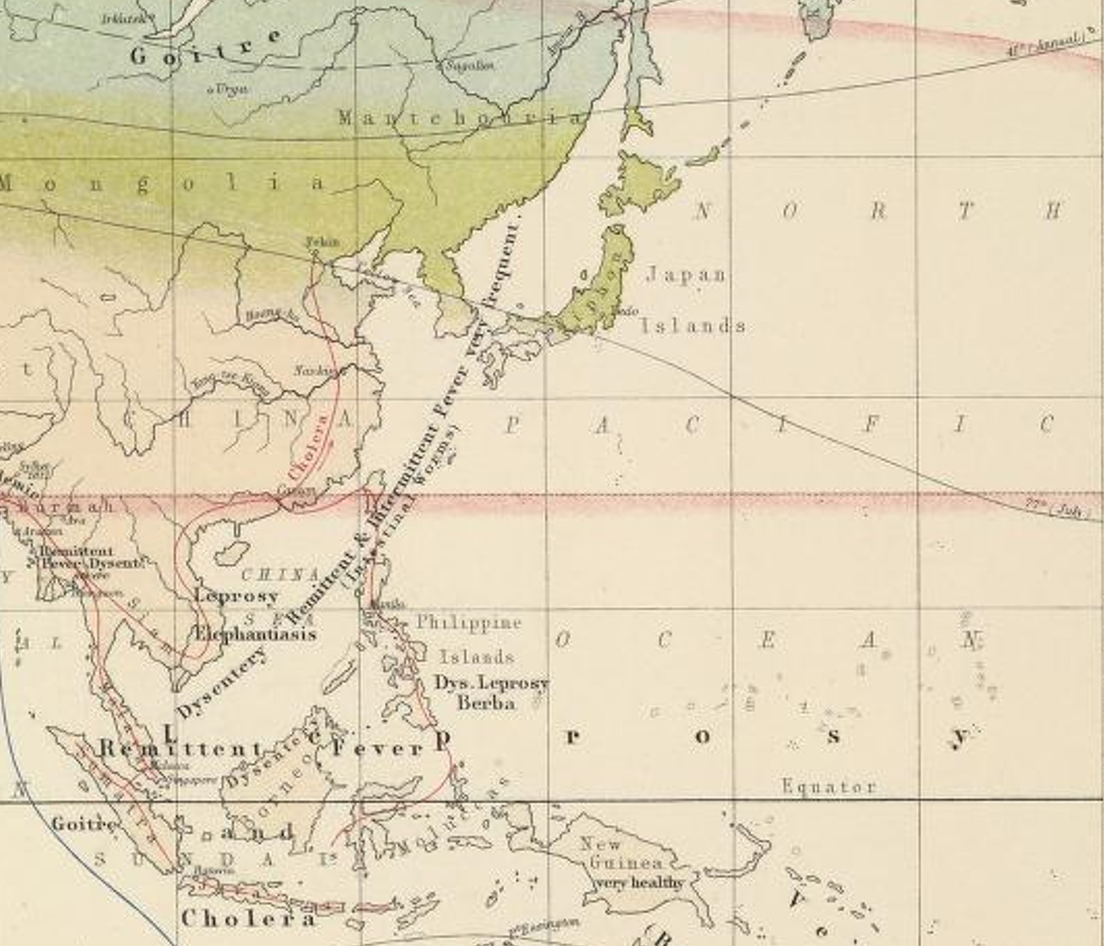
The lengthy disease label off the coast of China focuses on dysentery and and the two fever types. In parentheses appears the term “Intestinal Worms”. The first worm linked to a continent is African worm, taenia solis. The Chinese worms may have been the typical roundworms and such, but also involved several flukes that infected the liver.
Sumatra is right on the shipping route, and yet has goiter. One interesting ecological-phytochemical-nutritional deficit parallel here is the cyanogenic glyscoside rich Cycad trees, the pulp of which was consummable in traditional settings. Certain island bound cultures living this lifestyle may have suffered goiter.
One important disease not immediately detectable on the above map is schistosomiasis, which would have been linked to the Southeast Asian region, and so could have been linked to the Intestinal Worms label, like the liver fluke
Cycas sago starch. Robley Dunglison’s 1866 Medical Lexicon
Africa
.
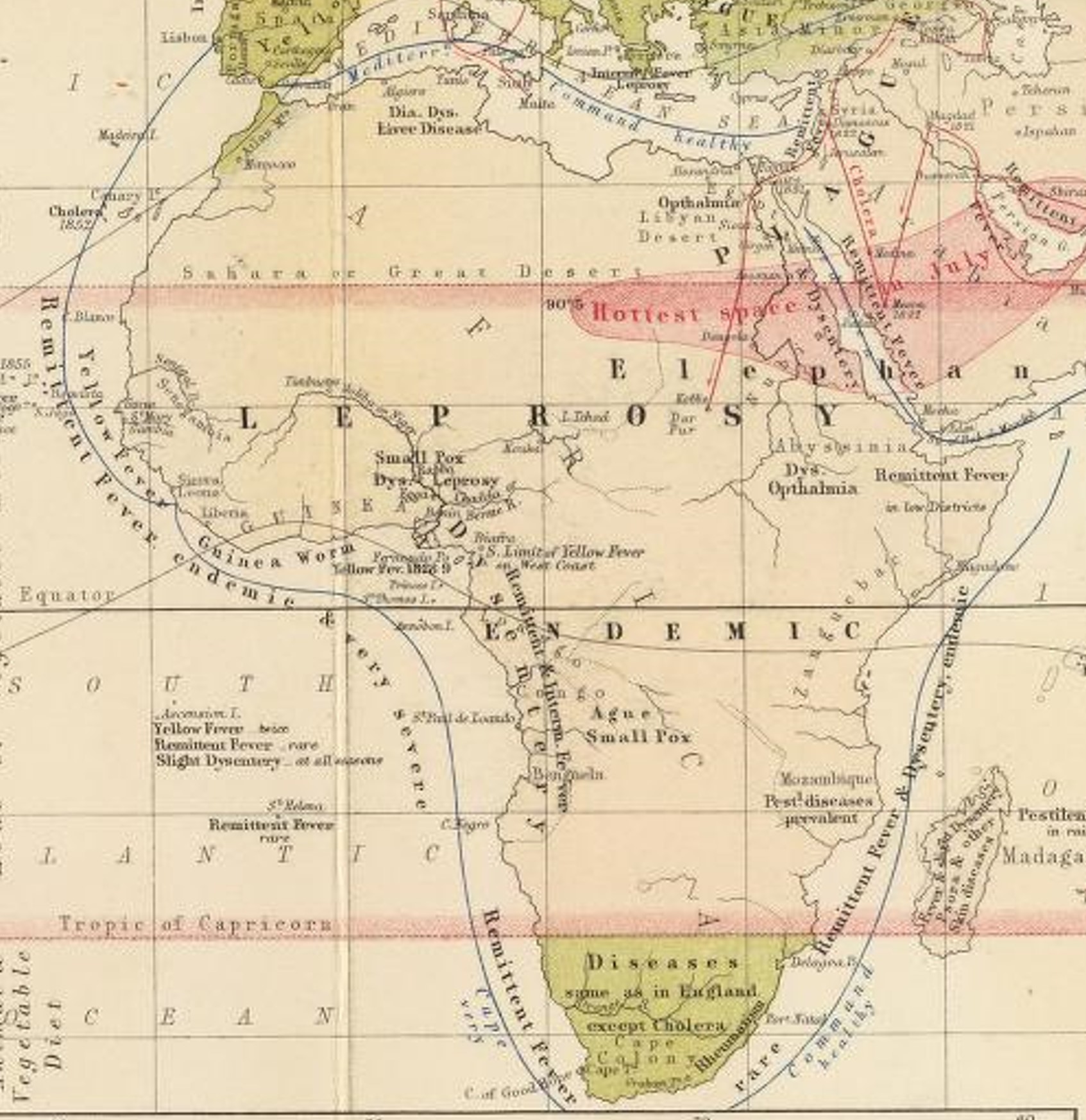
The Hottest Space in the World, with diseases next door.
“Dys opthalmia” probably stands for Dysentery and Ophthalmia. These are just south of “The Hottest Space”.
The Ophthalmia may be referring to Eye Worm.
Notice the Cape Command Route skirting about the southern tip of Africa is labelled in parentheses “very healthy.” Pestilential diseases are prevalent on mainland Africa near Mozambique and across the way on Madagascar.
The island also bears various Skin Diseases. (states “_______ & other Skin Diseases”)
Note the “Slight Dysentery” label for Ascension Island in the South Atlantic, SSSW of Guinea. In sequent occupancy terms, Ascension Island is being developed, latrines have become commonplace, and the water table is being contaminated–most likely a stage 2 to 3 transition in areal/economic development.
Ascension Island was a mainstay for sailors crossing the ocean (ref: The Peninsular Jl of Med., 1858), and so was associated with a significant amount of STD spread. Many examples of human behavior disease correlations are found when we review spatial disease data. The association of Beri Beri (or even Scurvy sometimes) and prevention of Beri Beri regions in exchange for developing STDs was not at all unusual. Tropical fruits diminished the scurvy and beri beri problem. whilst tropical culture led to the spread of STDs.
Also realize, amoebic dysentery cannot be distinguished from opportunistic dysentery (the animalcule relationship for this problem was not quite figured out). The Amoebic form due to entamoeba is ecological and endemic in nature. The opportunistic form is pandemic or endemic, ensuing where ever people settle and where unsanitary living practices are engaged in (most befitting of a sequent occupancy review.)

Robert William Felkins 1889 Disease Map of Beri Beri and Oriental Plague, from one of my two blog pages on his disease mapping (Source)
.
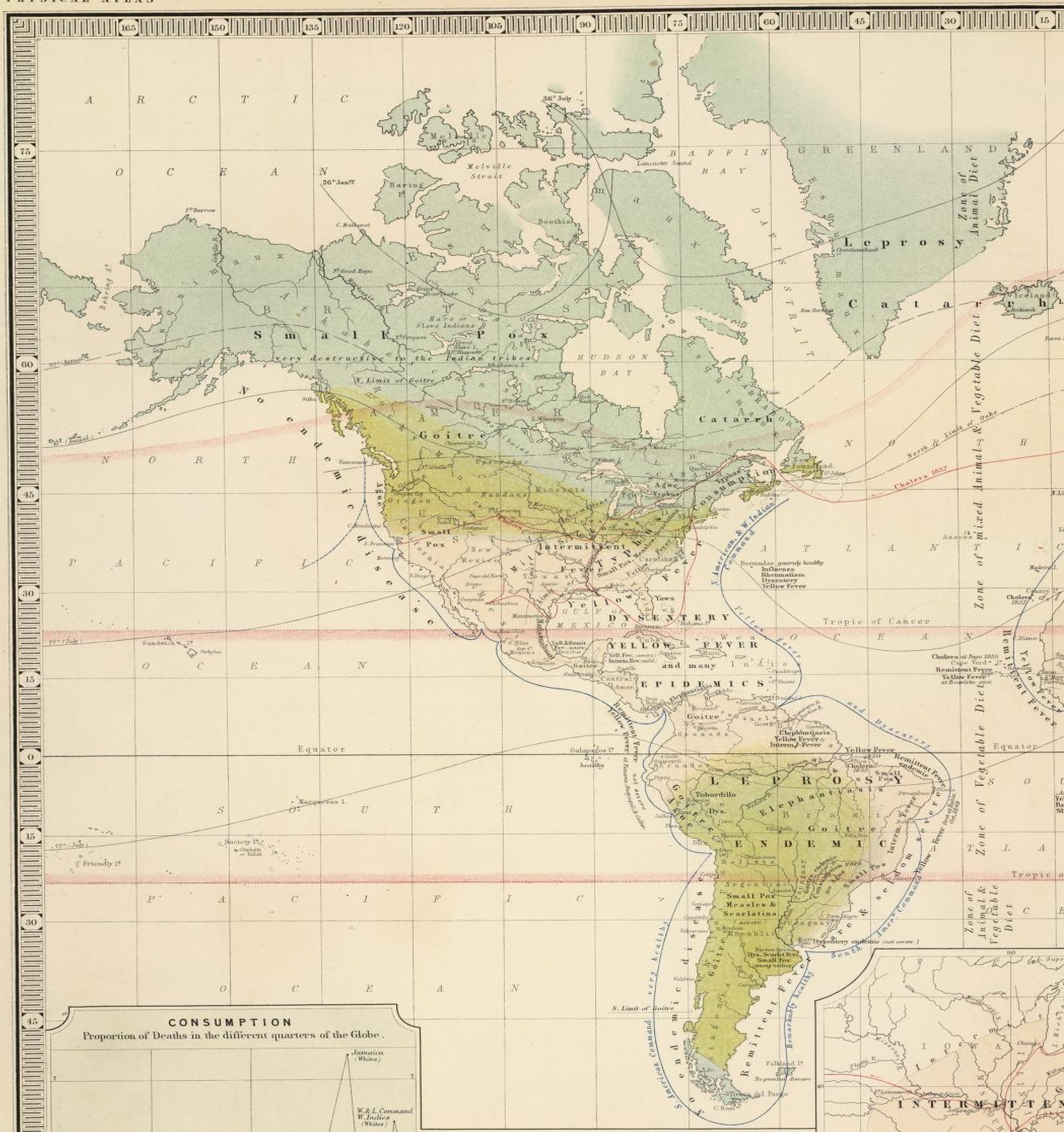
The Americas
.
.
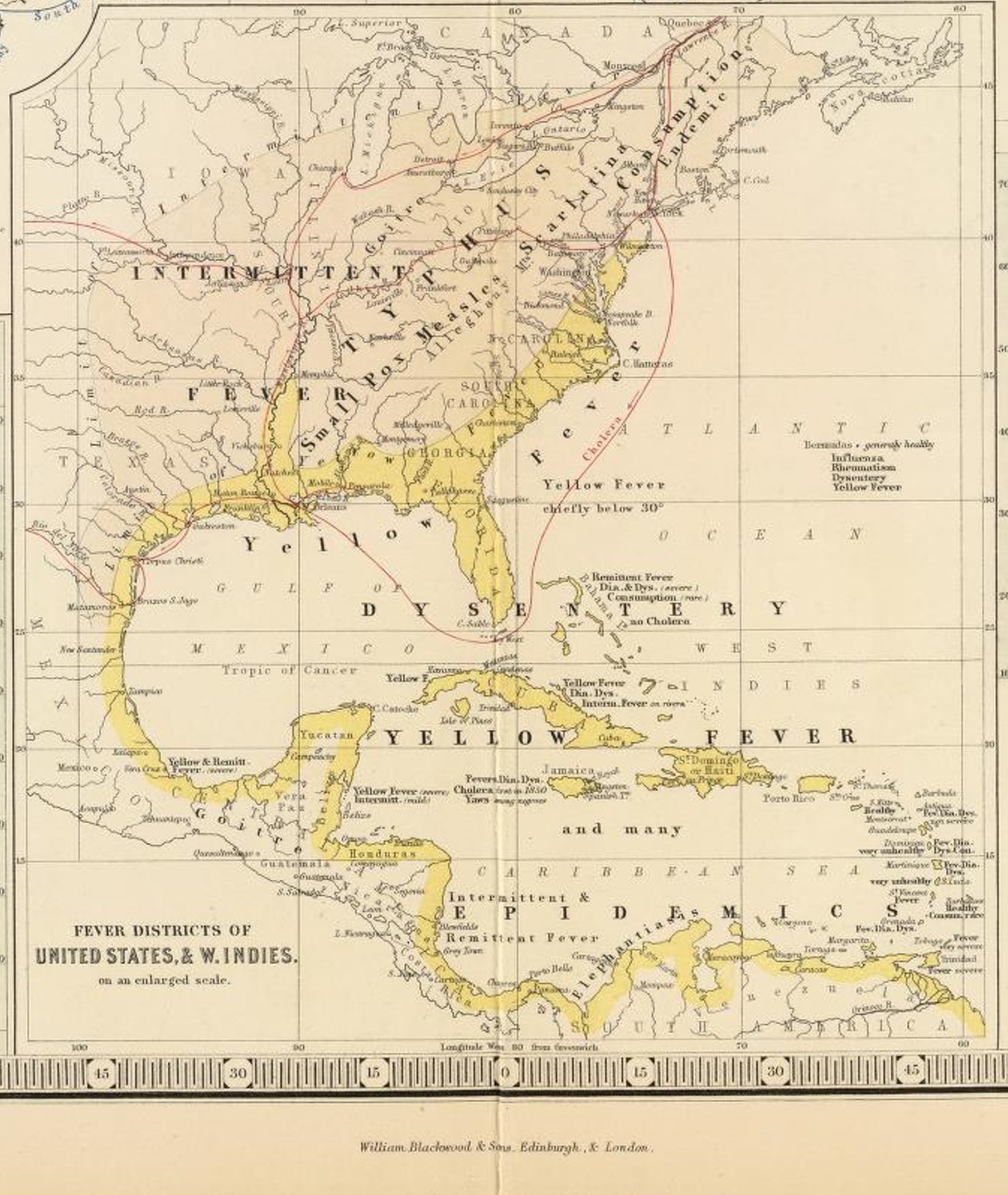
South America
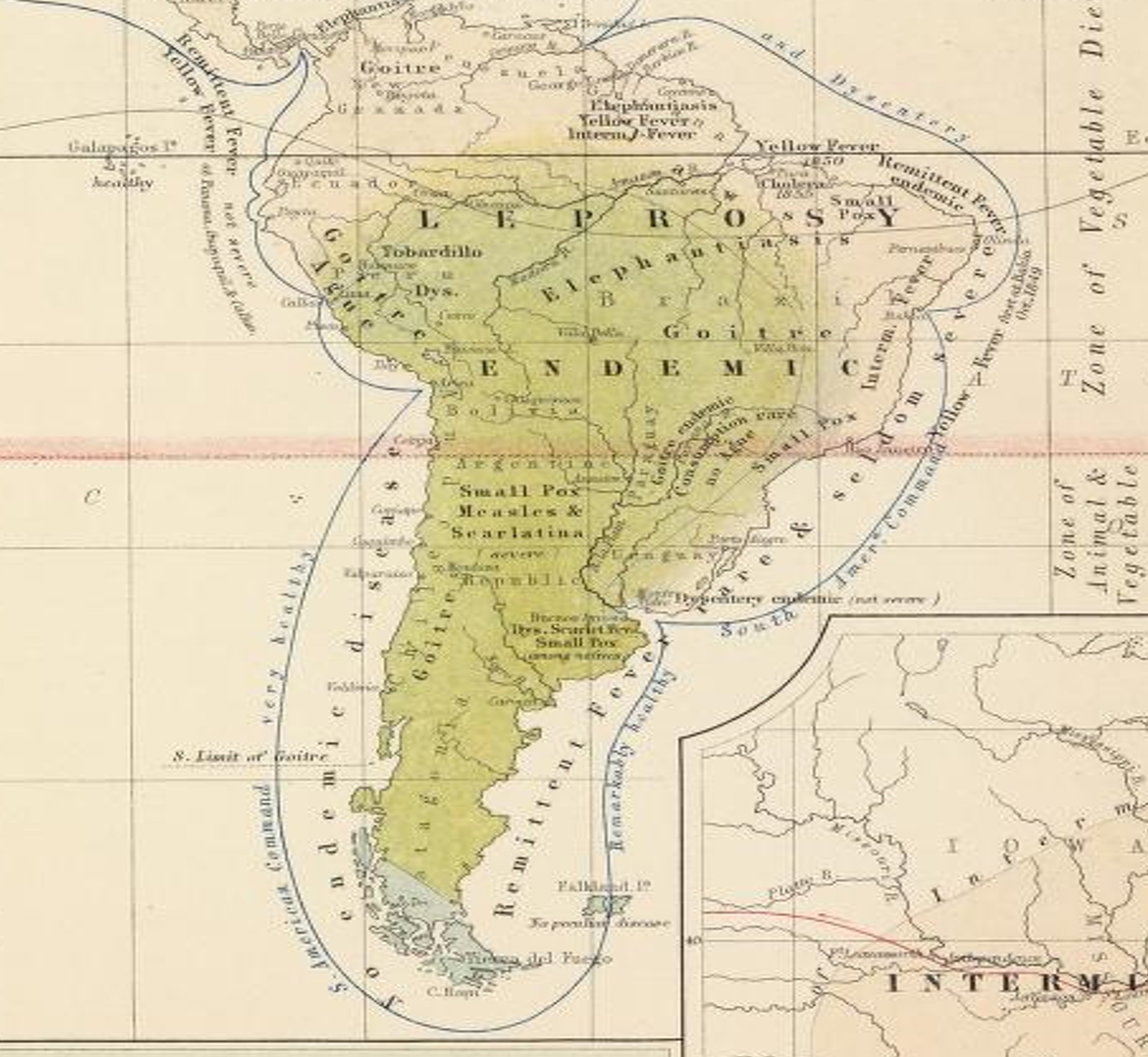
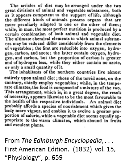
The most unique thing about this map is the dietary note Johnston place (see the right edge). The red highlighted line that traverses South America depicts the line distinguishing the Zone of Vegetable Diet from the Zone of Animal and Vegetable Diet. For a better understanding of this product of natural philosophy, see Robert Dickson’s ‘Sacred Philosophy’ series writing for the article “Contribution to the Natural Theology of the Vegetable Kingdom” (The Church of England Magazine, vol. 10, no. 263, pp. 19-25). This philosophy was developed just prior to the period when Erasmus Darwin’s writings on evolution of lifestyles had their greatest influence. These religiously derived natural philosophy traditions enhanced the role and importance of medical geography philosophy in general, and helps to explain the reasons we find many physicians moving back and forth between southern and northern climates in the United States during the 1820s and 1830s. This belief system would also later support some of the claims promoted about the need to import slaves for labor related reasons; they were necessary for heavy labor to be possible in hot climate regions.
The following helps to explain the application of Johnston’s Zones of Diet:
Other things to note include:
- Goiter exists in both of the zones meaning latitude is not a requirements, and suggests that this disease occurs due to local culturally defined dietary patterns. Cassava diet for example is a major cause for cyanointoxication (CN more in its pure form though, not glycosidic form), which may in theory provide a food chemical link to the possible biochemical causes for goitre for this region (not fully researched however at this point). (This review was also engaged in by a colleague of mine from Columbia Univ. in the 1970s (his thesis), and later at Oregon Health Sciences Center during the 1980s; both involved explorations of the impacts of Manihot or Manioc consumption on diseases, esp. neurological, in the Carribean.)
- Quite a number of endemic diseases are noted in South America. But most important to note is the Elephantiasis present at the northeastern edge, and its association with Yellow Fever. Both of these, along with Yaws migration into Florida, are direct results of which trade relationship? In other words, which cultural group brought these diseases here and why?
- Also note, Small pox is scattered about the map. More people, more in-migration, more interaction with indigenous groups, means that more regions for these diseases requiring close contact will be documented.
- The Galapagos Islands off the northwestern shoreline are “very healthy.”
- The southern tip of South America converts to the northern edge of the Arctic Zone. Theoretically, this meant that a trip around the southern point might eliminate any outlying diseases on board a ship that required temperate zone temperatures to remain active. This might explain Johnston’s comments on the west versus eastern command routes: “very healthy” on the west shore changes to “Remarkably Healthy” on the east shore. Travelling towards to tropics increases the chances for fevers on board.
- The most unique disease to note on this map is perhaps the “Tobardillo” (more correctly spelled Tabardillo) in Peru’s very high elevation inland setting (to the right of the shoreline Goiter Ague note). Also known as Mexican or murine typhus, this is a Rickettsial form of Typhus spread by Lice [Link for more] and is akin to Jail Fever. Johnston is making a cultural statement with this note. It is also an historical note worth further exploration due to its relation to the earliest Spanish explorations of the region (see link to Google Search on this). Two other cultural linked diseases noted in this work, and associated with Spanish South American and Central American history are the Mayan ~huatls and Pinto.
.
North America-Central America
.
.
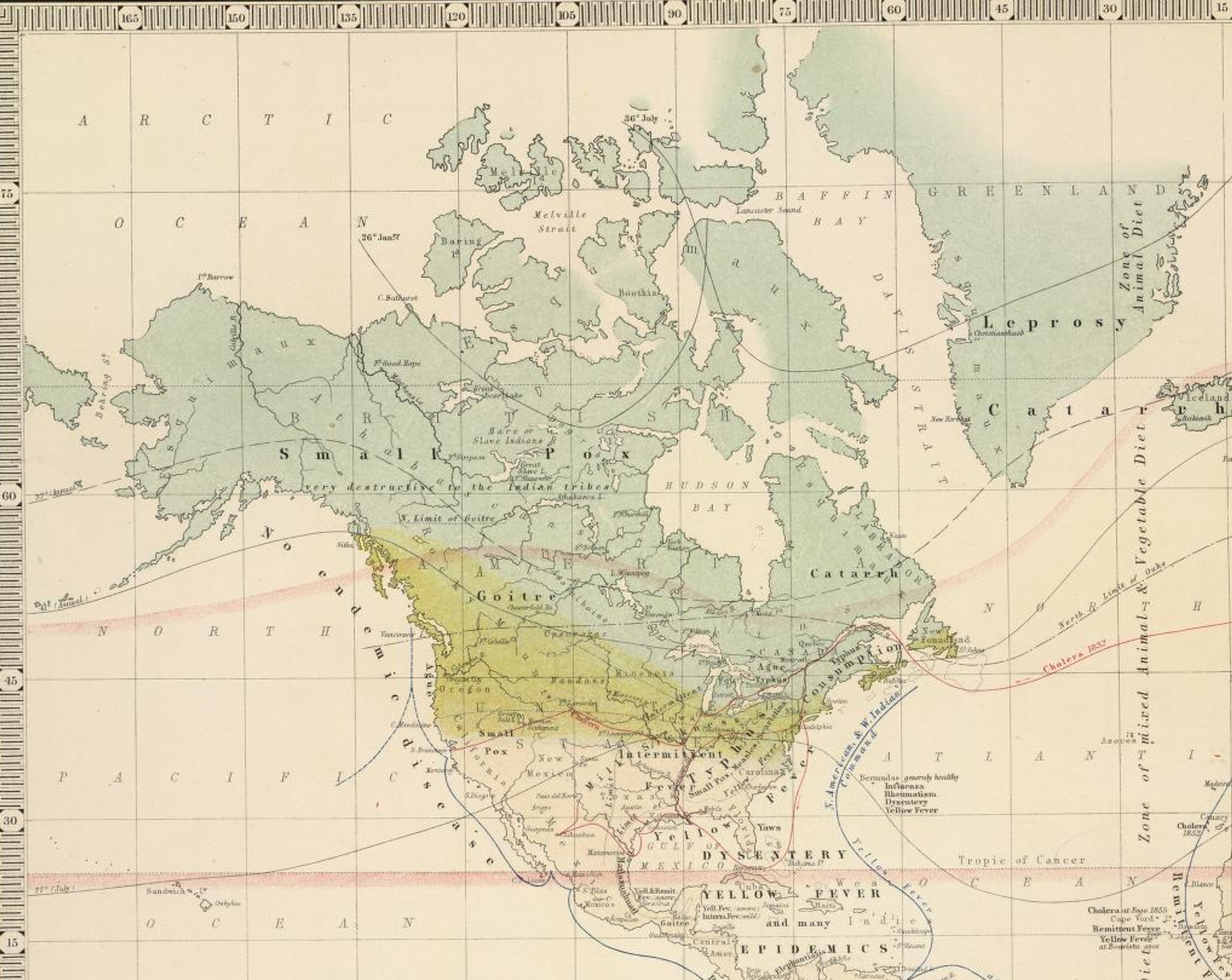
United States-Mexico
.
Other observations worth mentioning:
Johnston’s map tells us he noted Milk Sickness to cross the temperate-tropical zone boundary; thus it is not that attached to the major climate and thermal patterns. The same was observed for Typhus. Both of these suggest a landschaft reason (if Johnston thought that way).
Consumption is a northern latitude illness, and like elsewhere in the world.
Goiter is mostly an inland, cold region malady. The goiter in Mexico near the Yucatan peninsula will later be accompanied by geophagia (clay eating) and pinto/pinta.
Florida has Yaws (again a disease linked to slavery in-migration and climate).
Topographically, the Aztec-Mayan epidemic disease Matlazahuatl has been linked by some to Yellow Fever (I cover Matlazahuatl extensively on another page devoted to Johnston’s map of the Central and North Americas; but see also this link for another piece of hemorrhagic disease history). Topographic features tend to exclude the possibility of Matlazahuatl being one and the same as yellow fever. Also note, Johnston’s map depicts this disease as a shoreline disease, not a higher elevation disease, suggesting he has linked the lower elevation yellow fever and the higher elevation Matlazahuatl together. Another possibility not well reviewed for Matlazahuatl is that it was due a tick or arthropod born disease brought in with animals, and the transferred to other animals in the wild, thus resulting in the higher elevation ecology of this problem and its association with high elevation native communities. (See my page on a Mexico Medical Geography disease map for more on this.)
The section of the map is reviewed in detail on the neighboring page.
The Caribbean was also viewed in more detail on the home page detailing Lawson’s work on the health of the region, and the followign sections of Johnston’s map:
.
.
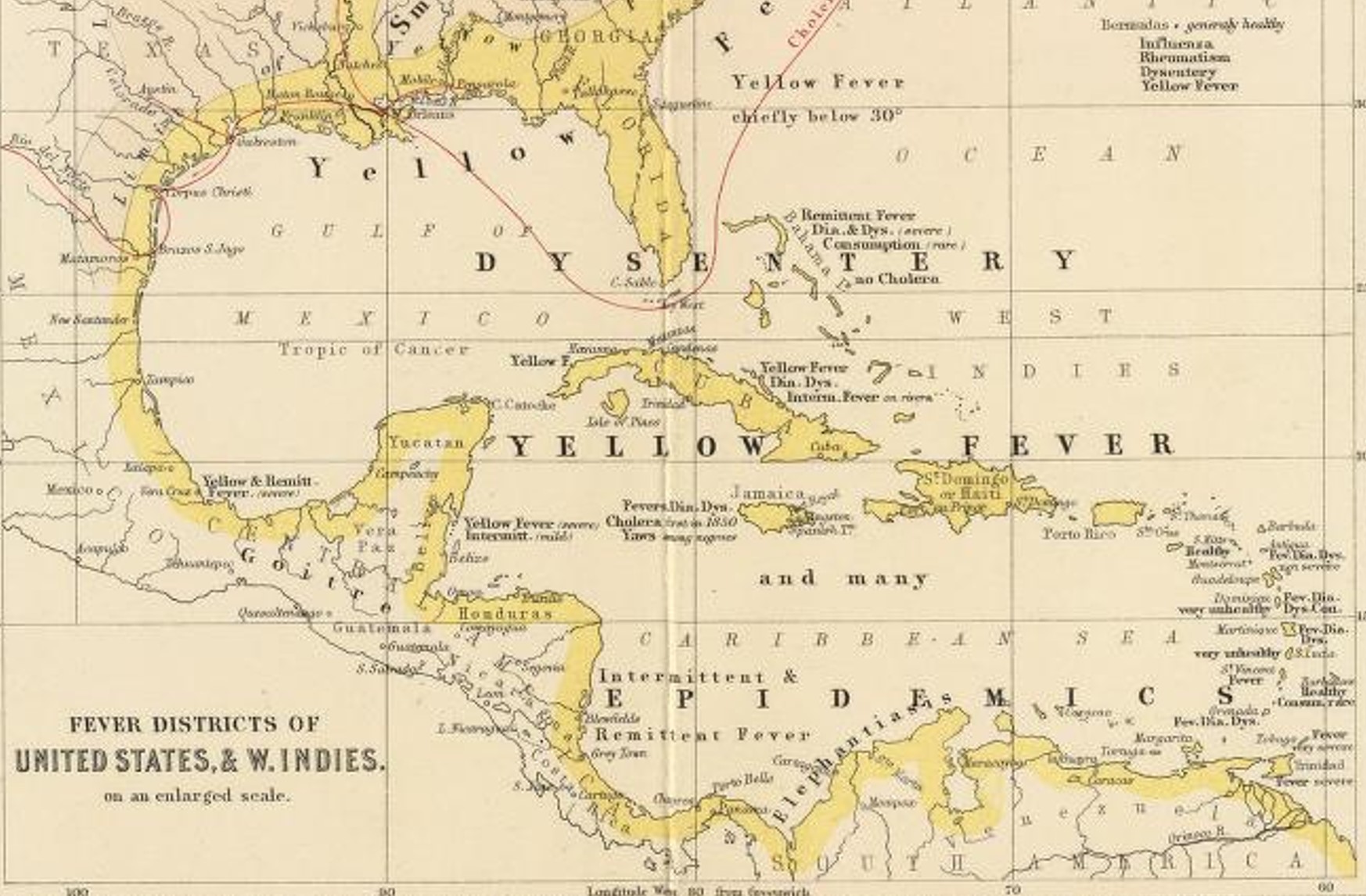
Map 1 – Middle America
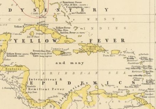
Jamaica, Map 2 – West Indies
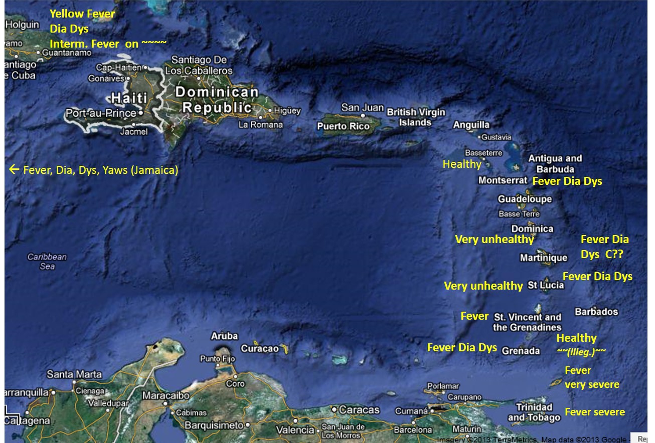
Map 3 – Haiti and the Island Chain
.
Note: for “Healthy islands” (bottom right), illegible word may be Consumption . . .
Implied research question: why were The Grenadines and the Virgin Islands, St. Kitts and Nevis (unlabeled islands, south of British Virgin Islands, south of St. Thomas, eastward to Montserrat) so much healthier during this period in Caribbean history?
Study question for Med Geog course, Maps 1 and 2: Applying the sequent occupancy model to the above 1856 maps, there are three or four levels of habitation depicted on these maps based on their residency. Using the disease patterns noted on these maps by Johnston, and the geography of the various places including the large islands, the mainland, and the small island chain with its various residential setting and disease patterns in 1856, how might each of the diseases listed by Johnson relate to sequent occupancy patterns? (Try linking the different diseases listed to the levels of development related to sequent occupancy, assign levels to the various regions where the diseases are mentioned, using 1=wilderness/pre-settlement, 2=pioneer settlement, 3=farming/agricultural settlements, 4=industrial and major business development. )
Australasia
.
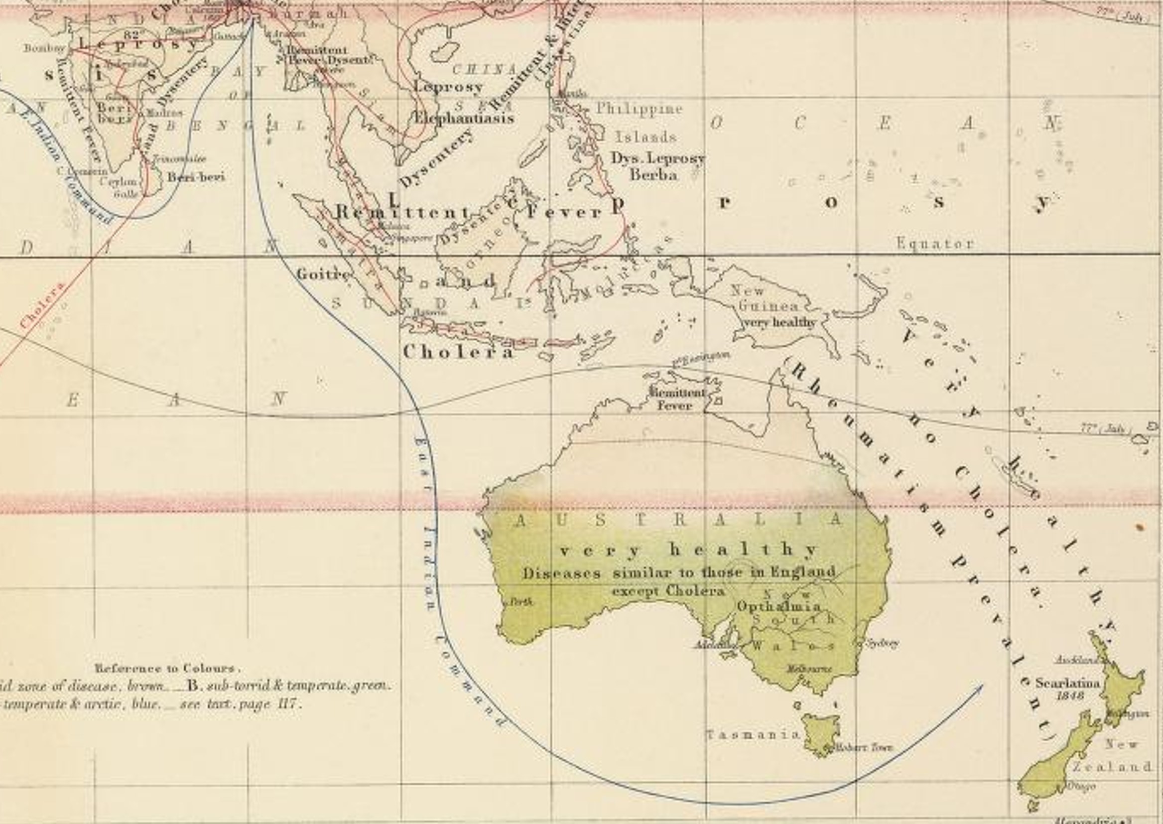
Isolationism kept New Zealand and Australia from experiencing the wrath of some of the worst of the Western European diseases typical of heavily populated settings. Plague especially, usually associated with crowding, is absent.
Decipher the cultural meaning of the following label placed on this map: “Diseases similar to those in England except Cholera”. What diseases in England? Why is cholera an exception? How do these observations tie into the Western European social interpretation and use of Australia? “Very Healthy” is written over adjacent regions three times–what are these healthy regions? Which others are probably the same?
What role die the “East Indian Command” line play? and how does this relate to disease type or spread and any epidemiological concerns that led Johnston to produce this map?
.
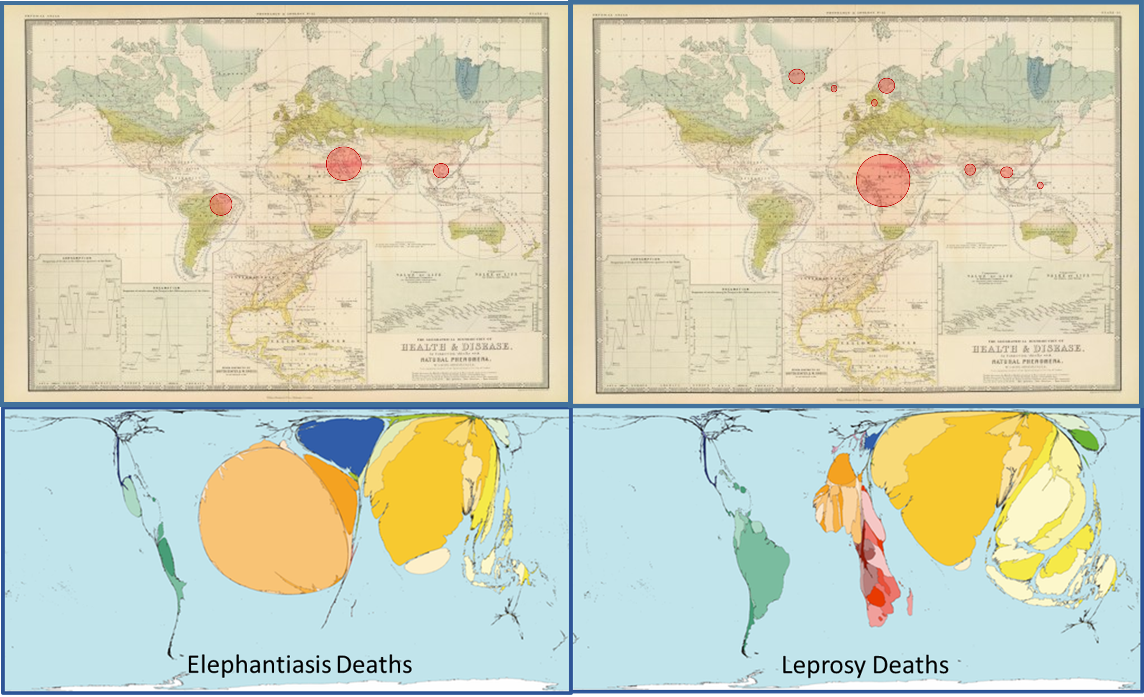
Two Forms of Global Disease Mapping, 150 Years Apart.
Johnston’s map is placed next to (0ver) maps produced depicting the 2002 WHO statistics for world disease patterns. The red circles on Johnston’s map are based on estimated numbers of people at risk or afflicted in the regions which Johnston labeled are linked to Elephantiasis, or Leprosy. The lower maps are graphical images depicting the distributions of these same disease today. The source for the lower maps is . . .
(Notice: a page is being developed to review and compare the great disease maps produced and displayed by Worldmapper.org.)
