Note: As of May 2013, I have a sister site for the NATIONAL POPULATION HEALTH GRID MAPPING PROJECT. Though not as detailed as these pages, it is standalone that reads a lot easier and is easier to navigate. LINK
.
Measuring Effect before Cause,
the Grounded Theory Approach to evaluating Population Health 3D Mapping Results to produce better Preventive Care Programs
The 3D National Population Health Grid Mapping Technique that I developed has some interesting applications.
There are several major ways to interpret this data.
- The first is to analyze true numbers N, with the assumption that N is directly related to service needs and cost. The goal of this approach is to meet health care needs. It doesn’t matter so much how and why they are needed, only where they are needed and how much.
- The second is to take relative age-gender data into account in order to see if one place has a greater probability of having this diagnosis, action, metric, etc. than others. We do this for developing preventive care programs, hoping to find the cause for the problem and then use this information to prevent it from recurring.
- The third is to hybridize these results, so as to merge cost and numbers with high rates of sickness and the need for prevention in the form of intervention.
Examples of Use
The following are examples of how this method of spatial analysis may be applied for utilization, pragmatic purposes when evaluating cost of care concerns. This methodology has a different goal that something like a Markov Chain model of events and more events, co-events, and confounders. This methodology is utilitarian down to the small area, small population level. Within an urban setting, this means you know which neighborhoods are most costly, most problematic, the least served by a given health care system.
- Example 1. As an example, if we look at numbers of people that a particular company serves, the spatial distribution of those who have diabetes, and tie that information together with average needs and costs for insulin and insulin-like products, we end up with a map that tells us where the highest cost is being generated for insulin-dependent diabetes. We can in turn take this spatial data, and do a product line analysis of where the highest cost substitutes are being sold and distributed, and if an areal analysis is generated regarding poverty stricken regions as well, we can produce a complex overlay of these six items (diabetes-n adjusted for population ages, # of those requiring insulin-n or percent, average cost per patient for those on insulin, insulin type and cost ranges, mapped over an areal map of income level or poverty regions). If we chose our ranking methods effectively, we can define a single value to each region assessing for risk or unhealthiness, and know where to intervene, and at what point to intervene (diabetes rates? insulin products promotion and cost? available diabetes care services? charges for these services?) based on each of the numbers applied to the final risk assessment equation.
- Example 2. We can do this complex calculation because we designed our data using the grid method. The grid method allows you to adjust and normalize your data so it can be directly correlated. One of the most common errors seen in analyses of this type is assigning risks using additions, rather than multiplication. In remote sensing, if you want to really see the differences between neighboring cells, you multiply your measurements. Taking that one step further, you can segment these differences into specific ranges based on logBase=n (usually 10 is used, but I found for populations a range of 4 to 6 provides better display effects when money is involved). Log is the best way to measure health related costs due to the way cost-payments work in a claims-claimant-insurer copay process (see my population pyramid work on this). This way, your log range n = 3-3.9 stands out as distinctly different from 2-2.9 or 4-4.9, which for log10 is like comparing average costs in the 100s’s to distribution of costs in the 10s to 100, or 10,000s (the most expensive people).
- Example 3. Applying a log5 to this methodology, you’d be comparing log5^3.xx to its neighboring values log5^2.xx and 5^4.xx, or the $125-624 cost range to members within the $25-124 range and $625-3125 range. This could be applied to a test for average monthly or quarterly costs for visits, screening and testing for a disease such as asthma, epilepsy, diabetes, etc., to determine where the highest costs for total care exist, measured discretely for each 25×25 mile grid cell area.
The above kinds of analyses can be done by combining 3D grid modeling with rasterized point-line epidemiological data. Applications for this methodology are limitless. In contrast, some methods being implemented right now engage in too much manipulation of data, engaging and already a costly process in evaluating and even more costly problem that exists within health care, magnifying the long term effects of any financial mismanagement that exists. (See Bogus Statistics in Health Care article at Kongstvedt’s website.)
We can do the same three approaches to any metric evaluated for public health, including costs. We can do this for total cost, average cost, cost per unit of time or product, numbers of people per $1000 unit supplied or provided by a financier, etc. etc. etc.
A grounded theory is recommended for this analysis due to its logic. It pretty much resembles the ecological theory approach to studying disease and health in general. But it allows for more of an open approach to applying this methodology. It begins the project with no presumed outcomes, although the method outwardly accepts the inclusion of researcher’s bias in some of its processes. This counter’s the researcher’s bias that exists within standard analytical processes, the researcher bias existing within that system are the assumptions of accuracy and validity in methodology and applications, two assumptions that are true for a standard classical systems, but not when Occam’s Razor effect or the Double Paradigm effect (light is a wave, vs. light is a particle) is taken into account. We accept a method and its results because we are used to seeing it, and know that it is proper to ignore that p-score telling us we cannot take the results seriously, and yet we still do, and publish these results no less.
The nature of mapping statistics is in itself a right-hemispheric approach to thing. As one well known writings contest, one can lie with maps. So the best solution to avoid this claim of “fabrication” is to simply demonstrate the basics, and the simple ways of manipulating and demonstrating the final data. The value of the map is it tells us more, and provides more accurate insights into events than words and a table. It demonstrates a value of right-brain versus left-brain thinking.
In theory, we follow through with this philosophy therefore by utilizing a more eidetic approach to mapping diseases with 3D mapping, using the map to design our research questions, basing all of this upon our understanding of the world or knowledge base. Anyone who contests this philosophy in effect is questioning any sort of values-related, open-minded approach to engaging in the Evidence-based health care approach, and by the way, he/she by doing this is also indicating his/her lack of adequate background training, skills and ability to diverse in his/her approach to studying health in general. Such limitations do not have much value in a field of research in need of change and always in the process of undergoing systems related improvements.
This national population grid mapping technique is valuable because it represents a combined qualitative-quantitative method for evaluating disease patterns. It is even more valuable because its takes the routine methods of presenting data, in left-hemispheric chart and table form, and puts these results for 300 pages of information onto one succinct map taking up just 1/6th to 1/4th of a page (1/2 page if you really need to view the details in a much larger image).
So, this method is best used as part of this preliminary phase of my work by using a grounded theory approach to developing and posing any subsequent research questions. We let the maps define the results that are uncovered, trying to group these results in some logical fashion to determine how space and place define how diseases exist and behave. As I have already illustrated elsewhere, disease is sometimes and human ecological phenomenon and sometimes a natural ecological phenomenon. For the former, diffusion is very much defined by populations. For the latter, nature defines it for the most part, with people by nature needing to be present in order for it to become the disease or condition that we define it to be, by using ICDs, V- and E-codes, etc..
…
Typically we are used to engaging in analyses by starting with a basic set of research questions. This very Aristotelian way of engaging in research is a product of not having the big picture in mind when we begin. Research questions serve to define a path for the methods we choose to engage in whenever we wish to learn something new, to carry out a project, but not take so long because we are anxious to find out the answer to our brilliant set of theoretical research questions.
When you have an entire dataset to work with, and when time no longer is a factor in determining the answer to your big questions, you first receive the satisfaction of finding the answers to your questions right away, point blank, with minimal need of redefining your methods, hoping to reach the end of that long road you are taking towards the “Truths” in less time than expected. The suddenly, reverse psychology tends to take palce once we begin to review our outcomes. We immediately turn to a desire to ask new questions, by seeing what kinds of questions can be answered by this new approach that can be taken. We want to know if the answers that are now being inferred to us by our results, answers to questions we didn’t pose when we first decided to engage in such a research process, can be taken seriously.
Grounded theory is the approach we use to delve into this exploratory research methodology. What steps must be taken to engage in some sort of logistical review of our outcomes has to make sense, and when we look at the objects that bring up such questions, like the result of a survey or focus group set of notes, or in this case a large number of disease and medical condition/claim maps, we have to develop some conclusions that lead us on to our next discoveries and desires to make change for the better. This is exactly what producing a large collection or series of 3D maps on a set of observations does with regard to assigning value to such projects.
The outcomes of this work could be geared towards similar questions focused on money and finances, the root of all of big businesses out there trying to determine the best way to capitalize on their mines of business intelligence or personal information. Just how savvy businesses are with this goal is made clear by the fact that attempts to engage in this process have to date not displayed any signs of value and worth. This is in part because we, the common people, are usually not the few investors hoping to see some sort of success from a company we place so much of our savings into. The common person is not being satisfied with this piece of the corporate logic that is out there, and at times it even makes people appear at times to be more like an animal in a cage when it comes to engaging in the best use of your time and money. People spend time doing lots of things, some of which make them very unhealthy or prone to becoming very unhealthy, and meanwhile, the places where benefits arise from this increasing unhealthiness are seen in the business sector, where money is spent trying to deal with the problems in health as they happen.
Much of this becomes better understood by seeing how and in what ways people are becoming unhealthy. Just where are most of these costly illnesses taking place? Where are they costing us the most per person and why? Where is both the number and severity of sicknesses taking their tolls on the costs for living, staying alive and getting the best care that you need?
By reviewing the population as a whole–the Big Data–in an analytical way–known as Big Analyses–you get the answers to questions that businesses today could answer, but decide not to spend the much needed time doing.
Again, I sound very anti-establishment and too critical to some if not many. But I suspect that since 80-90% of businesses are so badly behind in catching up with the potential means and values of looking at population health in a preventive health way, that those who are “anti-establishment”, per se, are actually ahead of the others who are too far behind to come up with constructive way for dealing with this issue.
So, just to take this path this logic is taking one step further, the following are ways in which a grounded theory approach can be used to pose important public health questions, pretty much answered by this method of 3D mapping that I am promoting.
Some preliminary statements have to be made before developing the rest of this section.
First, the original method used for this analysis meets my 16.7% rule, which states that when a population represents more than 1/6th of the whole, that it is more than likely going to represent most of the trend of the rest of the population. I say for the most part because statistically, it is possible that this 1/6th of N is the worst 1/6th I could have received randomly, but such a probability is so low, that the odds are in my favor in terms of viewing these results as indicative of the country as a whole.
Second, this N really represents closet to 1/5th or 1/4th, so I have much less to worry about regarding this fallacy related Type 2 error issue.
Third, the most likely opportunity to disprove my numbers requires a doubling of N, and since N is already very high, this means that half of the total N has to be looked at and the new results compared with the previous results to see if and where differences do in fact exist.
Fourth, with hundred to thousands of metrics evaluated this way, it is likely some are going to have results that change if the test population N is doubled. Those changed the most are probably going to be those related to the rarest of events or outcomes evaluated.
Fifth, metrics related to exceptionally large numbers of people are most likely very solid in any suggestions that can be made by their outcomes.
Sixth, this is a measure that is also time sensitive, meaning diagnosis or medical metric x evaluated for this point of time could be very different from the exact same metric measured for 5 or 10 years from now. Medical conditions and disease states change and evolve at their own rates, which are not at all evaluated or taken into consideration when using these methods.
Seventh, numbers are very different when compared with fractions, ratios and prevalences. For the rarest of conditions or metrics, numbers may have more meaning that percentages and the like. For very common metrics, such as a diabetes or obesity rate, prevalences are important because of the variables that influence their outcomes.
Eight, perhaps the best way to spatially evaluate disease and cost is by grid cell, adjusted for population size and distributions, and then recalculated in relation to a true spatial distribution map using point data to define where certain values truly reside. This means that a hybridization of the grid cell and point maps are required to produce a slightly more accurate method of determining overall spatial distribution. In the long run, based on the errors assignable to a grid mapping technique, since the cells are relatively speaking fairly small in size, error may make it impossible to produce much change if such a hybridization of these results were to be carried out. However, this same problem exists for the adjustments made to other raster images such as Landsat images, in order to provide the best product in the end. So, for presentation purposes, the very small area correction steps may not at all need to be taken, but based on time and value of presentation, may still need to be carried out when small area, such as town or city level data is being used and presented, using this method of public health grid mapping.
Finally, the information presented here and suggestions made are only guesswork for the most part. Consider them to be somewhat subjective in nature, unless something really obvious stands out as a valid line of reasoning. There are two human behaviors linked to this kind of work–the 100th Monkey Effect is anticipated by my producing this page, and Occam’s Razor is expected to be close by and in my hand, meaning some of these results could be completely wrong due to the minutia of life. The best way to interpret any set of results is to interpret the true values–the n’s and their place–not the percentages, rates, frequencies, ratios, or similar adjusted values produced when compared with their neighbors, etc. etc. etc.
……………………………………………………………………………………………………………………………………………..
The Analytical Process.
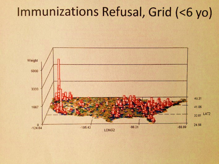
The above map is a fairly basic example of an object that has to be reviewed as part of the research process at hand. No research questions are as of yet posed. So what does this map tell us or suggest the need for further questions about?
There are 4 clusters noted–the large one along the eastern shore, two along the western shore, and a small one on the left half of the interior of this continent. There are also several even smaller groups scattered about the western half mostly; these sites beg for more complete reviews, but more than likely are simply a result of population density.
.
.
.
.
.
.
.

Spatial Distribution of Job Applications for marketing this approach (pharma, medical, consumer-economics and other big data and IT/spatial data industries, January-February 2013. Source) Why did I do this? See related job-seekers’ article.
