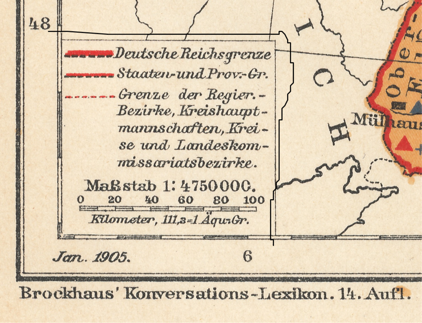
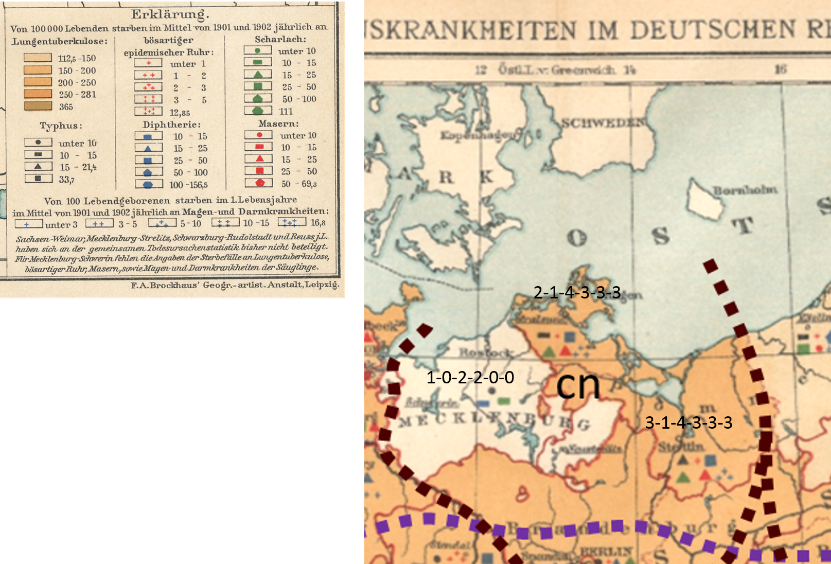
F.A. Brockhaus’ Geogr.-artist. Anstalt, Leipzig. Verbreitung Eininger Wichtigen Infektionskrankheiten Im Deutschen Reiche in Den Jahren 1901 und 1902. Brockhaus’ Konversations-Lexicon. 14. Aufl. Jan. 1905.
PART 1
Introduction
.
This review is in several parts. This first part sets the stage for the methodology to be applied for the spatial analysis. The second part, Part 2, will demonstrate its application.
This was first developed as an exercise for a GIS lab, now more than 10 years ago. My method was illustrated and it was up to students to repeat it, review it, and determine what other methods could be used to “regionalize” the results of a map like this. This method of analyzing data and space is akin to modern demographics and political mapping. How we judge an area at times is very personal and subjective in nature. Most demographic maps engage in this sort of “information sharing” related to elections, the definition of needs, and such, or what some call gerrymandering.
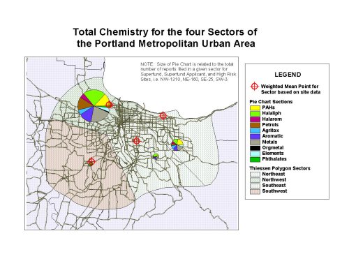
I use this method to compare regions, especially urban sectors with different social and class systems. It provides a nice way to correlate SES to public health matters.
In the following map for example, the propensity of chemicals spills and toxicity in the northwestern sector (largest pie chart) demonstrates a socioeconomic status (SES) relationship between likelihood for exposure and residing in low income areas (also this sector). To develop this map, a centroid defining the sum of the sited in this part of the city was developed, and then the other parts of the city assign centroids for their release sites. Four centroids total were defined, and the urban area polygon produced (the smooth, curved outer margin); an extension was then run in ArcView (yes, that long ago) to define the theissen polygons for this urban setting, based on the four pollution-related centroids.
The Map and Basic Methodology
<>
The following three sections appear on this page for Part 1.
- Step 1 – Review
- Step 2- Segmentation
- Step 3 – Analyses and Spatial Data Definition and Labeling (Examples of)
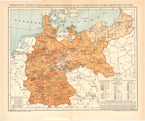
For this part of the study, regions are defined in the medical map evaluated, roughly by area and nearest neighbor.
Looking at their spatial relationships, points that are further away from each other are assumed to have human defined barriers (distance of travel, differences between local cultures). Political boundaries are taken into account as well. The assignment of boundaries took several steps, defined later on this page. A 3×3 sectioning ideology was used, although only 8 of the 9 sections or areas were produced due to the shape of the region.
Notice that, in spite of its visually pleasing method of presentation, this is a hard map to read or interpret. This provides with better insights into its use and value back when it was first produced.
It ends up there are several important spatial details it presents us with, which are not at all apparent with the original image. Moreover, if you were an outsider reviewing this map for government related reason, such as a transaction involving an economic plan in the works or some governmental work, this map doesn’t provide us with the information we need about regional behaviors and differences. We can look at each city or developed setting, one at a time and get a better idea of the way in which health and people is distributed here, but to develop and then answer some more specific questions using this map would be a tedious to say the least.
.

.
Step 1 – Review
>
Fortunately, the patterns of presentation are somewhat helpful. After a few moments of viewing and memorizing these you can get a feel for what the symbols mean and scan the map for anything new that could be obtained with that knowledge.
.

.
.
If we start by looking at a small area, we immediately see why it is going to be hard to summarize the results of each of these data points on the map as a whole. The following section of East and West Prussia display 5 points in the lighter area. Going back and forth with the legend for the meanings of these points, what can be deduced with the above map that is of use, if anything at all?
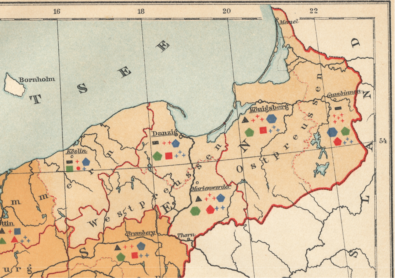
Mostly what we find are high versus low count or prevalence areas. The basic polygon feature is constant.
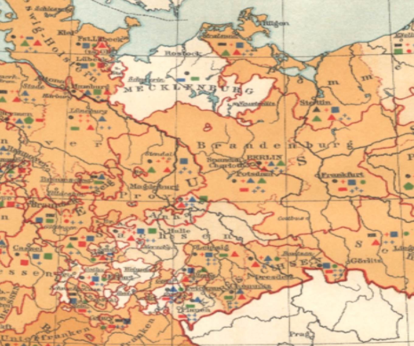
This above example is simple. Now try the same using the next example of a small area. Count the number of hamlet, village or town points, and the try to determine if any regional attributes stand out for neighboring places.
.

One way of analyzing the above is to determine where all the points are, then scan them sequentially for each of the 6 metrics, one metric at a time, i.e begin by scanning all the red squares, etc. and then the blue squares etc., and then the black dots or polygons, and finally the blue + marks followed by green.
.
.

.

.

.
I decided that a good way to evaluate this map was to divide it into regions and the compare those regions to each other by applying some sort of rank-order statistical method. To define these regions, I tried searching for areal breaks between data, and searched for anything that popped out at me as regional like in behavior. This very subjective approach people often condemn in true quantitative analysis techniques. But due to the statistical model I will be using to analyze this information, which is somewhat qualitative in nature, a certain amount of subjectivity is involved here.
.
Step 2 – Segmentation
.
The primary observation I made came by dividing this area into subregions, is as follows:
.

Lateral or Latitudinal Dividers for Grid Development
.
The Lateral dividers produce a north, central and south region. There are probably mild-climatic impacts that differen between these regions, but not due mostly to latitudes. The maritime nature of the northmost sector is why a difference exists. There is also of course the greatest probability of disease in-migration from places afar in this sector. The topography defines the southernmost portion as inland and with montane and combined vegetation-population defined regional differences.
.

North – South lines used to define sectors.
.
The north-south divides can be in several forms. The middle sector has several smaller areas that may or may not be excluded from a major statistical study of the region. The application of this option are very helpful in the first stages of this work, which is why I do it. More importantly, it works at small numbers qualitative research levels as well as large numbers qualitative research levels, and is a very valuable approach to performing heteroscedasticity research–determining the ranges of differences within sections/areas, between two opposing or distant regions, when the concern is there is a continuous change taking place between the two over space.
Like the Theissen polygon work I did on the Portland, Oregon area about 15 years ago, this method is very much subjective in nature (I created it for my work due to the need.). This time I let the map define the outer borders (for Portland I produced a smooth ovoid shape encompassing the pre-defined and very erratic urban boundaries). The irregularity of the region with the data still allowed for some segmentation to be defined. I defined these based solely on the borders and by reviewing the points for the data and towns/cities. Equal space rather than equal numbers (numbers of towns/cities, numbers of people) was approached.
.

.
One major philosophy I learned to apply to continuous variables over space studies, is that since GIS works on spatial information, one can include in the initial assumption one of a continuous spatial process, and then try to prove or disprove that hypothesis (i.e. these really aren’t continuous they are discrete, but with spatial analysis hypotheses as the crux of the metrics, we assume or work on the diffusion process as continuous variable).
The next assumption then becomes: if the data is continuous, and equally changing across space from left to right, the middle area is equally or fairly similar to the areas east and west of it, than the opposing areas (east vs. west) are to each other.
So with this in mind, we throw out the middle sector and compare the two ends. We repeat this for north versus south as well if we want. Then, the middle area is pulled back into the analysis and compared with its neighbors. Each of the approaches gives us regional data to help develop a better understanding of how each of the areas differ from the rest.
I apply this to numerous other variables as well, such as demographics and age-gender-income, occupation types by pseudo-SIC groups, etc.
The point here is to look at differences between opposing ends and then neighbors. Simple 2×2 is all that’s needed for this approach, and for some metrics homogenous and heteroscedasticity reviews. Classes or types of sections/sectors can be defined as well. In the above, nw vs nw areas have distinct cultural differences. The cc, ne and sw areas are politically different from each other. Some of the disease count data demonstrate these areal differences.
To continue this way of analyzing the data, horizontal and vertical line boundaries are overlain, resulting in the 8-section/area squares map below. These regions are then reviewed for their point data, comparing opposing areas as just mentioned. The areas for this study were assigned names (two letter codes), as in the following map.

Each point is assigned a unique point identifier
.
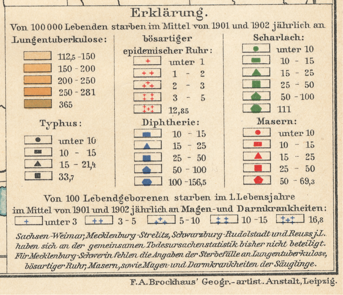
Next, each section was evaluated for its points and those points assigned ranking values for the symbol used to represent it.
Most symbols used to quantify the point data had 5 ranks, one 4 and the other 6. The area underlying the points pertained to the Phthisis or consumptions statistics, and this color pattern also ranked.
An alternative to using rank scoring is assigning the median value for each rank, such as a “5-10” would be scored as 7.5, “25-50” as 37.5, “200+” as 200 or 201, and “under 10” as 5, etc.
This value was recorded as well, and can be used to double check the methodology to be employed with simple rank-order evaluations.
<>
Step 3. Examples of Scoring or Ranking
<>
Each point is now assigned a series of scores, as ranked values, for the risk of disease as defined by incidence counts.
.

.

.
.

.
It ends up the southern most sections of this map are scoring very differently than the more northern two rows or study areas.
This could suggest a different public health program underway. Before investigating that possibility however, I want to see if the bottom regions are scoring different than the rest in way that is statistically significant.
The easiest way to do this is through simple score-ranking analytic methods, but to be fast and easy about this, I can just use a simple 2×2 analysis to see if one region is different from all the rest as a whole.
.
.
.

Leave a comment