March 2014
Monthly Archive
March 25, 2014
Posted by Brian Altonen, MPH, MS under Uncategorized
Comments Off on The Animation of Medical GIS
See on Scoop.it – Medical GIS Guide
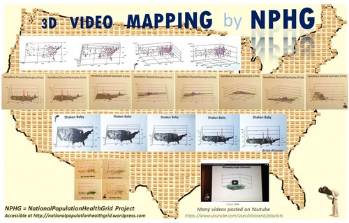
National and regional NPHG Video mapping. NPHG depictions of everything from people to cost and utilization in managed care may be presented as national, regional or close up images. The uses for these techniques are diverse and are applicable to the insurance, healthcare, health economics, and PBM industries.
Brian Altonen‘s insight:
During the late 1990s (ca. 1997), a number of west coast reviews of GIS included research teams devoted to animated mapping. Within a year, a leader in this field was Sonoma College in California, where GIS was successfully used to map out crime in an animated fashion (Lodha and Verma 1999). The same year, a University of Georgia student completed his assessment of the same for evaluating densely populated urban settings (Beavers 1999). In 2003, Bidoshi (2003) completed his dissertation on the virtual visualization of mapped data at Ohio State University. By 2009, Yale University students at G-Econ created a 3D global mapping program based on spherical geometric formulas.
The use of three-dimensional GIS for tracking population features is now more than 15 years of age. Its most common uses have been mapping crime and demographic features. Recent works by Alfarhan (2010), Kim (2012), and Zhang (2012) suggest that new cloud and EMR technology might pave the way for the development of more successful use of this Medical GIS technology.
This is the purpose of the NationalPopulationHealthGrid (NPHG) program I developed. NPHG algorithms produce maps on population health that are much faster to run than the traditional methods already in place for developing these maps. NPHG is designed for use in weekly and daily reporting on hundreds to thousands of population health metrics.
References
Alfarhan, M. S. (2010). Geosciences information system (GeoIS): A geospatial paradigm for real and virtual three-dimensional worlds. (Order No. 3414888, The University of Texas at Dallas). ProQuest Dissertations and Theses, , 135. Retrieved from http://search.proquest.com.proxy1.ncu.edu/docview/734622078?accountid=28180. (734622078).
Beavers, R. M. (1999). An evaluation of cartographic visualization’s utility in the spatial analysis of urban social dynamics. (Order No. 3022089, University of Georgia). ProQuest Dissertations and Theses, , 164-164 p. Retrieved from http://search.proquest.com.proxy1.ncu.edu/docview/304516996?accountid=28180. (304516996).
Bidoshi, K. (2003). Virtual reality visualization for maps of the future. (Order No. 3088842, The Ohio State University). ProQuest Dissertations and Theses, , 186-186 p. Retrieved from http://search.proquest.com.proxy1.ncu.edu/docview/305319198?accountid=28180. (305319198).
Kim, I. H. (2012). Developing high performance GIS simulation models on geospatial cyberinfrastructure: a case study of population change models with grid computing and cloud computing technologies. (Order No. 3545065, University of California, Santa Barbara). ProQuest Dissertations and Theses, 250. Retrieved from http://search.proquest.com.proxy1.ncu.edu/docview/1237250056?accountid=28180. (1237250056).
Lodha, Suresh K. and Verma, Arvind . 1999. "Animations of Crime Maps Using Virtual Reality Modeling Language." Western Criminology Review 1 (2). [Online]. Available: http://wcr.sonoma.edu/v1n2/lodha.html.
Nordhaus W. (2009). Geographically based Economic data (G-Econ), Yale University. Accessed at http://gecon.yale.edu/
Nordhaus W. (2009). G-Econ Project, Yale University, September 2009. http://gecon.yale.edu/g-econ-project-yale-university-september-2009.
Zhang, C. (2012). Interfaces and visual analytics for visualizing spatio-temporal data with micromaps. (Order No. 3504130, George Mason University). ProQuest Dissertations and Theses, , 156. Retrieved from http://search.proquest.com.proxy1.ncu.edu/docview/1011001290?accountid=28180. (1011001290).
See on wcr.sonoma.edu
March 22, 2014
Posted by Brian Altonen, MPH, MS under Uncategorized
Comments Off on Omsk Fever – YouTube
See on Scoop.it – Episurveillance
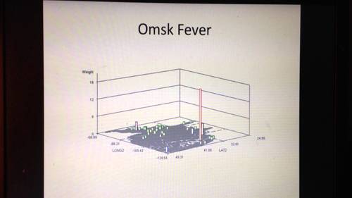
http://youtu.be/nk2HMqICMd8 IMG 0724 OmskFever
Brian Altonen‘s insight:
In 2006, I was asked by two companies in Atlanta, Georgia to develop a model for surveilling in-migrating disease patterns.
.
This is why I re-developed my algorithm used to map cholera outbreaks back in the late 1990s.
.
I then tested this technique on dozens of very unusual foreign-born diseases migrating into this country and resulting in cases being documented in a national EMR database.
.
After producing more than one hundred maps of international disease patterns, I merged these into disease patterns for combinations of ICDs linked to certain parts of the world. By merging so many ICDs together, patterns emerged enabling you to tell if diseases are spread across land based international borders with the U.S., by air-water travel Pacific Rim routes, or via traditional commercial air-water routes involving the East Coast, Saint Lawrence and the Great Lakes, or the Mississippi River.
.
The Omsk Hemorrhagic Fever, named for its first descriptions published for Omsk, U.S.S.R. in the 1940s and 1950s, is an example of a disease pattern that can take either the east coast or west coast route.
.
Contaminated water, ticks and an animal host like the muskrat are important natural ecological requirements for its distribution. Human population density and cultural demographic patterns define its human ecological distribution patterns.
.
This video map depicts numerous isolated cases in EMRs which are probably the result of in-migrating people with a history of exposure or need for "rule-outs" for this diagnosis. (Rule-outs typically include the ICD for a specific case the lab is asked to remove from a list of possible diagnoses, and so these appear in the EMRs, but as single hits.)
.
The loner peak in the Southwestern U.S. is an exceptionally high number of cases, suggesting (but not at all proving): i) possible Pacific Rim in-migration behavior and therefore ecological origin , and ii) a probable rule out of human ecology and population density as the sole explanations for this particular outbreak.
.
One role of the spatial epidemiologist in disease surveillance is to locate potential niduses, so they can be ruled out where appropriate or added to local surveillance programs.
See on www.youtube.com
March 20, 2014
Posted by Brian Altonen, MPH, MS under Uncategorized
Comments Off on Retracted autism study an ‘elaborate fraud,’ British journal finds
See on Scoop.it – National Population Health Grid
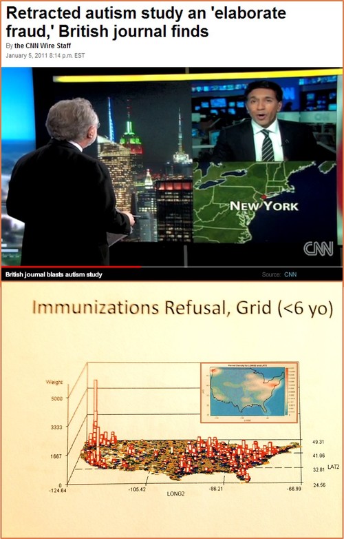
A now-retracted British study that linked autism to childhood vaccines was an “elaborate fraud” that has done long-lasting damage to public health, a leading medical publication reported Wednesday.
Brian Altonen‘s insight:
How did the refusal to vaccinate children get so out of hand in the U.S.?
.
This whole problem began when an article was published in 1998 that provided falsified results to support its claim.
.
The Jan. 5, 2011 news story and related video describing this event are at: http://www.cnn.com/2011/HEALTH/01/05/autism.vaccines/
.
According to a krigged analysis of the distribution of these behaviors, the two niduses for this social pattern are the tristate area near Manhattan (high density), and the Pacific Northwest (statistically significant z-axis values).
.
A third nidus for this human behavior is surfacing in southern California.
.
A number of secondary sites defining potential entry points are in the Great Lakes region, in Florida, and in the southern (Houston) Texas area.
See on edition.cnn.com
March 18, 2014
Posted by Brian Altonen, MPH, MS under Uncategorized
Comments Off on Mumps Outbreak at Ohio State Widens
See on Scoop.it – Episurveillance

U.S. vaccination refusals demonstrate peaks in the Pacific Northwest and the region just north of New York City.
Brian Altonen‘s insight:
March 17th 2014, 7:12 pm
.
Mumps Outbreak at Ohio State Widens
.
COLUMBUS, Ohio — Health officials say 23 cases of mumps are confirmed in an outbreak at Ohio State University. Eighteen students and a staff member are among those infected.
University and public health officials warned Ohio State students, faculty and staff to take precautions to keep themselves healthy as they headed back to class Monday after spring break.
A Columbus Public Health spokesman says authorities are mapping cases to determine how people became infected and any links between them. He says three people have been hospitalized for at least one day.
The confirmed cases involve 11 women and 12 men. They range in age from 18 to 48.
The spokesman says they include a relative of a student and three people who don’t study or work at Ohio State but have links to the university community.
.
— The Associated Press
See video at http://www.10tv.com/content/sections/video/index.html?ooid=BpeGYxbDpBhyQajV5Omm4f9Rif2uF-VW&cmpid=share
See on www.nbcnews.com
March 18, 2014
Posted by Brian Altonen, MPH, MS under Uncategorized
Comments Off on Has polio-like virus spread outside California? | wtsp.com
See on Scoop.it – Episurveillance

Brian Altonen‘s insight:
Take your pick . . .
.
Three interpretations of a new disease pattern, be it emerging, re-emerging, neither, or because we simply do not know:
“These five new cases highlight the possibility of an emerging infectious polio-like syndrome in California,” author Emanuelle Waubant, MD at UCSF.
.
“We would like to stress that this syndrome appears to be very, very rare . . .Any time a parent sees symptoms of paralysis in a child, the child should be seen by a doctor right away.” Stanford’s Keith Van Haren, MD
.
“At this time, CDC does not think the situation in California is a cause for public concern,” Jamila H. Jones, CDC public health educator, to the AP.
Three newer stories on this growing concern:
Reuters news: http://rt.com/usa/polio-paralysis-california-children-692/
Boston globe: https://www.bostonglobe.com/lifestyle/health-wellness/2014/03/03/how-worried-should-about-new-polio-like-virus/D44YZgt3mKHSLgQLdvXYnN/story.html
Stanford: http://med.stanford.edu/ism/2014/march/polio-0310.html
See on archive.wtsp.com
March 15, 2014
Posted by Brian Altonen, MPH, MS under Uncategorized
Comments Off on Small Area Analysis and Surveillance at its Best!
See on Scoop.it – National Population Health Grid
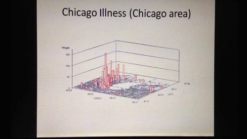
http://youtu.be/C6UPqBSvudc IMG 1160 LongBlastomycosis ChicagoIllness
Brian Altonen‘s insight:
My "Blastomycosis, Chicago Illness" (4 min video) on YouTube was an early accomplishment using the 3D mapping technique developed more than a decade ago. Several years ago, I produced this teaching video to describe the different perspectives this mapping technique give you, for different distances from the earth’s surface and different levels of resolution. These results were not produced using a GIS.
The purpose here is to demonstrate that this method for surveillance can be easily applied to visualizing results, and has valuable applicability to use in large and small area surveillance and public health programs. Due to the nature of the algorithm, special reports can be be run by the dozens to hundreds of maps depicting spatial health measures per day. On the average, to produce my videos using this technique, I can produce more than 12,000 images per day.
If your goal is to determine specific cause and effect, applying your research question to dozens or hundreds of potential hypotheses, this is the method to use. It can be used to depict any size research area. You can use it to better target intervention activities, more precisely plan your health care programs and activities, or produce a clear presentation of your findings and results for a conference attended to by professionals or even local community health specialists.
Any public and community health issue, any population measure and any health economic metric can be mapped using this technique.
See on www.youtube.com
March 12, 2014
Posted by Brian Altonen, MPH, MS under Uncategorized
Comments Off on National Suicide Rates by Age Group and by Region
See on Scoop.it – Medical GIS Guide

Everything you need to know, or want to know, about suicide, age, gender, and regions of the United States
Brian Altonen‘s insight:
One of my first age – specific endeavors into exploring the national suicide activities and patterns was defining how to break these claims down into the right age groups.
.
Knowing that the Pacific Northwest had its own unique patterns involving runaways, children no longer attending school, and those living on the streets, my focus was on young parented children followed by teens, and then teens who were older, and had more than we wanted living on the streets.
Next, I experimented with this data modeling technique for young, middle age, and older adults, and then people of retirement age or at an age well into the retirement and/or assisted living years.
.
Finally, I focused on the questions,
.
–where in the country do teens, and older and younger kids try to commit suicide–was it in fact the Pacific Northwest due to its unusually high number of street kids support services?
.
and which age group did Niagara Falls fit into this scenario, commonly referred to as Lovers’ Leap impact?
These and other questions were reviewed, and my first attempts to apply 3D rotating imagery mathematics to my U.S. spatial mapping algorithms was developed.
See on brianaltonenmph.files.wordpress.com
March 12, 2014
Posted by Brian Altonen, MPH, MS under Uncategorized
Comments Off on Population Health and Meaningful Use measures
See on Scoop.it – Episurveillance
Why focus on mapping events by age and gender in one year brackets rather than five year brackets? The innovative nature of such work stems from how much more detail it provides quantifying differences between two different groups by one year periods. This way of analyzing population tells you exactly where differences in age gender distribution are statistically significant. Which diagnosis presented here does the woman best represent? The traditional broad age group methods for past analyses worked well with researching in epidemiology, but not for tending to your managed care program and engaging in Meaningful Use programs.
Brian Altonen‘s insight:
The only way we can fully understand an ICD, V-code, E-Code, or any other statistic analyzed, is by engaging in detailed reviews and presentations of our data. The standard way of presenting age-related health measures in 5 year age brackets is outdated for most Big Data programs focused of managed care populations. There is a difference between populations made completely of people in one age band versus two populations with two age bands at opposing ends of the age and gender spectrum, but with the same average age result.
.
Even more importantly, the causes for certain public health concerns may be completely different for two similar groups are just a few years apart in terms of average age and gender. Why risk spending all of your money on an intervention program or task that wasn’t designed with specific target populations in mind?
.
In managed care, true age, gender, ethicity, socioeconomic status and place are important. The only way to be successful in managed care special studies (QIAs and PIPs) is to focus on these attributes when interpreting your population and defining preventive care goals.
.
The best way to meet your Meaningful Use [MU] requirements in 2014 is to take this more detailed approach to reviewing your population. You need to know your members down to their smallest communities and cultural, socioeconomic subgroups, and the bulk of these MU processes should be automated.
.
See on www.pinterest.com
March 12, 2014
Posted by Brian Altonen, MPH, MS under Uncategorized
Comments Off on Big Data Insights – Smoking during Child-bearing Years
See on Scoop.it – National Population Health Grid
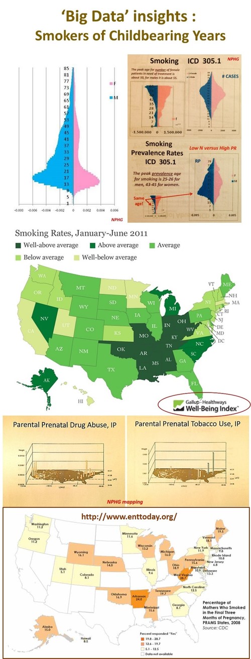
Insights into the national studies on smoking rates and exposure risks. Including a review of the findings of “Sensorineural Hearing Loss Linked to In-Utero Second-Hand Smoke Exposure”, an article published in Archives Otolaryngology Head & Neck Surg. (2011;137:655-662) and summarized on EntToday — October 2013. Last Figure contained in this article is “Percentage of Mothers Who Smoked in the Final Three Months of Pregnancy, PRAMS States, 2008.” Source: CDC..
Brian Altonen‘s insight:
There has been a substantial change in smoking rates over the past few decades, but two public health issues still deserve our attention. The first is the racial and gender discrepancies in smoking rates. Regarding race or ethnicity, young adult African Americans have higher rates of smoking into their 30’s than caucasians, who appear to reach a peak in their mid 20s. When we compare prevalence rates for one year age bands between genders for either group, it is not unusual to find the number of female smokers documented in EMRs to continue to increase in number until they reach their midlife years (around 45), whereas male smokers peak about 15 to 20 years earlier.
.
The second major finding with smoking still in need of aggressive education and prevention programs are the smoking habits of pregnant women. The two maps of drug abuse and tobacco use show the peak areas in this country, based upon a spatial evaluation of the national data (NPHG project). The last map in this set (and the LINK for this image) is about how smoking results in sensorineural loss of deficits in newly born children.
.
According to a study published last October,
.
–"[T]he overall prevalence of maternal smoking during the last three months of pregnancy at 12.8 percent in the participating states, ranging from a low of 5.1 percent in Utah to 28.7 percent in West Virginia" (see map).
.
–"[B]abies born to women who smoke while pregnant have a higher risk of premature birth and low birth weight and an increased risk of sudden infant death syndrome (SIDS), cleft lip or palate, asthma, obesity and cognitive deficits, among other injuries."
.
–New findings show an association between sensorineural hearing loss (SNHL) in adolescents and secondhand smoke (SHS) exposure (Arch Otolaryngol Head Neck Surg. 2011;137:655-662). The authors for this report linked SHS exposure in prenatals and newborns to health conditions or risks such as SIDS, asthma, respiratory tract disorders, cognitive and behavioral problems, and the increased risk of otitis media.
See on www.enttoday.org
March 11, 2014
Posted by Brian Altonen, MPH, MS under Uncategorized
Comments Off on Research by Topic – The State Child Welfare Policy Database
See on Scoop.it – National Population Health Grid

The State Child Welfare Policy Database
Brian Altonen‘s insight:
The sexual abuse of children is one of these public health metrics that does not require prevalence to lead to the development of interventions programs. The above maps depict child abuse raw data in normal 1n and n-squared form to demonstrate where peak regions for reported cases exist. . The State Child Welfare Policy Database reviews this major health issue, at the policy level. This site has a national map for reviewing the state statutes pertaining to this public health concern.
See on www.childwelfarepolicy.org
Next Page »
