Recently, I had to review the level of work being done for the healthcare program I am employed with. This job is devoted to supporting and advancing the different forms of research being implemented at the NYC health care facilities, overseen and/or managed by my chief employer. Most importantly, with COVID-19 outbreaks now as much a past as they are a remaining current concern in public health, researchers have been able to “catch their breath” so to speak, with developing new research projects.
The one major consequence of the COVID-19 outbreak is that it finally demonstrated to the healthfields the need to implement GIS in health surveillance and population health analyses, at all public and private levels. Some might remember that 10 years ago, I did a survey of epidemiologists and medical staff across the country, to determine how many were prepared and using GIS as a part of their hospital programs. Only the experts in GIS chimed in on this. The majority of population health monitoring and reporting programs hadn’t yet taken the use of GIS to define areas more at risk, and their predecessors to this high risk such as low income, into account.

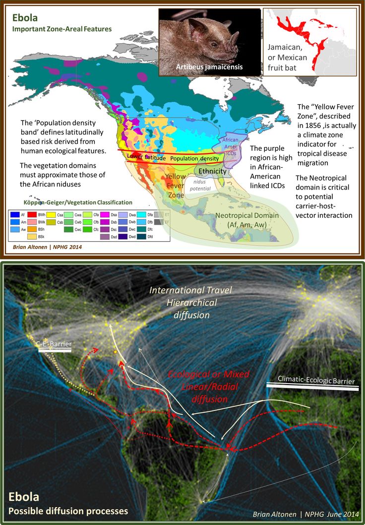
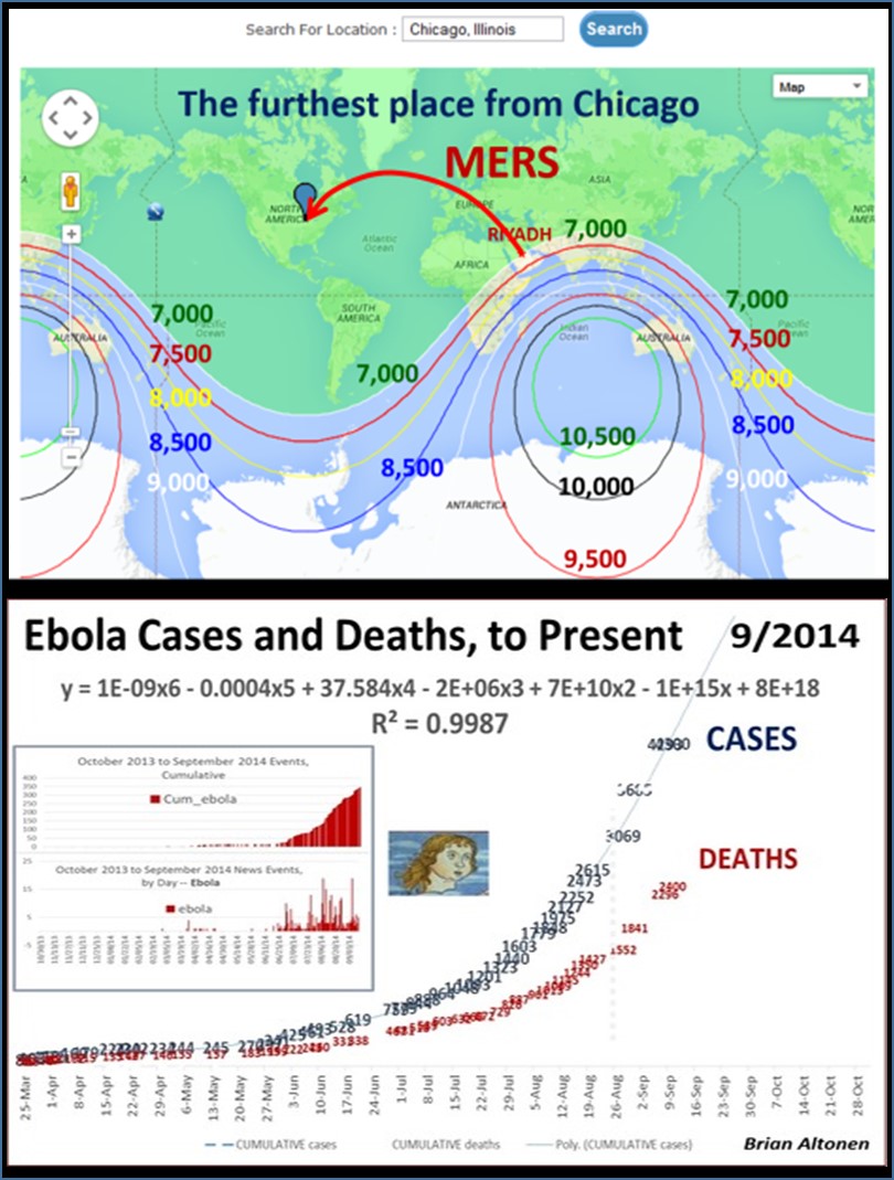
By this time, I had already demonstrated the use of GIS to observe and evaluate the global transport of international diseases like Ebola. I did a full evaluation of this when it began showing signs of making its way to the United States. Few probably remember these cases and the internet public discussions epidemiologists were having as the numbers of Ebola patients who died grew in number and demonstrated the value and need for better disease mapping, as a live version of studying disease patterns, not just a retrospective interpretation of these historic events.

Prior to Ebola, we had the various forms of Antibiotic resistance strains of contagion making their way to the United States. These were fairly low numbers of events, but the fact that a Medication Resistant strain was able to infect the New York City subway, and other public transportation systems, due to health care givers ignoring the voluntary quarantine imposed upon them, demonstrated as well the need to do whatever it takes to make all people, not just patients and health care workers, conscious of public health related events and biological security practices.
Implementing a GIS devoted to epidemiological surveillance and prediction modeling, makes all of the above possible.
This was a very popular and “hot topic” in my field. It was most influential on health care programs devoted to public health surveillance. But for some reason, interest in improving our tools and resources fizzled out relatively quickly after MRSA (Medication Resistant Strains), MERS (Middle East Resistant Strains), and then Ebola hit. A good portion of this I blamed, back then, on the lack of adequate experts in the field being used to build our disease surveillance programs. Now, this might seem ludicrous for me to say–but the World Health Organization and especially the US CDC had large parts of their research, work, and services devoted exactly to epidemiological monitoring, and both underreacted and were underprepared for the Ebola outbreak. At the time, the PR for all of this was that ‘in case of outbreaks’ they had people considered the experts in evaluating and managing such events. (At the time however, what we didn’t know, was that these tasks were assigned to new workers, and mostly hired students. Experts in this field like myself, were not hired.)’
West Nile, however, was the reason these programs finally grew. West Nile fever concerns were yearly concerns ever since Year 1. Since its birth in winter of 1999-2000, today’s experts in West Nile should be engaging in remote sensing and other advanced RS-GIS skills and processes for engaging in such work. This form of study is very different however, from what’s required of a human population, travel and human behavior kind of study, which COVID was.
Likewise, preceding West Nile, we had the need to engage in surveillance of Lyme’s Disease, which was a much more slowly progressive outbreak disease pattern, which became an important example og how to engage in host-vector-case analysis. When the Borrelia for Lyme first re-emerged over by the New York-Connecticut border, its cause and source weren’t fully understood. Looking at historical data on this condition or disease, one can see that what is now called Lyme Disease probably originated in the dairy farms in Sweden, decades ago, as so seemed to be reborn when it re-emerged in Lyme, Connecticut, thus resulting in its new name, for its new place of origin. Lyme was a slow migrater, making it easier to develop surveillance programs for, and test their validity and adequacy. In a way, Lyme Disease ecologic studies served us very well in preparing us for the West Nile outbreaks that emerged later.
West Nile work in turn served to improve our skills in faster moving vector transmitted diseases, providing us with GIS skills applicable to dozens more vector transported diseases, and ultimately, prepared us for looking at diseases that spread beyond the limits of their vectors, vector ecology, and hosts/carriers ecology. MRSA events emerged just in time it seems. MRSA was not a host-vector ecology related issue, it was a human ecology or population based spatial analysis issue.
But then the Ebola diverted the attention back away from internally spread human-to-human contact diseases.
For this reason, we didn’t react much to the two sets of MRSA like cases (MRSA and the Middle East origins events). AS a result, we were not at all ready for observing and research disease transmission as a live event. It took a fairly simple outbreak, like those of the various strains of COVID that emerged, to show us even more about how to look at disease in relation directly to people. It is hard to say with certainty whether or not it was the organism or the improved knowledge looking for a use, that came first for each of these changes in our medical GIS knowledge, awareness, and technology. But, whatever the cause, it is also quite event that outside the new fields and specialties emerging related to Medical GIS, the health care system as a whole, was not ready to employ such studies.
In retrospect, one has to wonder why we were/are not ready. It always takes an embarrassing lesson, to make administrators of our systems change their ways, and invest more money in the needed infrastructure of health in general. But that is what happened here due to COVID in the past several years. Is this avoided by departments having analysts begin such work early on, before it is requested?
When COVID-19 commenced, no one was ready for it, and the insurance companies in particular could have been prepared for this, based on prior West Nile, and MRSA events. The big insurers nationally had the potential at this point to already have a process developed for initiation, should such an outbreak occur. Similarly, we expect big city programs devoted to health care to have plans, at least in their heads, about what to do if that suddenly became necessary. Fortunately, Johns Hopkins had such an idea already to be implemented. They defined to the world, the reason we need to stop ignoring the increasing numbers of deadly disease outbreaks, at the global level.

A part of this plan to implement GIS in health care came to be, probably, about 2004, when the ability to manage population health data, and compare and contrast it with institutional internal datasets, became possible, memory and spacewise in the desktop computer. Storage capacity was finally >8MB (remember then?), so populations health data could be importable, useable, for mathematical analyses, in the institutional, patient health research level.

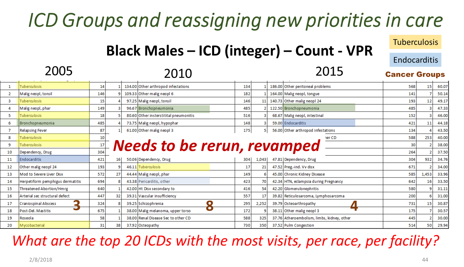
Between 5 and 8 years ago (this is really an ongoing project, broken into parts, with stages of accomplishments), I began developing a population health database for use in the workplace, for analyzing urban health. A number of 2018-2019 projects had these processes tested, on studies devoted to tuberculosis testing and incidence, drug-resistance bacteria strains development, unhealthy human behavior related problems, and specific health risks found in unique populations.
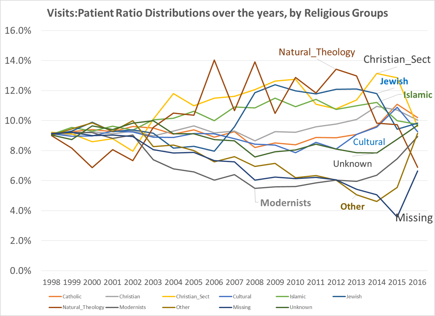
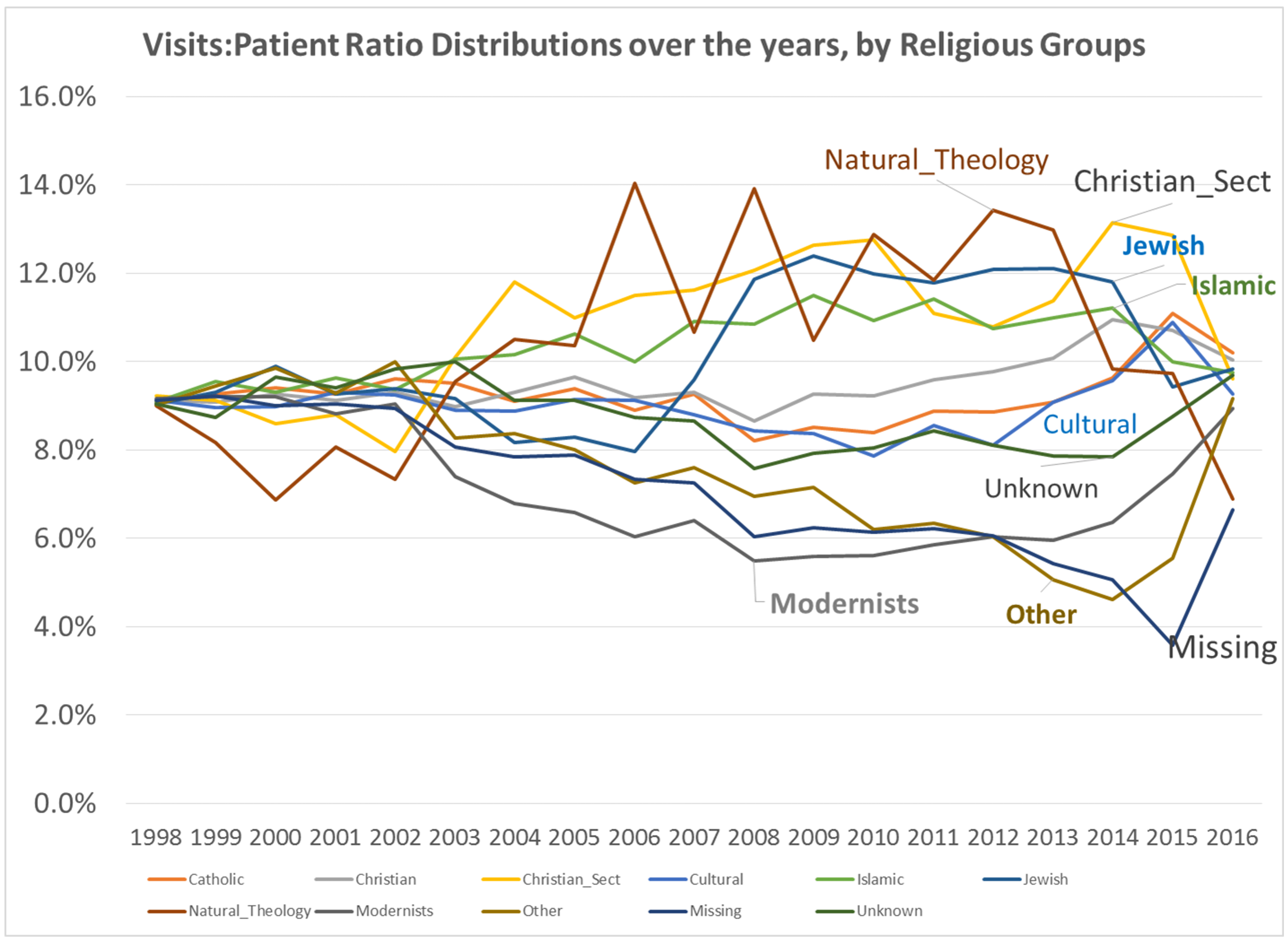
By this time, I had also added religion to the way in which we “type” and “quantify” particular people and their cultural settings, or living places. Census and family features data were placed in the datasets being developed. National stats for specific common disease rates were used. Income, work, rates and dollar values, were related to specific places, focusing on Census block groups, census block, and zip codes areas, for which these were defined by US Government offices.
When COVID-19 broke out, the residents decided to add the features needed to measure and report on poverty and health, due to the types of medical history and socioeconomic status of our very first fatalities. It perhaps took about 2 to 3 months for us to confirm that this is the path that need be taken when researching this outbreak. Need I say, the general attitude at the time, just short of panic, was impacted greatly by the high degrees of stress most students in medicine (for me, the residents) were experiencing at the time, as we were trying to manage the first hundreds of cases, per emergency room, department, etc.
First Covid project

From February to April, I spent the time researching the medical journals worldwide about the outbreak. I did a full review of Pubmed and the like for what had been published, saw the temporal patterns of articles related to this virus, and the countries. About 1200 of these articles had abstracts or full text, and so could be evaluated for the beliefs then being published about the outbreaks. The full bibliography including abstracts was downloaded, and at about 15-24 per page, with available complete articles read through over the next few weeks, providing certain key finds that could be targeted/labeled for later counts (a traditional qualitative analysis / pseudo-metaanalysis) technique for first review, I would add).
It’s interesting to note that reviewing the foreign articles on the outbreak provided a significant about of insight into how to approach researching this outbreak. China had a lead in many of the findings of this outbreak, which makes sense being it is the human geography origin of this outbreak. A couple of weeks into this review, I concluded that the one finding that really stood out was the association of outbreaks with patients with a diabetes history. We already knew that it impacted older people the most,. In fact it was very deadly to those patients. But what stood out for me were the kinds of diagnoses histories that seemed to be shared across regions.
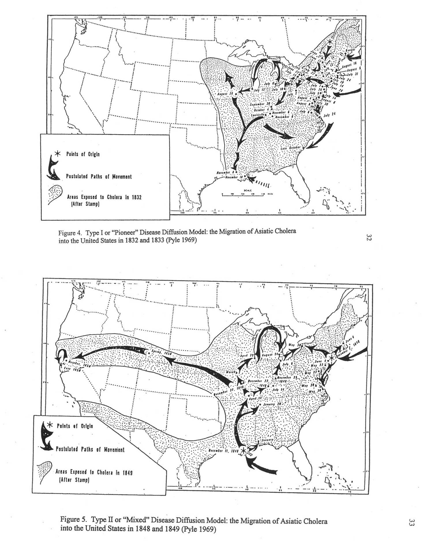
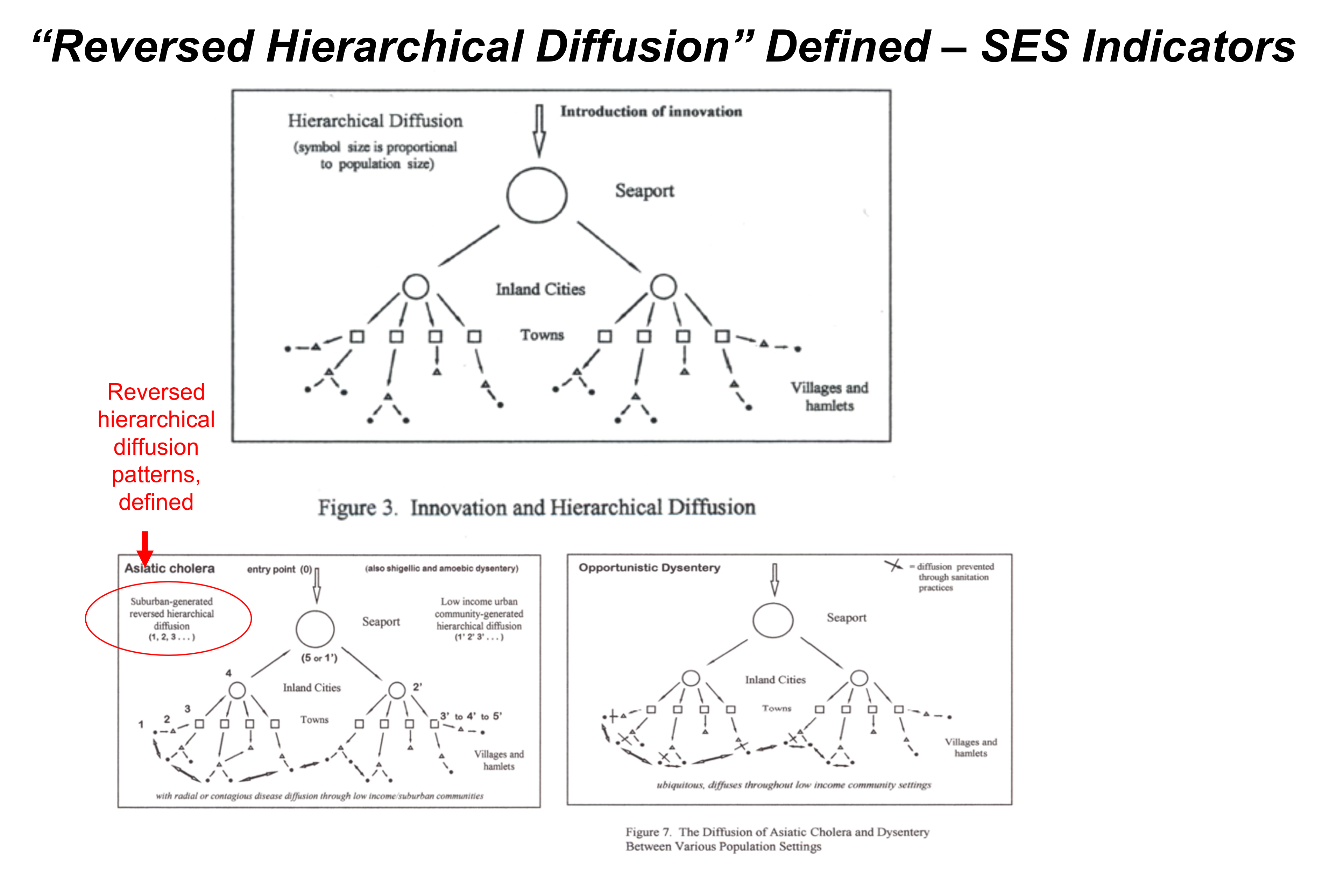
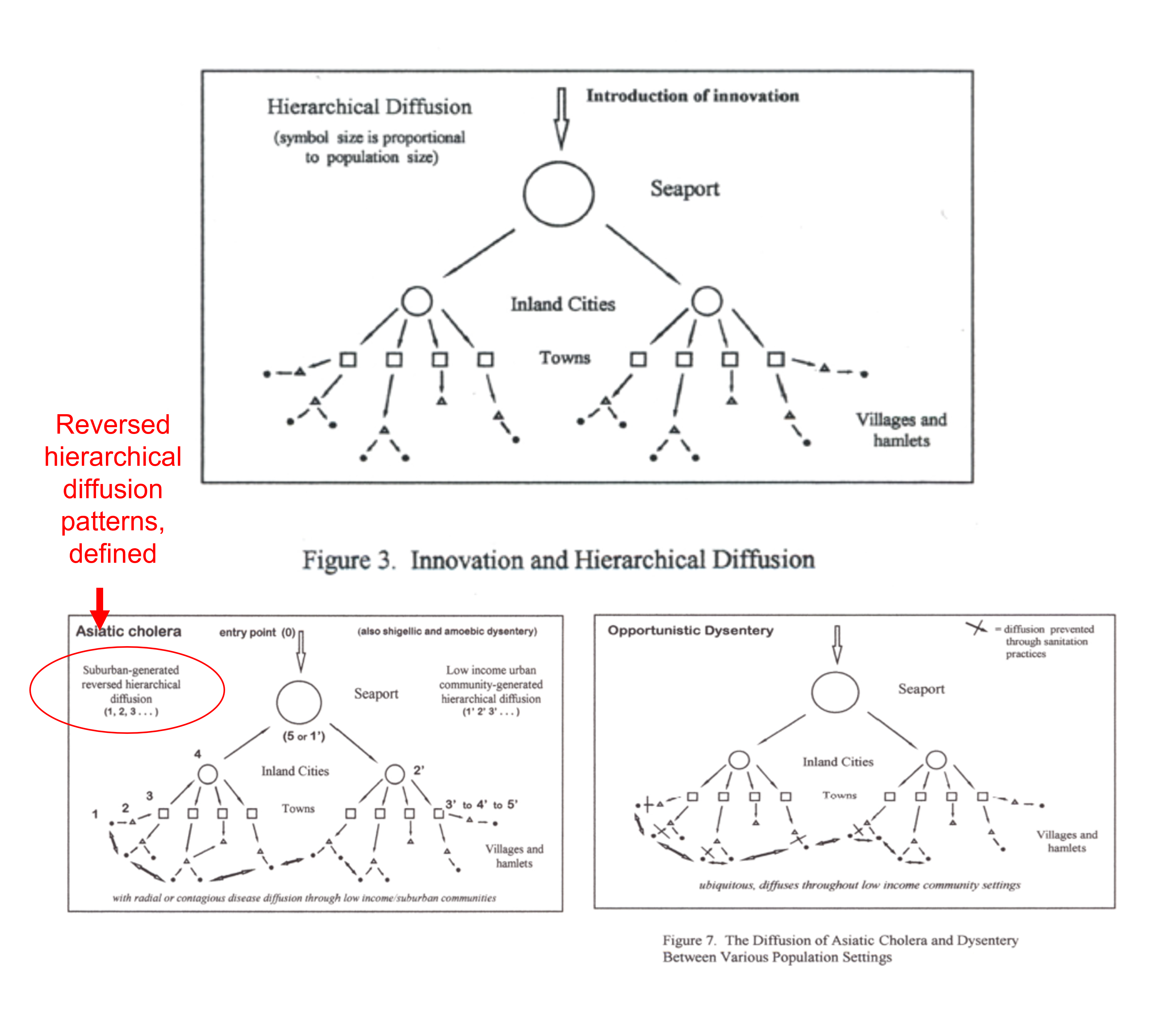
France was the first country to publish an article almost directly relating the onset of cases to a diabetes history. That was by around April (may have to look this up later). But some of the first research done of this outbreak in China, were some incredible analyses of the disease quite early on, in areas far away which were already stricken by similar outbreaks, such as Australia. Since the initial diffusion patterns of a contagious disease are often linked to economic and sociological cross-cultural hierarchical patterns, at the national level, we almost immediately find such a pattern of spread mimicking the centuries old cholera diffusion patterns, a topic covered quite extensively in my 2000 historical epidemiology thesis. That meant to me that reversed hierarchical diffusion processes were almost immediately taking place.

The next key finding I had pertained to ACE1 and ACE2 binding sites. ACE2 appeared to be repeatedly an underlying background to patients who had it. At first, it appeared as though ACE1 binding, when it forced cells to initiate ACE2 production, may in fact be the event to give people who allow COVID to cross the cell membrane, the environment it needed to pass through and into the cell. That was the model a lot of us started to work with regarding a specific cause for the cases being developed. This ACE2 specificity also had to do with certain ACE inhibitors being used, and some had speculation that those inhibitors, by binding the ACE1 molecules in the cell membrane, caused the cell to activate its processes for making the substitute or replacement for ACE1, ACE2 receptors production. This you could tell, by simply reading the annotated bibliography I produced, looking up the disease history worldwide.
By the end of April, I had a model in my mind of how the ACE2-COVID-19 relationship defined who could be most susceptible, and seeing who and what types of disease histories were related to this, it was only natural to next go to considering the possibility that this has something to do with the “metabolic syndrome” philosophy we developed in recent decades, in the field of medicine.
Metabolic syndrome is really not anything new to myself, being that my family has it due to their ethnic history. This is a genotype-phenotype phenomenon that I began researching repeated in 1988, when a medical anthropologist (Weiss) composed his theory about how different cultures evolved this “gene” related to aging and health. Due to decades of reviewing that, I had a good background in this molecular pharmacology scenario and paradigm. This only took a day or two of percolating in my subconscious, to lead me to make my first study of COVID-19 cases related to this hypothesis.
The first cases which data came to me for, in May, pertained to the Liver functions and blood tests demonstrating the body’s reaction to what was happening in the blood–it didn’t really add to my model, focused on ACE receptors and ACE2 susceptibility and treatment.
The next set of cases ended up allowing me to pull this entire concept together, and test it in numerous ways. At first, I was told these cases were in fact going to be what the common writings were telling us should be low risk cases. By May it had been decided that age was directly related to deaths due to COVID. Nearly all studies focused on how that was happening.

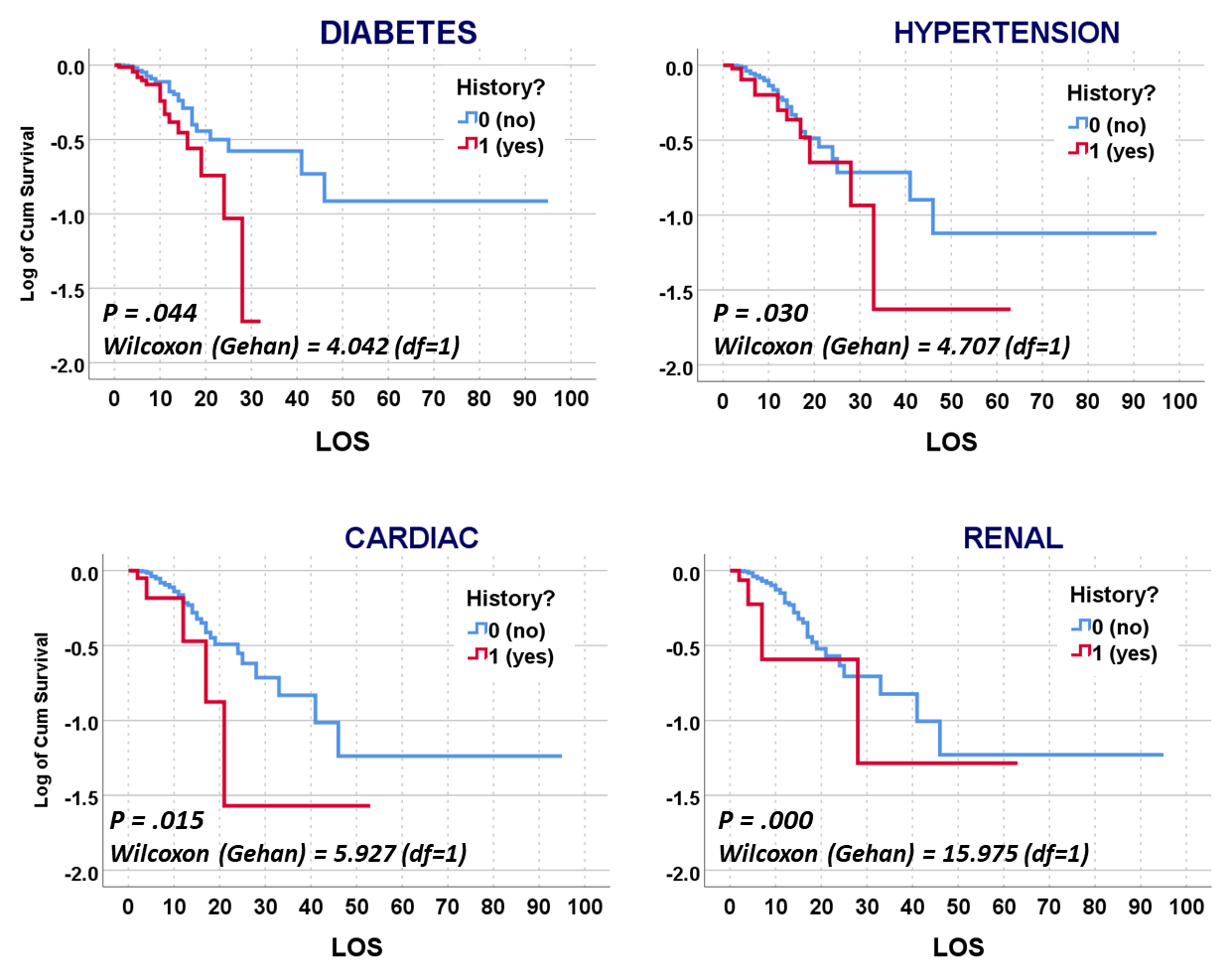
But my research population was of young adult age cases, and their medical history, and disease history, in relation to how the COVID impacted then (fatal or not). Basic methods of researching something like this were already being published by now. The first article on our local cases, covering thousands of patients afflicted and serviced by a nearby health care system or program, showed using basic stats what increased versus decreased their fatalities and impacted their recoveries and outcomes. My study focused on cases that required ventilators, in relation to the other aspects of care. In essence, the first published article reviewed everything possible, but took these reviews only to what I called, and was teaching to my residents, the intermediate level of analysis. Time and mortality were not taken into account in the best way possible. For example, the French article stated that Diabetes appears to be related to a major cause for death. Did those people die quickly, or did it require some time for the effects of that predisposition to impact the COVID and what it might do?
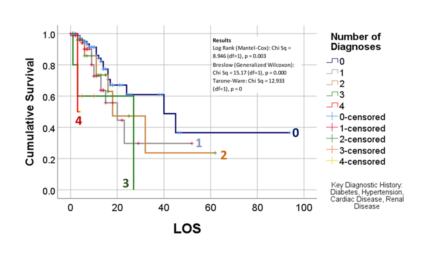
The way to relate this to my group was to see which one of the 175 studies had different levels of complexity in their multiple disease histories, and compared death times and rates for those with more metabolic disorder like features linked to their susceptibility. The binomials set up for this explored the numbers of days until fatality, relative to disease type and organ–so post-cardiac cases with need for ED intervention, did they die in a certain time, versus those without this history, but still with several combined heart and blood vessel diseases (hypertension and hyperlipidemia), and did the second group die mostly in 4 days, 5, 7, 9, 10, 14 or even 17 days? All were tested. The results with the best lowest p value, suggested the pre-death condition was of greater risk than the rest.

This series of tests, and checking the time frames, in view of what the bibliographic research suggested, suggested to me that there was a critical time for onset of conditions that turned fatal–the critical days were 18-20, when something in the body kicked in, and resulted in a very ill patient, who would either live a long time on the ventilator, or experience very specific long term effects due to their disease history, but recover. Early deaths were due to one set of features; later deaths due to another; all of these somehow related to the ACE2 receptor and ACE1 vs ACE2 drug history and use.
I wrote up some prediction model binomials to test all of the above, and they supported the metabolic syndrome association I speculated about, but was not completely willing to accept the definitions and terminology for, as posed in the medical literature.
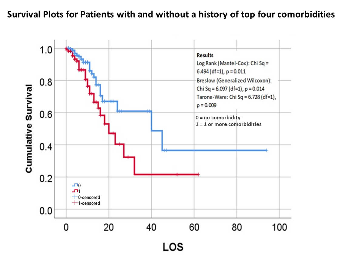
So, that test was included in my write up, which included a complete and full review using time Kaplan Meier (KM) to research and model the cases and their mortalities. I used KM as it related to other factors we might normally associate that with, to show that there are specific high risk factors, diabetes being one of them, but more importantly, the relationship of Diabetes to therapeutics being employed, and the underlying genetics of the patient in terms of ACE1/ACE2 reactions to the COVID infection process.
About July 1st is when I saw this in the stats, tables and preliminary graphs being developed. At that time I was being asked ‘are you ready with it yet?’ in terms of submitting the results and article for consideration. I replied, I needed a few more days to research that last series of questions of mine.
The next few days, I confirmed that suspicion, and submitted the final version in early July.

We then waited for acceptance or refusal. It underwent the first two sets of reviews–expected due to all of my math–but lagged past August, which got me worried that somebody else might publish the findings first. But everything got excepted on time. The electronic publication went online by October; the physical form came out by November.
Apparently, this was a good finding. I was not referred to much at first in other articles on COVID. Those references tell me people saw the value into how I made detailed, exceptional use of the survival plotting and prediction modeling. My impression is that this method of analysis usually is done a few months into research, not just 3 weeks into it. You have to fully understand the gist of your first two sets of findings, before using them to help you design you more advanced levels of analyses.

To summarize all of this, there was a section of a research methodology proposal I have to always mention to researchers–the really simple basics for explaining how you will analyze data. It is a pretty generic style of writing. I have seen resident teams for varying institutions all seem to state these same things in the Internal Review Board (IRB) papers submitted for project plans or approvals.
What follows that one paragraph, first paragraph that follows, is the ways in which the COVID outbreak resulted in making major changes in how we can analyze public health, at this epidemiological, surveillance level.
Prior to COVID, systems were against spatially modeling diseases, and were even more against the methods I began producing and applying to Big Data projects. The main concern was that this compromises personal health information related security.

Methodology (a standard write up)
Most of the demographic data will be assessed using descriptive and comparative methodologies related to the standard Chi Squared, Pearson’s tests, and Students t-Test methods, for reviewing continuous and non-continuous variables. Descriptive tables will be generated for information related to gender, race-ethnicity, and patient lifestyle related descriptors such as insurer group, years of experience with conditions under review. Continuous variables such as age, and numeric laboratory outcomes, are tested as individual values (age, years, lab results) and groups (age ranges, relative lab results ranges, normal/abnormal outcomes results). One or more forms of regressive analyses are typically formed on the larger variable sets, to review these sets for unique group-related differences, such as impacts due to age, gender, race-ethnicity, insurer class (low or no income vs. employed), and other lifestyle features (zip code defined areas and their socioeconomic status (such as high vs low income areas, race-ethnicity predominant or not, etc.). Where dates or patient’s age are collected, such as length of hospital stay or age at diagnosis, temporal evaluations will be run, namely Kaplan Meier and/or COX regressions, to discretely define the highest risk groups. Continuous or parametric numbers results, such as for labs, health scores, graded medical evaluation outcomes, allow for risk assessments to be performed, determining the most critical ranges where prognoses might be likely to become more reliable, based on p values produced through these tests.

Analytics
Amounts of analyses performed for this work are based upon datum quality and quantity, datum form and content, and datum types and content in terms of format (numbers or not). A standard base level review of health data results in typical tabulations of results, with p values provided wherever possible based on data form, consistency, and content. The most basic data produced from these initial studies focus mostly on demographics and patient medical and health history features, and may be presented mostly as tables and a few basic figures describing the population and depicting the results. An intermediate level of data evaluation include the implementation of regression analyses and certain cross analyses of select groups identified as important to the study due to applications of these results. These analyses generally contain more tables and more constructive figures, enabling interventions for example to be developed and followed up, in order to assess the study for validity and its use in predictive modeling.
A third level of analysis, generally termed “advanced” versus intermediate, consists of highly detailed regression analyses, with continuous and non-continuous variables assessed in multiple ways, including through the use of temporal data, thus resulting in the previously stated Kaplan Meier (KM) and COX Regression methods, and Repeated T-test methods of analyses. These allow for more detailed research plans and programs to be established in terms of the patient care program being evaluated, including post-activity and/or intervention analyses.
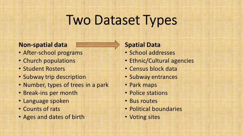
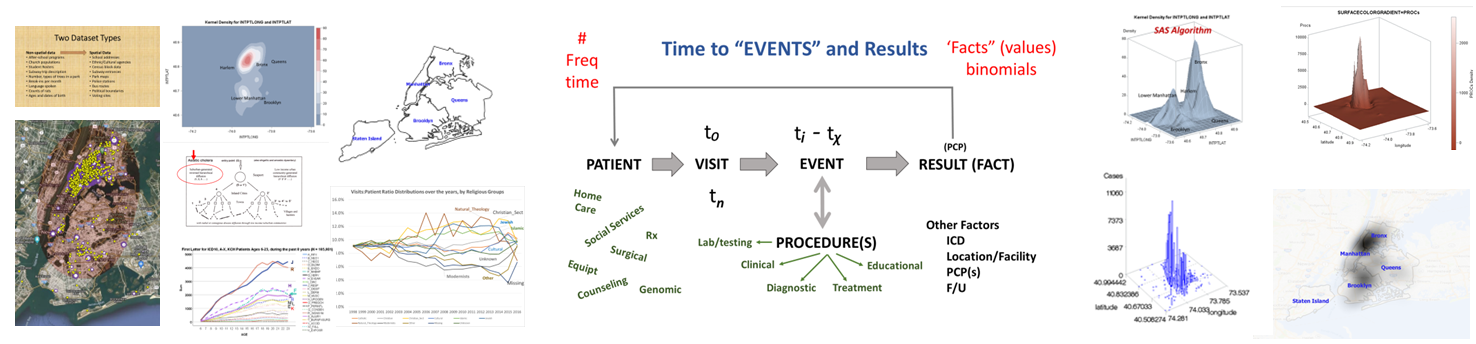
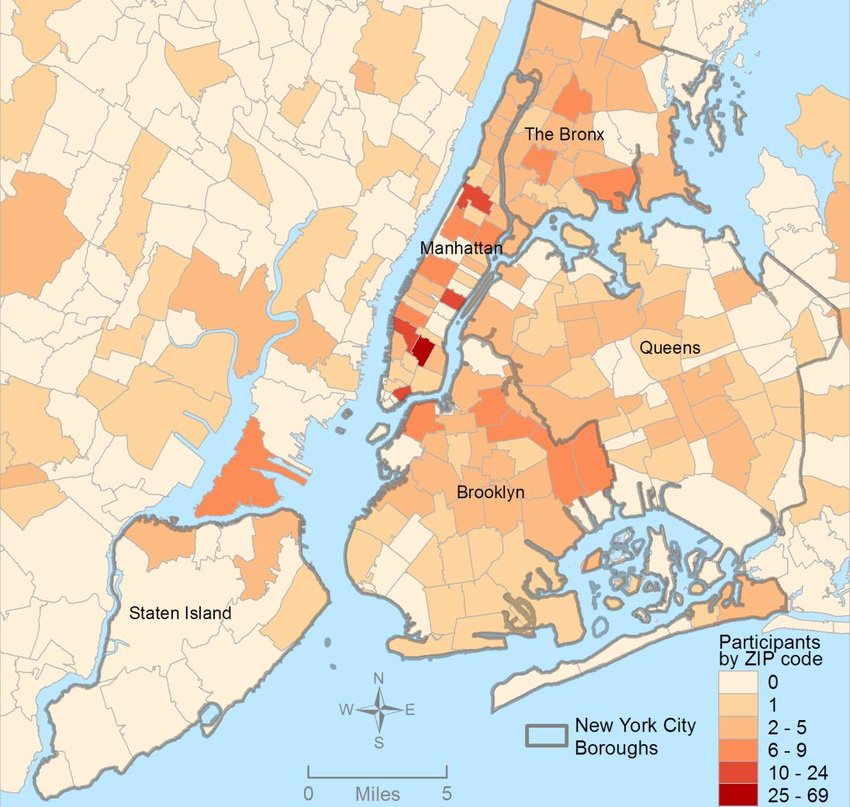
The fourth level of analyses makes use of space or place as a variable. This has usually been omitted from nearly all studies engaged in, prior to the development of a more useful, functional geographic information systems (GIS) program for use in population health analysis. The latter method has traditionally has the issue of releasing too much personal identifier data, based on the assumption that if a reader is given ample amounts of details about an individual, including approximately where he she lives, that the actual patient could in theory become identifiable. Due to population density related features, and the irregularity of health insurance and health care programs in terms of planning and patient-level personal identifiers/spatial data definitions, the notion that someone is known is a self-imposed biasness added to the conclusions reached. The use of regional or areal identifiers reduces the likelihood such is possible. The addition of zip code data to a study, in order to group patients into geographically similar regions, makes patient groups to be used, to define the impacts of specific living practices and regionally assessed or summarized lifestyle behaviors and habits to be evaluated for patients who share the service of a single sizeable health care program. The features of zip code defined areas most applicable to this work relate to socioeconomic status (SES) levels of identity, community, culture and income related living behaviors, and personal-professional activities engaged in at the family, neighborhood, professional contacts levels. This spatial method of patient health analysis is currently in its early initial phases. A sizeable database has been developed to allow such a process to be implemented for all studies performed at H+H, based upon data content. Such an approach has become a standard of health surveillance, engaged in by publicly operated, publicly accessible, health service providers and surveillance programs, initiated during the outbreak of COVID-19 in December of 2019.
Discussion
In most H+H residency level research, public health maps are not produced using a standard GIS, but can be approximated quite easily using a number of basic SAS and/or SPSS software analysis techniques. For reporting SES and place, relative to population health level case data, both 2-dimensional and 3-dimensional methods have been developed and employed numerous times, since their development in 2004, and implementation in the public health sector beginning 2009, reaching its first levels of success in 2019. To date, area health related SES features are reported as aggregates based upon a series of population level classification systems, merged to form a value that quantifies each regional type. Regions which have similar socioeconomic (i.e. dominant and/or mixed income, household family members counts, percent employed vs. unemployed, and/or on MCD/MCR, marriage/divorce/single parenting rates, food stamp utilization levels, and general demographics features (gender, race-ethnicity), are classified into specific groups. High, medium and low health risk regions were effectively identified using this methodology, just prior to the COVID-19 outbreak, and was implemented and tested from July 2020 on.

Final Testing
Since 2010, SQL has been the standard method used to evaluate ‘Big Data’ and develop ways to model the datasets and produce mappable results. When this project began, SQL lacked any easy, non-costly GIS-related transfer of data applicability, and so datasets were developed for develop in SQL, but then transferred and run in SAS, in order to produce final population level aggregate health data for use in spatial modeling.
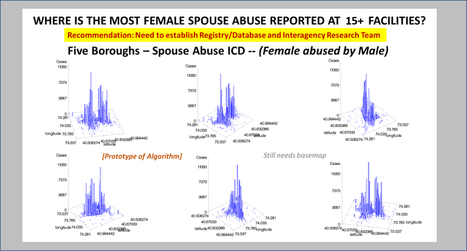
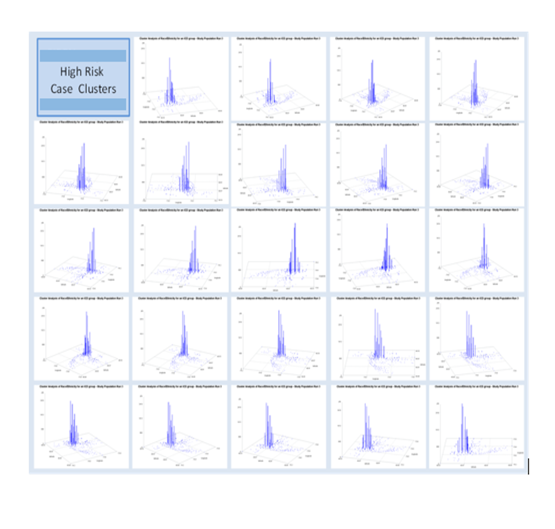
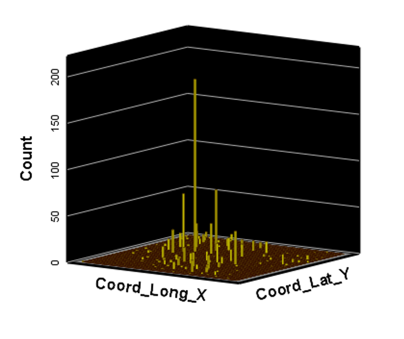
Ath the time this was developed, SAS had produced a crude GIS that could be run in the system. But the results of those SAS-GIS projects were very poor (the worst I have ever seen). After about 5 years of trying to improve their SAS-GIS add in, that ;plan was ceased and the standard software companies invited in, to replace SAS-GIS. During this period of testing the mapping of GIS data using SAS, a series of new algorithms were written. The first was to publish this data as point data on a national zip code related centroid dataset, for use in spatial analysis. A given zip code had the raw data and/or normalized data added to the national map produced. This map was developed by merging two SAS programs into a single program, the first produced the centroids values, the second transferred those values to a much more SAS-GRAPHICs model producer, results in more intricate, even colorizable 3D maps of the areal health data. Due to the clearness of this means of mapping spatial centroid data in SAS, this method was immediately tested on the majority of ICDs, ICD classes, and subgroups (by age group, race, gender, etc), to produce 3D models of US maps. The nature of the SAS programming used, allowed for one map to be produced for each set of 3D angles for looking at the US image. A repeated program was written to produce a 3D map at a given degree set for x,y,z, and then the values changed for each single new run, to produce images in sequence, that rotated from 1 degrees to just under 360 degrees, in 10, 5 and finally 3 degree increments. The formula 360/10 means the first set produce results in an image that rotated crudely around from 1 degree back to 1 degree (37 images). The 5 degree model produced 75 images. The 3 degree rotation models produced 76 plus images.

The time consumer in the SAS formula is mostly related to dataset development and testing. So the production of subsequent figures for each new rendering of the dataset at a new degree of spin, only takes a second or less to occur. A 76+ image set runs in just 3 to 5 minutes. A standard run to produce a useful video required a minimum of 300 images, preferable more like 900 to 1000, for a 2-3 minute video to be produced using those maps. SAS had the capability of placing those images in sequence into a video, or a manual process could be used by exporting the SAS produce into some other software package that produces the video, which is usually of much smaller size. The size of a SAS provides video can be 32MB for example, whereas the exported SAS data, imported into some video program, produces a comparable video of just 3-7.5MB in size, which was much more postable and transferrable in 2010, on the internet.

The major improvement after producing the zip code centroid rendering of these data, was the conversion of zip code centroid data into hexagonal grid datasets, using a model and the math I developed for producing hexagonal grid centroids data. Zip Code centroid then was transferred to hexgrid modeling programs, and this led to my creation (invention) of the first hex grid models of spatial data, using the programming, mathematics formulas, and methodology that I developed in December 2003/January 2004, added to the SAS shell of this work.
Years later, 2009-10, the SPSS method was initiated for developing these and the formulas, work were published, and was first used by Canadian Urban Science researchers. It has since been applied (with the appropriate permissions) to a number of foreign institutions based human ecology and population health programs. Any U.S. based GIS utilization of this technology is by companies that did not ask for permissions to “borrow my intellectual property” and run the models. This potential “stealing” of IT began years later, when I first noticed it being used in a taped presentation for an international GIS conference devoted to public health.

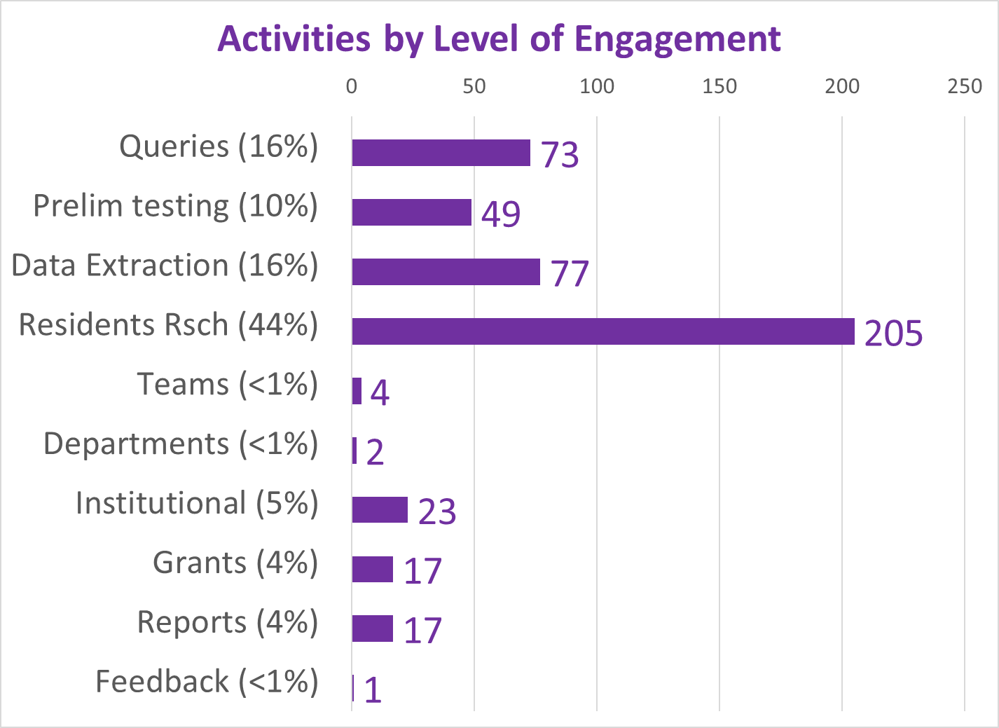
Since 2020, more than 200 active studies were used to text the above state method of testing population health. Prior to 2020, it was developed and tested using only about 40 such models, with the public data drawn from numerous public data sources, and the health intervention/activity data drawn from various public and professional data sources, mostly in aggregate form based upon data provided for zip code defined areas. Approximately one fourth of these preliminary studies also implemented use of a small area census block or block group data and spatial modelling datasets, to compare small area testing with medium sized area testing, using standard GIS (QGIS c2.0) and SAS- and SPSS-produced geographic/spatial equations developed for modeling these data. To date, about 10-20 models are developed per year, for testing and refining this approach to spatial health analysis.

The most important advancements in this project are 1) the testing, validation and improvement of implementing and reporting upon (in limited fashion) the outcomes of zipcode areas-defined public health patterns, and 2) the growth, development, and repeated re-testing of zip code area defined socioeconomic features and their applicability to using such datasets to develop further, much more detailed insights into the projects engaged in by this department and program; the current SES dataset has a little more than 200 zip codes areas defined fully, at the standard US Government, US Census, US population predictions, US Postal Service, and standard MCD/MCR levels, as well as the current educational history, religious history, voters/political party history, small business investment grants history, criminal history, npo/businesses history, and regional Economic/Financial history datasets, which were developed and placed on the web for use by planners and developers across the U.S. To date, the SES dataset has 40-50 very reliable datum points used to define areas, but a database with up to 1000 columns if the complete arrays of the above are included in the working spatial analyses-applied datasets.