A Focus on Methodology
The following is meant to provide a little more detail on the hexagonal grid mapping project.
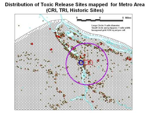
To accomplish this, ArcView and several extensions were used back in winter of 2005/2006. The purpose was to replace the standard square grid representation with something a little more realistic, especially when it came to the construction of isolines representing small and large area results.
The problem with square grids is the bends and turns isoline have due to the reliance on 90 degree angles. With the use of a hexgrid, this corner angle effect is less a problem. This allows for more viewer friendly isoline illustrations to be produced. It is also possible that the hexgrid produces an isoline map that is more accurate as well, especially when cell size is carefully tested and selected for.
To produce the following hexgrid, the research area polygon was produced (the boundary of the area in which the grid should lie). Next a hexagonal grid point-centroid series was placed on the map using the Add a Theme. The lat-longs for these points are defined using the spreadsheet. The data are produced in very large decimal form for x and y (7 or greater decimals, with the full number readable on the screen). This data is then saved as text form for import to the GIS. (You have to play around with the GIS base map, and determine your UL x,y and LR x,y. This method works best with State Plane Coordinates.)
These points were produced using a series of formulas I developed, with a variety of options, including: defining your points based on point-to-point distance rowwise (widest diameter), hexagonal side length or circumference, and hexagonal area (the best way to do this due to the use of this for areal analysis, not distance analysis). [If you want the excel sheets for this, contact me.] I produced several grid formula types, but finally decided that a specific area was better than a specific diameter due to the differences in width-height based on cell alignment. I developed a 50×50 grid formula spreadsheet, and then converted to a much larger version (about 130 x 200).
A Theissen Polygon tool is then used to produce the hexagonal array, using the collection of points laid out in regular fashion. This array is then trimmed of its edges, and the research area polygon first developed used to select the particular series of hexagons over and adjacent to the research area. It is important to note here than two or three rows of hexagons outside the research area need to be selected as well, in order to avoid edge effect related mistakes from creeping in with any analyses that are performed.
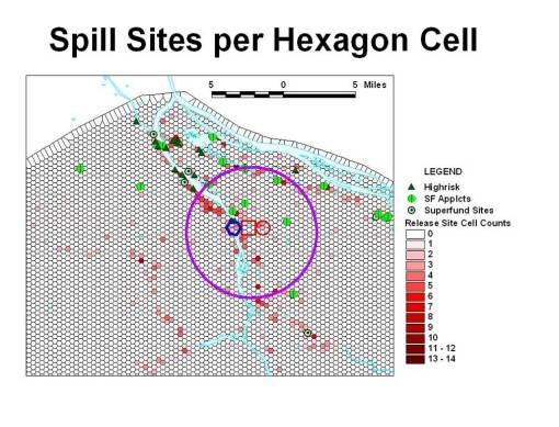
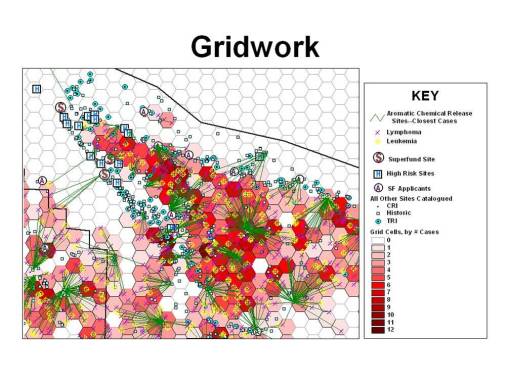
To demonstrate the use of this grid, using the Query tool, basic chemical spills sites were counted and the grid cells classified in the legends tool in order to redisplay the cells according to the various ranges in counts of spills reported per cell. (This was previously defined by the series of SIC reclasses I developed, the methodology of which is reported elsewhere.)
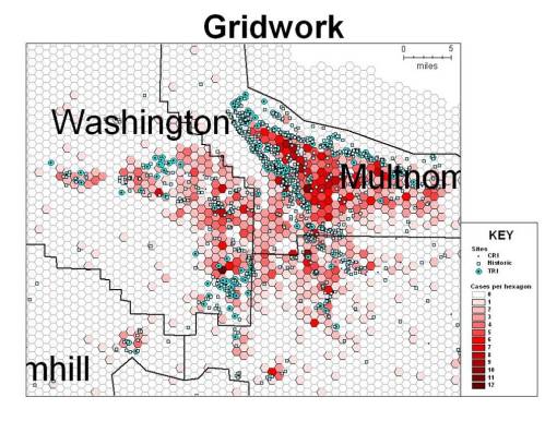
The next several illustrations depict how a specific section of a tricounty area near the urban and periurban (mostly industrial) setting of Portland was evaluated using this grid methodology.
The upper Northwest section of the area was of most importance due to its concentration of chemical spill reports. The numbers of cancer cases per cell, for specific forms of cancer known to be chemical induced, were evaluated.
Each of the cases was then linked to its nearest release site.
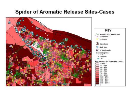
Next, we need to put this information into perspective with other spatial information. In this case, I am relating the site-case information to population data provided by the Census (actually an updated census-related population prediction dataset good for 2005). The first image depicts the census blockgroup data, demonstrating an interesting problem we have with the use of block groups.
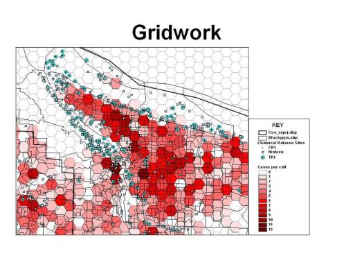
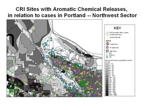
Block groups are certainly more detailed than census tracts, but the problem with blockgroups that for case analysis, they are still not detailed enough to make conclusions spatially at the neighborhood level. In the following, we see an exceptionally dark area to the north edge of the populated region, but based on geographic and economic aspects of this industrial region, we know the population has to be much less than suggested by the blockgroup maps. Therefore, the much more detailed block area maps are used to related the census data to the disease incidence data and in turn to the spatial chemical exposure data.
It is also important to note here the logistics of using block versus block group datasets. There is a significant difference in size for blockgroup versus block datasets. Block datasets can be from 24 to 48 megabytes for even a small area within the state; the same research area of the census takes up only 7 to 15 MB in block group form.
The following two illustrations depict the above map information overlain on blockgroup (the map in red) and then block datasets (in grey tones).
Focusing on the Northwest portion of the research area.

Leave a comment