April 2015
Monthly Archive
April 28, 2015
Posted by Brian Altonen, MPH, MS under Uncategorized
Comments Off on School shooter didn’t plan to hurt students — How to “GIS” this, Without GIS?
SEATTLE (AP) — A 16-year-old boy who fired two gunshots Monday inside a Washington state high school, hitting no one before a teacher tackled him, told detectives he never intended to hurt any students, a police spokesman said.
Source: news.yahoo.com
What are the spatial determinants for this? Population density? Rural versus urban? Pop culture in the school setting? Large schools versus small schools? Socioeconomic Status? Levels of Education? Social and cultural labels? Race-ethnicity patterns?
EMR/EHR should be capturing this data right now. This means that in a year or two, maps like those on display can be produced using your HIT system. The priorities to accomplishing this goal (in descending order) should be: data completeness, SQL, skillsets, SAS or equivalent (non-GIS), long term storage capacity, virtual space for rapid data description, analyses and reporting.
The above dataset took just 7-15 minutes to pull and generate 750-1000 maps with, and another hour to produce the video. For reporting purposes of course, there is no need to make the video. No GIS was required. Only the most basic, most standard systems HIT tools.
See on Scoop.it – Episurveillance
April 24, 2015
Posted by Brian Altonen, MPH, MS under Uncategorized
Comments Off on Producing better targeted intervention results
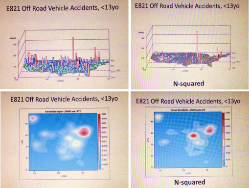
A simple way to tell the difference between neighboring regions is to magnify the results of your spatial data. This method is used to define where the nidus or nest of a problem exists in the social or community setting. It can also be used to define where to establish new clinics, or where to focus the bulk of of your intervention activities.
The simple use of N versus N-squared for your indicator score helps define exactly where the highest risk regions exist.
High risk is defined in two ways using this method. The first is the standard amount of events or risk scores obtained per unit area evaluated statistically (n, incidence, prevalence, age-adjusted results, etc.). The second is the simply square these results in order to identify the exactly location of your most needy community settings.
This evaluation process requires just a few minutes to be run, in a standard HIT system. It can be run at the local or neighborhood level, as well as the large area or regional level (like illustrated here).
The two sets of figures provided come from the following two videos posted at YouTube:
N — https://www.youtube.com/watch?v=lbg6Z8Ylfm8
N-squared — https://www.youtube.com/watch?v=If-HKIdoiuc
See on Scoop.it – Episurveillance
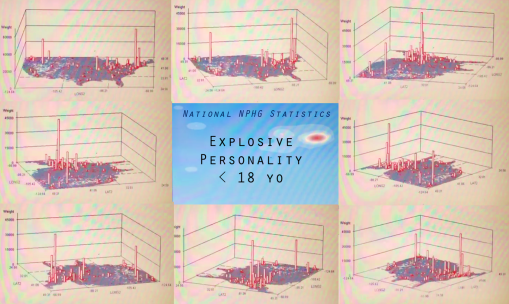
April 24, 2015
Posted by Brian Altonen, MPH, MS under Uncategorized
Comments Off on Natural Poisoning Cases – YouTube
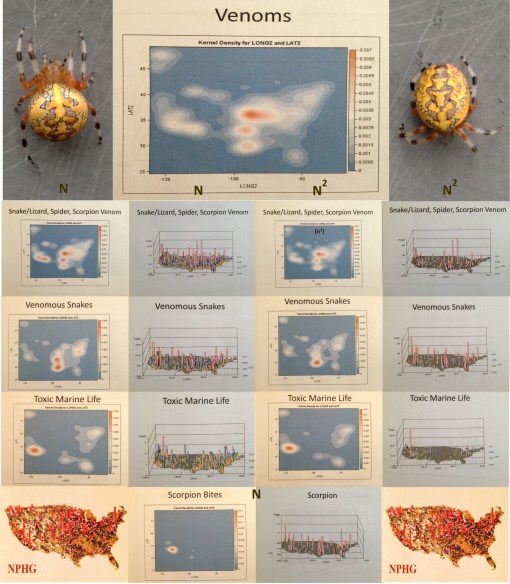
Venoms in the U.S.
https://www.youtube.com/v/GvdzdBTyO2I?fs=1&hl=fr_FR
http://youtu.be/GvdzdBTyO2I NaturalPoisoningCases 0536 7
Source: www.youtube.com
Mapping out poisoning cases is a use for NPHG that is pretty much indisputable. So what does it teach us?
This video is a demonstration of the natural versus human ecology of venomous animals, inferred by the distribution of envenomation cases related to these animals. An interesting portrayal of cases related to outdoor activities, for comparison with animals with spatial distributions defined by indoor, personal pet keeping practices.
This result may also be related to in-migration of animal vectored disease patterns, and respiratory conditions generated by hypersensitivity to animal dander.
See on Scoop.it – Episurveillance
April 22, 2015
Posted by Brian Altonen, MPH, MS under Uncategorized
Comments Off on The Next Outbreak in Evolving Disease Migration Patterns
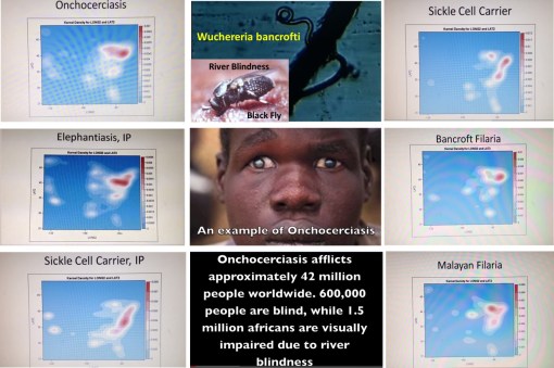
The last two or three years have demonstrates that the diseases that affect the earth are changing, and migrating, and increasing the likelihood of new populations becoming infected. The increase in polio cases more than a year ago was a reminder to remain active and avoid certainty or complacency, behaviors further removed by this past year’s measles outbreak in the U.S. Vectored diseases are also in need of more attentiveness, and the fairly commonplace mosquito born disease patterns forming the top of this list.
Mosquito born disease patterns like West Nile and Chikungunya constitute a very small part of this evolutionary process. There are other insect vectored disease in need of increased attention.
Onchocerciasis and filariasis need to be placed high on our re-emerging diseases watch list.
Onchocerciasis was one of the first diseases that WHO designed global health focused preventive health programs. The Onchocerciasis Control Programme in West Africa (OCP) was developed by WHO in 1974. Its efforts focused on the use of widespread aerial spraying tactics of the insecticide ivermectin, hoping to kill most of the blackfly vectors. Forty years later, the world still has a very large number of onchocerciasis cases–42 million approximately.
This high prevalence supports the ecology of the pathogen, host, vector and/or reservoir.
The following are information resources for this disease, and its very common co-disease filariasis.
J. Blanks, F. Richards, F. Beltran, et al. The Onchocerciasis Elimination Program for the Americas: a history of partnership. Rev Panam Salud Publica/Pan Am J Public Health 3(6), 1998 . http://www.cartercenter.org/resources/pdfs/news/health_publications/river_blindness/panamjph-history%20of-oepa.pdf
Training in the management of Onchocerciasis (River Blindness) and Lymphatic Filariasis. From a 2013 Global Health and Disasters Course. https://www.youtube.com/watch?v=azlDp4M9vTo
Seth Elliott’s Onchocerciasis slide presentation. https://www.youtube.com/watch?v=vda5R6urnXg
Infective larvae ofwuchereria bancrofti (1947, Instructive Military video). https://www.youtube.com/watch?v=_AZ4IlPQehU
WHO. Preparing and Implementing a National Plan to Eliminate Lymphatic Filariasis (in countries where onchocerciasis is co-endemic). WHO/CDS/CPE/CEE/2000.16 .
http://www.filariasis.org/pdfs/Press%20Centre/Training%20Material/pmgico.pdf
Examples of related NPHG products (U.S. map videos):
Sickle Cell : https://www.youtube.com/watch?v=q7U9Z91ljRU
Bancroft Filaria : https://www.youtube.com/watch?v=8hgpCdf2W9Q
Malayan Filaria : https://www.youtube.com/watch?v=R3-5NfKrJ-Q
Elephantiasis , IP : https://www.youtube.com/watch?v=Uc6zvqutU3g
Foreign Born Zoonotic Diseases : https://www.youtube.com/watch?v=NWYslHBLzeI
My complete listing of these diseases from the preliminary dissertation work: https://brianaltonenmph.com/gis/global-health-mapping/foreign-disease-intrusion/
See on Scoop.it – Medical GIS Guide
April 16, 2015
Posted by Brian Altonen, MPH, MS under Uncategorized
Comments Off on Obama pledges US aid in wiping out last traces of Ebola

President Barack Obama met on Wednesday with the leaders of three Ebola-stricken West African nations, vowing US help in wiping out the last vestiges of the often deadly disease. “We begin by noting the incredible losses that took place in all three countries,” Obama said during his meeting with Liberian President Ellen Johnson Sirleaf, Guinean President Alpha Conde, and Sierra Leonean President Ernest Bai Koroma. Obama hailed the “great courage and resolve” of the three nations where the current Ebola outbreak has claimed more than 10,000 lives, and promised continued US support to help prevent future outbreaks, even as the numbers of infected people subsides. Obama said in addition to the lives lost, Ebola has exacted a tremendous toll on the economies of the three West African countries.
Source: news.yahoo.com
Ecological diseases just don’t go away. They cannot be easily eliminated.
If this were the case, yellow fever would have been eradicated, or perhaps even Asiatic cholera and a host of other well studied vectored diseases.
Also working against this possibility is our lack of knowledge of the full history of ebola. We only started documenting several decades ago, but my review of the historical epidemiology literature and translation of the documents, including an 1827 map which notes an ebola like disease, suggests this epidemic was first documented during late 17th, early 18th century colonial exploration periods, a hypothesis that is strengthened by two other events I uncovered for the 19th century colonization period, dealing specifically with the Ebola zones in Africa.
This implies that we do not know the full extent of ebola history or capability of its diffusion processes.
Finally, all spatially (globally) spreading diseases progress as they continue to infect new parts of the globe. Cholera’s spread increased in size and regional type (and biodiversity) as a result of this diffusion process. So too will the ebolavirus species. Once this epidemic is over, the next one could demonstrate an even greater impact–infecting new countries . . . or worse.
Like cholera and yellow fever, the pests behind malaria, typhus, the plague, and others that seemed travel internationally in the past, I expect the ebolavirus to progress naturally, and reach its natural peak, establish some new ecological domain(s), and then reduce its number of chief events, stabilizing within these new domains. Like Vibrio cholera variants accomplished for various deltaic settings over the past two centuries.
See on Scoop.it – Episurveillance
April 15, 2015
Posted by Brian Altonen, MPH, MS under Uncategorized
Comments Off on Hex grids are Essential to developing a more effective Medical GIS workstation
The best way to reduce error in mapping is to convert from the use of square grids to hexagonal grids. This reduced the 40%+ error generated by apices in the grid to 14%, a more than 25% reduction in total grid mapping and analytics error (this is allowing for the natural +/-3-5% error we often rely upon).
The popularity of this technique is demonstrated by the numbers of downloads my site is getting for the excel sheet I produced in winter of 2003/4. There are also SQL formulas for this for limitless cells, but the traditional method uses a hexagon overlay for your analyses, calculated using the lat longs for your area, as defined by this page.
To state bluntly what this method corrects for, if we are using grid analysis for intervention or surveillance (determining causality), there is error in our point-area relationships. 41% of the area mapped and assigned a point value for a findings may be assigned to the wrong centroid due to edge-centroid areal trigonomic or geometric features. This math rule applies to all mapping techniques on a surface (flat or curved) with square grid monitoring techniques.
Hex grid approaches to flat surfaces and sphere more accurately represent the area below, and produce results at least 25% more accurate than traditional grid mapping techniques.
We haven’t used hex grids in the past due to ease of producing square grids in GIS. Manually or even pseudo-automatically calculating grids, before excel and the PC days, was a time (in not labor and thought) intensive process. These limits no longer exist today. So why do we keep using this method capable of generating so many errors?
Another question to ask is do you wish to produce contour or isoline related risk analyses products? If you do, then hexagonal grids produce more accurate and understandable contour images (the lines are smoother and more real).
In general, I have asked – which cultures or countries excel in Medical GIS and especially the use of innovative ways to produce your results?
The stats for my site indicate US visitors are the most frequent, but based on feedback from emails, comments, etc., Great Britain and Canada are most engaged in the use of this new GIS technique.
Moreover, based upon my years of researching geographic medicine in general, the support of geographic approaches to health and disease, in a statistical spatial sense, is mostly a skillset adhered to and frequently used by geographers in Great Britain. I blame this on the lull in interest in "Geography" that this country had through the mid to late 20th century.
The largest support of this method at the professional level, from Canada, is perhaps the result of an offshoot of British culture and traditions into Canadian academic patterns and behaviors. Fortunately, Canadians make excellent use of this more accurate technique, the respondents tell me.
There have been very few outcomes of hex grid work in general in the refereed, academic publications on GIS. I have also found it hard to convince the companies to accept my help in making this a standard tool available to GIS technicians. (But I admit I am also very brazen about this result of professional jealousy, now 20 years into this profession.)
It is important to note–that two changes related to GIS need to happen in medical GIS to make it more accurate, and useful at the professional level.
1. Agencies, organizations, insurance companies, PBMs have to become fully engaged in GIS and spatial analyses–not just for that occasional research project (which is now the case), but at the 1000s of analytics per year, for each program they attend to. Managed Care insurance agents and facilities have to catch up with this technology. The current outbreaks are happening due to the failure of these programs to evolve over the past decade, change with the time, initiate new thoughts, recruit new thinkers (us GIS pros are under-employed and not at all respected).
2. These companies etc. also have to slow down, hire and make better use of the skills of better trained GIS individuals, check their data and work for errors, change to spatial analyses, and go beyond just "the experimental stage" (a status now 10-15 years old).
It doesn’t help that some major GIS businesses or industries are non-supporting of the new ideas, methods, skillsets, and technology.
It’s been well over a decade since I began promoting this use of GIS at the statistical and administrative-clinical level.
Think of this as getting the wrong address for an emergency call–We don’t want to send our services, products and staff to the wrong address. We need to reduce that 41% error the traditional form of spatial grid analysis has, as much as possible.
RESOURCES:
My information sheets on Grid Analysis in general, and the hex grid technique I developed more than ten years ago, are as follows:
1.
Grid mapping health and disease in the United States –
https://brianaltonenmph.com/gis/population-health-surveillance/grid-mapping-disease-in-the-united-states/
2. Grid Cell Analysis (and Ecology) –
https://brianaltonenmph.com/6-gis-ecology-and-natural-history/grid-cell-analysis/
3. Sequential Series analyses using Hexagonal Grid Cell techniques –
https://brianaltonenmph.com/6-gis-ecology-and-natural-history/hexagonal-grid-analysis/gridcells/
4. Applying Grids to Managed Care programs Medical GIS –
https://brianaltonenmph.com/gis/populations-and-managed-care/applying-gis-to-managed-care/
6. Downloads Page for Hex Grid formulas/calculation sheets (the stats for which are cited above) –
https://brianaltonenmph.com/6-gis-ecology-and-natural-history/hexagonal-grid-analysis/hexagonal-cells-excel-spreadsheet/
See on Scoop.it – Medical GIS Guide
April 10, 2015
Posted by Brian Altonen, MPH, MS under Uncategorized
Comments Off on NPHG: Production History
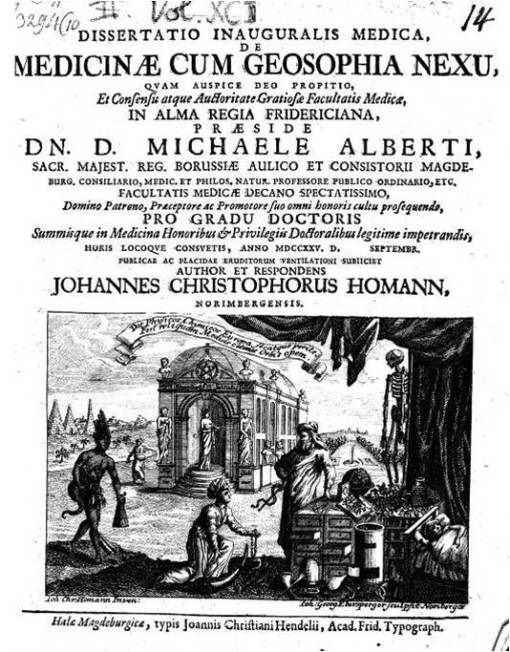
Johannes Christophorus Homann. The inventor of modern mapping, who defined the need for mapping cultures, living styles, health, and disease. I translated a portion of this thesis, reviewable at http://wp.me/Puh6r-7MS ;
Source: brianaltonenmph.com
The page this ScoopIt! links you with is several years old, but still one of the best and longest demonstrations of the national population health grid project.
I produced it with the goal of marketing NPHG to several of the top Healthcare Quality/Patient Safety companies in the U.S. The goal is to merge NPHG with a standard GIS module already in place. NPHG does mapping exceptionally fast; GIS can be used to follow up on the discoveries made utilizing NPHG.
NPHG is valuable at the small area and national health level . In theory, a company could produce a page for internal staff to access that is updated on a regular basis. This process can be used to a standard reporting module, such as a report focused on : African/African American Health, Asian American Crosscultural Physical and Mental Health, Latino/a Healthcare Programs, High Risk/High Cost Patient Care, SES, CDM Risk-Cost and National Mental Health Cost modeling. PW : Homann
See on Scoop.it – National Population Health Grid
April 9, 2015
Posted by Brian Altonen, MPH, MS under Uncategorized
Comments Off on Jennie-O turkey farm in Minnesota hit by deadly bird flu

MINNEAPOLIS (AP) — A ninth Minnesota turkey farm has been hit by a form of bird flu that’s deadly to poultry, this time in a large Jennie-O-Turkey Store operation that has 310,000 turkeys, federal authorities and company officials said Wednesday.
Source: news.yahoo.com
Lets take a look at the issue of fowl and livestock and diseases.
Not that we can change the industrial farming methods that much (although modern high tech and upcoming high tech robotic methods seem atrocious to some).
But farming has given us Hog Cholera, Texas Fever, Bovine Tuberculosis and Avian Flu. The Hogs in their usual way helped make the typhoid outbreak more efficient in Cumberland in the late 1800s. Cattle spread their Tb across numerous states by train between 1850 and 1855. Texas Longhorns gave us Texas Fever out of Mexico by way of ticks.
Over the years, I posted extensively about the history of these diseases that were developed because of industrial farming and the late 20th C livestock industry.
Examples:
Turkey Farms — https://brianaltonenmph.com/historical-buildings-and-sites/the-james-way-for-hens-and-turkeys/
Texas Fever — https://brianaltonenmph.com/gis/historical-disease-maps/zoonoses/1866-1885-the-texas-cattle-drives-and-texas-fever/
Bovine Tb — https://brianaltonenmph.com/gis/historical-disease-maps/zoonoses/contagious-lung-plague-of-cattle-1843-to-1892/
Zoonotic Diseases in general — https://brianaltonenmph.com/gis/historical-disease-maps/zoonoses/
Atlantic Veterinary College hour long class on this: https://www.youtube.com/watch?v=JcxR5kgS8zs
My Youtube video on the distribution of zoonotic diseases brought in from other continents/regions, at https://www.youtube.com/watch?v=NWYslHBLzeI
Results of my study of traditional Anthrax in the U.S. – https://www.youtube.com/watch?v=YpdAZjH2m60&list=PLWrApErk5byYGS5oG0u575xDIEwmANtyD
These continents/regions are also reviewed separately in the Youtube. Many zoonotic diseases can be found on my Youtube page.
See on Scoop.it – Global∑os® (GlobalEOS)
April 7, 2015
Posted by Brian Altonen, MPH, MS under Uncategorized
Comments Off on Mapping elephantiasis in Ethiopia
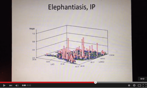
Ethiopia now has a national plan for eliminating neglected tropical diseases, but success depends on disease mapping, monitoring, and making data accessible for policymakers
Source: www.theguardian.com
I have a couple of projects I posted the results for on mapping history for elephantiasis. The figure provided ("Elephantiasis, IP") pertains to my study of the recent or modern history of importation of this disease into the United States.
By the mid-19th century, elephantiasis was considered a "latitudinal disease" by famous disease cartographers like Heinrich Berghaus (1847), Adolph Muhry (1856), Alexander Keith Johnston (1856), William Aitken (1872), and Robert William Felkin (1889) (the links to the pages I developed on these scientists are below). Its method and pattern of spread globally changed little over the next 75 years.
The history of mapping elephantiasis can be reviewed, starting with the links and maps below.
My spatial review of EMR claims noting Elephantiasis history, in video form, is at https://www.youtube.com/watch?v=Uc6zvqutU3g
FRIEDRICH SCHNURRER (1784-1833)
1827 ‘Charte Uber die geographische Ausbreitung der Krankheiten’ (1827) — TRANSLATION & REVIEW IN PROCESS
R. Brömer. The first global map of the distribution of human diseases: Friedrich Schnurrer’s ‘Charte über die geographische Ausbreitung der Krankheiten’ (1827). Med Hist Suppl. 2000; (20): 176–185. At http://www.ncbi.nlm.nih.gov/pmc/articles/PMC2530995/?page=1
HEINRICH BERGHAUS (1797-1884)
(1848 Map, translated, with review) –
https://brianaltonenmph.com/gis/historical-disease-maps/heinrich-berghauss-physikalischer-atlas-1848/
ADOLPH MUHRY (1810-1888)
(1856 Map, partially translated, with discussion) – https://brianaltonenmph.com/gis/historical-disease-maps/adolph-muhrys-global-disease-map/
ALEXANDER KEITH JOHNSTON (1844-1879)
(his 1856 world map) – https://brianaltonenmph.com/gis/historical-disease-maps/alexander-keith-johnstons-famous-map-a-detailed-review-1856/
(the North America portion, reviewed in detail) – https://brianaltonenmph.com/gis/historical-disease-maps/alexander-keith-johnston-health-disease/
(his philosophy and such) – https://brianaltonenmph.com/gis/historical-medical-geography/1856-alexkeithjohnstonsmay5thpresentation/
WILLIAM AITKEN (1825-1892)
(his 1872 map, compared with others) – https://brianaltonenmph.com/gis/historical-disease-maps/aitkenglobaldiseasenosogeography/
(more) – https://brianaltonenmph.com/gis/more-historical-disease-maps/1872-william-aitken-book/
ROBERT WILLIAM FELKINS (1853-1926)
(full 1889 map) – https://brianaltonenmph.com/gis/historical-disease-maps/robert-william-felkin-1889-tropical-diseases/
and (parts of his writings) –
https://brianaltonenmph.com/gis/more-historical-disease-maps/1889-robert-william-felkins-on-the-geographical-distribution-of-some-tropical-diseases/
(His work as a Google Book) – https://books.google.com/books?id=0t1TAAAAQAAJ&pg=PA43
See on Scoop.it – Global Health Care
April 7, 2015
Posted by Brian Altonen, MPH, MS under Uncategorized
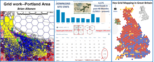
Comments Off on Hexagonal Grid Analysis – An Update on Recent Trends
This sites received 91,000 hits per year. My page on hexagonal grid analysis receives a consistent percentage of these hits.
The reason is the description on how to use and manipulate the hex grid method of mapping, my arguments as to how it reduces error production in spatial analysis by 25% +/-, and the value of downloading the hexagonal grid modeling tool that I posted 5 years ago, for students in search of a unique final project.
I developed this method of analyzing health in the winter of 2002/3, twelve years ago.
It was successfully applied at the state level to demonstrate the spatial relationship between exposure to chemicals and leukemia/lymphoma case reporting.
Source: brianaltonenmph.com
The isolines that are developed from hexagonal grids are more accurate and visually appealing than those generated using a traditional square cell grid technique.
A fairly detailed statistical analysis I performed comparing square cell grids to hex cell grids demonstrated there to be a 42% of error with square grid cells due to corner-centroid spatial relationships. With hex grids, this relationship is reduced to 16%-17% potential for error in spatial assignments.
The hex cell method is by far more reliable and useful than the traditional square cell method, yet 90% or more of GIS analysts rely upon the more error prone older methods.
The number of visitors at my site on medical GIS for hex grid training is unique, and consists mostly of students, who are engaged in some sort of GIS lab project or producing a project in GIS to hand in as a term project or paper.
One way to understand the ingenuity of a GIS user is to determine how exposed and familiar he/she is to the applications of grid modeling, and the benefits of hex grid methods over square grid methods.
For grid mapping spatial analysts, until hex grid cell methods are employed, esp. for medical GIS, we will always be dealing with the >40% spatial error problem for our work.
The major advantage of grid mapping is that it does not require base mapping, or even the use of a background GIS to produce your results. With the hex grid method, we could avoid the need for a regular GIS to produce our results (a popular early 1990s philosophy amongst us grid analysts), but hex grid mapping techniques provide a greater benefit and more useful graphic output when developing using a standard vector GIS tool for the spatial analysis.
See on Scoop.it – Episurveillance
Next Page »

