I designed a way to score health care programs for their GIS savviness using this scoring process, which evaluated the different spatial modeling software tools, methods of analyses, mapping processes, applications of GIS use, types of GIS (point, raster, vector) employed for surveillance and public health monitoring. This survey ran from 2015-2019 and focused on the use of GIS by Health Care Organizations and Facilities.
Middle of Outbreak update.
A number of historic epidemiology researchers, like myself, have stated that more than three years is a lengthy stay for a pandemic event. The ways that yellow fever and cholera tended to stay, and re-emerge, was in two or three year clusters during the late 1700s and 1800s. Each had varying numbers of years apart between their cycles, a source for our reasoning.
The first tendency is to look at past epidemic history and try to assign some sort of natural cyclicity to the observations. The most common blame we hear surfacing this way, is “global warming”. Noah Webster is perhaps the first to note this relationship–blaming the outbreaks on climate and weather changes in combination with population growth, dwindling natural resources, and the development of urban areas. (see https://www.smithsonianmag.com/history/americas-first-great-global-warming-debate-31911494/ )
But still, we are now more than two centuries through these patterns of recurring reasoning, none of which seem to have resulted in science and medicine learning anything new about recurring disease outbreaks. This new outbreak gives us a chance to “reconnect with out past”, new opportunities to be published, to be the “first to discover something” within our own personal calendar for learning.
The first large organization/epidemiological research team outside the CDC, WHO, to successfully map an outbreak, continuously, came to be due to the Covid outbreak–Johns Hopkins (link: https://coronavirus.jhu.edu/map.html ). Other leaders in this field (I won’t give their names), whose products focus on disease monitoring and surveillance, were caught completely by surprise by Covid, and not at all ready to develop their workstations to a fully manage the outbreak about to happen.
With this new outbreak, there are observations we can now make about disease ecology and public health. There are also observations we can make, and the theories that follow, regarding evolution and genetic changes within a pathogen, that could enable us to better understand this natural phenomenon–disease pathogen evolution, migration and diffusion.
Cholera, Yellow Fever, Measles, Small Pox, Covid, all seem to follow similar spatial diffusion patterns. These laws persist, regardless if the organism/pathogen is multicellular, bacterial, or viral. There may in fact be some biological/evolution-based reasoning for the outbreaks we are seeing, but this post is not the place to discuss such a topic, for the moment. Suffice it to say, that like Vibrio comma, whatever newer strains of pathogens evolve, they work towards allowing themselves to spread more quickly, more easily, into more people, preferentially, without killing off their hosts or victims too quickly–that would be against their long term survival.
So for the moment, this addition to the page is for only to give an update to several years back. More will follow. Time to stay “politically” and “scientifically correct.”
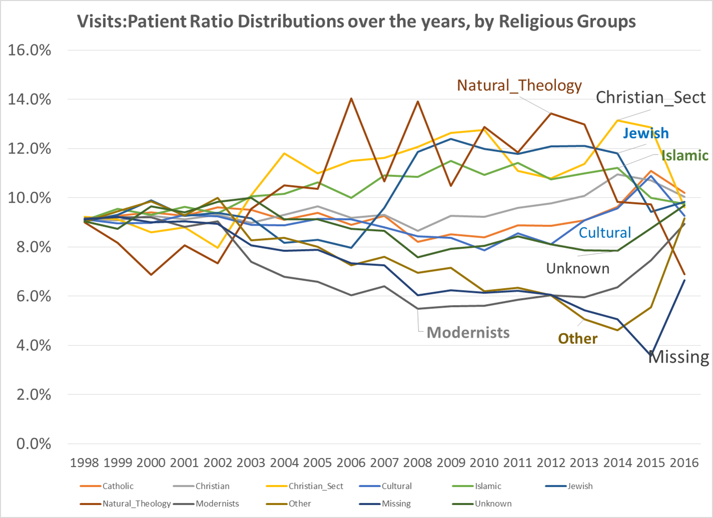
Over the past 6 years I produced numerous studies on epidemiology, averaging about 52-60 per year, depending upon how you define a new study when an old one is extended or provided with a new grant. All in all, a total of 417 “projects” were engaged in during a 6.5 year period. 35 per year are completed residents’ work; another 15-17 are residents’ work in the first year and more in a preparatory phase, when I am not engaged much in the project, a handful are in the post-completion, pre-writing or writing phase for a journal article and/or conference abstract proposal. The rest of the projects are department level, and ongoing and/or grant related. These numbers do not include the data mining I regular engage in, and develop helpful disease registries from.
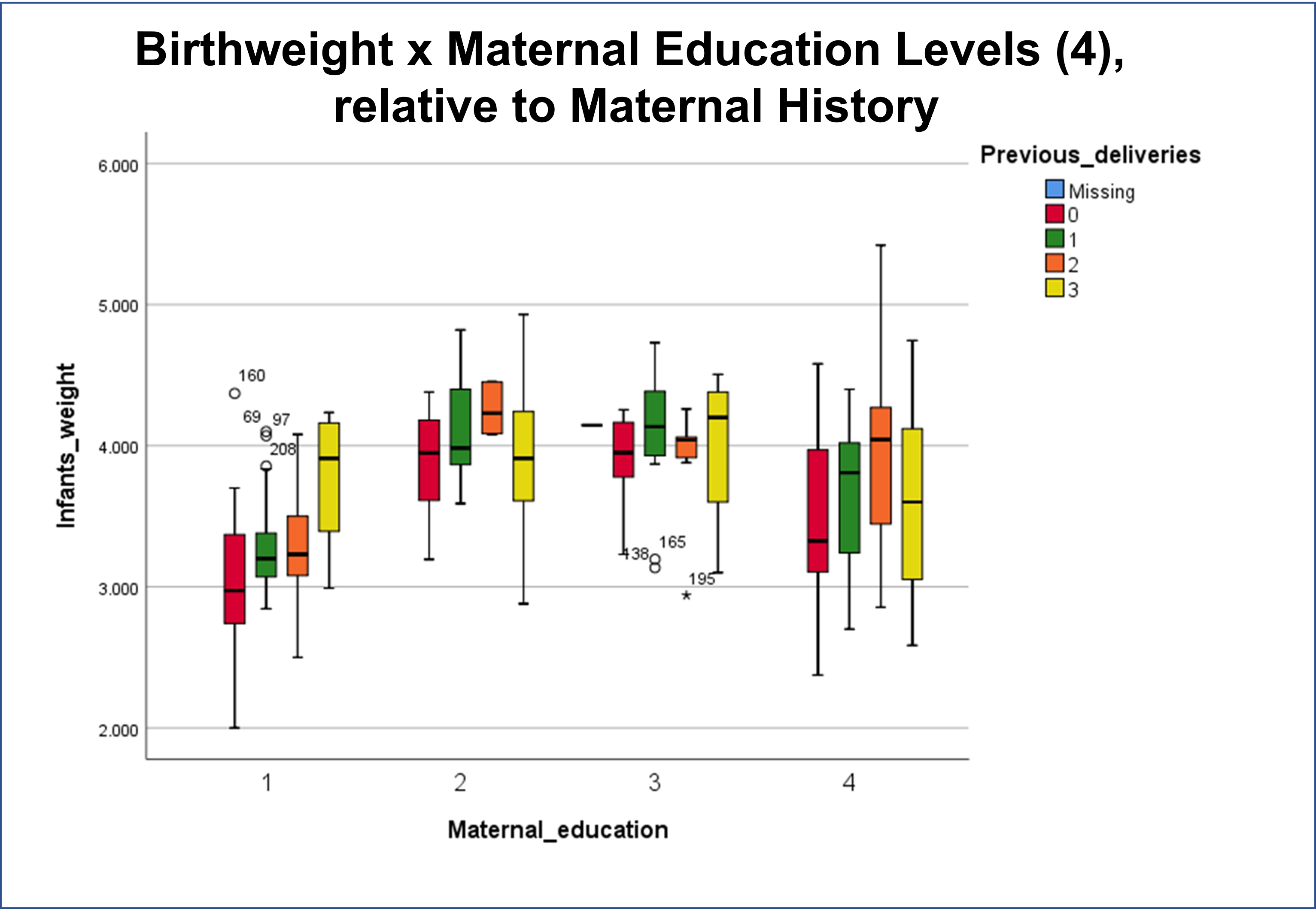
The value of this seemingly continuous research work is it provides me with opportunities to test new methods, new software, new formulas, and design new methods of analyses. It allows me to test small groups/small numbers theory, in relation to exceptionally large numbers theory. It allows for the confirmation of past theories published in my 2000 thesis (use of the “Reversed Hierarchical Diffusion Theory” model to explain how poverty can be a leading cause of epidemic spread.) It allows me to develop new and more helpful ways of presenting the data (examples follow).
One of my past writings, accomplishments in researching these spatial diffusion of disease patterns is worth noting.
In 1999, for my thesis work, I developed the logic for how, when and where a reversed hierarchical disease diffusion pattern could commence. This was the result of my extensive review of John C. Peters’s work on the Asiatic Cholera outbreaks throughout the 1800s. Peters was assigned a position that was the predecessor to today’s position(s) in charge of monitoring national epidemiology data, peoples’ health behaviors and disease statistics. John C Peters noted the tendency for cholera to initiate in low income living settings, a pattern repeatedly seen for many big cities impacted by the outbreaks, where mostly low income families resided, in particular the Irish and German immigrants. But we could also see this tendency for low income people to be struck in other cities, with African American poverty stricken communities. Kingston, Jamaica in particular developed its outbreak due to a low income older lady shopping for family’s food related essentials at the nearby wharfs.
So, today’s recent realization of this outbreak striking mostly the lower income settings–lower Socioeconomics Settings or SES–is simply a rediscovery or re-recognition of a link between poverty that we have known to exist since the first statistical reviews of yellow fever and cholera were published. Political leaders and leaders in health care are just never trained to keep this thought in mind when making their decisions, about how and where to divvy up the costs for care, and provide health care services where they are most needed.
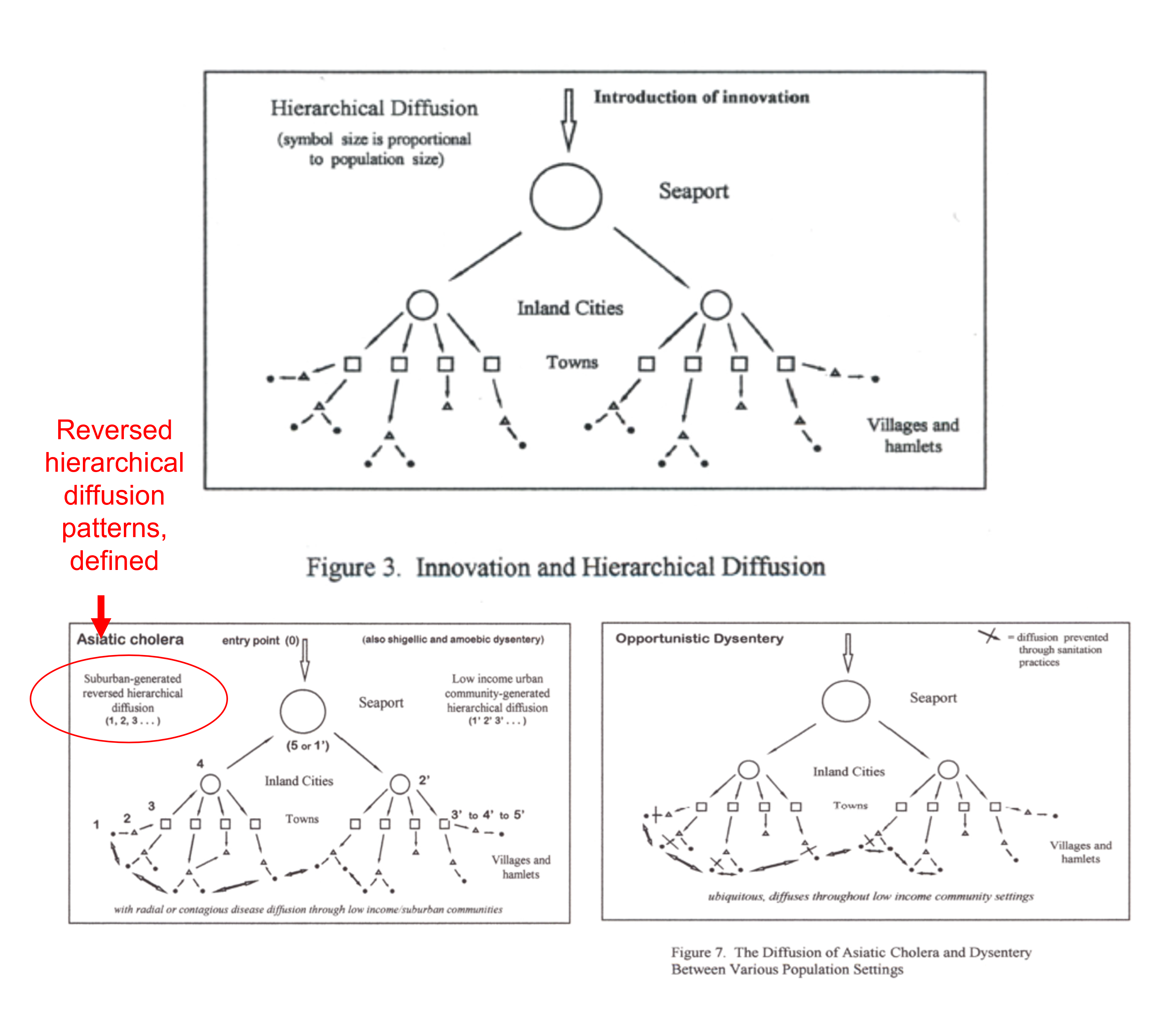
Figures Extracted from my 2000 Thesis (source: https://oregontrailcholera.wordpress.com/ ).
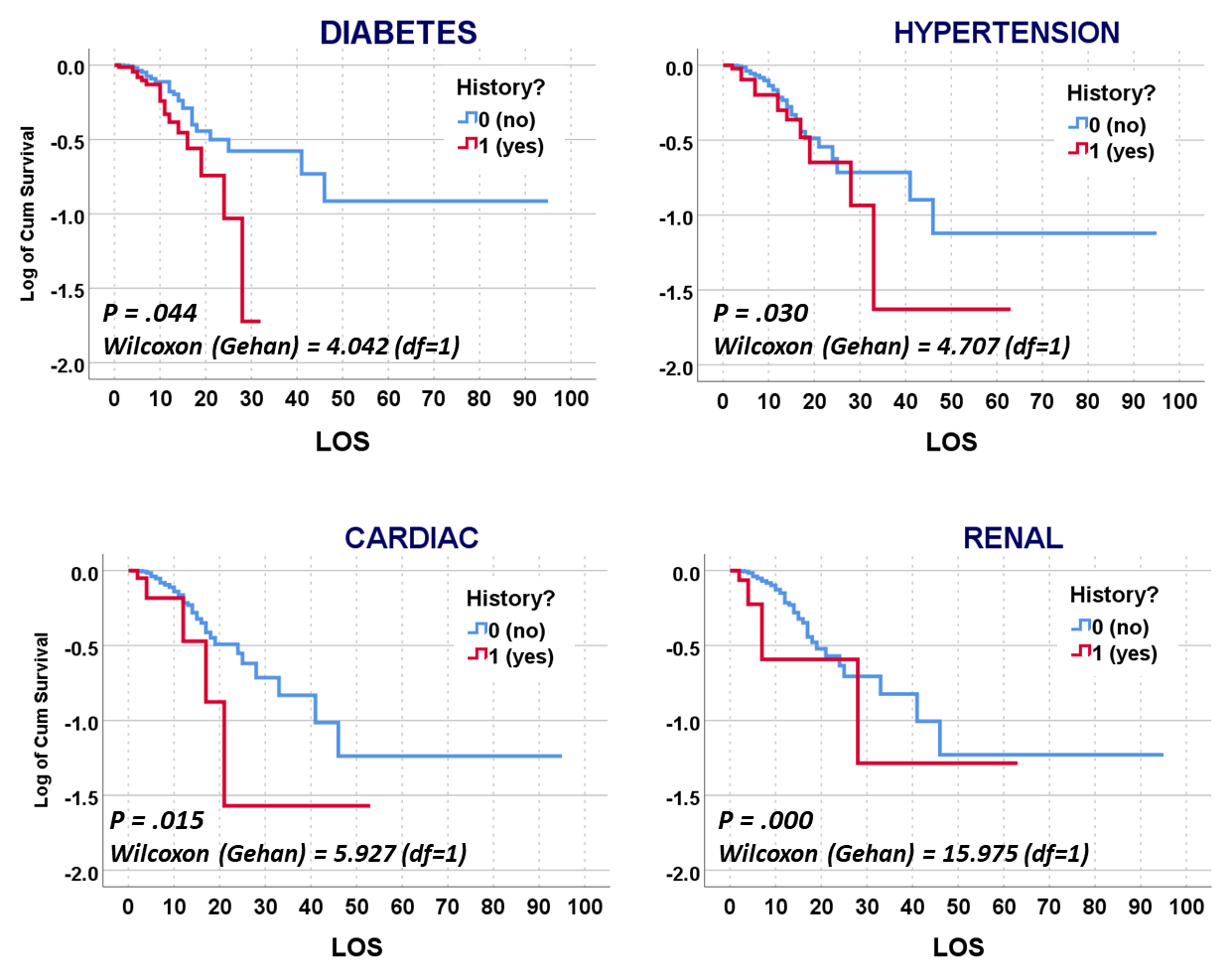
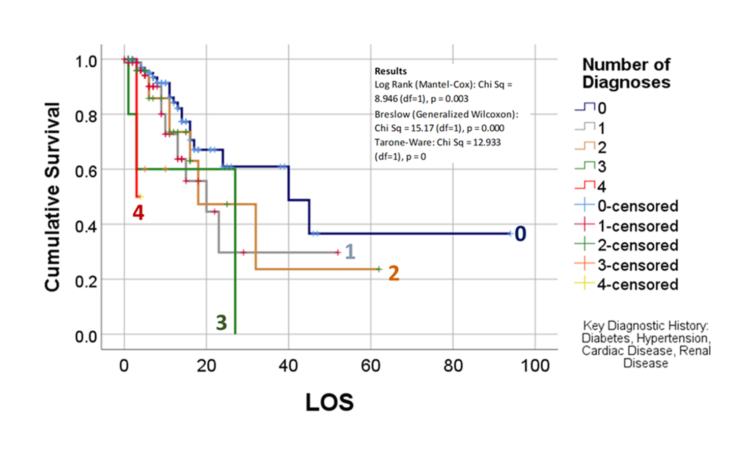
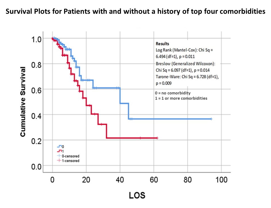
The following is from the November 2020 Publication of some of my May to July 2020 work, defining the relationships between mortality and chronic disease (CD) history, with each CD evaluated independently and as a combination risk factor for use in outcomes prediction and risk analysis.
See
Altonen BL, Arreglado TM, Leroux O, Murray-Ramcharan M, Engdahl R. Characteristics, comorbidities and survival analysis of young adults hospitalized with COVID-19 in New York City. PLoS One. 2020 Dec 14;15(12):e0243343. doi: 10.1371/journal.pone.0243343. PMID: 33315929; PMCID: PMC7735602.
https://pubmed.ncbi.nlm.nih.gov/33315929/
Acknowledgements: this work completed courtesy of Ryan Engdahl, MD., Department of Surgery, NYC Health + Hospitals, Harlem and Woodhull Hospitals, and Department of Research Administration, Health+Hospitals/Central Office, New York, NY, 10013, USA.
Other recent professional journal articles by myself are referenced on the following NIH search page:
https://pubmed.ncbi.nlm.nih.gov/?term=Altonen%20B%5BAuthor%5D&cauthor=true&cauthor_uid=34675748
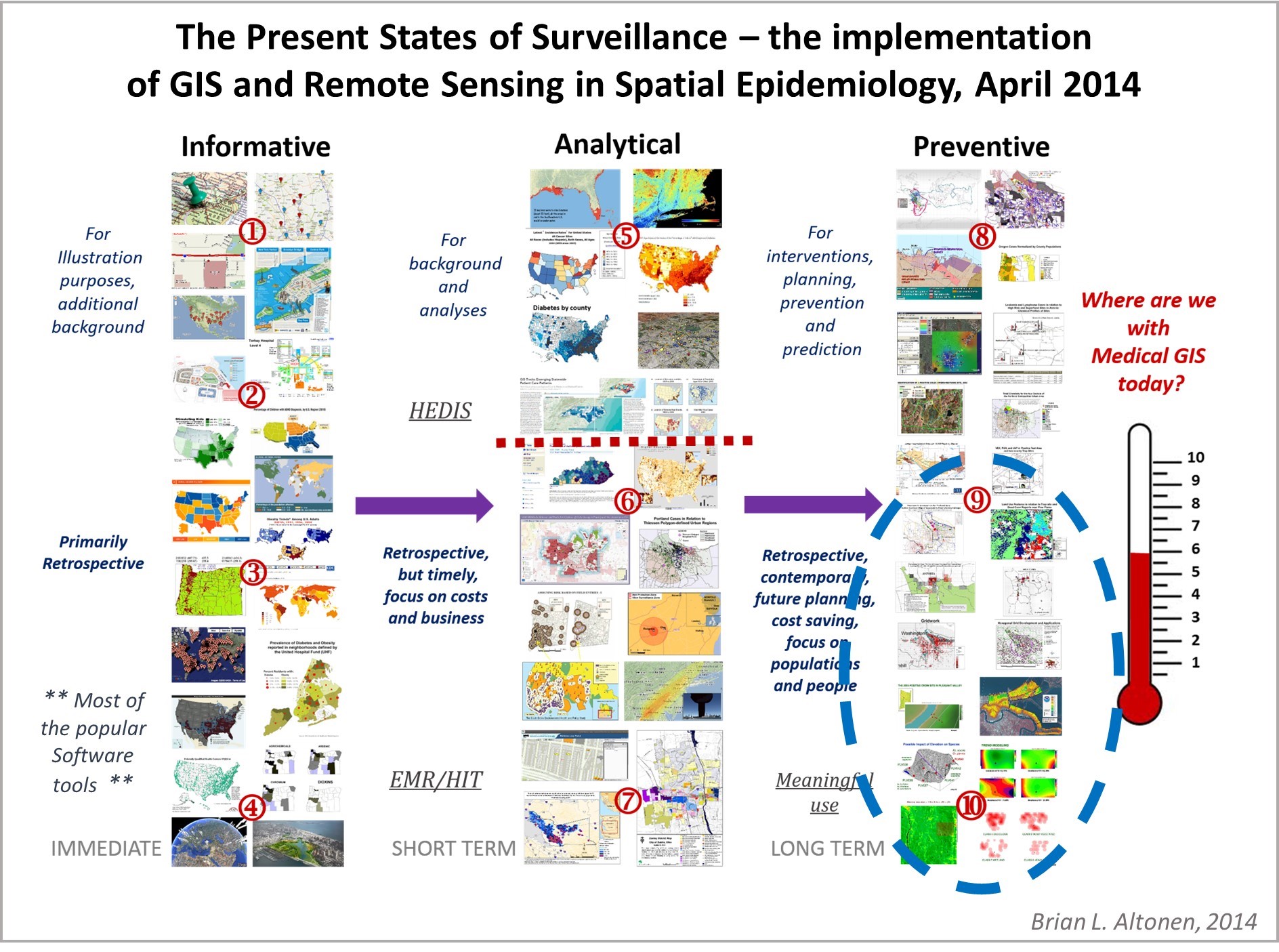
The implementation of GIS as the means to monitor health by many (most) agencies is twenty years overdue. Barriers to implementing GIS theoretically could be defined as simply: lack of understanding of the technology, lack of experience engaging in its use, the absence of leaders in the field with a true GIS mathematical experience (most agencies felt specialist in CAD sufficed during the early years–2000 on, ’tis not the same!), the hesitancy to learning this new technology, the fear of losing your place in the workforce as a CAD expert, the cost of initiating a GIS, and based upon the decade, the level of technology that was presently in place, its storage and costly hardware requirements.
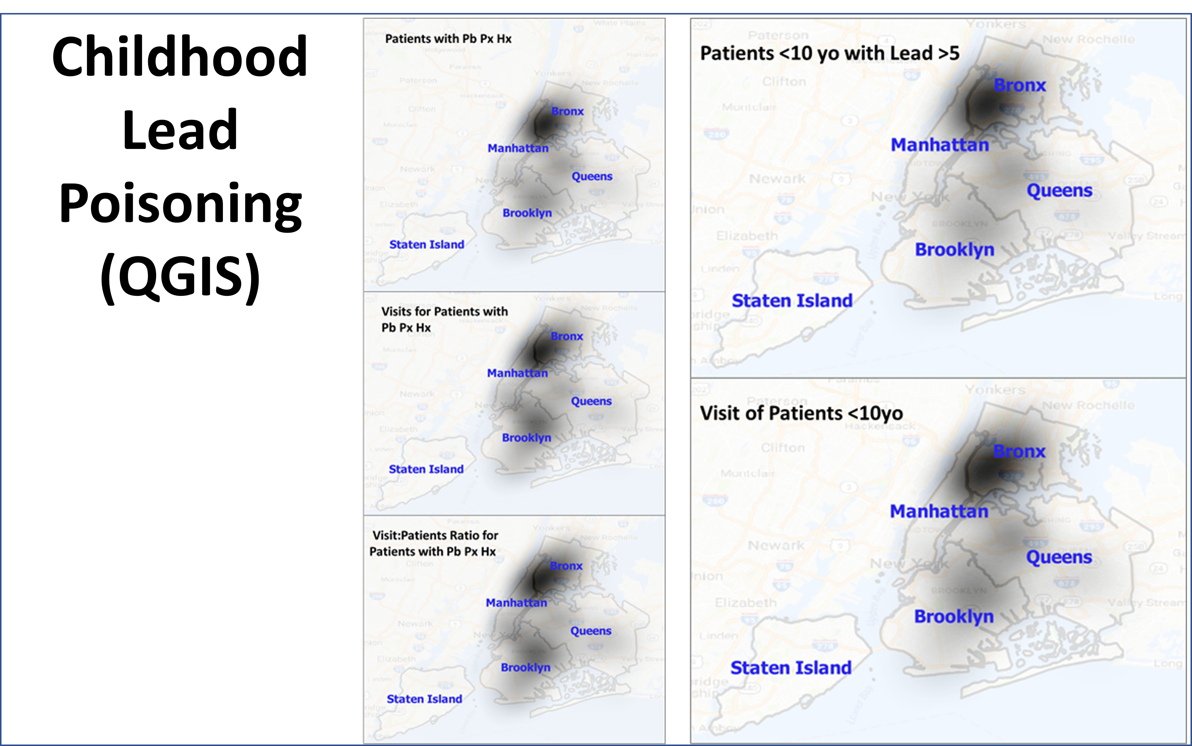
QGIS is a free GIS tool, developed abroad, that is very easy to use and less cumbersome than the products commonly sold in the U.S. In terms of sophistication and power to detect and display valuable epidemiological information, half of this is due to the knowledgebase and skills of the researchers and analysts, with another substantial part of this linked to the GIS tool(s) in use. The disadvantage to the most popular tools out there are:
- cost
- the value of what they produced (i.e. better unquestionable analyses are still generated more by direct human involvement, than by using/misusing the technology to achieve such gains),
- the possibility of “going down a rabbit hole” without knowing there are better options, end products that may be generated in other ways.
The chief factors that led me to search for better options were the slowness of traditional GIS methodologies, and the constant need for experimentation and re-experimentation with new formulas, programs and technologies. The health care field recognizes and accepts certain tools, products, presentations as acceptable standards, and refuses to pay much attention to newer, more diverse, helpful forms and versions of the same technology.
Unfortunately, the most popular of these technologies are still very primitive in the way they function and operate, how many end products they can produce in a given amount of time. Can these tools produce, for example, a standard Atlas style report of the top 300 ICDs in a given hospital population? produced in just a day? repeated for various comparable subtopics, such as age groups (i.e. children, on up to seniors), gender, race/ethnicity, religion, zipcode area, field of employment, SES, etc.? The capability to accomplish this has been present for at least a decade (or longer).
It is possible there are just two hindrances to companies becoming overly creative in this field. They are rapid turnover of people in various positions, for various reasons, but perhaps largely due to how the HIT field is managed when it comes to implementing a complete and thorough Data Management. The overturn of experienced workers, in search of other venues and positions, removes people with important skillsets, where they could become exceptional producers of outcomes. The lack of expertise in management with health data is the second reason–if they cannot themselves produce the reports or products they want, then they should not be in the position to request such items. Likewise, the manager of a team should be able to produce the products being requested of his team members. Some differences in skills sets are expected between management and the rest; but differences that are so prevalent that they slow down performance, discovery, recognition of need, and the ability of the team to produce a much needed product at the time, make such managers very inefficient.


Related to the inability of a team to produce an effective work crew, is the tendency for inefficient teams and especially management to gloss over their human resources, and to even eliminate some of the most important members of a team when it comes to certain skill sets. This is regular event in the workplace, no matter how much sites like LinkedIn want to put out some unrealistic representation of how companies are actually engaged in this form of corporate growth due to better use of human resources and staff improvement.
With regards to generating an effective GIS for a program, production should start as soon as three months, with product by month 9, that then gets administrative and department approvals, and fine tuned, all by month 12, and then by the end of the first quarter of the next year, pass the first quarterly reporting administrative tests. It’s an “If I can do this, then why not you?” scenario, for those companies/work environments that need to take two to three years to finally get their act together.
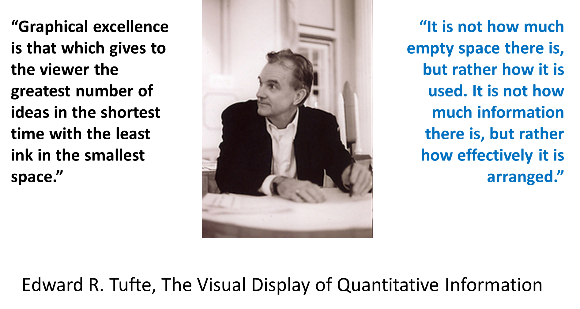
Innumerable facilities like to refer to Edward Tufte’s work on becoming a successful, highly productive business when it comes to data reporting. The late 1980s (to 1990) is when I was first approached by someone who likes referring to Tufte’s work. He was a used bookseller in Portland, OR. Now, nearly thirty five years later, I can say he is still right. And I have been in several positions where I experienced managers who attended conferences and came back swearing they, their team or company, was about to engage in such a venture.
To date, companies are still trying to get one basic data system working completely and effectively, not hindered by the new technology and hardware-software requirements. What prevents discovery, are the factors hindering chances of completion and thus slowing down the rates of discovery. Unfortunately, we are still trying to understand and document the same metrics in health care that we were trying to document twenty years ago, in turn never looking fully at the rest of our data. Thus, cancer, diabetes, rheumatism, hyperglycemia, are still being tested and retested, at the cost making important chronic diseases like epilepsy and MS last on the priority list.
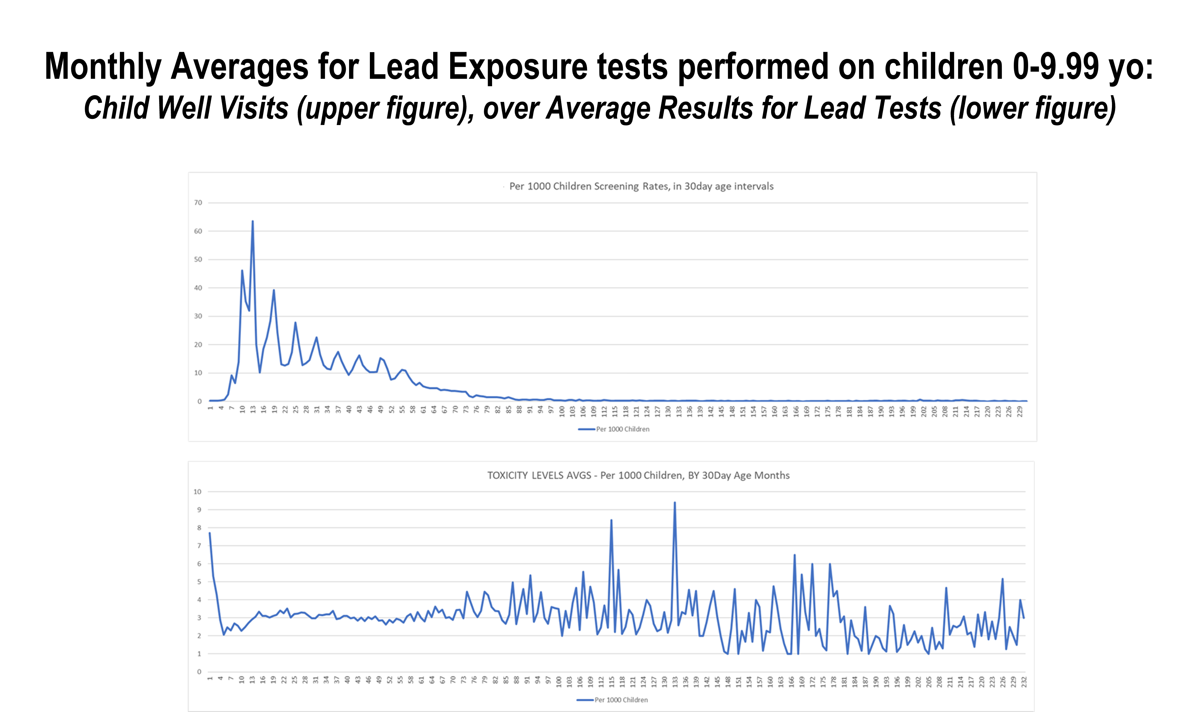
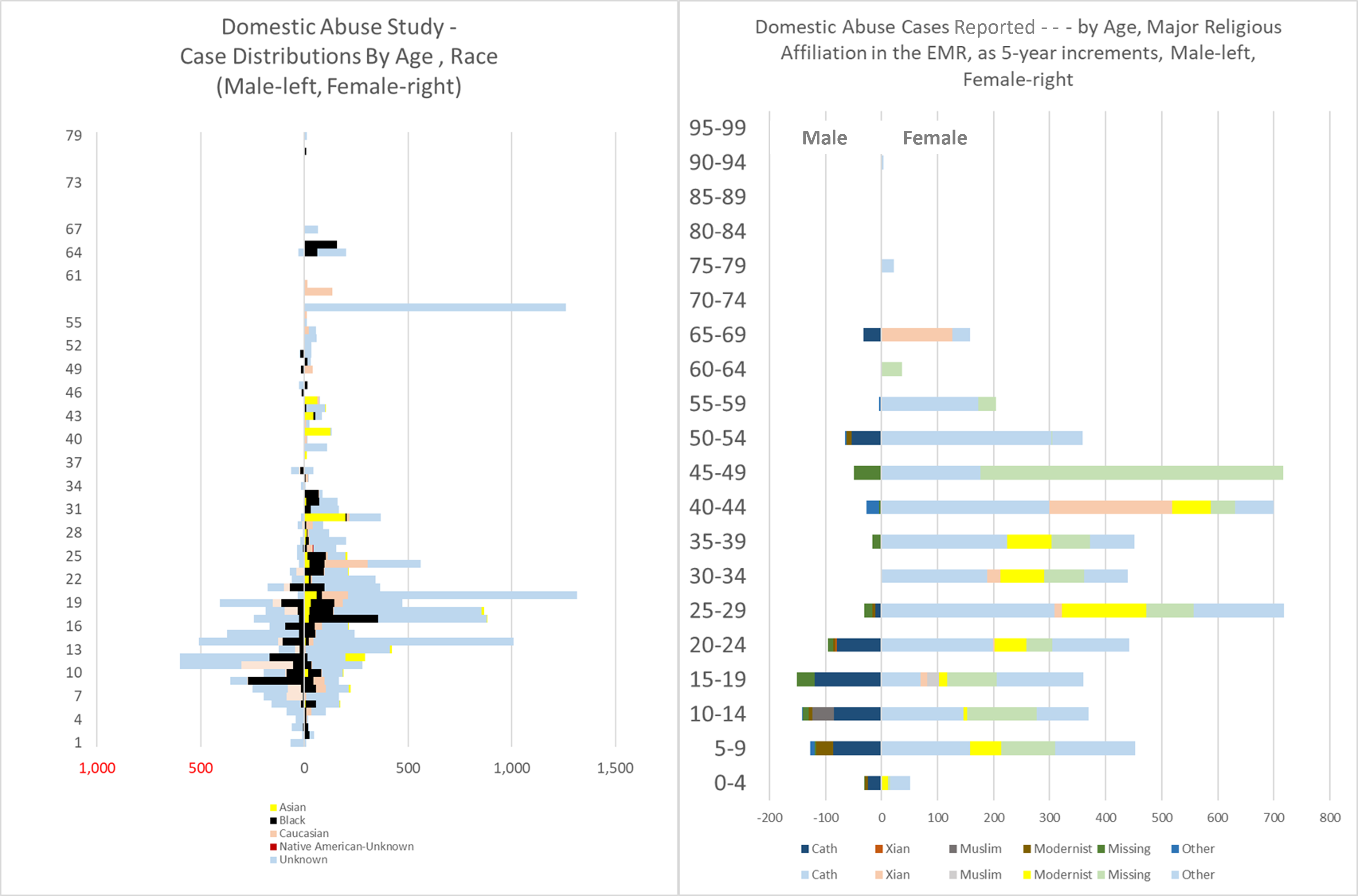
The following is an example of how I applied it to develop my typical video-style presentation of a diagnosis distributed about a region.
(https://brianaltonenmph.com/about/)
