
ó ♣ ô ♦ ◊ ♠ ö ♥ ò.
.
Note: As of May 2013, I have a sister site for the NATIONAL POPULATION HEALTH GRID MAPPING PROJECT. Though not as detailed as these pages, it is standalone that reads a lot easier and is easier to navigate. LINK
.
Seeing the Elephant(s) – Part 2
Preface
The common ideology about medical care and costs is as follows . . .
Corporations, insurance agencies, health care providers all try to engage in documenting and understanding how to make people healthier. The services they provide have primarily just one goal in mind–increased revenues and saving money. Most For Profit agencies, groups or companies are not so much concerned with making people healthier, as much as they are devoted to finding the cheapest way to provide this service. The logic is that by reducing cost, the company in turn increases capital gains and according to corporate logic, has more resources to go around. Were it not for certain programs overseeing their program, like the federal agencies that monitor and measure the results of health care programs, or the auditors and outside non-profit agencies scoring them as service providers, these kinds of health care programs would pretty much go untouched. A disaster for many people, a live saver or extender for very few. People get the best product from their corporate factory only if they can afford it. With or without overseers and government interventions, this is pretty much true for all programs currently in place. One commonly mistaken assumption is that cost and prevalence go hand-in-hand, an assumption promoted mostly by individual inexperienced in receiving these different forms of care and medical/pharmacal support. Such is the typical product of a United States health insurance market.
Cost and prevalence do not go hand-in-hand. Just because high prevalence exists for a given health related metric, this does not necessarily mean there is high cost. In regions of high cost, prevalence could in fact be average, or better, meaning this high cost exists due to population density and the frequency of a health related need. When we monitor health care we often tend to link cost to health related metrics like quality of life, degree of healthiness, or amount of prevention. It is a big mistake to assume that cost for service and quality of service are the same. Since the success of a business like health care insurance, from the corporate side, is devoted to saving money, developing new metrics and designing new ways to interpret or predict health savings for the sole purpose of defining where failure exists is like placing the cart in front of the horse.
The best way to deal with population health issues is to look at where the health care needs exist first, and then distribute these needs accordingly. In this scenario only afterward do we look at costs and cost differences and then make the appropriate adjustments. Within the corporate setting, the focus of distributions research is on earnings and products first. Studies of Quality of Life and overall population health often never become a part of the study. That is considered the responsibility of care providers.

.

Just to be fair about these statements, it is worth mentioning that due to overseers and federal recommendations and at times requirements, many insurance groups have quality of life activities going on designed to improve health through intervention activities. These activities in turn are monitored by measuring rates of cancer screenings, percentages of children completing their vaccinations by the age of two years, numbers of people undergoing a colonoscopy after reaching the age of 50, numbers of smokers making use of a hotline dedicated to smoking cessation. Some companies or agencies like to add such measures as prevalence or incidence to their metrics for the population under review, trying to combine together two opposing ideologies– trying to make people healthier and trying to reduce financial losses thereby increasing corporate income. The cost for a particular form of health acre changes whenever the availability of the product to which cost is attached costs less to produce, less to sponsor or less to make available to the people. Because diseases exist that influence few people overall, these types of diseases also have attached to them the problem of costing the most (orphan drugs for example). Industry wants to be reimbursed for its efforts, but is unwilling to accept the additional income generated through the development of another product as compensation for these financial losses. This means that when population health is measured at the corporate level, the focus is always on cost, not people. When population health is measured at a non-profit level, the focus is on people, at the risk of providing inadequate services due to limited financial support. When reviewing population health, some agencies or groups try to focus on both numbers or prevalence, but this only introduces prejudice to any outcomes under review. The first deals directly with cost, and where and how to lower costs for health care. The second deals with people.
In places with large numbers of people receiving a particular service due to a certain disease, small reductions in cost can go pretty far and add up to significant changes, even though prevalence is not changed. In places where highly expensive medical problems like the need for cancer or heart surgery exist at low rates, this does not mean the people in that region are healthier, it only means they need less of the costly health care services made available to the public as a whole. In the case of rural health care for example, the cost for preventing late diagnoses may greatly outweigh the money saved by facilitating early detection in turn result in early intervention and early disease management. One can save the industry a quarter million dollars by preventing the need for expensive cardiac surgery in a single patient, or save the industry millions of dollars by preventing the need for the same involving dozens of patients, undergoing more expensive intervention and prevention activities, by a fancier health care facility, located within a more expensive urban setting.
Suffice it to say that cost reductions and prevention do not go hand in hand in terms of planning your program’s activities for the upcoming year. The reason we map disease is either for purposes related to better understanding the cause-prevention relationship, as measured by incidence and prevalence rates for age-adjusted populations. The other reason we map disease is to illustrate and come to a better understanding about where the greatest costs exist for each type of disease state dealt with, for each kind of community that exists. Incidence/Prevalence has little to do with costs in the long run, except when these differences between two groups are significantly different–the 1 million dollars per year per patient versus 250,000 dollars per year per patient two-systems comparison. Most analysts that utilize maps develop a better understanding of their people and population needs by focusing on numbers of people, number of dollars, numbers of providers. If they turn to incidence prevalence mapping, they are in essence ignoring the corporate strategy, which is to reduce costs. Due to low numbers, lack of service, poverty, inconvenience, those most in need and who cost the most to manage are in the end very people due to other socially based causes.

Ranking Success
In my first essay on “Seeing the Elephant” I introduced the notion that the largest industries with the most potential for improving population health are those with the largest number of patients or people and their related health care data. There are only a few places where this data can exist due to HIPAA and PHI-related privacy rights. There are a number of places we can go for data from the past. Data of the recent past–the contemporary and live data sources–are much fewer and usually have restricted access.
The best data to review and map of course is that most recent data. GIS products like those of ESRI enable companies, npos, and other large groups to map their data and demonstrate these results on the web. They also provide live GISing tools that can be utilized by visitors of the page for reviewing what kinds of health features exist in the more recent or contemporary population settings. These live GIS tools set to most basic goal that now exists for all health care PHI storers and analysts to try to meet. So how do we interpret and “judge” a company relative to such a standard? How do we best rank the success a particular company bares in the modern information technology world?
Having worked with and in the IT since 1982, the year of the first PC and personally manageable databases with matching analytic tools, we can rank these companies by where their intellectual and analytical progress lies. One could ask ‘is this company a contemporary, a 5 years old company, or a 10 year old company when it comes to how successful it is in keeping up with the technology and making the best use of its data.

.
There are a number of ways in which corporate or office success can be measured in the medical IT world. These rankings are based on how much the company or agency has automated its activities, and how much and how quickly new tools can be produced and implemented for producing new measures. These company-level skills are a product of two things–the knowledge base of the staff and workers, and the availability and active use of the software tools and self-produced sqls needed to engage in such tasks.
These successes also have a timeline attached to them that can be generated. This timeline is used to define the lag that exists between the introduction of new software, techniques and tools and the actual implementation of the use of these tools at a completely engaged corporate level, as a moneymaker and information source. For the related descritpions that follow, I use similar last digits to keep these times about 5 or 10 years apart. Notice that some of the years defined may by slightly more accurate, but due to technology lags (the west coast catching up with the east and vice versa), we’ll just stay with the 5-year segmentation for now, and apply these standardized numbers to ranking processes, scores provided and goal-setting.
- 1982 – database development, with basic analyses possible, mostly done manually, search and diagnosis are possible, but time consuming and costly. Crude and primitive data-mapping is possible.
- 1992 – database automation and integration (undertaking hierarchica formsl) are possible. Computer-generated mapping is in its infancy. At the GIS/RS level, remote sensing and photogrammetrics are more helpful population analysis tools and techniques. Population health is completely possible–meaning that 1-year or 5- and 10-year analyses and comparisons can be the standards. Access to large numbers however is the limiting factor in this growth period for health-related information. Crude data-mapping is possible. “ArcInfo era”
- 1997 – Data mapping is possible, but somewhat time consuming, and limited in its presentation. Reasons for initiating these tasks have to demonstrate GIS to be high advantageous. “MapInfo” and “ArcView” eras/parts of era.
- 2002 – Data mapping and display are very much possible at the corporate level, and data management products can be effectively mapped. The only reasons these are not integrated into particular programs is lack of knowledge, lack of interest, related costs, “confusion”, and lack of willingness to take a risk. Late ArcView, with Avenue Extensions; early ArcGIS. (By 2003/2004, ArcGIS is a very solid institutional and government office commodity. By 2004/5 corporate level engagement should be underway if this is an essential tool in information/cost management and supply-demand analyses.) ‘ArcView with Add-ons and Avenue Extensions, or ArcGIS’
- 2007 – Data mapping and display are possible and should be presentable at some client/consumer level. GISing served mostly as a information tool, although analyses are possible. Data should be presented in image form, but the tendency is to provide only or mostly tabular and text form end products. Innovation can be measured by the amount of the end product (reports, handouts to staff, etc.) containing images rather than text. Technician skills have the potential of being ahead of CEO/management skills, meaning that even if results are produced, managers lack the background to understand the value of the end product. (The old time managers problem–having a manager with little or no knowlege relaventd to the technology, its value and purpose.) “ArcGIS”
- 2012 – Data mapping and display are proactive business behaviors with potential for use as an analytical tools. “ArcGIS and web”
To understand where a company lies today, in the above timeline, requires you ask
How much GIS is implemented–is it . . .
0. non-existent [1970s-most 1980s, excl RS stations] . . .
- primitive [286, 386, pre-Pentium–late 1980s-1992/3],
- crude map [excel/Mapinfo/other, 1992-1995],
- ArcInfo/MapInfo [1994-1997],
- ArcView [1995-1999],
- ArcView, Add-ons and Extensions [1997-2003/4],
- ArcGIS [2002- ],
- ArcGIS with Web incorporation [ca. 2003/4 on ; Stage or Level I]
- ArcGIS with Interactive Web [ca. 2005/6 on; Level II]
- Advanced ArcGIS, etc. with integrative internet interactivity [2010; Level III].
- Advanced ArcGIS and related components fully employed, interactive, and utilized [2011/2012, Level IV].
For example, in one health care administrative program I was involved with managing intervention projects, the population health reporting was outsourced. When the reports were received, the technology for the time was 5 to 10 years different from the normal reports being generated. The outsourcing company replied to my query into this awith “If an old tool works, why change it? Right?” In the end this that saved both of us money. However, since the project was a population health topic, it would have helped if the data could have been generated in another format for GIS, pseudo-GIS or non-GIS analyses, which was not the case. Due to the primitive nature of the reporting tools, and the fact that this analysis was subcontracted out, this could not be accomplished.
Another project in 2002 involved the Anti-bioterrorism grants generated by NIH as a result of 9-11. The plans were to develop a GIS Emergency Response system for the next time such a disaster was repeated, in particular in rural communities and involving the spread of a bioengineered anthrax or some rare contagious disease. One county attempting to monitor the project developed an Autocad approach to the project; it had some of the best Satellite communications hardware required, but none of the GIS spatial software needed to do maintain a database on the work during the years to come.
We can determine approximately how far behind in the technology a company is by using a simple equation:
2012 [or measurement year] – year of highest level of technology
A company that today barely monitors its statistics cartographically, and should so, and/or is in the working and testing stage of GIS development, is very much akin to the “MapInfo era” [illustrative/informational mapping] or “ArcInfo” [statistical mapping]. (We called it this due to the MapInfo versus ArcView users hierarchy–ArcView cost more, those frustrated due to cost went to MapInfo, which had some very useful spatial tools that required several hundred dollars more in cost for ArcView [esp. 3.2].) If it is more into mapping looks and development, we can advance it into the ArcView era–more than ten years behind in the technology.
We can also apply this way of thinking to company stability and it ability to stay alive in the years ahead. Companies that are more than a decade behind are right now at high risk for failure. This means that if you are a company with mappable data and clients with a need for mapped data, improvements are necessary if you plan to retain old contracts and still develop new contracts two to three years from now. It also means that in order to reach this goal, a paradigm shift has to happen–in the form of purchasing (not contracting out) the new technology. It also means that new a knowledge base has to be established–the same old staff (most members lacking in GIS experience and knowledge) is not going to allow a company to reach their goal on time.
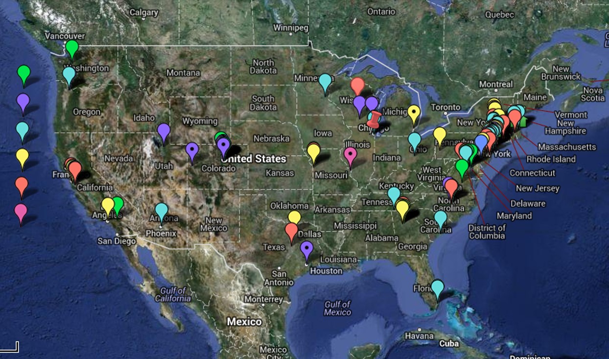
The above features discussed have been assessed for the point locations on the above map over the past 18+ months as of this date (6/1/2013). These are companies which would in theory benefit from GIS but haven’t fully employed such a system (fully employed referring to monthly to weekly regular, standardized sql/SAS/GIS reporting that can review hundred of metrics). They are companies that due to size and/or reputation and stature would benefit by implementing GIS, placing them in front of all others for this particular part of the health care industry. Only one company was found to be actively employing the GIS at a level 6, a few times a year, and another company in the process of developing a “Healthy GIS” system at level 7 and posting live maps, but only at a large area level. Another Big Business with health care data responsibilities, but not priorities, is considering the implementation of popular health behavior monitoring. None of these companies have developed or implemented the use of small area algorithm for their work, a necessity for determining how to better target healthcare and intervention needs, and improve the long term health of patients (but not necessarily lower immediate costs).
The impacts this lag in technical development has upon future success is well demonstrated by the bioengineering companies that arose during the late 1980s. From 1986 to 1988 I did some work for a major nationally known, stock brokerage firm. My role was to review the bioengineering companies that were recently formed. Their bioengineering work was well described, and proposed in their annual reports published for investors. Theinvestment firm I worked for felt these companies were high risk, but some investors were intersting in learning more about the validity of their goals and claims to projected drug productivity. As long term investments, the brokers felt these companies were too risky, but they had potential as short term investments. They wished to learn more about the backgrounds for these companies, the validity of their research projects and methods, and the possibility of reaching their long term goals. They used this information to provide recommendations for their short term investors.
At the time, Calgene had just created its first frost-resistant bacterium then, but news of this was only found in the writings targeting investors and a few trade magazines. Canadian Oil had just created Low-Erucic Acid Rapeseed Oil (later referred to by the trademark name Canola). Three other companies (no names here) had goals or projections about end-products that were very questionable, one of which seemed impossible for the time frame given. Two of the five companies successed, three failed. An equal number of companies were too young to predict much for, and made no progress that year, and yet another list of companies were theoretical at best.
Much the same is true for today’s companies’ Data Mining, IT, IM (information management) and GIS employment and utilization status. Reviewing a company’s product description, if you have the right background you can tell which proposed programs are most realistic and most likely to succeed, either in general or within the proposed time frame. One of the primary ways to determine this is learn how much GIS is being utilized by the company, at what level, and what equations are being used to perform their spatial analysis. Both the technology and the math have to match in terms of validity, reliability, quality of outcomes, and overall productivity (can this new method of measurement be automated and made applicable to a standardized database?). [I cover this in detail on another page.]
 .
.
Rhinosporidiosis as a Profiling & Surveillance Example
Profiling and Surveillance
Most companies aspire to be in one of the final three periods or eras noted above (ArcGIS, Stages or Levels I through III; Level IV is the goal). They like to believe and think that they can produce important statistical information and therefore possess certain bragging rights. Internally, these self-administered pats on the back may seem significant, but in the eyes of GIS experts the company overall can seem very much behind the times. (Which is why this essay was constructed.)
This second part of my population health work deals with surveillance mapping and statistical techniques–what can be done with GIS technology. The sections prior to this part of my work are focused on individual population profiles, a profile being an evaluation of a population in terms of susceptibility to poor health and disease. This second part that follows this page is focused on health indicators or population profiles and how to spatially measure and express them. Whereas the first part of this process is designed to show how to better understand a populations profile, this second part serves to illustrate how to effectively map out the results of such analyses, identify possible causes, and make significant changes in overall population health features.
I use this term “profiling” due to its similarity to a methodology I developed earlier for a completely different series of studies. More than ten years ago I used the term ‘profile’ to refer to a statistical method I developed for evaluating toxic release sites. The method I used was similar to a methodology published more than a decade earlier by a federal research team trying to better understand toxic waste sites and their chemical history. During the course of my review and training on chemical carcinogenesis, I was hesitant to elect to use the term benzene theory for carcinogenesis, knowing that it took more than a simple benzene ring to cause a tumor to develop. For this reason I developed a way of grouping chemicals into risk groups related to their structure, toxicity and carcinogenicity, and then developed a number of formulas used to analyze each chemical types within these new groups developed. The groups that were developed lumped certain structural types together, such as separating agritoxins from heavy metal poisons, from organism aromatic rings compounds, to polycyclics, to complex aromatic double bond rich chemical groups (the most toxic and usually carcinogenic). Using this method a site could be “profiled” based on the ratios between the various group, using bar charts to illustrate this on the ArcView maps.
I also developed a way to compare these charts, which I called “chemical fingerprints” or “chemical profiles.” In essence, these profiles were used to assign a chemical history sites with an industrial history, which in turn was found to have a certain chemical history attached to the industry type (which I based on SIC and the reading of the EPA reports on the sites over the years). The formulas used to compare profiles were modified slightly, and then related to a profiling technique I developed a number of other times involving a number of different studies, resulting in the analysis technique used to tell you where a profile is statistically significant when compared with another. This method can be used to evaluate surface transects, facial forms, silhouettes, etc. It is used to compare the shape, form and numbers for a given population pyramid result to another pyramid, demonstrating where the significant changes occur.
By using this method one can compare two pyramids, compare and contrast the sizes and numbers of age-gender specific groups, such as the retired group in one population versus the other, the number of children born in a given population in a given region versus another, the numbers of mid-age people employed or unemployed versus the national averages for each age band.
Methodology
These techniques were applied to two types of studies in an attempt to apply them the population health studies. The first study was a large regional study of diseases identified by ICDs in the United States by major HEDIS/NCQA-defined regions. The second was the development and testing of a grid mapping technique for analyzing human population and disease at a large area regional level.
The first method made use of the standard SQL system found in most sites, to which a variety of mathematical techniques were applied, most by the use of Excel to produce some automated reporting sheets for the counts and the thousands of analyses engaged in simultaneously for each population group evaluated. This first technique was performed thousands of times, this number meant to illustrate just how easily it can be performed and how rapidly the results are produced.
The second technique made use of a combined series of ArcView/Ave-IDRISI-SQL-SAS techniques which I developed over the years. [See above link for Rhinosporidiosis map]. Most of these formulas are in the public domain and it is only the new applications I gave to these methodologies that constitute the unique skill set required for this work. Unlike the grid technique I usually favor (hex grids), a typical square grid cell was applied to this technique. For non-grid methods of evaluation, other methods for defining the small areas were applied. Most commonly, the zip code related centroid coordinates served as the mapping locations for most datasets.
In the long run, once this technique is shown to work in SAS, and the various limitations in use tested, it can be re-written for ArcGIS performance. The purpose of this technique is to design a way to analyze large regions, large numbers, in such a way that the reports generated are not only easy to produce, but very much self-explanatory.
These methods to be reviewed demonstrate how to apply the population health monitoring techniques in a way that is designed to point out where the risk groups exist. This methodology is meant to be applied to populations of 250,000 or more, but as previous tests who, given a reliable, standard distribution of people, this methodology can be applied to studying groups down to 25,000 or even 10,000 in size.
A population of 1 million or more typically has no problems being evaluated using these methods. This is due to the regression of the means effect U.S populations tend to display. Major differences between two population may make a large population like 1 million not representative of another very different large population. Examples of non-comparable populations include Medicaid versus Medicare, Medicaid versus an Employee population (again, these are for groups 10,000s to 100,000s per group, which is very large for most businesses, small for megabusinesses), students versus employed, unemployed versus employed, US versus non-US, etc. It is usually very hard to produce a population of 100,000’s that is a poor representative of the US population in general, at least in terms of just age-gender distributions.
Results
All of the maps to be demonstrated were produced using SAS. Once this methodology is perfect in SAS, additional SAS procedures more specific to GIS may be employed, but the best use and management of these methods is to develop them into more traditional GIS-directed processes such as through the use of ArcGIS or the like.
Two main steps were taken in this analysis.
- First, the notion of “regions” was defined (redefined) for the US based on US population data and health findings. These analyses were engaged in using a traditional US map background for displaying the results. Since regions were studied involving 50 states, and 12-14 regions tested along with some subgroups, this amounts to approximately 15 x 160 or 2400 areal analyses.
- Second, following completion of the regional analyses, direction was turned towards plotting specific patterns at a much smaller scale, using two ways to dcefine areas–zip codes and grid cells. Traditionally zip code tract analysis is avoided for spatial disease data due to the area-population problems zip codes produce (see the page on this for more of this explanation). But a number of recent articles have demonstrated a utility for zip code data in many local studies not encompassing large rural community settings. [I need to add a bibliography on this.] Grid cells assign values to equal area plots, involving metrically equidistant and geometrically equidistant centroids, depending upon the plotting method that is employed.
Several types of plotting are being tested for mapping the data.
- A standard small area (zip count) plot of the country is being produced, first without normalized distributions and later with age-gender adjustments being made, with false 3d plots produced of various types of outcomes
- A standard grid plot of the lat-long zip code data, with false 3d columnar graphs produced.
- A standard small area 3DG (3-dimensional) grid plot using the splines produced with the previous method, using a surface plot methodology.
The methodologies and formulas developed for these methods are SAS-related, but with applications drawn from the use of IDRISI for remote sensing 3D-imagery (DEM-based) evaluations.
Source for cartoon at the top of this page:

.

Leave a comment