
What lurks beneath the surface of health care?
The Flame-emitting Skeleton beneath the surface on the above map symbolized Yellow Fever during the 1800s. Elements above the surface symbolized the problems of health and health care that then existed.
GIS could effectively change the current health care system in terms of cost and health improvements, but it doesn’t. So why is the health care industry so far behind . . . ?
.
A Modern Torrid Zone
As we are all hearing on the news these days, the health care industry and programs are about to undergo several changes needed for a new health care program to begin.
The newest trend in health care is medical tourism, which is when we decide to go to another country for a high cost procedure rather than pay the amount that is due in the U.S.. The goal is to obtain equivalent health care services, usually an expensive operation or form of special treatment, for much lower costs. Once upon a time we weren’t sure if we could trust the quality of services being provided by foreign countries. Now that is much less the case.
Some are going to contest the claim I just made about “equivalent skillset”. But, a recent classmate of mine from the medical school years (early 1980s) told me he had just opened one such clinic in the Caribbean. After detailing the cost differences to me and how the lower costs benefited him (office and renting a surgical unit combined) and how the greatly lower costs impacted his patients, he and several other classmates from our years were already fully engaged in this part of the medical tourist industry. It eliminated the problems he was having with approvals and payments received for his services from the American health insurance companies, and he could perform the same procedure normally engaged in at his facility in NYC, for just 1/5th the cost to the patient. The doctor and provider of the surgical unit reduced the cost to the patient, and the patient’s payment went to more efficient use due to bypassing the administrative costs that result in very high surgical costs within a United States setting.

http://www.medicaltourism-guide.com/2008/04/03/cost-comparison/
Medical tourism is one of two ways the torrid zone of our region is currently impacting the cost for health care. The other way it impacts the quality of care pertains to the “corporate greed” that is out there interfering with progress and reducing the efficacy and quality of care being administered to all patients within a U.S. health care system. And as is the purpose of this site, the purpose here is to point out what GIS has to do with all of these claims I am making about a stubborn, unchanging health care insurance industry.
This failure to grow in the health care industry is due mostly to the failure of CEOs to effectively implement the recent advances in technology into their programs. They make it appear as though the Big Data field suddenly appeared to them out of nowhere, when in fact they had more than a decade to design, develop and build an infrastructure to make better use of the electronic health care data once it became widely available. Now, because they failed to update their infrastructure and knowledgebase about this particular technology and the need to apply GIS to it, they are behind in advancements, achievements and ultimately in their competitiveness.
In recent business classes I took for the PhD program I am enrolled in, it is mentioned that the current trend is to turnover CEOs who are not kept up with the technology. The year of this writing is 6 years ago. The problem with poorly educated CEOs is now, going on six years after this textbook was published. The recommendation back then about what to do about these CEOs and other C*Os, VPs, Directors and Higher Level Managers is just as good for now: give them a decent severance package and see them off if you want your company to grow.
Like slowly rising salaries, technology changes and the related skills needed increase faster than the salaries do for an individual employed by the same company for a long period of time. Similarly, CEOs’ knowledgebase and skills grow slower than the technology around them, making it impossible for many of the more showy examples of CEOs to actually keep up with these changes at the right intellectual level. In other words, they can “BS” their way through this lack of sufficient knowledge and education the first years through, but once skills needed to Master the technology are required, they need to either be retrained or replace . . . . put out to pasture. The assumption that “More Sh*t = M.S.” just won’t do for this newer high technology level. We need real knowledge and experience for GIS to be made adequate use of in this field. CEOs who cannot do, see or mathematically define GIS results of their data, who still rely upon graphs and those 50 to 100 page printouts to understand their points, are just not fast thinkers. GIS can tell you on one page what it takes 50 or more pages to demonstrate using the much older analytic techniques.
Most of these changes now being made in health care by companies reinvesting in themselves have little to do with medical GIS directly. Yet for the most part they should have everything to do with the role of GIS if they wish to get the best results for these efforts. Spatial thinking is a new form of innovation that companies the health care industry must pay better attention to for a better, more financially successful future. Big business is against the need for these changes, or the need to make health care better and the recipients of this care much healthier; they are primarily focused on their investors, the final dollar in savings, net earnings and future investors.
Now, a traditional corporate conspiracy theorist would say this is due to “corporate greed”, which is not exactly what I am trying to state here. That interpretation of the corporate attitude is not completely true as well. Most businesses engaged in this behavior don’t have as much to gain financially as the biggest ones do. So when smaller business are acting and behaving lazy in much the same way, there has to be something other that just potential financial loss that they are dealing with–knowledgebase and skillset are what get in the way in such cases, as well as poor leadership and interpersonal jealously or insecurity on behalf of the decision makers.
In sum, the incentive for smaller companies to avoid change has much to do with the following reasons: high cost, need for technological updates, need for smarter workers, managers and CEOs, and a complete change in internal mindsets and habitual practices engaged in for the past decade of two in the U.S. industry setting. For bigger companies, it is more like maintaining control of a particular line of business until it complete fails, then see what new step can be taken.
Health care has been for the most part big business. For the smaller companies like the private local ones, IT improvements are needed. For nearly all of the remaining health insurance companies with national names and managing a quarter million patients on up to 50 million or more patients, it is simply laziness and lack of investment power at the intellectual level, not the IT/affordability level. Very few leaders in the field on up know and can do what they think can be done using GIS. This is because they neither invested in the software, and if they did, haven’t acquired the right talent. If they did, I wouldn’t be making these statements.
When you work in health care as a statistician, there are two major career routes you can follow. There is the traditional route in which you map out the health of people. Then there is the business intelligence or BI route, in which you focus primarily on costs and the Return on Investment for your employer, often at the expense of providing less costly, less effective health care.
As a spatial technician searching for a job in the health care industry, I found there to be those traditional mortality-morbidity statistics positions, followed by the research and “Quality Improvement,” “quality assurance,” and/or intervention positions. The research positions are generally how we all wish to go with medical GIS. But for some, like myself, Big Data is overly tempting and so we look for other ways to get our “fix” on the numbers (some of this pun intended).
The problem with such a goal is that Big Business is so far behind in GIS that we have to go back 5 or 10 years in our know-how as GIS’ers we can contribute. This is because businesses are so focused on BI stats that they lost touch with the other avenues out there to be explored.

Now, almost a decade behind in their technological skills, for each year that passes they need to spend what’s equal to two to three years of training to catch up with each year of loss. For businesses not willing to engage in true spatial analyses in the future (not rewrites of those older non-spatial techniques they continue to use), failure, change or merger is the only way to go.
The reason for this dilemma that now exists is simple–there are hundreds to thousands of big and small businesses out there devoted mostly to money. For every dollar we spend as patients, we have to realize that little to none of it goes into improving our health care or improving our longevity. If such a route did exist, then we wouldn’t see the need to change to the new health care plan being presented.
So, although there is tremendous resistance to this up and coming AOA plan for health care, there is some logic to the rules they set for these changes to happen. The most important of these rules pertain to the development of an electronic medical records (EMR) system and the improvement of the Health Information Technology (HIT) that currently exists. Companies not savvy in HIT at the GIS level, without the ability to immediately convert their non-spatial system into a spatial system, are going to fall behind.
Until now, health insurers have been so focused on staying on track with their previous methods that they blinded themselves to the changes now underway. Fifteen to twenty years ago is when the Managed Care idea came to be. It consists of including active intervention activities as a part of your health care program. The problem is insurance industries don’t want to spend money or make their product better. They want to produce more and obtain more revenue at the cost of minimal change. For the most part, a makeover was all that was needed to show you were trying to make change as an insurance company–for example a special hotline for those with a particular health or behavioral problem. In the least both sides got to have their say.
It also didn’t matter if that makeover was so out of date or non-stylish that it was an ultimate failure in two or three years; all that mattered was that it kept the overseers at bay for the next few years. The earlier ways of administering quality of care reviews took this approach to getting companies to be more engaged in targeting their health care practices.
It used to be you kept a tally of how many diabetics you were treating and how they progressed. Then the need for intervention activities was added, with the goal of improving health and thereby reducing the cost of the more expensive health care provisions that might be needed later in that person’s life. The point was to try, not necessarily to succeed. A good company would perform a number of these studies and demonstrate success or improvements in health, reduced costs, etc., in two or three of them.
Next, intent had to be proven. A company had to devise a plan for intervening in poor health and increased costs, design a plan to carry out that process, and be evaluated for these accomplishments. This is how the quality and performance improvement programs came to be, with their outside overseers making sure the actions taken and results reported are accurate.
.
.
As an employee for example, you have to wonder if the money going into the health care industry is coming back to you when you need it. Or is that fact concealed even further by complicating things by requiring co-pay.
For a fairly healthy person with just one condition, the need for one medicine that is common, the unit cost for the monthly supply of that medication in 3 or 4 dollars. When insured, you are required to provide a co-pay for that medication, and as a result your monthly cost for staying healthy has jumped to the $10 co-pay, or as much as 250%. For a very common condition like hyperlipidemia, hypertension, and the like, that means we are talking into the hundreds of millions of dollars per condition across the country that is overpaid by those who have health insurance requiring a co-pay. With health insurance, the lowest existing price rule doesn’t exist, and those who co-pay unknowingly are actually providing recipients of that money with empty profits, nothing to show for what has just been rewarded.
So the system itself right now has a cost related problem.
The companies receiving those funds however have a greater problem to deal with. They are more than a decade behind in the technology.
Quite recently, a big insurer on the east coast started up an online GIS that allows people to visit its site and look at disease distributions in the state. The problem is, that although the programming used to present this information on the web is fairly new, and interesting, this process does little if anything to improve the health of people. A purist might refer to it as a waste of government money.
On the inside, this company feels it accomplished something by producing the online GIS for anyone to visit, and like the yellow pages of a business directly plow through a few topics to see how health is distributed, but in general this method for presenting data offers little to no additional insight, and is a sign of no intellectual progress, only improved software skills by its provider, focused on decade or more old software no less.
Another big data company decided it wanted to show its health data at the national level, by regionalizing this country into less just a handful of areas, one for each finger–the thumb was excluded. At first one could be impressed by this, until you look into the literature and see that this method is decades old and useless in terms of improving health in general. One cannot possibly take a condition in the Dakotas such as a childhood learning problem, ADHD, anorexia, autism, or agoraphobia and believe it is of the same or exact form, ideology, social impact and the like in the Pacific Northwest.
We cannot possibly use this kind of mapped data for anything other than bragging rights of the company that produced it; to those in the field of Medical GIS, this only further proves that a problem exists in the Big Data community with health care, population health and GIS. These businesses are so focused on BI and internal money flow that basic health knowledge, overall population health analytic skills, and base-level GIS capabilities are equivalent in value as they were when the ArcView products first came out about 20 years ago. That is how far behind in skills and knowledge of space, time and health that the corporate part of population health analysis is.
At the government sponsored public health level, GIS is much more fixed in its value and purpose in population health work. Even though businesses like to call their work innovative, it is still behind in really presenting us with any proof of being ahead or being novel in terms of what was invented. The government or semi-government Medical GIS are much more ahead, but are focused mostly on the standard statistical information they have been reporting on for decades. For nearly all of these agencies, there are special research topics under constant review.
But could we turn to the local health department and request a report on the top three hundred to five hundred diagnoses or diseases of our region, including some only of local incidence, and expect that such a report could be generated?
In this case, the answer is primarily “no.” The manpower and time needed to produce such a report is simply not there, and the cost of paying an outsider to do it simply makes it unaffordable.

Productivity & Financial Stability vs. Longevity & the Cost for Care in Modern Times.
Averages based on a series of Reviews of Age-Cost Curves generated for 40M to 80M Americans, based on acute care and chronic disease events and normal preventive care practices
Another type of Medical GIS out there is that working at the university, teaching institutional level. This Medical GIS is for the most part comprised of thousands to tens of thousands or more projects on spatial health that are as short-lived as the students, academicians and grants supporting these efforts, meaning that more than 90% of the time the purpose of these projects is to make an innovation, present it, and then get on with life by entering the job world and dropping your level of knowledge use and application down by 10% to 30%. The business world doesn’t hire the Einsteins that are out there, only those that management can understand the language of.
The final type of Medical GIS individual or institution out there is the specialized experts in the field, whose data is somewhat limited by the npo providing them with their work position, whom due to the size of their agency may be more productive than business and even the governmental workers, but whose work remains unrecognized for the most part due to less learned business leaders.
The following is a Medical GIS innovation.
It is an example of mapping the Northwestern corner of the US in order to localize where refusals to immunize children are happening. The extremely high resolution of this method enables one to pinpoint where to begin an intervention program. The algorithm used to produce this map works at incredible speed, and has no limits as to size. Large or small areas can be produced and mapped with it. There is a second algorithm I use to hybridize the data into a true grid pattern, in which grid coarseness is corrected for by combined the data with true point data (Much like remote sensing data is normalized and “corrected” for lat-long misalignments.)
Right now, GIS is an technology that the business world lacks much knowledge in. We know this because if these businesses had such knowledge, this method of mapping I developed would be so unique, with few if any examples out there in the business world. For the businesses that do have some internal GIS activities testing and demonstrating such use, all is fine and good perhaps. But is that GIS producing monthly or weekly reports on client data, population health, whatever, for hundreds to thousands of measurements or metrics per report? I ask this because at the current level of technology and big data potential and speed that exists, I can accomplish this. My methods produce 100 reports a week at full speed, 12 hrs/day productivity, each report consisting of 370 to 1200 maps, or 37,000 to 120,000 maps per week. [This is based on a teradata or cognito run.]
Now, granted, these maps produce a video, which I have termed a “report”. If this were a report on 100-200 infectious disease rates instead, divide everything by 4, which means 9,000 to 30,000 maps generated per week as 100 reports.
Where big businesses in health care are faltering right now is their lack understanding of population health and the related misguided focus they are having on expenses. One of the truth about health care expenses is that the better you help someone, keep him/her alive, the more likely you will also be paying for the more expensive health needs he/she has in the later years of life. We can improve our abilitites to prevent one long term disease concern from becoming costly, such as midlife diabetes, hypertension and obesity problems, but later on still have to contend with other issues such as cancer, COPD, osteoporosis, needs for joint replacement, needs for rheumatoid arthritis and rheumatoid disease care, Parkinsonism, Alzheimers, severe MS, prostate cancer, need for mental health care, chronic renal failure and dialysis care, etc. etc. etc.
One company in the midwest contested the value of this 3D mapping routine. During the discussion with this company it was apparent the company was very interested in the innovative nature of this way of modeling health data, but for whatever reason had a lawyer on board in this discussion who decided to contest the intellectual property right of my formula and its value. Another midwestern company in the southern parts, devoted to IT data-mapping software production, failed to have a similar program in place in its software, and after several direct discussions realized the lack of the same values and skills in its programming tool, currently one of the most popular in health care. Along the mid-Atlantic coast, a PBM took issue to my discovery, and took a unique turn in discussing this new technology; obviously something was amiss because the VP scheduled to participate in that discussion decided to not attend, perhaps considering it an exaggeration or bluff. Another company close to the Mason-Dixon line realized it was innovative, but too innovative to invest in, not meaningful for the public health and epidemiological professions..
[]
.
One of the most unique things about my work is how I like to bring the historical and the modern day interpretations of medicine together. GIS has shown me that there are some very good reasons for going back to the history of Medical GIS. The physicians of the mid-19th Century are far more efficient in understanding and explaining the natural history and spatial patterns for many diseases than most physicians are today. The reason is that the older paradigm better defined the human ecological aspect of disease and the human life experience, the phenomenology of disease and its interpretations, not that plain of dry, scientific philosophy that people in the medical claim is the only way to interpret disease. The allopathic or western interpretation of a disease is after all a paradigm. MDs cannot describe why acupuncture works, if it really does. But they try to, using their paradigm. And when they see it work, to avoid being removed from their comfort zone, they provide some simplistic, overly naive excuse like endorphins, or a half century earlier–endocrine, or another half century earlier–autonomics and the “sympathetic” nerve (thus its name, from a 17th C teaching).
The main reasons we need to review medical history are several. The most important reason is to develop a better understanding of how people behave based on whatever belief system or set of theories they are abiding for at the time.
The second most important reason is to realize how subjective medical interpretation (diagnosis) is, and how much of that is tied to western culture and tradition, and is anti-alternative often times.
A cultural bound syndrome is yet one other example of this practice. Today we consider a disease to be culturally bound when its cases are pretty much restricted to a certain ethnological, sociological setting defined by how the people live, work and philosophize about their life, health and disease. In modern medicine, a disease that a person believes is due to problems with their second chakra, and are manifesting it as such, could be considered culturally bound. A follower of a pentecostal church whose seizures are brought on by the Devil and healed by a laying of hands is another example. A believer in voodooism whose spirit is in turmoil, a Native American child invaded by a ghost spirit, a Vietnamese elder who suffers a heart attack due to insomnia and vivid dreaming (SUNDS) are all examples of diagnosable conditions that fit into some paradigm western medicine has about how and why people from other cultures become so uniquely malafflicted.
The politics of these modern day cultural settings is the next place where western medicine, cultural health and traditions, and medical anthropological and social services have to merge some of their efforts together to make for better medicine in the unique cultural environments that have evolved in this country. The politics and culture of disease is just as varied in the underlying philosophies of two or more sides today, as it was back when Western European trained MDs were considered less fitting of the needs of sick and ailing early United States citizens, not yet fully adapted to this country’s settings in some traditional Lamarckian sense.
Several sections are now evolving that detail the ways in which western medicine and in particular US allopathy, prepares for the treatment of other culture related disease patterns. The subcultures of the United States set the stage for better documentation and research into ethnic and race related medical programs, like improved hispanic, African/African-American, Native American, and Asian ( or better stated, multiple Asian) protocols and modalities allowing tradition to play an important role in improving the recovery from certain diseases (culturally-related chronic disease patterns and infectious/non-infectious individual diseases), preventing severe onset of others (culturally-linked), and at times, totally curing the individual of yet other disease patterns (culturally-bound syndromes).
Likewise, the modern day 2-dimensional interpretation of disease, in the form of maps, is an old established flat approach to viewing the world of disease and health. My 3-dimensional is method is 50% better numerically (the conversion from 2 to 3 dimensions), but its application change the meaning of the map from a large area perspective on human health to a small area focused maturation of this way of interpreting health. We can see the small picture with 3D, and yet code it to present in 2D as well by color patterns or by producing that supplemental 2D map for final comparison.
However, in the real world, if I were to hold two maps in front of someone, my 3D model and the traditional 2D model, and then ask where would you begin your intervention program, or your need for savings analysis and activities, or your desire to look at culture-related disease patterns linked to a specific ethnic group–in what town of city would you start?–you could only make this final decision based upon my 3D mapping algorithm. The 2D just doesn’t cut it when it comes to time and cost saving ventures.
Contemporary businesses think they have the money to spend, and only talk about the theory of saving money and lowering expenses. But the tools they use to accomplish this are a result of 20th Century technology and philosophy. The 3D mapping algorithm is a result of a 21st Century philosophy and tradition.
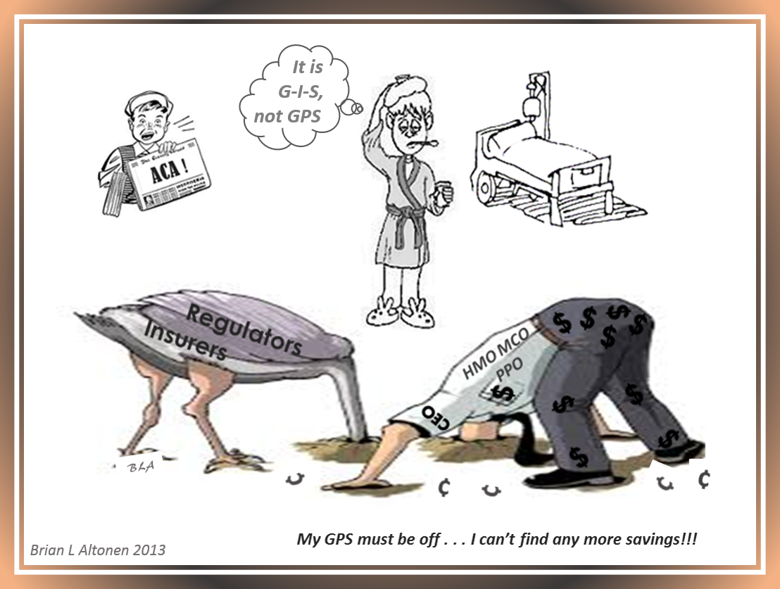
Like the Ostrich and CEO in the cartoon up above illustrate, you can only search for so long in the darkness of the old archival way of thinking and analyzing that we make use of daily in the Health Care Insurance and Cost for Services world. We can only focus on trying to save more, even at the expense of limiting care elsewhere, for only so long before the industry topples due to its complacency about the real world out there–the patients, not the investors in our stocks.
The following political cartoon, from another of my pages, infers these series of judgmental statements I just made fairly well:
One behavior that has not changed is that the youngest generation of health care statisticians see how and why these new methods of interpretations work. Old timers just don’t get it. They still believe in the use of Occam’s Razor to dissect their profession down into its smallest parts, on paper, in the form of words, graphs, charts, etc., but then only present these results using a 300 page report rather of a one to five page map with summary text, after all you’re being paid for all of your “work”.
