Bringing the health care system back to life — the new style versus old style of managed care and monitoring peoples’ health.

……………………………………..
Note: As of May 2013, I have a sister site for the NATIONAL POPULATION HEALTH GRID MAPPING PROJECT. Though not as detailed as these pages, it is standalone that is easier to read and navigate. LINK
………………………………………..
Long story short:
Corporate strategists need to get out of their 20th century mindset and into the 21st century.
Prabhakar Gopalan’s “Why corporate strategy needs to change with the cloud.” Posted January 1, 2013. [*LINK*]
. 
Abstract
There are two parts to this page. The first is an introduction of a method for mapping data nationally at a very small areal level, and how these techniques can be employed for both public health and national security related purposes. The second section explains how and why this method was developed more than a decade ago and how it has evolved into a highly productive research and surveillance tool, with plenty of examples to prove its efficacy.
The purpose of the page is singlefold–not to condemn, criticize or otherwise put down the contemporary industries–it is only meant to point out how the lack of knowledge, insight, and willingness of current industries to consider new paradigms can significantly hamper progress.
.
The following is from Jeffrey A. Krames’ What the Best CEOs Know. 7 Exceptional Leaders and Their Lessons for Transforming any Business. (New York: McGraw-Hill, 2003, p. 52)
*** The Traits/Accomplishments of Exceptional Leaders ***
√ An Outside-in perspective.
√ An Evangelical Leadership Gene
√ Understands the Critical Roles of Culture
√ Creates next generation products, processes or solutions
√ Implements the best ideas, regardless of origin
√ Advances the leadership body of knowledge
.
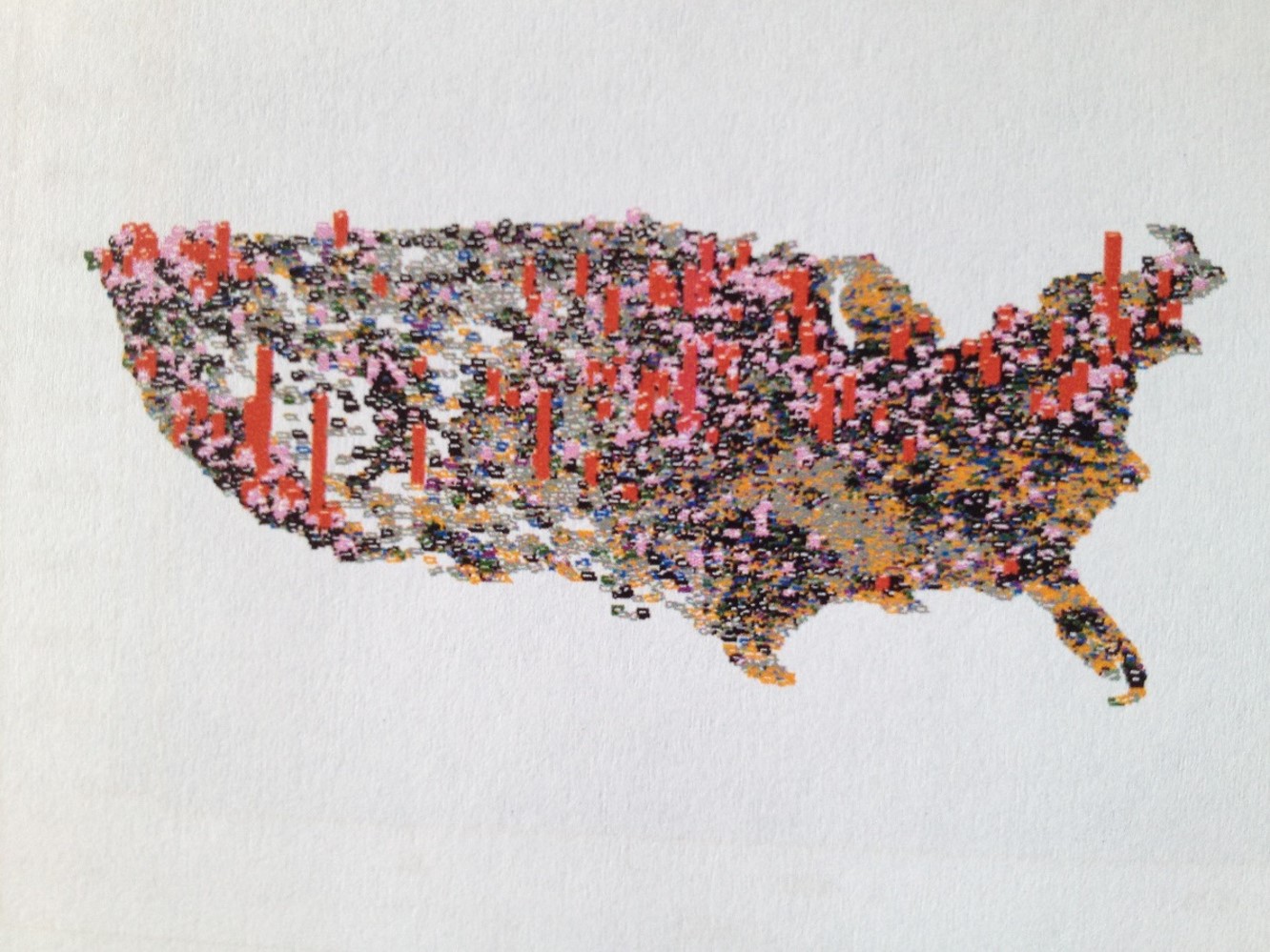
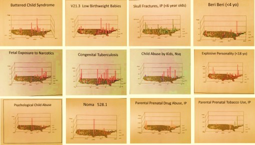
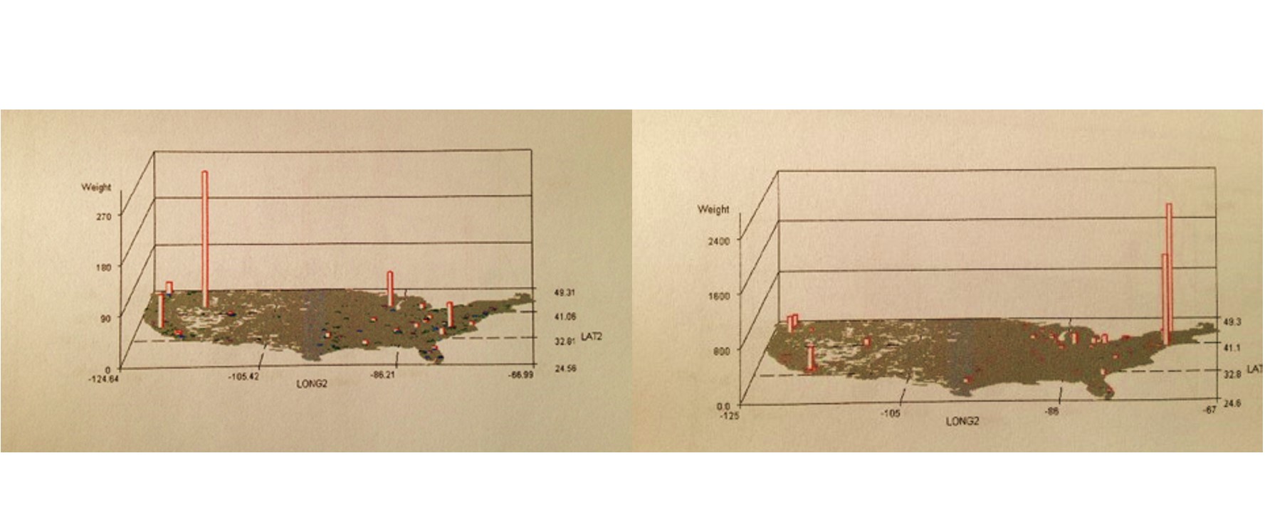
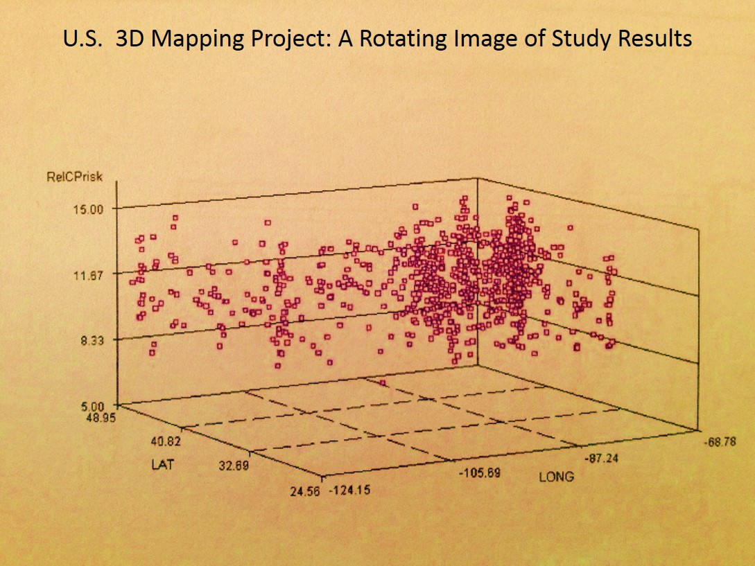
The above is one of a dozen new Video 3D mapping techiques I developed for national statistics analyses.
SECTION 1: A REVIEW
Preface
.
In contrast to my history work, I also work on developing methods for mapping, evaluating, explaining and predicting disease. This is part of my more than twenty years of experience teaching medical and pharmacal history, medical chemistry and pharmacology, environmental chemistry, epidemiology, and GIS. Whether a disease, medical condition, psychological state, action or diagnosis is human in nature, environmental in nature, or both, maps can be used to provide us with important insights into the natural history and spatial behaviors of these events. Those which are easier to map include common diseases, medical conditions and diagnoses, human behavior linked medical and mental states that are easily recognizable as medical events. Those which are not as easy to predict or identify as taking place are certain unhealthy behaviors, some genetic and culturally linked conditions and medical problems, and culturally bound syndromes requiring both the knowledge of this particular medical state or behavior, along with knowledge about its unique cultural meaning and interpretation.
.
With standard disease mapping techniques, we can add another dimension to the spatial interpretation of health or disease through the use of 3D imagery. In the amount of time it takes to produce typical graphical illustrations and tabular reports, less time can be spent producing more useful, action-generating maps of your results, effective down to the age and square mile of space evaluated. Three-dimensional mapping provides us with useful insights into spatial disease behaviors normally missed with traditional mapping techniques. What lacks in the analyses of prevalence using two-dimensional techniques is the minutia when comparing seemingly identical neighboring places on the standard map. In the tradition two-dimensional model using isopleths and ranges of statistical results, places with different results are sometime clumped together, and their small differences often missed due to identical color patterns. With 3D modeling we can still see this similarity due to the color coding, but still see their uniqueness due to the 3D effect. This allows for more detail to be present with my technique, enabling summaries to be made and new reasons to be defined for the existence of these patterns, their reasons for nearest neighbor similarities and dissimilarities.
.
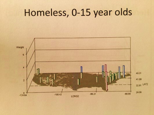
The epidemiological modeling technique I present here is highly applicable to risk analysis and prediction modeling. It can be applied to any large region studies involved with spatial patterns. It can be applied to numbers, cost, prevalence, health risk scores, high cultural impact on diagnoses scores, local likelihood for catastrophic illness scores, overdose rates, average numbers of visits missed by patients, household densities for lead paint exposure, numbers of pedestrian accidents per square mile, amounts of domestic abuse and childhood malnutrition per study area, the likelihood that another disease may erupt in a given space, the probability of children making their way into a college, the percentage of teens who are homeless on the streets, the need for more aggressive counseling and intervention programs.
.
Its only limits are the kinds of data and quality of data that can be linked to this mapping methodology. The potential applications for this new method of mapping are limited primarily by the understanding or lack thereof of its applications by potential users. Regardless of the value and integrity of spatial data, this public health mapping and surveillance technique has applications across all lines of business in health care when it comes to epidemiological research, prevention program activities, business related cost analyses, fraud and abuse monitoring and surveillance, or simple risk analysis and prediction modeling relative to exceptionally high costs, high fatality and morbidity, or the unexpected onset of highly expensive rare medical conditions. As stated in a most recent article posted on the web about corporations and their lack of adequate knowledge based, background experience and intellectual property, the current 20th century mindset related to public health program development and problem solving has to be replaced by a 21st century approach to analyzing Big Data so that public health researchers can now take complete advantage of this opportunity.
.
All truth passes through three stages. First, it is ridiculed. Second, it is violently opposed. Third, it is accepted as being self-evident.
Arthur Schopenhauer
..
Applications
To make it clear, the values attached to this method I am promoting pertain to some very unique applications–public health and disease mapping, and anti-terrorism/anti-bioterrorism surveillance as a human behavioral and natural-human ecology feature.
There are two interesting routes that this 3D disease mapping tool can take. The first is to apply it to the industry, the insurance industry, a part of which includes aspirations for the develop of teams that can apply this data into a GIS environment. The second is to focus solely upon financial gains and income, the traditional route that businesses are taking.
Regarding the first option, the current dilemma in the health care insurance industry pertains to the value of a program and the actions that define that program, such as care related activities, claims and billing, reimbursements, returns of investment, overall health and financial outcomes. Even though health is the reason these activities are engaged in, at the business end of things financial success dictates the metrics used to measure a program’s success. To counter this big business attitude about health, there are numerous agencies, organizations, programs out there designed to encourage businesses to focus on the value of their product, not the amount of revenue it generates because a cheaper or less valuable product is manufactured and distributed.
Right now it is the middle of 2013, and work on the use of GIS for disease surveillance at the business level, on a broad range basis, by mapping and monitoring 100s of diseases per day, has not developed much in terms of financial input, manpower, programs, knowledge and abilities at any data world level. The focus has been on promoting the fact that Big Data exists, not the fact that it can be used in new ways to such an extent that these new ways are developed and presented at conferences by numerous Big Data users.
.
.
The following is a map of more than 100 industries places that have a potential for establishing such a program and have not done so. These are more than 100 of the biggest of these businesses or the most directly involved with Big Data, not at all the bulk of them. I have also excluded those industries/businesses that I know have the knowledge based requirements and skill sets to do this at the private or corporate level, businesses and information distributors that are contracted by or are directly employed governmental agencies whose chief purpose is to explore, implement and utilize this method for monitoring this country’s population, such as high level GIS companies, remote sensing/satellite industries, etc.. They are excluded due to their given skill set and knowledge base and experience, enabling some of the more important national security questions to already be solvable. The statements made here pertain only to companies that should be in the process of using these skills and the spatial analysis methods–meaning insurance company overseers or monitoring companies and npos that have the finances to afford such a program, the insurance companies themselves, especially those with populations over a half-million (the larger they are the more responsible they are), the benefits managers and warehouse analysts for these companies, etc. etc.

National GIS BI Stats to date (7/13).
Only 3 companies demonstrate signs of possible Big Analyst GIS plans in the works, scoring <6 (not even a monthly spatial analyses for a single client), in my review. There are no doubt some passive testers of this technology in the above list, producing a few products per year, but none out there producing monthly to weekly reports on dozens to hundreds of diseases for a predefined purpose or goal, the true value of this technology.
My review of this topic, the survey I used to review it (on Survey Monkey), and the ways I obtained the other data on Big Business activities akin to what I am writing about, and personal experiences linked to communications with these companies, tells me that Big Data people and industry are right now mostly speculators in this line of business. They realize something can be done, but don’t fully understood it enough to be able to be able to perfect doing it, much less share this information with others in the field, or be able to produce exceptional data at high rates of productivity–as a Big Data/Big Analytics business so to speak.
So what we see right now is a field stumbling to produce at this point in time, claiming it can do something, but then when it holds its classes on its new software tools, fails to be able to present how to do this at any highly productive rate or speed. This is due to these businesses lacking the partners, subcontractors, and employees needed to be this productive–people who know the technology down to the level required to develop this possibility into a Big Business skill.
.
.
So currently the dilemma is this field of mapping Big Data at an analyzable spatial level, easily dissectable down to its parts, is not yet the case. We have what I call “Sayers” not “Doers”. Having produced these types of maps as long as and for as many years as I have, I am left to wonder why I am able analyze the disease data down to the town level nationally but the others cannot.
Now this claim can have some unfortunate consequences, and it has. But the truth is in 2005, which is ten years ago, the possibility of developing the infrastructure needed to carry out such activities was already there. The companies failed to demonstrate any of the 6 traits noted on the list of those traits for the companies with the most exceptional leaders, i.e.
- They lack an “Outside-in” perspective
- They lack CEOs and sub-CEOs upper level managers with the background needed to understand the application of this technology.
- They fail to understand the role of this methodology in the culture of the American industry in general, and how much simpler, and more realistic it is than the virtual theories they are trying to show us that are highly theoretical and speculative.
- Because this is a next generation method of performance I am talking about, this means they have stalled their growth and development by ignoring the new learning options and executing them
- They failed to implement one of the best ideas for dealing with Big Data out there, they are demonstrating that they do not wish to ‘think outside the box.’
- They failed to prepare for changes adequately during the months to years before by advancing their leadership by hiring more technosavvy individuals and spatial epidemiology experts.
I began to suspect this about 10 years ago when a number of agencies contacted me about this exact dilemma, all in one week. They wanted to be able to design a program for live monitoring of infectious diseases, in order to catch the in-migration of a disease pattern and automatically have an alert pop up on some surveillance team’s PC screen indicating there was an outbreak in some small community. Their sudden interest in this told me that some new funding was out there to promote the development of such a technology. I was asked if I ever considered developing a GIS program to do disease surveillance with. I told the first caller ‘yes’ and my name and resume went into a hat so to speak. I received a similar call just a little while later, again said ‘yes’ and turned to the web to see what was going on in the job world.
I saw that money had just been released for this exact project, instead of carrying it out internally within the federal agencies out there. (Which do in fact have the technical and intellectual prowess to develop such a technique, but for whatever reason wanted to contract parts of it out. Federal agencies can be and usually are well ahead of the Big Businesses with technology and its applications.)
I spent the next two months pulling out my older formulas and designing such a program. Without any call backs, I turned to the developing the new grid mapping methods and the production of the hexagonal grid technique, which I presented publicly later.
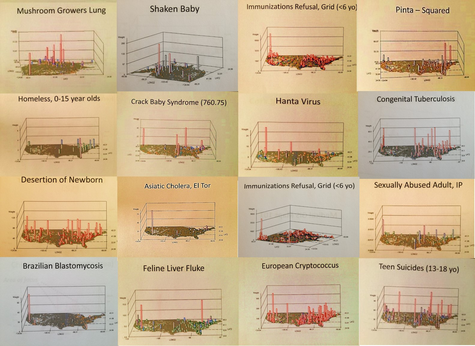
Such is an example of one use for this 3D grid mapping method I developed, which can run up to 100 or perhaps 200 disease analyses per day spatially across a large area is for public health epidemiological surveillance. But this requires businesses to grow and mature more quickly than they normally do in the high tech and math-statistics fields. So there is another forms of community risk surveillance that can utilize this methodology–activities related to national security and national population health surveillance related security–bioterrorism.

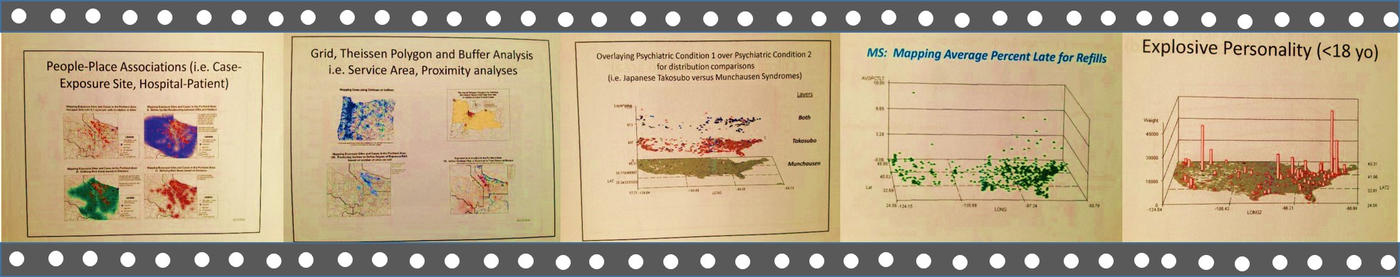
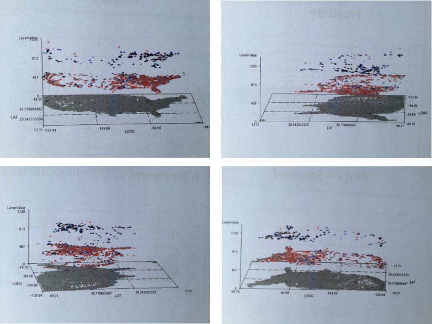
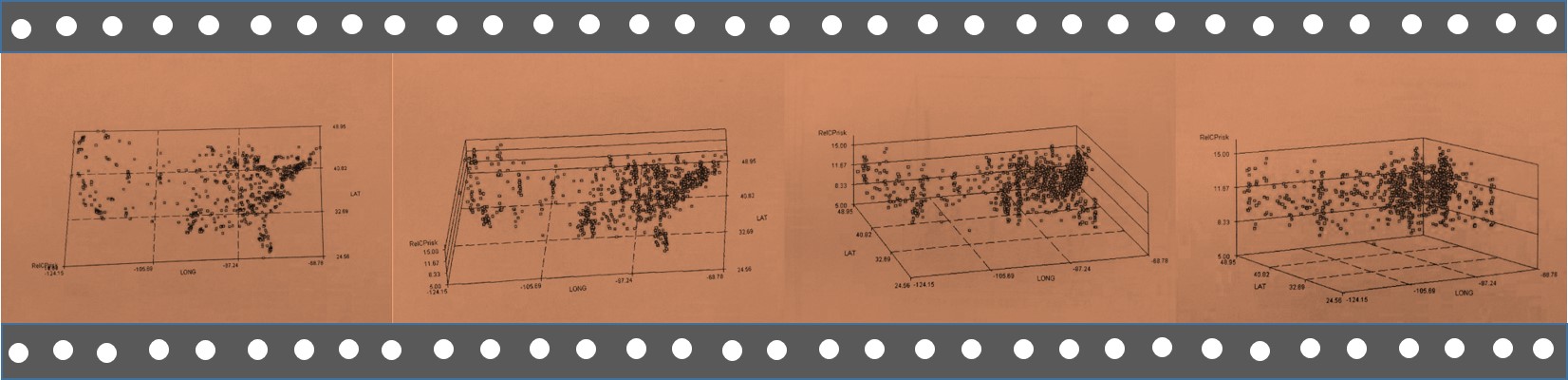
This method of mapping can be used for disease surveillance related to bioterrorism needs and uses. Now no doubt such technology already exists, and so what makes this particular form of this technology different is its speed and productivity–its ability to produce hundred of reports per day at a single workstation. The above series of maps is an example of a part of a report that I generated on foreign-born disease in-migration patterns using this method. See Risk Management page for more on this. This use of the mapping method enables specific surveillance reports to be generated and posted daily, for examples diseases from specific countries or in-migration routes.
.

The above is a method for illustrating the aggregate of diseases labeled as indicators for disease in-migration from specific parts of the world. Some have 2 metrics for this, a people-focused or anthroponotic disease in-migration evaluation followed by a combined anthroponotic-zoonotic disease in-migration patter (“v2”).

The above are examples disease clusters or aggregates, two or which are of well-documented ICD defined origins.
The above is an example of hot spots mapping, which is when we look at areal aggregate data to determine where a current outbreak is and how it has dispersed, and/or to predict where the next outbreak due to human or physiographic reasons are likely to happen. Other benefits of this process include:
.
Culture and disease patterns can be traced.
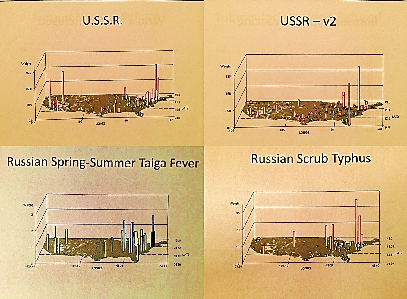
When I moved to Oregon back in the mid-1980s I never imagined the different population I would interact with once I settled into the Northwest environment and its various communities. The following are what I like to call ‘Pacific Rim epidemiological events’.
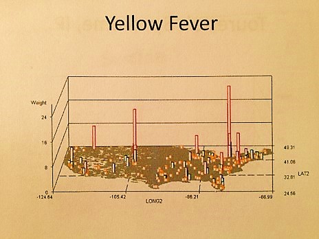
The Northwest Pacific is on the Pacific Rim, meaning that diseases that come in from far away can arrive directly from Asia, Alaska, Russia, western South America or Central America, to name a few. But as the disease geography above also points out to us , it also ends up that there are inland routes to this part of the country from Canada, and Mexico via California. In the late 1980s there, Portland health practitioners saw AIDs come in from the south, and Lyme Disease also apparently crossed the borders from the south as well. The Hanta Virus infected the state around 1995/6, due to a drought down in the Arizona-New Mexico Mesa regions causing rodents to migrate north. My Yellow Fever case mapping shows this disease can penetrate this country via its northern border, due to our guard being down because of its primary link to tropical climates and latitudes.
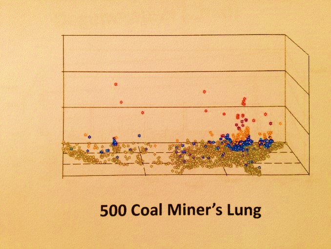
When I was working in a chemistry lab and a plant chemistry specialist, my department’s sensitivity to regional health was due in part to the association of my work to the selective toxicity of plants (not to mention the taxol industry). The person in charge of this lab was a principal researcher/investigator in terpenoid toxins. The director of this department worked on occupational lung diseases like pneumoconiosis, asbestosis, miner’s lung, etc.. In the basement of the building was the local CDC-sponsored chemical testing facility or agency.
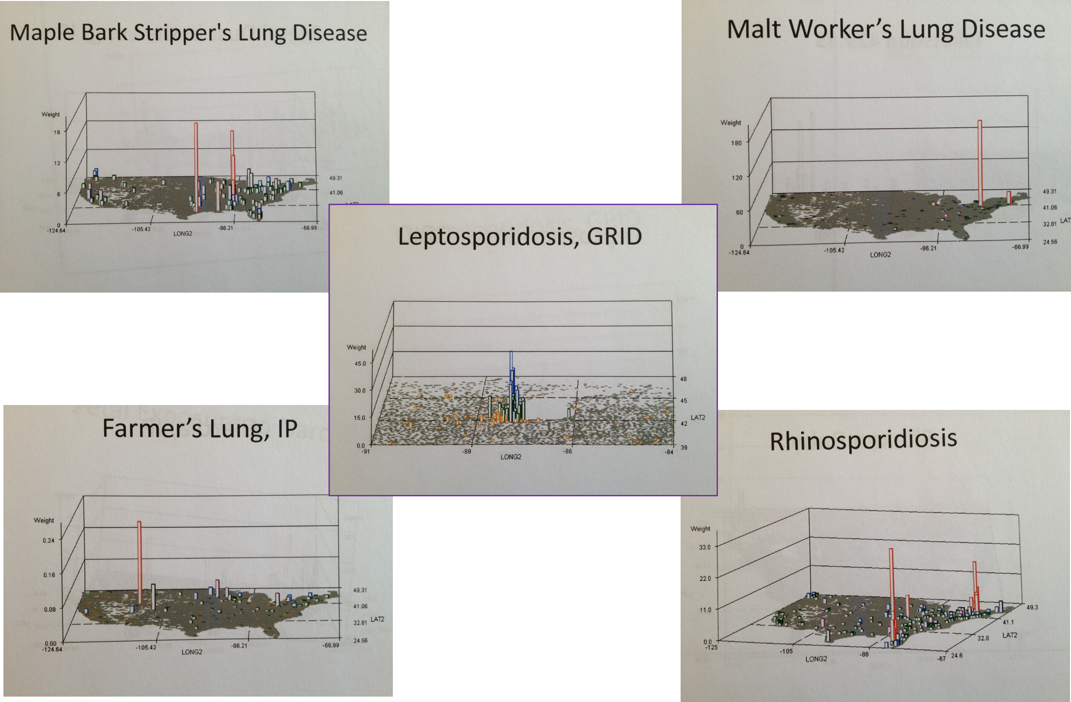
As a result of this unique blending of interests (a decade before I began mapping) we had several very unusual local ICDs occur became involved with. Like my predecessor I specialized in mushroom grower’s lung and a unique form of allergenic bronchitis that impacted loggers cutting down liverwort laden old growth trees covered by the species Frullania, as well as herbal medicine adulteration and poisoning (the tryptophan cases in Oregon came through my lab at first.) side from these local diseases we learned to pay attention to diseases that could make their way to this part of the country from Russia, China, Hawaii, the Baja Peninsula, and other Pacific Rim places and countries. Most of these diseases I reviewed and later mapped.
.
In-migration zoonotic (anthropozoonotic inferred) patterns can be monitored, an application made popular due to some Cornell University Studies developed for a Western New York surveillance GIS project back in 2003, the years of local Lyme Disease, Equine Encephalitis and West Nile concern.
But the uniqueness of Portland culture also led to our interests in the impacts of cultural behaviors on health. The toxicity of a Chinese Medicine due to a mistake in the harvesting process was one such use for these insights. But cultural applications not linked to biological disease penetration research became a major area of interest, including the use of this disease mapping method to evaluate social behaviors defined by cultural or philosophical traditions.
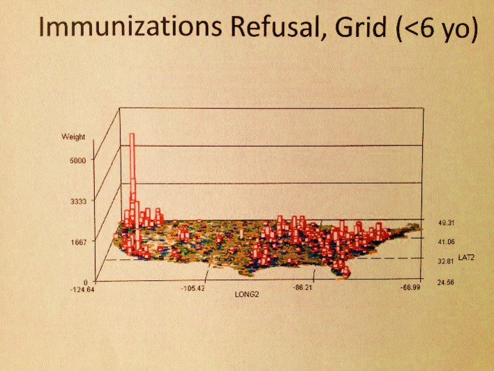
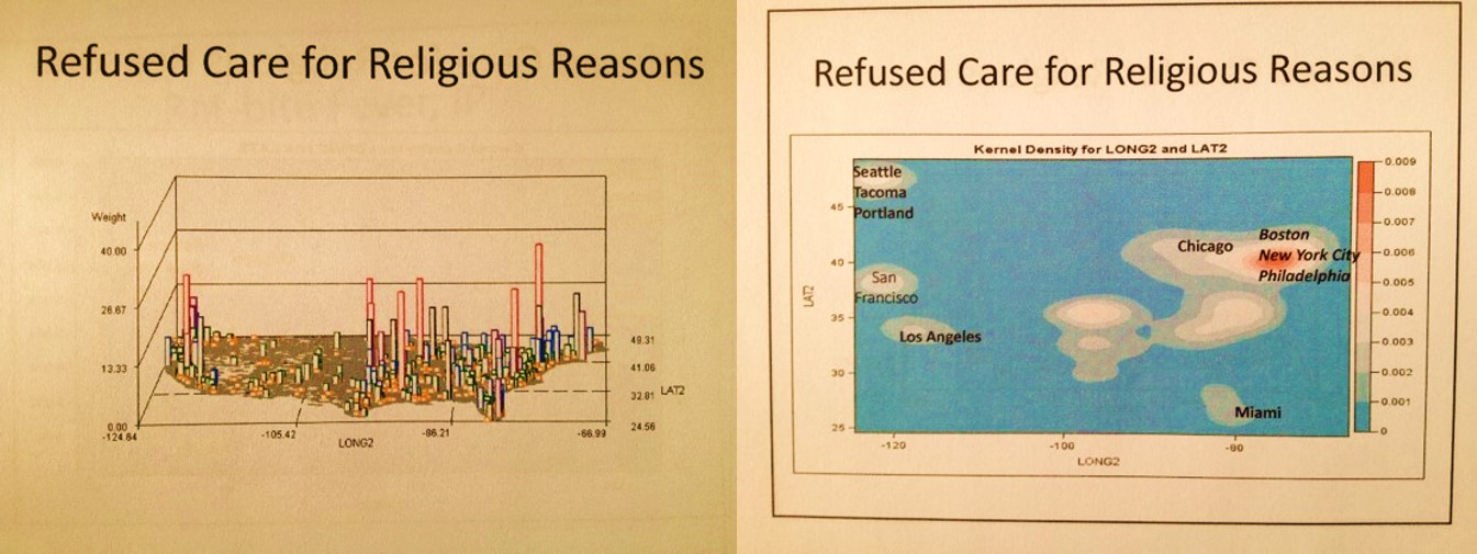
It ends up, the Pacific Northwest is the nidus for refusal of immunization programs. But do these refusal constitute a form of child neglect or abuse?
The above is an example of engaging in a more detailed review of diagnoses, emergency visits and V-code histories that can be correlated with abuse and neglect. An exploration of all the diseases immunized demonstrated that this refusal to immunize your child did not have much of an influence on Pacific Northwest health in general, just an occasional impact on its population health HEDIS related statistics.
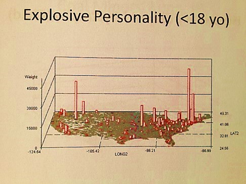
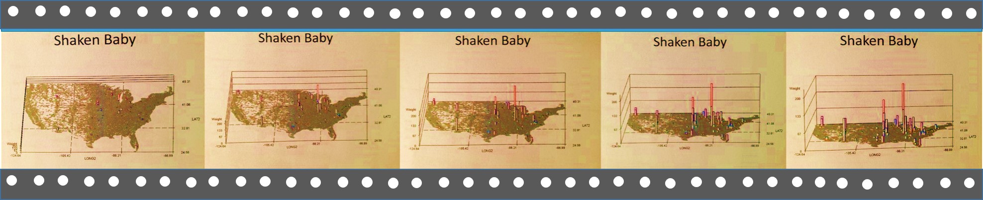
When the disaster at Columbine, Colorado happened one had to wonder if such a behavior was predictable. So years later I mapped out those disease patterns most related to this mental and sociocultural health question as well. There are several diagnoses that could be evaluated for such an event. Only one of these is displayed, and note, this evaluation was based on just a single ICD measurement period and is therefore not a good predictor for such an event.
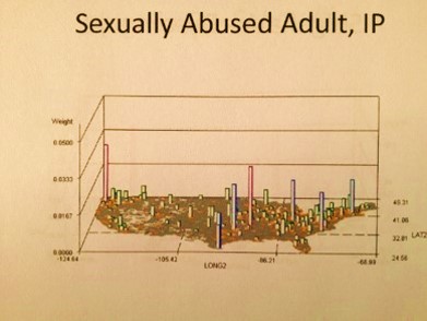
Still, it ends up there are a number of indicators in ICDs not directly linked to the Child Abuse V-code that can be used to support the V-coding data. Child neglect has some addition physiological ICD and V-coding that can be evaluated, such as malnutrition, poor nutrition, and the like. Child abuse has emergency room visits codes to consider, such as links to elbow dislocations for children under 3 years of age and specific types of injuries.
.

.
Several maps above, there is an example of a well defined nidus for mushroom grower’s lung, with the US outline overlain. The immediately above maps define where religion plays a role in the acceptance versus refusal of health care. The amount of individuals with this V-code on their EMRs are mapped both as N and as krigged or spatially evaluated n across the grid I defined. The cities central to each metaxenotic setting (a Russian term for the spatial human ecological realm of a disease pattern and its points of maximum spread around the nidus) are defined for many of these human population spatial centers or anthopoxenoses. (See my page on the history of Russian Geography for more on these concepts.)
This in turn can be related to the following . . .
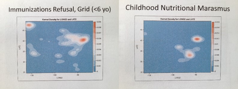
Above are two krigged maps of diseases in the US. A large area Big Data managed care agency Quality Assurance company responsible for overseeing multiple programs could use this method to see where two potentially correlated risks exist for young children–refusal of parents to engage fully in the childhood immunization programs underway, in combination onset of a childhood condition indicative of childhood neglect–nutrition-generated marasmus. A three dimensional algorithm can even be developed to overlay these two metrics onto a single map in order to display independent and and correlated risks.
.
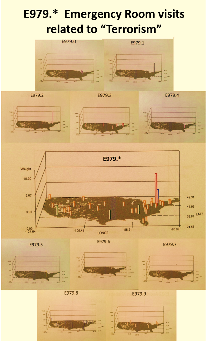
In this last example above, terrorism activities are reviewed based on age groups, genders and types of activities defined using the V-code, E-code systems in place. (Note: This is a significant underestimation due to the nature of V- and E-coding practices.)
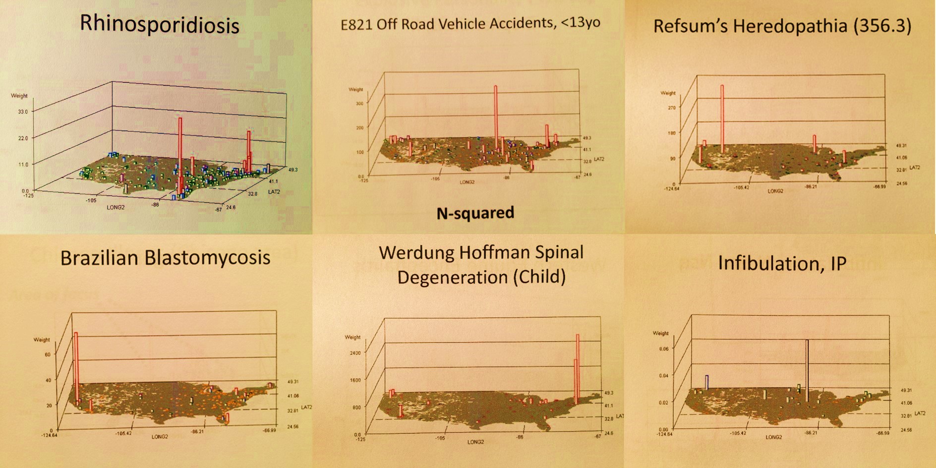
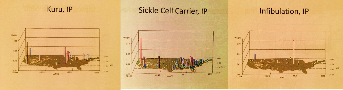
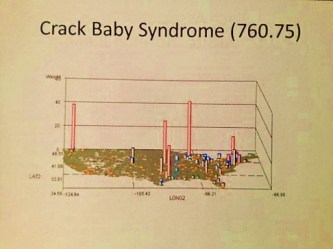
The well-localized distributions for two very rare diseases
Population health reviews have the unique ability to evaluate psychiatric or psychological diagnoses at the individual level. That is to say, there are distinct differences between men and women, and various age groups when it come to psychological, behavioral and psychiatric health matters. We tend to develop out intervention programs using large age band group targeting routines, such as engage the 20-45 year olds or 15 to 25 years olds, when in fact we can narrow these age bands based on large population data. This can cut the cost for intervention programs considerably, such as 20-40% in the case of young adult prevention programs administration.
In the following multilayer 3D map presentation, two psychosomatic (physical-psychological/behavioral) disease patterns are correlated spatially. The lowest level consists of the base map and disease or diagnosis pattern type 1, the second or mid layer type 2, and the third layer the combination of the two–areas where both prevail. This can be used to correlate two different conditions or diagnoses, different incomes levels with health data, local social or cultural features to specific local living and health behavior patterns such as drug use or criminal data.
I used this to correlate a culturally-linked syndrome to a common diagnosis for a syndrome typical of US populations, demonstrating how much and where the culturally-defined disease pattern demonstrates a higher correlation.

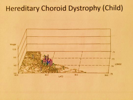
Finally, in this next example (above), culture and family history come into play for a condition that is genetic and apparently culturally linked. Its tight distribution about a small region, being that it is genetic in nature, is generally speaking hard to explain. Once you leave the well defined geographic area, even passing through some fairly densely populated metropolitan regions, the diagnosis disappears.
The above examples should hopefully demonstrate what this method of mapping can hopefully be used for. The two directions it can be taken are disease and population health monitoring for intervention, prevention and reduced cost of care related purposes, but it can also be applied to monitoring disease patterns for reasons linked mostly to the anti-terrorism/bioterrorism programs underway. Speed of production and reporting capabilities are the main feature that define its potentials for the latter application. Since it has a number of crime-related mapping routines engaged in as a part of this process, it very much fits in with the forensics applications for GISing. But there are also public health related applications for it that exist as well, and like I said earlier, similar methods have to already be in place at the federal level–the purpose here is to demonstrate the need for Big Business to make better use of its Big Data by spending more time engaged in spatial analyses, not non-spatial cost-benefits analyses, prediction modeling, and the like.
.
.
.
SECTION 2: THE HISTORY OF THIS WORK
Background
.
Back to the matter of how and when all of this work I did come about–my personal IP or “brand” so to speak.
Some time during the mid-winter of 2005/2006, I received a couple of emails and calls requesting my resume and the time to talk with me regarding a job opportunity. These calls were from agencies responsible for recruiting spatial statisticians. The recurrence of these contacts told me something had just opened up a new position for a spatial statistician.
.
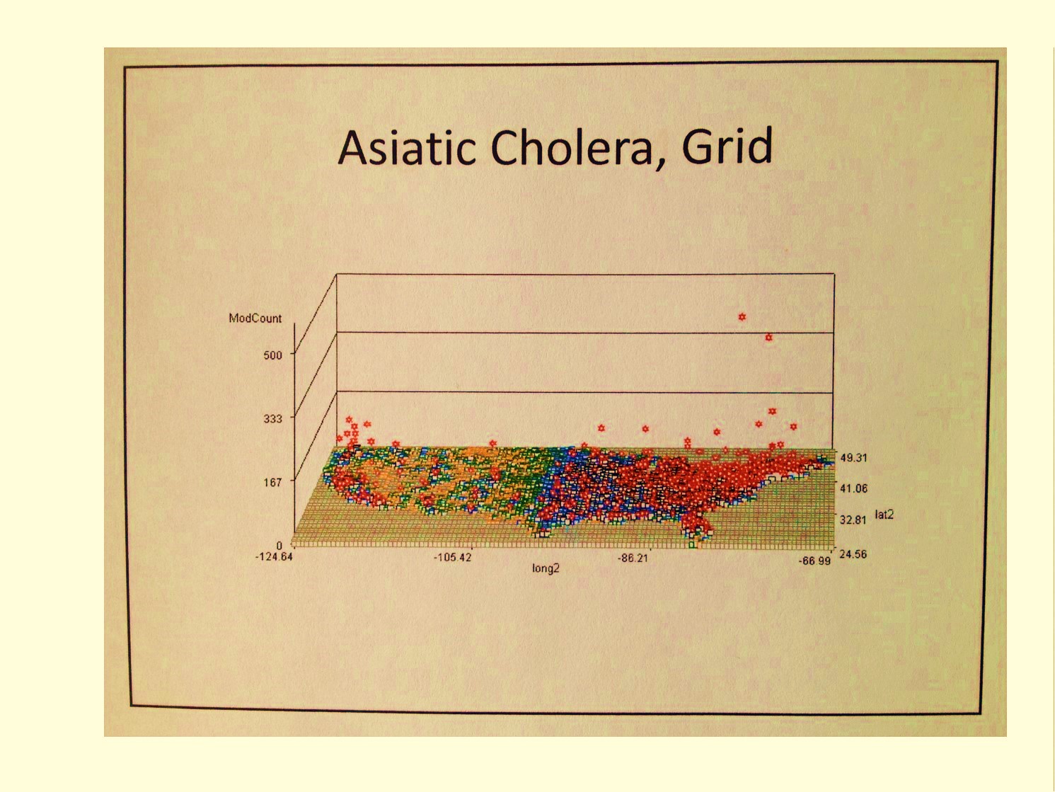
Over the next few days I uncovered several other companies searching for similar recruits. One such company in Georgia, following my application, told me this was linked to some new grant opportunities posted by NIH or CDC. The companies typically hired for this work were searching for GIS experts to oversee projects to be managed by a contracted lab facility, the responsibilities for which would be to develop a new disease surveillance program to meet standard disease reporting requirements on a fairly regular basis. As a result of these calls and invitations to apply, I pulled together a program and method for mapping diseases based on my experience with the Gulf of Mexico Cholera, New York and Oregon Lyme Disease, New York and Colorado West Nile and the Oregon toxic release site surveillance programs.
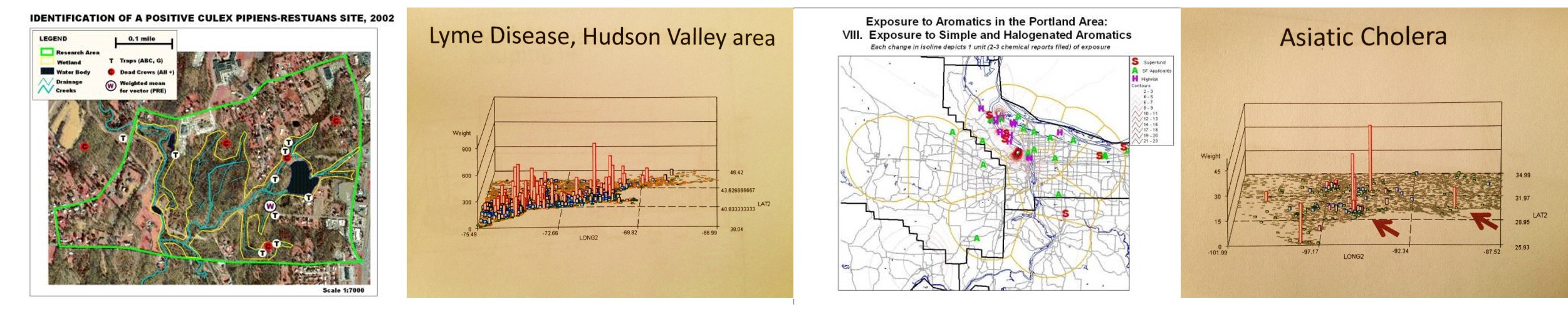
Maps from my West Nile, Lyme Disease, Toxic Release-Leukemia, and Asiatic Cholera Studies
.
It ended up the task of developing an efficient, rapid-producing GIS program was not an overnight event, due mostly to system limitations. In order to determine the best diseases to monitor as indicators of change, the methods for best monitoring them, and the means to automating this process using a GIS, one had to know in more detail how these diseases behave with people as well as within the environment. Early on it was determined that several to one dozen or more GIS technicians were required to produce regular lengthy epidemiological surveillance reports of my design. Such a report, based upon my ongoing surveillance at the time, required a little more that 300 disease indicators to be monitored and regularly analyzed for daily to weekly prevalence rates and trends reporting. At the time, there was such a database available to me for generating these reports, the sqls for which had to be rerun every day and updated to refer to the daily downloads that came in, and so for the most part, the first few minutes of each daily operation for this process required manual activities. After that, it was easy to rejoin the tables, run the macros, and produce a final report. It was these reports in fact which led me to design the methods for adding to the already ongoing HEDIS/NCQA related disease monitoring procedures then underway.
.
Most of the time was spent identifying disease or ICD indicators that could be used to fill in for those age-gender gaps missed by the standard 100+ HEDIS/NCQA population health monitoring activities. The most underrepresented populations, the male and female older children and teens, required the most improvements, with an added emphasis on drug use, sexual activity, drug use, and psychological or psychiatric misbehaviors found to be identifiable and measurable with ICDs, so long as there were no confidentiality issues that could arise from this surveillance work. For several months I used this method to regularly review the 300+ indicators I identified for monitoring a population of about 150,000 to 200,000 patients, based mostly on clinical datasets that were updated daily rather than claims data which normally had a 2 to 3 month lag. With my method, one could easily develop a useable population health monitoring system, for use in monitoring incoming disease information on a daily to weekly basis, depending upon the number of diseases being monitored, but the required daily rewrites of portions of the sql based on unpredictable database naming systems and the regular need for copying and then re-linking or re-joining of the tables for this process made it fairly cumbersome. Several times I developed datasets used only to characterize certain cross sections of the population. In the end, it was determined that slightly more than 300 diseases were needed to represent a decent cross section of any population for which the ages were analyzed and measured from 0 to 100, in two year age increments.
.
It was also determined that the best total population size for this kind of study was a half a million, although one could get by with just 100,000 members or patients, assuming the population cross section in two year increments mimicked the overall base population. This latter requirement was the hardest to meet for small companies with under 500,000 people in their insurance programs. With the right knowledge of the normal U.S. population statistics, corrections could be made to make this methodology work for certain SIC corporation or company types/classes. In the long run, this also meant such a method works best for the working class, and required further review and development of standardization processes in order to work effectively with the rapidly growing Medicaid, Medicare and CHP populations.
.
Often in the private sector for work, populations to be monitored can be quite small, much less than one million. With large scale disease monitoring programs, often much more than a million people are being monitored. These surveillance systems define the best, most accurate forms of Medical GIS disease surveillance programs that are possible, at least in terms of generating reports on the statistical significance of given predictive modeling outcomes.
.
“. . . . the solutions to our problems lie outside the box”
Aviation Week & Space Technology, July 1975.
 .
.
Technique
.
Unknowingly, I just set the stage for the development of the next generation of surveillance tools. I realized that grid mapping was the way to go for monitoring health due to the ability to produce a good base map without need for all of these point-arc datasets taking up so much time in developing the backgrounds for your standard presentations. With grid mapping, you could continue to decrease the size of a grid cell until you reached that critical number when error becomes greater than the size and accuracy of the grid cell. With grid cells, you can in theory research an area as small as your error allows, and the result of raster image and point-arc/vector image analyses become nearly identical.
The best way to engage in this kind of surveillance is to analyze large numbers of people in very small increments of space and variables. Typical methods implemented with GIS in the current public health reporting system utilize large area plots and point-area mapping methods to display data. The reason for this standard in population or demographic health relates to the standard areas reviewed in GIS, namely census blocks, block groups or tracts, zip codes, and sometimes township-city areas. No matter what method is used to accurately evaluate an area, the standard problem of normalizing data exists whenever small numbers of people are being analyzed. We are always dealing with unequally distributed people based upon age and gender subgroups.
.
To correct for the potential errors that such differences in populations may result in, researchers normally turn to age-gender adjusted prevalence or incidence methods to evaluate and compare different regions to each other. This way of processing the data is what turns the values into normalized areal measures, a process which in itself has a tendency to introduce errors into the methodology. To deal with these problems I have had to contend with over the years, I decided to develop another way to look at this information. The most important geographic feature that had to be deal with pertained to areal features used for the baseline spatial evaluation, namely zip code, census, and township/local government region data. The goal of this new method was to replace these irregular, ever changing polygons related to basemaps into unchanging or constant area-defining features.
.
The reasoning and assumptions related to developing this method were simple. The first observation and assumption I made was that zip code areas are too irregular, abnormal shape and size, and therefore prone to producing centroid errors. In addition, zip codes were constantly changed over time due to changing population size, and therefore could not be depended upon for long periods of time when comparisons had to be made over such periods. the knowledge base details needed to research and upgrade or change zip code data, to allow for comparisons between two different time frames, typically resulted in miscalculations and losses in data use. A zip code map for 2005, for example, is not necessarily the same as one for 2010 or 2000, much less 2008 or 2003, etc., and data from 2005 might have to be split into the two new areas defined due to a zip code change. This process had to happen for every datum piece involved in the analyses. Such a process was not cumbersome, but also increased the likelihood of introducing errors. This also meant that for every year of disease data being mapped based on zip code features, the placement of zip codes for each of those years had to be reevaluated, and then each of these independent centroid lat-long value sets for each of these years included in the evaluation standardized across the entire time frame.
.
In the end, this meant that the use of zip codes for analyses was best applied to small area, small population health reviews, the entire process for which was most applicable to studies focused on current and recent periods of time, in places where the location basemaps have not changed too much. The second option for areal mapping and analysis is to rely upon census blocks. This method has the problem of providing too many areas with zero values, which over time slightly lessen. Census blocks also share some of the same problems noted for zip codes related to irregular polygon shapes and centroid lat-long features. Even though census blocks are highly detailed in terms of shape and placement, they too have the potential for generating a misplaced centroid with the related data placed outside the polygon in a fairly irregular fashion.
.
The first alternative to blocks is block groups. Even though block groups reduces the zero point value frequency problem, it does not eliminate it and still has that irregular polygon/area problem. This means that both blocks and block groups are problematic should a desired end product be accurate isoline or density maps of the information being evaluated. The irregular placement of erratic and unpredictable point data makes combined large-small area analyses less reliable, especially in rural regions where the largest distance between data points exist.
.
The final alternative to blocks and block groups is census tracts, which pose many of the same problems as zip code areas. Zip codes areas tend to be much more irregular that census tracts, and often have a higher range of potential values when it comes to area measures. This increases the variability of potential incidence/prevalence results with disease data, especially in areas where there are large numbers of zero population and/or zero prevalence/zero incidence data. This also means that rural areas are more prone to significant errors in calculations than similar calculations performed for densely pack urban settings. Such an outcome can demonstrate significant difference where no such differences truly exist, and inaccurately define the need or lack of need of interventions or further study of rural areas, making zip code tract related studies more favorable to producing positive results in small tract areas, which are primarily in urban settings. Low income urban communities are thereby favored with such an approach, whereas outliers residing in far away rural settings, of either low or medium income status are less likely to undergo the appropriate intervention activities based upon mapped results. This also makes us question the validity and reliability of low income rural community studies when they are performed using much the same methods as urban-based low income community studies, suggesting the two types of low income studies are probably best performed separately from each other, if zip codes are relied upon for spatial analysis of the results.
.
.
.
If you’re not adapting to the very rapidly changing environment, if you can’t think creatively, you lose big in this society . . . .
Robert Sternberg
.
Results
.
In the end, the most valuable feature of a polygon map is the nature of its polygons area distribution patterns, a regularity for which is highly desirable, along with the regular spatial nature of the related centroid distribution. With these two features, we can attach values to a given set of points on a map and produce the most reliable isolines map of the data being evaluated. This process mimics many of the 3D digital elevation modeling techniques used to produce DEMs. Corrections are made in the irregular point data network, by modifying it into a more reliable, regularly spaced point grid system, upon which more accurate and reliable, more detailed isoline and isopleth relationships can be developed and drawn out. The most important advantage to grid mapping versus the standard areal mapping techniques just described, is the need for a base map when engaging in any of these last processes just described.
.
It ends up that with grid modeling processes for data, actual base maps are not required. The nature of the grid determines the resolution of the spatial information, which naturally lays out in such a way that it recognizable, without need for too much preliminary basemapping, although very much benefitted by the use of overlays in some circumstances. The programming of the data allows for correction of lack of basemap data. In the particular examples of grid mapping demonstrated on this page, the 3D modeling technique, additional programming can be implemented to differentiate one region from the next, without need for basemapping, meaning that the time constraints produced by the need to apply some basemapping techniques are avoided.
.
This brings this presentation back to the original question I had when trying to develop this process–‘what is the fastest, easiest way to monitor disease without having to go through those lengthy steps of producing base maps and the like?’
When it comes to fast, the answer is not GIS unfortunately. I developed this method of grid method without the use of GIS. By removing GIS from the software requirements, I lessened the cost requirements for this kind of information mapping. Not that GIS should be avoided, just that if you want to run 50 to 300 maps per day in Big Data producing a detailed reports of just as many metrics spatially, the standard GIS tool is not the way to go. I can run a program that produced 470 related maps in just 20 minutes during peak utilization hours of a teradata day. The task then becomes putting that many objects into a report, a much lengthier process. This also means that ideally, 3 runs per hour for three totally different mapping analyses (i.e. national, versus tristate, versus urban area at a couple of miles grid resolution for one ICD), automated for all 8 hours of the work day, means I can engaged in 24 runs, producing just over 11,000 maps per day, on a slow day. If the mapping if for different ICDs, cut that productivity in half just to be sure. This means that a corporate report focusing on several hundred ICDs can be generated in a day or two, and by the end of the week reported to management. This opens up time and opportunity for exploring other unique avenues, such as ethnicity, aging and health, age-gender poverty related health issues, the distributions of all 250 to 300 internationally spread infectious disease patterns in need of monitoring in case of outbreaks, the patterns of development for culturally-bound syndromes and how these relate to SES, the distributions and locations of peaks for V-codes and E-codes suggesting insecure domestic settings, regional age-specific suicide rates, and ethnicity, age-gender-dependent disease in-migration patterns. (All of these have been tried by the way as of 2012.)
.
At the time this question was first posed (8-9 years ago), the reporting standards were geared mostly towards graph and table production, with maps serving as an additional product of this work due to time, storage space and data processing constraints. The reverse is now the case. Maps can be used as the most basic part of a presentation on local, regional and national health, with many of the tables forwarded to the appendix, to avoid too much time being spent reviewing what is now for the most part unessential information. A map tells you much more, in much less time, than the review any graph or any series of graphs. Add tables to the schedule and one only has time to review the top 15 or 20 features usually, and a couple of those common themes that were reviewed the time before.

.
With a good, solid program, these maps can be merged into a lengthy, high descriptive document detailing everything we need to know to better target our products, plans for reduced cost and higher savings, activities design to improve upon the overall systems performance. Such accomplishments are hardly accomplishable with the current 1960s and 1970s methodologies, formulas and algorithms being used, much less the lack of 21st century processing and creative knowledge to supplement the out of date base knowledge that already exists.
.
All of this perhaps sounds very harsh and maybe even exaggerated to some within the business setting who know about or see changes being made. To date, the evidence for change is lacking any public visibility, and therefore lacks in some very important public confirmation and validation for this improvement process. Few to none of these criticisms or examples of practice patterns relate in general to academic, governmental, and industries for which the primary goal is GIS-IT related. These industries have the knowledgebase, manpower and access to hardware/software tools needed to perform many of the research steps and tasks noted above. Other industries have the potential to obtain these skills, but voluntarily opt not to do so, for financial, administrative, leadership and goal related reasons.
.
The problem is that there are very few technologies that essentially haven’t changed for 60, 70 years.
Robert Sternberg
.
Conclusions
.
The purpose of this page is to demonstrate the practical applications of 3D mapping to public health analysis, without the need to utilize GIS. This writing is meant to exemplify not so much how this new technique can be done, or how to make the best use of the potential knowledge base that is out there to which it can be applied, its purpose is to demonstrate the application of this very rapid programming method for interpreting disease, public health, disease patterns, cost-behavioral patterns and economic outcomes, human behavior features and health, the spatial sense of socioculturalism and socioeconomics history and health, and the relationships of practically any other human and environmental features to people health and population health. The speed of this program is of course dependent upon Big Data storage facilities, and I recommend use of Teradata or the equivalent for processing your data.
.
Currently, organizational and corporate involvement in the public health field at times tends to appear archaic nature. It is no coincidence for example that at the beginning of this calendar year, on the first of the month, one writer voiced his criticisms in plain, easy to understand words:
“Corporate strategists need to get out of their 20th century mindset and into the 21st century”
(Prabhakar Gopalan’s “Why corporate strategy needs to change with the cloud.” Posted January 1, 2013).
I was rather surprised to see such a pointed statement posted, ‘but c’est la vie’ I thought, at least it wasn’t me who pointed the finger at this tremendous slowing of progress in the Information Market and Big Data Industries over the past several years.
We barely read about programs that make good use of new statistical modeling formulas and techniques. We even more rarely hear about programs that make efficient use of GIS techniques to analyze large numbers of people and space. With the exception of industries whose job it is to provide the data developed using GIS, industries in general have been too locked into their non-spatial mode of operations, unwilling to learn about this new technology, and when they do, taking short cuts and never making use of the best people out there in the Medical GIS industry. We never, for example, learn about business communities making a discovery about the market place using GIS or GIS-equivalent analytic styles. Nor is there any proof yet out there to demonstrate some good examples of innovations that were developed by people within the business community. A simple map of cost-consumer distribution just won’t do in this case. What I am referring to is the use of spatial knowledge and data to draw new conclusions, to define something never seen or known before about the US population at large. A simple map that transfers data from a census-like table onto paper is interesting, but only teaches me a little more about stuff I am already well versed in–places, people and corporate incomes. The use of GIS by health related industries has to produce progress in the health world, with the consumer or patient in mind, not re-calculate losses and savings in order to increase the numbers of investors out there, as if relying upon these patients and their illnesses to survive.
.
In essence, what is being taught by this lack of innovation within the business communities with GIS (and my “faux GIS”) is explained well by Robert Sternberg’s 2003 model of Triarchical Formula for Creation: businesses are only effective in managing and showing evidence for just one or two of three steps needed for individual and business sponsored inventions to become productive–analysis and perhaps some creativity–but they fail to make the best practical use of these resources, especially those of a creative nature and highly innovative. [see wikipedia Robert Steinberg for more on this Triarchical Theory].
.
By mapping people and disease across a broad area interpretation of the local landscape, we are offered a unique perspective on diseases and their natural and human ecology. Even when diseases have little to no relationship with the environment, and are mostly formed, caused and distributed due to people, a disease map tells us more about the disease than a simple verbal description of all of these facts. Such a map provides us with the confirmation we need to understand how and why certain disease behaviors we might believe could exist. A map tells us when and where unique focal points or niduses for disease may develop. A map also provides us with the documentation needed to understand and explain how and why the communication of a disease from one region to the next can occur.
.
Unlike the typical broad band areal analyses, with relatively large area maps depicting prevalence, frequencies, ages in broad ranges of 5 or 10 units, such as a state or even county map, the right grid map tells us more that expected about disease behavior than a typical isopleth map. The effects that we typically peruse and watch take place as a two-dimensional representation of a disease distribution pattern comes to life once this 3D interpretation of data is produced. With the right map, this technique can be used to define the most accurate geometric and spatial centroids for various medical behavior and disease patterns, information most useful for risk analyses and predictive modeling applications.
.
We are victims of our habits . . .
.
1928, Napolean Hill, from Law of Success in 16 Lessons.
.
At the corporate level, companies have become victims of their own CEOs and corporate leadership habits, due to their lack of sufficient updates in knowledge base and skills. It is easier to repeat old methods for demonstrating and reporting outcomes, even when there is significant error generated using this process, than to invent a new method from scratch to produce more accurate results by way of new technologies. A major limitation to such progress exists whenever the leaders in a business community or corporate setting stop progress because they either cannot or are unwilling to keep up with what has to be learned for such progress to be made.
.
At times this results in health prevention failures, but more often financial failure. The failure of an old method to continue to produce change is probably due to the mistakes that exist in the underlying logic and numbers upon which it was based.
.
The failure of management to be able to see and accept these errors and to then incorporate new technologies and new techniques in order to eliminate them only results in the perpetuation of these errors in the marketplace. This happens to Corporations because they lack innovation at the creative level (producing something new out of the blue, with no prior connections to base it on), even in spite of demonstrating innovations at the synthetic level (reshuffling old techniques to make them appear new and better).
.
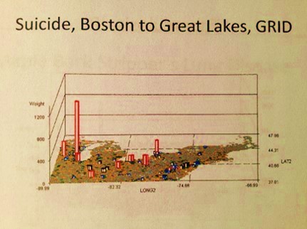
National Population Grid Maps are much needed additions to the standard reporting systems now in place. They offer a much higher resolution for data, thereby providing more applications for this data, with the potential of producing more accurately targeted intervention programs, resulting in more cost-effective, long term outcomes. Due to the nature of the small cell grid, the information each cell contains provides us with better insights into such issues as medical problems linked to particular urban, suburban, town, village or hamlet settings. Well-localized nests for a particular medical problem, can be defined and treated. Places where human behavior and psychology result in certain medical events can be identified, for example involving suicides, crime-related injuries, spouse or child abuse, drinking, automobile crashes, and drug use.
.
This use of three-dimensional mapping provides more information, more satisfaction in knowing, than the usual flat surface, planar 2D images that we use for defining areal events provides us with.
.
With grid maps, very local rates can be analyzed and depicted in the form of isopleths, but better yet, the centroid values for each grid cell can be used to produce isoline or contour maps depicting spatial distribution, for those most comfortable with using 2D map displays of population health statistics.
.
The 3D map is the best way to display any sort of population, health, economy or poverty related feature about a small area, with unique patterns of distribution or spread that can be seen only on these maps.
.
Not all diseases are distributed in some random fashion, and even when documented in small numbers due to their rarity, they tend to show pattern-related distributions.

.
With these maps, random events equally displayed as distributed across the entire mapped area. This is because diseases as defined in the databases on health are people-generated phenomena. For example, only a few measles cases are documented per year in recent U.S. history. These are recorded in the historical population health data and tend to always occur in different places, sometimes associated with other areas in the past, but almost always explainable based upon specific features of highly infected areas. In such situations, the exact location for the next outbreak area may be hard to predict, but with effective surveillance techniques we can define areas with the highest risk across the total research area, thereby better focusing our disease monitoring procedures.
.
As another example of effective disease or unhealthy behavior monitoring using this 3D mapping method, for diseases of a social or socioeconomic character that recur in small areas, we find many times that these problems occur in proximity to economically depraved communities. One common political interpretation of these happenings is that these places where certain misbehaviors occur are capable of putting other families at risk as well, those which are not so much in poverty or are experiencing the greatest consequences of social inequality that can exist. Even diseases that appear to be mostly population based, relying upon numbers and density to define their diffusion patterns, can be mapped. This helps us to better understood them and make predictions about future events based on this mapping technique.
.
Diseases which demonstrate the best examples of this application for 3D socioeconomical modeling in relation to disease patterns include the common, typically immunized, that demonstrate cluster patterns or behaviors wherever immunization programs fail to intervene, such as: diphtheria, mumps, pertussis and rubella. Other diseases demonstrate culturally-derived or linked distribution patterns, such as certain cardiovascular disorders, certain genetic conditions and a number of culturally-bound syndromes. The in-migration peaks for new infectious diseases can be mapped to define possible areas where improved monitoring programs and techniques can be developed. Diseases brought in from foreign countries by way poorly monitored transportations routes are definable using this mapping method. Diseases with socially defined causes and expectations can be evaluated to validate whether or not these perspectives on their natural history are true, of completely misleading.
.
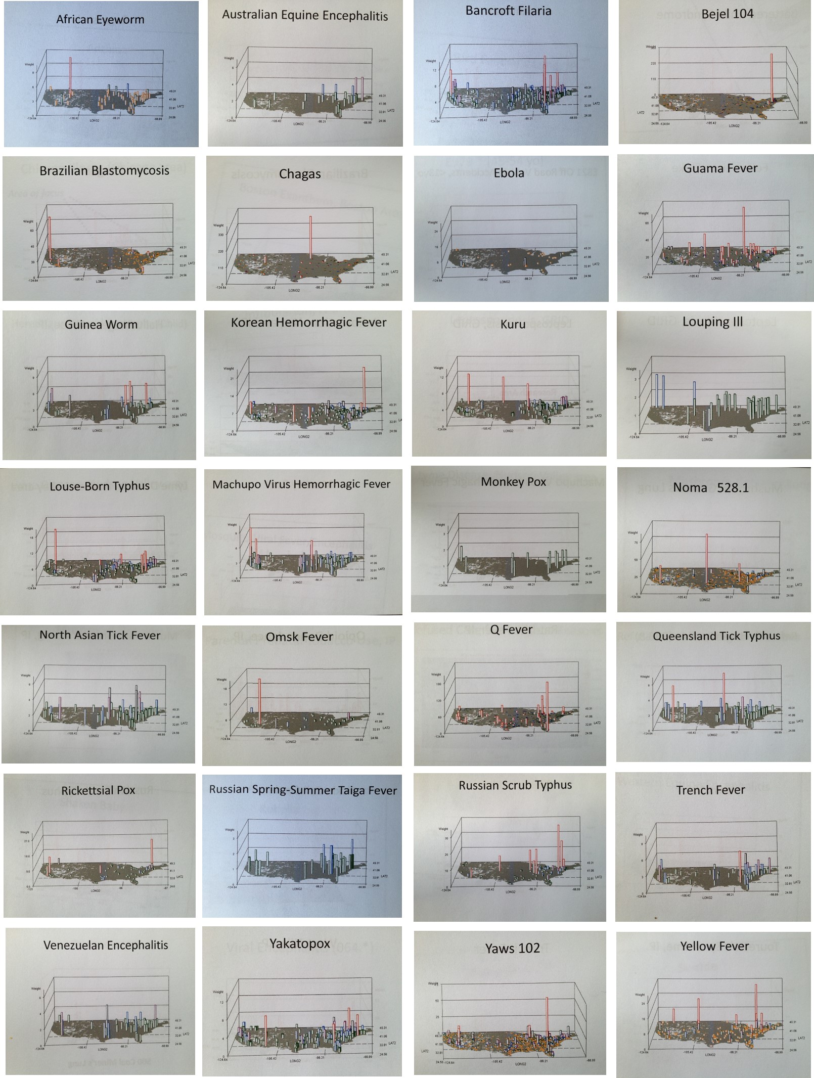
For each of these applications of grid mapping ICDs, I have produced numerous examples of maps demonstrating the valuable utility of this method of disease, medical and public health surveillance. We can better demonstrate important spatial behaviors using this three-dimensional map modeling technique.
.
A Standard US County Epidemiological Map on Obesity
Unlike the current flat plane regional techniques in use, a more precise grid mapping method serves to provide important insights into exactly where, in which neighborhood or community, to begin an intervention program designed to better the health of an entire community or region. We can use this kind of information to better define where a new health care facility needs to be built in order to provide additional services for specific community health related problems. We get a 3D perspective on distributions, a feature lacking on the traditional 2D isopleth map like the one illustrated above. We can look at the above map, and see where all the problems areas are, and perhaps pick out some clusters. But we don’t know where the greatest numbers of cases exist, or where the regions with the most prevalence exists in any useful detail. With small area grid mapping, we know exactly where to begin our intervention programs–what cities have the greatest number of patients implying the greatest amount of impact, and what cities or towns or even hamlets may be in need of increased monitoring due to their exceptionally high prevalence rates. (Another series of algorithms I developed incorporate the two together to define both of these regions of intervention focus and intensity.)

A comparison of presentations used to demonstrate epidemiological patterns. The two maps on the right I developed, one was a precursor to the method presented on this page. The other two maps aren’t anything specific, have been modified, recolored and are used to demonstrate large area surveillance examples; these methods work for Incidence data and uses, but are not employable at the business level due to lack of specificity and lack of 3-dimensionality–one has no idea where to start an intervention program with the two maps on the left, although the bottom one does have some applicability.
.
.
Big Area/large regions maps can be applied accurately for programs targeting overall prevalence behaviors. But their utility in the field or at the clinical/provider level is very limited for small and regional businesses. Their value in the field contrasts with the map on the lower right. This very local, regional map allows for the development of programs made for a specific region, and which therefore can be planned out better and budgeted more precisely according to wants and needs.
National health assessment is interesting, but it doesn’t work in terms of developing more financially beneficial programs at the business level. Different industries have different population distribution patterns and must base their intervention activities, health or money related, to their unique population features, not necessarily the national population statistics. This is how the best use of grid mapping and its related methodologies can be employed effectively and in a high valuable time-saving manner.
These 3D maps I developed were from large area data used for mapping US population health related disease geography and disease ecology data. This work was not done using GIS. Its success can be complemented by the better use of a GIS to go into the details of what the 3D mapping technique tells you about national or regional health/disease profiles. For example, in any of the 3D models I demonstrated, peaks are noted, and those peaks can be analyzed in greater detail using the slower, more interactive standard GIS routine. We can also use a SAS-GIS, which due to its base-mapping programming needed to produce an object to graph your results upon, it is a time consumer often.
This work has applications to programs devoted to livestock disease monitoring, natural disease ecology mapping, human disease projects or requests, national security monitoring or surveillance procedures, risk and prediction modeling of rare diseases, human psychology and cultural/psychiatric disease spatial research, international and imported disease spatial research, small area and large area spatial environmental/epidemiological investigative work, and health care economics (cost-benefits) work.
.
“Great spirits have always encountered violent opposition from
mediocrity.”
Albert Einstein, 1940
.
.
Interpreter’s Notes
.
For this methodology and related research work, the following notes apply.
.
- This method has more than 15 years of formula work, development, testing and analysis. It was designed based on the standard US National Landuse Classification Data (NLCD) and Normalized Difference Vegetation Index (NDVI) mapping philosophies (that additional band in older Landsat image products circulated in the late 1990s, later made available via the “seamless maps” program on the web). This concept of mapping landuse or vegetation indices onto a basic grid was applied to disease ecology mapping. The disease ecology formula relies upon demographics, prevalence and spatial area features. Interpretations of the map have to take into account the impacts of both natural and human ecology on disease behavior.
- Beginning 1997 and continued in 2004, these formulas were typically provided as parts of my GIS classes and labs, and therefore may still be available through the proper ftp sites.
- Some of the older, less sophisticated mathematical modeling techniques are displayed as well as the contemporary 2010 modeling techniques. As is typical for this work, my newest methods are not reviewed.
- Data sources used to test these methods are both large and small, and vary over time; sources include ftp data, purchasable data, and university and government sponsored ftp-links and storage sites with raw unfiltered, unformatted data.
- All numbers are true, for the most part; some may be modified, rounded off, reduced, regrouped, or otherwise filtered slightly without impacting the overall meaning of the final results.
- Most displays are of raw counts; ‘*, IP’ displays depict non-kriged Independent Prevalence calculations per grid cell. N-squared and N-cubed are also included at times, and so labeled. Complex formulas are developed for non-ICD data pertaining to theoretical case history and population health survey responses drawn from analyses from the distant past.
- The continental proper is used to map nearly all of the results, with no projection data employed.
- In the 3D’s, height of area/point is mapped along initial x=long, initial y=lat, with z-axis representing numbers, prevalences, relative prevalences, squared relative counts and squared prevalences (squares give better resolution, like with LS, SPOT, SLARs and such), and any other metric that is mappable, including costs, ages, days sick, morbidity indices, health risk scores, etc., or an algorithm developed by using outcomes to produce small area health statistics risk metrics (i.e. basic age visits risk for chronic disease = log[age x risk score x #emergency visits/yr x log10-$cost per year for specific care)], calculated per grid cell area for total country, displayed as approx 2400 grid cells (30 rows x 80 cols).
- The z-axis value tells us whether a true number is used or a fraction or decimal percentage (values very much less than 1); exceptionally large values 10,000+ usually mean exaggerated results are used in order to expand the differences across a surface depicted by z-axis values (“topography” of the surface).
- [Not too many get this] This method tries to avoid bias and errors typical of block and zip code work, by normalizing data using 1-yr age-gender increments and assigning values to perfect grids instead of relying on basic GIS *.shp produced overlapping/irregular zip/block polygon plots.
- For the US continental proper, these are moderate to fairly high resolution maps, with areas mapped usually measuring 25 mi x 25 mi = 625 sq mi, or defined based upon address data converted to grid or polygon maps for aggregated numbers mapping; this method is needed to produce valid density and contour/isoline maps depicting rates. Some small area analyses may also be displayed (few displayed) and are much more detailed.
- For this presentation, video maps were developed in order to analyze, contrast and compare population health spatial disease patterns or behaviors. About 750 were tested and produced, and half developed further for later review and
application to more detailed population health studies. (My population pyramid work produced 3 to 10 times as many test samples in the end, but only required single passes with the algorithms–each of these video products require a minimum of 177 passes for the algorithm, perhaps tripling the production time for the final product.) - The gestalt, pattern, or visual representation of a disease, condition or public health statistic nationally using a 3D map is the focus with this methodology. For these videos, it is common to see certain population health disease patterns prevail and recur for seemingly unrelated disease states or public health related measurements, such as the most common in-migration patterns for Pacific Rim transported disease. Diseases normally thought to be similar in nature can have very different spatial characteristics not uncovered without the use of this spatial mapping technique, such as young adult suicide versus 55-64 yo, child abuse by older children versus by adults, or the most common importation routes for the tropical disease yellow fever versus asiatic cholera.
- Most videos are 3D rotating image displays. Some present as surface scanning, in which the video tracks across the surface as if viewing these results by airplane; others consist of large area views followed by zooming in on particular parts of the surface evaluated; still others are simple close up reviews of a part of this country.
- These videos are presented for educational and presentation purposes mostly. Reporting methods use a single or several images of a video to provide a detailed description for each medical condition, disease or even theoretically mapped. For more on this reporting method, see the information of GridEcon . . . and the like for more on this topic.
- Details of the results that researchers can draw from this method of review are covered on other pages.
- For other examples of this use of the 3D imagery method, go to the Sonoma College site with a pdf that includes similar maps depicting crime statistics, or go to the Yale site where this methodology was developed and posted several years ago at G-Econ using a global spheroid to depict global economy. (The method I use was independently and separately created and developed, before the G-econ method was uncovered. Thus the differences. Links for G-Econ are at the end of this page.)
- I have several other pages on this grid mapping method at this site: Space Time Behavior in Contemporary Disease Mapping, Grid
Mapping Health and Disease in the United States, and Hexagonal Grid
Mapping . . . . - Due to IP concerns, and the fact that new discoveries are still being made with this methodology and the kinds of recurring patterns being revealed, not all maps may be accessible all of the time on the various pages.
- For the most part I rely upon shapes and letters to link to these products, but occasionally have related text adjacent to them to explain them or draw attention to the link. These are found throughout this blog site, but are primarily on the population health pages and some CV- or resume-like pages summarizing my research and work
experiences. - Links to some of these videos (50 of 310 to 450) are at the end of this page and on other pages.
- Only the point mapping and grid cell mapping techniques are displayed here. In case anyone should wonder or ask, my extremely accurate, hybridized or dual point-grid 3D mapping routine demonstrated with IDRISI32 is not being presented for the time being.
..

.

.
The programming I developed was used to produce multiple maps of results, about 450 to 1200 per analysis. These were compiled to produce the following videos of results. About 20 videos were produced per day, semi-manually, consisting of a total of approximately 15,000 maps per day, the speed of this algorithm at 1/4 to 1/3 its maximum speed, meaning I can produce 50,000 maps per day in a good terabyte system using this method.
The following are examples of these videos.
ASR
Τ
RCRR
AS
CML
CO
RMV
TD
CO
SS
CD
RSNC
Link to more examples (not yet
accessible). . . . ©+®
.
———————————————————————————————————————————————–
.
My ‘Peoples’ Health or Corporate Wealth?’
essay; source for cartoon at the top of this
page:

. .
…………………………………………………………………………………………………………………..
.
GLOBAL MAPPING BY G-ECON AT YALE . . .
.
G-Econ, Yale
University (for comparison,
these are not mine) .

3D Surface
Patterns depicting Regional Economic Modeling program, created by
the G-Econ Spatial Analyst
team at Yale
University
***********************
Go to : https://brianaltonenphd.wordpress.com/
References to surveillance lists for a major metropolitan area mapping project
The 155 disease list: https://wordpress.com/page/brianaltonenphd.wordpress.com/216
21 Research Topics or Themes, ca. 1200 ICDs surveilled: https://wordpress.com/page/brianaltonenphd.wordpress.com/218

Leave a comment