Posted by Brian Altonen, MPH, MS under Uncategorized Comments Off on California Lawmakers Vote to Limit Vaccine Exemptions for School Children
California lawmakers voted on Thursday to substantially limit vaccine exemptions for school children in the most populous U.S. state, an initiative prompted by last year’s measles outbreak at Disneyland that sickened more than 100 people.
It is exactly 100 years since there was a significant outbreak of small pox in Niagara Falls, NY, a town that had just incorporated several years earlier.
We have now we have gone full cycle on the reasons why Niagara Falls had such a memorable small pox outbreak–at least to some medical historians.
The issue hand: mothers decided not to vaccinate their children due to the anti-vaccination movement going on. Animal Rights activists were its primary instigators. Due to public pressure, New York allowed parents to decide on their own if theirs kids were to be vaccinated for a number of infectious diseases. They called this ability to opt out–"compulsory."
Just a few years into this movement, 1914/5, a number of states had developed strong anti-vaccination movements, and large percentages of children began to attend school completely unvaccinated (85% to 100%). In some towns, with strong religious leaders, in politics as well as the law, outbreaks ensued as a result of a lone infected person attending the same school and coming down with the infection.
A significant small pox outbreaks ensued in Niagara Falls due to this.
It is now 100 years later, and the Measles outbreaks of 2014 have just passed. This outbreak started in California for much the same reason. Once it took off, it quickly made its way back east to the same part of western NY where small pox made a brief stay.
Ironically, both of these times we put Canada at risk, due to the same human behaviors in the U.S. and and the same economic geography and physical geography related reasons.
So I wonder what Canada has to say about all of this!
Posted by Brian Altonen, MPH, MS under Historical Medical Geography Comments Off on More on the Stats for this Site
The research question for this review is: How many “unique people” visit this site?
By unique, I mean unique names. Individuals may return several days per week, and each day gets counted as an individual person, and each page they go to as a unique visit. But at the end of the week, one person who visited several times per day, daily, will be counted as at least seven individuals. So I worked on a way to evaluate the numbers of unique people who come to this page/site. For this review, I focused on the main page.
To accomplish this, I reviewed the numbers of visits, developed an equation for calculating numbers of visitors for entire 5.5 years, based on the last three years, and came up with estimates/guesstimates on the numbers of unique visitors.
In general, the average number of pages visited per visitor is between 1.5 and 1.75. The value 1.5 means that approximately 33% see just one page and 66% see two pages. (1:1 is 50% see one page, 50% see two pages.)
.
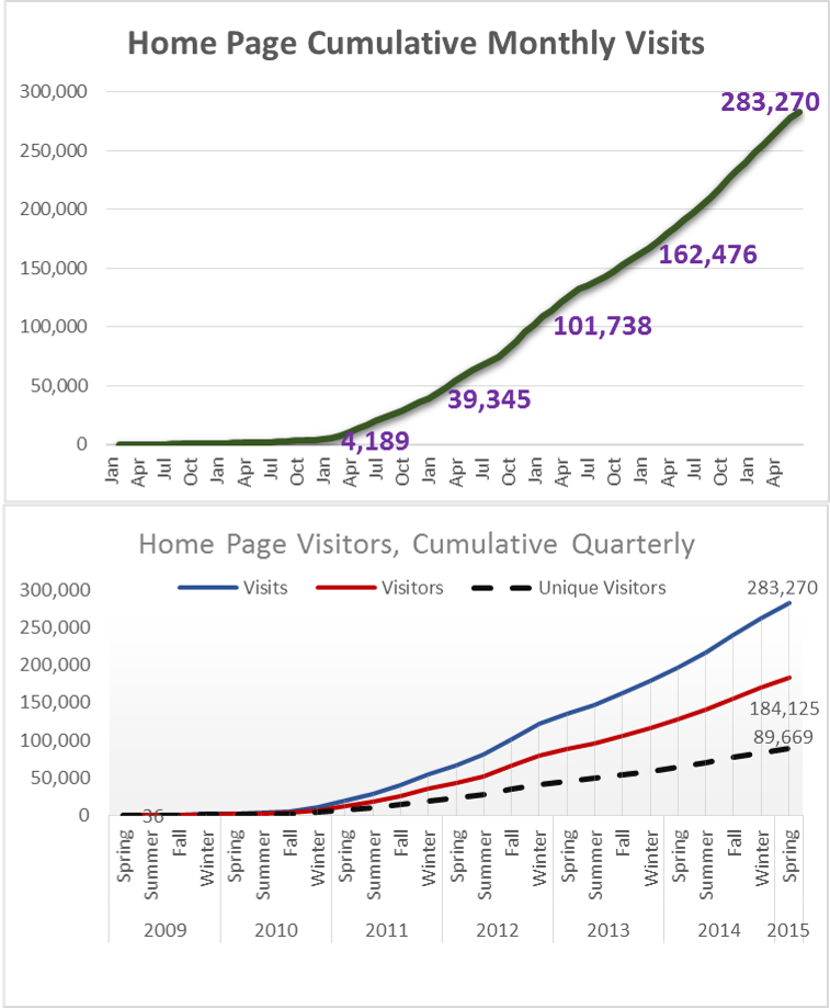
This first set of graphs depict values per period, illustrated as quarterly and yearly. These are not cumulative data. Over time, the numbers of followers continued to increase. Again, this is the number who visited just my main blog page, no special pages on the topics I review. Typically, a person first visits a special topics page, then looks for the main page to see who the author is.
For the first quarter in 2015, which I call “Spring”, I had 77,474 visits. (Jan-Feb-March is actually Winter, but I called the end of the year “Winter” for this review.)
A cumulative of this period is as follows:
This is a conservative estimate, based on the 1.5 value noted earlier. It takes into account the influx of new members each month, and then estimate how many of them return over the remaining periods, per month and quarter.
The conservative estimate of number of people impacted by this site in just under 90,000 people.
It is estimated that about half of these visitors are doing work or research in medical GIS. The other half are visiting for information about medical history and/or medical botany, and/or due to links from other places such as LinkedIn, ScoopIt!, Tumblr, and a few other sites that re-post much of my work. (I recently learned get on the average 1300 to 1500 re-posts per new blog/home page posting, per special search engines, and about 15 reposts of my work by other ScoopIt! sites.).
The less conservative estimate for individual impacted, by my pages only (not the LinkedIn and others), increases this number to 100,000 or more.
So, I need to add–many thanks to all you out there revisiting this site.
ESRI still has links to the historically important historical medical geography maps and articles I have posted, so I appreciate this support from ESRI as well.
I am in the process of translating the text (handwritten script, in Old German, using Old German medical and geographic terminology) and determining how to reproduce the famous disease map of Friedrich Schnurrer, ca. 1827 (figure below). It is the first map of diseases, globally, based on his review of the literature for the time. His work focuses on the famous epidemics and diseases documented by earlier writer. Schnurrer was an expert in Chinese culture, and perhaps produced these maps due to the cholera impacts on China before it turned into a pandemic.
Posted by Brian Altonen, MPH, MS under Uncategorized Comments Off on Alien-Like Worm Invades US
A bizarre invasive worm with its mouth in the middle of its belly has been found in the United States for the first time, according to new research. The New Guinea flatworm (Platydemus manokwari) is only a couple of millimeters thick but grows to be up to 2.5 inches (65 millimeters) long. As an invasive species, it’s a threat to native snails — so much so that the Invasive Species Specialist Group of the International Union for Conservation of Nature (IUCN) lists it among the 100 worst invasive species in the world.
What insights does this provide to disease ecologists?
The ability of small invertebrates to make it pass the security checks also means that other hitchhikers like then and the hitchhikers residing on these hitchhikers could make it into the U.S.
We traditionally maintain a high alert for obvious pathogens, like the mycobacterium species responsible for bovine tuberculosis or the ticks that can make their way in with farm animals.
The New Guinea flatworm is now causing U.S. ecologists to be prepared for yet another disturbance in the food web and cycles. The flatworm itself is not a health concern. Since the 1970s, the invasive "jumping worm" from China has been a pain to U.S. fishermen; it doesn’t stay on the hook that well due to weak musculature and lack of tough skin.
But these small organisms serve as ecological test species for those mapping the unique pedochemical, hydrologic, and climatically impacted behaviors of these organisms as they make their way into this country. Modeling can be done with the pre-vertebrates, to establish baselines for how to map the same environmental features once an pathogen-carrying host makes it past the security checks.
The impacts of a mistake can be quite devastating. Not just due to diseases, but also due to the potential these organisms have upon food and livestock security. So the best of us who read news about a possible foreign agent coming into this country, also have public health in mind.
Perhaps it’s time to review those older studies of diseases we’ve managed to avoid the past 50 to 75 years. Re-emerging diseases are not just those that arise as examples produced by human pathogens. We can get away with ignoring ecology when we study primarily human-based diseases; but when anthropozoonotic diseases become the issue, we have to convert to a more natural ecological means to perform our Medical GIS.
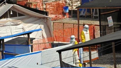
Posted by Brian Altonen, MPH, MS under Uncategorized Comments Off on Ebola spikes again in Guinea, Sierra Leone: “WHO’s on First?”
The number of Ebola cases has risen in Guinea and Sierra Leone for the second consecutive week, the World Health Organization said Wednesday. In Guinea, 16 new cases were found in the week ending June 7, with 15 more found in neighbouring Sierra Leone. In the previous week, 13 new cases had been found in Guinea, a clear increase on the nine reported a week before that.
. . . Third Base . . . . Forgive me for being a political satirist here, but I would like to say (and post) the following for this news :
“Let the games begin! We will start out the season with WHO vs. MERS, and then follow it up with games involving the Ebola team. Then WHAT’s Second?. Counter-Defense Crews (the anagram here) will make their way into the games, once they win out in the American BA (BS Artists’) series. ABsA and NBsA will then go face to face for the greatest game of all—the World Series. But only those customers caught distracted by watching the games are the real losers here–forgetting their safety when it comes to wild throws and foul-balls. But isn’t that really what this “game” is all about? Errors by in-field mistakes?
(What we don’t know is when is ‘I DON’T KNOW’ up to bat? That’s the big question here!)”
Posted by Brian Altonen, MPH, MS under Uncategorized Comments Off on Four Diseases in Prussia
These four maps demonstrate the significant spatial differences in distributions of four disease patterns. The four mapped diseases are Diphtherie (Diphtheria), Unterliebstyphus (Typhus), Lungenwindsucht (Tuberculosis or Consumption), and Sumpffieber or Wechselfieber (Malaria). Diphtheria is dependent primarily upon people. Typhus is due to a combination of transportation, population density and people. Tuberculosis distribution is defined by a combination of topography, climate and pedological (soil) features in relation to people. Malaria is an example of the classic host-vector zoonotic disease migration problem that plagues the world for nearly two centuries by the time this was published.
The influences of Prussian (German) cartographers and medical topographers/medical climatologists dominated the medical and disease geography profession between 1800 and 1850. When the first influential disease geographer became famous, Alexander Keith Johnston, the map he produced (https://brianaltonenmph.com/gis/historical-disease-maps/alexander-keith-johnstons-famous-map-a-detailed-review-1856/ ) was up against three very reputable maps produced by three German medical cartographers.
British mapmakers had less a sense of authority in this profession globally at the time. Supplementing the German leadership in this field was the purely geographic taxonomy for diseases developed by another Prussian/Germanic cartographer and specialist in this field in 1847 –- Dr. Carl Friedrich Canstatt and his book Handbuch der medicinischen Klinik (https://brianaltonenmph.com/gis/historical-medical-geography/dr-carl-friedrich-canstatts-handbuch-der-mediziniche/ ), in which the classification of diseases was perfected based upon a combination of environmental and human population features, including topography, climate, population patterns, wildlife and plants, natural disaster events, solar and even barometric influences.
Like many broadly read and trained professors, he had the knowledge background needed to map out the underlying climatic, environments, temperamental, evolutionary (pre- or Social Darwinian), cultural, anthropic, toxicologic, geologic, climatic and biological nature of the large numbers of diseases documented by explorers and missionaries around the world. Schnurrer also managed to review the famed plague epidemics and a variety of race-ethnicity related histories of diseases, and placed his observations on his map, detailing a part of medical history that has barely covered since and before this work was accomplished.
In light of these findings, from my work on these four most important maps in the history of medical geography, it now makes sense why this 1880 map on four Prussian diseases in the Germanic part of Europe remains one of my top visitor sites.