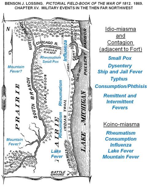
A depiction of how diseases were theorized around 1812, wtih expected locations of diseases over the Lake Michigan shoreline, Great Lakes area.
At times I get a little self-assured with the way my predictions have panned out over the past five years.
Back in 2013 I stated that measles was due to re-emerge, after discovering the dense cluster of non-immunized families and children along the west coast, centered in the Pacific Northwest.

Immunization Refusal peaks in the Pacific Northwest, 2000-2010. Individuals in the national dataset evaluated for this work, who had a Measles history.
Like I said in the many posting on that topic, before, during and after the measles outbreak in the Palisades area of New York, followed by the much broader, nationally spreading disease that erupted out of California. To date, most of the blame for that outbreak has been directed both at people from other countries coming into the U.S. for a short while, unimmunized and carrying the disease or bringing a child who has the disease, or we have blamed the numerous families into alternative medical philosophies and traditions in California, who felt the world was safe, and whp had that malingering phobia about their child getting autistic due to vaccinations–just MMRs mind you–“but hey, what the heck, we might as well skip them all.” I hear them say.
CDC and other major epidemiology, surveillance groups are focused on the California nidus based cause for the measles outbreak. They are wrong mind you, since the higher likelihood remains untouched due to this mis-directed focus down south.
And that is often what epidemiologists do–jump to conclusions, determine what’s likely to happen, and take action based upon that guess.

For decades, if not centuries (depending upon how far you read into the past), this basic layout of the world was used to define epidemic patterns, especially for fevers. Yellow fever was natural to the Torrid Zone, but during warm spells migrated into Temperate Zones. If in the upper north (for the southern hemisphere, lower south), the colder half of the temperate zone kept the fever present either by warmer weather, or by dense populations of people who could become infected. This important piece of American history is reviewed in more detail at https://brianaltonenmph.com/gis/historical-disease-maps/yellow-fever/a-new-war-yellow-fever/
So, the new Yellow Fever concern is bringing us another of these returning diseases that we are going to perhaps have to deal with.
See recent news article: Lydia Ramsey’s “Another deadly virus is poised to go global“.
If yellow fever hit the U.S., in epidemic fashion, I can predict that several big mistakes are going to happen and be published.

A section of William Aitken’s 1872 map of the U.S., depicting the Yellow Fever regions of North America [Link to Aitken’s map]
First, some of the past “yellow fever” outbreaks that weren’t yellow fever at all may be brought up. Yellow fever is very much a seasonal epidemic that erupts in the northern latitudes during the late summer, early fall–or as one Quaker physician Shadrach Ricketson stated around 1803 or 1804, it can become more likely when summer returns in the months of October and early November– that period of time we call “Indian Summer.”

Periods in Epidemiological Transition, according the the Sequent Occupancy method of interpretation. For basic background, see https://brianaltonenmph.com/gis/applying-new-methods-with-gis/sequent-occupancy/ In 1786, the famous patriot Benjamin Rush wrote about the ways in which society evolved in regions, producing a Human Species-based Evolution Theory that preceded Sequent Occupancy. (for which see https://brianaltonenmph.com/gis/historical-medical-geography/1786-benjamin-rush-an-early-rendering-of-the-sequent-occupancy-philosophy/ )
A very early possible outbreak, isolated on an Island south of Rhode Island is discussed in an article on an “Extraordinary Disease”. The geographical theoreies as to how an epidemic can strike an area, based on its levels of development, is also presented on this page that is referenced. This economic geography interpretation of disease explains the epidemiological transition patterns and behaviors we often see, in more detail and in a much more concise way that the traditional epidemiological transition theory. This philosophy that fits the epidemic changes better than epidemiological transition is called Sequent Occupancy Theory. (For “Extraordinary Disease” see https://brianaltonenmph.com/gis/historical-disease-maps/yellow-fever/1763-the-extraordinary-disease-of-marthas-vineyard-and-nantucket/ )

German medical cartographer Friedrich Berghaus produced this 1848 map, the second global disease map to be published. The yellow sections (barely visible) are the yellow fever areas of North America.
But the biggest mistakes US epidemiologists could very well make is to predict the entry of this disease by traditional mid-southern and southeastern routes into the United States. Some will believe it can return in a hierarchical way, via the largest, most heavily traveled cities.
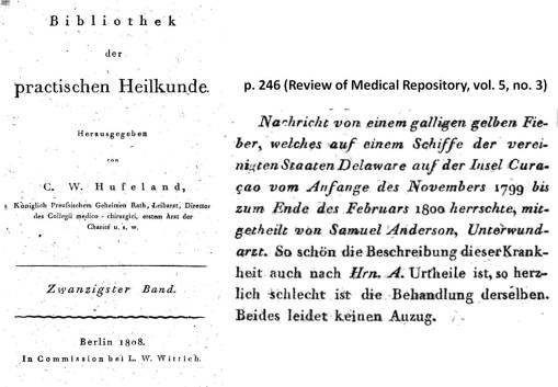
Congressman-to-be Samuel Anderson theorized the possibility that yellow fever was being carried by ships. On one of the ships he managed as a ship surgeon, he documented the conditions that existed and he suspected may have been related to an epidemic brought up from Curacao to Delaware. This is from my page on this topic https://brianaltonenmph.com/gis/historical-disease-maps/yellow-fever/samuel-anderson-and-the-mystery-of-yellow-fever-on-board/
But my review of yellow fever 6 years ago demonstrated more cases striking the northern states than the southern ones. That can happen in one of several ways.
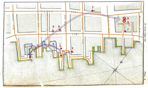
From one of my studies of Seaman’s maps of the 1790s-e1800 Yellow Fever in New York City (source: https://brianaltonenmph.com/gis/historical-disease-maps/valentine-seaman-1804-the-black-plague-or-yellow-fever-in-new-york-city/ )
First, the disease managed to come into the U.S. in spite of epidemiological surveillance in its natural endemic settings to the south. In other words, people bypassing the public health security part of the southern border of the U.S. will never be caught, and therefore make their way, as quickly as possible, to the northernmost parts of the US, via the Mississippi River and Great Plains travel routes.
Chiclero’s Ulcer ( see http://youtu.be/5a08oS23f4Q )
Of all things to relate to yellow fever, Chiclero’s Ulcer or Ear, an infection of the external ear indiced by the heavy humidity of Yucatan, also makes its way into this country via this route. The same migration route into the United States is followed by another Mexican-originated ecological disease–Pinta (pinto), a relative of STDs Falcoparum.

PINTA
> ♥ (link) <
So, Yellow Fever could make its way into the U.S by a classical in-migration route, that one would think the U.S. government can secure and watch over.
Another route that Yellow Fever could take in is the route in first took as it made its way into this country–by traditional shipping routes. Though this may not be so likely today as it was between 1740 and 1815, when shipping was a primary way to get around. Shipping routes enabled the disease to follow the inland waterways as well, meaning that in order to infect parts of inner Canada the way it did, yellow fever had to enter by way of the St. Lawrence Seaway, head across the Great Lakes, and then head in every direction along major tributaries heading west and north into Canada, and south and west into the United States.
The first disease with numerous topographic and geographic associations was the yellow fever, finally put onto a map by New York’s Valentine Seaman, as part of his investigation of the New York City outbreaks.
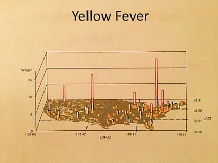
National Yellow Fever cases in the 2000s (personal research)
Numerous more maps of yellow fever behaviors have been published. Unlike Malaria or Dengue Fever, two other mosquito related foreign diseases to hit the United States, yellow fever has more of an ecological niche on this continent, and of the three, it is therefore more likely than them to return, and acclimate to the warming climate and the warmer southern shores of the United States, now managing to become a part of the ecosystems here, unlike back in the late 18th and early 19th century.
An Early Pinta 3D rotating image video I produced using my sql and sas formulas.
The third possible route for yellow fever into this country that is most unusual is akin to the last example just mentioned with the St. Lawrence Seaway. Today’s peaks of yellow fever seen between 2000 and 2010 possible relate to lesser security to the north, due to lesser expectations for yellow fever to enter the U.S. by way of a northern route.
And so, that’s the hypothesis I am testing here, by watching how the yellow fever behaves if it reaches this country. If there are weaker security measures for this disease at our north border, accompanied by lesser expectation by Canadian Public Health officials for a tropic disease to enter the heart of their country and establish a seasonal-only nidus there.
For more examples of Ecological Disease Cluster research using GIS, see my NPHG page: https://nationalpopulationhealthgrid.com/applications/2-ecological-disease-clusters/
