For a couple of years I have been pointing out where the managed care profession lies in terms of its skillset when analyzing population health.

Most managed care companies left nearly half their potential behind when they ignored the advancements in GIS that developed over the past ten years.  These changes in computer hardware and software, information technology, electronic medical records, data warehouse development, exceptionally large storage areas for long term medical records, made it possible for the research of 10 to 15 years of medical data to suddenly be accomplished by individuals like myself.  With the right expertise in data mining and aggregation, the goal of producing GIS applicable findings is now possible.  In a single day, several dozen diagnoses, research questions, spatial analyses can be performed at a moment’s notice.  This past week along, I averaged more than 100 analyses per day using some of the most gratifying algorithms I developed for risk prediction and defining individual patient health, healthcare related needs.

It is important to note that insurance companies initiated the idea of mapping health, back in the 1860s and early 1870s.  They stopped utilizing this means for evaluating health when the bacteria theory erupted, diverting the attention of many epidemiologists from the environmental setting, to the home setting and environment immediately next to the patient’s body, school, playground, party sites, meeting rooms, and workplaces.

The image at top depicts the status we are at in managed care when it comes to GIS utilization.  It depicts the common behaviors seen in the managed care field, the level of accomplishment healthcare programs have reached when it comes to reaching their marketing and business potentials.

32555b39-1e9b-4f2c-8ea3-9a5ffb8ee7ac.jpg

On a scale of 1 to 10, I place our system at 5.5, almost 6.  That is to say we focus on retrospective analyses and information production and display for the most part.  We rarely use spatial modeling to make predictions about our programs, its financial growth, its patient population, the local community health-related changes.  We do not utilize grid mapping techniques, nor prediction modeling, nor quarterly spatial display of our services and finances, nor economic and quality of service assessment programs to score and improve our projects.

To many, taking the chance that well over half of them may have little impact or fail remains a major deterrent.  Knowing the field your are in, and where and how to start such an exploratory process, is also a skillset lacking in upper level management.

ElixCCICompar_SEC

But the advantage to employing an aggressive spatial surveillance and prevention-minded medical GIS is seeing the impacts of those few successes financially and healthwise.  Chances are, if you evaluate 50 to 300 features of population health, design your surveillance system such that it allows you to engage in well targeted intervention programs, you make it possible for good news stories to be generated for your program by the end of each and every year.

Survey_PAcNYImmumRefusals

The following are potential uses for medical GIS-HIT, which is why I keep the score for where managed care unexcitably low, and why the level of potential growth this business experienced at embarassing levels.

e9313c85-140a-4669-ab84-98c6ac22bb99.jpg

All of the others professions in healthcare have developed more rapidly and completely that managed care, regarding the use of EMR data.  While programs still struggle to get their EMRs working, experts in GIS working in managed care are taking their data and doing hundreds of times more analyses and reporting, than simple meaningful use report writing can achieve.

E979-x

For much more, see nationalpopulationhealthgrid.com

NPHG_LOGO

KernelDensity629ICD9_SEC

Over the last 6 or 7 years I have been “showing off” this algorithm I designed nearly a decade ago, longer in terms of copyright and intellectual property rights claims.

This way of modeling disease patterns is a direct product of my first studies of spatial data, which ironically focused on remote sensing and the value of raster imagery before I was able to see the value of a standard point-line-arc or point-line-polygon geographic information system (i.e. the ESRI and MapInfo GIS products from the mid 90s).

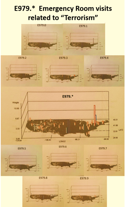
When I developed my first algorithms, they were for differentiating land use patterns, in particular regarding vegetation types and the patterns changing “browns” and “greens” they produced in the various early Landsat and AVHRR imagery then available for research.  I came up with/developed and tested some unique algorithms for overlaying trend surface models to identify important edges to overland diffusion processes, such as for a migrating animal bearing disease, or a pathogen capable of spreading as wind-blown materials.  I even used these to study the nature of very large repeated forest fires developed due to a combination of climatic, meteorologic, topographic and phytochemical (resin index) features.  These algorithms were used to exaggerate 3D differences, converting them from linear to logarithmic in order to depict the most important “hot spots.”

Later I found a use for these algorithms in evaluating population density, public health related features.  The same algorithms that defined edges for conifer rich regions in the mountains could be used to define religious, cultural, age pattern density, environmental disease, elevation, traffic flow, and sociocultural disease type edges.  The edge of outbreak and outbreak susceptible areas can be defined quite easily using mixed 2D and 3D modeling.

You can also overlay certain features on some of these diagrams that can be developed in the right SAS programming (not at all requiring SAS GIS).  These features include risk area patterns, critical p lines demonstrating the edge of a break out area, points depicting where the event peak is relative to local police and fire stations, a hospital, an emergency care facility, a specialty clinic in charge with specific public health concerns.

The amazing thing is that today, with the current technology, without ArcGIS, QGIS, Cognos, Tableau, these maps can be produce, in record amounts per day.  All of the 45-60 Meaningful use (MU) metrics can be evaluated several ways (by facility, by race, by ethnicity, by clinic, by provider, by provider type, as percent performance) in a single run of the program, using the right macros.

In a regular Data Warehouse, it takes a day or more to develop the macro from scratch.  But then, once it is finished, it is written such that it can be applied to other metrics.  The process for using a macro-based process for running your daily ED evaluation or weekly MU review, cost analysis, enables up to 2 or 3 hundred tests to be run in less than two hours.  In terms of 3D modeling, producing multiple images of the same result, depicting the same finding but at different rotational angles, it takes a few minutes more to produce several maps, a half hour more to produce hundreds of them.

What takes the most time right now at this end for mapping diseases and health / visit behavior is the time to pull the data (it sometimes take just as long, a half hour to a few hours, times 5 or 10 on occasion).

3DMapICD9_629_SEC

On a good day, I have found that one can spend 3 or 4 hours writing up the logic, the sql and SAS needed to pull the data and reassess it, resort it, count it out, in such a way as to produce your numbers.  Add another half hour to merge this with your overall population data for comparisons (i.e. for incidence/prevalence measures), and if necessary link as well any additional spatial data required by your facility for the areas to be assessed (i.e. pull in zip code data for: facility, special location, and even patient residence for proximity to care measures).

A great program in managed care, that implements GIS and spatial analysis, is productive in 3 months at the demographic, basic numbers level.  It should be producing spatial data (maps or the likes thereof) in 4 to 6 months.   Depending upon the software used for GIS (which is not required so far), another month or two is needed to develop the actual GIS tool process for a standard coarsely mapped zipcode or county (even census block or clock group) based system.

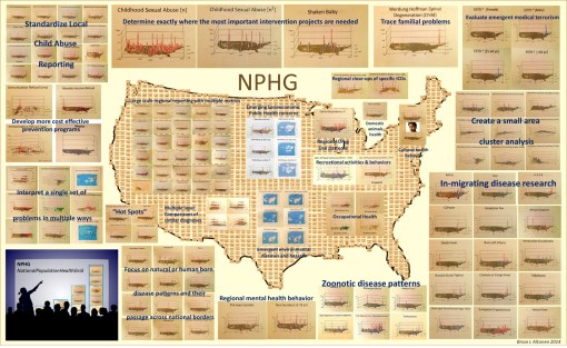
  • A GIS based managed care system should be able to engage in meaningful use related activities such as:
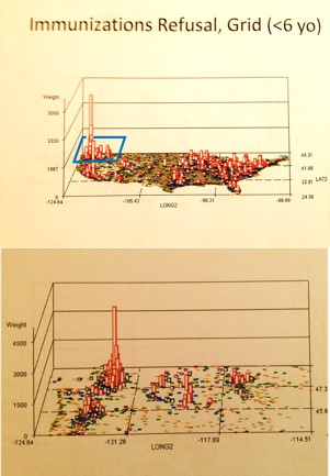
  • location analysis of 0-2 yo immunization completion findings,
  • develop of a clustering algorithm for mapping asthma and COPD patients,
  • engaging in a study of relationships to completion of well visit requirements relative to facility types and service hours
  • mapping suicide attempt rates (V and Ecodes), as an age-gender-race metric
  • developing comparative studies of cancer risk testing rates at the socioeconomic level,
  • evaluating STD spatial distribution relative to age group and ethnicity
  • documenting diabetes prevalence rates for specific zip code defined areas
  • documenting the distribution of spouse abuse events in EMR derived by Ecodes information
  • relating SES and median income to costly chronic disease medication timely refill statistics
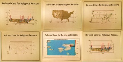
  • producing areal maps of immunization refusal family clusters based upon Vcodes
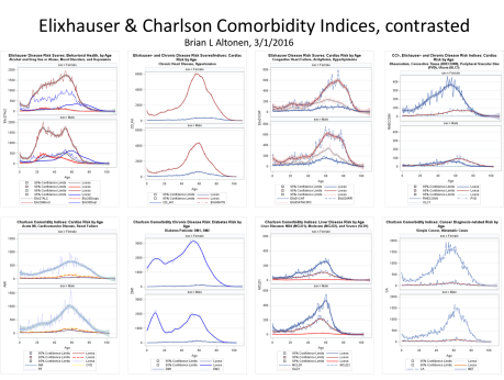
  • mapping zip code or retirement facility specific overall health risk in 3D, based upon Charlson comorbidity (CCI), Elixhauser comorbidity and federal Chronic Disease Management algorithms.

There are three major stages or series of processes required to develop a spatial GIS for managed care.  I have identified these as EMR, Spatial, and then GIS stages.

The EMR Stage is the development of data into a usable form for spatial analyses.  Nearly all managed care facilities have the goal of reaching this stage in their development.  A few programs even implement some form of Cognos, Tableau, ESRI tool, QGIS, or the like, for information mapping.  Information mapping is different from Spatial Analytics mapping.

There are a number of places that engage in pseudo-spatial mapping.  They analyze data by simple areal and point features (EpiINFO / EpiMAP style of work), don’t actually engage in spatial analysis, but spatially present their findings.  Some even use these products to design special needs or intervention programs.  If a pre-post evaluation is performed, the spatial process is well on its way to being implemented as a standard part for a Managed Care program.

One level above this pseudo-spatial analysis is using spatial techniques with a spatial purpose.  Like developing a spatial data program that utilizes zip codes to define areal risks based upon age-health features, and then using the spatial process to define cluster areas or predict where the next clusters of cases will emerge, such as new diabetes patients over 65 or more cases of toxic lead paint exposure in low income urban settings.

Proactive use of spatial methods in an essential part of the true spatial analysis routine.  Reactive or retroactive spatial evaluation are simply that–a review of the past, but without a particularly well defined reason other than to better understand an event.  In the west nile example I engaged in more than 10 years ago and posted, I used GIS (but spatial processes) to evaluate west nile clusters of positive testing hosts and vectors, then set traps to prove that a local vector existed at the nidus of spatial centroid of that area, and then used that area to demonstrate that the mosquito carrying this disease could survive the following winter; which it did, enabling me to come up with the first early Spring positive testing sample. (I have a page or two posted on this.)

In sum, the spatial process of spatial analytics development within a managed care system involves understanding and employing your spatial formulas, even though your company may not be regularly using a GIS to meet its requirements.

Spatial techniques may also, incidentally, be used to evaluate SES, demographics, marketing, cost performance, fund raising program success, public interaction of the healthcare program or facility with the local populations.  Spatial evaluations of this sort are often requested, but often by engaging outside resources to provide the mapping and analytics required, due to the cost of the staff and hardware associated with this form of productivity.

Spatial analysis at the institution. health care level is reached when data is functional and used by a facility, from its EMR warehouse.  These uses includes areal analyses of some sort, engaged in regular, and as part of occasional or once only programs such as for a grant funded research.  Forward thinking is also required for a spatial analysis program to truly be engaged.  This means that production at the next stages need to be ongoing, with regular presentations provided at times to inform the right people.  Presentations at local meetings and conferences are also essential to making the program stable, ongoing, able to discover more areas of interest in need of research, more groups of people and npos that can benefit from continuing the program, and more followers at the production and performance level, including other workers with similar skillsets and their own unique spatial analysis abilities.

The third stage, or GIS stage, of this setting, occurs when an actual GIS is incorporated into this process, not just for demonstrating results in a report, but for use in analyzing specific questions, completing analyses that cannot be easily performed in the spatial tools that do not map (prediction programs that calculate probability, but don’t map; SAS generated tables and charts, but not maps).  Two forms of GIS are traditionally recognized as applicable to healthcare–the line-vector and the raster system.  Both should be available to the managed care system and be used for spatial databasing, operations development (testing and designing algorithms specific to your program), presentation (at managerial on down to public levels), prediction modeling, and producing final summaries or atlases depicting your program’s spatial results, for the annual report required of most healthcare systems.

At another site I am working on the details of all of the reporting that can and should be done by a managed care combined EMR-GIS/spatial analysis program (a small part of my dissertation work.)

At several locations I posted examples of many the above mentioned products.  (I’ll also try to post some examples here).

[Note: I also have a survey posted at SurveyMonkey, querying those engaged in managed care or GIS and health about their experiences in this field.

Participation in this survey is of course appreciated from this end; it abides by IRB requirements; no personal info is divulged; it exists only due to my work as a leader in this specific epidemiology/population health specialty.  Please visit it at https://www.surveymonkey.com/r/JW88X3F  ]

This slideshow requires JavaScript.


To GIS students: Invest in Medical GIS

The Trump Healthcare plan will no doubt provide opportunities for growth and change.  But the same opportunities could be argued for any new healthcare plan that is proposed over the next 18 months.

We fall for the same tricks every time the healthcare systems appears to be a failure.  One of these tricks is condemning the recent past, while making promises for the weeks and months ahead.

Does anyone remember when Clinton and Gore were running for president?  What was it that the two of them offered to the American people?  What they offered was not any different from what we are still trying to establish today.  Since that run for presidency, there have been no successes made in the attempted improvement of healthcare insurance programs available.

The common cause for all of these failed presidencies and laws passed regarding health care (the HITECH Act for example)  are the same–the insurance companies.  You cannot reform health care without reforming the insurance company, the role of the insurance company, how it should managed healthcare insurance, and how it needs to either bow out of the health insurance industry (hard for some, since that is all they do), or come up with a plan that they are willing to take responsibility for, and follow.

The common thread to the slowly maturing failures of health maintenance organizations since Nixon signed them into existence, is equivalent to that of Presidents Ford, Carter, Reagan, Bushes 1 and 2, etc. etc, etc.  The common thread is the health insurance industry, an industry with too little competitions, too much merging allowed, too much regional pseudomonopoly-like settings.

Trump’s idea of allowing citizens to produce and managed their own medical savings accounts in theory makes sense, that is assuming we did not treat them like we treat the family’s educational account established for kids.  That money must not be allowed to be pulled for anything but for what it was originally intended, and that money should be treated like money put away for retirement–it must never be taxed.

The way disease and health mapping come into play here is at the clinical and, believe it or not, the insurance industry level, maps can be used to reduce the cost of anything and everything pertaining to the rising cost of care.  Yet, why don’t these industries use maps to surveil their patients or members–the source of their revenue?

The health insurance industry and many health administration people haven’t an inkling of an idea on how to read a medical topology map.  They don’t know how to interpret statistics (not simple reported information in the form numbers, actual p values and Chi-squares used to determine statistical significance).   These businesses do have statisticians capable of understanding the basic non-spatial ways of developing statistical insights.  But these same businesses do not know or understand the steps required to develop spatial statistical information.

This means that in order to be ahead in the healthcare profession, you have to learn spatial statistics, not simple t-Test, ANOVAs, Chi Squared methods or even survival plotting.  You have to know and work with theoretically, and with the ability to develop new protocols in health statistics methods, using spatial data.  GIS is the main way to convert any non-quantifiable measure into a quantifiable measure, by relating the measure events or things to each other over time and space.  If children in one zip code use a specific swear word with sexual innuendos, and that term they use is very different from the terms used by another place, because another culture is there, you can document the publishing of the swear words as graffiti, and analyze their relationships to each other, and to the types of churches that exist in the same neighborhood, not to mention measures of race, ethnicity, average age, average history of income, or citizenship.

Does the current plan for improving our healthcare system make it possible for more attention to be paid to previously ignored social and cultural events with meaning?  Is healthcare more than just the patient-doctor-billing agent (collectors) relationship?  Is it possible to make sense of each and every event that happens, good or bad, moral or immoral, culturally correct versus politically correct?  GIS tells use the answers to these questions.  It takes second to apply GIS to billing data, to determine where physicians are prescribing more drugs than expected, or being paid much more than would be predicted for a given area with specific population derived predicted healthcare needs.

Obamacare was developed to improve upon the HIT system that exists, encourage or force programs to commit to developing an HIT.  The Obamaplan also had the idea of monitoring performance of healthcare systems and businesses.

The Obamacare system has lost its race because the wrong directions were taken by the entire system and its administration.  No attempts are made to make the insurance companies more liable for their laziness, malfeasance and malpractice.  And if there is an insurance company you have that your are wondering about, if that insurance is a large scale company with other affiliates in the country, then that company is probably one of the dozens I analyzed to see how inefficient the companies can be, how skill-less they are becoming, and how incapable they are of seeing into the future of the healthcare industry.  They are still living as reactionary businesses, not proactive preventive healthcare focused businesses.

So, to make GIS work for your job as a technician looking for work in the healthcare insurance industry, the best thing to do is to look into how this is being done, in managed care.  This site I am putting together on Managed Care Innovations, will allow those who are “literate in healthcare statistics” to do just that, not the insurance companies (stuck in their way), but the newcomers to this field.  A lot of my methods are there–but you have to be able to interpret programming language to determine how it can be done quite effectively.

There are a series of requirements for establishing an HIT system so that it is capable of developing into an HIT-GIS workstation.  There are a series of large scale metrics that have to be accomplishable in a system.  Since 2006 I have worked with agencies that report on thousands of metrics in some way shape or form, not just the 40 to 60 required for meaningful use.  Systems and technology savvy IT managers, directors and statistical experts can produce two or three thousand metrics per years–they can analyze all of the patients for unhealthy lifestyle, poor genetic history, multiple chronic disease mortality and morbidity indices.  They can analyze the congenital conditions, and relate culture and place to costs and losses in revenue.  They can evaluate the culture of their patient load, and know where people are most likely to engage in spouse abuse, illegal surgical practices entered into EMRs in the form of specific ICDs, places where exposure to the environment might be causing learning disorders in children, or hampering the performance of patients in terms of engaging in preventive health activities.


(From https://www.donaldjtrump.com/positions/healthcare-reform)

HEALTHCARE REFORM TO MAKE AMERICA GREAT AGAIN

Is this plan crazy?

My guess is a lot of people are going to take little to no look at this plan, and immediately verbalize their opinions about, even recommendations against it.

The sources for resistance to such a plan, at this point in time, is where the U.S. stands in regard to the presidential race.

A year or so ago, I was still supporting the Obamaplan rather steadily and daily in my postings on LinkedIn, ScoopIt!, and even this site.

This changed when the news was out on the use of penalty fees for patients – – – or should I say potential and returning patients — to hesitate about filing due to concerns about hidden costs, accrued on a per need basis, such as co-pays.  The penalty fee was recommended for those who failed to commit to a plan, or failed to sign up for one when that was the expectation.

Most people don’t file for insurance due to limited incomes, even those from the middle class.  Myself included, the costs for adding my name to an insurer’s program, in addition to the amount I would probably have to pay when I went for care, especially emergent care, puts patients in a position where the impact is the same no matter what decision you make, about pre-paying or pay once the need arises.

But still, the worst part about the Obamaplan is that it penalizes every one involved in health care, from the patient to the physician and nurse, to the administrators and hospital staff who have to make up for losses accrued when patients, insured or not, cannot comply with the rise in health care that the Obamaplan resulted in.

That one good thing about the Obamaplan is that is covered a significant number of people who were a month or two earlier uninsured.  But that really isn’t worth the amount of members lost in healthcare plans due to the costs involved.  And it certainly doesn’t make up for when insurance companies and states decide to bow out of the Obamacare plan, like North Carolina did, in order to avoid having to deal with the problems inherent to its operation at the insurance company level, the health care facility level, the billing agency level, the collection agency level, . . . and oh yeah, the patient level.

When a plan doesn’t care who it impacts and turns into a victim of change, that plan is not at all democratic or “American” in nature.  It is totalitarian or oligarchic like in nature–it only benefits the few programs in charge of these operations.  It only benefits the patients and administrators who don’t have to subscribe to this “New Deal.”

In 2015, New York City had 1.4 million patients enrolled in a medicare/medicaid program.  Due to the Obamaplan, in less than 6 months, this membership dropped to 1.25-1.33 million, depending upon your definitions.  That is a 0.o7 to 0.15 million drop in insured patients–or in real numbers, a drop of 70,000 to 150,000 patients in half a year.  The Obamaplan is not intended to increase enrollment.  It is intended to change enrollment.  The cost accrued by the patients who did depart their previous plan, may now be uninsured, and cost the newly insured more for healthcare by the end of a year.

So relating this to the Trump plan, the goal of the Trump plan is a generic one, plainly stated, focusing on the most important parts of healthcare that all os us like to complain about.  The Trump claim is as follows: “to create sound public policy that will broaden healthcare access, make healthcare more affordable and improve the quality of the care available to all Americans.”

The next section is a description of seven attributes to this program meant to improve the healthcare system, as it exists now.  As follows . . .

[Begin Quote]

*********************************************************

Congress must act. Our elected representatives in the House and Senate must:

  1. Completely repeal Obamacare. Our elected representatives must eliminate the individual mandate. No person should be required to buy insurance unless he or she wants to.
  2. Modify existing law that inhibits the sale of health insurance across state lines. As long as the plan purchased complies with state requirements, any vendor ought to be able to offer insurance in any state. By allowing full competition in this market, insurance costs will go down and consumer satisfaction will go up.
  3. Allow individuals to fully deduct health insurance premium payments from their tax returns under the current tax system. Businesses are allowed to take these deductions so why wouldn’t Congress allow individuals the same exemptions? As we allow the free market to provide insurance coverage opportunities to companies and individuals, we must also make sure that no one slips through the cracks simply because they cannot afford insurance. We must review basic options for Medicaid and work with states to ensure that those who want healthcare coverage can have it.
  4. Allow individuals to use Health Savings Accounts (HSAs). Contributions into HSAs should be tax-free and should be allowed to accumulate. These accounts would become part of the estate of the individual and could be passed on to heirs without fear of any death penalty. These plans should be particularly attractive to young people who are healthy and can afford high-deductible insurance plans. These funds can be used by any member of a family without penalty. The flexibility and security provided by HSAs will be of great benefit to all who participate.
  5. Require price transparency from all healthcare providers, especially doctors and healthcare organizations like clinics and hospitals. Individuals should be able to shop to find the best prices for procedures, exams or any other medical-related procedure.
  6. Block-grant Medicaid to the states. Nearly every state already offers benefits beyond what is required in the current Medicaid structure. The state governments know their people best and can manage the administration of Medicaid far better without federal overhead. States will have the incentives to seek out and eliminate fraud, waste and abuse to preserve our precious resources.
  7. Remove barriers to entry into free markets for drug providers that offer safe, reliable and cheaper products. Congress will need the courage to step away from the special interests and do what is right for America. Though the pharmaceutical industry is in the private sector, drug companies provide a public service. Allowing consumers access to imported, safe and dependable drugs from overseas will bring more options to consumers.

********************************************************

[END QUOTE]

Entitlement 1.  We’ll begin by skipping this first order, except for a brief comment.  People have a choice about whether to pay for care or not.  There is a problem with this ideology for, which is if employers decide to no longer give in to providing some form of health insurance as part of the employment process, that the current markets out there will turn into haves and have-not industries.  Big businesses will reward employees with healthcare coverage.  Minimum wage or low wage businesses will hire, but make its workers poorer if they have to pay for health insurance on their own.

Entitlement 2. Remove the cross-state border issues with healthcare.  This is a new one to me, having worked in healthcare, medicaid and medicare claims related issues.  Sure, there are problems with obtaining insurance from your federally subsidized and funded state agency–like Medicaid and Medicare.  And programs that cover people in this way, always make it more expensive for you to receive care from an out of state facility.  Even more, if you obtain care from an unapproved facility, provider, company, without preapproval, this care could very well cost more as well.   The cross-state borders concern may help certain people receiving certain forms of care.  In places like NY, where people may cross over to Connecticut to receive better care due to the location of an Acute Care hospital, this problem theoretically already exists.  Yet it has not hampered upstate NY care that much.  I would need to see more details about what interstate care this clause pertains to.  More important perhaps would be a similar clause allowing patients to travel for less expensive care, by engaging in the now rapidly growing medical tourism industry.  I would rather have my colonoscopy performed for $1,000 instead of $5,000 to $7,500, and on a nice Caribbean Island rather than is a grimy urban neighborhood, where the hospital or facility is surrounded by everlasting construction events and hazards, and inadequate parking space.

Entitlement 3.  Allow individuals to deduct health related costs from their annual income tax returns.  Not at all contestable.  This should have been there from the beginning.  The government has to either choose to pay for your healthcare entirely, and tax your full income, or deduct what you have to pay as a matter of governmental choice.

Entitlement 4.  Health Savings Accounts–why do these opportunities keep returning? It is the choice of the agency providing them that is responsible for this decision.  The company is irresponsible with this potential healthcare insurance option.   This is also like that option you have, that comes and goes, of putting some money aside that is pulled from your paycheck, for miscellaneous health expenses.   You lose it if you don’t use it up by the end of the year.

Entitlement 5.  Price transparency.  This is where I can get personal about all of this.  A procedure performed on a medicaid patient, that costs $350, will inevitably cost a patient covered by some form of commercial insurance two or three times as much.  The low cost for the medicaid patient is because the government only covered a little under 50% of the billed amount, and the healthcare facility/insurance company usually is expected to accept this drop in payment.  So they make up for the medicaid, unemployed and disabled patient induced losses in income by doing something one step short of deliberately overbilling those who can afford to pay.  What’s worse about this aspect of healthcare billing habits is that a single procedure can have many different costs for the many different parts and programs in the U.S.  Costs for care are not defined as having to be within a given range, or for a specified amount.  Potential costs for opting for a healthcare service should be transparent to the patient population.  People like myself, who analyze and company the different BCBS’s and United *** insurance agencies, can determine where overbilling is being performed strategically, at the agency level.  How else can we compare the cost for a procedure nationally, if we continue to accept these varying differences in billing strategies and amounts. Such inconsistent pricing makes it impossible to safely evaluate the cost for healthcare and the Big Data level.  I use my own price sheet to review and compare these plans.

Entitlement 6.  Block Grants.  Nothing completely new here.  Not like this hasn’t been done before.  The thing to do is make block-grant required.  For some states, this means we go back a few years, or generations, in terms of how the state managed its patients.  The history of this type of payment plan is already in place, due to Medicaid and Medicare.  We use Block Grant like options as well for other things we do, such a develop new schools, or determine where to invest in certain infrastructure requirements in decomposing urban settings.  IF not for the failure of that last use of clock grants, we could argue that this method could work very often.

Entitlement 7.  Remove barriers for the marketing of healthcare.  As usual, that is always a good option, but it can result in a unique set of have and have nots.  Some form of care is essential, and overcharging for it is an issue.  It’s like saying the poor cannot have the best surgery, only the quick fix.  There are already a lot of rules an regulations about invention, marketing, testing of new products.  There is nothing new inferred by Trump’s plan regarding the expected rules to remain in effect regarding patient safety.  Trump’s proposals will not cause another Thalidomide tragedy to erupt.  Pharmaceutical industries are the cause for their own demise, or lack of success with their products, as the controversies behind certain unproven medications continue to show.  This issue has to be evaluated more strategically, and with more detail.  The one form of healthcare that needs to be added, once again, is the medical tourist industry option, for expensive processes, but maybe for alternative means of cultural healthcare processes as well. (It’s up to you if you want the Brazilian shaman to heal your Pinta or Chiclero’s Ear, or the African medicine man to treat your African American heritage induced genetically-derived cardiomegaly.)

So what’s Missing?

I’ll review that next.


Florida’s hot, humid climate puts its 20 million residents at risk — along with millions more tourists

Sourced through Scoop.it from: www.cbsnews.com

It is one week into February.  For New York that means we are5 or 6 weeks away from paying close attention to the first mosquitoes.  The first pests are those that successfully  overwintered.  This spring will be full of those pests, because this winter has managed to steer clear of too many El Nino-La Nina effects.  It has snowed only once up in my county, and been miserably cold for just a week or two.


But the first adults to re-emerge from their winter hibernation should be carrying much, we hope.  There haven’t been too many positive testing cases with West Nile and Chikungunya like we feared late last summer.


So weather and climate determine when the first southern disease bearers will impact this part of the States.  Whereas Aedes aegypti is the vector epidemiologists have to watch to the south, Anopheles are the pests we may have to pay close attention to up here, perhaps Aedes.  


So where do the Aedes mosquitoes penetrate the US with their tropical diseases?


I mapped the answer to this questions years ago.  See https://www.youtube.com/watch?v=eHyehbfOwFo   


West Nile is a related disease; but it rapidly migrated across this country ecologically.  Can Zika virus do the same?  This video is of the success that West Nile had crossing this country in just a few years: https://www.youtube.com/watch?v=VKtREeEtkaY 


The way Mosquito Viral Encephalitis is distributed in this country is at : https://www.youtube.com/watch?v=YGu_hY_r0Ko 


It shows where the Dengue is brought into the US by Aedes, via people.  NY is the center for possible in-migration of the disease by infected people.  Whereas Florida, Louisiana, and numerous southern states riddles with mosquitoes are how it will enter this country ecologically.  


I produced a rich resource on how to evaluate mosquito-vectored diseases using GIS.  I developed a method for ecologically profiling places, to determine where these critters are most likely to run rampant, and where they will mathematically cause to most chaos to ensue and the likelihood for unexpected diseases to penetrate the local wetlands and swamp-ridden areas.


The following is how I used a light sensing device to develop a better ecological understanding of mosquitoes, in relation to land use patterns and ecological vegetation-domain status:  https://brianaltonenmph.com/west-nile/west-nile-surveillance-2/

Remote sensing tells us plenty about an ecosystem and whether or not it has the features to develop a stable ecosystem for vectored diseases to survive.  See https://brianaltonenmph.com/west-nile/6-remote-sensing/ 

My study of species for these vectors:  https://brianaltonenmph.com/west-nile/vectors/ 

My vegetation survey derived plant ecology study: https://brianaltonenmph.com/west-nile/3a-west-nile-surveillance-1/ 

My surveillance of cases:  https://brianaltonenmph.com/west-nile/case-related-surveillance/ 

My method of assigning risk to areas:  https://brianaltonenmph.com/west-nile/assigning-risk/ 

My review of topography, landform and vector patterns (won an award for this): https://brianaltonenmph.com/west-nile/topography/ 

My NLCD grid mapping method of evaluating vector and host distributions: https://brianaltonenmph.com/west-nile/nlcd-grid-mapping-and-west-nile/ 

My introductory page on how to do this monitoring of diseases using a GIS, with plenty of pages to follow, is https://brianaltonenmph.com/west-nile/

My award winning west nile ecology poster, 2006: https://brianaltonenmph.com/about/west-nile-ecology-poster-session-at-2006-esri-conference-denver-co/ 


I posted numerous videos of zoonotic disease behaviors in the US based on 1998-2012 EHRs (the past 15 years), at https://www.youtube.com/playlist?list=PLWrApErk5byYvO6ZHvDzgzmPqOGs1WI9B 


and 


https://www.youtube.com/playlist?list=PLWrApErk5byZnE0bWUqdfH4CYVmnETLg6 


FOR STARTERS . . . 

See on Scoop.itMedical GIS Guide

. PREFACE I can start off by stating that “the Extraordinary disease” that struck Nantucket in 1763, and referred to by the writer of this article, was not yellow fever, or at least not just yellow…

Sourced through Scoop.it from: brianaltonenmph.com

A few days ago, November 24th, I had 450 people visit one of my historic medical geography pages.  This page reviewed the epidemic that stuck Martha’s Vineyard in 1763.


I use two well tested theories to evaluate this diseases most likely to strike this setting during some of the earliest years of colonial history.  Sequent Occupancy and its equivalent idea penned around the same time by Benjamin Rush as a variation on the newly population Erasmus Darwinian evolution theory.


Erasmus Darwin (grandfather of the famous Charles Darwin, founder of the more modernly accepted evolution theory), identified the concept of speciation [“Speciation transition theory”], in which beings develop as a consequence of their ecosystem.  Applying this to humans, Rush stated that as people mature and their work environment and community mature, so too does their way of living and occupation (see “1786 – Benjamin Rush – An early rendering of Sequent Occupancy”  at https://brianaltonenmph.com/gis/historical-medical-geography/1786-benjamin-rush-an-early-rendering-of-the-sequent-occupancy-philosophy/ ).  Rush referred to these periods of sequential development in reference to the different “species” of mankind they produced. Man’s way of living, building houses, setting up business, raising or grown food, all changed as well as a result of these changes in the colonial setting.  To contemporary readers, this seems figurative at first, but a review of the Erasmus Darwinian theory makes sense of it–that theory claims the same natural events and forces occurred throughout nature, not just to plants and animals, but also to stones, the environment, mankind, etc.


In the late 1800s, the geographers reiterated Rush’s theory, without knowing he had in fact already invented it, when they described the sequent occupancy theory for how people evolve and change as the place they live in changes as well (“Epidemiological transition”, at https://brianaltonenmph.com/6-history-of-medicine-and-pharmacy/hudson-valley-medical-history/european-multiculturalism/moravian-indian-medicine/medical-changes-over-time/ ).  These changes in the immediate environment are a consequence of changes in prevailing occupation patterns, prevailing resource and product needs, and prevailing skills and knowledge based needs in order for that business and its factory or industry setting to develop.


For each of these E-Darwinian evolution-ecology states, or Rush species periods, or sequent occupancy stages, come a specific set of medical conditions and disease types.  This direct relation of these three paradigms all precede the contemporary epidemiological transition theory by just a few decades.


Now of course, sequent occupancy, speciation, and early E-Darwinian ecology are not perfect matches for epidemiological transition.  Like any theory that exists in today’s scientific community, older theories undergo change and upgrading every now and then.  Sometimes they fade out, only to return years or decades later in some new form, supported by some new paradigm.


Sequent occupancy is a far better way to map diseases and health over space and time today, as much as a century or two ago.  It is as much a valid theory for geographers to use in their studies of spatiotemporal disease patterns, as the traditional ecological theories are for the biological fields, or the demographic-environment theories are for pathogenesis.


Sequent occupancy is here for spatial analysts to use to study their topics with.  It provides a much better, more specific format to carry out this research with, defining as well the observations that need to be recorded and discussed to help show a value to sequent occupancy theory to the modern spatial epidemiology studies.


This page more than likely had such a great following during the first days of this week due to its sequent occupancy and review of history and health for a time when colonial medical theories prevailed.  Colonial medicine beliefs were very different from those of today–few overlap, except at the sentence level–we still occasionally uses leeches to treat the human body for specific conditions.  We bloodlet patients, but only those who are hyperemic.  We reserve religious beliefs for disease, but fall upon other culturally-related belief systems to try and explain our sickest behavioral health patients.  Some doctors believed in metaphysical theory and applied acupuncture to patients, for the electric energy or vital force it transferred, spread or helped to develop.  Such a philosophy differs extremely little from today’s reasons for why we want to rely upon acupuncture for treating certain medical conditions, such as back pain or even cancer.


Whatever the reason for its high popularity right now, this item out of the U.S. medical history represents one of many examples of the value of historical medical research, for use by today’s healthcare and medical research projects.  Very few medical scholars know and understand medical history.  They often re-write its meaning, purpose, definition and intent for the philosophy, in order to make it fit better with their own modern paradigm.


But theory is theory.  Theory works when we can make it work, and when if works real well, deserves to be tested for more applicability.  The sequent occupance part of this highly popular page, and its example of how epidemics in the past can be so hard to recognize and decipher when penned by non-medical writers, and why we must engage in this kind of work to better understand some of today’s medical and public health issues, are the main reasons this many people took to this page on the epidemic that struck Martha’s Vineyard, nearly 250 years ago.  In it, I provide as well as contemporary historian’s take on the cause for this disease centuries ago; but the underlying basis for this modern diagnosis is so wrong in terms of time and place.  To make the right diagnosis today, it helps if we know the full history, even of the disease we are trying to decipher and diagnose.

See on Scoop.itMedical GIS Guide

Arguments over whether the city can require pre-K students to get flu shots reached a fever pitch in Manhattan Wednesday, with a courtroom full of anti-vaccination activists railing against everyth…

Sourced through Scoop.it from: nypost.com

I spent the past three months reproducing my 3D maps of disease, that I developed the NPHG program for several years ago.  


For those unfamiliar with my NPHG work, years ago I developed an algorithm for analyzing population health data, and then mapping the results of my analysis at the small area level (adjusted for particular density features), in order to produce a video of my results that depicts the US turning.  This presentation can be zoomed in on, and looked at using any 3D angle.  The purpose was to determine the best way to demonstrate disease outbreak clusters, ICD clusters, human behavior clusters.  I produced more than 1000 of these 3D videos, each with 1000 or more maps in them.  


Duplicating this statistical method for a smaller area, large medical data company, focused on NYC, I produced identical maps for this part of the US megalopolis.  Most important to me was the fact that with the smaller dataset (1.5M-8M patients, 1B records), my results mimicked the results I produced for my 80M-120M patient population reviewed, that I posted quite a bit from over the past few years.


What is evident from thus duplication of findings is confirmation of a number of unexplored disease topics, in dire need of closer attention to culture, race and religion-related influences on the diagnoses, and the places where these events tend to cluster.  This is certainly a way to uncover both the genetic and the cultural makings of the many neighborhoods that make up a healthcare populations "region" of distribution.  It can be used to map out the value of where your facilities are placed, and how to link that info to community income level and types of medical needs.


The most controversial outcomes for these projects pertain to intercultural findings–behaviors, genomics, and culturally-linked ICDs that cross over into unexpected families and cultural communities.  


The refusal to immunize your children is in part ethnic-culturally based, for two very clear reasons, and it is neodarwinian, U.S. based cultural beliefs–the notion that avoiding the vaccine is the safer way for a child to live.


It is up to the healthcare, managed care systems to be able to utilize findings like those produced using highly detailed spatial approaches to analyzing healthcare related needs, services and costs.  The single most reason managed care groups have enabled these behaviors to happen in the NYC community is obvious–leaders of healthcare systems are inexperienced in producing an impact on the health of their local community.  Another leadership related reason for the failure to improve healthcare practices and outcomes in recent years is also based upon poor experience and lack of adequate background in directing a managed care program as a healthcare system and business, not just one of either of these two.


Due to an efficient EHR, EMR, I can go to work and in an hour or two map the entire region and tell you where the most frequent use of these v-codes related to immunization refusal are documented.  I can then map these results and produce a video well before the day is even half over.  


So, for a while, I wasn’t sure why managed care programs still cannot engage in this level of spatial epidemiological research, much less get their act together with EHR and EMR.  But this new "theory" in the dissertations that have been published in recent years, demonstrates this problem due to be to management and directors.  Many if not most medical institutions have the employees with the skills for doing exactly what I do, map the results in record time, and analyze thousands of health related metrics per year.


My NationalPopulationHealthGrid.com page, personal blog site (brianaltonenmph.com), and YouTube sites provide numerous examples of this mapping technology.  Once my dissertation is over (or just before), I’ll put out there the simple formulas I use to produce valuable epidemiological surveillance tools, without the need for a GIS.

See on Scoop.itMedical GIS Guide

Solving the crisis?!  Well, not really.  2016 is the year when managed care programs will either suffer and succumb to the pressures of HIT, or successfully find new talents and leaders to advance their system ahead of the rest and implement a  Medical GIS.

2016 is also the year when a significant percentage of healthcare programs will fall behind in the most basic IT and HIT requirements even further.  Some may even fall so far behind their competitors, that it becomes necessary to sell, or initiate a major overhaul.

The first thing to go with a successful overhaul are the “leaders” of the past.  They are the ones who are dragging your managed care system behind, not only in its technology, but also it economic potentials, in the form of rewards and benefits for . . . . need I say? . . . .  “good service.”.

Sourced through Scoop.it from: brianaltonenphd.wordpress.com

This philosophy defines the neoinstitutional theory of health care administration, the primary theory by which my dissertation work on managed care and the current barriers that exist for GIS implementation.  The lack of success and rapid growth, when compared with the advancements epidemiologists, marketing companies, surveillance specialists, and climatic health experts have made using GIS, is due to the absence of upper level management having any direct, first hand knowledge or field and hands on experience with GIS and the use of GIS skills to create your own maps . . . from scratch. . . . by hand . . . not just by using the routine shapefiles that most GIS’s are provided.

Some very old habits have resurfaced again, due to the last two year’s worth of failed healthcare information technology improvements.  The primary proofs of these failures are demonstrated best by programs still unable to produce an entire and effective HIT information management system.  realize, the bulk of these programs have only a few dozen metrics that are required of them, about 60 meaningful use metrics.

I have identified thirty-four major SETS of metrics that need to be developed, and then managed regularly on a monthly, quarterly or annual basis, for any managed care system to demonstrate its expertise in understanding population health and the roles of medical GIS in producing more cost effective HIT-GIS guided Managed Care programs.

These 34 classes I came up with define about 1500 to 2000 metrics.  Most of them were developed as part of a major MC program I was involved with back when the first contemporary forms of these systems came to be (more than 10 years ago). So these 34 classes on population health/meaningful use reporting shouldn’t be too difficult to develop in three years or less.

Now I admit, this is just my preliminary set, and is based upon projects in which I was able to develop these reports in very little time over the past 10-15 years.  I suspect a few more details will need to be added as I recheck my sql and sas algorithms and rewrite them to more rapidly produce the end products that are required.  This project is based upon real life, real time data.  There is a real need for managed care systems to develop a programs that are more robust, not scripted as just a bunch of various “silo” projects, by unmanaged, non-integrated research teams and offices.  Working together as part of an HIT-GIS program, these programs can have a very significant impact.

On the page this ‘blurb’ is linked to, I define the following sets of skills and applications of GIS as the directions these programs need to be heading.  All but two of these items should be able to be accomplished in under one calendar year, with or without a GIS.

Location/Access improvements; redesigning plans and servicesCost savings by redesigning facilities, determining needsServices — quality and adding new services, documenting thisFuture planning (projection of health and patients and costs; plans/goals)Standardized reporting of valuable QA information; meet MU requirementsPerformance Improvement QI scores, documenting and reporting on 60+ specific metricsPerform Ad hoc reporting, per local needAchieve more recognition and support:Improve professional reputationIncrease Public Support and recognitionPress related support and recognitionObtain other institutional support and recognition (tertiary care settings, university hospitals, npos, clinics, allied health)Improve financier support and recognition; improve investments; improve IT infrastructure.Obtain more allied corporations support (manufacturers, inventors, innovators)Receive more Federal and State support and recognition, and publish more in the literature.

See on Scoop.itMedical GIS Guide

With new infection hot zones developing in Europe, world leaders need to get ahead of potential epidemics.  My map videos for each of three geographically different Leishmaniasis patterns in the US, are [American] https://www.youtube.com/watch?v=hpxw97tM75k ; 

[Ethopian Leishmaniasis] http://youtu.be/jhw8nfEfNOw ; [Asian]  http://youtu.be/mkHYn-r-5WQ .

Sourced through Scoop.it from: www.washingtonpost.com

Taking a close look at the history of diseases, they appear to recur in different countries as if a "new wave" of outbreaks was developing.  This new event leaders are trying to link to global warming and climate change, which could be very well correct, at least partially.  


Global warming isn’t the same reasons outbreaks of various international diseases occurred in the past.  The past events may have even planted some of the pathogens into our local ecology, long before the first outbreaks even happened. 


Other factors that come into play with new foreign disease outbreaks in this country pertain to the migration diseases underwent centuries ago.  The common factor for most outbreaks brought from afar is travel, and the amount of people travelling.  During the mid-14th century, Taenia (African tapeworm) made its way to Europe by way of merchant and explorer ships.  


During the mid-19th century, there is plenty of evidence suggesting the classical Vibrio cholerae was planted ecologically within the Mississippi River deltaic setting.  On and off it produced a few outbreaks in Mexico and the U.S., which were never considered an indicator suggesting the pathogen was part of the local ecology.  


In the past five decades, travel has been the means by which disease causing organisms provided the opportunity to commute to a new ecosystem.  But, whereas fifty years ago in the 1960s, a plane from New York to the Caribbean was a unique transportation event, today, it is nearly a commuter’s route to some, a recurring ‘frequent flier’ event for others.  


As of this decade, travelers can easily take just a few hours to spread a disease anywhere they want around the world, from western Australia to Chicago in less than one business day.  The migration of a number of foreign borne diseases into the U.S. in 2014 and 2015 proved this inevitability was finally upon us.


Recently, several foreign born pathologies or diagnoses were brought to my attention, due to their "discovery’ in the lower New England-Mid-Atlantic setting.  I remind people to check one or more of my postings, if you want to see the past behaviors of diseases on United States turf, over the past ten years.  Most of these maps are now being reconfirmed, using different data from different sources.  However, if things do get worse, they represent just this moment in US epidemiologic history.  


For a number of examples of map videos I produced on what I termed "Foreign Intruder diseases", go to:

https://www.washingtonpost.com/opinions/preventing-the-next-disease-outbreaks/2015/10/23/c4564ec0-7817-11e5-a958-d889faf561dc_story.html?ref=yfp


My blog page with a listing of these (no video links), is at 

https://brianaltonenmph.com/gis/global-health-mapping/foreign-disease-intrusion/


For those who don’t want to search . . . see . . . 


Ethopian Leishmaniasis – http://youtu.be/jhw8nfEfNOw

Asian Leishmaniasis – http://youtu.be/mkHYn-r-5WQ

See on Scoop.itMedical GIS Guide

From 1987 to 2000 I ran a lab at the local university that specialized in testing phytochemicals.   My focus was on my own “discovery” of the local yew tree as a source for a new treatment for breast cancer, which would be marketed several years later as Taxol.  That study was second to my study of benzylisoquinoline (BIQ) alkaloids, metabolically active selective toxins capable of being applied as medicines.  I also monitored OTC herbal products for adulteration and counterfeits, and occasionally followed up on complaints of toxicity.

Sourced through Scoop.it from: www.newsweek.com

This current argument, pertaining to antioxidants, mimics similar events that ensued in the late 1980s for Echinacea, when it was promoted for treating AIDs.  Many herbal medicines are potential victims of this slippery slope error, usually made by their most devoted (and highly biased) advocates.

During my 20 years working as a phytochemist and phytotaxonomist specialized in the pathways for developing new products, I attended hundreds of presentations, classroom teachings, and other public events about the new claims to herbal medicines arising over the years.

Echinacea was the first attack I would make on these claims, as the researcher, lecturer and professor in natural products chemistry from 1989 to 2000.  The primary individual promoting Echinacea at this time recommended it for treating AIDs.  Attending one of his sessions, I asked about its mechanisms of action; he was unfamiliar with the contradictory nature of his claim, which stated that an herb stimulating the immune system would help “cure” or minimize AIDs related complications because of its non-specific “immunogenic” effect. (Lucky guess on which pathways to take, I guess.)

For the next decade we contested each other’s claims about what is “efficaciousness”, when it came to herbal medications and their nutriceuticals.  Ultimately, some people in this profession developed a better understanding of the immune system processes, and the varying pharmaceutical nature of the  ‘Chemicals in Plants’ (the name of my most popular course at PSU for 15 years).

Also note, these same incompletely researched arguments have been made for plant seed oils, in particular arguments that posed ideas about prostaglandins and prostacyclins, not to mention the other arachidonates and EPAs.  Such arguments claimed that generically assisting the body in its chemical processes somehow results in a therapeutic effect because nature selects the right side of the pathway to health for its plant chemicals to take. (Or maybe it’s simple “luck of the draw”!)

Similarly, herbalists rarely  take into account the opposing natures by which black cohosh and blue cohosh on uterine muscle and blood vessel walls; the effects of the two, when taken together, are in opposition to each other in some cases.

Over the years, I demonstrated that one of the most embarassing things about phytochemical drug related claims is what little herbalists know about the chemical nature and chemical history of some of their most popular products.

Since I specialized in BIQ alkaloids back then, I reviewed the “curative” BIQs purportedly in Goldenseal (Hydrastis canadensis) from 1990 to 1993; I presented these findings several times, including at OAS.  I found that hydrastine (green to gold on the TLC) rapidly decays to produce hydrastinine (sky blue).  Different products had different amounts of hydrastinine produced, indicating substantial irregularities within the herbal medicine trade.

That second product (light blue hydrastinine) is a result of the oxidation of hydrastine to hydrastinine, by light, heat, exposure to oxygen, free radicalization,  etc.  This chemical conversion also changes the questionably-proven antibiotic Goldenseal powder into a better-documented smooth muscle relaxant (see ‘The Merck Index’, 1970s).  Since the half life of hydrastine (the desired antibiotic chemical) is a just few months in powdered products, this means the capsules, teas, and such that are made from golden seal powder may be totally “ineffective” in therapy in overpriced in terms of their hydrastine content.  [Take them for your IBS instead; I explain all of this on part of my resume/autobiographical page, at https://brianaltonenmph.com/tag/selective-toxicity/ ].

During the 1990s, some of the OTC industries made corrections for these inconsistencies and even tried standardizing the testing of their alkaloids, flavonoids, and other forms of phytochemical content.

But similar problems ensued.  Concerns about the substitution of Devil’s Claw with a closely related “unofficial” species (but perhaps allowable) is currently a major concern.  Since the 1920s, there has been this ongoing problem for identifying the right “Pau d’Arco”.  Adulteration is also still a problem with herbal medicines, for example, the many “legal highs” may be totally bogus, questionably effective neurotonics.  Likewise, the use of “scullcap” for epilepsy has had its non Scutellaria substitutes found in the batches instead.  One Uva Ursi (Arctostaphylos uva-ursi) produce sent to me by an Alaskan herbalist ended up being boxwood (Buxus) shrub instead, alkaloids and all.  (Grossly, it is a lookalike at first, and so was perhaps gathered by mistake.)

And as usual, poor management of OTC the plant product manufacturing industry remains a major problem with this unmonitored profession.  Last week, the story was once again countering the Echinacea immunogenic theory claims.

Finally, I find this problem to be very much like another series of legal cases I managed from 1989 to 1990, involving the Oregon patients who took the first bioengineered version of the OTC nutrichemical, tryptophan (TRP).  It was produced by the Japanese company Showa Denko, using aggregate cell culturing (“bacillus soup”) techniques (one of my first professors was Abe Krikorian, who sent the Daucus carota to the Moon and back during one of those Apollo missions, in aggregate rootcap bioengineered form; the cell aggregates survived and produced new plants on earth).

This attempt to make a bioengineered form of TRP for the first time unknowingly resulted in the production of di-TRP, which was undetected, since it never existed before, and found to be neuromyotoxic on skeletal (esp. leg) muscle.   [See http://www.nemsn.org/Articles/summary_tryptophan%20Fagan.htm ]

The misfortune there is that this enabled the FDA to regulate TRP rather than require it be tested and monitored for public health safety.  That move was obviously one of a political nature, not intended to be solely of a public health nature.

Remember, as a medicine, the herb is what you make of it.  As a source for chemicals, however, there’s more to a plant than just a list of compounds, some of which have possible effects.

If only we paid more attention to the highly detailed alchemical history of what’s in a plant.

So many compounds, so many theories. (“So that’s why it worked!”)

PS: Don’t forget the ZMAPP project!  This Ebola drug was bioengineered using Tobacco Plant, and the rights to its product and the genetic engineering processes are patented.  So this process and its unexpected problems it may cause at times may very well continue.  See my related ScoopIt! at http://www.scoop.it/t/episurveillance/p/4026182931/2014/08/12/zmapp-and-the-treatment-of-the-spanish-priest-in-the-madrid-hospital-for-ebola  

See on Scoop.itEpisurveillance