JULY 4, 2014.  Ebola News and Information Updates.  

Source: uk.news.yahoo.com

July 14, 2014.  The long term predictions for Ebola are not overly surprising.    


A fairly realistic view of outbreaks like those for Ebola rely upon the assumption that these outbreaks are primarily of natural and human ecological in nature.  In the long run this can means that they are more difficult to suppress than a disease diffusion process that lacks a natural ecological component, and is dependent mostly upon just people interacting with other people, mostly in human occupied places.


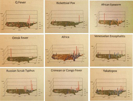
We learn about future disease patterns for a disease from other countries by looking at how similar diseases behaved in the past.  The behaviors of west nile for example to date have been very much like those of the early 19th century yellow fever.  The diffusion processes for the recent outbreaks from the Caribbean of Chikungunya are very similar to vector-host relationships, climate of origin and diffusion by transportation for the 19th century typhoid fever.  As for Ebola, . . . 

these few observations beg the question:  If we apply to this same logic to Ebola, relying upon matchable natural and human ecological matching disease patterns, what might we come up with?  


Current speculation is we are still far from the opportunity for a diffusion of Ebola to other parts of the world.  Ebola’s zoonotic behaviors suggest a limited "metazoonotic" region (according to Pavlovsky’s and Voronov’s definitions) for the time being.  Until the host-vector ecology is somehow changed, or its genetically defined tendencies to survive based on interactions with nature change, the "metaecology" of host, vector, organism and combinations thereof remain the limiting factor(s).


EBOLA LINKS/UPDATES:


UK NEWS.  (July 3).  W. African Ebola epidemic ‘likely to last months’, says UN.  At    https://uk.news.yahoo.com/w-african-ebola-epidemic-likely-last-months-says-185447906.html#fakodRB     


CBS News (July 2).  Ebola rages through West Africa, with no signs of stopping.   At     http://www.cbsnews.com/news/west-africa-struggles-to-fight-off-ebola/     


The Guardian.  (July 2).  Monica Mark. Fear and ignorance as ebola ‘out of control’ in parts of west Africa.    At   http://www.theguardian.com/world/2014/jul/02/-sp-ebola-out-of-control-west-africa     


ALJAZEERA.  (July 2).  

Ghana hosts crisis talks as Ebola toll rises.Ministers from 11 African nations meet to plan "drastic action" as death toll from haemorrhagic fever reaches 467.  

 http://www.aljazeera.com/news/africa/2014/07/crisis-talks-held-as-ebola-death-toll-soars-20147282632436552.html


THE TELEGRAPH.  Mike Pflanz.  (July 3).    Ebola ‘out of control’ in West Africa as health workers rush to trace 1,500 possible victims.  Fear, mistrust of Western medicine and difficulties reaching remote areas mean hundreds of potentially infected people have not yet been found.  At    http://www.telegraph.co.uk/news/worldnews/africaandindianocean/guinea/10942598/Ebola-out-of-control-in-West-Africa-as-health-workers-rush-to-trace-1500-possible-victims.html     


CNN NEWS.  Laura Smith-Spark.  (July 3).  Ebola virus: Can nations stop deadliest ever outbreak from spreading?  At   

http://www.cnn.com/2014/07/03/health/ebola-outbreak-west-africa/     


BBC NEWS.  (July 3).  Ebola outbreak: West African states agree strategy.    At  http://www.bbc.com/news/world-africa-28156263     

CBC NEWS.  Daniel Schwartz. (July 4). Ebola epidemic unlikely to spread beyond Africa. Deadliest outbreak of the disease still a challenge to contain. At   http://www.cbc.ca/news/health/ebola-epidemic-unlikely-to-spread-beyond-africa-1.2695879


CHIKUNGUNGYA.  LINKS/UPDATES:  


European Centre for Disease Control and Prevention.   Chikungunya.     http://www.ecdc.europa.eu/en/healthtopics/chikungunya_fever/pages/index.aspx      

Eric M. Leroy, Dieudoné Nkoghe, Benjamin Ollomo, Chimène Nze-Nkogue, Pierre Becquart, Gilda Grard, Xavier Pourrut, Rémi N. Charrel, Grégory Moureau, Angélique Ndjoyi-Mbiguino, and Xavier de Lamballerie.  (2007).  Concurrent Chikungunya and Dengue Virus Infections during Simultaneous Outbreaks, Gabon, 2007

Emerging Infectious Diseases.  Volume 15, Number 4—April 2009.  At  

http://wwwnc.cdc.gov/eid/article/15/4/08-0664_article


NBC News –  MAGGIE FOX.  Bugs at Your July 4th BBQ? Beware of Chikungunya and West Nile.   At  

http://www.nbcnews.com/health/health-news/bugs-your-july-4th-bbq-beware-chikungunya-west-nile-n147881       

MICHAELEEN DOUCLEFF.   Chikun-What? A New Mosquito-Borne Virus Lands In The U.S.   At       http://www.npr.org/blogs/health/2014/07/03/327760854/chikun-what-a-new-mosquito-borne-virus-lands-in-the-u-s     


http://news.nationalgeographic.com/news/2014/07/140701-chikungunya-caribbean-mosquitoes-world-health/     


For more on the Russian philosophy of disease ecology, by Evgenii Nikanorovich Pavlovsky (1884-1965), and A. Georgy Voronov, see:


—my thesis, Overview at http://wp.me/Puh6r-3HT, or full project and supplement chapters, not published except on the web, detailing the history of the medical geography and disease ecology fields, at http://oregontrailcholera.wordpress.com/     


—my webpage and dedication to , "Zoonosis and Russian Medical Geography", at https://brianaltonenmph.com/gis/historical-disease-maps/zoonoses/     


or, the following classical reference:


—Human Diseases with Natural Foci.  (Abstract/Description for purchase) 1963.   At:    http://www.cabdirect.org/abstracts/19642702411.html;jsessionid=05B0F21042EF4956C63AE975AC35B36D       


The Present States of Surveillance – the implementation of GIS and Remote Sensing in Spatial Epidemiology.     


A Flowchart used to assign levels of engagement in the Medical GIS process.    


Normal Ranks 1 to 9 (1=low; 9=high performance and success; 10 = ideal theoretically rank.     


Status, in this illustration is almost 6.   Although this score is based on interviews etc. analyses completed a half year ago  These assignments are based on the forms of software/programming required for each step and its uses, i.e. presentation and/or utilization, levels of spatial math, spatial representation, and analytic tools/methods used.  Note: last month’s second review demonstrated considerable progress.     


Improvements in accuracy, presentability, complexity, dimensionality, utilization, and predictability are some of the major changes required for each step.     


To effectively deal with Ebola, the higher end agencies are working close to levels 7 and 8, and testing at levels 8 and 9.

The circled level is where we need to be for outbreaks like those of Ebola and other foreign born emerging diseases.  Research stations and facilities at major headquarters no doubt have these technologies in place.  Where we are lacking is at the infrastructure level and the lack of engagement in upgrading our software and skillsets.  


     In some ways, this reminds critics of what happened due to the natural disasters we experienced over the recent years.  There were a number events we were "unprepared for", resulting in limited recognition, delayed response, and inadequate long term follow up for these events .


     The point here is that we should use cases like these as lessons, that very well could prepare us for a repeat in these same events next year, but with worse consequences.  


     This year’s spatial epidemiological events–ebola, chikungunya, polio in the Middle East, the polio-like condition in California, the measles outbreaks and other immunized diseases in the U.S., and most recently Whooping Cough (is mumps, rubella, or diphtheria next?)– demonstrate better systems should be put in in place at regional and local levels.  These systems should match the level most of the better standard system in health care are at currently (Levels 6) and be able to progress rapidly to levels 7 and 8 (begin to employ NLCD, grid, DEM, RS, NIR, vector-NDWI, RADAR, LiDAR, live LS or equivalents), and even 9 (prediction/accurate risk assignment) for the most advanced.  


     The technology we need to accomplish this goal exists right now.  Only human behaviors can be used to explain why Medical GIS, as a profession, has not reached its fullest potential.


     Those companies and health care organizations that start right now will become the local Innovators and Supporters.  Those that wait, but ultimately find a way in are Early Followers.  


     Which pack does your company or healthcare group belong to?


      I am currently trying to document our participation and rate of implementation, including with this ANONYMOUS survey,


     described at:  https://brianaltonenmph.com/biostatistics/gis-in-the-workplace-survey/


     and directly accessible at:   https://www.surveymonkey.com/s/HZ7MH7Q


For students into Government Security, Bioterrorism, Re-emerging Disease and Foreign Disease Migration, etc. , this is a nice demonstration of the value of maps . . . especially political maps.


These are two maps  with almost an exact match!!!  The question that leads me to is: Could they provide insights into the philosophy and history leading to ISIS and the ISIS objectives?


The top map depicts the goals of the Great Ottomon wars fought by Turks and supporters from the late 1600s to the early 1800s, on and off [ this more “lively source” is from 

http://generalhelghast.deviantart.com/art/Greater-Ottoman-Empire-256901086  .]

.  


The lower map depicts the long terms goals of the Islamic militant group ISIS, trying to produce a [re-]unified Caliphate Islam.  [Source: 

http://abcnews.go.com/International/terrifying-isis-map-showing-year-expansion-plan/story?id=24366850&nbsp ;]. 


Source: abcnews.go.com

Excerpts from the new ABC News article:


"The Islamic militant group currently marching across Iraq trying to seize territory in order to create an Islamic state has purportedly published a map showing their plans for the next five years.


The maps were widely shared on Twitter this weekend. They show parts of Africa, the Middle East, and even Europe shaded in black, to represent the territories that ISIS hopes will be part of its Sunni-run state.


ISIS stands for the Islamic State of Iraq and Syria, and is a militant group that currently has fighters in Syria and Iraq trying to seize territory."


MY OBSERVATION:


My initial query consisted of a plan to compare the ISIS plan with that of Adolph Hitler. But Hitler’s plan did not match the ISIS plan at all. [For Hitler, see the Life magazine version of this, from 1942, at
http://www.dailymail.co.uk/news/article-2032699/What-Nazis-invaded-America-Maps-published-1942-Life-issue-detailed-plans-Hitler-invasion-U-S.html  ]

But then I noted the expected match to many of the medical conditions and behavior I tracked related to the Islamic lifestyle and Islamic belief system.

Reviewing the maps of the war, it was not a similarity I saw between these two maps, but more an exact match, except for the north western part of China the ISIS plans to [re-]capture.

A nice demonstration of the value of maps . . . .


Two Maps  with almost an exact match!!!  Could they provide insights into the philosophy and history leading to ISIS and the ISIS objectives?


The top map depicts the goals of the Great Ottomon wars fought by Turks and supporters from the late 1600s to the early 1800s, on and off [ this more “lively source” is from 

http://generalhelghast.deviantart.com/art/Greater-Ottoman-Empire-256901086 .]

.  


The lower map depicts the long terms goals of the Islamic militant group ISIS, trying to produce a [re-]unified Caliphate Islam.  [Source: 

http://abcnews.go.com/International/terrifying-isis-map-showing-year-expansion-plan/story?id=24366850 ].


Source: abcnews.go.com

My initial query consisted of a plan to compare the ISIS plan with that of Adolph Hitler.  But Hitler’s plan did not match the ISIS plan at all.  [For Hitler, see the Life magazine version of this, from 1942, at 

http://www.dailymail.co.uk/news/article-2032699/What-Nazis-invaded-America-Maps-published-1942-Life-issue-detailed-plans-Hitler-invasion-U-S.html ]


But then I noted the expected match to many of the medical conditions and behavior I tracked related to the Islamic lifestyle and Islamic belief system.


Reviewing the maps of the war, it was not a similarity I saw between these two maps, but more an exact match, except for the north western part of China the ISIS plans to [re-]capture.

African-U.S. Disease patterns, from NPHG (the National Population Health Grid mapping project)

Source: news.yahoo.com

We COULD, or is it SHOULD, already have the answer to this question!


No doubt the CDC, NIH and WHO have some of the best people and tools in use to evaluate this potential epidemic problem.


At the public health level, if no such programs are in place regionally or within urban-metropolitan regions, the hubs of international commerce and travel, it is probably way too late to get anything started for this season.  When asked how long it takes for me to establish a workstation from scratch, my guestimates based on experience are several weeks to, unfortunately, up to a year to develop and test, assuming the agency has a fairly poor infrastructure in place.


The infrastructure requirements for mapping a serious disease migration like that of Ebola requires more than just a basic demographics, transportation, and overall health patterns geographic information systems.  Ecological data has to be completely included with this Integrative Disease Management (IDM) geographic information system.  I favor phytoecological mapping due to correlations that can be drawn between vegetation regions and host-vector patterns.  The skills of Pavlovski and Voronov of the Russian fields of study in human ecology, macroecology and disease geography drew together some of the most important ideas in spatial zoonotic disease patterns that have yet to be made a part of a daily system in most U.S. surveillance systems (see https://brianaltonenmph.com/gis/historical-disease-maps/zoonoses/ ).


The essential skills of mapping required for preparing for Ebola or any other in-migrating disease pattern, requires a complete and extensive review of these natural events, both in the natural setting and within the human ecological setting.  Studies of lyme and west nile in the U.S. for example, using NLCDs, remote sensing and climate analyses, show these techniques could provide important insights into certain types of disease patterns.  The mapping of all of the rare to infrequent zoonotic disease patterns for the U.S. (like some of those pictured above), yellow fever  (https://www.youtube.com/watch?v=qH_cWGT8QbE&feature=youtu.be ), the distribution of diseases that logically came in by airline such as internationally induced elevation sickness (https://www.youtube.com/watch?v=PPeiDkhrgkI&feature=youtu.be ), and something as seemingly unrelated as hurricanes and tornadoes, produce findings that can be applied this work as well.  [See sections of my extensive Pacific NW coverage as well– https://brianaltonenmph.com/gis/population-health-surveillance/production-examples/regions-and-health/part-iv/ ].  Could it enter via Mexico?  Another disease evolved natural to that region could provide us with insights into how extensive in-migration travel is for the U.S. (https://www.youtube.com/watch?v=fcDTC-fXhg0&feature=youtu.be&nbsp ;).


At one point I produced a series of international migration maps using two types of formulas, one focused on the basic migration patterns ecologically and environmentally defined, the other inclusive of diseases from other countries that are primarily people related, not necessarily vector or animal related.  The latter provided insights into how people travel from Africa (and other main regions or continents)  to the US, and probably who upon arrival had to be assessed for something they may have brought in with them (recognizing “rule outs” as an important part of claims related behaviors in EMR is important to know).


My NPHG 3D map video on Ebola demonstrates the “rule out” effect in the claims contained in EMR:     https://www.youtube.com/watch?v=RfvUQfYLlvM


More of this In-migration Disease series of NPHG videos, using several unique areal and grid mapping algorithms I developed, is at:


https://www.youtube.com/playlist?list=PLWrApErk5bybFfsOWTXWjlwvIM7D4d6-h


So, at the risk of repeating myself too much, I recommend the following [NOTE: at this site, the non-Youtube sites with my name attached, already on this page, may not open depending on your device; so scroll down or hit HOME above to see all of them]:


The Latitude and Longitude of Ebola.

https://brianaltonenmph.com/2014/06/24/the-latitude-and-longitude-of-ebola/&nbsp  (seen on this page, below);


Current Ebola Outbreak Is Now The Worst In History And ‘Totally Out Of Control’.      http://www.scoop.it/t/global-health-care/p/4023600494/2014/06/25/current-ebola-outbreak-is-now-the-worst-in-history-and-totally-out-of-control 


http://www.pinterest.com/altonenb/epidemics/ 


. . . and concerning dozens more vectored and non vectored diseases out of Africa, such as Chikungunya (if link is disabled or blocked, see June 9th entry below):


https://brianaltonenmph.com/2014/06/13/monitoring-chikungunya-virus-and-dozens-more-vectored-diseases-in-the-united-states-a-testing-of-our-spatial-analytics-potential/&nbsp ;


The behavior of such a disease were it to come in through Chicago like MERS did (again, see below):


http://www.scoop.it/t/an-episurveillance-researchers-guide/p/4022709334/2014/06/09/a-lesson-in-disease-migration-the-chicago-illness-to-be-compared-with-mers 


And “the methods to my madness”:


https://brianaltonenmph.com/about/grid-economics-and-population-health-work-experience/


But if you don’t want to listen to me, see:


‘outbreak’ at Tumblr.  http://www.tumblr.com/search/outbreak/recent?language=en_US 


Mapping Ebola’s Deadly Spread (Huffington Post).  http://www.huffingtonpost.com/2014/06/20/ebola-map_n_5516406.html


Brief General History of Ebola.

https://web.stanford.edu/group/virus/filo/history.html


Medical experts are worried that an increasing number of children may become susceptible to diseases such as measles and whooping cough

Source: www.usatoday.com

The video at this site summarizes quite well the public health issue we are now contending with. (See http://www.usatoday.com/story/news/nation/2014/04/06/anti-vaccine-movement-is-giving-diseases-a-2nd-life/7007955/)


Adults are vulnerable as well, especially those who are 50 years of age or older, whose childhood vaccines might no longer be fully effective.


For those who think this issue is really “blown up”–children with lost appendages and neurological diseases due to meningitis, mumps and whooping cough are shown on this video.


Other sites worthy of review include:


Newsweek’s “Anti-vaccination movement strikes out in the Bible Belt States” at http://www.newsweek.com/2014/06/27/anti-vaccination-crazies-strike-out-bible-belt-states-255483.html


“Leaving the Anti-Vaccine” at  http://www.voicesforvaccines.org/leaving-the-anti-vaccine-movement/


The Washington Post’s “How the Anti-vaccine movement is endangering lives” at http://www.washingtonpost.com/blogs/wonkblog/wp/2014/05/05/how-the-anti-vaccine-movement-is-endangering-lives/


Committee for Skeptical Inquiry’s ‘The Anti-Vaccination Movement’ at  http://www.csicop.org/si/show/anti-vaccination_movement


Finally – – – Some PHYSICIANS are anti-vaccine as well ! ! !


See more on this and the counts of lives lost at Jenny McCarthy’s Body Count site page, http://www.jennymccarthybodycount.com/Anti-Vaccine_Body_Count/Home.html


The patterns in general for Ebola migration and diffusion are somewhat predictable.


When viewed in a global sense, we get a better perspective as to why foreign born diseases inevitably go northward as the season progresses.


Population density and clustering in relation to the latitude is the reason diseases diffuse from the tropics to the northern temperate zones where more people reside.  Any one looking at the above map with population density displayed relative to latitude can figure this out.


But the above basic display of latitude and people relationship took centuries to develop, still longer to make sense in terms of diffusion processes and the importance of spatial epidemiological research.

Source: news.yahoo.com

Today’s vision of how a disease spreads was not to obvious to people during the 17th and 18th centuries.  Through observations made over time and distance,  doctors and scientists developed what they referred to as “The Latitude of Pestilence Law” in 1814.  This law explained epidemics and the migration of diseases as a consequence of global climate differences across the earth’s surface and as a consequence of seasonal changes making of section of the earth resemble another climatologically, and in particular in terms of amounts of rain, daily temperature levels, humidity, and the health attached to each.


This relationship was first described by geographers trying  to describe how and why yellow fever behaved the way it did.  It did not infect Europe much at all, but created a devastating impact on North America, progressing from the south to the north.  At first this was taken to be the consequences of slave trade, that is until England came into the path of yellow fever as well.


The seasonal and recurring behaviors of yellow fever resulted in the first global warming theory to ever be made in the literature, by the now infamous Noah Webster (originator of the Webster Dictionary).  But much more was soon to be learned about yellow fever as medical climatologists and medical topographers combined their theories and produced a number of novel geographic theories for yellow fever.  (see this Global Warming review at http://wp.me/Puh6r-3Z1&nbsp😉


Two of the most important of these theories became popular in the young United States throughout the early to mid-19th century (https://brianaltonenmph.com/gis/historical-medical-geography/1814-the-latitude-of-pestilence/  ).  One of these theories stated that the destruction of forests was causing this “black plague” through global climate change, induced by noneother than God Himself.  But quite soon, as quarantine practices were perfected, this theological explanation was dropped and most people began adhering to the preachings of physicians and scientists instead.


Quite early in this period of the use of climate and topography to explain disease, latitude worked very well in helping us understand the relationship between particular diseases and the time of the year, seasons and climate.  During this time, medical geography reached its peak in performance both as a medical profession and as a natural science study.


The realization that sanitation was important is certain diseases developed took center stage between 1850 and 1860, by the end of which the earliest organism or animalcule and sanitation theories developed.  It was during this time that physics impacted medicine as well, in particular the physics and laws used to describe and explain the earth’s magnetic fields.  In the 1860s, the popular culture aspect of this claim led British military physician and geographer Robert Lawson to go one step further with the theory by trying to explain the remaining observations about latitudinal behaviors of disease based on a new rendering of the earth’s magnetic fields, in turn creating a new longitudinal disease theory.


Lawson used the recently discovered global magnetic field flux behaviors made by Faraday to explain how changed in disease patterns happened (some might even call this an early predecessor to today’s El Nino theory).  By following a north-south pole route, as magnetism fluctuated to the east and west due to surface feature differences, it changed local climates, local energies, and made certain regions more susceptible to natural events than others.  He used this to explain the deviations seen in certain disease patterns   (https://brianaltonenmph.com/gis/historical-disease-maps/robert-lawsons-pandemic-waves-theory-and-map-ca-1864-1875/ ).  He then duplicated Faraday’s map renderings of these terrestrial magnetism lines, and re-named them “Pandemic Isoclines” on his disease map, which was subsequently published and thereby popularized.


Like any popular culture, Lawson’s theory died out, and his historically important map forgotten (but posted on my site just noted).


For several centuries now, scientists and doctors have observed diseases travel from the tropics to the temperate zones of the world.  These earliest reasons given for this migration based temperatures and climate during the 1700s and 1800s were transformed into a host-vector-pathogen theory and a sanitation theory by the 1880s.


In either case, the migration of certain diseases remained south to north, beginning at or below the equator, and initiating in less developed tropical and southern temperate zone developing countries.  Today we define this to be due to an ecological theory involving all of the carriers and initiators of these illnesses.


The distribution of global population and population density patterns in the upper left map, displayed here, demonstrates how and why this migration happens, and shows us that it is in fact inevitable in a sense.  There are less people to be impacted by a disease that travels south, much more to the north.  Thus the survival of the pathogen and its end product for us–vectored and non-vectored viral and bacterial diseases.  Transportation of hosts and vectors, by air, water, ship, plane, or infected humans, defines the changes in longitudinal distributions for these public health concerns.

The patterns are in general Ebola spread somewhat predictable.  

When viewed in a global sense, we get a better perspective as to why foreign born diseases inevitably go northward as the season progresses.

Population density and clustering in relation to the latitude is the reason diseases diffuse from the tropics to the northern temperate zones where more people reside.  Any one looking at the above map with population density displayed relative to latitude can figure this out.


But the above basic display of latitude and people relationship took centuries to develop, still longer to make sense in terms of diffusion processes and the importance of spatial epidemiological research.

Source: news.yahoo.com

This vision of how a disease spreads was not to obvious during the 17th and 18th centuries.  But through observations, time and travel,  doctors and scientists were able to establish what they called the latitude disease diffusion law –known as "The Latitude of Pestilence Law" in 1814.  This relationship was first described by geographers trying to describe how the yellow fever made its way in a seasonal fashion to the young United States in the way it did during the early to mid-19th century (https://brianaltonenmph.com/gis/historical-medical-geography/1814-the-latitude-of-pestilence/  ).  Yellow fever was the nation’s new "plague" (the in fact called it "the black plague").


Latitude worked in helping to explain its behavior relative to time of the year, seasons and climate.  During the 1860s, British military physician and geographer Robert Lawson went one step further by trying to explain the remaining observations about latitudinal diseases based on his rendering of a new longitudinal disease theory.  He used the recently discovered global magnetic field flux behaviors, following a north-south pole route, to explain the deviations that were occurring in disease patterns   (https://brianaltonenmph.com/gis/historical-disease-maps/robert-lawsons-pandemic-waves-theory-and-map-ca-1864-1875/ ).  He essentially then duplicated Faraday’s map renderings of the ever-changing terrestrial magnetism lines, re-naming them "Pandemic Isoclines" on his disease map.


For several centuries now, scientists and doctors have observed diseases travel from the tropics to the temperate zones of the world.  These earliest reasons given for this migration based temperatures and climate during the 1700s and 1800s were transformed into a host-vector-pathogen theory and a sanitation theory by the 1880s.  


 In either case, the migration of certain diseases remained south to north, beginning at or below the equator, and initiating in less developed tropical and southern temperate zone developing countries.  Today we define this to be due to an ecological theory involving all of the carriers and initiators of these illnesses.


The distribution of global population and population density patterns in the upper left map, displayed here, demonstrates how and why this migration happens, and shows us that it is in fact inevitable in a sense.  There are less people to be impacted by a disease that travels south, much more to the north.  Thus the survival of the pathogen and its end product for us–vectored and non-vectored viral and bacterial diseases.  Transportation of hosts and vectors, by air, water, ship, plane, or infected humans, defines the changes in longitudinal distributions for these public health concerns.

California is declaring whooping cough to be an epidemic after 800 cases were reported in the last two weeks. Learn how whooping cough spreads.

Source: edition.cnn.com

My controversial 3.75 minute NPHG presentation on the distribution of immunizable diseases is at :  https://www.youtube.com/watch?v=UBUPd8LPdrQ&list=UUMJaJTXo6VmoTW2yktQiZrA&index=24


My 3D videomap on the distribution of refusals to immunize children is at:  https://www.youtube.com/watch?v=LyqSJQOqSHU&index=21&list=UUMJaJTXo6VmoTW2yktQiZrA


The Playlist for this several year old site is found at:  https://www.youtube.com/playlist?list=UUMJaJTXo6VmoTW2yktQiZrA


Scientists are searching for clues to the resurgence of whooping cough, a nearly forgotten childhood infection causing outbreaks around the country. California last week announced a whooping cough epidemic.

Source: www.usatoday.com