See on Scoop.itEpisurveillance

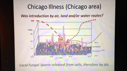
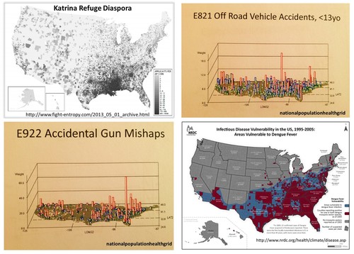
Outside the CDC and other epidemiological and public health work environments, other programs can monitor and report on their vectored diseases patterns.  The most rapid way to analyze any ecological, population base, or culturally and socioeconomically based disease pattern is by grid mapping.  


Grids have been criticized in the past because they are not exact.   Current systems can manage the small area grids and map results incredibly fast and with an incredibly high resolution less than the spatial error contribution.  These systems need not be GIS, but can include standard Big Data sets up designed for SAS (not SAS-GIS) and SQL.   Adding GIS also means your are also adding a tremendous amount of work due to whatever programming (“tweaking of the maps”) is involved.  This also increases the cost for producing and maintaining an effective surveillance system, and it can increase the likelihood that researchers’ or  presenters’ bias and presentation error could impact your work.  


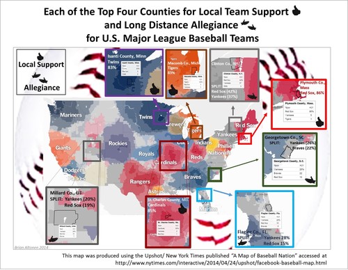
One can accomplish the same using Teradata.  It takes  just 10-20 minutes to map a total of 2400 25 mile areas, representing the outcomes for the entire U.S., up to 1000 maps per data run, 24k per day, for one analyst.  [See NPHG pages for more.]

Brian Altonen‘s insight:

Chikungunya Cases Double in CaribbeanNBCNews.com-Jun 5, 2014… Vincent and the Grenadines, and Saint Maarten),” they wrote in theCDC’s … “As of May 30, 2014, a total of 103,018 suspected and 4,406 … Officials have been cautioning that the virus could become established in the U.S. …Mosquito-Borne Chikungunya Virus Spreads in the Americas
Medscape-Jun 6, 2014 The next mosquito-borne infection you might want to start worrying …
Washington Post-Jun 5, 2014 Chikungunya Cases Increase in the Americas
Guardian Liberty Voice-Jun 7, 2014 Mosquito-borne chikungunya cases double in Caribbean
WXIA-TV-Jun 5, 2014 Mosquito-borne virus a public health nuisance
In-Depth-San Jose Mercury News-Jun 4, 2014

See on Scoop.itMedical GIS Guide

http://youtu.be/qN9CALP2_uw ;   Chicago Illness, Full video,7, recording session 0808, Teaching Videos.  The ways in which a disease like MERS can spread from Chicago to other parts of the country, based on the Chicago Illness diffusion pattern accompanied by lecture notes and demonstrations .

Brian Altonen‘s insight:

The Diffusion of diseases in this country follow several spatial patterns and abide by specific temporal patterns.  


   The simplest spatial model for diffusion is the radial or linear process with follows either just the air and is impacted by wind flow patterns (radial), or travels a natural route of least resistance such as through a gully, along a woodlands edge, parallel to roadways and animal migration routes (linear).


   A more complex spatial model follows human migration and travel patterns and certain commercial or economic paths.  The most human dependent ironically abide by many of the same patterns that inventions and discoveries tend to follow.  They hierarchically diffuse from one area to the next, going from large population area to large population area and then back-tracking to smaller areas between these major landing or outbreak areas.


   In some cases, especially when poverty becomes a major issue in how a disease develops, a reversed hierarchical pattern develops.  That is to say they at first behave hierarchically, moving from one large area to the next, but each time they reach a new population center, they infect the most susceptible populations.  In most urban settings, for numerous regions low income, low socioeconomic status neighborhoods become the places where many of these disease develop, or adapt to human population features and human behaviors to help find the next susceptible victims.  Cholera is an example that migrates internationally in this fashion.  The most susceptible areas and people are typically low income groups residing in low property value settings (poor managed, filthy, least desirable living places.)


   The temporal pattern of disease flow is related to how it travels and at what rate across the earth’s surface.  As recent diseases making their way to the United States from other countries demonstrate, distance is no longer a deterrent to international disease spread.  Even Australia, more than 10,000 miles away from the center of the U.S., is capable of sending its next disease or vector to the U.S.


   This review of how diseases that make their way to Chicago fits the current dilemma we are in with international disease migration patterns and concerns.  The spread of MERS into the more southern midwestern regions of the U.S., demonstrates a possible mixed diffusion pattern.  The early stages appear to be linear or radial in nature based on transportation routes, but should this disease take off and produce an outbreak, hierarchical diffusion patterns are expected as well.

See on www.youtube.com

See on Scoop.itGlobal Health Care

MERS (Middle East Respiratory Syndrome) is a coronoa virus induced disease first documented in Saudi Arabia in 2012.  It’s mortality rate is about 30%.  On May 2, 2014, the first case of MERS made its way to the United States.  On May 11, 2014, a second U.S. case was confirmed.  (http://www.cdc.gov/CORONAVIRUS/MERS/INDEX.HTML)

Brian Altonen‘s insight:

News about the United States cases of MERS is at the CDC site http://www.cdc.gov/coronavirus/mers/US.html


The status of health care in Saudi Arabia was detailed in the conference presentation:  

HEALTH CARE DATA IN SAUDI ARABIA:  CHALLENGES IN COLLECTING, SHARING, AND APPLYING, by Mohammed Al-Kelya MS, PhD  and Abdulaziz Al-Saggabi, MSc, PharmD (http://www.ispor.org/meetings/neworleans0513/releasedpresentations/FORUMArabicNetwork.pdf&nbsp😉


WHO has reviewed healthcare in Saudia Arabia and presented its conclusions  at Eastern Mediterranean Health Journal – Health care system in Saudi Arabia: an overview, http://www.emro.who.int/emhj-volume-17/volume-17-issue-10/article-11.html

In a 2008 article published in the Lancet about disease penetration due to tourism and travel, a complete review was provided for diseases from Saudi Arabia and elsewhere,

Lin H. Chen, and Mary Elizabeth Wilson.  The Role of theTraveler in Emerging Infections and Magnitude of Travel,  Med Clin N Am 92 (2008) 1409–1432.  doi:10.1016/j.mcna.2008.07.005.

available in its entirety at http://download.thelancet.com/flatcontentassets/H1N1-flu/epidemiology/epidemiology-1.pdf

Older people with comorbidities are at the highest risk of infection and mortality from this diagnosis.   For more, see "Health officials keep close watch over MERS as potential pandemic", in 

Infectious Diseases in Children, September 2013, at http://www.healio.com/pediatrics/news/print/infectious-diseases-in-children/%7Bf9c3c3e0-0c66-45e5-a024-5256240113e5%7D/health-officials-keep-close-watch-over-mers-as-potential-pandemic


As many as 17 million people per year travel out of Saudi Arabia to other parts of the world.  High migration rates for people and high mortality rates for the virus (30-50%) are the makings for a potential pandemic, according to some writers.


For more on migrating disease patterns, see also:


Infectious Disease Movement in a Borderless World:: Workshop Summary, by Forum on Microbial Threats, Board on Global Health, Institute of Medicine.  National Academies Press, Washington, D.C.  Preview available at http://books.google.com/books?id=TJZhAgAAQBAJ&lpg=PT67


INFECTIOUS DISEASES RELATED TO INTERNATIONAL TRAVEL AND MIGRATION: PART I .  By George A. Wistreich, RC Educational Consulting Services, Inc, PDF accessible at http://www.rcecs.com/MyCE/PDFDocs/course/V7104.pdf


See on news.yahoo.com

See on Scoop.itEpisurveillance

Before you hand over the car keys to your teenager, know the facts. Car accidents are the leading cause of death for teenagers ages 15 to 20.  Before you let your teenager take the keys, is s/he in the middle of ongoing texting with someone?  Before jumping to conclusions about his or her behavior, do you know where s/he’ll be going, and is it on-road or off-road?  Finally, how many times a week do you text to your teens and/or children while driving home?  


According to these stats, 48% of kids 12 to 17 years of age have been in a car while the driver was texting.  We don’t know what percent of kids at home receive texting from their parents, while they are driving.  But even if there was just a two percent rate for this behavior while in a moving car, this means that at least half the time, a poor example is being demonstrated to teens about right driving behaviors.

Brian Altonen‘s insight:

2009 Teen Motorcycle Accident StatisticsUnfortunately, we are not as up to date with teenage motorcycle accidents as we are for other teen motor vehicle accidents.In 2009, 205 young motorcyclists (ages 15 to 20) were killed, and an additional 5,000 were injured.Of the young motorcycle riders who were fatally injured, 26% were not wearing helmets.Of the young motorcycle riders who were fatally injured, 39% were either unlicensed or driving with one that wasn’t valid.Teen Drivers, Cell Phones, and Texting32.8% of high school students nationwide have texted or e-mailed while driving.12% of distracted drivers involved in fatal car accidents were teens ages 15 to 19.Talking on a cell phone can double the likelihood of an accident and can slow a young driver’s reaction time to that of a 70-year-old.Drivers under the age of 20 make up the largest percentage of distracted drivers.56% of teens admit to talking on cell phones while driving.13% of teens admit to texting while driving.34% of teens age 16 and 17 admit that they send and respond to text messages while driving.48% of kids ages 12 to 17 report being in a car when the driver was texting.


See on www.edgarsnyder.com

See on Scoop.itMedical GIS Guide

Do you think your allergies are bad now? Federal report shows that climate change may lead to longer, more intense weather patterns that could dramatically impact our health, especially for the most vulnerable populations.

Brian Altonen‘s insight:

GIS has innumerable applications to population-season-climate-public health monitoring activities.  Temporal changes and latitudinal (seasonal temperature migration) changes are the first that come to mind, but influences of the environment upon human behaviors and peoples’ health are just as important.  Disease in-migration patterns need to be monitored.  Animal born disease patterns can undergo change overnight, without adequate warning signs.   


Climate change over time, such as global warming, accelerates those changes already in place, and adds more to the agenda for research teams trying to monitor regional change patterns.  Thus the need to have a very successful GIS program in place for monitoring these public health statistics.  


Two international/governmental documents worth exploring on this topic:


STATISTICAL COMMISSION and ECONOMIC COMMISSION FOR EUROPE.   CONFERENCE OF EUROPEAN STATISTICIANS.  "Draft recommendations on climate change related statistics."  Presented at the Third Meeting of the 2013/2014 Bureau Geneva (Switzerland), 28-29 January 2014.    ECE/CES/BUR/2014/JAN/18.   8 January 2014.  Prepared by the Conference of European Statisticians’ 

Task Force on Climate Change Related Statistics.  8 January 2014


Accessible at http://www.unece.org/fileadmin/DAM/stats/documents/ece/ces/bur/2014/18-Draft_recommendations_on_climate_change.pdf


and,


IPCC WGII AR5 Summary for Policymakers.  

http://ipcc-wg2.gov/AR5/images/uploads/IPCC_WG2AR5_SPM_Approved.pdf

See on www.boston.com

See on Scoop.itMedical GIS Guide

The AAFP recently announced that it has acquired HealthLandscape, an interactive Web-based mapping tool that allows users to collect, analyze and present complex health data in an easily understood visual format.

Brian Altonen‘s insight:

An excellent GIS tool to look into for supplementing the responsibilities of Managed Care.

See on www.aafp.org

See on Scoop.itNational Population Health Grid

I used this Upshot/NY Times mapping tool available on the internet to evaluate counties for highest level of local team support, and longest distance allegiance to teams based on distance and percent support or allegiance to a distant team.  

Brian Altonen‘s insight:

No county could be located that had a 100% score for local team support.  

.

Allegiance or devotion to a former home or distant team was found in several expected places such as Florida (NY’ers winter paradise) and the Boston Red Sox-NY Yankees border in upstate NY.


Unexpectedly, Utah also has its own major followings for each of these teams.  South Carolinians on the other hand were split between NY and Atlanta.  

.

The best scoring local support that I could find (and by "local", I mean from the diamond to the neighboring teams’ territorial edges) was Boston Red Sox (86%), followed by St. Louis Cardinals (85%).  [However, territorial area was not evaluated!!]

 .

This interactive mapping tool, (for now, April 30th 2014), can be found at http://www.nytimes.com/interactive/2014/04/24/upshot/facebook-baseball-map.html#4,43.328,-74.795


See on www.nytimes.com

See on Scoop.itEpisurveillance

Today, April 26, 2014, marks the 60th Anniversary of the initiation of the polio vaccine!


Invented by Jonas Salk, experimental trails of this vaccine were initiated on April 26, 1954.  The first vaccines were provided to children at Franklin Sherman Elementary School, McLean, Virginia. Ultimately, 1.8 million children would be vaccinated for this trial.  


Albert Savin developed an attenuated form of this organism that could be administered orally several years later (ca. 1957).  This method was later licensed for its first clinical trials by 1962.  


The important lesson here:  progress came about quickly due the creation of an oral vaccine; it took just a half century to nearly wipe out polio disease worldwide, whereas certain pox, measles and other infectious diseases requiring injections continue to produce outbreaks.


Brian Altonen‘s insight:

Brian Altonen’s insight:
The pictures provided here (minus the descriptive text) are from the AMA’s "family health magazine" Hygeia, published in 1944.
.   
The problem as it existed at this time is discussed in detail in Mark Graczyk’s "HIDDEN HISTORY: Polio outbreaks hit area, 1939 & 1944."
http://thedailynewsonline.com/blogs/mark_my_words/article_03cf064a-e8ce-11e2-8327-001a4bcf887a.html 
.   
The magazine Hygeia was devoted to health and targeted the average American households (not to be confused with a contemporary journal bearing the same name, published in India). The title Hygeia was in use from 1923 to 1949, after which it was renamed Today’s Health (1950-1976).
.   
More on the Polio vaccine and its history can be found at the History Channel: http://www.history.com/this-day-in-history/polio-vaccine-trials-begin
.   
"The Charbor Chronicles". Saturday, April 26, 2014. "On This Day in History – April 26 Polio Vaccine Trials Begin" at http://charbor74.blogspot.com/2014/04/on-this-day-in-history-april-26-polio.html
.   
Smithsonian National Museum of American History wepage. "Whatever Happened to Polio? " http://amhistory.si.edu/polio/virusvaccine/clinical.htm
.   
Polio Eradication – Global Status and Progress. UNICEF. at http://www.unicef.org/media/media_18981.html

See on www.pinterest.com

See on Scoop.itEpisurveillance

Child Abuse of kids upon kids, or bullying, is one of those things we can monitor in any managed care system.

Brian Altonen‘s insight:

The current technology exists to monitor child abuse, bullying, adult abuse, or any form of abuse and mistreatment using a basic statistical program.  We do not need a GIS to map many of the conditions that should be monitored by a managed care system, just the right knowledge and manpower.  

Unfortunately, many companies choose to not engage in this very detailed review of the healthcare that our population receives.  This is either because we lack the desire to engage in this work, think we lack the software to accomplish such a brutal endeavour, or believe we haven’t got the manpower we need to accomplish it.  

All of these limits we place upon our self in managed care.  Either we place them upon ourselves, or higher up decisions limit us from reaching these potentials.  Some of the most important social issues in medicine and public health are poorly managed due to this lack of engagement.

See on www.pacer.org

See on Scoop.itNational Population Health Grid

Managed Care Organizations benefit from GIS software’s use of patient demographics and market and provider data to make better decisions regarding Medicaid, disease management & utilization.

Brian Altonen‘s insight:

In some of my past discussions with student about population health monitoring, I referred to a successful GIS that is already operating and managing several hundred metrics or more per month as our "sixth sense."
Even when nothing appears in the forefront about health matters, viewing the images you are used to seeing every day  can often bring about new attention whenever a new health problem is surfacing, and its appearance on the map suddenly changes.
This is the major reason GIS works better for population health analyses and surveillance than any other method out there that is predominantly word or table based.
On a single page, single screen, one can review several dozen outcomes in just a few seconds.  This rapid processing is what enables us to utilize these methods as a ‘sixth sense" approach to analyzing population health.


See on www.esri.com