See on Scoop.itMedical GIS Guide

Finally, NoBullying.com presents Bullying Statistics 2014 for researchers, students, parents and teachers. Explore our essential Bullying Statistics 2014!

Brian Altonen‘s insight:

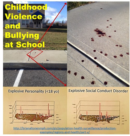
Mapping childhood aggressive behavior will probably not resolve the problem or help define its exact cause(s).  

But it may provide us with insights into the social situations or environments that help lead to this growing problem, and/or provide us with the knowledge needed to better understand these events as possible personal behavior induced events.

The relationships between grade level and age, gender, ethnicity, family poverty history, school-derived cultural definitions about certain people, and the nature of ongoing staff-student relationships help shed some light into the social aspects of this problem.

We once believed that the causes for this behavior were very much related to mostly poverty, and crime and gang-related activities.  More recent cases suggest that these social behaviors can occur independent of such causes, tending to be individually derived rather than socially derived.  

 Bullies themselves can be broken down into different groups (http://bullying.about.com/od/Bullies/a/6-Common-Types-Of-Bullies.htm ).


Chances are, many GIS interpretations of bullying and other activities related to violence (spouse or child abuse, drug activity, certain crime events) may in fact show it is not as predictable through spatial analyses as we would like.  However, with spatial analyses we can still see certain large area features being shared by these cases (i.e. mostly within urban settings, or certain SES  and poverty settings). 


For more on this topic . . . . see


Bullying Statistics:

http://nobullying.com/bullying-statistics-2014/

http://www.a4kclub.org/get-the-facts/bullying-statistics

Signs of bullying at school:

http://www.prweb.com/releases/2014/03/prweb11654053.htm

National Association of Nursing opinion on this subject:  http://www.nasn.org/PolicyAdvocacy/PositionPapersandReports/NASNPositionStatementsFullView/tabid/462/ArticleId/638/Bullying-Prevention-in-Schools-Adopted-January-2014

American Psychological Association stance:  http://www.prweb.com/releases/2014/03/prweb11654053.htm

Graphic depiction, caught on tape:  http://www.huffingtonpost.com/2014/01/22/high-school-bullying-video_n_4644787.html

Who is in fact liable?  http://www.nj.com/opinion/index.ssf/2014/03/if_schools_are_liable_for_bullying_parents_can_be_too_editorial.html


See on nobullying.com

See on Scoop.itMedical GIS Guide

“There are many assumptions about homeless people. Perhaps the most common is that they are too lazy to work. Having been there myself and having worked with many others in the same situation, I have to say that for the vast majority of homeless people . . . “

Brian Altonen‘s insight:

But what about kids?


Does the health of homeless people impact you?


At Catholic Online, the article ‘Tuberculosis sweeping through Los Angeles’s population’ attempts to explain this (https://www.catholic.org/news/health/story.php?id=49847).  The authors state:


[begin]

"Tuberculosis is also common among the homeless as they live in overcrowded areas and are constantly moving among hospitals, shelters and the streets. In addition, many have substance abuse or mental health issues that can impede treatment.

"’They go from place to place and the likelihood of passing it along is much greater,’ Paul Gregerson, chief medical officer of the JWCH Institute says. The organization runs a homeless healthcare program on skid row. ‘It makes everybody more susceptible.’

"Tuberculosis is easily transmitted by inhaling droplets from infected patients when they sneeze, cough — or even laugh. TB can be deadly if left untreated. The skid row strain can be treated with all anti-TB medications. Treatment lasts six to nine months.

Most of the TB patients are men. Twenty percent are also HIV-positive, according to the alert. Six of the eight patients who also had HIV have died.

The increase of TB among the homeless population is occurring even as the county is seeing a decline in overall cases."

[end]


The majority of homeless people with Tb are adults.  The majority of Congenital Tb cases in newborn children is coincidentally distributed around many of the same urban settings where homeless is more common.  Both are products of urban settings with dense populations and desirable living space (even on behalf of the homeless).


"One of the four goals of Opening Doors is to finish the job of ending chronic homelessness by 2015.  Working together to implement proven solutions, we can continue to make progress towards our goal."  (Source:  http://usich.gov/population/chronic)

According to Opening Doors . . . 

As long as there are homeless populations, there will be pockets of families and individuals who never receive complete health care.  Typically we hear about Mental Health, HIV, poor nutrition, drug use, the poor management of chronic diseases such as diabetes or epilepsy as primary concerns of community health groups.    


But there is more to this public health issue than normally considered.


http://eurpub.oxfordjournals.org/content/7/4/398.full.pdf?origin=publication_detail

http://www.ncbi.nlm.nih.gov/pmc/articles/PMC80688/

http://www.ncbi.nlm.nih.gov/pmc/articles/PMC1883152/pdf/bmj00087-0017.pdf

http://www.nationalhomeless.org/factsheets/health.html

http://www.nhchc.org/wp-content/uploads/2011/09/Hln_health_factsheet_Jan10.pdf


My page which includes a review of this topic for Portland, Oregon, is:  

https://brianaltonenmph.com/gis/population-health-surveillance/production-examples/regions-and-health/


See on kylyssa.squidoo.com

See on Scoop.itMedical GIS Guide

National and regional NPHG Video mapping.  NPHG depictions of everything from people to cost and utilization in managed care may be presented as national, regional or close up images.  The uses for these techniques are diverse and are applicable to the insurance, healthcare, health economics, and PBM industries.

Brian Altonen‘s insight:

During the late 1990s (ca. 1997), a number of west coast reviews of GIS  included research teams devoted to animated mapping.  Within a year, a leader in this field was Sonoma College in California, where GIS was successfully used to map out crime in an animated fashion (Lodha and Verma 1999).   The same year, a University of Georgia student completed his assessment of the same for evaluating densely populated urban settings (Beavers 1999).  In 2003, Bidoshi (2003) completed his dissertation on the virtual visualization of mapped data at Ohio State University.  By 2009, Yale University students at G-Econ created a 3D global mapping program based on spherical geometric formulas.


The use of three-dimensional GIS for tracking population features is now more than 15 years of age.  Its most common uses have been mapping crime and demographic features.  Recent works by Alfarhan (2010), Kim (2012), and Zhang (2012) suggest that new cloud and EMR technology might pave the way for the development of more successful use of this Medical GIS technology.  


This is the purpose of the NationalPopulationHealthGrid (NPHG) program I developed.  NPHG algorithms produce maps on population health that are much faster to run than the traditional methods already in place for developing these maps. NPHG is designed for use in weekly and daily reporting on hundreds to thousands of population health metrics.


References


Alfarhan, M. S. (2010). Geosciences information system (GeoIS): A geospatial paradigm for real and virtual three-dimensional worlds. (Order No. 3414888, The University of Texas at Dallas). ProQuest Dissertations and Theses, , 135. Retrieved from http://search.proquest.com.proxy1.ncu.edu/docview/734622078?accountid=28180. (734622078).

Beavers, R. M. (1999). An evaluation of cartographic visualization’s utility in the spatial analysis of urban social dynamics. (Order No. 3022089, University of Georgia). ProQuest Dissertations and Theses, , 164-164 p. Retrieved from http://search.proquest.com.proxy1.ncu.edu/docview/304516996?accountid=28180. (304516996).

Bidoshi, K. (2003). Virtual reality visualization for maps of the future. (Order No. 3088842, The Ohio State University). ProQuest Dissertations and Theses, , 186-186 p. Retrieved from http://search.proquest.com.proxy1.ncu.edu/docview/305319198?accountid=28180. (305319198).

Kim, I. H. (2012). Developing high performance GIS simulation models on geospatial cyberinfrastructure: a case study of population change models with grid computing and cloud computing technologies. (Order No. 3545065, University of California, Santa Barbara). ProQuest Dissertations and Theses, 250. Retrieved from http://search.proquest.com.proxy1.ncu.edu/docview/1237250056?accountid=28180. (1237250056).

Lodha, Suresh K. and Verma, Arvind . 1999. "Animations of Crime Maps Using Virtual Reality Modeling Language." Western Criminology Review 1 (2). [Online]. Available: http://wcr.sonoma.edu/v1n2/lodha.html.

Nordhaus W.  (2009).  Geographically based Economic data (G-Econ), Yale University.  Accessed at http://gecon.yale.edu/

Nordhaus W.  (2009).  G-Econ Project, Yale University, September 2009.  http://gecon.yale.edu/g-econ-project-yale-university-september-2009. 

Zhang, C. (2012). Interfaces and visual analytics for visualizing spatio-temporal data with micromaps. (Order No. 3504130, George Mason University). ProQuest Dissertations and Theses, , 156. Retrieved from http://search.proquest.com.proxy1.ncu.edu/docview/1011001290?accountid=28180. (1011001290). 

See on wcr.sonoma.edu

See on Scoop.itEpisurveillance

http://youtu.be/nk2HMqICMd8 IMG 0724 OmskFever

Brian Altonen‘s insight:

In 2006, I was asked by two companies in Atlanta, Georgia to develop a model for surveilling in-migrating disease patterns.  

.

This is why I re-developed my algorithm used to map cholera outbreaks back in the late 1990s.

.

I then tested this technique on dozens of very unusual foreign-born diseases migrating into this country and resulting in cases being documented in a national EMR database.

.

After producing more than one hundred maps of international disease patterns, I merged these into disease patterns for combinations of ICDs linked to certain parts of the world.  By merging so many ICDs together, patterns emerged enabling you to tell if diseases are spread across land based international borders with the U.S., by air-water travel Pacific Rim routes, or via traditional commercial air-water routes involving the East Coast, Saint Lawrence and the Great Lakes, or the Mississippi River.
.
The Omsk Hemorrhagic Fever, named for its first descriptions published for Omsk, U.S.S.R. in the 1940s and 1950s, is an example of a disease pattern that can take either the east coast or west coast route.  

.

Contaminated water, ticks and an animal host like the muskrat are important natural ecological requirements for its distribution. Human population density and cultural demographic patterns define its human ecological distribution patterns.

.

This video map depicts numerous isolated cases in EMRs which are probably the result of in-migrating people with a history of exposure or need for "rule-outs" for this diagnosis. (Rule-outs typically include the ICD for a specific case the lab is asked to remove from a list of possible diagnoses, and so these appear in the EMRs, but as single hits.)
.
The loner peak in the Southwestern U.S. is an exceptionally high number of cases, suggesting (but not at all proving): i) possible Pacific Rim in-migration behavior and therefore ecological origin , and ii) a probable rule out of human ecology and population density as the sole explanations for this particular outbreak.
.
One role of the spatial epidemiologist in disease surveillance is to locate potential niduses, so they can be ruled out where appropriate or added to local surveillance programs.

See on www.youtube.com

See on Scoop.itNational Population Health Grid

A now-retracted British study that linked autism to childhood vaccines was an “elaborate fraud” that has done long-lasting damage to public health, a leading medical publication reported Wednesday.

Brian Altonen‘s insight:

How did the refusal to vaccinate children get so out of hand in the U.S.?  

.

This whole problem began when an article  was published in 1998 that provided falsified results to support its claim.  

.

The Jan. 5, 2011 news story and related video describing this event are at:  http://www.cnn.com/2011/HEALTH/01/05/autism.vaccines/

.

According to a krigged analysis of the distribution of these behaviors, the two niduses for this social pattern are the tristate area near Manhattan (high density), and the Pacific Northwest (statistically significant z-axis values).  

.

A third nidus for this human behavior is surfacing in southern California.  

.

A number of secondary sites defining potential entry points are in the Great Lakes region, in Florida, and in the southern (Houston) Texas area.

See on edition.cnn.com

See on Scoop.itEpisurveillance

U.S. vaccination refusals demonstrate peaks in the Pacific Northwest and the region just north of New York City.

Brian Altonen‘s insight:

March 17th 2014, 7:12 pm

.

Mumps Outbreak at Ohio State Widens

.

COLUMBUS, Ohio — Health officials say 23 cases of mumps are confirmed in an outbreak at Ohio State University. Eighteen students and a staff member are among those infected.

University and public health officials warned Ohio State students, faculty and staff to take precautions to keep themselves healthy as they headed back to class Monday after spring break.

A Columbus Public Health spokesman says authorities are mapping cases to determine how people became infected and any links between them. He says three people have been hospitalized for at least one day.

The confirmed cases involve 11 women and 12 men. They range in age from 18 to 48.

The spokesman says they include a relative of a student and three people who don’t study or work at Ohio State but have links to the university community.

.

— The Associated Press


See video at  http://www.10tv.com/content/sections/video/index.html?ooid=BpeGYxbDpBhyQajV5Omm4f9Rif2uF-VW&cmpid=share

See on www.nbcnews.com

See on Scoop.itEpisurveillance

Brian Altonen‘s insight:

Take your pick . . .

.

Three interpretations of a new disease pattern, be it emerging, re-emerging, neither, or because we simply do not know:


“These five new cases highlight the possibility of an emerging infectious polio-like syndrome in California,” author Emanuelle Waubant, MD at UCSF.

.

“We would like to stress that this syndrome appears to be very, very rare . . .Any time a parent sees symptoms of paralysis in a child, the child should be seen by a doctor right away.”  Stanford’s Keith Van Haren, MD 

.

“At this time, CDC does not think the situation in California is a cause for public concern,” Jamila H. Jones,  CDC public health educator, to the AP.


Three newer stories on this growing concern:


Reuters news:  http://rt.com/usa/polio-paralysis-california-children-692/


Boston globe:  https://www.bostonglobe.com/lifestyle/health-wellness/2014/03/03/how-worried-should-about-new-polio-like-virus/D44YZgt3mKHSLgQLdvXYnN/story.html


Stanford:  http://med.stanford.edu/ism/2014/march/polio-0310.html

See on archive.wtsp.com

See on Scoop.itNational Population Health Grid

http://youtu.be/C6UPqBSvudc IMG 1160 LongBlastomycosis ChicagoIllness

Brian Altonen‘s insight:

My "Blastomycosis, Chicago Illness" (4 min video) on YouTube was an early accomplishment using the 3D mapping technique developed more than a decade ago.  Several years ago, I produced this teaching video to describe the different perspectives this mapping technique  give you, for  different distances from the earth’s surface and different levels of resolution.  These results were not produced using a GIS.


The purpose here is to demonstrate that this method for surveillance can be easily applied to visualizing results, and has valuable applicability to use in large and small area surveillance and public health programs.  Due to the nature of the algorithm, special reports can be be run by the dozens to hundreds of maps depicting spatial health measures per day.    On the average, to produce my videos using this technique, I can produce more than 12,000 images per day.  


If your goal is to determine specific cause and effect, applying your research question to dozens or hundreds of potential hypotheses, this is the method to use.  It can be used to depict any size research area.  You can use it to better target intervention activities, more precisely plan your health care programs and activities, or produce a clear presentation of your findings and results for a conference attended to by professionals or even local community health specialists.    


Any public and community health issue, any population measure and any health economic metric can be mapped using this technique.

See on www.youtube.com

See on Scoop.itMedical GIS Guide

Everything you need to know, or want to know, about suicide, age, gender, and regions of the United States

Brian Altonen‘s insight:

One of my first age – specific endeavors into exploring the national suicide activities and patterns was defining how to break these claims down into the right age groups.

.

Knowing that the Pacific Northwest had its own unique patterns involving runaways, children no longer attending school, and those living on the streets, my focus was on young parented children followed by teens, and then teens who were older, and had more than we wanted living on the streets.

Next, I experimented with this data modeling technique for young, middle age, and older adults, and then people of retirement age or at an age well into the retirement and/or assisted living years.

.

Finally, I focused on the questions,

.

–where in the country do teens, and older and younger kids try to commit suicide–was it in fact the Pacific Northwest due to its unusually high number of street kids support services?

.

and which age group did Niagara Falls fit into this scenario, commonly referred to as Lovers’ Leap impact?

These and other questions were reviewed, and my first attempts to apply 3D rotating imagery mathematics to my U.S. spatial mapping algorithms was developed.

See on brianaltonenmph.files.wordpress.com

See on Scoop.itEpisurveillance

Why focus on mapping events by age and gender in one year brackets rather than five year brackets? The innovative nature of such work stems from how much more detail it provides quantifying differences between two different groups by one year periods. This way of analyzing population tells you exactly where differences in age gender distribution are statistically significant. Which diagnosis presented here does the woman best represent?  The traditional broad age group methods for past analyses worked well with researching in epidemiology, but not for tending to your managed care program and engaging in Meaningful Use programs.

Brian Altonen‘s insight:

The only way we can fully understand an ICD, V-code, E-Code, or any other statistic analyzed, is by engaging in detailed reviews and presentations of our data.  The standard way of presenting age-related health measures in 5 year age brackets is outdated for most Big Data programs focused of managed care populations.  There is a difference between populations made completely of people in one age band versus two populations with two age bands at opposing ends of the age and gender spectrum, but with the same average age result. 

.

Even more importantly, the causes for certain public health concerns may be completely different for two similar groups are just a few years apart in terms of average age and gender.  Why risk spending all of your money on an intervention program or task that wasn’t designed with specific target populations in mind?  

.

In managed care, true age, gender, ethicity, socioeconomic status and place are important.  The only way to be successful in managed care special studies (QIAs and PIPs) is to focus on these attributes when interpreting your population and defining preventive care goals.

.

The best way to meet your Meaningful Use [MU] requirements in 2014 is to take this more detailed approach to reviewing your population.  You need to know your members down to their smallest communities and cultural, socioeconomic subgroups, and the bulk of these MU processes should be automated.

.

See on www.pinterest.com