See on Scoop.itNational Population Health Grid

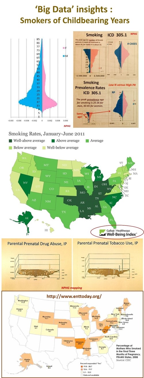
Insights into the national studies on smoking rates and exposure risks. Including a review of the findings of “Sensorineural Hearing Loss Linked to In-Utero Second-Hand Smoke Exposure”, an article published in Archives Otolaryngology Head & Neck Surg. (2011;137:655-662) and summarized on EntToday — October 2013.  Last Figure contained in this article is “Percentage of Mothers Who Smoked in the Final Three Months of Pregnancy, PRAMS States, 2008.” Source: CDC..  

Brian Altonen‘s insight:

There has been a substantial change in smoking rates over the past few decades, but two public health issues still deserve our attention.  The first is the racial and gender discrepancies in smoking rates.  Regarding race or ethnicity, young adult African Americans have higher rates of smoking into their 30’s than caucasians, who appear to reach a peak in their mid 20s.   When we compare prevalence rates for one year age bands between genders for either group, it is not unusual to find the number of female smokers documented in EMRs to continue to increase in number until they reach their midlife years (around 45), whereas male smokers peak about 15 to 20 years earlier.

.

The second major finding with smoking still in need of aggressive education and prevention programs are the smoking habits of pregnant women.  The two maps of drug abuse and tobacco use show the peak areas in this country, based upon a spatial evaluation of the national data (NPHG project).  The last map in this set  (and the LINK for this image) is about how smoking results in sensorineural loss of deficits in newly born children.

.

According to a study published last October, 

.

–"[T]he overall prevalence of maternal smoking during the last three months of pregnancy at 12.8 percent in the participating states, ranging from a low of 5.1 percent in Utah to 28.7 percent in West Virginia" (see map).

.

–"[B]abies born to women who smoke while pregnant have a higher risk of premature birth and low birth weight and an increased risk of sudden infant death syndrome (SIDS), cleft lip or palate, asthma, obesity and cognitive deficits, among other injuries."

.

–New findings show an association between sensorineural hearing loss (SNHL) in adolescents and secondhand smoke (SHS) exposure (Arch Otolaryngol Head Neck Surg. 2011;137:655-662). The authors for this report linked SHS exposure in prenatals and newborns to health conditions or risks such as SIDS, asthma, respiratory tract disorders,  cognitive and behavioral problems, and the increased risk of otitis media. 

See on www.enttoday.org

See on Scoop.itNational Population Health Grid

The State Child Welfare Policy Database

Brian Altonen‘s insight:

The sexual abuse of children is one of these public health metrics that does not require prevalence to lead to the development of interventions programs.  The above maps depict child abuse raw data in normal 1n and n-squared form to demonstrate where peak regions for reported cases exist.  .  The State Child Welfare Policy Database reviews this major health issue, at the policy level.  This site has a national map for reviewing the state statutes pertaining to this public health concern. 


See on www.childwelfarepolicy.org

See on Scoop.itEpisurveillance

This is a description of the visitors of my NPHG sites over the past year.  This site has been in operation now for more than 5 years and receives anywhere from 5,000 to 10,000 visitors per month depending on the academic period, with peaks on primary lecture and/or regional and national spatial health conference and seminar dates.   As expected, the usual countries to visit my site on a daily basis are US, England, Canada, India, Australia, China, and parts of South America.

Brian Altonen‘s insight:

 My major inspirations for the topics I cover at this site come from real experiences mapping costs, claims, billing and fraud, prescription drug patterns, age-gender-ethnicity relationships, and most ICDs, V-codes and E-codes considered hot topics or linked to important social issues in today’s day and age.  Like always, I make it a point to focus on the less obvious, metrics that are normally underrepresented but important to understanding the US health care system.  I developed this unique mapping technique more than ten years ago.

My NPHG spatial mapping site is at http://www.pinterest.com/altonenb/nphg-the-news/

My more frequently visited educational site is http://brianaltonenmph.com

My videos of the rotating 3D US maps of epidemiology are being posted at https://www.youtube.com/user/altonenb/playlists

These are the only sites where hundreds of examples of my NPHG 3D disease mapping algorithms are demonstrated, nationally and at the small area level.

See on www.pinterest.com

See on Scoop.itGlobal Health Care

EDEN, Emerging Diseases in a Changing European Development

Brian Altonen‘s insight:

From Main Page:


EDEN (Emerging Diseases in a changing European eNvironment) is an Integrated Project of the European Commission that aims to identify and catalogue those European ecosystems and environmental conditions which can influence the spatial and temporal distribution and dynamics of human pathogenic agents. The project develops and co-coordinates a set of generic methods, tools and skills such as predictive models, early warning and monitoring tools which can be used by decision makers for risk assessment, decision support for intervention and public health policies.

EDEN integrates research in 48 leading institutes from 24 countries. The eco-geographical diversity of the project area covers all relevant European eco-systems from the polar circle in the North to the Mediterranean basin and its link with West Africa in the South, and from Portugal in the West to the Danube delta in the East. EDEN is organised into a series of vertical Sub-Projects linked together by a series of Integrative Activities that include biodiversity monitoring, environmental change detection, disease modelling, remote sensing and image interpretation, information and communication.

See the

EDEN project [1.53 MB]EDEN_DisseminationPlan_v04 071215 [151.92 kB]EDEN strategy document 07 [1.64 MB]Executive summary year 3 [3.63 MB]Executive summary year 1 [239.81 kB]

See on www.eden-fp6project.net

See on Scoop.itEpisurveillance

The Medill Justice Project, in its now year-long effort to build a database of SBS cases, has published a portion of that data relating to the geographic occurrence of SBS . . . .  http://www.medill.northwestern.edu/experience/bsj/exclusives/medill-justice-project.html

Brian Altonen‘s insight:

Phil Locke’s article "Are there geographic "hotspots" for shaking babies?" (http://wrongfulconvictionsblog.org/2013/12/15/are-there-geographic-hotspots-for-shaking-babies-shaken-baby-syndrome/) provides us with important insight into this growing national public health problem. 


The above map in this figure is the nationalpopulationhealthgrid (NPHG) mapping technique developed for mapping any medical statistic or number down to the small area level.  Beneath the NPHG map is the US map by states produced by Lauryn Schroeder of The Medill Justice Project at Northwestern University (http://www.medill.northwestern.edu/experience/bsj/exclusives/medill-justice-project.html).


NPHG allows us to identify small areas of high incidence for any medical diagnoses, episode or event.   Exact locations within each of the states noted as high risk were reassessed down to the town/city level using this innovative mapping technique. 


Important to note here is that NPHG displays its results in 3D, and can also be used to generate rotating videos of your results, impressive for any public speaking or upper level management presentation.


Minus the videos, NPHG can produce hundreds to thousands of maps per day, depending upon your study.  The rotational 3D images used to make the videos could be produced at a rate of 15,000 to 20,000 (15-20 videos) per day.   At this speed, we can now report on dozens to hundreds of metrics per week spatially, either locally or at the national level, and at any pre-determined subpopulation level (age, gender, SES, etc.).  

There are no limits to the use for this spatial modeling tool.

See on wrongfulconvictionsblog.org

See on Scoop.itEpisurveillance

The Medill Justice Project, in its now year-long effort to build a database of SBS cases, has published a portion of that data relating to the geographic occurrence of SBS.  The report identifies s…

Brian Altonen‘s insight:

Phil Locke’s article "Are there geographic "hotspots" for shaking babies?" provides us with important insight into this growing national public health problem.  


The above map in this figure is the nationalpopulationhealthgrid (NPHG) mapping technique developed for mapping any medical statistic or number down to the small area level, without the use of GIS.  Beneath the NPHG map is the US map by states produced by Lauryn Schroeder of The Medill Justice Project at Northwestern University (http://www.medill.northwestern.edu/experience/bsj/exclusives/medill-justice-project.html).


NPHG allows us to identify small areas of high incidence for any medical diagnoses, episode or event.   Exact locations within each of the states noted as high risk were reassessed down to the town/city level using this innovative mapping technique.  

Important to note here is that NPHG displays its results in 3D, and can also be used to generate rotating videos of your results.  Impressive for any public of upper level maangement presentation.

Minus the videos, NPHG can produce hundreds to thousands of maps per day, depending upon your study.  The rotational 3D images used to make the videos were produced at a rate of 15,000 to 20,000 (15-20 videos) per day.  


See on wrongfulconvictionsblog.org

See on Scoop.itNational Population Health Grid

Brian Altonen‘s insight:

With an efficient disease mapping and surveillance program you can monitor the effectiveness of your health care system for the groups that are most needy, the socioeconomic and ethnic or race groups we usually pay less attention to than we’d like because we don’t have the manpower and time needed to evaluate all of our PIP and HEDIS measures for special needs populations.


With the best use of HIT and Big Data, you can routinely monitor each of these groups for hundreds of metrics that are specific to their areas of high risk.  With the right system, we can easily produce annual and even quarterly reviews of topics like African American, Asian American, Hispanic, or Native American health needs, and/or monitor our low income, special needs populations and our highest risk chronic disease patients.


For example, more than 100 key indicators were identified  for monitoring for the African American culture.   They included diagnostics and V-code and E-code entries, and specific ongoing physical, cultural and mental health measures normally not focused on for this particular group.  

A few examples of unmonitored diagnoses. and potential long term health or QOL risks faced by the African American patient population are demonstrated by the following short videos.


African Eyeworm — http://youtu.be/dSP6tOQs-RQ

Bejel — http://youtu.be/RI9Z0HXZFUg

Ebola — http://youtu.be/RfvUQfYLlvM

Crimean or Congo Fever — http://youtu.be/YWuMBOdB08k

Guinea Worm — http://youtu.be/YwSnpT7hAI8

Obscure African Cardiomyopathy — http://youtu.be/90XMDpr-fZ4

Kuru — http://youtu.be/x4VR1rf6C78

Elephantiasis — http://youtu.be/Uc6zvqutU3g

Elephantiasis, IP — http://youtu.be/-SS43bqFqvM

Sickle Cell Carrier — http://youtu.be/q7U9Z91ljRU

Yaws — http://youtu.be/SsMQNsxOkSE


See on Scoop.itNational Population Health Grid

Pakistan’s beleaguered battle to eradicate polio is threatening a global, multi-billion-dollar campaign to wipe out the disease worldwide.

Brian Altonen‘s insight:

Immunizable infectious diseases are making their come back in certain parts of the world.   Polio is the most recent example.


In the United States, there is a human behavior that results in two regions with the highest rates of failure to immunize children–the Pacific Northwest urban center and the tristate (NY-NJ-CT) metropolitan region.  This is according to krigged population health density grid mapping data and the evaluation of claims data identified by the appropriate V-codes.  


Each childhood immunization disease has its own unique spatial pattern. (see  http://nationalpopulationhealthgrid.wordpress.com/applications/01-childhoodimmunization/ and http://nationalpopulationhealthgrid.wordpress.com/applications/3-sociocultural-disease-clusters/


Polio is unique in that is appears to present with a well defined ecological and topographic cluster in the Great Lakes region of the United States.  This could be due mostly to more effective surveillance and reporting practices for this region clinically, or some combination of population density, climate, weather, transportation, and landuse feature(s) that favor poliovirus activity and disease transmission.

Poliovirus is considered mostly a human-dependent enterovirus, that normally does not engage in processes involving livestock and other animals (excluding primates).  Therefore, a cause for this unique geographical pattern of the cases has yet to be determined.

See on www.denverpost.com

See on Scoop.itEpisurveillance

Brian Altonen‘s insight:

The recent exposure of a shopping mall to measles in Rockland, NY is a reminder of how important childhood immunization programs are and the need for ongoing surveillance of infectious disease patterns.

Three spatial behaviors define how outbreaks occur and the patterns by which they are likely to spread.  

1) Population density is important to understanding these patterns due to likelihood of contact and the development of new victims.

2) Transportation and communication patterns define where people travel and aggregate, and the most likely routes to be taken by diseases or health problems imported from other locations.

3) In some cases, local land use patterns, and socioeconomics and human behavioral patterns help to define those parts of the country that are more susceptible to certain diagnoses and new cases than others.


The review of several immunizable diseases and their varying spatial patterns for outbreaks over the past decades, at the small area level, is at https://www.youtube.com/playlist?list=PLWrApErk5byY6emyCz0_ROOXw9FdsfCfY


A review of immunization refusal patterns in this country for childhood immunization programs is at https://www.youtube.com/watch?v=9TYCqtIg2Xs&list=PLWrApErk5byaJjbbjS6TEAAChZ7apmbzg


The Pacific Northwest, the nidus or nest for this behavior of refusing to immunize your child, is displayed spatially in detail and 3D at  https://www.youtube.com/watch?v=YHH32Oq_obs&list=PLWrApErk5byaJjbbjS6TEAAChZ7apmbzg


According to the 2D krigged data map, the New York City region and urban settings in the Pacific Northwest are the epicenters for these outbreaks.

See on Scoop.itMedical GIS Guide

http://youtu.be/EXvvlNePtZs — 3D mapping rotational imagery mapping of theoretical ‘Chicago Illness’ Dispersal Patterns

Brian Altonen‘s insight:

Chicago Illness –  A Lesson in Rotational 3D Epidemiological Mapping and Public Health Surveillance.

Why and how do diseases spread and migrate?

Now you can monitor this process, and determine if particular diagnoses, human behaviors, or other public health concerns diffuse or travel in all directions, or are hierarchical in nature, meaning they tend to travel the way people travel and strike heavily populated regions first and then the suburbs.  Some diseases and behaviors such a poverty, abuse, poor nutrition, child care related issues, follow a reversed hierarchical pattern, impacting poorer households first and if and when infectious, later impacting the middle class and upper class communities.

Ideally, we can monitor population in this way with little effort using the highly effective NPHG methodology.  This way of analyzing and visualizing population health has the potential of preventing disease, designing better intervention programs, and determining your highest risk communities for any intervention programs you might have in mind.  

This is what the NPHG method for disease mapping was written for.  It’s advantage is it is less expensive than buying into a GIS or new HIT system of any kind.

Whatever system you utilize for developing your EMR/HER data and HIT monitoring programs, this method can probably be used to perform the tasks at hand.  If not, Open Source methods makes reaching this goal possible, in less than a year, at little or no cost.

See on www.youtube.com