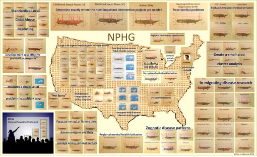
Nearly 10 years ago (time flies!), I performed extensive research on the in-migration of diseases from Africa and other continents and large countries, completing that project more than five years ago.

I identified more than 100 diseases that can be easily monitored, continuously, by a managed care program. I used this project to demonstrate that if the ICDs of these diseases are placed into a single search tool for EMS, and the resulting “hits” assigned locations based upon their latitude and longitude, that plenty of leads can be found about how diseases migrate into this country, not to mention how people behave.  Ebola is one of those diseases I mapped.

Sourced through Scoop.it from: www.newsweek.com

Now, with the possibility of sexual transmission of Ebola, living and working in the vicinity of one of the non-compliant healthcare providers to bring Ebola into this country, these events made me recall my years in medical school, during the early to mid 1980s, when AIDs had yet to receive a formal name, and when the first research into HIV and AIDs migration and sexual transmission patterns came to be, as one of my mentors was forced to leave his position as administrator of the medical school, due to his refusal to publicly refer to the university officials’ desire to link the new epidemic coming to be to a small community located in and about Queens.

Now granted, the organisms behind AIDs and Ebola are very different.  What happened in New York and later California may not be at all like what happened 30 years ago in the U.S.  In an evolutionary sense, as well as a physiological and adaptive one, the organisms responsible for each are very different, although the routes of transmission, sexual behavior, may not be as different as we’d like to think.

What HIV taught us is that carrying and disease and spreading it elsewhere around the world can become a long, drawn out event, enabling the organism to mutate, survive better, change from a rapidly fatal pathogen to a wandering one in search for new hosts.

It will be interesting to see if people behave like they did between 1985 and 1986, and 1986 and 1988, when leaders in my medical communities in NY and later OR tried to lay blame on specific ethnic groups for the introduction of a new disease to specific communities in Long Island where I did my rounds on the hospital floor, and still later in specific parts of California, the second time through.

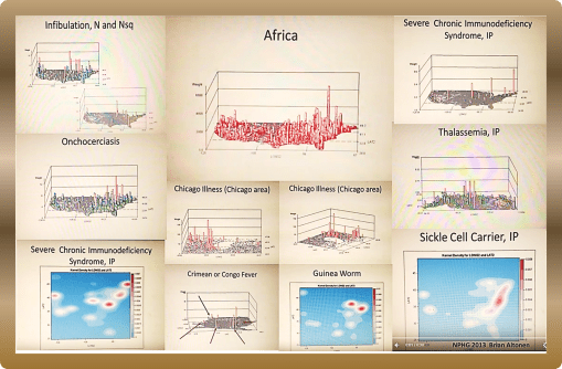
To understand how African diseases impact this country, back then, in African, and in the U.S., begin by reviewing my work of the Geography of African Diseases that I produced years ago from a large national health dataset . . .

My method of developing the first videos to display the national distribution of these diseases, individually as well as as a collective, appears much like a GIS, but it was produced without GIS software.  I designed my own algorithm for this 3D mapping methodology eons ago.

Begin with:

http://www.scoop.it/t/an-episurveillance-researchers-guide/p/4027597103/2014/09/07/african-in-migrating-disease-patterns-around-the-great-lakes-region 

VIDEOS of the NPHG Product include:

African Diseases

https://www.youtube.com/watch?v=qi-fXinlTjE

Geophagia as an African behavior:

https://www.linkedin.com/grp/post/2601248-5936505909034364929

African Eye Worm

https://www.youtube.com/watch?v=dSP6tOQs-RQ 

Obscure African Cardiomyopathy:

https://www.youtube.com/watch?v=hSj78VNYMbY 

Bejel:

https://www.youtube.com/watch?v=RI9Z0HXZFUg 

Guinea Worm

https://www.youtube.com/watch?v=YwSnpT7hAI8

Crimean or Congo Fever

https://www.youtube.com/watch?v=YWuMBOdB08k

Elephantiasis

https://www.youtube.com/watch?v=Uc6zvqutU3g&list=PLWrApErk5bybFfsOWTXWjlwvIM7D4d6-h&index=22 

Assorted Videos in a row:

https://www.youtube.com/watch?v=x4VR1rf6C78&list=PLWrApErk5bybFfsOWTXWjlwvIM7D4d6-h&index=20

Ebola

https://www.youtube.com/watch?v=RfvUQfYLlvM

AIDS/Severe Chronic Immune Deficiency

https://www.youtube.com/watch?v=IIQh7bLpgZs 

Noma Page

https://brianaltonenmph.com/gis/population-health-surveillance/production-examples/528-1-noma/ 

POSTINGS in ScoopIt! about Ebola, each a lesson in itself:

Pages on the Geography of Ebola:

http://www.scoop.it/t/an-episurveillance-researchers-guide/p/4024239730/2014/07/07/the-geography-of-ebola-important-spatial-features-influencing-its-diffusion-patterns 

https://brianaltonenmph.com/2014/07/08/the-geography-of-ebola-important-spatial-features-influencing-its-diffusion-patterns/

and Mapping the Outbreak of Ebola:

http://www.scoop.it/t/episurveillance/p/4039425741/2015/03/18/ebola-mapping-the-outbreak

http://www.scoop.it/t/global-health-care/p/4034141340/2014/12/24/ebola-mapping-the-outbreak 

See on Scoop.itMedical GIS Guide

These are examples of a number of programs/HIT-GIS projects I developed and implemented as part of my National Population Health Grid (NPHG) program.  The purpose of NPHG was to demonstrate potential uses for GIS in population health analysis, as a part of the managed care system,  in a way that focused on the combined annual, quarterly and ad hoc reporting needs typical of the Meaningful Use, QIA and PIP programs that many health care systems engage in.  The Managed Care HIT-GIS (or Medical GIS as some are now calling this process) focuses on the EMR/EHR differently than population health, epidemiology and environmental health programs.

There are five tasks to keep in mind when trying to implement a GIS for use by a managed care program.

The first task is it must be able to report meaningful use outcomes and any outcomes for special studies engaged in for quality improvement or performance improvement using local, regional maps.  Preferably, two maps must be reproducible.  The first is the standard zip code choropleth like map depicting distributions of people, patients and specific health related issues.  The second is a map developed for internal use that depicts the same, only at the small area, intervention level, for use in targeting your services, defined needs, gaps in services with more precision.

The second task, is the system has to establish a monitoring and surveillance process, meaning that the GIS can be used weekly, monthly or ad hoc when specific questions are asked.  This is mostly a descriptive use of GIS, meant to serve curious healthcare providers trying to compare their program or services and outcomes to those of their competitors, of for directors and officers to use to evaluate quality and cost related features for given people, programs and regions.  The ideal surveillance program in a managed care setting would of course be live, an outcome that is possible with the right software and data management packages, the right skillset, and the right services from the software providers (I have seen just one or two managed care settings where all three of these are happening.)

The third task is to be able to predict in what direction specific forms of services are heading, such as a growing need for cancer screenings of the 50+ age group, or changes in immunization demands by specific neighborhood clinics and cultural settings.  The use of multivariate analyses in combination with GIS spatial modeling algorithm, in both linear and non-linear,  polynomials are the preferred ways to go when developing these algorithms.   The most accurate long term models I have found, and shown, are initially polynomial in nature with a total of 6 or more independent (unlimited) and dependent (2 or 3 max) variables, merged with an exponential equation used to define a similar outcome, but initiated just before the decay portion of the polynomial modeling ensues, thereby allowing for longer periods of prediction (I made previous postings about this regarding my more accurate way of predicting the 2014-2015 Ebola outbreak).

The fourth task is to provider upper level managers on up to CEOs, VPs and Presidents the visualization needed to bring the points of your research home, as a medical GIS spatial statistician.  This means that the upper level “leaders” must be savvy in their population, its data, the ways this data can be presented, and able to interpret any representation they are handed pulled from SAS, Cognos, Qlik, or GIS.

The fifth task is to document your finances, management, human resource and service industries, in a way that can be analyzed and monitored over a 10+ year period.  As a part of this upkeep, HR (and the managers they report to, make suggestions to) should become more responsible with mining for and utilizing their most valuable human resources.

To date, software, management knowledge base, management skills, and indirectly HR skills or lack of action have been responsible for the failure of HIT to advance enough to allow for rapid advancements in HIT-GIS to ensue.

It is now fifteen years into the popularization of the “Managed Care” philosophy for health care.  The current QI programs, Beacons, MCs and such that oversee changes in the healthcare system have remained slowly-progressive.  This in part is due to employee turnover, repeated software changes, data warehouse challenges, outsourcing based losses in important employee skills.  But it is management that produced the greatest barriers against HIM/HIT development involving a very productive HIT-GIS system.

Due to poor management, the most skillful employees when it comes to GIS are rarely used fully or effectively.  This results in reduced employee retention, further reducing the institution’s momentum in this field.  The lack of managers with adequate GIS training further complicates this problem.  Experience and success are a necessity, if a manager is to have a worthwhile goal in mind, that is also advanced.  This barrier in turn results in a further loss in momentum and ultimately the opportunities for discovery and creation at the corporate level are lost.

My preliminary review of the roles of GIS and GIS-trained people in a managed care system demonstrate that most large companies have one or a few individuals highly skilled and knowledgeable in GIS, Medical GIS, HIT-GIS, and spatial analysis, with few used to their fullest potential (if they are working with GIS at all.).  Management’s  the lack of knowledge of the potential value of GIS and these employees is the primary reason HIT is not advancing as quickly as we hope, and will certainly not lead to any major innovations in the near future for any current HIT-GIS program’s status. (They must be able to produce hundreds of maps per day program).

The talent, resources, skillsets and knowledge base are there; it is up to management to catch up with this technology.

See on Scoop.itMedical GIS Guide

A Work in Progress SUICIDE Recent news (Joel Morales and the pre-teen suicide issue in New York, 5-31-12):  http://www.nydailynews.com/new-york/12-year-old-east-harlem-boy-driven-suicide-sick-bullies-taunted-dead-father-article-1.1087190 The spatial distribution of suicides is not equal across all age groups.  Some parts of the country are more likely to have the very young (<12 yo) or very old (75+ yo) people documented as having been…

Sourced through Scoop.it from: brianaltonenmph.com

Attempted suicide is one of those regional behavioral health patterns that is underevaluated on a regular basis.  


Suicide behavior has a cultural link to it that can vary from region to region, county to county, town to town, neighborhood to neighborhood.


When a story about a suicide is released to the press, there are often other behavioral patterns that we expect to occur over the next few days, weeks and occasionally months.   "Copycats" are both a local and national phenomenon, with social and cultural behaviors often defining the types of duplicate cases can prevail.


For example, it is unusual to see extensive duplication of a teen age event, unless there is a shared cause.  The places where these events happen, is where teen age suicide is greatest in the country, which the rotating 3D maps on this page demonstrate.  We do see more deliberate copycat cases with individuals who are sending a message, and have a reason, meaning they are young to mid-age often, and with some complaint or attitude in need of expression.  


Isolated and coupled suicides cases impact older people.  Culture differences are often the reason group or family-related suicides happen in this culture.  The greater the cultural detachment from the local communities, the more likely some groups will express this attitude about their value of self and living more aggressively and deliberately.


Not yet published are the results I obtained years ago about age, gender, family size status and type of suicide the prime candidate tried to perform.  There is a gender related reason to how suicide attempts are made.  i.e.


Women are most likely to use gas-powered ovens, men are most likely to use hand guns.  


Ceremonial weapons are also used by a unique class of people.


Alcohol based versus drug (OTC or illegal) are also linked sometimes to very difference sets of people.  


Suicide in the outdoors, such as performed on top of a mountain and along a hiking trail, is more a practice noted for younger women than men.  


Lovers’ Leaps (there are two main ones in this country) demonstrate a large peak next to, but not exactly at Niagara’ Falls; its used mostly by just one particular age range and gender.  


Suicide by car, by garage, when canoeing or boating, by bike.

Teenage and young adult kids demonstrate peaks in certain urban settings, where runaways are common and well managed (or mismanaged, via teenage prostitution).

All of these processes can be evaluated using the detailed coding put in place for suicides when ICD9 was established.


(When I get a chance and have the time, Ill go back to this data and summarize these ‘method of attempt’ findings.)


What is unique, is companies often have a large enough dataset to evaluate suicides at such a level of detail: age, gender, form of attempt, and in some cases successfulness.  The current EMR/EHR makes this type of evaluation possible for your local community.


The video maps at this site provide some insights into what forms of suicide your local population may be trying to engage in.  Begin by looking for age range related peaks.  


.

See on Scoop.itMedical GIS Guide

The pictures depict a child’s throat with the false membrane produced by diphtheria.   The frequency of diphtheria outbreaks in the late 1800s is what led to the frequent use of the emergency trachotomy procedure to open up the respiratory passage.

Sourced through Scoop.it from: www.newsweek.com

First used successfully around 1832 by French physician Pierre Brettoneau, the tracheotomy became popular during the 1850s when it was commonly applied to patients with diphtheria and very severe croup.  The tracheotomy again became common during the early 1900s, when large numbers of polio outbreaks occurred in the U.S..

In a review of US cases of diphtheria I performed several years ago, I uncovered one episode of a large number of diphtheria cases recurring in the midwest, totalling over 100 cases (and/or suspected cases coded as such) between some time before 2008.

The Mumps and Whooping Cough (Pertussis) are still recurring each year in this country.   Last year and earlier this year, Measles made the headlines.  Most recently, a cluster of infectious disease cases made the news close to where the previously noted diphtheria outbreaks occurred.

Of course, this recurring theme of immunizable disease outbreaks points to the consequences of parents refusing to vaccinate their children.   The clusters in Utah may be related to a large religious community in that region, which has been into naturopathic medicine since the early 1900s.

Incidentally, naturopathy is the only accredited “doctor of medicine” program in this country that has a large number of graduates against immunization programs.  This resistance is due largely to the long history of anti-immunization beliefs professed by professors of these schools in the U.S., and their graduated physicians (NDs not MDs), licensed and able to practice naturopathy legally in 8 states (maybe one or two more since I last researched this.)  [This profession is most often linked to the unaccredited naturopathy home-schooled practitioners, who don’t undergo the same level of graduate level medical education as MDs or NDs).

This midwest diphtheria outbreak is referred to specifically on my video of immunized diseases, viewable on Youtube,

https://www.youtube.com/playlist?list=PLWrApErk5byaJjbbjS6TEAAChZ7apmbzg ,

or on my page entitled “The Childhood Immunization Problem”  (https://brianaltonenmph.com/gis/population-health-surveillance/production-examples/the-childhood-immunization-problem/ — links to the videos are at the very end; the second video is of immunization refusal clusters).

I also review these diseases and how the patients appeared in a fairly lengthy presentation . . . .

as a slideshow at:

http://www.slideshare.net/brianlaltonen/immunized-diseases&nbsp;

and as an autoplay this slideshow entitled “Immunizable Diseases – A Reminder of the Past” (27 min.) at:

https://www.youtube.com/watch?v=LOp-KGd4hV0&nbsp;

See on Scoop.itEpisurveillance

This page provides the math behind my grid mapping of the United States, without using a GIS.  This technique is called grid mapping and was popular when ArcInfo and the first versions of ArcView were the most common spatial analysis lab tools.

Sourced through Scoop.it from: brianaltonenmph.com

I use these maps to produce my 3D models of the US and its various public health patterns.  The advantage to this method is in a decent system, it takes less than 10 minutes to map a large dataset, like that for the entire US, by zip code, block group, and/or gridcell plan (2500 analyses of 10s of millions of patient data rows, each depicting a standard one-row summary EMR).  


Because this tool works very fast, I learned immediately to go through the extra effort needed to produce  the 1,000 to 1,500 maps, with varying angles, pitch, and rates of revolution, needed to produce a video.  A twenty second video requires about 1,200-1,500 images.  A few of these videos are 5 or 6 minutes long. Most were derived from 2,000 to 3,000 images.  Standard production rates in teradata are 15,000 to 20,000 images per day, developed into numerous videos.  I mapped all of the ICDs, including those depicting specific age groups (suicide, homelessness and other V and Ecodes), in under two months.


My remaining research question:  Can this same high rate of productivity (15k maps/day, for video production) be re-created in SAS-GIS, Cognos BI, ArcGIS, Qlik, Tableau or the host of other spatial tools out there?  (see http://www.capterra.com/gis-software/&nbsp😉


My dissertation work focuses on the barriers to implementing GIS in the managed care workplace as a highly productive reporting tool, i.e.  reporting all ICDs, including age-culture-gender subgroups, with summary maps depicting the five primary ethnic disease pattern groups, on a daily basis.


See on Scoop.itMedical GIS Guide

In a recent re-review of infibulation in the U.S., in particular a section of it that is predominantly black, with hundreds of thousands or people of the right descent, I uncovered ICD evidence for 4000 patients from a population of just about 160,000.  I then evaluated the age profile of these patients, and duplicated my findings from 7 and 10 years ago.  The most important repeated finding was that about 0.5% of these 4,000 were under 18 years of age, with the lowest frequency of events noted for the 12 year olds.  How do we interpret these findings?

My interpretation of these findings is that the four peak ages for infibulation (ca. 1 year old, 3-4, 7, and 13-14–this graph not displayed) suggests the following:

1.  that there are at least two kinds of infibulation being performed on children (four are differentiated with the version 9 ICDs); the younger ones do get the less traumatic form perhaps, because of its potential fatalities.

2.  Children who undergo this process are the fewest at 12 years of age (in fact pretty much nil), because they are sen to their family’s homeland for the process to be performed–it is illegal to perform in the U.S.

3.  The 1, 3-4, 7 and maybe even some of the 13 year old children who are noted as having endured this process, and are now U.S. citizens, may have in fact received that procedure in the U.S.  The younger the victim identified in this study, the more likely this practice was performed in the United States, and again–illegally.

There are cultural explanations for the 1, 3-4 and 7 years old procedures.  The 3-4 year olds stand out however, because they are the years just before pre-schooling and public schooling.

The number of patients who may have had this process performed in the U.S. is about 160 out of the 200, who are under 18 years of age and have this diagnosis in their EMRs.  Even if half of those very young cases were performed outside the U.S., this means that 80 were still illegally performed in the U.S.
So, there’s no getting around this point: there are individuals in the U.S. who may be performing/practicing infibulation on very young girls, because the parents (and perhaps mostly the father) believe this cultural belief is essential, because she (the daughter) cannot be trusted, and must be taught how to remain a virgin until her “culturally appropriate” marriage.

One of the most incredible rates of change for this practice in the 4,000 women identified and researched for this study, the escalation in numbers (percents) of cases between 15 and 25 years of age is phenomenal.  If your people, family, believe it must be practiced, then there is no way around this sociocultural requirement for growing up.

This study duplicates my past reviews of this most controversial issue, which I predict will increase several fold over the next several years.  The events that will increase the most are the illegal performance of this practice is certain communities, rather than send the 11 or 12 years old girl back to the homelands.  (See a recent news story on this issue, related to Pakistan: Send Girls Off to Learn, Not Off to Marry, Says 13-Year-Old Pakistani Activist–http://news.yahoo.com/send-girls-off-learn-not-off-marry-says-211504295.html )  The field of medicine, and even the government offices that oversee health matters, haven’t the knowledge base, know-how or ability to manage these back room illegal practices that go on in culturally defined medical practices.

Medicine is often treated like religion by certain government services.  Some forms of health care practice are based on belief and cultural acceptance.  We do not intervene in these practices; the leaders turn their heads away from watching them happen.  “Politically correct” is a must for some religions, some medical philosophies.  In the case of infibulation, the patient’s rights are being ignored each and every time we let that happen, making it possible for physicians from other traditions to engage in a practice that is typically taboo and considered cruel to patients when engaged in the U.S., and most developed country settings.

WHO does not support infibulation.  Neither should we.

My stats tell me that from one to five of these events occur every month in the region I am studying.

For more on this process, my past videos and maps of its happening across the U.S., based on an evaluation of 50-60M people, go to:

3 videos of the map of the U.S., depicting these cases (my 3D rotating map images of the US):

www.youtube.com/watch?v=0A95jfeAScw

www.youtube.com/watch?v=mNGxDzOkl_Q

▶ 0:21
My review of the first documentation of this practice by a U.S. doctor, in a U.S. medical journals:
“A Disease Peculiar to the Children of Negro Slaves.”
My ‘Socioculturalism and Health’ page, which incldues coverage of this sensitive topic, at:
Another individual’s page on the cultural geography of this practice:
Articles on this controversial topic:
Cosmopolitan

A page with links to the Youtube videos on this controversial topic:

https://www.youtube.com/playlist?list=PLCu236rTh0duC4Euag8Fpz7JW19c2LPCr

See on Scoop.itMedical GIS Guide

https://www.youtube.com/v/LOp-KGd4hV0?fs=1&hl=fr_FR

Produced 1 29 15. A video produced from my Powerpoint on the history of vaccinated diseases. The focus is on what these kids looked like or experienced due to this disease.  

Sourced through Scoop.it from: www.youtube.com

This video is my review of the history of immunizable diseases.  Many of the figures in this presentation demonstrate what these patients looked like, according to the medical schools books for the time–the 1940s–75 years ago.  

See on Scoop.itEpisurveillance

……………………………………………………………………………………………………………………..

A traditional approach to studying sickle cell disease uses population health age-gender profiling in a very coarse fashion.  For a full population study of sickle cell and sickle cell carriers age-gender distribution, we see very unique and even unexpected differences in the longevity of men versus women.  During the past decade, I have seen this population health profile for Sickle Cell in boths of its ICD 9 identifier forms duplicate this model, for a number of difference parts of the U.S.  Due to the unique shapes of these numbers-prevalence profiles for “Active Disease vs. Carriers”, this profile presented here demonstrates remarkable external validity.   This relationship exists at the national level, and local levels.

Apply 3D NationalPopulationHealthGrid modeling algorithms to my data, the resulting maps provide a very unique sociocultural interpretation of how Sickle Cell exists and continues to spread throughout the United States.  More importantly, the population pyramid approach to analyzing this data shows us how treatment and intervention programs should be modified to better fit the needs of age-gender groups in specific parts of the country, or locally.

Most important to note is the difference in lifespans when men and women carry the sickle cell in its non-expressive [“carrier” or ss] form.  This is due to partial expression of the S gene, the degree of expression, and the impact it has on the longevity of the patient.

Social Darwinians might have a field day with the social implications of these spatial findings.  For it demonstrates that women who carry sickle cell live longer than men who are carriers, to the point that they remain alive throughout the primary fertility/fecundity years.  Men on the other hand lack this survival feature and are more likely to die, even as carriers, during their most  active reproductive years.

This method may also be used to model others diseases linked to the human genome.   (A number of my videos in Youtube provide examples of the various genetically-linked diseases and development disorders that I reviewed years back.)

About ten years from now, this way of modeling and interpreting genetic diseases will become one of the most important applications of NPHG style analysis of human EMR/EHR and lab/genome data.

For more on how I applied NPHG and ICD9 analyses techniques to human genome projects, ICDs, EMR, EHR and Managed Care planning strategies, see:

Socioculturalism and Health:

https://brianaltonenmph.com/gis/population-health-profiles/part-iii-population-health-application/special-topics/socioculturalism-and-health/&nbsp;

Fatal and Non-fatal Genetic Disease:

https://brianaltonenmph.com/gis/population-health-profiles/part-iii-population-health-application/special-topics/degenerative-lifelong-and-degenerative-fatal-diseases/

and the numerous NPHG mapvideos on the following :

https://brianaltonenmph.com/biostatistics/risk-management/

See on Scoop.itMedical GIS Guide

It has been nearly a year since I last pushed this survey I produced, focused on GIS and the health care profession.  My focus is on managed care, and whether or not it can become a part of a big data population health enterprise program that I am a part of on the east coast.  


As a PhD student, my dissertation planned focuses on the potential applications for GIS to Managed Care (MC), and what barriers have prevented GIS from becoming a strong part of the MC system, like it has for separate agencies devoted to population health, disease surveillance, even market analysis for healthcare facilities and agencies.


[REF: Survey Links]

Sourced through Scoop.it from: brianaltonenmph.com

Prior to my PhD enrollment several years ago, I developed these two surveys on Medical GIS. They are still active. If you are interested in GIS and Managed Care, please visit the following pages to take one or both of these surveys. The purpose is to see how leaders, management and staff are trying to implement spatial population health surveillance systems around the country.


The general survey is at https://www.surveymonkey.com/s/HZ7MH7Q


The MANAGED CARE [MC] version is at:
https://www.surveymonkey.com/s/V5THRFQ

See on Scoop.itMedical GIS Guide

The number of people diagnosed with Legionnaires disease has risen to 108 as America’s largest city suffers from a record outbreak of the form of pneumonia, authorities said Saturday. No new deaths have been reported on top of the 10 announced earlier in the week and officials say the outbreak is now on the decline. To date, 94 people have been admitted to the hospital with the infection since the outbreak began on July 10 in the south Bronx, the poorest section of New York state.

Sourced through Scoop.it from: news.yahoo.com

Working in the heart of New York City right now, some thoughts about the nature of what is happening with Legionnaires makes me wonder how the press and people are going to deal with this.  

It is worth mentioning that I am perhaps two steps shy of feeling much concern for my developing this disease.  First and foremost, I use my "sense" of health and especially immune health (mostly subjective assumptions) to keep these concerns at a minimum.  Legionnaire’s erupted in my medical school during my first year there, in 1982; I did not catch it then why might I catch it now?  May I add, this reasoning is identical to what I used to perform my field surveillance work around known houses with cases of West Nile inside; the purpose of being there was to map out the ecology of that setting and evaluate the species of vectors and determine if they were carriers.  The second reason I had was even more pinpoint–all of the cases I investigated then involved people who were much older than me . . . and therefore textbook cases.  


Everyday, I take a train past on of the hot spots for the most recent New York City Legionnaires outbreak, and may have even traveled to one or two of these sites as part of my work.  

But seeing the big picture of what’s happening in the immediate one to two block area, around a potential outbreak nidus, and seeing how many people travel those streets and enter those buildings each and every hour, I find it amazing to think that anyone could actually design a model to accurate predict the diffusion activity down to the small area spatial level.  That’s what makes spatial epidemiology as exciting as it is and formula writing the big brainteaser that it is.  


Taking a break at lunch, I counted about ten thousand people coming in and leaving a less than one block area in lower Manhattan per hour.  Therefore, it makes sense to guess that this is a place where an infectious disease could very easily come in.  


But exactly where the infectious person goes once he lands on Water Street is  a different story.  He or she could head to a hospital in the Bronx by taxi or subway, the many local tourist sites, the 911 monument, to times square, or to a small clinic north of Harlem by bus or company transit because that is where he or she works.  How and where a disease will actually diffuse away from the Old Slip is anyone’s guess.  


What’s also important here is to realize that is how Valentine Seaman thought when he was trying to map yellow fever out in 1799 or 1800,  following its repeated return in early October.  Seaman thought his disease had to be either locally airborne or came in by crew and passenger and/or by rotten foodstuffs and stinky ballast water. 


So, based upon Seaman’s observations, applying this same logic to Legionnaire’s makes no sense–or does it?  


The large air conditioning facility is the suspected culprit in this case–aerosolized water particles being spread about a facility.  But how can such an event commence almost simultaneously in multiple facilities?  Is there another commonality to these places and their people, be it environmentally or ecologically (human ecology that is)?  


Once again, that question has to be asked by modern New York epidemiologists–is the disease being spread by people or air-water effects.  The locations point to people.  The pattern suggests an aerosol nature.  The nature of the facilities point to the role or human transportation in all of this.


Relating all of this back to GIS–with GIS, we cannot make as accurate prediction for the cause and spread of Legionnaire’s as we would like.   We would have a hard time predicting this outbreak, had we the foresight to think about looking this up months ago. But once it is there, we have a place to begin our spatial prediction modelling routine.


Fortunately, we can develop a very accurate model on how a disease can behave once it has erupted, and in retrospect why it is where it is.  

See on Scoop.itEpisurveillance