2015
Yearly Archive
October 3, 2015
Posted by Brian Altonen, MPH, MS under Uncategorized
Comments Off on When even “only a few patients” is still too much !

In a recent re-review of infibulation in the U.S., in particular a section of it that is predominantly black, with hundreds of thousands or people of the right descent, I uncovered ICD evidence for 4000 patients from a population of just about 160,000. I then evaluated the age profile of these patients, and duplicated my findings from 7 and 10 years ago. The most important repeated finding was that about 0.5% of these 4,000 were under 18 years of age, with the lowest frequency of events noted for the 12 year olds. How do we interpret these findings?
My interpretation of these findings is that the four peak ages for infibulation (ca. 1 year old, 3-4, 7, and 13-14–this graph not displayed) suggests the following:
1. that there are at least two kinds of infibulation being performed on children (four are differentiated with the version 9 ICDs); the younger ones do get the less traumatic form perhaps, because of its potential fatalities.
2. Children who undergo this process are the fewest at 12 years of age (in fact pretty much nil), because they are sen to their family’s homeland for the process to be performed–it is illegal to perform in the U.S.
3. The 1, 3-4, 7 and maybe even some of the 13 year old children who are noted as having endured this process, and are now U.S. citizens, may have in fact received that procedure in the U.S. The younger the victim identified in this study, the more likely this practice was performed in the United States, and again–illegally.
There are cultural explanations for the 1, 3-4 and 7 years old procedures. The 3-4 year olds stand out however, because they are the years just before pre-schooling and public schooling.
The number of patients who may have had this process performed in the U.S. is about 160 out of the 200, who are under 18 years of age and have this diagnosis in their EMRs. Even if half of those very young cases were performed outside the U.S., this means that 80 were still illegally performed in the U.S.
So, there’s no getting around this point: there are individuals in the U.S. who may be performing/practicing infibulation on very young girls, because the parents (and perhaps mostly the father) believe this cultural belief is essential, because she (the daughter) cannot be trusted, and must be taught how to remain a virgin until her “culturally appropriate” marriage.
One of the most incredible rates of change for this practice in the 4,000 women identified and researched for this study, the escalation in numbers (percents) of cases between 15 and 25 years of age is phenomenal. If your people, family, believe it must be practiced, then there is no way around this sociocultural requirement for growing up.
This study duplicates my past reviews of this most controversial issue, which I predict will increase several fold over the next several years. The events that will increase the most are the illegal performance of this practice is certain communities, rather than send the 11 or 12 years old girl back to the homelands. (See a recent news story on this issue, related to Pakistan: Send Girls Off to Learn, Not Off to Marry, Says 13-Year-Old Pakistani Activist–http://news.yahoo.com/send-girls-off-learn-not-off-marry-says-211504295.html ) The field of medicine, and even the government offices that oversee health matters, haven’t the knowledge base, know-how or ability to manage these back room illegal practices that go on in culturally defined medical practices.
Medicine is often treated like religion by certain government services. Some forms of health care practice are based on belief and cultural acceptance. We do not intervene in these practices; the leaders turn their heads away from watching them happen. “Politically correct” is a must for some religions, some medical philosophies. In the case of infibulation, the patient’s rights are being ignored each and every time we let that happen, making it possible for physicians from other traditions to engage in a practice that is typically taboo and considered cruel to patients when engaged in the U.S., and most developed country settings.
WHO does not support infibulation. Neither should we.
My stats tell me that from one to five of these events occur every month in the region I am studying.
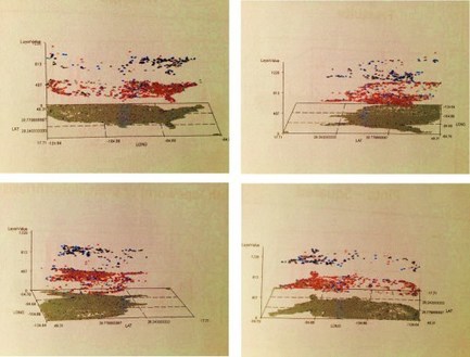
For more on this process, my past videos and maps of its happening across the U.S., based on an evaluation of 50-60M people, go to:
3 videos of the map of the U.S., depicting these cases (my 3D rotating map images of the US):
www.youtube.com/watch?v=0A95jfeAScw
www.youtube.com/watch?v=mNGxDzOkl_Q
My review of the first documentation of this practice by a U.S. doctor, in a U.S. medical journals:
“A Disease Peculiar to the Children of Negro Slaves.”
My ‘Socioculturalism and Health’ page, which incldues coverage of this sensitive topic, at:
Another individual’s page on the cultural geography of this practice:
Articles on this controversial topic:
Cosmopolitan
A page with links to the Youtube videos on this controversial topic:
https://www.youtube.com/playlist?list=PLCu236rTh0duC4Euag8Fpz7JW19c2LPCr
See on Scoop.it – Medical GIS Guide
September 17, 2015
Posted by Brian Altonen, MPH, MS under Uncategorized
Comments Off on Immunizable Diseases – A Reminder of the Past – YouTube
https://www.youtube.com/v/LOp-KGd4hV0?fs=1&hl=fr_FR
Produced 1 29 15. A video produced from my Powerpoint on the history of vaccinated diseases. The focus is on what these kids looked like or experienced due to this disease.
Sourced through Scoop.it from: www.youtube.com
This video is my review of the history of immunizable diseases. Many of the figures in this presentation demonstrate what these patients looked like, according to the medical schools books for the time–the 1940s–75 years ago.
See on Scoop.it – Episurveillance
September 13, 2015
Posted by Brian Altonen, MPH, MS under Uncategorized
Comments Off on GIS, in Sociocultural Medical Research
……………………………………………………………………………………………………………………..
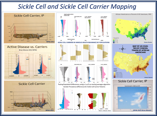
A traditional approach to studying sickle cell disease uses population health age-gender profiling in a very coarse fashion. For a full population study of sickle cell and sickle cell carriers age-gender distribution, we see very unique and even unexpected differences in the longevity of men versus women. During the past decade, I have seen this population health profile for Sickle Cell in boths of its ICD 9 identifier forms duplicate this model, for a number of difference parts of the U.S. Due to the unique shapes of these numbers-prevalence profiles for “Active Disease vs. Carriers”, this profile presented here demonstrates remarkable external validity. This relationship exists at the national level, and local levels.
Apply 3D NationalPopulationHealthGrid modeling algorithms to my data, the resulting maps provide a very unique sociocultural interpretation of how Sickle Cell exists and continues to spread throughout the United States. More importantly, the population pyramid approach to analyzing this data shows us how treatment and intervention programs should be modified to better fit the needs of age-gender groups in specific parts of the country, or locally.
Most important to note is the difference in lifespans when men and women carry the sickle cell in its non-expressive [“carrier” or ss] form. This is due to partial expression of the S gene, the degree of expression, and the impact it has on the longevity of the patient.
Social Darwinians might have a field day with the social implications of these spatial findings. For it demonstrates that women who carry sickle cell live longer than men who are carriers, to the point that they remain alive throughout the primary fertility/fecundity years. Men on the other hand lack this survival feature and are more likely to die, even as carriers, during their most active reproductive years.
This method may also be used to model others diseases linked to the human genome. (A number of my videos in Youtube provide examples of the various genetically-linked diseases and development disorders that I reviewed years back.)
About ten years from now, this way of modeling and interpreting genetic diseases will become one of the most important applications of NPHG style analysis of human EMR/EHR and lab/genome data.
For more on how I applied NPHG and ICD9 analyses techniques to human genome projects, ICDs, EMR, EHR and Managed Care planning strategies, see:
Socioculturalism and Health:
https://brianaltonenmph.com/gis/population-health-profiles/part-iii-population-health-application/special-topics/socioculturalism-and-health/
Fatal and Non-fatal Genetic Disease:
https://brianaltonenmph.com/gis/population-health-profiles/part-iii-population-health-application/special-topics/degenerative-lifelong-and-degenerative-fatal-diseases/
and the numerous NPHG mapvideos on the following :
https://brianaltonenmph.com/biostatistics/risk-management/
See on Scoop.it – Medical GIS Guide
August 31, 2015
Posted by Brian Altonen, MPH, MS under Uncategorized
Comments Off on GIS IN THE WORKPLACE FOR HEALTH & MEDICINE – A SURVEY

It has been nearly a year since I last pushed this survey I produced, focused on GIS and the health care profession. My focus is on managed care, and whether or not it can become a part of a big data population health enterprise program that I am a part of on the east coast.
As a PhD student, my dissertation planned focuses on the potential applications for GIS to Managed Care (MC), and what barriers have prevented GIS from becoming a strong part of the MC system, like it has for separate agencies devoted to population health, disease surveillance, even market analysis for healthcare facilities and agencies.
[REF: Survey Links]
Sourced through Scoop.it from: brianaltonenmph.com
Prior to my PhD enrollment several years ago, I developed these two surveys on Medical GIS. They are still active. If you are interested in GIS and Managed Care, please visit the following pages to take one or both of these surveys. The purpose is to see how leaders, management and staff are trying to implement spatial population health surveillance systems around the country.
The general survey is at https://www.surveymonkey.com/s/HZ7MH7Q
The MANAGED CARE [MC] version is at:
https://www.surveymonkey.com/s/V5THRFQ
See on Scoop.it – Medical GIS Guide
August 9, 2015
Posted by Brian Altonen, MPH, MS under Uncategorized
Comments Off on Record 108 contract Legionnaires disease in New York

The number of people diagnosed with Legionnaires disease has risen to 108 as America’s largest city suffers from a record outbreak of the form of pneumonia, authorities said Saturday. No new deaths have been reported on top of the 10 announced earlier in the week and officials say the outbreak is now on the decline. To date, 94 people have been admitted to the hospital with the infection since the outbreak began on July 10 in the south Bronx, the poorest section of New York state.
Sourced through Scoop.it from: news.yahoo.com
Working in the heart of New York City right now, some thoughts about the nature of what is happening with Legionnaires makes me wonder how the press and people are going to deal with this.
It is worth mentioning that I am perhaps two steps shy of feeling much concern for my developing this disease. First and foremost, I use my "sense" of health and especially immune health (mostly subjective assumptions) to keep these concerns at a minimum. Legionnaire’s erupted in my medical school during my first year there, in 1982; I did not catch it then why might I catch it now? May I add, this reasoning is identical to what I used to perform my field surveillance work around known houses with cases of West Nile inside; the purpose of being there was to map out the ecology of that setting and evaluate the species of vectors and determine if they were carriers. The second reason I had was even more pinpoint–all of the cases I investigated then involved people who were much older than me . . . and therefore textbook cases.
Everyday, I take a train past on of the hot spots for the most recent New York City Legionnaires outbreak, and may have even traveled to one or two of these sites as part of my work.
But seeing the big picture of what’s happening in the immediate one to two block area, around a potential outbreak nidus, and seeing how many people travel those streets and enter those buildings each and every hour, I find it amazing to think that anyone could actually design a model to accurate predict the diffusion activity down to the small area spatial level. That’s what makes spatial epidemiology as exciting as it is and formula writing the big brainteaser that it is.
Taking a break at lunch, I counted about ten thousand people coming in and leaving a less than one block area in lower Manhattan per hour. Therefore, it makes sense to guess that this is a place where an infectious disease could very easily come in.
But exactly where the infectious person goes once he lands on Water Street is a different story. He or she could head to a hospital in the Bronx by taxi or subway, the many local tourist sites, the 911 monument, to times square, or to a small clinic north of Harlem by bus or company transit because that is where he or she works. How and where a disease will actually diffuse away from the Old Slip is anyone’s guess.
What’s also important here is to realize that is how Valentine Seaman thought when he was trying to map yellow fever out in 1799 or 1800, following its repeated return in early October. Seaman thought his disease had to be either locally airborne or came in by crew and passenger and/or by rotten foodstuffs and stinky ballast water.
So, based upon Seaman’s observations, applying this same logic to Legionnaire’s makes no sense–or does it?
The large air conditioning facility is the suspected culprit in this case–aerosolized water particles being spread about a facility. But how can such an event commence almost simultaneously in multiple facilities? Is there another commonality to these places and their people, be it environmentally or ecologically (human ecology that is)?
Once again, that question has to be asked by modern New York epidemiologists–is the disease being spread by people or air-water effects. The locations point to people. The pattern suggests an aerosol nature. The nature of the facilities point to the role or human transportation in all of this.
Relating all of this back to GIS–with GIS, we cannot make as accurate prediction for the cause and spread of Legionnaire’s as we would like. We would have a hard time predicting this outbreak, had we the foresight to think about looking this up months ago. But once it is there, we have a place to begin our spatial prediction modelling routine.
Fortunately, we can develop a very accurate model on how a disease can behave once it has erupted, and in retrospect why it is where it is.
See on Scoop.it – Episurveillance
August 6, 2015
Posted by Brian Altonen, MPH, MS under Uncategorized
Comments Off on Applying GIS to Managed Care Quality Improvement Programs
Childhood Preventive Care Topics for utilizing a 2005 Medical GIS research methods, with examples of results for several 2009 to 2013 test runs The above is an example of how national population h…
Sourced through Scoop.it from: brianaltonenmph.com
This three layer map I produced for my study of diseases amongst the elderly. On the top are parts of the US where two types of elderly care related mental health ICDs are found–one American and the other traditionally Asian. The middle layer depicts the Asian culturally linked illness on its own. The first layer depicts background mapping data overlain by the US case history of this mental health condition.
These three layer maps are easy to produce, and have the additional value of being useful for mapping a very unique three-dimensional dataset gathered only in urban settings–this can be used to depict people within buildings, with each layer depicting one of the floors of the building.
There are a few places in the country where this kind of mapping is powerful. The most obvious example for me is the outbreak of heat stroke and exhaustion cases several decades ago in Chicago. Another use pertains to V-code and E-code claims for such events as domestic abuse, crime and drug use for high rise buildings set up in low income areas. Occupancy of a building can be evaluated using this building. Outbreaks due to contagious disease may also be mapped.
The recent outbreak of Legionnaire’s reminded me of the value of this algorithm. In large bulding settings, where a disease is suspected to be generated by the local environment setting, you can use this procedure to illustrate in three dimensions the cases that are reported.
This type of mapping uses non-GIS software to be produced, and common formulas to generate the algorithm. The value of that algorithm is detailed more extensively at my site nationalpopulationhealthgrid.com.
See on Scoop.it – Medical GIS Guide
August 1, 2015
Posted by Brian Altonen, MPH, MS under Uncategorized
Comments Off on Human smuggling ring dismantled in South Texas
SAN ANTONIO (AP) — U.S. Homeland Security investigators dismantled a South Texas ring that illegally smuggled thousands of immigrants across the border from Mexico and on to other parts of the state — often tucked in small, dangerous truck crawl spaces.
Sourced through Scoop.it from: news.yahoo.com
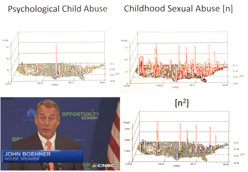
This is in fact the surface of a much greater social problem that exists in Texas. Some of the most useful findings that studies of V-codes, E-codes and ICDs demonstrate pertain to preventable human behavior and cultural and poverty-linked diseases and health issues. In this NPHG study, pathways leading form Mexico into Texas also brought into this country many other controversial health problems, such as communicable disease, zoonotic diseases, illegal drugs, and a host of very unique health related matters. In the n-squared image displayed here, notice the small town in Texas at the Tex-Mex border. It is very indicative of the main route taken by kids into this country. It is also where the greatest amount of physical and sexual abuse of teenagers prevails. This may be due to a number of reasons, but two of the most commonly cited ones are teen age prostitution and "domestic servant" contracts.
See on Scoop.it – Medical GIS Guide
July 15, 2015
Posted by Brian Altonen, MPH, MS under Uncategorized
Comments Off on Reviewing Peoples’ Big Data

The people in healthcare are the patient, the physicians, the nurses and other allied health care givers, the administrative staff, the individuals in charge of facilities upkeep, pretty much every person who sets foot in a healthcare facility or setting.
There are a few people that are virtually present within a healthcare environment. The most important of such are those that comprise an individual’s past medical or health history. This includes past physicians and surgeons, and all of their associates who saw you name, you medical history, your state of being, your financial state and healthcare debt status.
The indirect, almost invisible people, also present in the healthcare equivalent of Big Data and its collection of people’s health trivia and other unexpected tidbits of personal knowledge, are the financiers, investors, innovators (if there are any), outside thinkers, members of the Boards and Committees who have minimal business relationships with the system, and as many other people one can think of that contribute to the quality of life and health in the health care environment setting. There are the brownies perhaps, or the dog breeders with their patient friendly doses of animal medicine, or the volunteer groups often interacting with the children’s leukemia floor patients, or the post-op epilepsy wards where patient need to readjust to their recent physical and possibly cognitive changes.
Some of the the events I mention are very rare. Others are quite common, so common they happen numerous times every day.
The rarest examples are those outlier cases that come into a facility or unit, the likes of which may never be seen again by that team due to its low incidence rate. There is that hemophililia patient, whose cost amounts to more than 1 million dollars per year, just for the costly pharmaceuticals. Such a cost may be covered personally, or by some government program like medicaid, or by the patient’s insurance agency (rather rarely so, however). There are those 6 infants per year who present with a fracture of their arm near the elbow, for which there is usually only one way that happens–child abuse. There are those people whose health history demonstrates an exceptional outcome, so exceptional the system has to determine how to treat such an event, quietly or supportingly and even outwardly, whatever way being the patient’s choice.

The rarest medical events occur on a scale of a few per 100,000. There are even rare events, but for this review, we will stick with the handful of cases per 100,000 patients as a realistic prospect when you are reviewing two million people.
Two million people has within it 20 groups of 100,000 people. If the incidence of something is 3 per 100,000, that means for your 2 population population, you have 2,000,000/100,000, or 20 times 3 possible cases that might exist in your patients’ list. That’s 60 cases, and is possibly enough to do a mixed study of, in terms of the quantitative-qualitative research sense.
The more common events documented in medical records are those in the n/10,000 ratio, one logarithmic level greater than the previous example. These patients provide researchers of that population with the most valuable insight once the 2 million begins to be studied. These kinds of events (diagnoses, complications, etc.) can be situations which are too often ignored of not reviewed. Again, with a mixed approach to this sort of study, you could produce a very valuable set of insights into this population, enough to advance the special programs defined for these individuals further along.
The second benefit of this incidence and the 2 million population size is that we now have 10 times more examples than the previous example. Instead of 60, we have 600 cases. Perhaps the entire population can be reviewed, for general features such as age range and gender, but now also more specific features such as income level, neighborhood setting, type of job.
The n/1000 group provides us with still better opportunities to explore health and health related events at the small subgroup level. For a 2 million population, with the same incidence noted before but increased tenfold, we have 3/1000 or 0.3% of the population eligible for the review–totalling 6000 cases (from 0.003 x 2 million).
Now we definitely have to sample for our study, unless we are dealing with only EMR/EHR data. Then we can explore the 6000 cases and explore their features, mine their other records in search of unique cases and/or outliers. A common example of this kind of scenario is studying the epileptic patient, the frequency of which is about 4 out of 1000. A two million patient population will not doubt have about 3000 to 6000 patients, of which if we select the most active and present examples, we are still provided with a large enough population to apply mixed methods research to. The question on how to deal with this possible study population size is as follows:
- First, you need to deal with specifically what it is that you want to study, and how big are the related subgroups. With epilepsy, we could divide these people into socioeconomic groups and/or ethnic groups, and probably come up with a completely new insight into managing these patients.
- Second, you need to know what topics can be studied that can be linked to an intervention or improvement process. For the treatment of epilepsy, these could include such metrics as waiting room time, frequency of hospitalizations, comparisons of health and performance of patients between major treatment facilities or groups, comparisons of the smaller subgroups to each other (the many kinds of epilepsy), to see which programs are effective, and which are not.
- Third, you need to evaluate when, where and how qualitative reviews will carry your study further into the unknown. Case studies, focus group activities, surveys are all methods available to these patients for further exploration of their care process, and how well it meets their needs.

For the n/100 group. . . that seems like it could be too many cases for your clinical teams to deal with for a study. Selection is definitely needed, or requests for voluntary participation. But at the EMR/EHR level, these groups also allow for a stabilization of data quality in the EMR/EHR world. One can evaluate all of these patients, filter down to smaller groups by finding the percent of good versus bad records, and then come up with a set of rules for evaluating this kind of population in general. Examples of this would be the diabetics and heart disease patients common to healthcare programs.
It could also be demonstrated as certain forms of poor patient compliance, poor physician performance, poor follow-up activities, poor long term quality of life consequences. Again, the mixed approach to studying this group is possible. Defining subgroups or specific aspects of the care process that you wish to improve can be added to the overall study design. This is the situation in which performance improvements can be made in quality of care offered for certain ethnicities or minority groups. Such work on these patients will also significantly impact the cost of care overall, first by increasing healthcare system engagement processes, themselves requiring more money, and then secondly by targeting and actively engaging doctors and patients in this quality of service, quality of life related process. As before, sampling may help, but it is more useful to subdivide your patients into smaller groups, define your priorities, and continue this study with an emphasis on the differences between the forms of patient care provided for each of these sets of patients.

So, the number 2 million is certain a benefit to a healthcare system, if an when I can evaluate such a population size.
Next, we have to answer the question: ‘What are the ways to initiate this form of research?’
July 10, 2015
Posted by Brian Altonen, MPH, MS under Uncategorized
Comments Off on Bill change rankles descendants of Hamilton . . . it should rankle Homeland Security specialists!

COLUMBUS, Ohio (AP) — Doug Hamilton is just fine with plans to put a woman’s portrait on U.S. paper money, but he’d prefer that the Treasury Department leave the $10 bill alone — particularly the prominent visage of his great-great-great-great-great grandfather, Alexander Hamilton.
Sourced through Scoop.it from: news.yahoo.com
How naive people are about history.
If we’re going to make a change, I say "REPLACE JACKSON, NOT HAMILTON".
According to many, Jackson did much to deserve heavy criticisms in retrospect. He was not always the best example for being a president. And when it came to medicine, Jackson felt the MD wasn’t worth his few bits for a simple bloodletting, which he routinely did on his own to himself at night.
Alexander Hamilton, on the other hand, was of utmost important to national security. In medicine, Hamilton was the first to take control of the tropical fever problem developing in troops. Due to yellow fever, he established protocols for packing and unpacking or exchanging goods from ships, military wagons and carts. All goods were sealed in fabric, placed in a vehicle under a secured cover that was sealed and had to be recorded each time it was opened. In just one year, this proved beyond doubt that yellow fever could not be carried by the military wagons, and therefore was not transmitted by air that got caught in sealed containers and wrapping materials.
As for his greatest accomplishment outside medicine and his work as a Military leader, Hamilton worked alongside Thomas Jefferson when the nation’s first National Homeland security act was passed and signed. [see https://www.pinterest.com/pin/568790627909905309/ ]
This can be reviewed at the Pinterest site or on pp. 63-65 in ‘A defence of the measures of the administration of Thomas Jefferson’, Volume 40, Issue 3, by John Taylor, Thomas Jefferson Library Collection (Library of Congress), Miscellaneous Pamphlet Collection (Library of Congress). in books.google.com/.
See on Scoop.it – Global∑os® (GlobalEOS)
July 9, 2015
Posted by Brian Altonen, MPH, MS under Uncategorized
Comments Off on “Tighten vaccination loopholes: Our view” (vs. my view)
USA Today Editorial states: “Last year, the U.S. saw 668 cases. Midway through 2015, about 180 people across half the states have been sickened. Many cases were linked to an outbreak at California’s Disneyland, and most of those who’ve fallen ill were never vaccinated. Last week, Washington state reported the first death from measles in the U.S. in 12 years.” and “States that still allow easy opt-outs should follow Vermont and California. . . . “
Sourced through Scoop.it from: www.usatoday.com
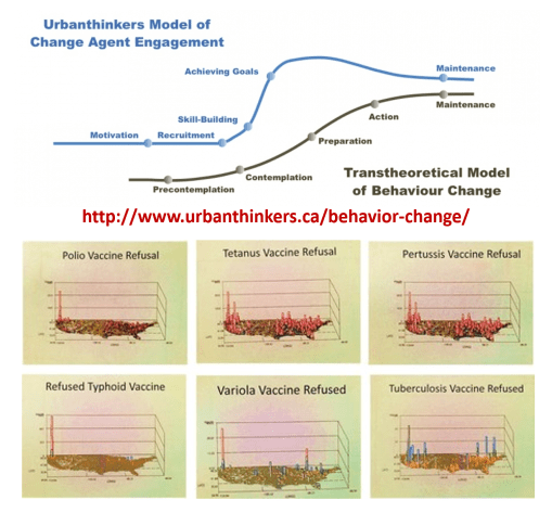
Let’s apply Prochaska’s Transtheoretical Model of Behavioral Change to this public health/healthcare administration problem.
The healthcare programs in the US are for the most part either in the pre-contemplative or contemplative stage for GIS implementation. The more engaged programs are focused on skill building. Utilization of just a simple spatial program to map your data is early "Preparation" Unless you have a GIS established that deals with all QIAs, PIPs, MUs, Chronic Diseases, and the majority of HEDIS metrics, reported yearly, your agency, company, or facility is not in the Action stage.
Based on my national GIS/NPHG study outcomes, my recommendations are as follows:
#1 – regarding refusals to immunize, focus on the Seattle, Portland, San Francisco, and maybe Los Angeles areas.
#2 – approach insurance companies and physicians’ businesses in the Pacific NW urban settings and ask them why they have facilitated this problem for 25 years.
#3 – develop mandatory rural health monitoring programs for the Pacific Northwest
#4 – research the in-migration track from NYC to Albany where the hot spots develop due to tourism and immigration.
#5 – improve public health security programs designed to prevent the spread of immunizable diseases into Canada via the Buffalo area and other Great Lakes related paths into Canada; apply this to all other high fatality diseases capable of crossing borders (this is possibly the chief route for unexpected yellow fever entry).
#6 – continue to vamp up Mex-Tex border security, and establish plans for the south the north route these individual take with their disease, from the border to Midwestern cities along the Mississippi and Chicago.
#7 – increase public health security along the Haiti/Cuba-to-Florida route (chikungunya and naturalized Ebola/Ebola host routes).
#8 – set up a plan for potential polio re-emergence around the Great Lakes; consider Canada or Chicago a possible direct or indirect (via NYC) point of entry.
#9 – require the largest health insurance companies like Aetna, Anthem BCBS, Blue Cross Blue Shield, Cambia, Cigna, Emblem, Fortis, Kaiser Permanente, UnitedHealth, to initiate a medical GIS program immediately, that is capable of working in 9 months, to begin quarterly reporting in 12 months.
#10 – Retire all CIOs, CTOs, Directors, VPs, managers, in charge of IT/HIT/QI/QA, who lack spatial epidemiological background and experience, and have not published or presented a demonstration of their unique skills by the implementation of new programs and/or publication of spatial epidemiology results that are more than just descriptive statistics.
For those highly adventurous, I recommend:
#11 develop a program that separates and spatially evaluates sociocultural and socioeconomic classes of diseases and quality of care (in descending order of priority) for: lowest income classes, highest cost CDMs, african/african-american, hispanic and subgroups, asian/asian-american, native american groups.
See on Scoop.it – Medical GIS Guide
« Previous Page — Next Page »