Kiera Driscoll, 5, had a slight fever on Sunday morning, but she seemed to be feeling better after taking some children’s ibuprofen, said her father, Patrick Driscoll. “In fact, she was playing outside that afternoon with my wife and even made a comment that it was ‘the most fun time ever,'” Driscoll said. But then Kiera’s slight fever returned and her cough worsened and included phlegm, Driscoll said. She didn’t have asthma but occasionally had a barking cough as a baby, Driscoll said.

Source: gma.yahoo.com

There are seven ways debaters can go with this news story.  The writer of this story and editor of its source took direction #7 — the worst approach.  It will be interesting to see how many ways that those with ulterior motives go with this sad story.


My first impression, however, is, based on the ill-conceived, misdirecting title, that this tale is going to add fuel to the fire already out there about vaccinations, namely linked the events linked to the recent measles outbreaks on both the east and west coasts over the past year.


But these measles outbreaks and the issues they relate to are not related to why this girl died.  She died because she caught the flu, but the flu alone did not give her cardiac arrest and take her life.  One could argue that if she had the shot . . . .   (I don’t know really if she did or didn’t.)  One could also argue that even if she did, it doesn’t matter, since the flu shot available this year doesn’t match the strain that is going around this year.


Still these reasons have nothing to do with this her death.


I next read that she was put on ibuprofen, which reminded me of my freshman years in pharmacology and medicine when myself and others felt the aromatic ring added added to salicylic acid was "bad for you", and toxic to the liver, and reduces the purported effect that salicylates have upon EPA, PC and PG pathways it was felt to work with, unlike tylenol.  All of those "truths" about what makes these common OTCs work and so different from each other are now dead and gone.  Guess I didn’t learn only the facts back then after paying my medical school tuition.


Ibuprofen couldn’t cause the mucus plug that blocked her airway passage, nor did the flu.  It was the asthma medicines that caused these mucus plugs.  This is a classical lesson about the use of asthma medicines in emergent care, that all of us have to learn and relearn as clinicians and as patients (or parents of), lest we forget it at the worst of times.


Up until the 70s, you could by the daturine and analogs needed to "treat" asthma.  I say "treat" in quotes because that’s not really what you are doing.  The Acetylcholinesterase Inhibitors [AChE-Inh’s)  like daturine, hyoscyamine, belladonine, scopolamine, atropine, and the like, work by drying air passages, making the mucus thicker, unable to to be expectorated.  This was the primary reason we stopped the distribution of products like Asthmador and the like in the 70s.  


Today’s  complementary-alternative medical [CAM] field has practitioners who still support this very old line of therapy.  So this story brings us in circles–CAM is also strongly linked to the anti-immunization movement that is now happening.  Could CAM be the reason for her death?  Unlikely. (I hope).  


CAM isn’t responsible for this asthma drug related tragic death, nor is the asthma drug probably (unless it’s an overprescribed  100% AchE-Inh against HEDIS/NCQA/FDA/APhA recommendations), nor the flu shot, nor the use of OTC ibuprofen, nor the flu, nor her history of a flu shot. 


But I am providing this background about the probably cause, forensically, due to the Title of this article.  It is misleading, and very much showboating.  


Kiera Driscoll did not die after catching the Flu, or after getting her Vaccine.  She died due to her need for asthma medications, the administration of the wrong type, and the lack of emergent care received on time.  The flu was a co-morbidity, and initiator, but not the cause.  The Vaccine had nothing to do with this event.  Still, due to Pop Culture, the editor and author wish to follow their ulterior-motive/personal ambitions with their title, pointing their fingers in all the wrong directions.  


This is biased reporting, if ever I wished to see a perfect example of such.  That makes it a lesson for the day in public health.

See on Scoop.itEpisurveillance

Review of the history of Vaccination and Inoculation, and the diseases that have been reduced due to the immunization program. An epidemiological transition a…

Source: www.slideshare.net

I have also posted this in video (minus audio) form at :  https://www.youtube.com/watch?v=LOp-KGd4hV0

I produced a lengthy review of this vaccinated diseases topic that has evolved in recent weeks.  I have been watching the anti-immunization movement grow for quite a few years, and decided it was time to publish my rendering of what this movement could do to the history of medicine and how these diseases can impact the lives of kids who don’t get vaccinated.  This version lacks an incidence-prevalence statistics review, but covers the history of inoculation/vaccination in detail, going back to the 1770s.  A few recent postings show the graphs I was developing for this, with the results of my temporal analysis of the immunization programs and immunizable diseases.  I avoided several “hot topics” for now, but will re-review them and add them in at a later time.  The major point here is to provide a detailed visual presentation of what the diseases look like within the clinical setting.   People seem pretty much decided upon this matter for the time being.  So I may be preaching to the choir with this posting.

See on Scoop.itEpisurveillance

Melinda Gates:  “Americans have “forgotten what measles deaths look like.”


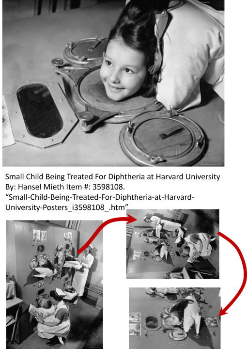
Melinda Gates was very much right about how much too many of us have forgotten.  This set of pictures I have on display here say it all.  As pop culture historians interested only in today, as we personally see it, we remember the least, but retell the past as if we were “experts”.


Source: www.vox.com

Ahh, the mistakes we make!!!!

See on Scoop.itEpisurveillance

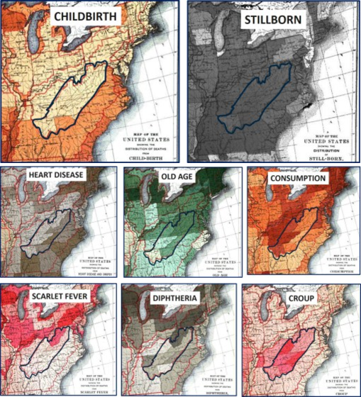
The disease maps in the 1890 Census provide us with some of the best insights into American medical history just after the bacteria was discovered.  Disease mapping was about to experience a major change in significance, as scientists began to focus on the microbe, something you did not easily map.  We started to focus a lot on population health, due to the development of the sanitary theories for disease popular from the 1870s onward.  This is from a page I posted on the 1890 Census Disease maps, a part of which is focused on the health of Appalachia, where some of the poorest parts of the United States still exist today. 

These maps can actually tell us a lot, if we take a moment and think about the US population during this time.  


Westward Expansion was well underway.  


One direction the US population flowed was directly westward, across the northern edge of Appalachia, through western NY into Ohio and from there over the Illinois and then south the Missouri.  We can see the impacts of these populations on diseases or conditions related to population density and increased likelihood for survival. for example the map of "Old Age."


The US population also continued to follow the eastern ocean shores, forming many large cities, but still decades way from establishing a megalopolis.  Heart disease hugs the short of part of the Atlantic for this reason.  The were some of the most developed parts of the US at the time as well, and demonstrated the impacts of less poverty than the rural mountain regions heading through the Appalachians.  Does this mean the northern New England region and Southern Diets weren’t at all good for the heart?


Consumption is a western slope disease.  Originally noted to be most prevalent in the NY-New England sector, it managed to head deep into the interior but seemed to like a specific environmental setting.  There are two unique strips of this disease, one along the mid-Atlantic oceanic-bays states regions, the other on the western edge of mountain, eastern end of the Great Plains.


Scarlet Fever is very much a population-bound disease, following the migration roads, shipping routes and adjacent railways laid through central Pennsylvania along the Ohio River, staying at the south edge of Ohio, Indiana and then heading back north towards Chicago and the Great Lakes.


Croup wasn’t picky about what side of the mountains it was on.  It was just searching for susceptible kids.  


Diphtheria for some reason has a more northern tendency.  Part of it traverses Pennsylvania, another part follows what seems to be a latitudinally define path, heading north of the mid-latitude line of Ohio, then over the Northern Michigan and Northern Chicago into Wisconsin.  


Childbirth is a product of populations and people.  The Southern coastal state rates were higher than the northern  There are also two very distinct sections of the southern Atlantic states with higher numbers.  For obvious reasons, more people are seen living along the coastal regions, so more babies are born there as well.  Higher birthrates are on the eastern shore of the Mississippi River in Illinois, not the more rural western shore with larger farms in farmland communities.  The shores of the Great Lakes bear more children (shipping towns).  From New England to Ohio and lower Illinois, birth rates remain lower than the same longitude down south, along the Gulf of Mexico.


Finally, stillborns were a happening that occurred nearly everywhere.  This ubiquitous nature of stillborns in the late 1800s is very different from what I expected for midwest farming communities, the medical school books of which are filled with cases and chapters on teratopathy and birth defects.  

See on Scoop.itMedical GIS Guide

By Victoria Cavaliere SEATTLE (Reuters) – A Washington state teenager who suffered life-long injuries when she was violently shaken as an infant has died, and a Seattle-area prosecutor said on Wednesday he would likely charge her biological father in her death. Baylee Duggins, 15, of Tacoma, died on Sunday from respiratory failure linked to pneumonia, according to her mother and the Pierce County Medical Examiner’s Office. Duggins’ biological father, Christopher Schwanz, was convicted in 2000 of second-degree child abuse for shaking the girl as an infant, leaving her severely physically and mentally impaired, according to Pierce County court records. Pierce County Prosecuting Attorney Mark Lindquist said he expects to bring a second-degree murder charge against Schwanz pending a review of the medical examiner’s evidence.

Source: news.yahoo.com

The answer to this growing problem?  Perhaps it’s all in the mapping.    


My video on the national distribution of this public health problem –     


https://www.youtube.com/watch?v=Y3c4A-oagjg     


(other child related public health issues are included as well on this page).       


Shaken baby.   

Teenage/childhood suicides.   

Bullying.   


These are the three most important socially and culturally related public health issues for 2015.     


Aside from not accomplishing much clinically in terms of surveilling this public health issue, very little has been done to evaluate it in  detail at the national spatial epidemiology level.    


If there are programs out there that are trying to aggressive research this social phenomenon locally and regionally, I would like to hear about these actual events.  With spatial statistics, we can evaluate these problems and search for the cultural and social "triggers" of these events, issues such as poverty, family unrest, sense of shame, day to day financial issues, inadequate social services programs . . .   I am more than ready to develop a national population health study project devoted to this topic.

See on Scoop.itNational Population Health Grid

[linked to an Article by Jenny McCarthy]  The “One Poke per Visit” or “One Shot Rule” for Vaccines.   Sounds reasonable.  


Jennifer McCarthy states in this article:  


“I am not “anti-vaccine.” This is not a change in my stance nor is it a new position that I have recently adopted. For years, I have repeatedly stated that I am, in fact, “pro-vaccine” and for years I have been wrongly branded as “anti-vaccine.” My beautiful son, Evan, inspired this mother to question the “one size fits all” philosophy of the recommended vaccine schedule. I embarked on this quest not only for myself and my family, but for countless parents who shared my desire for knowledge that could lead to options and alternate schedules, but never to eliminate the vaccines. . . . I believe in the importance of a vaccine program and I believe parents have the right to choose one poke per visit. I’ve never told anyone to not vaccinate.” 

Source: chicago.suntimes.com

Jenny McCarthy can successfully "backtrack" all of her criticisms about childhood vaccinations with this logic.  Her reasons or explanation for the strongly worded versions of her criticisms posted several months ago about vaccinating children seem reasonable.    


In her article she explains her criticisms as follows:    


[Quote]

"    

Blatantly inaccurate blog posts about my position have been accepted as truth by the public at large as well as media outlets (legitimate and otherwise), who have taken those false stories and repeatedly turned them into headlines. What happened to critical thinking? What happened to asking questions because every child is different?   


For my child, I asked for a schedule that would allow one shot per visit instead of the multiple shots they were and still are giving infants.   

"

[End Quote]


In a review I drew up ten years ago about immunizations for a Medicaid Program working at 95-96% success if providing complete shots, one of the major causes I uncovered for overimmunizing and underimmunizing children was the use of combinations, and how much they varied in their rates of administration.    


Was this a supply problem? I asked the team.  Perhaps.  Shortages two years before had caused a more than 25% reduction in normal year to year immunization series completions for children less than 2 years of age.   


The availability of combinations certainly lessens the number of injections a kid has to receive significantly.  The administration of three or four, or even five different single shots per visit to kids seems to be bordering on torture.  McCarthy complained about six, and probably not all on the same body part.   


McCarthy continues    


[Quote]    

"  

“People have the misconception that we want to eliminate vaccines,” I told Time Magazine science editor Jeffrey Kluger in 2009. “Please understand that we are not an anti-vaccine group. We are demanding safe vaccines. We want to reduce the schedule and reduce the toxins.”   


This is what I believe:   


I believe in the importance of a vaccine program and I believe parents have the right to choose one poke per visit. I’ve never told anyone to not vaccinate. Should a child with the flu receive six vaccines in one doctor visit? Should a child with a compromised immune system be treated the same way as a robust, healthy child? Shouldn’t a child with a family history of vaccine reactions have a different plan? Or at least the right to ask questions?   


[End Quote]   


So, let’s do the math here – – –    


There are 49 vaccinations required by the age of 6   (http://www.nvic.org/CMSTemplates/NVIC/pdf/49-Doses-PosterB.pdf&nbsp😉   


36 between the ages of 0 and 2.   


13 between the ages of 2 and 6.      


36 vaccinations/24 months, or 1.5/month, 3 every two months, on the average.  Ideally, the first 12 month’s worth of visits are at least every two months, if not monthly the first quarter of life.  Including day zero or one as a vaccination day as well (for HepB), we have the possibility of 7 visits to given the bulk of these vaccines.  That leaves a 15, 18 and perhaps 21 month visit, leading up the the end date of 24 months visit, totaling somewhere between 10 and 12 visits total for 36 shots.  (The page linked to has one less visit for year 1, and no real visit counts implied up to 18 months, but the same range given above, minus 1).     


the explanation McCarthy gives seems reasonable.  But if you look at the combos required, there are just a few ways to produce the combinations needed to make fewer shots.  The calendar is too complex for between shot periods.  Based on the way the immunizations are sequenced, assuming traditional combos where they can be applied, the sequence for completion before two years of age is as follows (in numbers of shots).


1-8-7-8-1-10-1 (36) types of immunizations administered as:  

1 + 4 + 3 + 5 + 1 + 5 + 1 (20) injections.


(again, see http://www.nvic.org/CMSTemplates/NVIC/pdf/49-Doses-PosterB.pdf


This logic, by the way, doesn’t take into account the 2, 3 and 4 vaccination combos out there (i.e. DTaP, MMR, the rare duplexes for the latter, a new 4some or two being tested).   


The diversity or the product line is why we over-administer some more than others.  The fact that some immunizations need 1, 2, 3, 4, 5 or even 6 administrations to meet the requirements (18 if you add the 12 influenzas requied for 7-18 years of age), only adds to what you may find, if you are searching for reasons to complain.


The point is, there is limit to the math skills required to determine if and how you are going to abide by recommendations. I guess the real question here is ‘what value do you assign to your kid’s life?’  These problems exist because of the value we assign to them.   (And I admit, I wonder how many kids, if any, get the total numbers of flu shots recommended by the time they reach 18).  


Parental responsibility is the issue here.  If the kid had to take an epilepsy medication in some unique cycle, you would probably do it, right?  A kid with diabetes needs that medicine when he/she needs it, not when some calendar says he/she should take it.  A kid with asthma doesn’t wait until it’s too late (I hope).  A kid in need of regular visit because he/she is unhealthy–wait, that’s also required for healthy kids as well–kids in need of well visits must attend to them for the same line of reason.  


So imagine what Jenny McCarthy was telling us did happen, that there were people who abided by the rule of one shot per visit.  How many visits would that require.  


The math above says a minimum of 20 shots are needed with the combos available, or 20 visits in two years.  That’s a little less than one per month.  12 visits the first year to be sure you meet the expectations, 8 the following year.  Maybe with the first two months turned into frequent biweekly visits, to lower the pressure even more.


At 20 visits, $10-20 copay each, that $200/year.  Not too bad, if you can afford it.  On Medicaid, this could be a totally different problem to resolve.  


So, let’s try no co-pay per well visit.  Now you’re demanding much more physicians’ office time, maybe even doubling it per year per patient for pediatrics and newborn specialists, or kids with chronic diseases so young in life.  This is just for 20 visits total.  If you miss one, you narrow the time frame significantly about how and where to make up for that loss.  If you skip it again, your chances drop further for completing the series on time.  If you skip a third visit, even in the second year, you have little to no chance of recovery.


Now let exchange this for what if you skipped some visits, never fully vaccinated your child, and he/she was taken ill.  How much would that event cost you? your insurance agency?


It not only costs you the cost of treatment and hospitalization for the illness, but also the possibility of post-infection consequences, changes in cognition, hearing, onset of epilepsy due to febrile seizures, potential for later life autoimmune and re-exacerbation consequences.


In 2011, a cost of $799,000 was assigned to a 2008 measles outbreak (14 cases, 363 suspected), involving the care of 7 people, in two hospitals.  (http://www.modernhealthcare.com/article/20131130/MAGAZINE/311309983


The cost of having your child cared for if and when you mess up with an immunization isn’t cheap.  Can you or your insurance agency afford the bill?   (Celebrity status not included.)  


In a very recent study it was shown that vaccinations save us $13.5B in direct medical care costs (Zhou, F., et al. (2014). Economic Evaluation of the Routine Childhood Immunization Program in the United States, 2009. Pediatrics, 133(4):577-585).


***********************************************


REFERENCES and other resources:


Is the Anti-Vaccination Movement to Blame for Disneyland’s Measles Outbreak?  By Jennifer Swann | Takepart.com.  January 11, 2015 3:56 PM.  Takepart.com.  http://news.yahoo.com/anti-vaccination-movement-blame-disneyland-measles-outbreak-205657288.html


For more on costs and immunizable disease outbreaks, see


Parker, A. A., Staggs, W., Dayan, G. H., Ortega-Sánchez, I. R., Rota, P. A., Lowe, L., … & LeBaron, C. W. (2006). Implications of a 2005 measles outbreak in Indiana for sustained elimination of measles in the United States. New England Journal of Medicine, 355(5), 447-455.

http://test.naccho.org/topics/HPDP/infectious/immunization/upload/2006NEJM-Parker-Implicationsofa2005measlesoutbreakinIndianaforsustainedeliminationofmeaslesi.pdf


Sugerman, D. E., Barskey, A. E., Delea, M. G., Ortega-Sanchez, I. R., Bi, D., Ralston, K. J., … & LeBaron, C. W. (2010). Measles outbreak in a highly vaccinated population, San Diego, 2008: role of the intentionally undervaccinated. Pediatrics, 125(4), 747-755. 

http://pediatrics.aappublications.org/content/early/2010/03/22/peds.2009-1653.short  (more than $10,000 per case, 750/day for quarantine.)


Zhou F, Shefer A, Wenger J, et al. Economic evaluation of
the routine childhood immunization program in the United
States, 2009. Pediatrics. 2014;133(4):577-585.


Mona Patel, MPH; Laura Pabst, MPH; Sajal Chattopadhyay, PhD; David Hopkins, MD, MPH; Holly Groom, MPH; Stuart Myerburg, JD; Jennifer Murphy Morgan, MSPH; and the Community Preventive Services Task Force.  Economic Review of Immunization Information Systems to Increase Vaccination Rates: A Community Guide Systematic Review.  

http://www.thecommunityguide.org/vaccines/vpd-jphpm-ecrev-IIS.pdf


The Value of Vaccines in Disease Prevention

http://www.pfizer.com/files/health/VOMPaper_Vaccines_R7.pdf 


See on Scoop.itEpisurveillance

In the past 14 months, I posted 556 pages on my ScoopIt devoted to GIS and HIT (sum, approx. 8500 views, 4250 viewers).  


85% of these viewers visited the 3 sections of this ScoopIt! known as ‘Episurveillance’, ‘Global Health Care’, and ‘Medical GIS Guide’. 

I then dissected the postings down further to evaluate those related to the current Ebola outbreak.  These are my results.


Medical GIS: 2653 visitors, approx. 5600 views total; 217 postings total, 91 for Ebola (42%)   

Episurveillance: 736 visitors, approx. 1400 views total; 222 postings total, 78 for Ebola (35%)   

Global Health Care:  401 visitors, 783 views total; 117 postings total, 61 for Ebola (52%).   


To define the pages posted, I evaluated the primary purpose and content for the main article(s) cited.  Some pages contained by to 50 articles with links provided, with articles varying considerably in their content.     


The primary topic  of the posting was the focus of this review (which was a consolidation of the articles content).  These articles, publications, books, speeches, quotes, photoessays, and news items referred to one each page were evaluated, and the primary theme defined.        


At the time these articles were posted, there was of course my own biasedness in selecting what to post once October 15th was reached, and it was determined that Ebola appeared to be past the prime of its potential ecological migration to North America in the immediate future.  I ended the evaluation of all articles on the internet related to Ebola on October 31st, but continued reviewing the main news features or topics about Ebola as the total numbers of these articles accelerated considerably throughout November and December 2014.  I posted pages detailing to primary hot topics as new ones arose or content and reactions to the disease changed.   


I provided 2090 links (references provided) at my entire ScoopIt! for these three sections, 1090 (51%) of which were in direct reference to Ebola (excluding my history writings).  By the end of 2014 I had posted 230 pages on Ebola, 138 pages on other surveillance matters such as the measles, mumps, whooping cough, polio, MIRS, Chikungunya, and encephalitis outbreaks, as well as a number of socially important surveillance related diseases or disease matters such as immunizations and refusal to immunize (36 postings, 62 links), infibulation and other cultural issues (64 postings and links), and teen age suicide and similar teenage or children school and health related matters (14 pages, 70 links).    


I used this to identify the hot topics in medical GIS for 2015 (more details on this part of my study later).      


These findings in turn provide reason for establishing a live Medical GIS station at the typical standard health insurance company, managed care, PBM, and large university hospital/teaching institution settings.     


The purpose of such a GIS would be to monitor: 1) in-migrating disease patterns, 2) cultural and ethnically linked public health matters, 3) ICDs, E-code and V-code indicators of the most socially important public health concerns (abuse, violence, poverty-realted ICDs and V-codes), 4) local low SES related population health patterns, 5) local standard infectious and environmental host-vector disease rates, 6) immunizable disease rates (whooping cough, etc. outbreaks) and anti-immunization V-codes, 7) culturally-linked or specific ICD public health indicators (Tb infected newborns in Pac NW), 8) culturally-bound syndrome ICDs, and 9) complete disease pattern profiles (75-150 ICD profiles) for the major ethnic groups in the region, such as African American/Black (subtypes?), Hispanic/Latino/a (and subtypes?), Asian (subtypes?) and Native American.


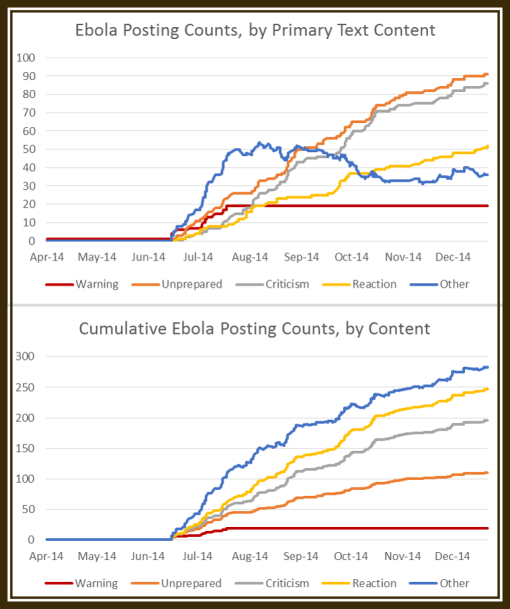
For this study of the Ebola topics referred to in the illustration here posted, the line charts demonstrate the periods of different behaviors related to this outbreak.  I categorized the articles content in what I call: [RED LINE] the warning period (people like myself voicing our concerns/need for an immediate WHO/CDC response), [ORANGE] articles that focused on the CDC, WHO and agencies being and acting as though they were unprepared for the outbreak (even months into it),  [GREY] the articles in which public and professional criticisms about this lack of preparedness emerged, and [YELLOW] the articles occasionally posted focusing just on the official reactions to these criticisms by WHO, CDC or the attached governments.     


 The articles counted as ‘other’ [BLUE] did not fit into these four classes and were usually about non-critical case/death counts, news about the Ebola spread without judgmental statements or conclusions made, news flashes about the results of new studies of Ebola or its treatment, pharma news, stock investors news, African economy and ebola news, etc.


See on Scoop.itMedical GIS Guide

The WordPress.com stats helper monkeys prepared a 2014 annual report for this blog.

Here’s an excerpt:

The Louvre Museum has 8.5 million visitors per year. This blog was viewed about 77,000 times in 2014. If it were an exhibit at the Louvre Museum, it would take about 3 days for that many people to see it.

Click here to see the complete report.

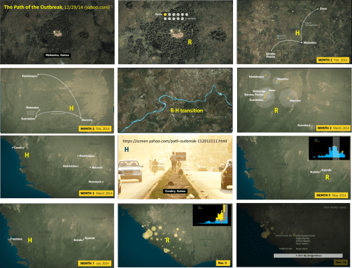
How Ebola spread during the first few months of the outbreak.  R = radial diffusion pattern; H = hierarchical pattern or behavior.

Source: screen.yahoo.com

Using the mapping of Ebola provided by this NY Times overview of what has happened, we can see how radial and hierarchical diffusion behaviors effect disease diffusion patterns.  This method of modeling also demonstrate how two other historical medical geography teachings–the sequent occupancy interpretation of a place, and transportation modeling–provide insights into predicting the disease pattern.      


These events barely integrate any natural elements linked to Ebola diffusion once the disease erupts.     These natural features may however remain present and active, although not predominant due to the epidemic outbreak process.   


There is also the classical modeling of epidemics in Iceland produced about 50 years ago by British Geographers, that these notes can be related to.  We see the Iceland outbreak events re-occurring on the maps provided in this NY Times video.      


In medical geography, a important lesson I learned nearly 10 years ago from ESRI’s medical geography statistician was the role of area size in understanding a diffusion pattern.     


Spatial analysis requires we repeat certain formulas over different levels of spatial resolution.  We then determine at what are size the most sensible and useful prediction model can be developed.  That critical spatial feature is defined by the transportation history and patterns of the people involved with an outbreak.  Africa’s transportation process defines 30 miles as a limiter, noted in this NY Times video.  For Ebola, this relates to when radial diffusion patterns (‘R’ in the above figures) end up being replaced by hierarchical patterns.     


The transportation of the Ebola to towns and villages distanced from the nidus or nest is a product of these features, and represent early stage hierarchical diffusion behavior (‘H’ in the above figures).  Like cholera and other diseases that erupt in communities due to poor sanitation, lower SES, poor living conditions, there can be this reversed hierarchical diffusion worth noting.  The transportation of Ebola to local, regional hospitals is an example of this stage in "gearing up" the epidemic for a major outbreak.   Transportation is the link in the change from radial to hierarchical diffusion patterns.     


The first outbreak was expected to peak in March or April and then reduce to little or no more disease outbreaks.  This didn’t happen however.  Instead the early stage hierarchical diffusion processes had already taken place, setting up new regions for perpetuating the outbreak and keeping its organism alive and making the likelihood for continued diffusion possible.   Small radial outbreaks ensued, involving neighbors and immediate family, and once again, hierarchical diffusion commenced, this time striking larger towns and cities (next step in the reversed hierarchical diffusion pattern).     


As soon as larger cities are hit, and the rural/wilderness setting of Ebola has been left behind, this sets the stage for international travel.  Due to the different forms of transportation and their potential speeds and distance of travel, introduction of any disease to a large urban setting makes it possible for hierarchical diffusion to commence to other countries on other continents.  Thus Europe was stricken as well as North America, and larger economic centers were impacted.     


Some other useful ways to look at this spatial behavior include the application of Christaller’s model, which focuses on economics patterns around major urban centers, and Theissen’s Polygon modeling, which when combined with transportation time-distance spatial relationships can be used to define the most susceptible regions to be attacked once a major urban center is impacted, such as Dallas, New York, Chicago, London, and Hong Kong. (I have some GIS pages posted on each of these two major spatial epidemiology topics.)     


Again, it is also important to note that the US medical geographer and economist Gerald F. Pyle defined radial, hierarchical and mixed disease diffusion patterns based on this interpretation of disease spread as a by-product of commercial patterns and economic geography.  I added to his model the notion of the reversed hierarchical pattern about 14 years ago, noting the role of SES, social inequity, poverty, and sanitation on disease diffusion patterns (the introduction of cholera into Irish settings in NY and IL, and into Kingston, Jamaica in 1849/50 were my lead examples).    


Sequential Occupancy, a late 19th C geographic interpretation of how landuse changes when a region economically develops, relates to this in how it provides insight into transportation related impacts.  (Sequential Occupancy is also my recommended replacement for epidemiological transition theory, since it is more precise in defining cause and effect.)      


Earlier stages in regional economic development define the local technology, and as a result also impact how a disease can and will diffuse, and in which directions, at what speed.   At the tricountry border of Guinea-Liberia-Sierra Leone, the use of early stage transportation (waterways) helped spread the Ebola, as noted in this video (‘R-H transition’ in the figures).    


Parts of modeling disease spread are much like modeling water flow patterns along a river or traffic flow along the roadways heading towards urban regions.  Spatial analytics makes it possible for specific routes to be predicted and then tested as soon as an outbreak happens.     


Traditional epidemiological research focuses primarily on the natural human ecological events, but fails to fully take into account the economic geography like behaviors of disease outbreaks.    


Every major transportation of this Ebola to a new location occurred due to hierarchical modelling human behaviors.  The Reversed hierarchical diffusion behavior prevailed all throughout this past year of activities.  Radial patterns defined mostly the local disease spread.  Sequent Occupancy modeling shows us that diseases can follow a 125 year old economic geography way of modeling man and disease due to the lack of much change in human behavioral patterns, spatially or temporally.    


This Ebola also behaved much like the Cholera of 1800 to 1873.  With each new outbreak, it traveled much further in its diffusion process around the world, following Gerald F. Pyle’s diffusion model.

See on Scoop.itMedical GIS Guide

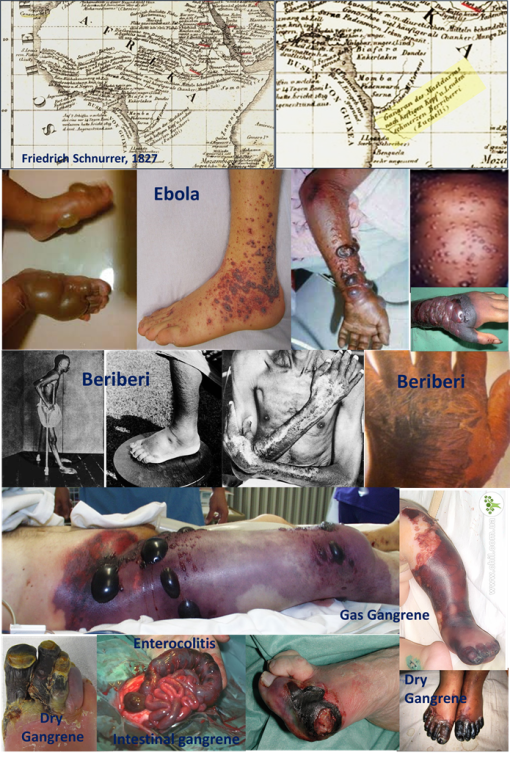
The sections of map are from the very first map of global diseases prduced in 1827 by Friedrich Schnurrer, professor in Oriental culture and history and headmaster of the theological faculty and chancellor of the University of Tübingen, Germany.

This section of Schnurrer’s map I extracted and enlarged is focused on the Congo River.  

Along the right side of that waterway he scribed “Gangran des Mastdarms nach heftigen Kopf u lenden schmerzen Berriberri (Zuchelli)”–this roughly translates to

“Gangrene of the lower bowel (rectum/colon) after a violent or severe attack of pain to the head, loins & lower back [like]  beriberi”   


The account Schnurrer is referring to as  “Gangran des Mastdarms nach heftigen Kopf u lenden schmerzen Berriberri (Zuchelli)” is an event first experienced by an early Protestant missionary in Africa, Antonio Zuchelli, who after a brief stop in Brazil in 1797 removed to Africa where he resided from 1698 to 1702 as part of the Protestant missions group (reference and links below).  


He returned to Venice in late 1703, early 1704, and spent the next seven years writing about the experiences he had along the Congo River between 1698 to 1702.  In 1712, these experiences were published as a popular "Viaggi e Relazioni . . . " (Travels and relations. . . ) account, entitled Relazioni del viaggio e missione di Congo nell’Etiopia inferiore occidentale, del P. Antonio Zucchelli da Gradisca, predicatore cappuccino della provincia di Stiria, e già missionario apostolico in detto regno ecc., consecrate alla sacra ces. reale maestà di Eleonora Maddalena Teresa, vedova del gran Leopoldo. (1712 ,a Venezia, presso Bartolomeo Giavarina, 4o, 438pp.)  

This book covers Zuchelli’s missionary expeditions to five parts of the world.  He traveled to Brazil and then Africa, making his way inland along the Congo, residing in what they called the Province of Sogno just south of Zaire (these missions go back quite a bit, see some of the links below).


Zucchelli remained at this place for several years, reported his experiences later in the ninth to thirteenth relations he published.  Like most missionary reports, these writings were heavily devoted to the culture customs of the local inhabitants . Throughout this recounts are included descriptions of the nearby villages and kingdoms (countries) he traveled to and a description of the local economy and businesses utilizing natural resources, the local climate and ecology, and the various other cultures nearby with descriptions of their villages.

Zuchelli’s description of the people and the local health and disease matters wouldn’t again be matched in as much detail pertaining to Ebola-like outbreaks until the early 1800s, when a number of ships made it their goal to travel deep into the heart of Africa by way of the Congo River.  

To understand the epidemiological history of these travels, it helps to understand how diseases were described and explained at the time.  As much as possible due to the early Greek writings, climate was associated with disease, along with temperament, our physique, our activities, our diet and waters, the way we dress and follow our passions, the ways in which we keep our living and working conditions clean or not.   On board ships, spending months on the waters, besides fever and occasional infectious diseases measles, our health depended upon our diet, and a poor diet resulted in scurvy and beri beri.  But usually whenever a ship reaches land, these diseases pass due to an improved diet (fresh fruit and vegetables).   Such was not the case at times along the Congo River, and the beri beri caused by poor diet and the body wasting away didn’t apparently ease completely upon landing.  Instead, it re-erupted in its worst form, with the appearances of decaying skin and flesh, the forming of blisters, bleeding, and bubos worse than those of the plague.  

The pictures in this set are of traditional, severe beri beri as well as the dry and wet gangrenes common to these settings, which to any physicians first seeing these outbreaks would resemble the other outbreaks he was already more familiar with.  The Ebola of today resembles the beri beri and various forms of gangrene of the past (Zuchelli’s description is what led Schnurrer to classify it as a gangrene, following somewhat Erasmus Darwin’s disease classification tree of decades before).

Of course, there are many other forms of flesh destroying diseases in very wet and humid living settings.   But what makes this condition unique is that it is just on the Congo River according to Schnurrer’s map, on the route to Zaire.   Schnurrer fails to notes such a gangrene anywhere else on his map.  

Later evidence for this claim based on Zuchelli’s writing and Schnurrer’s map can be found in the 19th century writings [next topic for this set or historical Ebola reviews].  

There are two early 19th century voyages made by two British military captains that provide very convincing descriptions of the outbreak of this deadly disease.  It would also be noted to emerge further north in the regions around Guinea, from where it is erupting today.  This part of Africa was most important for slave trade of course, which may even describe how and why Ebolavrus managed to make its way across the central climate belt to parts of Africa well north of the Congo and the Equatorial Line.    

Animal host migration can also be used to explain this migration, but whether or not such a trans-equator route was traveled back then remains uncertain at this point in the study.  

*************************************************

For more: 

see another of my blog pages on  this– https://brianaltonenmph.com/2014/10/14/is-there-an-early-history-for-ebola-preliminary-review-says-yes/&nbsp ;).


See also: an NIH article and complete book chapter devoted to this map also available for review at: http://www.ncbi.nlm.nih.gov/pmc/articles/PMC2530995/   and https://www.academia.edu/909628/The_first_global_map_of_the_distribution_of_human_diseases_Friedrich_Schnurrers_Charte_%C3%BCber_die_geographische_Ausbreitung_der_Krankheiten_1827_ 


(For beginning reference, see in Google Books, https://books.google.com/books?id=ZS9xdc3IVrcC&pg=PA646 The encyclopedia of missions, by Rev. Edwin Munsell Bliss, — p, 646, listing of Protestant Missions writings, has Zuchelli, A[notonio]. Merkwurdige Missions- und Reisebe schreibung nach Congo. Aus dem Italienischen.
Frankf. a.M.. 1715.


For more on Antonio Zuchelli.


Antonio Zuchelli’s biography [in Italian] is at http://it.wikipedia.org/wiki/Antonio_Zucchelli 


Relazioni del viaggio e missione di Congo nell’Etiopia inferiore occidentale by Antonio Zucchelli. 1 edition – first published in 1712 [openlibrary.org]  


On the related missions in the Province of Sogno, see Black history writer John Coleman De Graft-Johnson’s important work from 1954.  African Glory: The Story of Vanished Negro Civilizations.     https://books.google.com/books?id=LY5Lmc-To7cC&pg=PA141 

Early Missions

Hakluytus posthumus, or, Purchas his Pilgrimes: contayning a history of the Worlde in Sea Voyages and Land Travelles . . . By Samuel Purchas . ca. 1525 – .  https://books.google.com/books?id=BAsWAAAAYAAJ&pg=PA456 

The History of the Kingdom of Kongo.  http://www.africafederation.net/Kongo_History.htm  ("The Mani Sogno was the first Kongo nobleman to embrace the Christian faith.")

More contemporay renderings of this region:  http://kwekudee-tripdownmemorylane.blogspot.com/2013/05/pre-colonial-african-kingdom-of-kongo.html

And on Google Maps:  https://www.google.com/maps/place/Democratic+Republic+of+the+Congo/@-5.7565111,13.1358646,10z/data=!4m2!3m1!1s0x1979facf9a7546bd:0x4c63e5eac93f141 

See on Scoop.itMedical GIS Guide